

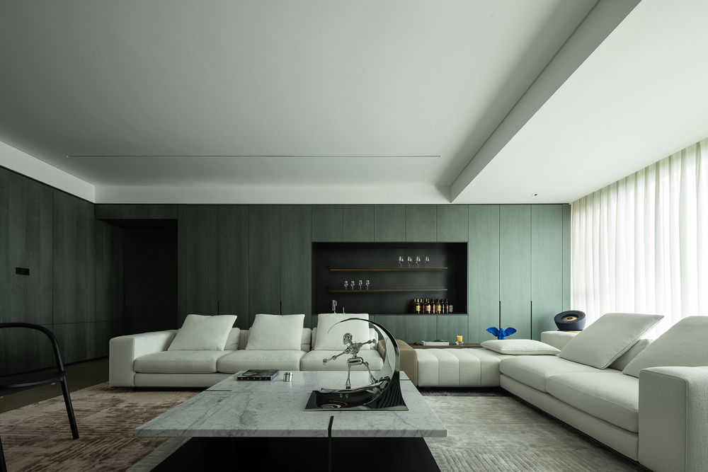
Postmodernism is quietly returning to China’s high-end residences — not as irony or applied ornament, but as a disciplined way of editing a floor plan. The Postmodern Monologue Home, a 338-square-meter apartment in Foshan, Guangdong, makes the case. Designed by Giant Design, a Foshan studio founded in 2009, and led by chief designers Jack Lee and Zhiqiang Hu, the project converts a conventional two-bedroom flat into four suites plus a generous public activity zone for a Canadian returnee couple and their family. Completed in February 2024, this postmodern home treats reduction as a social strategy: fewer walls, more shared landscape, and storage that disappears until it is needed.
| Project Name | 338㎡ Postmodern Monologue Home |
| Design Firm | Giant Design |
| Chief Designers | Jack Lee, Zhiqiang Hu |
| Location | Foshan, Guangdong, China |
| Floor Area | 338 m² |
| Year Completed | February 2024 |
| Client Type | Private residence (multigenerational family) |
| Design Scope | Interior design, construction, purchasing |
| Photographer | Yun Ouyang |
How This Postmodern Home Traded Two Balconies for a Social Core
The original plan carried what the designers describe as the weight of partitions, plus two living balconies that fragmented the public zone. Giant Design’s response was surgical. Both balconies were removed and absorbed into the interior, extending the floor plate and pulling the public spaces toward the dining room, which now acts as the home’s landscape and center of gravity. Private rooms extend toward the quieter rear.
The parti — the organizing diagram of the plan — reads like a barbell. The living room sits between the kitchen and the guest suites, balancing serviced and service spaces in a rhythmic sequence. Around this social core, four suites replaced the original two bedrooms: a master suite, two children’s suites with their own dressing areas, and a senior suite with a private bathroom. The flat was recalibrated for two generations without adding a single square meter.
The design language supports the planning logic. Floor-to-ceiling windows pull daylight deep into the open living-dining outline, while gray-green wood paneling, sintered stone, and matte black joinery lower the visual noise. Against that muted field, the owners’ collection — a chrome Sorayama figure, X+Q Art sculptures, a grid of Bearbrick collectibles — reads as deliberate punctuation.
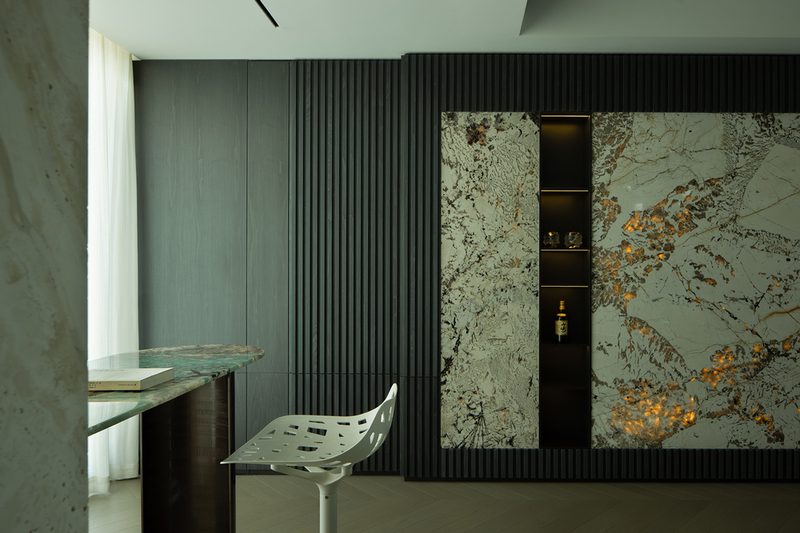
Design Decision: The living room's flush gray-green paneling conceals a full-height, backlit whiskey cabinet. Because the male owner entertains and collects wine, Giant Design hid the bar in plain sight — storage becomes atmosphere only when the doors slide open.
Inside the Monologue: A Room-by-Room Walkthrough
Living Room: A Quiet Field for Loud Objects
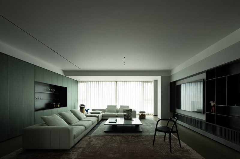
The living room anchors the public zone, set between the concealed bar wall and the full-height window sheers. Low white modular sofas form an L around a marble-topped coffee table, where a chrome Sorayama figure supplies the room’s single flash of reflectivity. Behind the seating, paneled cabinetry hides the whiskey collection; opposite, a black media wall holds the screen within a strict grid of open niches. A glass-enclosed firebox stacked with logs and a small blue angel figurine soften the discipline. The palette stays deliberately monochrome, so the art objects carry the color.
Across the living room shots, the space reads as a study in tonal restraint: gray-green joinery, white upholstery, and dark timber floors held in long horizontal bands. The paneled wall is not flat decoration — sections slide open to reveal backlit shelves of whiskey and glassware, turning storage into a concealed stage set. Daylight filters through full-height sheers, flattening contrast and letting the marble coffee table and chrome sculpture register as accents rather than clutter. The glass firebox with its stacked logs introduces an almost rustic note that keeps the minimalism from going cold. This is a room designed to recede so that objects and guests provide the noise.
 Pin
Pin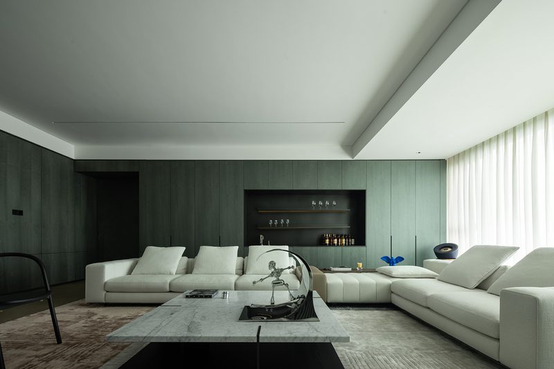 Pin
Pin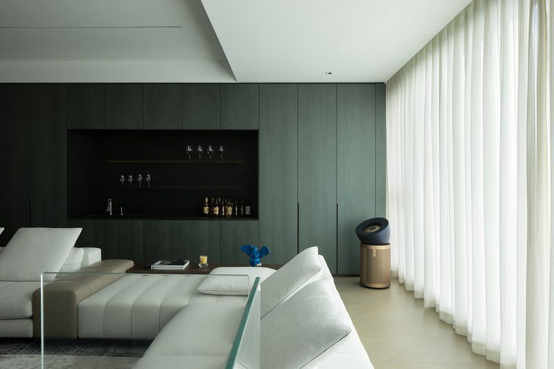 Pin
Pin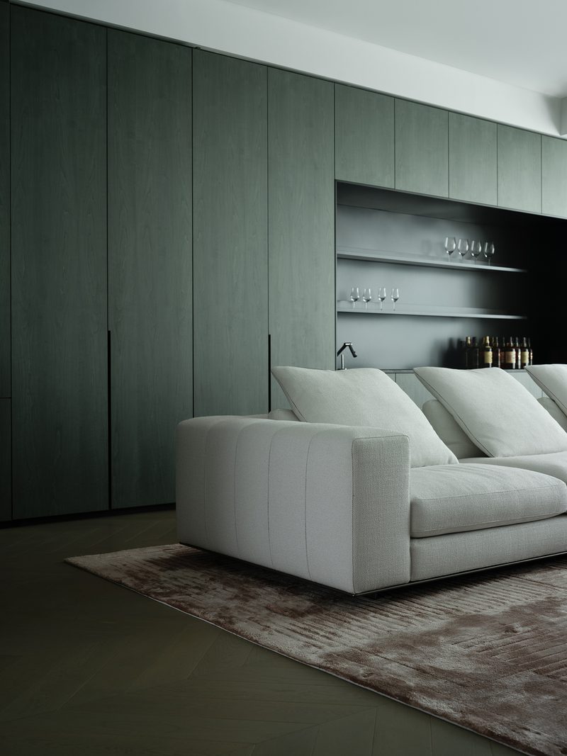 Pin
Pin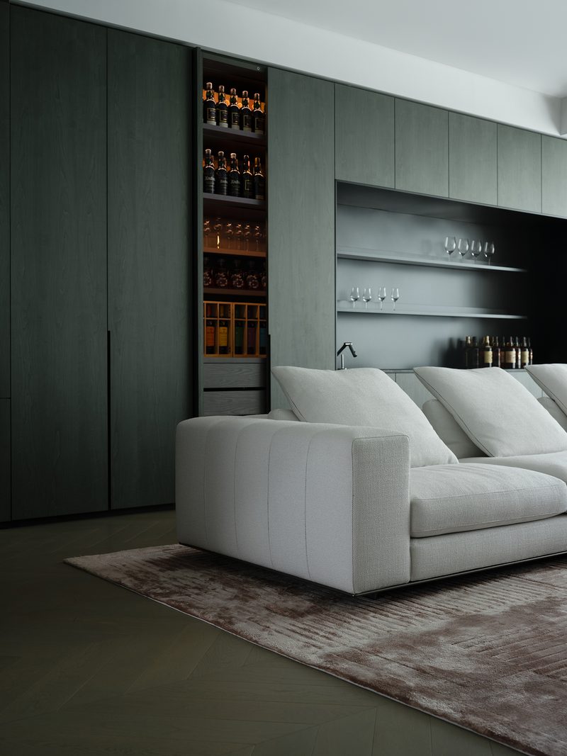 Pin
Pin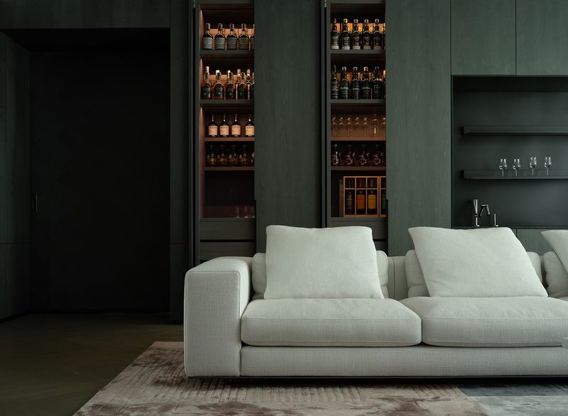 Pin
Pin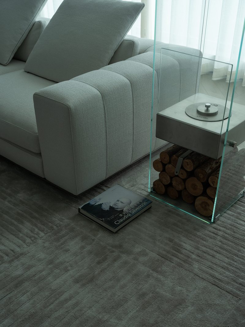 Pin
Pin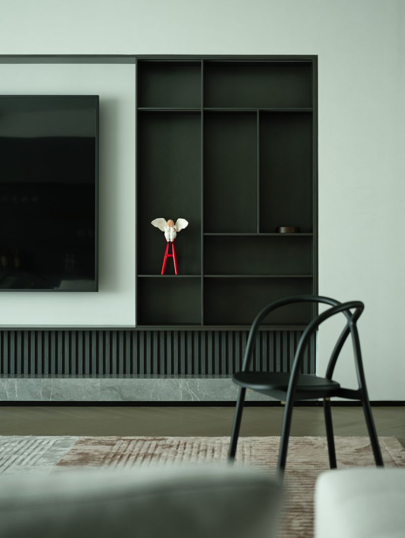 Pin
PinPhoto: Yun Ouyang
Dining Room: The Home’s Center of Gravity
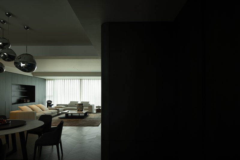
The dining room is the plan’s pivot — the point toward which every public space was gathered. A round marble table with a lazy Susan sits beneath a loose cluster of chrome Tom Dixon pendants, their liquid forms doubling the room’s reflections. Behind it rises the project’s most theatrical surface: a full-height backlit stone wall whose amber veining glows like a cross-section of geology. Fluted dark panels frame the slab, and a slim illuminated niche displays a single bottle like an exhibit.
Seen from the kitchen threshold, the dining room composes the deepest view in the apartment, layering pendants, stone, and the living room beyond into one compressed perspective. The backlit slab — sintered stone customized by Ultra Ceramic — performs two jobs at once: a luminous backdrop for meals and a glowing partition between dining room and corridor. Black upholstered chairs and the dark fluted surround keep the stone’s warmth from tipping into opulence. The fruit tray and the solitary whiskey bottle in the display niche signal that this is a working entertaining space, not a showroom. Of all the rooms, this one best explains the project’s title: one strong material statement, allowed to speak alone.
 Pin
Pin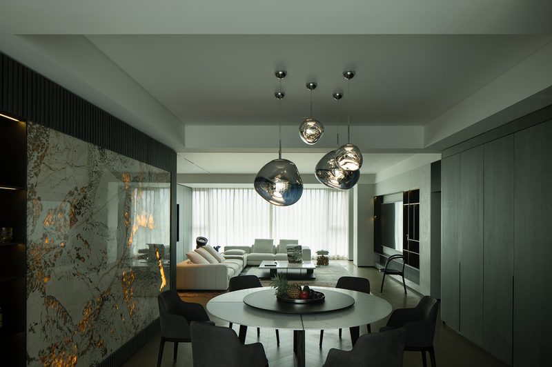 Pin
Pin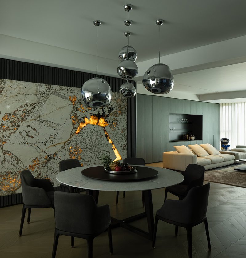 Pin
Pin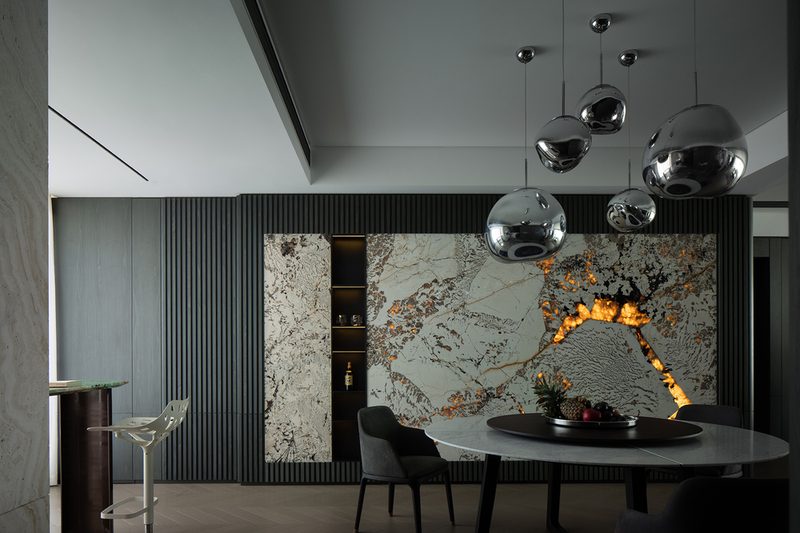 Pin
PinPhoto: Yun Ouyang
Kitchen and Bar: A Stone Perch at the Window’s Edge
At the kitchen’s edge, a bar counter in green-veined stone cantilevers toward the window sheers, paired with white perforated stools. The counter’s mineral surface — turquoise, rust, and cream — is the apartment’s most saturated material moment. Behind it, the working kitchen recedes into matte black cabinetry with integrated ovens, while a marble-clad column carries a small lit niche for a single ceramic vase. Climate control is handled by a concealed five-constant system, so no grilles interrupt the ceiling planes.
The bar photographs track from wide to intimate: the counter against full-height sheers, then close enough to read the stone’s crystalline structure beneath a tumbler of whiskey. This green-veined slab is the palette’s one departure from gray-green discipline, and placing it at the window edge is a calculated move — daylight animates the mineral patterning through the day. The stools, all perforation and thin legs, keep the composition weightless. Behind the counter, the black kitchen block holds to the shadows, respecting the open plan’s hierarchy: social stone in front, working kitchen behind. The result is a morning-coffee and evening-pour perch that bridges kitchen and dining room.
 Pin
Pin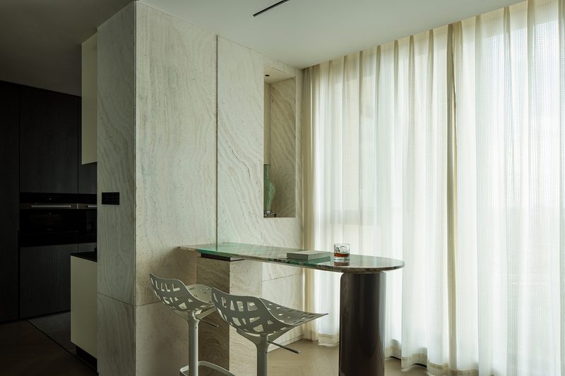 Pin
Pin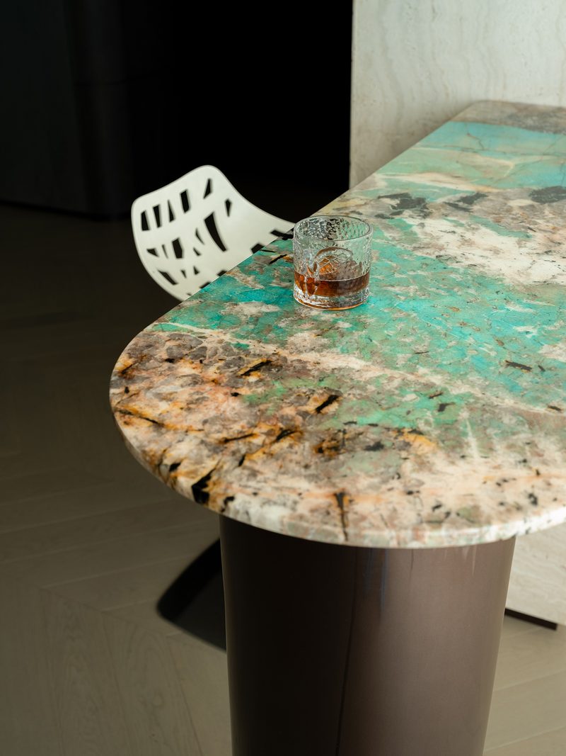 Pin
PinPhoto: Yun Ouyang
Master Bedroom Suite: Curves, Fluting, and Low Light
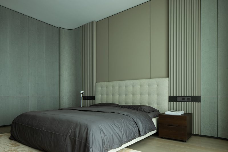
The master suite trades the public zone’s hard edges for softness. A curved wall corner — the apartment’s one explicit curve — wraps the bed wall, clad in pale fluted panels and broad upholstered sections. The low bed with its tall tufted headboard sits on a rug over timber; gray-brown bedding keeps the tone hushed. A white Occhio task lamp arcs over a dark nightstand, and a doorway frames the passage toward the dressing room and bath.
The bedroom photographs dwell on texture at close range: fluted wall panels, woven upholstery, and the shallow grid of the tufted headboard. The curved corner is doing real spatial work — it removes the hard junction where two walls would otherwise meet, letting the room read as one continuous surface around the bed. Integrated warm LED strips graze the fluting, giving the walls depth after dark while daylight stays diffuse. A flush black control band with switches and a temperature readout is the only overt technology, absorbed into the panel rhythm. The suite’s luxury is acoustic and tactile rather than visual.
 Pin
Pin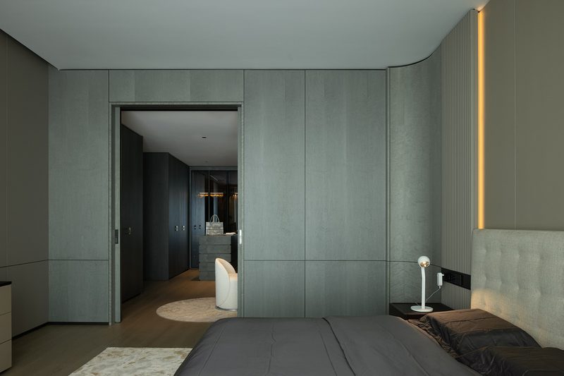 Pin
Pin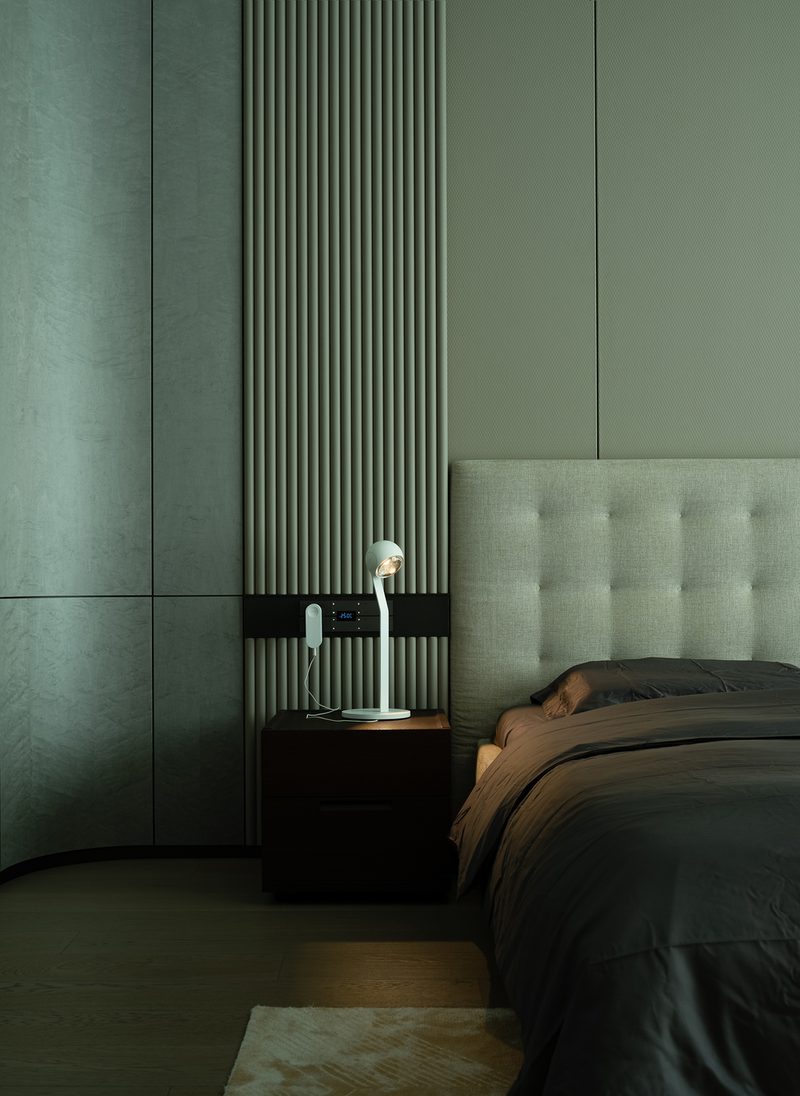 Pin
PinPhoto: Yun Ouyang
Dressing Room: A Dark Timber Gallery
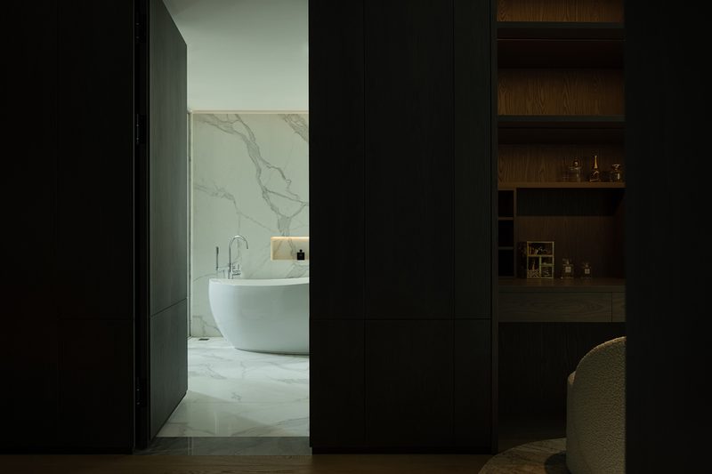
Between the master bedroom and bathroom sits a walk-in dressing room finished in near-black timber veneer. A central island of stacked stone-gray drawers anchors the space, topped with a single designer tote arranged as a still life. Glass-fronted wardrobes at the far end display clothing under warm linear lighting, while brass pulls catch points of light along the dark walls. The timber floor runs warmer here, easing the transition into the white marble bathroom beyond.
The dressing room is photographed like a gallery corridor: symmetrical dark joinery walls converging on a lit vitrine at the end. The composition is deliberately axial — the drawer island, the bag, and the glass wardrobe align on a single sightline, so the room reads as a sequence of frames rather than storage. Warm strip lighting inside the display cabinets provides the only glow, a contrast strategy that makes the wardrobe feel curated rather than merely fitted. One frame glimpses the bathroom through the passage, the white marble tub lit like an exhibit at the corridor’s end. It is the home’s clearest statement of the owners’ fashion-forward identity.
 Pin
Pin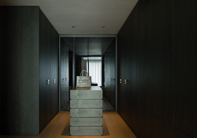 Pin
PinPhoto: Yun Ouyang
Bathroom: A White Marble Chamber
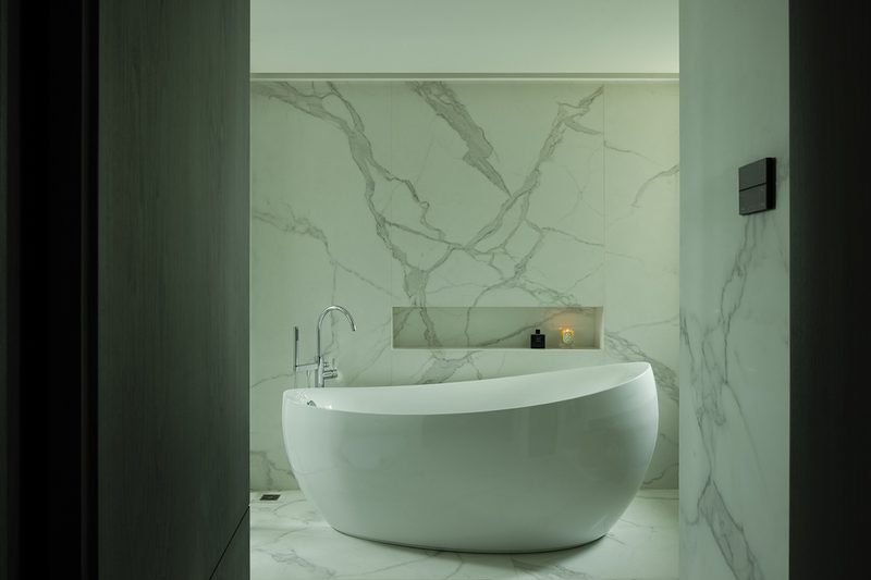
The master bathroom reverses the dressing room’s polarity: here, nearly everything is white marble with bold gray veining — walls, floor, and the recess behind the tub. The freestanding sculptural tub sits centered beneath the niche, which holds a candle and a single bottle like a small altar. A floor-mounted chrome filler arcs beside it. The room relies on veining rather than color for pattern, and on proportion rather than ornament for effect.
The bathroom sequence moves from threshold to centerpiece: first a glimpse of the tub framed by the dark wardrobe passage, then the full marble chamber. The stone’s veining does the decorative work, its diagonal gray strokes giving the compact room a sense of movement that fixtures alone could not supply. The recessed shelf with integrated lighting replaces the usual clutter of bottles with a single composed still life. Chrome fixtures are kept minimal in profile so they never compete with the stone. The result reads closer to a gallery vitrine than a utility space.
 Pin
PinPhoto: Yun Ouyang
Second Bedroom: A Child’s Suite in a Grown-Up Palette
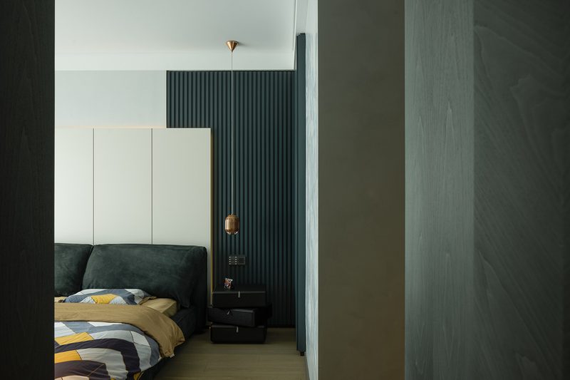
The second bedroom keeps the home’s dark green-gray shell but loosens it. A deep green upholstered bed wears geometric bedding in mustard, navy, and white — the apartment’s only real pattern play. A copper pendant drops beside a fluted teal headboard wall, and a stack of black drawers serves as a nightstand. Through the doorway, the corridor’s glass case of metallic Bearbrick figures glows like a lantern, tying the room back to the family’s shared collection.
The second bedroom frames its views carefully: each shot looks through or past a dark jamb, so the pale headboard wall and teal fluting arrive as a lit destination. The material strategy inverts the master suite — instead of curve and weave, here it is vertical flute and block — yet the color family stays continuous with the public zone. The geometric duvet introduces the home’s only hard-edged pattern, a concession to youth within an adult grammar. Warm wood flooring and the copper pendant’s glow keep the dark palette from flattening. A small toy clapperboard on the nightstand quietly registers who sleeps here.
 Pin
Pin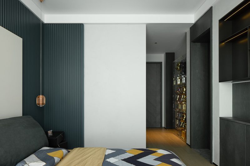 Pin
PinPhoto: Yun Ouyang
Corridor and Study Nook: The Collection as Wayfinding
The circulation spine doubles as a gallery. A grid of nine chrome and metallic Bearbrick figures sits in clear acrylic cases, lit to read as one reflective artwork. Further along, a quiet nook holds a floating desk, a black lounge chair, and open shelving — a study corner carved from the passage itself. Dark timber doors with brass pulls line the walls, so the route alternates between compression and release: dark joinery, then white void, then the glow of the collection.
The corridor photographs treat the passage as a designed room rather than leftover space. The Bearbrick wall is composed like a relief — nine identical bays with varied finishes — and its mirrored surfaces pull light into an otherwise internal zone. The study nook shows the opposite strategy: a white, almost empty volume where a single black chair and shelf give the eye a place to rest. Together they demonstrate the plan’s density management, alternating display and calm along the family’s daily routes. Even here the material discipline holds: timber, brass, acrylic, and white paint, nothing more.
 Pin
Pin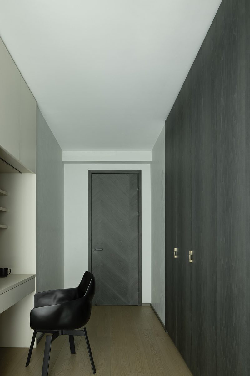 Pin
PinPhoto: Yun Ouyang
Where the Discipline Pays Off — and What It Asks of Its Owners
Strengths: A Social Core with Nothing on Show
The plan’s biggest success is its social geometry. By folding two balconies into the interior and regrouping the public rooms, a large flat gains a genuine center: the dining room acts as landscape, the living room adjoins it, and the bar counter bridges to the kitchen, so entertaining never crosses private territory. Second, the concealed-storage strategy — the flush whiskey wall, integrated appliances, and hidden joinery — lets a family of collectors display their objects without visual noise. Third, the backlit stone wall, fluted paneling, and warm strip lighting give artificial light a material partner; the home performs as well after dark as it does in daylight.
Challenges: The Upkeep Behind the Calm
That composure has a cost. Backlit stone, chrome pendants, and mirror-finish collectibles are fingerprint- and dust-prone, and the calm depends on constant maintenance. The deep, dark joinery of the dressing room and corridor relies entirely on artificial lighting — a failed strip light would flatten entire views. Finally, removing both balconies is a one-way decision: no outdoor retreat remains, and any laundry or airing functions must have been relocated inside the envelope (assumed from context — please verify). For a family that values a terrace, this plan offers none.
A Blueprint for the Returning Global Family
What the Postmodern Monologue Home contributes is a workable model for a demographic reshaping Chinese cities: the returnee family that wants gallery-level calm without giving up multigenerational function. Giant Design’s answer is not stylistic nostalgia but planning intelligence — four suites for privacy, one dense social core for gathering, and storage that hides until needed. It suits families who entertain, collect, and prefer their rooms quiet and their objects loud. Which raises the project’s real question: when every surface is this composed, where does the everyday mess go — and would you trade a balcony for this kind of order?
FAQs
Who designed the Postmodern Monologue Home in Foshan?
The home was designed by Giant Design, a Foshan-based studio founded in 2009 that specializes in high-end residential projects. Chief designers Jack Lee and Zhiqiang Hu led the work, which covered interior design, construction, and purchasing. The 338-square-meter apartment was completed in February 2024.
What is the design concept behind the Postmodern Monologue Home?
The project applies postmodern minimalism: refined lines, reduced visual information, and expression aimed at the spiritual rather than the decorative. Giant Design removed two balconies to expand the interior, regrouped the public spaces around the dining room, and turned a two-bedroom layout into four suites plus shared activity areas.
What furniture and material brands are used in the home?
Main furniture comes from Minotti and Poliform, with lighting by Tom Dixon, Occhio, and CDN Light. Art objects include a chrome Sorayama figure, X+Q Art sculptures, and a Bearbrick collection. Custom materials include MULl woodwork, Ultra Ceramic sintered stone, and TASSANI artistic paint.
How was the floor plan changed for the family?
The original two-bedroom plan became four suites: a master suite, two children’s suites with dressing areas, and a senior suite with its own bathroom. These private rooms extend to the rear, while the living room, dining room, and kitchen gather near the entrance, suiting two generations who entertain often.
Get gorgeous projects via email
