

Some architects build monuments to the new. Others choose to listen to what the old structure has to say before adding a single line. Cui Shu’s redesign of CUN Design’s own headquarters in Beijing falls decisively into the second category — and the result is a 600-square-meter studio that functions as both workspace and manifesto. Located inside the former 491 Radio Station compound in Chaoyang District, the project treats industrial heritage not as a nostalgic backdrop but as a living collaborator. The building once carried the founding declaration of New China across the airwaves; today it carries a different kind of broadcast — a design statement about how contemporary practice can honor history without freezing it in time.
| Project Name | “Conformity and Intervention” — CUN Design Studio |
| Architect / Designer | Cui Shu |
| Location | 491 Space, Chaoyang District, Beijing, China |
| Floor Area | 600 square meters |
| Year Completed | 2023 |
| Client Type | Design firm (own studio) |
| Photographer | Eason He |
When a Radio Station Becomes a Design Manifesto
The design strategy centers on a binary dialectic the architects call “conformity and intervention” — conforming to the historical texture of the existing industrial shell while intervening with a precise contemporary language. The original building’s most valuable asset, its unusually high ceiling height, was preserved entirely and leveraged to create dramatic vertical spatial sequences. Rather than hiding the raw structure, Cui Shu left the existing concrete walls exposed, their mottled surfaces acting as palimpsests that record decades of use.
The material strategy reinforces this temporal dialogue. Aged metal lines trace the contours of industrial civilization across the interior, while hand-made rammed earth walls introduce organic warmth and thermal mass. Glass curtain walls channel natural light deep into the plan, their transparency contrasted against the opacity of weathered steel and rough plaster. The atrium functions as the building’s primary light well, where a precisely cut skylight transforms solar movement into shifting geometric shadows on the floor below — what the architects describe as a “spatiotemporal narrative of light.”
 Pin
PinPhoto: Eason He
The building exterior at twilight reveals the restrained intervention strategy. The original gabled silhouette of the 491 Radio Station remains untouched, while warm interior light glows through the preserved industrial window grid — a lantern effect that signals the building’s new purpose without altering its civic presence.
Design Decision: Rather than installing conventional ceiling lighting throughout the atrium, Cui Shu specified concealed electronic light sources enclosed within glass "light containers" — a move that controls the precise projection range of each fixture while deliberately preserving shadow zones throughout the space. The result is an interior that reads as dim and contemplative rather than brightly uniform, honoring Eastern philosophical ideas about the value of darkness and negative space in spatial experience.
Spatial Sequence: From Public Reception to Private Work
Reception: Where Raw Structure Meets Curated First Impressions
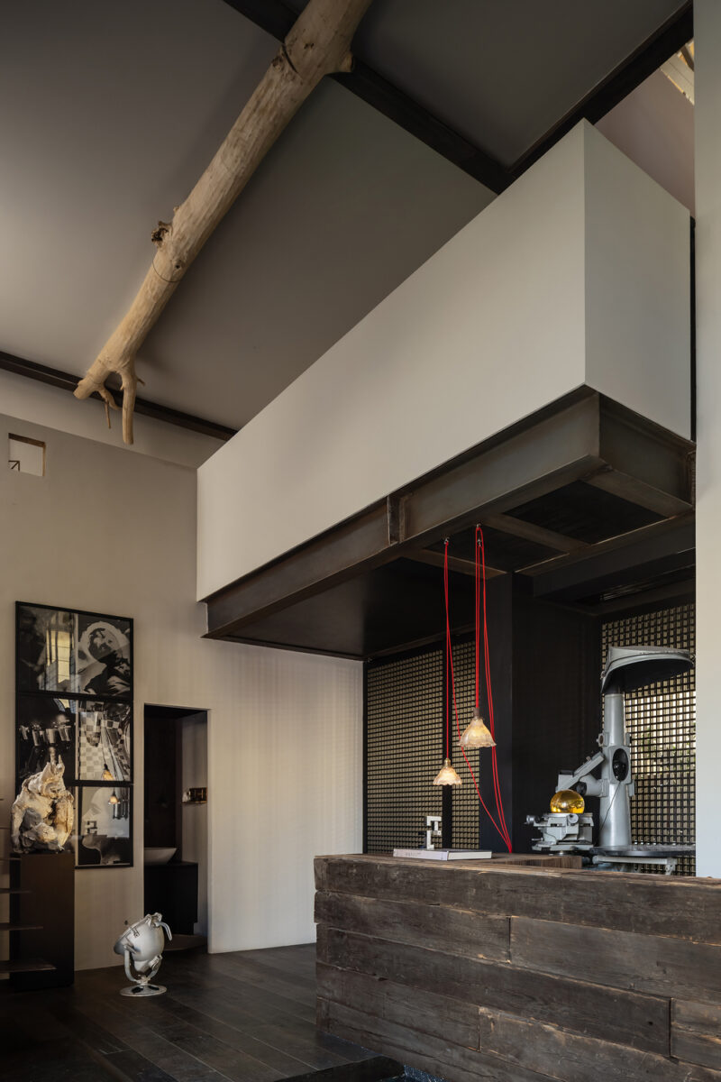
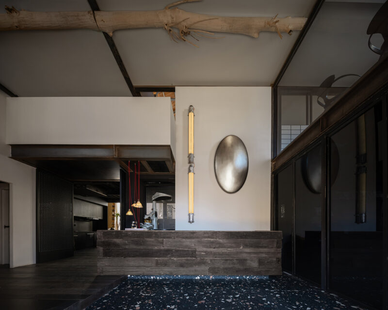
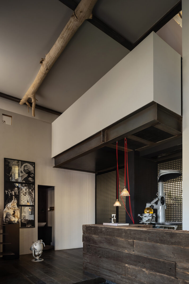
The entry sequence begins on a dark terrazzo floor that reads almost as a reflecting pool, grounding visitors in materiality before they process the full spatial composition. A massive reception desk constructed from stacked timber blocks anchors the center of the room, its rough-hewn texture a deliberate counterpoint to the precision of the white volume that hovers above it. The existing structural beam, left fully exposed, carries an unexpected sculptural element — a pair of large antlers that introduces an almost surreal conversation between industrial architecture and natural artifact.
 Pin
PinPhoto: Eason He
The reception area presents the project’s material thesis in concentrated form: terrazzo flooring with embedded stone fragments, a timber-block reception counter, an exposed concrete beam overhead, and a white floating volume that contains the upper-level program. The spatial compression here makes the subsequent expansion into the main atrium more dramatic.
 Pin
PinPhoto: Eason He
Seen from the opposite angle, the reception reveals its layered ceiling strategy — the original structural joists remain visible above a new plaster ceiling plane, while red pendant cords drop from the upper level like mechanical arteries, turning necessary infrastructure into compositional elements.
The Meeting Lounge: Natural Light as Design Material
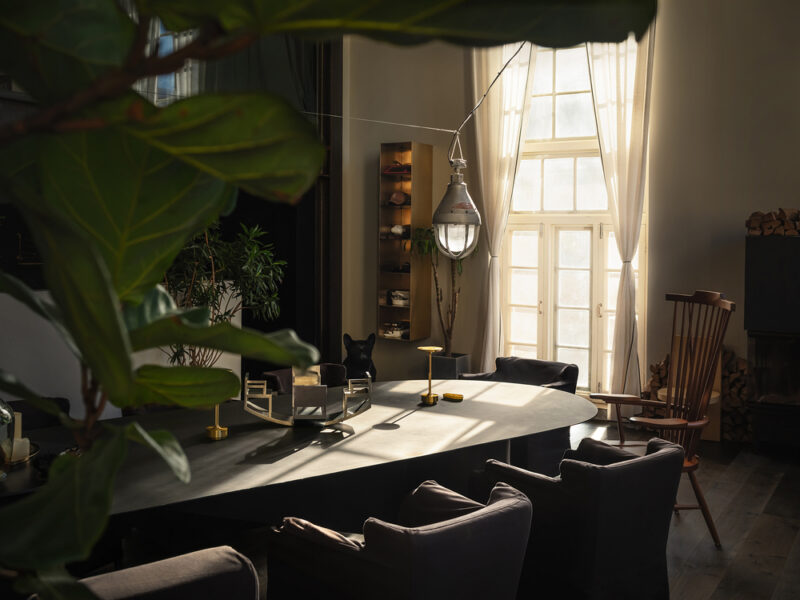
The main meeting space occupies the building’s tallest volume, where floor-to-ceiling windows with sheer linen curtains filter Beijing’s daylight into a soft, workable luminance. An elongated oval table in matte black anchors the room, surrounded by low leather armchairs that keep sight lines open across the full width of the space. The fenestration strategy *(the placement and sizing of windows)* prioritizes diffused northern light over direct solar gain, eliminating glare on work surfaces while maintaining visual connection to the mature trees outside.
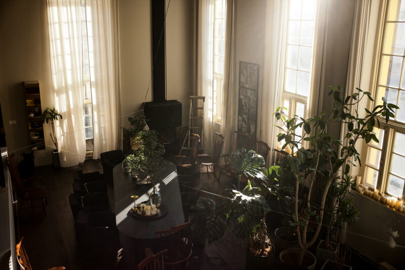
Interior plants punctuate the perimeter, their scale carefully calibrated to human seating height so they read as spatial dividers rather than decoration. Candles arranged on brass trays and the windowsill introduce flame as a secondary light source, its variable color temperature creating a warm counterpoint to the cool daylight. The overall atmosphere suggests a salon more than a conference room — a space designed for extended conversation rather than efficient presentation.
 Pin
PinPhoto: Eason He
The main meeting lounge demonstrates how daylight can function as a primary design material. Tall windows on two adjacent walls create cross-illumination that eliminates harsh shadows, while the matte black oval table absorbs rather than reflects light, preventing glare and grounding the visual field.
 Pin
PinPhoto: Eason He
An elevated view of the lounge reveals the full spatial strategy: the long table acts as a central spine, plants create soft territorial boundaries between seating groups, and the sheer curtains diffuse daylight into a uniform wash. The suspended industrial pendant introduces a vertical element that draws the eye upward into the tall volume.
Chief Designer’s Office: A Dark Room for Concentrated Work
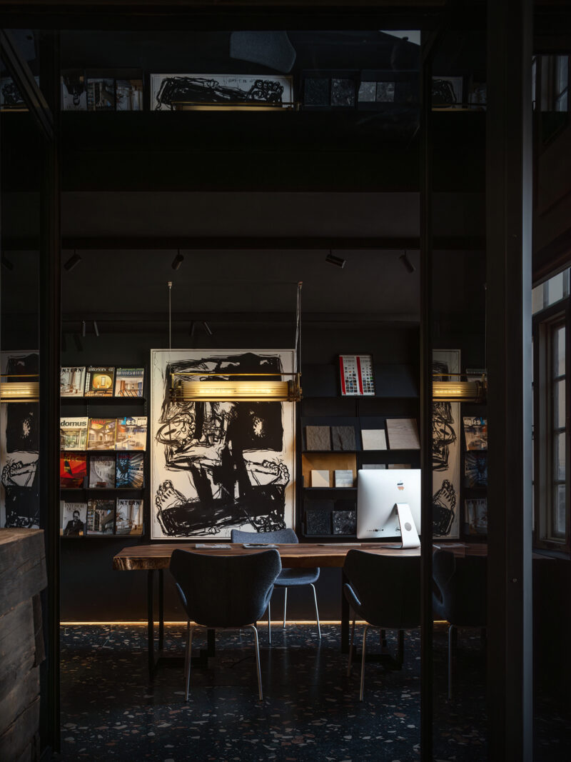
In deliberate contrast to the light-filled public zones, Cui Shu’s private office is wrapped in near-black surfaces that create a focused, cocoon-like environment for design work. Floor-to-ceiling bookshelves line the walls, stocked with architecture and design publications whose colorful spines become the room’s primary visual accent. A large-scale figurative ink painting hangs as the room’s singular artistic statement, its gestural black marks echoing the expressive potential of the design process itself.
The lighting strategy here relies on suspended tubular fixtures that cast a narrow band of warm light across the work surface, leaving the perimeter in shadow. This layered approach to illumination — bright where work happens, dark where thinking happens — reflects an understanding of creative labor that distinguishes between productive and contemplative states.
 Pin
PinPhoto: Eason He
The chief designer’s office uses darkness as a design tool. Black walls and ceiling absorb light, eliminating visual distraction, while a suspended tubular fixture provides task lighting precisely where needed. The large ink painting introduces gestural energy that complements the room’s purpose as a space for creative conception.
Open Workspace: Productivity Under Exposed Trusses
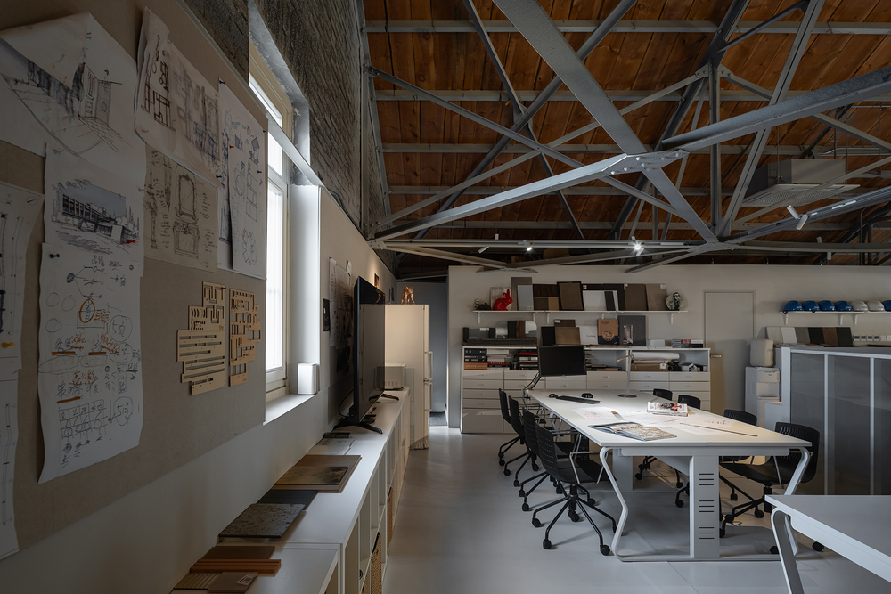
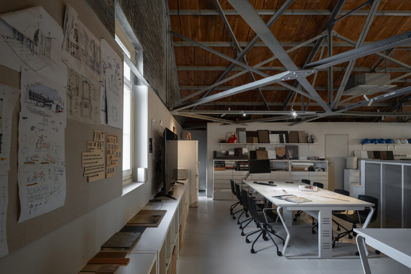
The upper-level workspace occupies the building’s roof structure, where exposed steel trusses and original timber decking create a cathedral-like volume above rows of white worktables. This is the most overtly industrial zone in the studio — the architects made no attempt to conceal the structural logic of the roof, instead treating the truss geometry as a ready-made ceiling composition. Cross-ventilation flows through clerestory windows, reducing reliance on mechanical cooling during Beijing’s mild seasons.
The furniture strategy supports flexible collaboration: ergonomic chairs on casters, white worktables arranged in clusters, and perimeter storage for material samples and drawing sets. Sketches and diagrams pinned directly to the walls reinforce the sense that this is a working studio rather than a curated showroom — the mess of creative process is on full display, and that honesty feels consistent with the building’s own unvarnished material history.
 Pin
PinPhoto: Eason He
The open workspace celebrates the building’s structural honesty. Exposed steel trusses form a rhythmic ceiling pattern overhead, while original timber roof decking adds warmth that balances the industrial metalwork. The white worktables and storage system read as a contemporary insertion that respects the historic envelope without mimicking it.
Circulation: A Spiral Stair as Vertical Sculpture
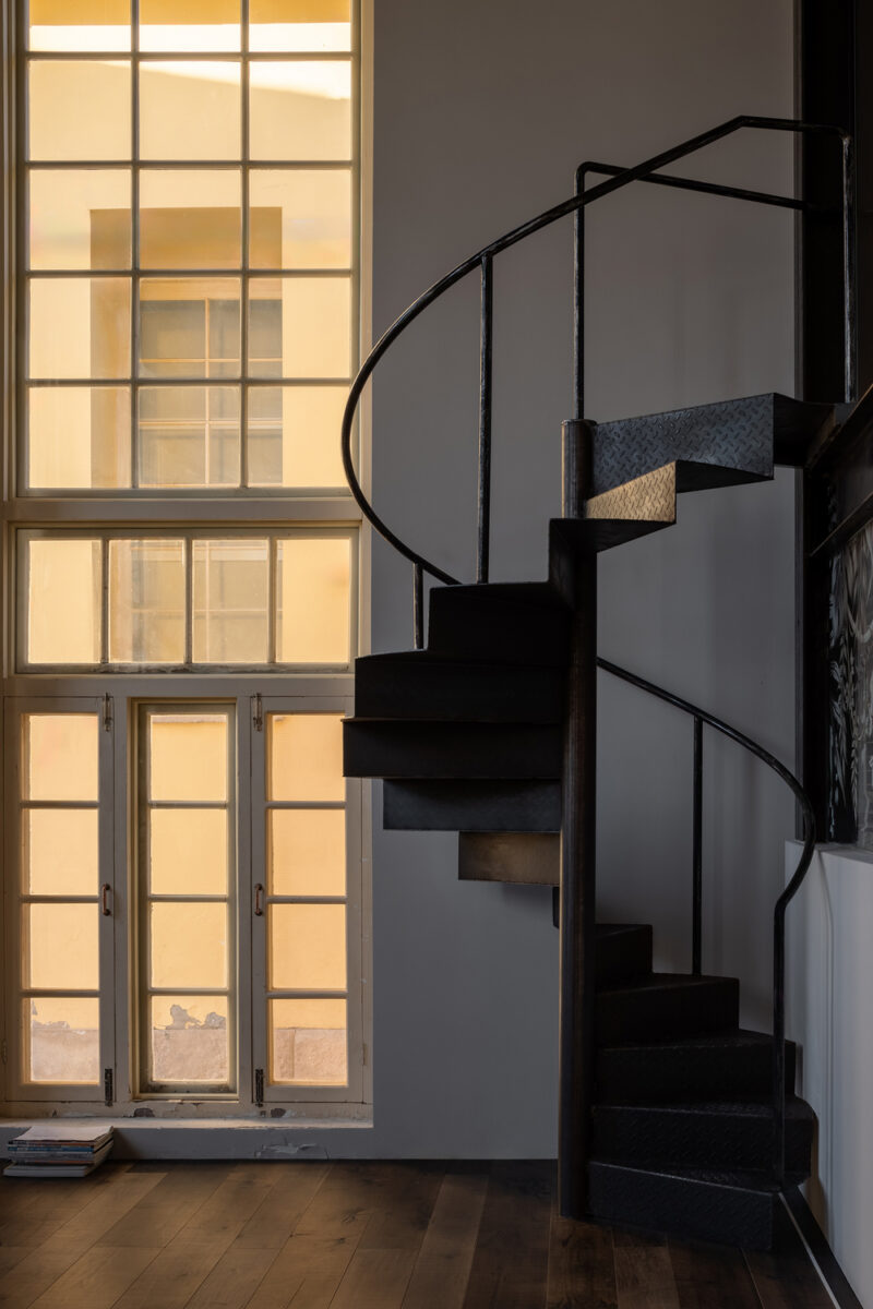
Connecting the levels, a black steel spiral staircase winds upward in front of a tall industrial window, its silhouette reading as a piece of functional sculpture against the grid of mullions. The diamond-plate treads reference factory flooring, maintaining material continuity with the building’s industrial origins, while the curved handrail introduces a single graceful gesture into an otherwise rectilinear environment.
 Pin
PinPhoto: Eason He
The spiral staircase demonstrates how utilitarian elements can become focal points. Positioned against the full-height industrial window, the black steel form creates a dramatic silhouette while the diamond-plate treads maintain the project’s material commitment to honest industrial textures.
Material Details: Where Time Leaves Its Mark
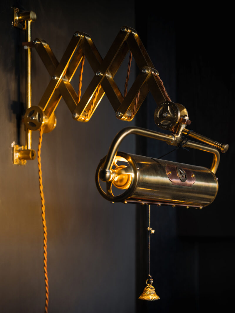
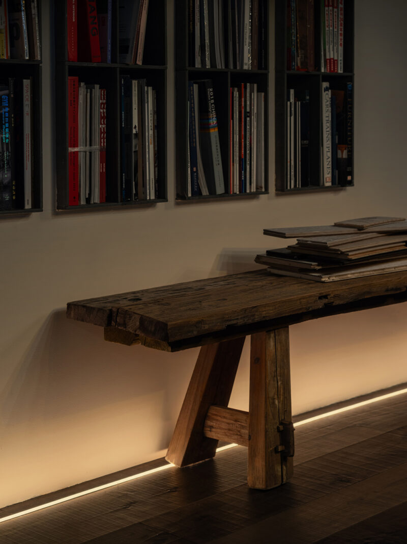
Throughout the studio, material details reinforce the project’s conceptual framework. A brass scissor-arm wall lamp, its patinaed surface suggesting decades of use, extends from a dark wall like a piece of laboratory equipment repurposed for domestic life. A rustic timber console table, its surface worn smooth by imagined years of contact, displays stacks of design books under warm perimeter lighting. These moments of tactile warmth prevent the industrial palette from feeling cold or institutional — they introduce the evidence of human presence that makes a workspace feel inhabited rather than staged.
 Pin
PinPhoto: Eason He
This brass scissor-arm lamp exemplifies the project’s approach to material aging. The patinated metal surface, the braided cloth cord, and the mechanical hinge details all suggest an object that has accumulated history — a deliberate design choice that aligns with the studio’s broader philosophy of embracing time’s effect on materials.
 Pin
PinPhoto: Eason He
A weathered timber console table displays design publications under warm LED strip lighting. The worn wood surface, with its softened edges and varied grain, introduces organic texture that counters the precision of the surrounding architecture. This is furniture that gets better with use — a philosophy the project extends to the building itself.
Floor Plan: Three Levels of Programmatic Clarity
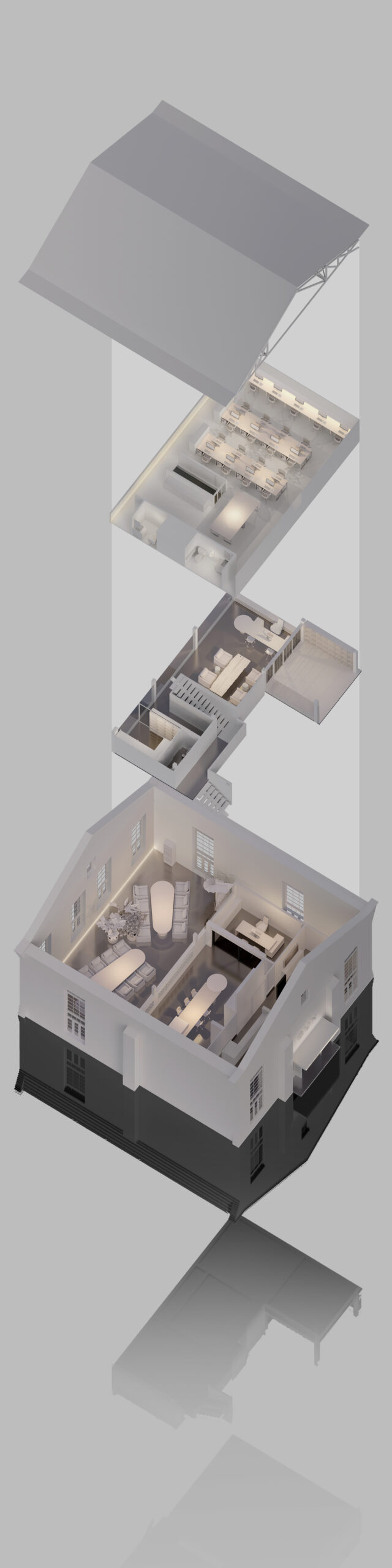
The three-level plan reveals a clear organizational logic. The ground floor concentrates public functions — reception, main meeting lounge, and service areas — using the full height of the original volume for dramatic spatial effect. An intermediate level introduces more intimate meeting and display spaces, while the upper floor dedicates itself entirely to open-plan studio work under the exposed roof structure. The vertical connectivity between levels ensures visual and social cohesion despite the programmatic separation.
 Pin
PinThe exploded axonometric reveals the three-level spatial strategy. The ground floor contains reception and primary meeting functions within the tallest volume; the intermediate level provides more intimate gathering spaces; and the upper floor dedicates itself to open-plan creative work beneath the original timber roof structure and exposed steel trusses.
Where the Dialogue Between Old and New Succeeds — and Where It Asks Questions
The Material Palette’s Temporal Intelligence
The project’s greatest strength lies in its material coherence. Every surface — from the mottled concrete walls to the patinated brass fixtures to the weathered timber furniture — participates in a unified narrative about the passage of time. The architects did not simply preserve the old and add the new; they created conditions for the new to age into the old. The copper cladding will develop verdigris; the steel will continue to oxidize; the timber will wear smooth. This is architecture designed as a time-lapse photograph in slow motion.
The spatial strategy is equally persuasive. By concentrating public functions on the ground floor and private work above, the plan resolves the tension between a studio that must receive clients and a studio that must protect focused creative labor. The atrium’s daylight choreography, driven by the precisely cut skylight geometry, adds a dimension of temporal experience that most office interiors fail to achieve.
The Maintenance Reality of Living Materials
The honest challenge of this project is maintenance. Living materials — oxidizing steel, aging copper, expanding and contracting timber — require monitoring and occasional intervention that painted drywall and vinyl flooring do not. The terrazzo floors, while beautiful, will show wear patterns in high-traffic zones. The sheer linen curtains, essential to the quality of light, will require regular cleaning in Beijing’s dusty climate. These are not design failures; they are the material cost of the project’s conceptual integrity. Owners who choose this aesthetic must also choose the stewardship it demands.
The darker private office, while atmospherically powerful, may prove challenging for tasks requiring precise color judgment or extended screen work. And the open-plan upper level, for all its visual drama, carries the acoustic limitations common to any workspace with exposed hard surfaces and high ceilings. The design addresses these concerns with localized solutions — carpeted zones, acoustic baffles hidden in the truss work — but the fundamental character of the space remains resonant rather than hushed.
A Workspace That Thinks Like a Cultural Artifact
CUN Design’s headquarters does not read as an office renovation so much as a cultural intervention — a design studio asking, through its own workspace, what it means to practice architecture in a city where the new arrives with such velocity that the old barely has time to register its presence. By choosing to inhabit a former radio station and by treating that building’s material history as a design partner rather than an obstacle, Cui Shu has created a studio that functions as argument as much as workspace.
This is a project best suited for design-led organizations with a genuine commitment to material experimentation and the maintenance it requires. It offers a model for how industrial heritage buildings across China’s rapidly developing cities might be reinhabited — not as museums of their former function, but as active contributors to contemporary cultural production.
Would you embrace the ongoing stewardship that living materials demand, or does the predictability of conventional office finishes offer a freedom this approach cannot match?
FAQs
Q: Where is CUN Design’s studio located?
A: The studio is located at 491 Space in Chaoyang District, Beijing, China. The building occupies a former radio station compound originally constructed during the early years of New China.
Q: Who designed the CUN Design studio interior?
A: The project was designed by Cui Shu, chief designer at CUN Design, who led the renovation of the firm’s own headquarters as a statement about industrial heritage regeneration.
Q: What is the design concept behind “Conformity and Intervention”?
A: The concept describes a binary dialectic: “conformity” to the existing building’s historical texture and structural character, and “intervention” through contemporary materials, spatial strategies, and technical systems that activate the old structure for new uses.
Q: How large is the CUN Design studio?
A: The studio occupies approximately 600 square meters across three levels, including reception, meeting spaces, a chief designer’s private office, and an open-plan creative workspace.
Q: What materials were used in the CUN Design studio renovation?
A: Key materials include exposed original concrete, aged metal and rusted steel plates, hand-made rammed earth, terrazzo flooring, weathered timber, patinated brass fixtures, glass curtain walls, and dark leather upholstery.
Get gorgeous projects via email
