

Most compact apartments fight their footprint. chose to work with it. Led by chief designer Karen Karapetian, the firm reconfigured a 72-square-meter two-bedroom unit into a warm minimalism apartment defined by oak veneer, travertine-textured porcelain, and an unusually generous sense of space. The clients — a young couple seeking a place to rest and recharge — needed storage, natural light, and a layout that felt open without becoming cold. The response removes nearly every non-structural partition, introduces a continuous four-meter kitchen countertop, and treats material warmth as a spatial strategy rather than a decorative afterthought.
| Project Name | Warm Minimalism: a Sanctuary to Recharge |
| Architect / Designer | Alexander Tischler LLC (Chief Designer: Karen Karapetian) |
| Floor Area | 72 sq. m |
| Year Completed | 2024–2025 |
| Client Type | Private (young couple) |
| Key Materials | Oak veneer (custom stain), travertine-textured porcelain tile, bamboo blinds |
How Removing Walls Became the Primary Design Strategy
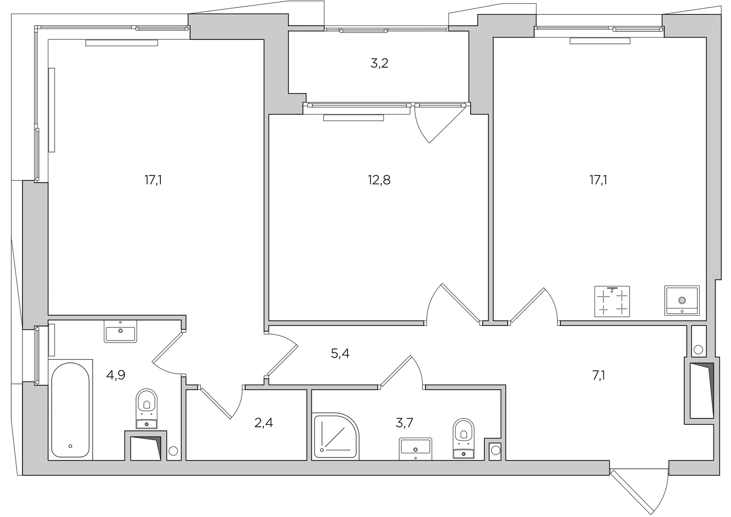
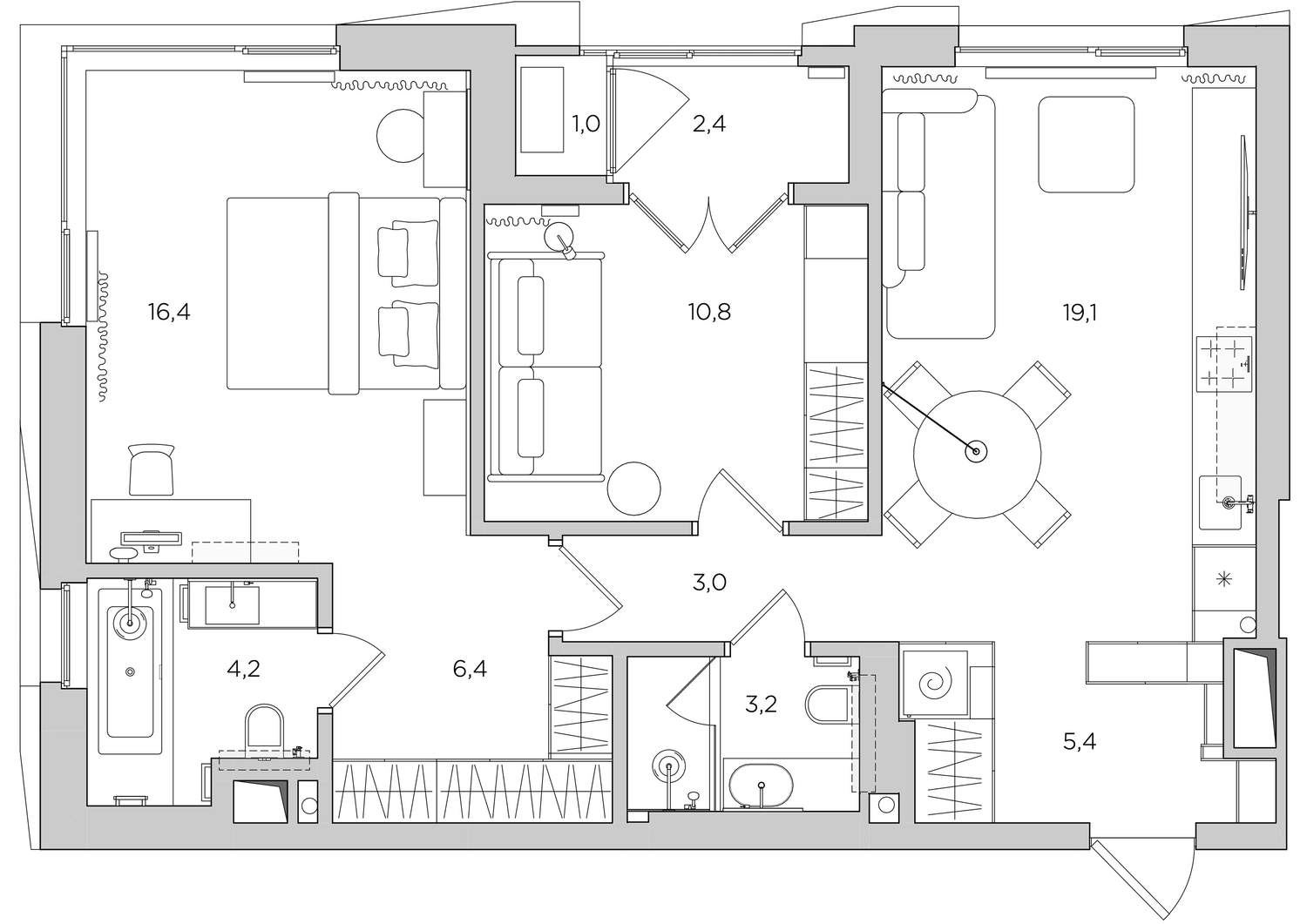
The existing layout presented a familiar problem: a small open-plan kitchen-living room, a narrow guest bathroom, a tiny walk-in closet, and an awkward loggia connection that trapped the external air conditioning unit outdoors. With no load-bearing walls to negotiate, the design team reallocated space with precision. The walk-in closet expanded into the guest bathroom’s former footprint; the guest bathroom gained width from a repositioned hallway; and the partition between entryway and living room dissolved, replaced only by a shallow cabinet that lets window light travel all the way to the front door.
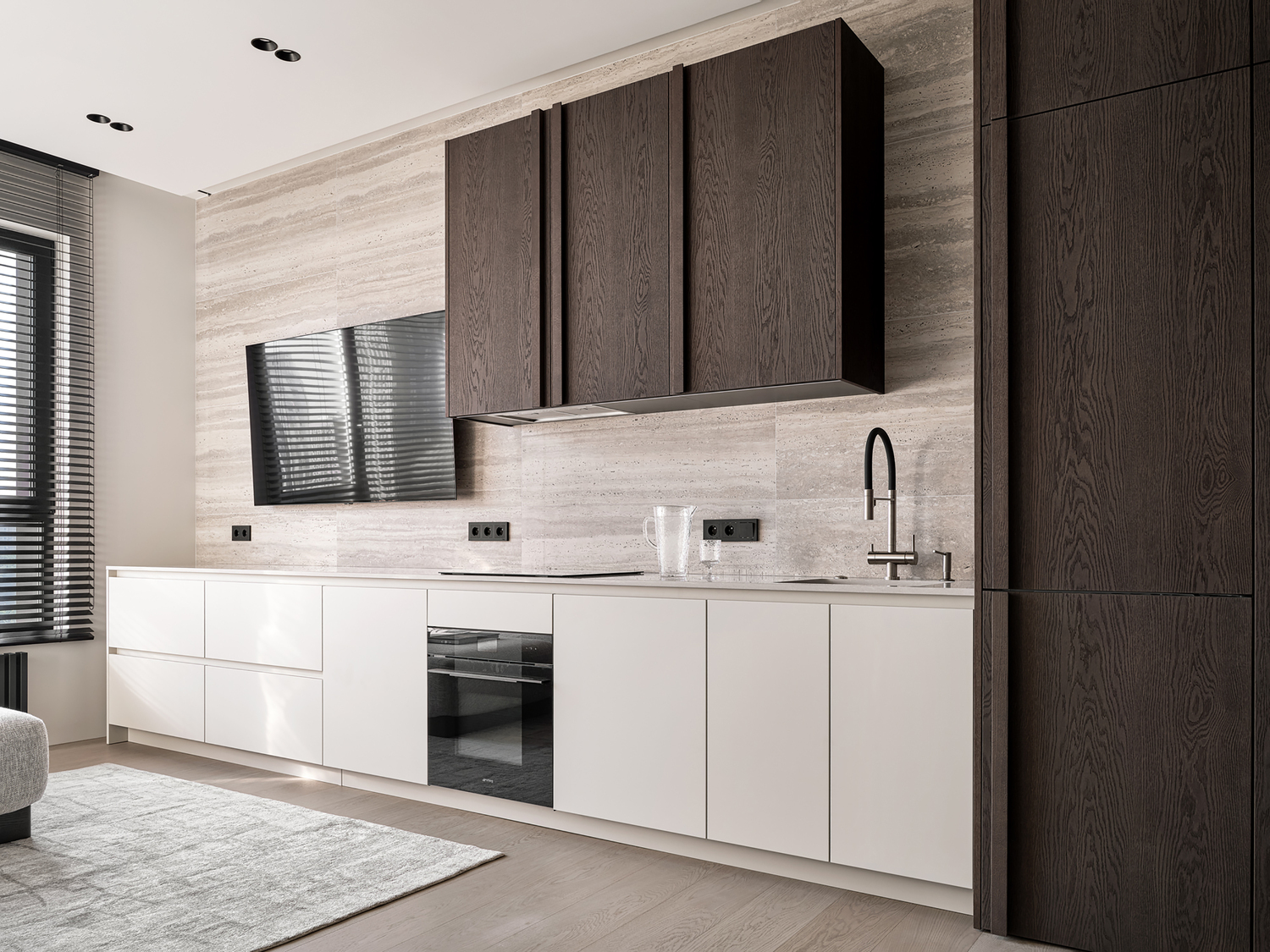
This parti (the fundamental spatial organization of a plan) treats the apartment as a single continuous volume differentiated by furniture and material rather than by walls. The kitchen’s lower cabinets extend to the window, creating a four-meter countertop of uninterrupted stone. Oak veneer upper cabinets, finished with a custom stain selected specifically for this interior, introduce warmth at eye level while the white base cabinets keep the lower plane visually light.
Design Decision: The architects relocated the external AC unit and supply ventilation into a small enclosed space on the loggia, sealed behind a sound-insulated door — a move that reclaimed the outdoor area for year-round use without altering the building facade.
 Pin
The original floor plan reveals a constrained layout with a tiny walk-in closet, narrow guest bathroom, and an awkward loggia exit that limited usable space.
 Pin
The redesigned plan reallocates space strategically: the walk-in closet expands, the guest bathroom becomes more square, and the living room opens fully to the entryway.
Room-by-Room Spatial Walkthrough
Living Room: Light as a Material
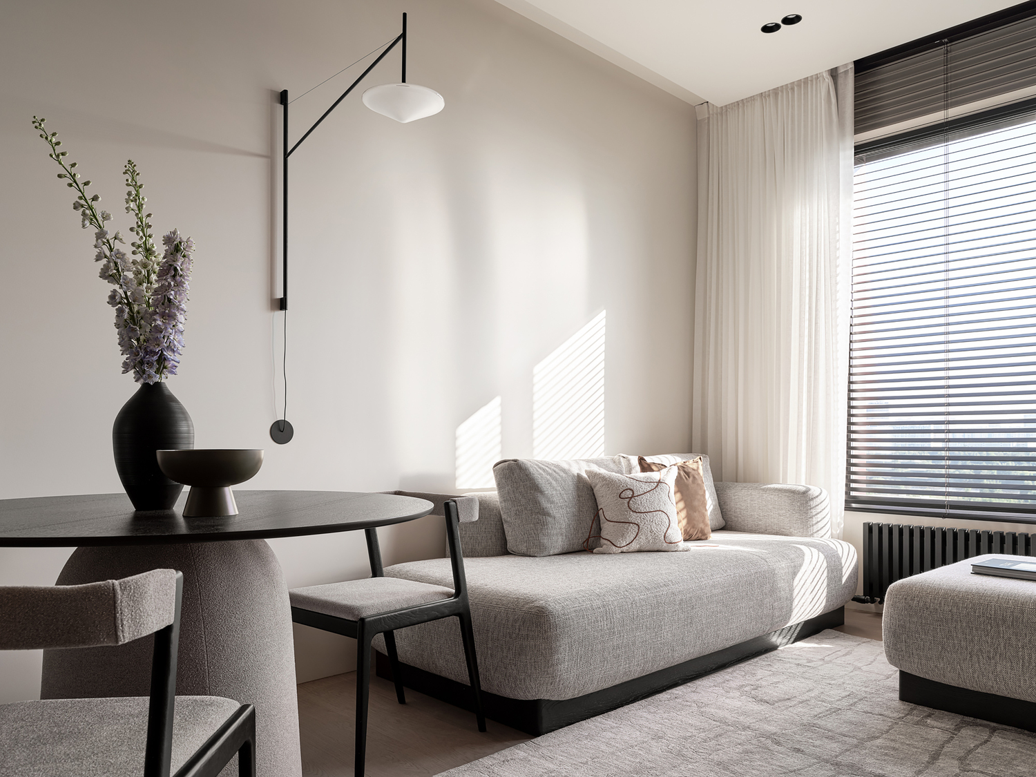
The removal of the entryway partition fundamentally changed how light behaves in this apartment. Natural illumination from the living room window now flows unobstructed into the former hallway, making the entire open-plan area feel substantially larger than its footprint suggests.
 Pin
The open-plan living and dining area reads as a single volume, with a grey upholstered sofa and contrasting black dining table defining distinct zones within the continuous space. A movable wall lamp provides flexible lighting between the two functions. Photo credit: Olga Karapetian.
 Pin
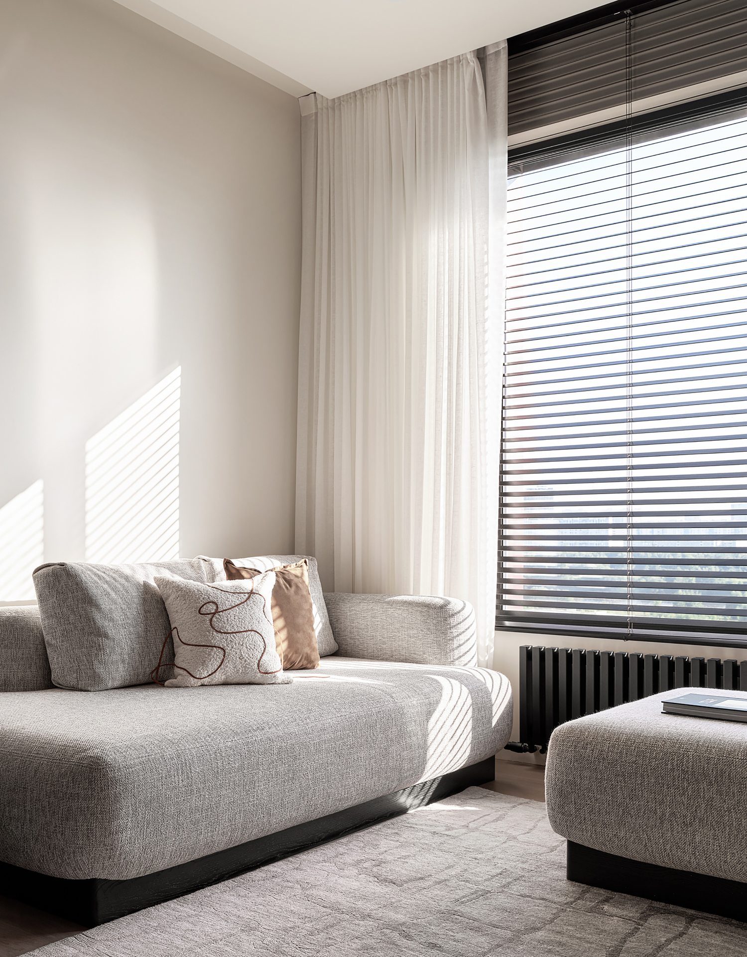
The sofa, paired with an ottoman that doubles as storage for books and small items, creates a defined relaxation zone. Bamboo blinds filter direct sunlight while maintaining the apartment’s warm material palette. Photo credit: Olga Karapetian.
Kitchen: Four Meters of Continuous Stone
The kitchen demonstrates how material continuity can expand perceived space. Tall cabinets and upper units in custom-stained oak veneer anchor the wall plane, while lower white cabinets extend all the way to the window.
 Pin
The kitchen’s upper cabinets in dark oak veneer contrast with white lower units, while the travertine-textured backsplash unifies the composition. The four-meter countertop length is unusual for a 72-square-meter apartment and speaks to the value of eliminating partitions. Photo credit: Olga Karapetian.
Hallway: Storage as Architecture
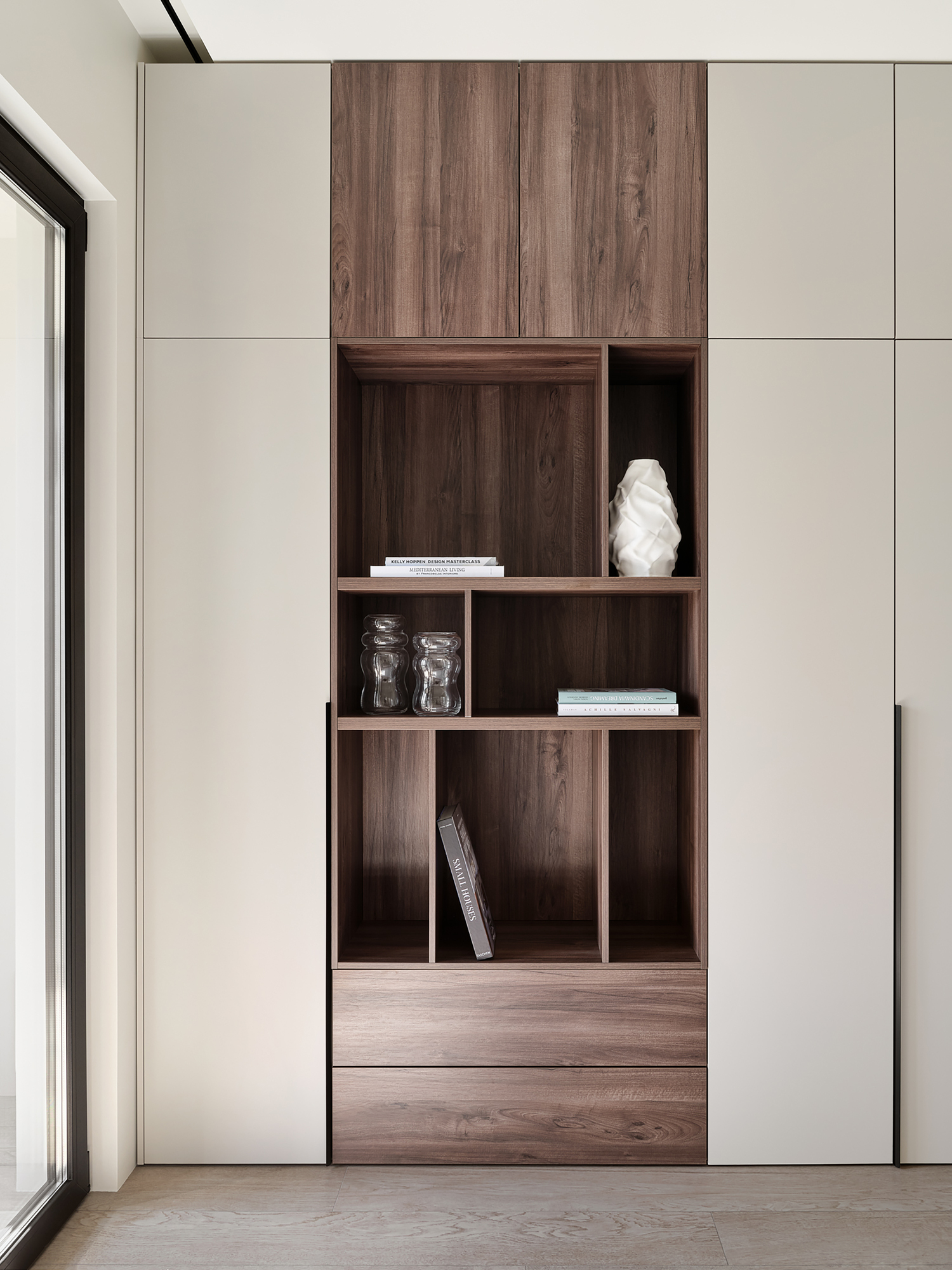
The corridor demonstrates how built-in millwork can replace walls as a spatial organizer. A large closet painted to match the wall color creates a seamless visual plane, with one mirrored front concealing the washer and dryer.
 Pin
The hallway storage unit alternates closed beige cabinets with open walnut shelving, creating a rhythm of concealment and display that animates the corridor without adding visual clutter. Photo credit: Olga Karapetian.
A second mirror, set flush between wall panels, produces what the designers describe as a “portal-like” effect that amplifies the sense of depth. The beige cabinet base is raised off the floor to create a dedicated docking station for a robotic vacuum — a small detail that signals how thoroughly the design considers daily habits.
Loggia: Reclaiming the Outdoor Room
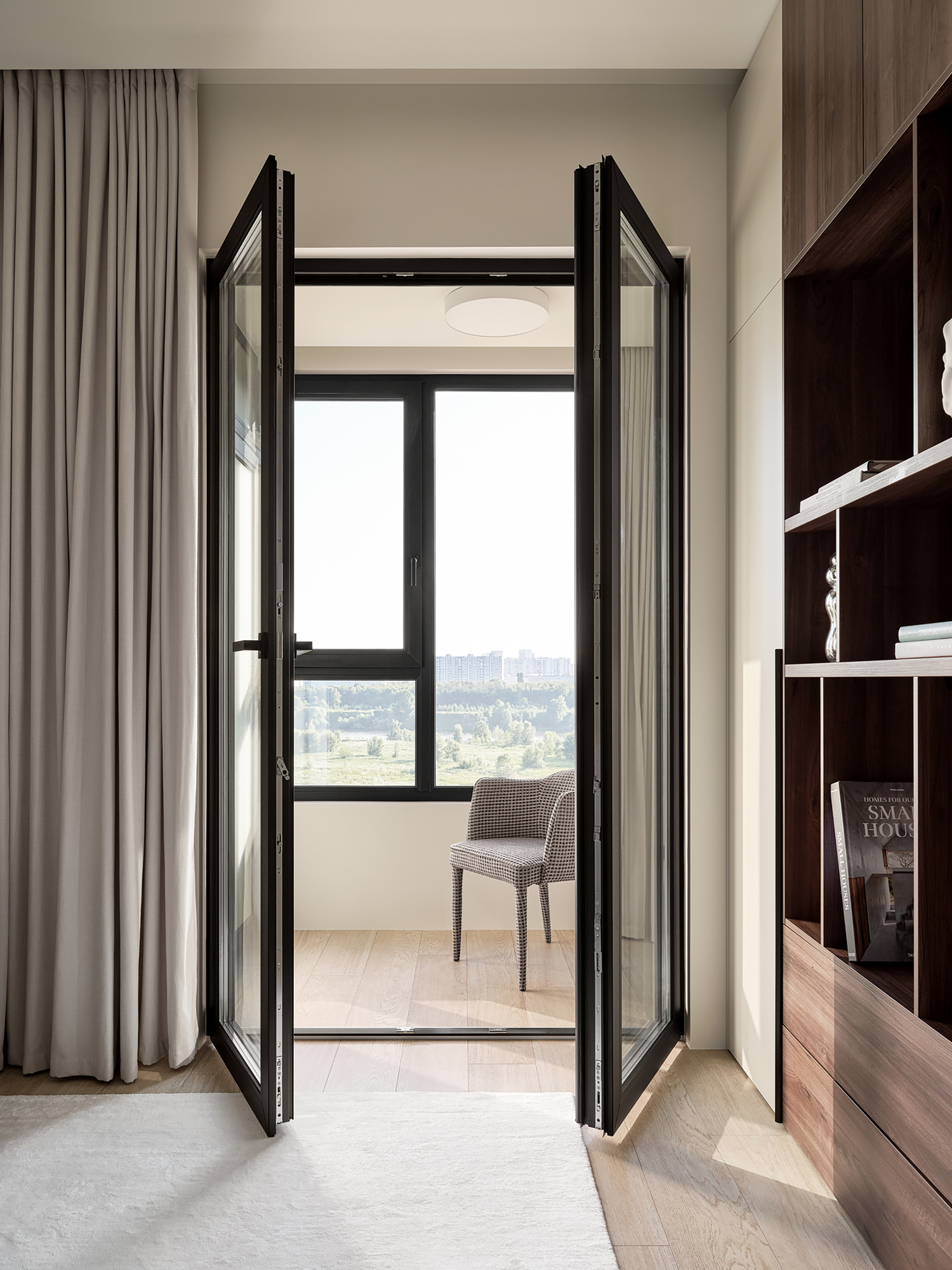
The loggia connection was one of the project’s most consequential moves. The original developer layout placed the external AC unit on the loggia, which would have rendered the outdoor space unusable in summer due to noise and heat.
 Pin
Full-height folding glass doors with black frames replace the former low window unit, treating the loggia as a genuine extension of the interior rather than an afterthought. The view frames a distant cityscape across greenery. Photo credit: Olga Karapetian.
The full-height casement window that replaced the old sill-level unit brings significantly more natural light into the living room while the enclosed utility block keeps mechanical equipment out of sight and earshot.
Guest Bathroom: Geometry as Comfort
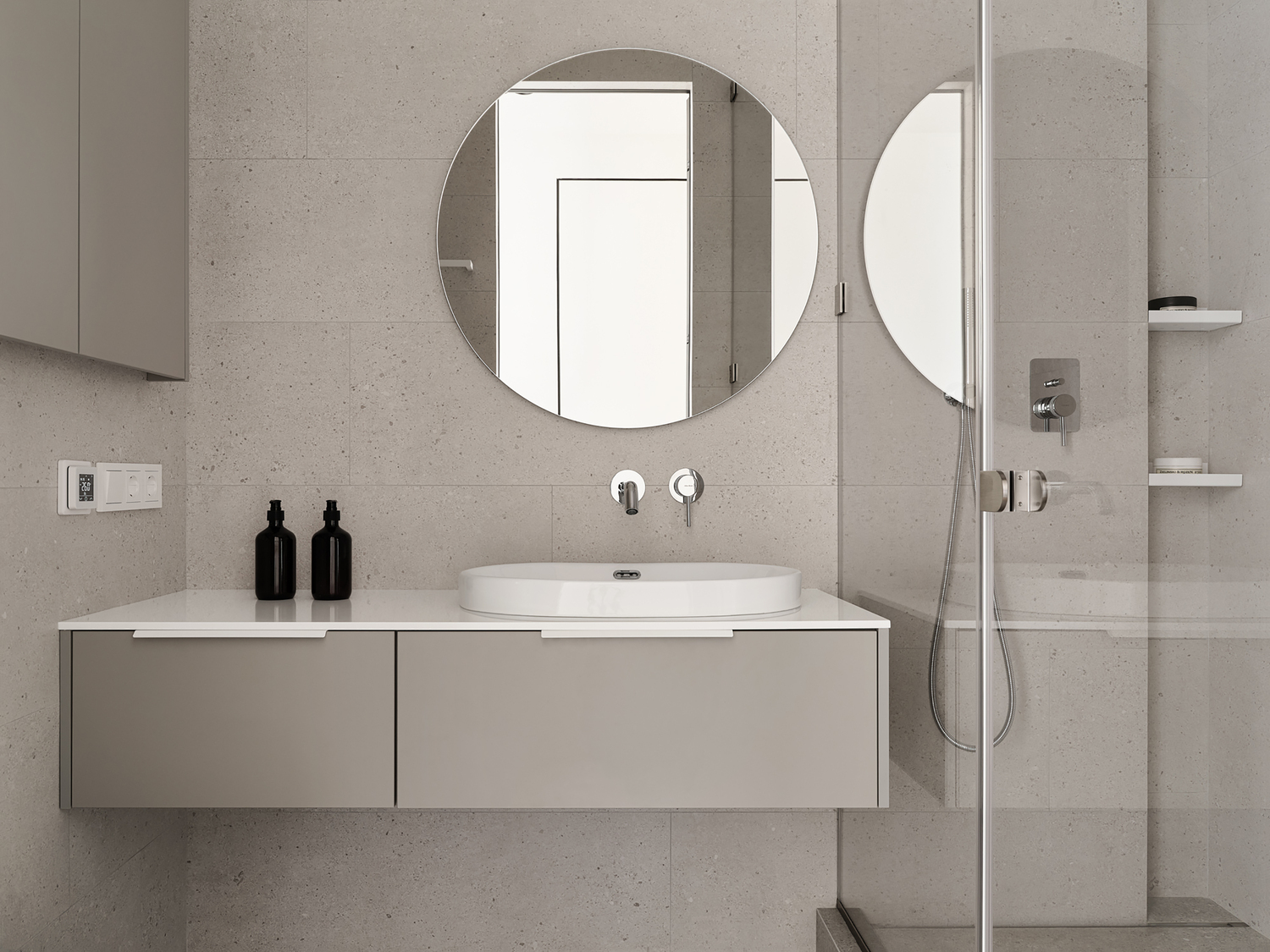
The guest bathroom gained space when the adjacent guest bedroom was slightly reduced. This allowed the room to shift from an awkward narrow rectangle to a more square proportion.
 Pin
The guest bathroom’s round mirror and wall-mounted vanity with integrated sink demonstrate how a modest footprint can feel generous when fixtures are arranged within a square plan rather than a narrow corridor. Photo credit: Olga Karapetian.
Master Bedroom: Vertical Volume Over Horizontal Spread
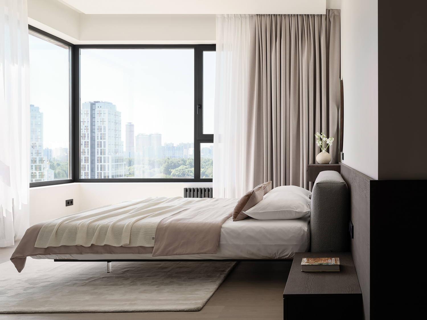
The master bedroom occupies a corner position with a large window that fills the room with daylight. The design response emphasizes vertical space rather than floor area.
 Pin
The “floating” bed with clear recessed legs reduces visual mass, while the headboard wall panel creates a low horizontal line that deliberately emphasizes the generous volume of space above. The corner window captures a panoramic city view. Photo credit: Olga Karapetian.
 Pin
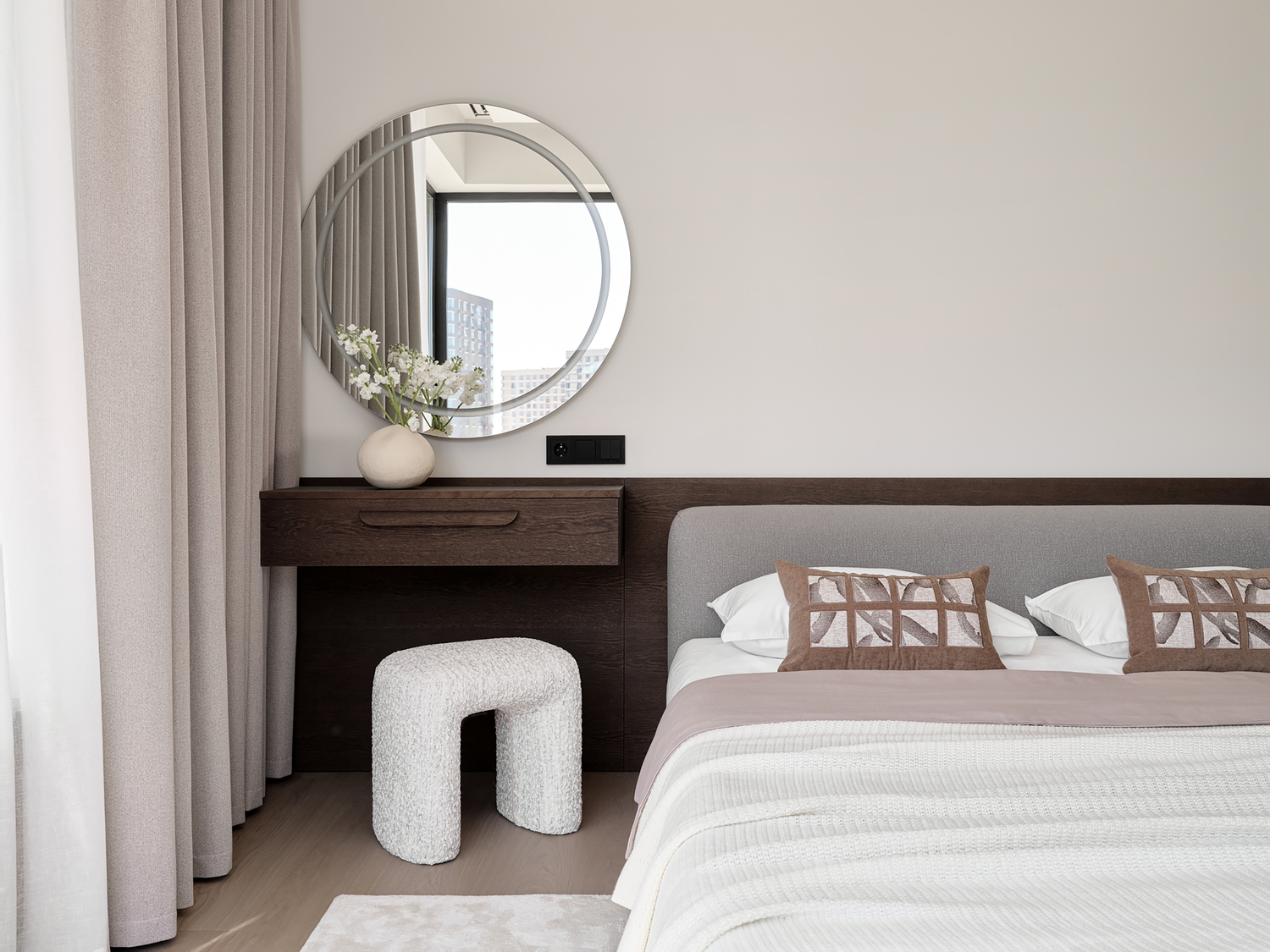
A console vanity table matching the bed panel finish sits to the left of the headboard, topped by a round backlit mirror that introduces a soft geometric counterpoint to the room’s orthogonal lines. Photo credit: Olga Karapetian.
Bedroom Workspace: Minimal Intervention
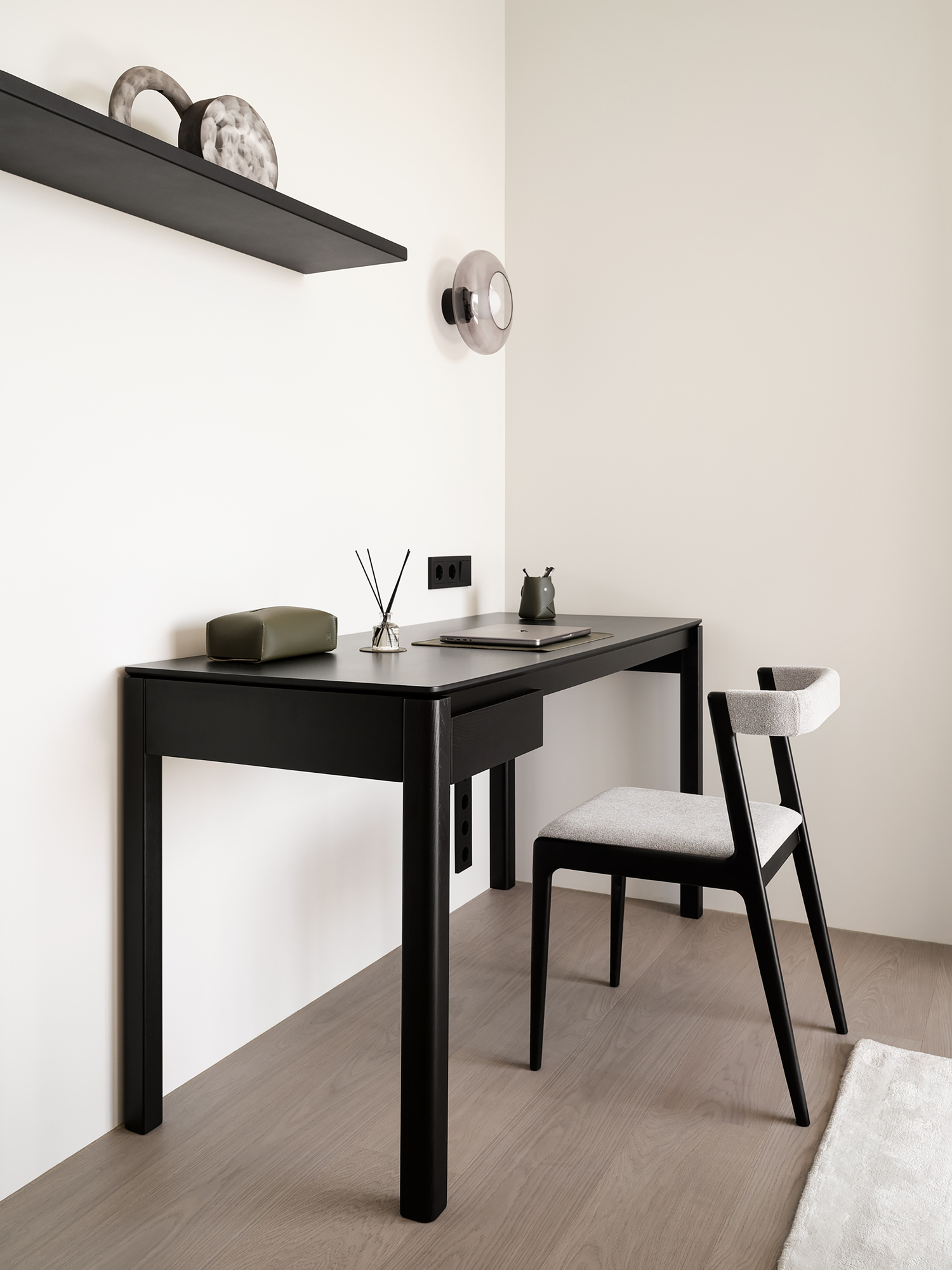
Per the client’s request, a dark textured desk with a large bookshelf and round sconce creates a compact work area within the bedroom.
 Pin
The dark desk introduces a tonal counterweight to the bedroom’s light surfaces, while the floating shelf above and round sconce maintain the project’s disciplined approach to form — each element performs a specific function without excess. Photo credit: Olga Karapetian.
 Pin
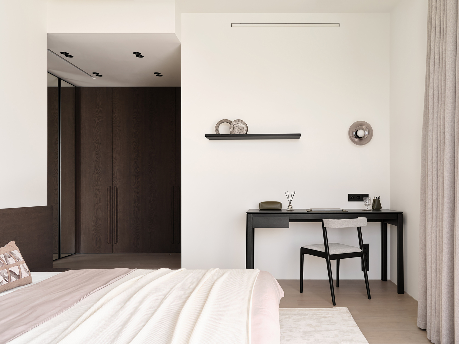
This wider view reveals how the bedroom connects to the expanded walk-in closet through a dark wood-lined passage, creating a sense of progression from public to private within the suite. Photo credit: Olga Karapetian.
Walk-In Closet: Transparency and Expansion
The partition between closet and bedroom was removed, and the closet expanded slightly into space reclaimed from the guest bathroom. Mirrors on two full-height hinged doors multiply the sense of volume while providing full-length views for dressing.
Master Bathroom: The Window as Focal Point
Most bathrooms treat windows as minor features. Here, the window overlooking the neighborhood becomes the room’s organizing element.
 Pin
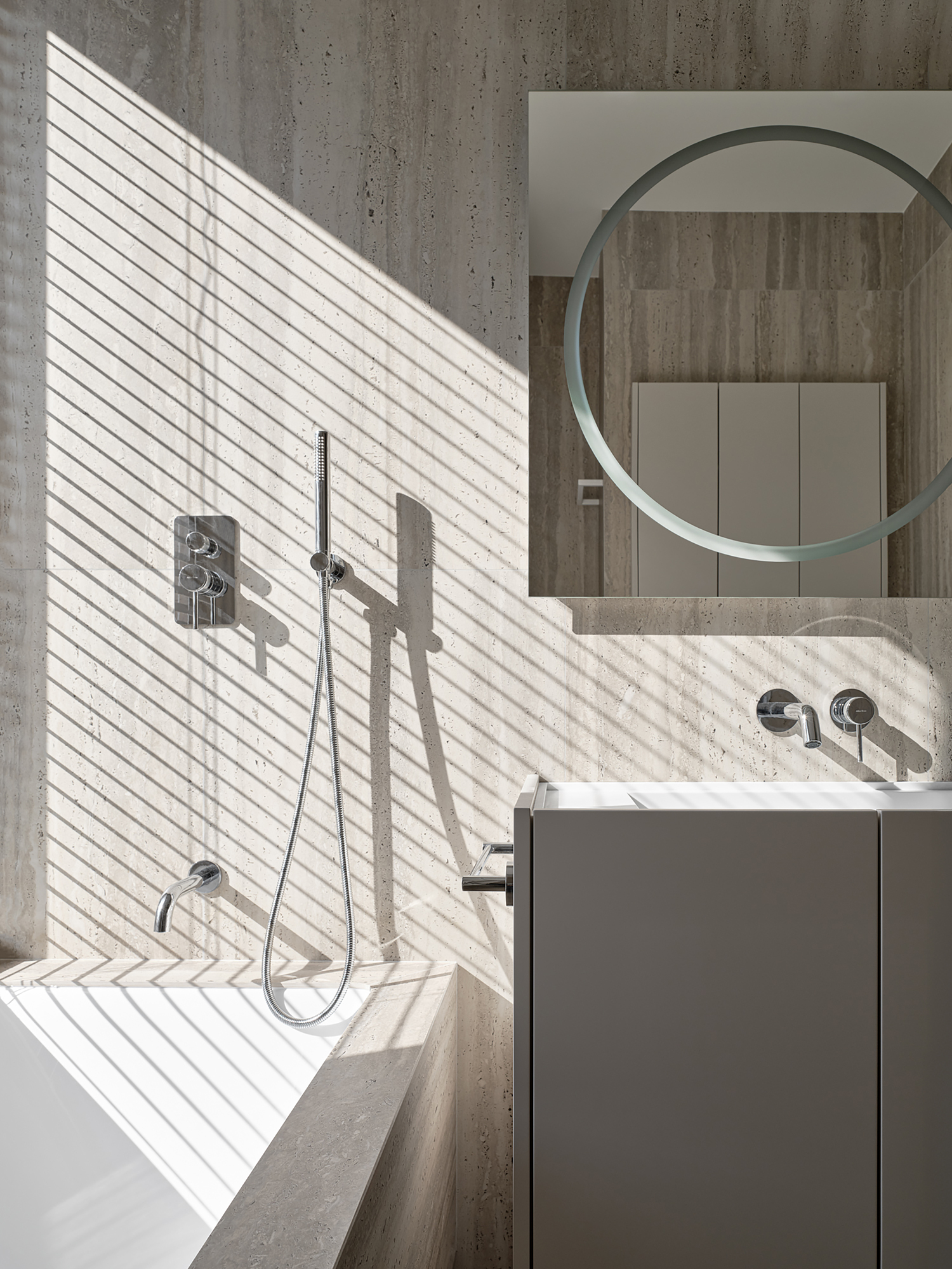
The master bathroom centers on its window, framed by light bamboo blinds chosen for humidity resistance. The travertine-textured porcelain tiles on walls and tub surround create a material continuum that feels both warm and waterproof. Photo credit: Olga Karapetian.
The bathtub is framed with a border of the same travertine-textured tile used on the walls, with the entire surface sloped to drain water back into the tub — a detail that merges waterproofing with visual coherence.
Where the Design Excels — and Where Daily Life Might Push Back
✦ What Works Exceptionally Well
The spatial reallocation is the project’s clearest achievement. Expanding the walk-in closet at the guest bathroom’s expense, then widening the bathroom through hallway repositioning, demonstrates how much a compact plan can yield when designers treat every wall as negotiable. The four-meter kitchen counter and the “portal-like” hallway mirror show similar confidence in exploiting available space.
Material consistency also deserves note. The custom-stained oak veneer, travertine-textured porcelain, and warm beige palette create a coherent atmosphere that actually feels calming — not merely photogenic. This is warm minimalism as a lived experience, not an Instagram aesthetic.
✦ Practical Considerations & Limitations
The open plan between entryway and living room, while visually generous, means cooking smells and sounds travel freely — fine for a couple, potentially challenging for future resale to families with children. The floating bed and recessed legs, elegant as they are, will require periodic tightening to maintain their visual lightness under daily use. And the light-toned fabrics throughout, while consistent with the warm palette, will show wear more readily than darker alternatives in high-traffic zones.
A Blueprint for the Couple Who Values Stillness Over Scale
This apartment makes a quiet case that 72 square meters is enough — if every wall, every cabinet, and every material choice is working toward the same goal. Alexander Tischler’s warm minimalism is not about owning less; it is about giving what remains the room to matter. The design is best suited to urban couples who prioritize atmosphere over square footage and understand that calm is a spatial quality, not merely a mood.
Would you accept a smaller second bedroom in exchange for a more generous main bathroom and closet — or does the traditional room count still dictate how you evaluate a floor plan?
Warm Minimalism Apartment: Key Facts Answered
What is the size of the Warm Minimalism apartment?
The apartment measures 72 square meters and contains two bedrooms, two bathrooms, a walk-in closet, and an open-plan kitchen-living room.
Who designed the Warm Minimalism apartment?
The project was designed by Alexander Tischler LLC, with Karen Karapetian serving as chief designer. Olga Karapetian photographed the completed interior.
What materials define the warm minimalism aesthetic in this project?
Custom-stained oak veneer, travertine-textured porcelain tile, bamboo blinds, and a palette of warm beiges and coffee tones create the signature material atmosphere.
How did the designers solve the external AC unit problem?
The team created a small enclosed utility space on the loggia for the AC unit and ventilation equipment, sealed with a sound-insulated door, reclaiming the outdoor area without modifying the building facade.
What changed most significantly in the floor plan?
The partition between entryway and living room was removed, the walk-in closet expanded into the guest bathroom’s former space, and the guest bathroom was widened by repositioning the hallway — all of which made the apartment feel substantially larger.
Get gorgeous projects via email
