

Regional Chinese cuisines rarely receive architecture this deliberate. When Meng Du Hui, a New Huizhou Cuisine restaurant, opened south of Beijing’s Wanshou Hotel in December 2023, it arrived inside a 1,600-square-meter argument: that Anhui’s quietly fading culinary tradition deserves a spatial revival as considered as its food. Tanzo Space Design, led by chief designer Wang Daquan, spent nearly four months converting an existing building into a contemporary reading of the Huizhou courtyard house — gray brick, water, bamboo, and paper lanterns folded into Haidian District’s urban fabric. The result treats dining as wandering, and treats memory itself as a working design material.
| Project Name | Meng Du Hui: New Huizhou Cuisine (Beijing) |
| Architect / Designer | Tanzo Space Design — Chief Designer Wang Daquan; Design Team: Jin Ping, Ma Hongxu, Zhang Xiangrong |
| Location | Wanshou Road, Haidian District, Beijing, China |
| Floor Area | 1,600 m² (approx. 17,200 sq ft) |
| Year Completed | March 2023 (design began November 2022; opened December 2023) |
| Client Type | Commercial — restaurant brand |
| Lighting Design | PROL Lighting |
| Landscape Design | Wild Green Botanic Garden — Zhang Xiaoguang, Yu Yan, Wang Yue |
Two Weeks in Anhui: How a Village Pilgrimage Became a Beijing Courtyard
Before drawing a single line, Wang Daquan and the Meng Du Hui team spent two weeks traveling through Anhui villages in search of an anchor for the project. The parti (the organizing idea behind a design) they returned with is a study in overlap: Huizhou’s black-tiled roofs and whitewashed restraint set against Beijing’s cosmopolitan grandeur, tradition set against the present, nature set against the city. The renovation had to deliver all of this inside a fixed envelope on a hotel campus — a constraint the design turns into its central device.
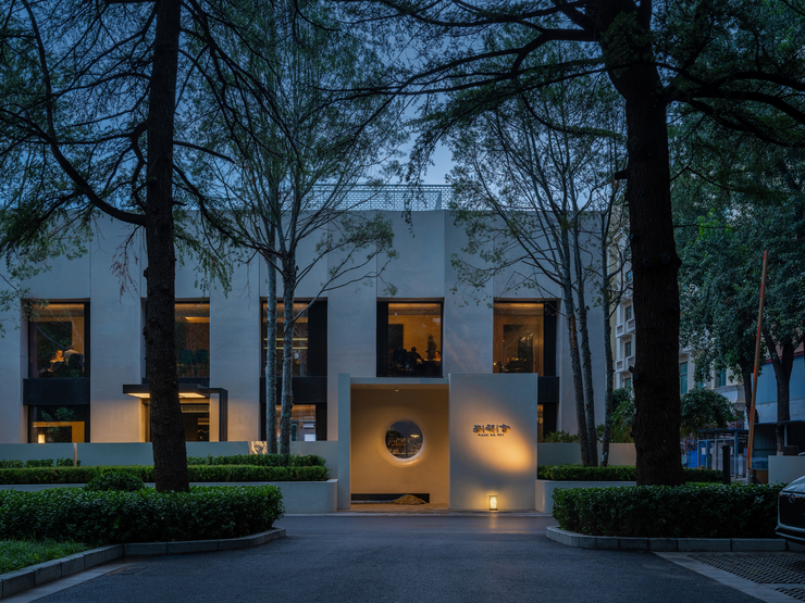
The building reads as a calm gray monolith from the street, its facade screened by mature trees and pierced at the entry by a circular aperture in a freestanding screen wall. That opening telegraphs the interior strategy: strip brick, textured plaster, and curved ceiling planes bend upward into skylights so the eye never lands on a hard boundary. Inside, deconstructed timber courtyards, corridors, sky wells, and lattice screens subdivide the plan into a circuit of dining rooms, tea spaces, and galleries. Water is drawn in at the threshold, stone is laid underfoot, and elevation changes layer pavilion, planting, and architecture into a single composed depth of field — exterior form and interior spatial logic operating as one continuous illusion.
 Pin
PinPhoto: TOPIA Commercial Photography
Seen from the tree-lined approach at dusk, the restaurant presents a pale, vertically scored facade with deep-set glazing that glows from within. The freestanding entry wall carries a circular aperture — a direct quotation of the Chinese garden moon gate — that frames the backlit bar inside before a visitor ever crosses the threshold. It is a precise piece of fenestration strategy (the placement and sizing of openings): the building withholds itself, then offers one curated glimpse. The composition establishes the project’s core promise that boundaries here are suggestions, not walls.
 Pin
PinPhoto: TOPIA Commercial Photography
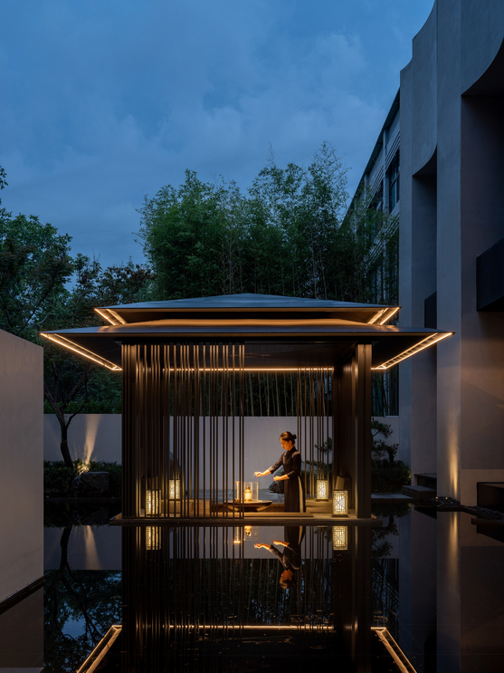
At the far end of the entry sequence, a steel pavilion rises from a black reflecting pool, its double roof edged in warm linear light and its perimeter dissolved into a curtain of slender, irregularly spaced columns. The bamboo grove behind absorbs the column rhythm, so built structure and planting merge at the horizon exactly as the designers intended. In Chinese spatial tradition the pavilion adapts outwardly while preserving its inner nature, and here it functions as the prologue to the meal. The mirrored water doubles the composition, turning a modest garden into a scene with real sectional depth.
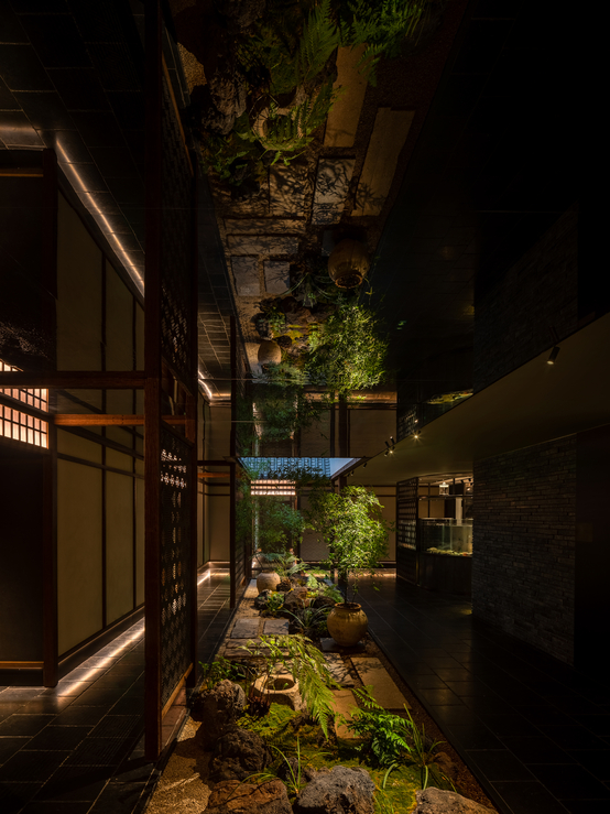
Design Decision: Above the sunken bamboo courtyard, the ceiling is finished in reflective glass so the grove reads from below as a pool of still water drifting overhead. Rather than build a literal pond, Tanzo Space Design lets reflection perform water's role — an economical move that doubles the garden and dissolves the ceiling plane.
Inside the Circuit: A Room-by-Room Walkthrough of Meng Du Hui
The Main Hall: Dining Beneath a Borrowed Sky
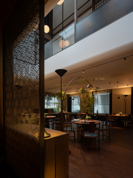
The principal dining floor gathers round hardwood tables under a low, warm ceiling that suddenly tears open into a two-story void. Track lighting is kept minimal; the working light comes from conical floor lamps arching over each table, so every party sits inside its own pool of illumination. Planted bamboo in oversized black vessels breaks the room into loose territories without walls, and window bays with fine horizontal blinds meter the daylight. The palette — rosewood furniture, deep brown floors, warm gray plaster — keeps attention on the tabletop while the section above supplies the drama.
 Pin
PinPhoto: TOPIA Commercial Photography
Viewed through a laser-cut metal screen patterned after Huizhou window lattice, the double-height dining hall unfolds in layers: foreground filigree, mid-ground tables and bamboo, background glazing washed in daylight. The white balcony fascia above traces a soft curve, minimizing the perceived edge between floors. Arc lamps hover over the round tables like fishing rods, a domestic gesture at commercial scale. The screen itself demonstrates the project’s spatial arithmetic — division that adds depth rather than subtracting space.
 Pin
PinPhoto: TOPIA Commercial Photography
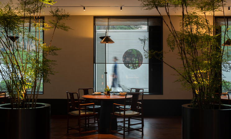
A four-top sits before a large window whose lower half is veiled by a translucent screen wall outside, pierced — again — by a circular opening onto the garden. A blurred figure passing behind the glass registers as shadow theater, animating the room without intruding on it. Twin bamboo plantings flank the table in cylindrical black planters, their foliage uplit to read against the neutral wall. The vignette shows how the design borrows movement and landscape as decor, in the classical Chinese sense of borrowed scenery.
 Pin
PinPhoto: TOPIA Commercial Photography
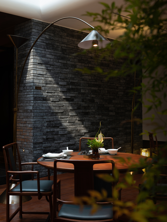
Here a single round table stands against a wall of long-format gray brick, its surface raked by a shaft of light that makes the coursing legible as texture. The brass arc lamp bends overhead from a weighted cone base, its shade echoing the paper cones elsewhere in the building. Blue-black leather seat pads pick up the slate floor beyond, tying furniture to architecture. It is a quiet demonstration of the material thesis: brick supplies memory, metal supplies the present tense.
The Wine Cellar Void: Lanterns Over Glass
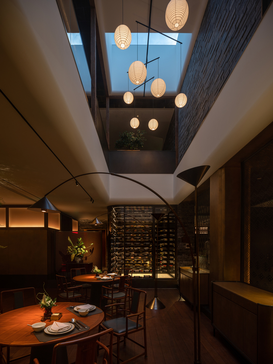
A second sky well (a vertical opening cut through the floor plates to draw light downward) hovers above the U-shaped wine cellar and the tables surrounding it. The cellar’s glazing throws reflections that reprise the water imagery from the entry, while an array of oval paper lanterns rises through the void on slender black stems. Looking up, the modern room dissolves into lantern light, mottled gray wall, and finally open sky — the building’s most complete vertical narrative, from bottle to cloud.
 Pin
PinPhoto: TOPIA Commercial Photography
From the cellar-side tables, the section reads as a single composed shot: illuminated wine wall at eye level, curved white soffits above, brick shaft rising past a planted balcony, and a constellation of rice-paper lanterns climbing toward the skylight. The lanterns’ irregular heights keep the eye moving upward in steps rather than one leap. Daylight entering from above turns cool against the warm interior sources, giving the void a dawn-like gradient. Few restaurant interiors argue this clearly that a ceiling can be an itinerary.
 Pin
PinPhoto: TOPIA Commercial Photography
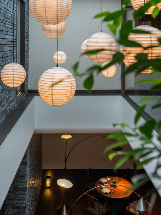
Looking down through the same void from the upper corridor, spherical lanterns crowd the foreground like moons over the solitary table below, where an arc lamp and a lattice floor lantern hold the darkness open. The dark brick wall at left and the glass balustrade at right compress the view into a vertical shaft. Green foliage slips into the frame, softening the geometry. The image captures the building’s sectional generosity — a renovation that spends floor area on air, and profits from it.
 Pin
PinPhoto: TOPIA Commercial Photography
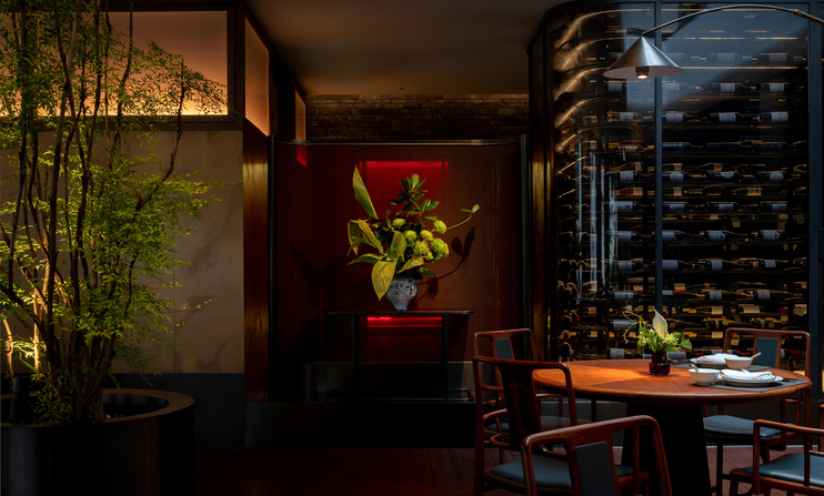
In the adjacent dining area, a crimson lacquered screen glows behind an ikebana arrangement, the one saturated color note in an otherwise earthen room. The full-height wine cabinet beyond displays its bottles like a library wall, lit shelf by shelf. Rosewood chairs with ink-blue pads circle the table in the foreground. The tableau shows the interior’s disciplined color strategy: near-monochrome surfaces that allow single objects — a screen, a flower, a label — to carry ceremonial weight.
The Bar: Backlit Onyx Behind Lattice
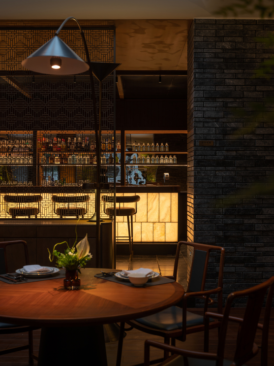
Tucked beside the main hall, the bar compresses the project’s material logic into one luminous elevation. The counter front is clad in backlit honey-toned stone panels, so the bar itself becomes the room’s lantern. Behind it, bottle shelving is layered behind dark geometric lattice screens, filtering the display into pattern. Brick piers frame the composition, and low-backed stools in dark leather keep the sightline clean. It is the most urbane room in the building — Beijing’s contribution to the Anhui conversation.
 Pin
PinPhoto: TOPIA Commercial Photography
From a dining table in the foreground, the view runs past an arc lamp’s steel cone to the glowing bar front, its stone panels emitting an amber gradient that pools on the black slate floor. Lattice screens hang as a scrim between bar and dining, their pattern legible only where light passes through. Espresso hardware and glassware read as silhouettes in the layered depth. The photograph demonstrates how the lighting scheme by PROL builds hierarchy: surfaces glow, objects silhouette, and people occupy the comfortable dark between.
A Private Room Facing the Garden
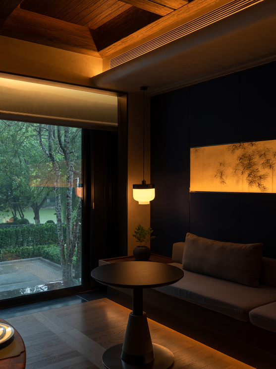
The private dining room turns inward and downward in tone: a timber-coffered ceiling washed in concealed light, walls upholstered in near-black panels, and a built-in banquette running beneath a gilded painting panel of wind-blown bamboo. Full-height glazing opens the room to mature trees and the garden’s stone paving, so the darkest interior in the building holds the greenest view. A small pendant with an opal glass shade marks the sofa corner, scaled for conversation rather than spectacle.
 Pin
PinPhoto: TOPIA Commercial Photography
Rain-dimmed daylight enters from the left, and the room answers with three warm sources: the cove above the ceiling coffer, the backlit gold-leaf bamboo panel, and the single pendant over the side table. The banquette’s oatmeal cushions supply the only pale surface, floating against the dark wall like the painting above it. A potted pine on a ceramic vessel anchors the corner. The room shows the dual lens of the project at its most intimate — architecture setting the frame, interior design tuning the emotional temperature.
Interior Courtyards: Bamboo, Moss, and a Mirrored Sky
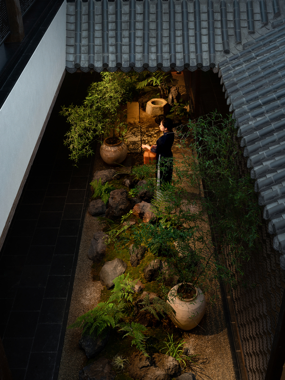
Two planted courtyards structure the plan the way a tianjing (the narrow sky-well court of a Huizhou merchant house) once structured a home. Gravel beds carry moss, ferns, lava stone, and potted bamboo between stone slab paths, with gray tiled roofs pitching inward overhead. Concealed uplights graze the foliage at night, and the reflective ceiling above doubles the grove. Staff report the space changes character across a single day — precisely the temporal quality the designers went to Anhui to find.
 Pin
PinPhoto: TOPIA Commercial Photography
At floor level, the courtyard reads as a green ravine between architecture: shoji-lit timber frames on one side, dark brick and the crustacean tanks of the open kitchen zone on the other. Overhead, the mirrored ceiling repeats the planting in inverted, watery form, exactly the still-pool illusion described in the design narrative. Linear floor lighting traces the path edges like wet stone catching lamplight. The garden performs as both circulation spine and living artwork, seen differently from every level.
 Pin
PinPhoto: TOPIA Commercial Photography
From the upper corridor, the view drops past authentic gray tile roof planes into the sunken garden, where a server in indigo pauses among ceramic jars, ferns, and volcanic rock. The roofscape crops the scene into a vertical scroll composition, house eaves standing in for mountain ridgelines. A carved stone basin recalls village wells. This single frame contains the project’s thesis — Huizhou’s domestic landscape reassembled inside a Beijing building, close enough to touch, framed enough to feel remembered rather than replicated.
Corridors as Gallery: Vaulted Brick and Lacquer Red
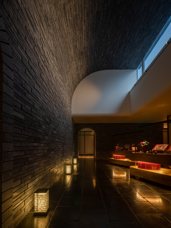
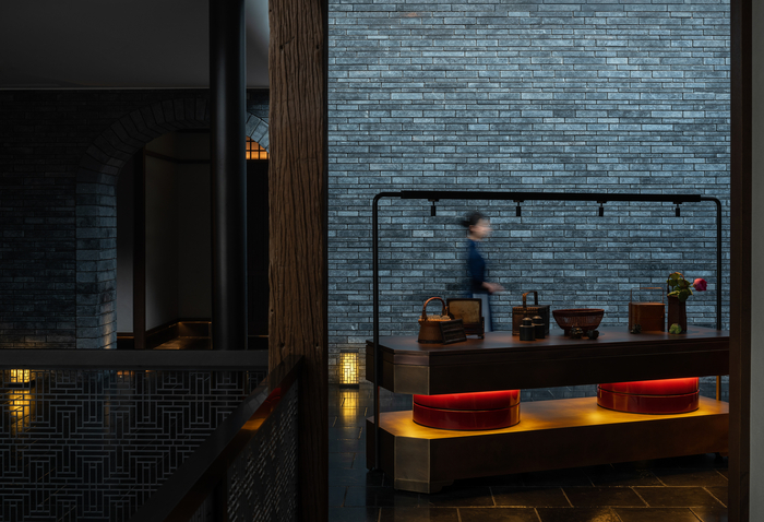
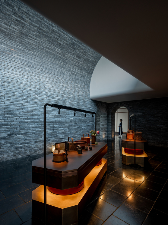
Circulation at Meng Du Hui is programmed as exhibition. On the upper level, a corridor swells into a brick-vaulted gallery lined with display tables of woven Huizhou baskets, bird cages, tea wares, and carved panels, each cabinet floating above a base of stacked red-lacquer drums lit from beneath. Cube lanterns with lattice faces sit on the slate floor, throwing low warm light up the walls. The route makes waiting, arriving, and wandering feel like curatorship rather than corridor time.
 Pin
PinPhoto: TOPIA Commercial Photography
The masonry vault springs directly from the corridor wall, its long thin bricks coursing overhead until a white curved soffit and clerestory glazing slice daylight into the tunnel. Floor lanterns punctuate the left wall in a receding rhythm, their reflections doubling on the polished slate. At the far end, red-lit display plinths glow like embers. The image shows how the renovation manufactures archaeology — a brand-new vault that carries the gravity of something excavated.
 Pin
PinPhoto: TOPIA Commercial Photography
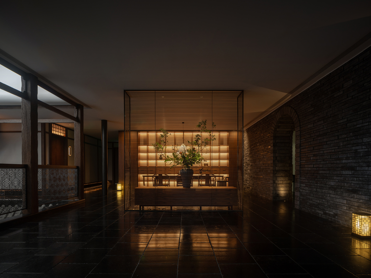
Midway along the dark upper corridor, a fine steel cage wrapped in horizontal slats contains a fully illuminated tea display, an ikebana arrangement rising through its center like a specimen under glass. The surrounding blackness — floor, ceiling, lattice balustrade — exists to make this one object burn brighter. Light striping through the slats falls across the stone floor in soft bars. It is retail display logic borrowed for cultural storytelling, executed with a jeweler’s restraint.
 Pin
PinPhoto: TOPIA Commercial Photography
Under the great curved skylight, display consoles march along the brick wall on glowing bases, red-lacquer drums compressed between dark timber slabs like seals pressed in wax. A track-mounted lighting gantry in blackened steel spotlights baskets, bronze vessels, and lotus stems without touching the architecture. Daylight rakes the blue-gray brickwork, revealing its long-format coursing. The composition treats merchandise-style display as museography, elevating everyday Huizhou objects to artifact status.
 Pin
PinPhoto: TOPIA Commercial Photography
A wider view of the same gallery shows the roof plane peeling away from the brick wall in one continuous curve, daylight flooding the gap. A staff member in a blue qipao stands at the arched threshold, giving scale to the vault. The freestanding display islands sit like lacquered barges on the reflective black floor. Here the section does the storytelling: heavy masonry below, weightless light above, and the past displayed comfortably in between.
The Tea Room: A Compressed Passage of Green Brick
Reaching the tea room requires a short climb past walls of tightly coursed green-gray brick, with daylight pouring down the stair — a deliberately compressed, time-bending passage before the release of the room itself. Inside, long walnut tables carry runners, scholar’s stones, and small clay teapots beneath conical rice-paper pendants. An adjacent double-height court pairs a raw boulder in raked gravel with a single black ink painting, a rock garden distilled to punctuation.
 Pin
PinPhoto: TOPIA Commercial Photography
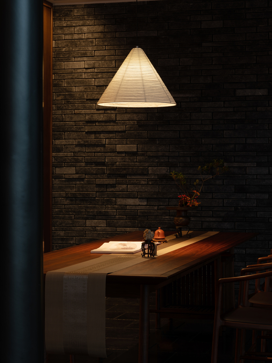
A single cone of washi paper hangs low over the tea table, its ribbed shade glowing against the shadowed brick wall behind. The pool of light lands precisely on an open book, a miniature teapot, and a berry-laden ikebana branch — the still life the room is built to serve. Everything outside that pool falls to near-black. The lighting design argues that a tea room needs only one bright idea at a time, and the architecture agrees.
 Pin
PinPhoto: TOPIA Commercial Photography
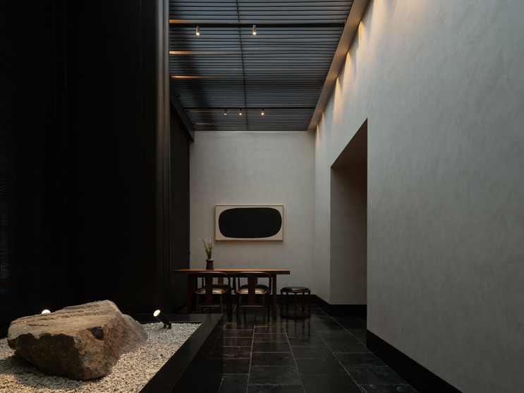
The tall anteroom pairs a rough granite boulder in a bed of white gravel with a framed black enso-like painting hung on limewashed plaster, beneath a louvered ceiling that filters the skylight into lines. A slender table with three chairs and a stool waits against the far wall, deliberately understated. Miniature spotlights graze the stone like moonlight. The room is the project’s most explicitly meditative gesture — stillness staged with museum precision, yet meant to be sat in.
Where the Illusion Holds — and Where Daily Service May Strain It
Spatial Depth as the Main Course
The renovation’s sectional ambition is its clearest achievement. By cutting two sky wells through the plates and bending ceilings into skylights, Tanzo Space Design gives a mid-rise conversion the vertical drama of a purpose-built atrium — the lantern void above the wine cellar delivers a legible bottom-to-sky narrative from nearly every seat around it. Second, the material register stays disciplined: long-format gray brick, walnut, paper, and lacquer build a recognizably Huizhou identity without a single pastiche gable. Third, the lighting hierarchy works at the human scale — glowing surfaces, silhouetted objects, and dark comfortable middle ground make a 1,600-square-meter restaurant feel like a series of small rooms.
The Price of Perpetual Dusk
The same choices carry costs. Illuminance this low demands flawless housekeeping and staff choreography; dust on a lacquer drum or a mis-set table reads instantly under accent lighting. The polished black slate floors that supply the water imagery will show wear paths and demand vigilant maintenance in a high-traffic dining operation, and their reflectivity depends on staying immaculate. Finally, the open voids that create the vertical spectacle also connect the acoustic environments of two dining levels — a full house upstairs will be audible below, a tension between spatial openness and the hush the design otherwise cultivates.
Why Meng Du Hui Matters Beyond the Menu
Meng Du Hui demonstrates that regional revival can be an architectural project, not a decorating theme. Tanzo Space Design translates the Huizhou courtyard — sky well, lattice, brick, water — into section and light rather than ornament, and the interior design carries the same argument down to the teapot. It is a model for restaurateurs and hoteliers who want cultural specificity without theater, and for designers converting existing buildings into narrative space. It suits the patient diner more than the hurried one. Would you give up two floors’ worth of rentable seating for a shaft of lantern-lit air — or is that void precisely what guests are paying for?
FAQs
Who designed the Meng Du Hui restaurant in Beijing?
Meng Du Hui was designed by Tanzo Space Design, the Beijing studio founded in 2006 by senior interior architect Wang Daquan, who served as chief designer. The design team included Jin Ping, Ma Hongxu, and Zhang Xiangrong, with lighting by PROL Lighting and landscape by Wild Green Botanic Garden.
How big is Meng Du Hui and when did it open?
The restaurant occupies 1,600 square meters (about 17,200 square feet) on the southern side of Beijing’s Wanshou Hotel in Haidian District. Design work began in November 2022, the architectural renovation and spatial design were completed in March 2023, and the restaurant welcomed its first guests in December 2023.
What is the design concept behind Meng Du Hui?
The concept is a contemporary reinterpretation of the Huizhou courtyard house, built on overlaps between Anhui and Beijing, tradition and modernity, nature and city. Deconstructed timber courtyards, sky wells, lattice screens, water features, and bamboo gardens run through a minimalist gray-brick framework, deliberately blurring the boundary between inside and outside.
What kind of food does Meng Du Hui serve?
Meng Du Hui serves New Huizhou Cuisine centered on fresh mountain and lake produce from Anhui, blending southern and northern influences with an emphasis on nourishment. Seventy percent of ingredients are flown in daily from their place of origin, and the menu changes seasonally, featuring dishes like Wen Zheng bamboo shoots and Dao Ban Xiang.
What materials define the Meng Du Hui interior?
The palette pairs long-format gray brick and textured plaster with black slate flooring, walnut and rosewood furniture, rice-paper lanterns, latticed timber screens, and red lacquer accents. Wood, stone, paper, and lacquer were chosen for their tactile richness — materials intended to build emotion as much as enclosure.
Get gorgeous projects via email
