

Sales centers are architecture’s most disposable genre — built to move apartments, then quietly torn down. City of Inspiration, in the Yuelai area of Chongqing’s Liangjiang New Area, argues the opposite case. Fun Connection, the Shanghai practice led by Tim Zhang, was brought in by developer PowerChina Real Estate to convert the district’s sales architecture into a permanent “living + commerce” hub. Opened on September 28, 2024, the 45,746-square-meter project treats red brick, layered lighting, and a cast of cat sculptures as instruments of community-building rather than decoration. It matters because it shows renovation, not demolition, as the default ending for this building type.
| Project Name | City of Inspiration |
| Architect / Designer | Fun Connection (commercial scene creation & design); Lead Designer: Tim Zhang |
| Location | Yuelai, Liangjiang New Area, Chongqing, China |
| Floor Area / Land Area | 45,746 m² (project area) |
| Year Completed | Opened September 28, 2024 |
| Client Type | Developer (PowerChina Real Estate) |
| Landscape Design | Guangzhou S.P.I Design Co., Ltd. |
| Interior Design | Chengdu Desmood Design Consultants / Chongqing Research Commune Design |
| Lighting Design | Shanghai Brandston Partnership Inc. |
| Photography | Archie |
Rejuvenating the Legacy: Turning a Sales Center Into a Cultural Anchor
The core problem was one of identity. The existing sales center set the tone for the whole district, yet carried no cultural weight of its own. Fun Connection’s response, framed by the concept of “rejuvenating the legacy,” pulls from Yuelai culture and Chongqing’s historical fabric to stage what the designers call a dialogue between tradition and progress — a parti (the organizing idea behind a design) built on memory rather than novelty.
Materially, that dialogue plays out as vintage red brick set against glass and metal. The massing reads as a family of brick volumes: arched arcades at street level, perforated metal screens above, and cantilevered boxes wrapped in suspended brick veils. The fenestration strategy differs by orientation — graphic window decals animate the street-facing facade, while the inner street gets fully three-dimensional relief — so the complex stays cohesive without repeating itself.
The payoff is practical as much as visual. The semi-transparent screen layers temper daylight, give upper-floor tenants privacy without sealing them off, and let the renovated architecture communicate its retail program legibly from the plaza. Exterior form and interior logic align: the arches that brand the facade also organize circulation inside.
 Pin
PinPhoto: Archie
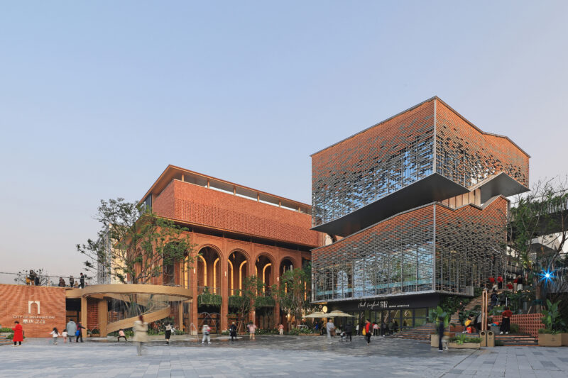
The dusk view captures the project’s full material argument in one frame: a spiral gold ramp winds around a preserved tree, the arched brick sales center glows behind it, and the stacked, brick-screened retail volumes rise to the right. The composition demonstrates how the renovation choreographs three distinct building expressions around a shared plaza. Crowds moving between them confirm the space works as intended — as a public living room, not a showroom forecourt. The checkerboard paving stitches the ensemble together at ground level.
 Pin
PinPhoto: Archie
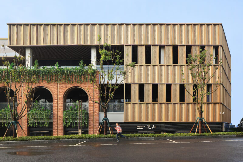
The street elevation makes the old-new contrast explicit. Perforated champagne-gold panels hang in a syncopated rhythm across the upper volume, their openings sliding to reveal glimpses of the terrace behind. Below and to the left, red brick arches draped in greenery anchor the composition in something older and heavier. The two systems never blend; they sit side by side, which is precisely the point of the “rejuvenating the legacy” concept. Street trees and a low hedge soften the transition to the roadway.
 Pin
PinPhoto: Archie
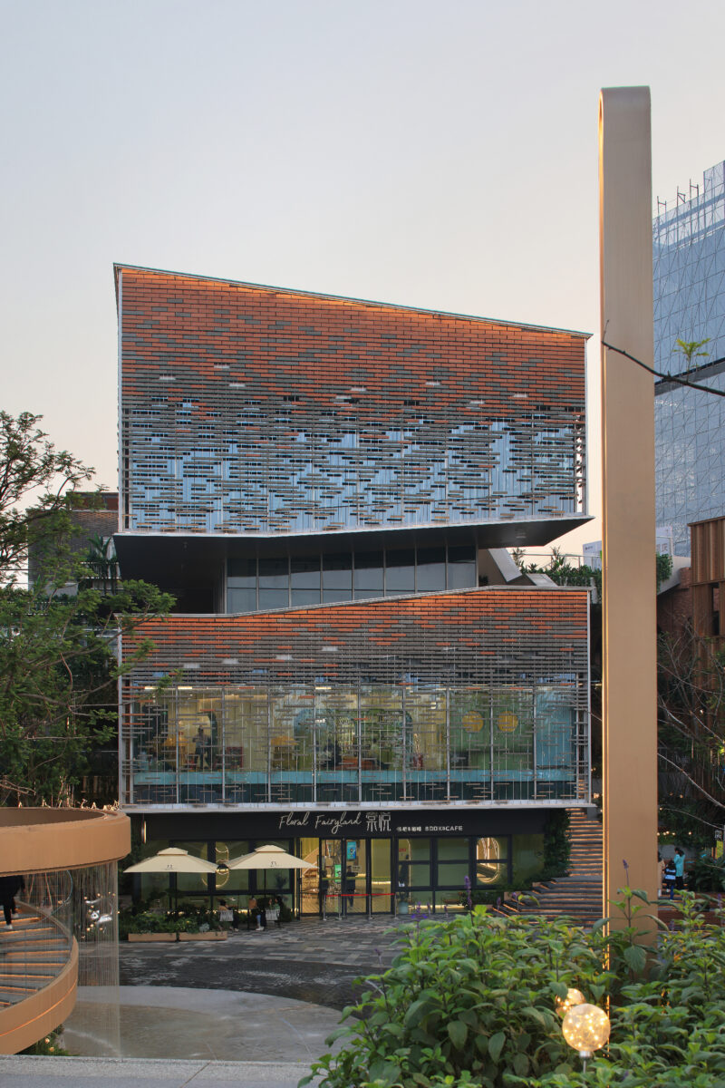
The Floral Fairyland book-and-cafe building shows the project’s most inventive facade system up close. Individual bricks appear threaded onto vertical cables in front of the glass curtain wall, dense at the top and dissolving toward the middle so the screen reads as brick evaporating into transparency. The two cantilevered volumes shear past each other, their offset registering clearly from the plaza. It is a structurally light way to keep brick’s texture while admitting generous daylight to the reading floors inside.
Design Decision: Rather than infilling the arches or cladding them over, Fun Connection extended the arch motif through layered metal mesh, producing a semi-transparent veil. The move preserves the original structure’s charm while adding depth — renovation by addition of a translucent layer, not subtraction of history.
Walking City of Inspiration: From Plaza to Lantern-Lit Lounge
Arrival Across Water: The Plaza as First Act
Entry happens across an open plaza where fountains, a preserved tree, and a spiral ramp do the work a lobby would do indoors. The ground floor is programmed for immersive first contact — themed window displays, art installations, and interactive elements pull visitors off the street. Greenery partitions and scenario sculptures give the threshold social texture, so arriving feels like joining a scene already in progress rather than crossing into a mall.
 Pin
PinPhoto: Archie
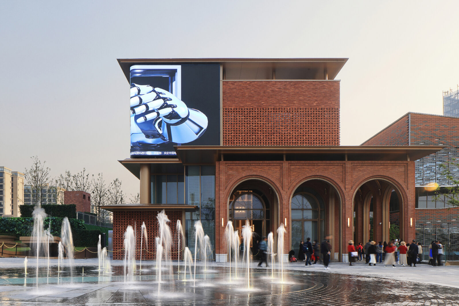
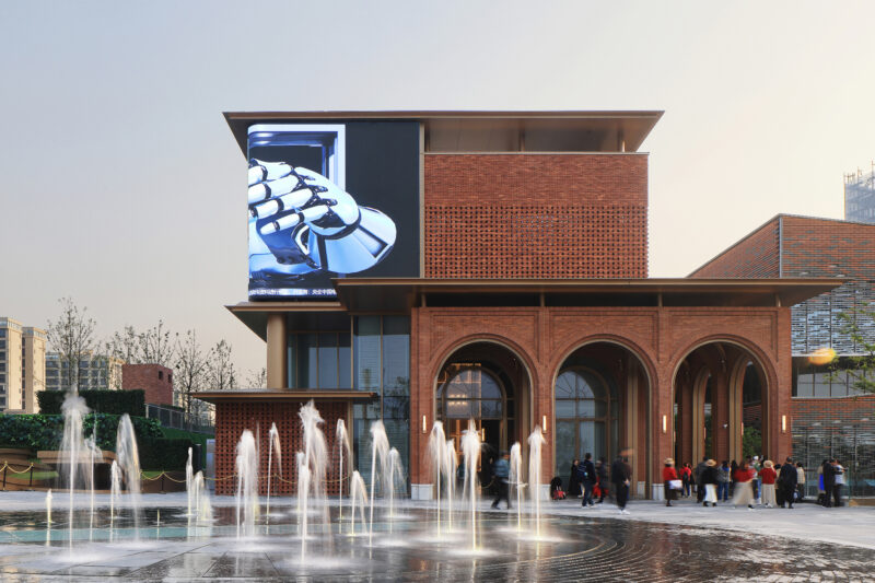
Dry fountain jets erupt directly from the plaza paving in front of the arched brick pavilion, with a large LED screen folded into the massing above. The pavilion’s deep roof overhangs, supported on slender gold columns, extend shelter over the perforated-brick garden walls at its base. Visitors cluster at the arcade edge, drawn by the water’s motion. The screen introduces contemporary media into a composition that otherwise leans historical, a deliberate tension the project sustains throughout.
 Pin
PinPhoto: Archie
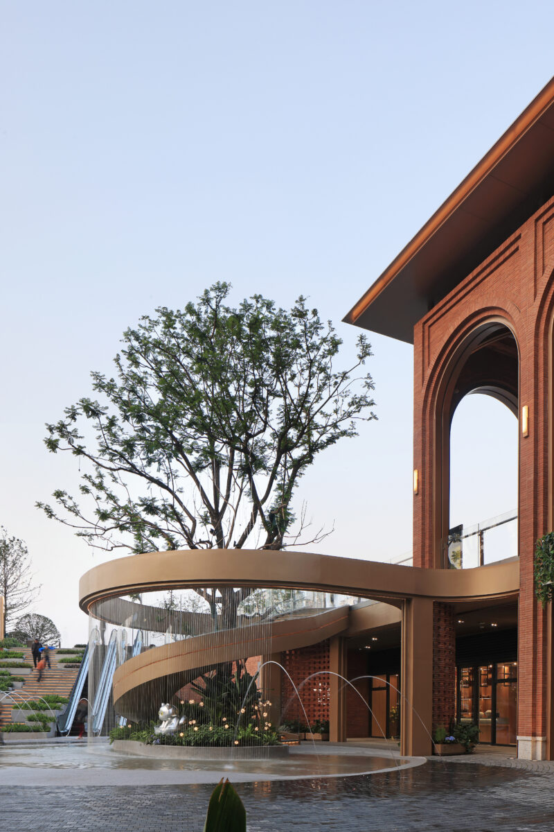
The spiral ramp wraps a mature tree in a full ring, its underside trailing a curtain of fine cables through which water jets arc into a shallow pool. One of the project’s silver cat sculptures lounges in the planting at the ramp’s base, catching the light. Circulation, landscape, water, and IP storytelling compress into a single gesture here. The ramp also solves a real grade problem, linking the plaza to the terraced stair garden visible at left.
Cross Vaults in Brick: The Arcade as Public Museum
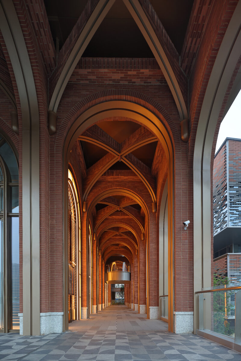
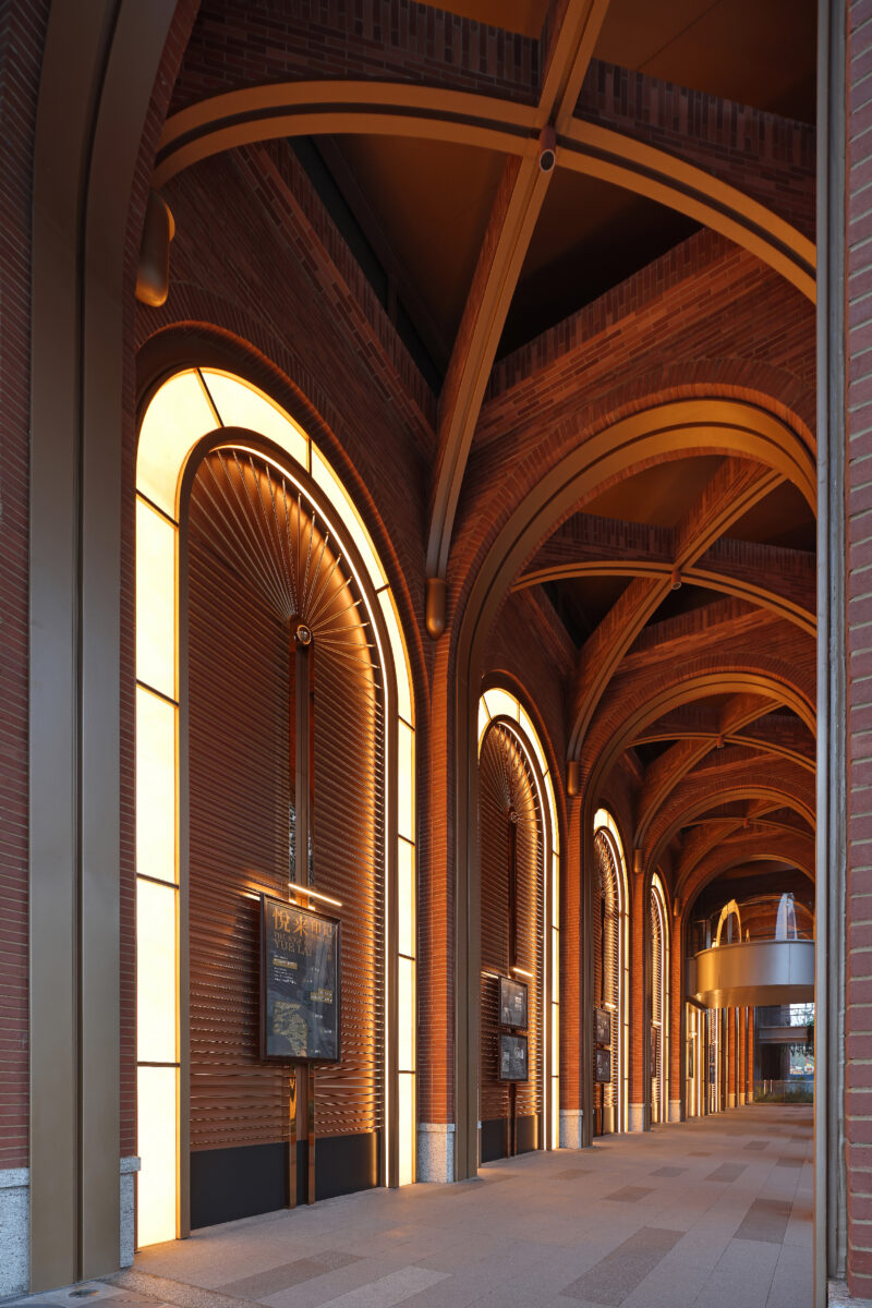
The arcade along the sales center’s flank is the renovation’s spatial high point. Brick groin vaults (arched ceilings formed where two vaults intersect) spring from massive piers, trimmed in bronze-toned metal ribs that trace each intersection. Illuminated arched panels line the inner wall, their fan-ray metalwork backlit to a warm amber, and mounted exhibition boards on the history of Yuelai turn the passage into a linear museum. The checkerboard stone floor sets a formal rhythm underfoot.
 Pin
PinPhoto: Archie
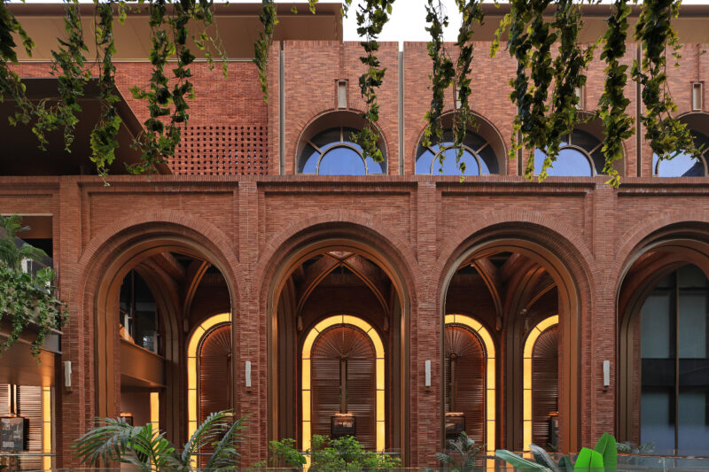
Seen in elevation, the arcade reads as a wall of light: each brick arch frames a smaller illuminated arch within, the amber glow silhouetting the fan-shaped metal screens. Above, round-headed windows with fine muntin grids sit in stepped brick surrounds beneath trailing vines. The layering — arch within arch, screen behind screen — gives the facade unusual depth for what is essentially a renovated commercial frontage. Wall-mounted lanterns punctuate each pier at a consistent datum.
 Pin
PinPhoto: Archie
Looking down the arcade’s length, the vaults compress into a rhythmic tunnel of brick and bronze, terminating in daylight. Granite bases protect each pier at pedestrian height — a durability decision that will matter in a heavily used public passage. The metal ribs are not structural theater alone; they crisply resolve the geometry where brick coursing alone would blur. It is the rare commercial corridor that rewards walking slowly.
 Pin
PinPhoto: Archie
Up close, each arched bay resolves into a composition of horizontal bronze louvers, a radiating fan of metal spokes, and a perimeter band of backlit glazing. The “Sign of Yue Lai” exhibition panels mount directly onto the louvers, putting district history literally on the architecture. Warm light grazes the brick soffits above, revealing the coursing’s texture. The detail density here signals genuine investment in a space many developers would have treated as leftover circulation.
The Inner Street: Storefronts Staged Like Sets
Inside the district, the commercial program climbs four floors — immersive retail at grade, a simulated bakery, cafe, and art experience center on the second level, then health-focused and cultural floors above with craft shops, book lounges, and small exhibitions. Community clinics, dining halls, and convenience stores are folded in alongside, meeting daily needs. The inner street’s storefronts are treated as stage sets, each with its own material identity under the shared brick frame.
 Pin
PinPhoto: Archie
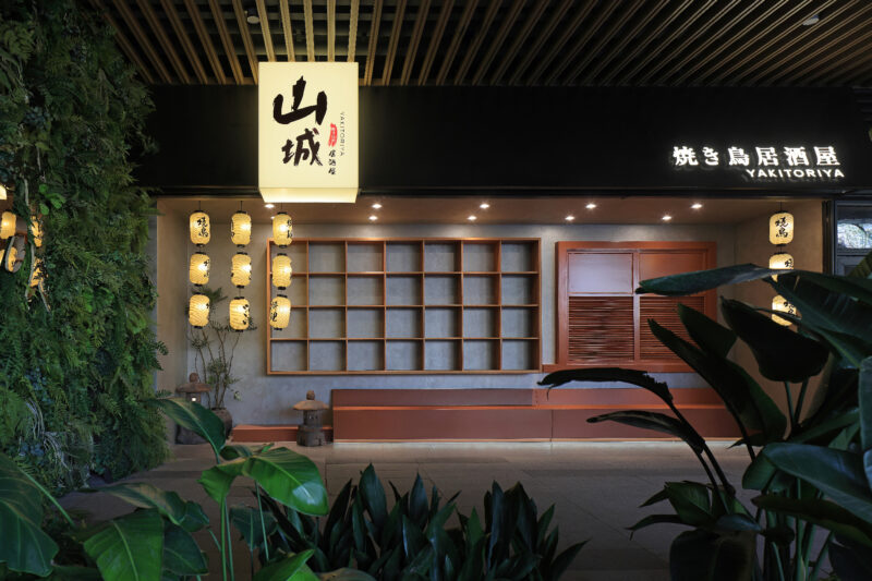
The Yakitoriya frontage shows the tenant-fit strategy at its most theatrical: calligraphic signage on a glowing lightbox, strings of paper lanterns, a red-lacquered display grid, and stone lanterns at the base, all set against gray plaster. A dense preserved-moss wall flanks the entry, with broad-leaf planting softening the foreground. The storefront borrows izakaya vocabulary without collapsing into pastiche because the surrounding architecture stays neutral. Lighting is layered — downlights, lanterns, and grazing light — so the scene holds up after dark.
 Pin
PinPhoto: Archie
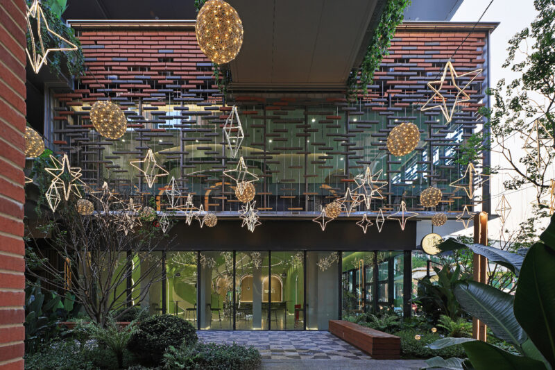
In the courtyard, festoons of wireframe stars and globe lights hang in front of the brick-screen facade, their warm points playing against the cool green interior glow behind the glass. The suspended brick rods read almost textile-like at this distance, a woven curtain rather than a wall. Below, a timber bench and dense understory planting make the courtyard usable, not just photogenic. The scene demonstrates the lighting designers’ role as co-authors of the architecture’s night identity.
Lounges Under Lantern Light: Furnishing the Outdoors
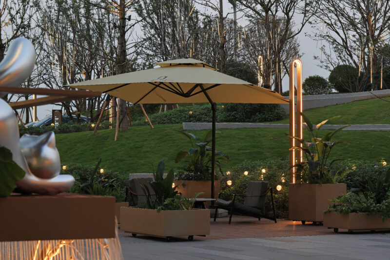
The public realm is furnished with the care of an interior. Custom seating groups — single sofas, tables, umbrellas — pair with floor lamps, grass-level ambient lighting, and canopy installations to build outdoor rooms. Lighting is treated as emotional expression rather than mere illumination: canopy lights, ambient fixtures, and tree-mounted units create layered levels and a legible spatial rhythm after dark. Flowing water lights and the cat sculptures thread through, keeping the atmosphere natural and unforced.
 Pin
PinPhoto: Archie
At dusk the terrace makes the furnishing strategy legible: a double-canopy umbrella shelters lounge chairs, mobile steel planters define the room’s edges, and a tall arch-shaped light column glows amber against the lawn. Globe lights scattered through the groundcover read as fireflies, while meteor-shower fixtures drip from the trees beyond. A mirrored cat sculpture at left anchors the foreground with a wink. Every element sits on wheels or in movable planters — the outdoor room can be rearranged as programming demands.
Where the Renovation Convinces — and What It Asks in Upkeep
Brick as Both Memory and Screen
The project’s clearest strength is its refusal to choose between preservation and reinvention. Brick performs double duty — as load-bearing memory in the vaulted arcade and as a dematerialized cable-hung screen on the newer volumes — so the whole district reads as one family across very different construction logics. Second, the lighting design genuinely structures space: the amber arcade, courtyard festoons, and grass-level fixtures establish a nighttime hierarchy that most open-air retail lacks. Third, the interior-design thinking extends outdoors; movable sofas, umbrellas, and floor lamps give the plazas the specificity of furnished rooms, which is why people linger.
The Price of Living Ornament
The same ambitions carry costs. The cascading greenery that softens every arch is a maintenance commitment in Chongqing’s humid summers and will read as neglect quickly if trimming lapses — and the source material notes some partitions are realistic artificial planting, which weathers on its own schedule. The suspended brick screens and star-light installations add cleaning and re-lamping burdens at height. And a scenography-led district must keep refreshing its window displays and IP moments; the day the sets go stale, the architecture alone must carry the crowd.
 Pin
PinPhoto: Archie
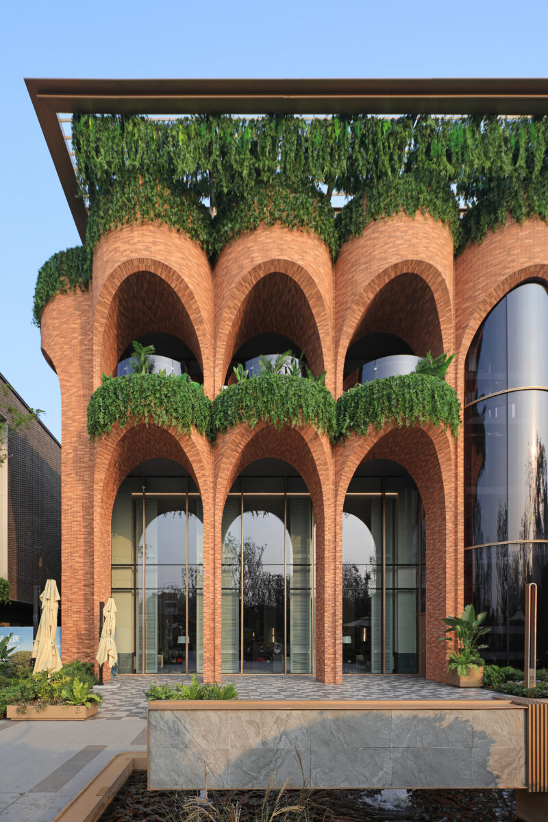
This detail of the stacked arches shows both the payoff and the liability in one frame. Greenery cascades in thick tiers from the parapet and the intermediate planter band, transforming masonry into something closer to a hanging garden. The effect is lush and immediate — and entirely dependent on irrigation, trimming, and replacement cycles staying funded. The brick coursing beneath is crisp enough to stand on its own if the planting ever thins, which is quiet insurance.
Why City of Inspiration Matters Beyond Chongqing
City of Inspiration’s contribution is a working method for the afterlife of sales-center architecture: keep the structure, layer on translucent screens, program the ground plane like an interior, and give the place characters worth returning to. It is best suited to developers holding mixed-use districts long-term, and to neighborhoods that need daily-life anchors — clinics, dining halls, book lounges — as much as retail theater. The dual lesson for designers is that facade renovation and furniture-scale interior thinking are one continuous discipline here, not separate scopes. Would you accept the ongoing upkeep of living walls and staged storefronts as the price of a commercial district that feels alive — or should architecture carry that burden on masonry alone?
FAQs
Who designed City of Inspiration in Chongqing?
Fun Connection, a Shanghai-based design company founded in 2014, led the commercial scene creation and design under lead designer Tim Zhang. Guangzhou S.P.I handled landscape, Chengdu Desmood and Chongqing Research Commune the interiors, and Shanghai Brandston Partnership the lighting design, for developer PowerChina Real Estate.
Where is City of Inspiration located?
The project sits in the Yuelai area of Chongqing’s Liangjiang New Area, in southwest China. It anchors a mixed “living + commerce” district and draws its design narrative from Yuelai culture and Chongqing’s local heritage, staging a dialogue between historical red-brick character and contemporary materials.
When did City of Inspiration open and how large is it?
City of Inspiration opened on September 28, 2024. The project covers a stated area of 45,746 square meters, organized as a four-floor commercial program that climbs from immersive ground-floor retail to leisure, health-focused, and cultural floors above, wrapped around outdoor plazas and an arcaded promenade.
What are the cat sculptures at City of Inspiration?
Fun Connection created a set of playful cat-themed sculptures as the project’s signature IP, narrating a whimsical day in a cat’s life — lazy afternoons, fishing, chilling out, forest play. Made of resin, electroplated stainless steel, and mirrored surfaces, they are placed through public spaces as emotional anchors for visitors.
Is City of Inspiration a new building or a renovation?
It is primarily a renovation-led transformation. The district’s sales center was renovated under the concept of “rejuvenating the legacy,” combining vintage red brick with modern glass, metal, and layered mesh screens, then extended with commercial programming, IP sculptures, and lighting design to become a permanent community hub.
Get gorgeous projects via email
