

Most 66-square-meter apartments force a choice: storage or breathing room, a nursery or a living room that seats guests. This watercolor apartment in Moscow refuses the trade-off. Designed by the Alexander Tischler design company under chief designer Karen Karapetian, the two-bedroom unit was completed across 2023–2024 for a young couple expecting their first child — and sharing the home with a Maine Coon. By shortening a single partition wall and treating cabinetry as architecture, the team produced a bright, natural-toned interior where a kids’ room, a compact kitchen-living space, and dedicated pet infrastructure coexist without crowding one another.
| Project Name | Watercolor Apartment |
| Architect / Designer | Alexander Tischler design company (chief designer: Karen Karapetian) |
| Location | Moscow, Russia |
| Floor Area | 66 m² (approx. 710 sq ft) |
| Year Completed | 2023–2024 |
| Client Type | Private — a young couple expecting their first child |
Inside the Watercolor Apartment: How One Shortened Wall Reorganized 66 m²
The developer’s plan handed the team two problems at once. The master bedroom sat directly beside the kitchen-living room, producing a long corridor, while the kitchen-living space itself was squeezed by walls — with a large plumbing box already fixed in the hallway. The response was quiet re-planning rather than demolition. The designers swapped the bedroom to another room, placed the future kids’ room beside the kitchen-living space, and shortened the partition wall between the two.
That single cut changed the apartment’s parti (its core organizing idea). Circulation contracted, the main living zone gained width, and the freed wall length was absorbed into one continuous block that combines kitchen cabinets with a cat complex while keeping a comfortable passage. Because an apartment has no facade of its own, the millwork does the facade’s job here: white flat fronts, oak-effect panels, and sage-green fluted doors read as a composed elevation that announces the palette from the front door. The exterior expression of the joinery and the interior logic of the plan are the same argument — every large surface is storage, seating, or shelter for someone in the household. A detailed estimate locked at the design phase kept the built result aligned with the drawings, and the cabinet furniture was custom-designed and built exclusively for this apartment.
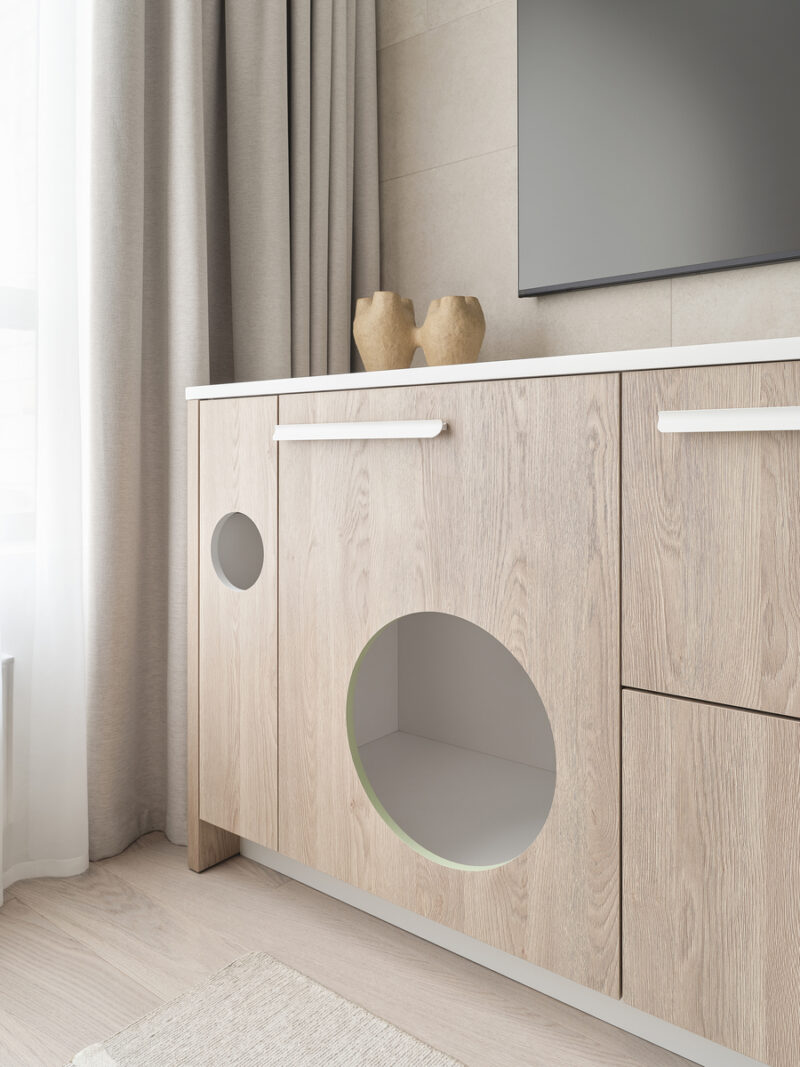
Design Decision: Instead of ending the kitchen at its last appliance, the designers ran the base cabinets past the room's threshold to the window and re-skinned them as a TV stand — then cut round openings into the oak fronts so the Maine Coon gets a den at the center of family life.
Room by Room: A Walkthrough of the Watercolor Apartment
An Entry Hall Shared With a Maine Coon
The hallway absorbs the apartment’s least glamorous duties without looking like a service zone. The team replaced the front door panel so it matches the wood-clad wall around it, hung a floating cabinet with a shoe box below a large mirror, and added hooks for bags on the door itself. The closets carry rods and shelves for clothes, and the far-right module conceals space for the Maine Coon’s litter box. The millwork (custom-built cabinetry and paneling) turns a plumbing-burdened corridor into the home’s most quietly engineered room.
 Pin
PinPhoto: Olga Karapetian
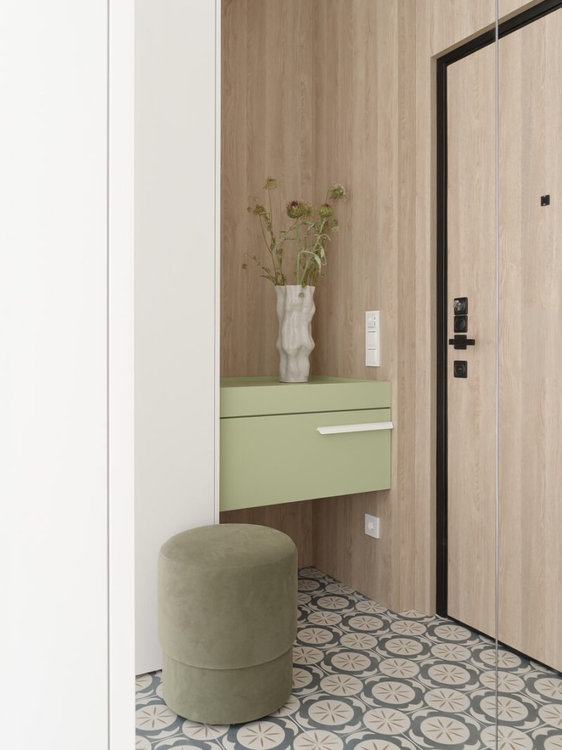
A sage-green floating drawer unit hovers against warm wood paneling, topped by a sculptural vase of dried flowers, with an olive velvet pouf tucked beneath. The patterned floor tile — the same used in the guest bathroom — gives the threshold its own graphic identity before the pale oak flooring takes over. Keeping the console wall-hung preserves visible floor area, a reliable move for making a tight entry read larger. The black-trimmed door frame sharpens an otherwise soft material set.
 Pin
PinPhoto: Olga Karapetian
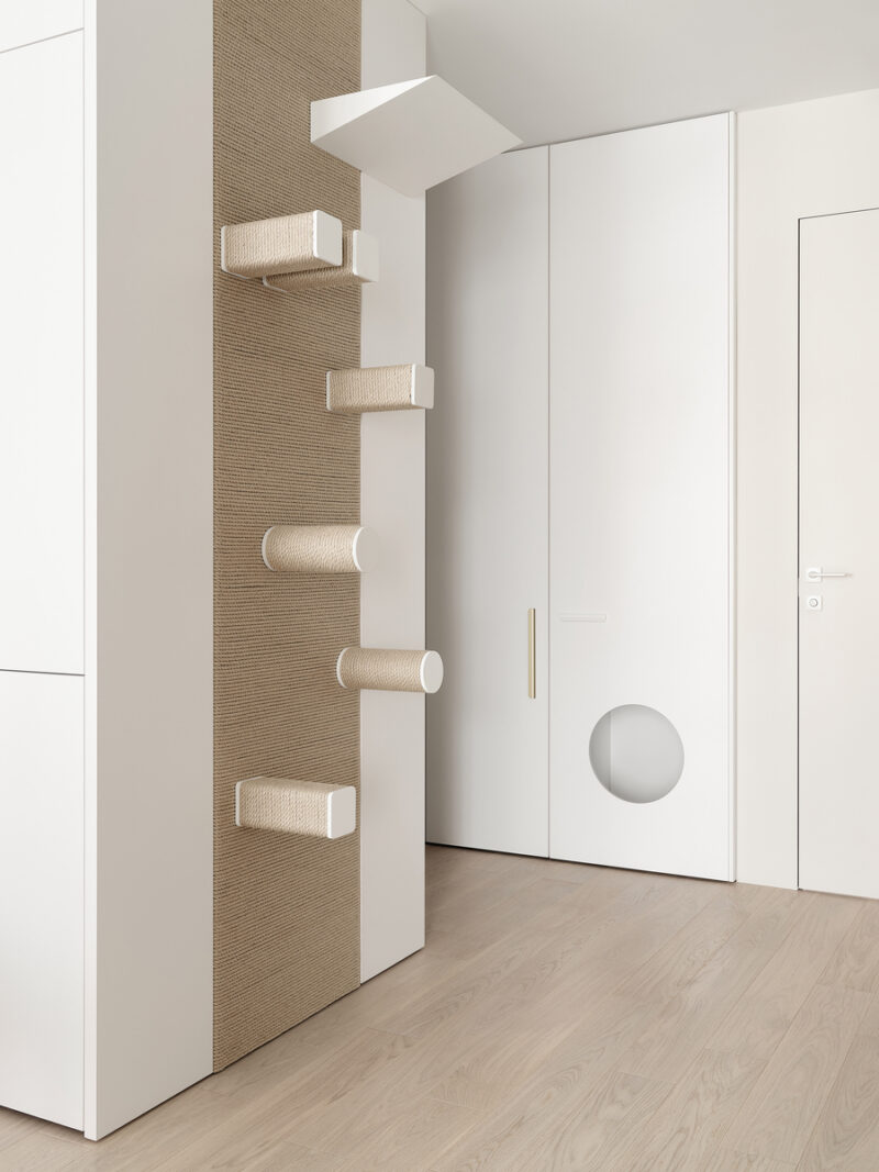
A vertical band of woven carpet runs up the closet flank, fitted with rope-wrapped climbing steps and a white perch — a full cat tower folded into the storage architecture. A round cut-out in the closet door below gives the cat private access to the litter module. Nothing here is freestanding pet furniture; the animal’s program is built into the same joinery that serves the owners. It is a small demonstration of the project’s central habit: one element, several users.
A Kitchen-Living Room That Seats Four and Naps One Cat
Despite the limited footprint, the main room fits a dining table for four and a deep modular sofa. The wall behind the sofa is dressed in oak-texture panels with integrated lighting, giving the seating zone a defined backdrop rather than a leftover corner. Sightlines (the unobstructed views across a space) stay long because the shortened partition lets daylight from the window wall reach deep into the plan. The atmosphere is deliberately low-contrast: pale ground, muted olive upholstery, and small doses of brass.
 Pin
PinPhoto: Olga Karapetian
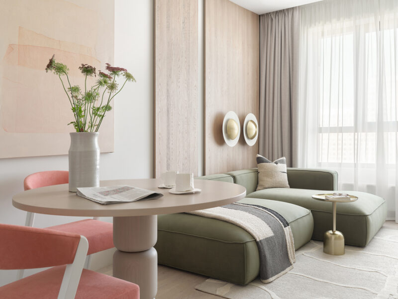
The olive-green sofa runs toward the window with its back to the dining zone, so one room supports two postures — upright at the blush-toned pedestal table, horizontal on the chaise. Twin brass disc sconces on the oak panel give the wall depth without consuming shelf space. Coral dining chairs supply the palette’s warm counterpoint, and the sheer-plus-drape curtain layering softens Moscow’s flat winter light. The composition proves a narrow room can hold a full social program if furniture edges are kept low and rounded.
Coral Velvet at the Breakfast Table
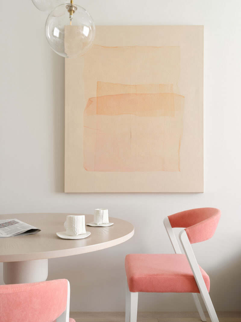
The dining corner works as the room’s color anchor. A round table on a turned pedestal base avoids leg clutter in the passage, while the artwork above holds the entire scheme’s thesis — translucent washes of peach and blush layered like wet pigment. A clear glass globe pendant lights the table without visual weight. It is interior design doing structural work: the table’s position fixes the boundary between kitchen circulation and the seating zone.
 Pin
PinPhoto: Olga Karapetian
Up close, the coral chairs show their construction: a white lacquered frame wrapping a velvet seat and curved backrest, more tailored than childish. The abstract canvas reads as the apartment’s namesake — watercolor fields in skin-warm tones on a raw ground. Textured white ceramic cups echo the artwork’s handmade register. The vignette shows how the project earns its softness through material contrast rather than pattern.
A Galley Kitchen That Refuses a Full Wall of Upper Cabinets
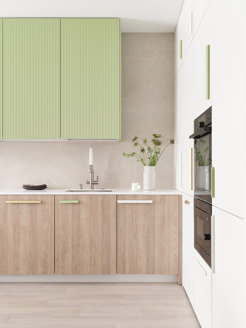
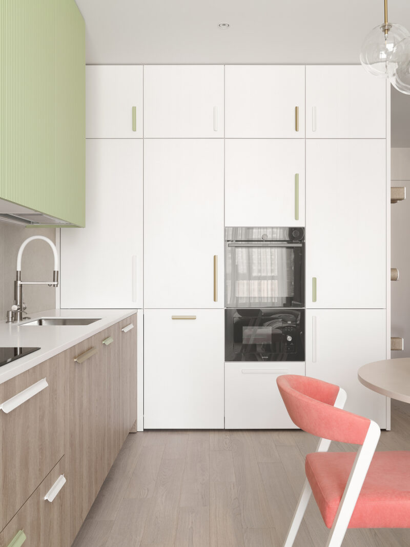
The kitchen is narrow, and the team chose not to run upper modules along the entire perimeter — a deliberate trade of storage for spatial calm, since full uppers would have overloaded the room. Lost volume is recovered in a floor-to-ceiling appliance wall. Fenestration-facing worktops keep prep in daylight, and the handle hardware alternates between sage, brass, and white, letting the cabinet fronts carry the color story in small strokes.
 Pin
PinPhoto: Olga Karapetian
The fluted sage-green upper cabinet is the kitchen’s single overhead gesture, floated against a stone-look porcelain backsplash. Below, oak-effect base cabinets keep the working wall grounded and warm. Ending the uppers before the corner leaves the stone wall exposed, which reads as breathing room rather than absence. The slim candle-form faucet and minimal countertop styling maintain the discipline.
 Pin
PinPhoto: Olga Karapetian
The full-height white column concentrates the ovens, microwave, and pantry storage in one flush plane, so the rest of the kitchen can stay light. Handle colors are scattered — green, brass, white — a playful code that breaks up an otherwise monolithic wall. The coral chair in the foreground shows how close the dining zone sits; the flush cabinetry is what makes that adjacency feel intentional rather than cramped.
 Pin
PinPhoto: Olga Karapetian
Here is the project’s signature move at close range: the kitchen’s lower modules extended past the room and repurposed as a TV stand, with a large round opening revealing a soft-green interior — the cat house. A smaller hole in the side panel gives a second entrance. The white countertop continues as the stand’s top, tying two functions into one line. Paired paper-clay vases and the TV above complete a wall that serves media, storage, and pet in a single elevation.
A Nursery Planned Past the Crib Years
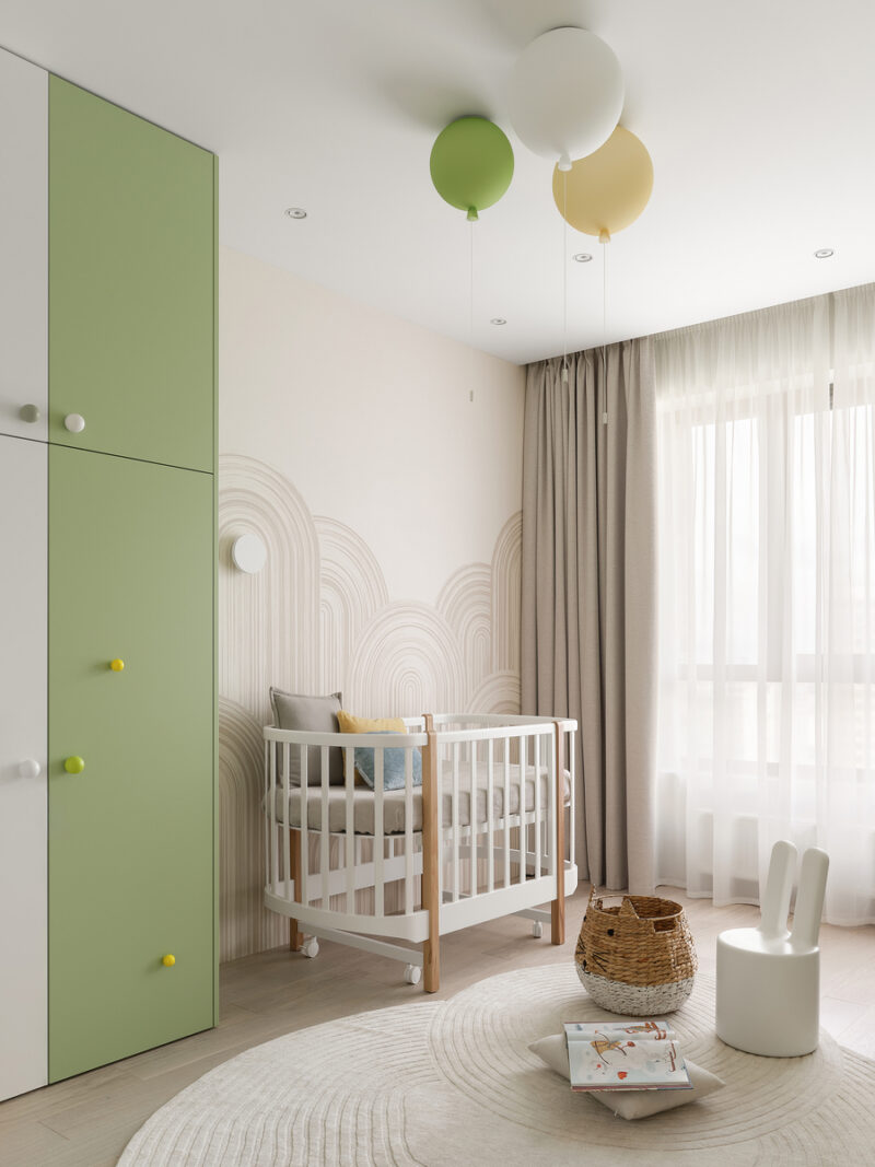
The kids’ room was designed for a child who does not exist yet — and for the older child they will become. A closet extends to the ceiling with multicolored ball-shaped handles, a bookcase hangs near the desk, and a dedicated toy cabinet sits low. Behind the crib, custom seamless wallpaper draws soft arches, and three balloon-like lamps replace a chandelier. More than two meters between the closet and the window means the crib can later swap for a full bed without redesign.
 Pin
PinPhoto: Olga Karapetian
The oval crib sits against the arched wallpaper mural, with the green-and-white wardrobe holding the room’s left edge. The balloon lamps — green, white, and yellow — float at staggered heights, a ceiling composition that will outlast infancy. A rabbit-eared stool and a cat-face basket keep the styling literal enough for a child without tipping into theme-park territory. Natural light arrives through the same sheer-and-drape layering used in the adult rooms, keeping the apartment’s atmosphere continuous.
 Pin
PinPhoto: Olga Karapetian
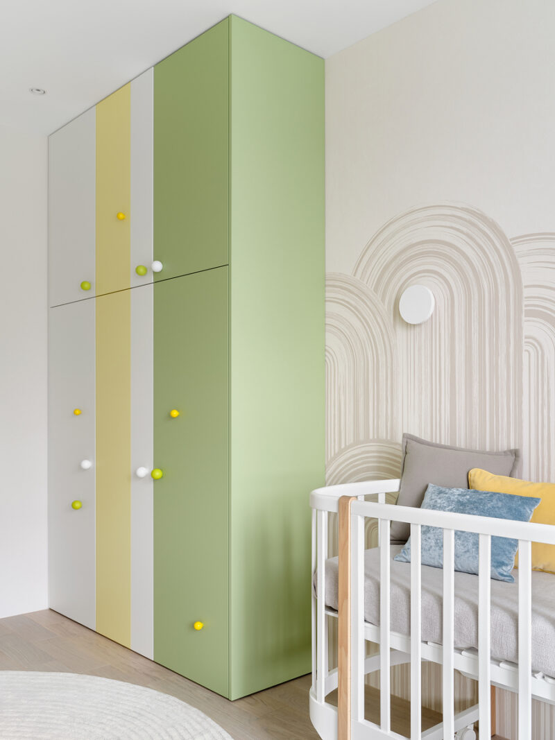
The wardrobe’s fronts are striped in sage, pale yellow, and warm white, with ball handles in yellow, lime, and white scattered like fixed confetti. Running the volume to the ceiling eliminates the dust shelf and makes the storage read as wall, not furniture. Beside it, the mural’s layered arches add depth to the crib corner. The panel joints align with the stripe boundaries — a small millwork discipline that keeps the playfulness precise.
 Pin
PinPhoto: Olga Karapetian
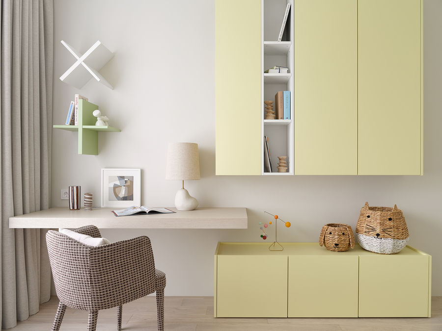
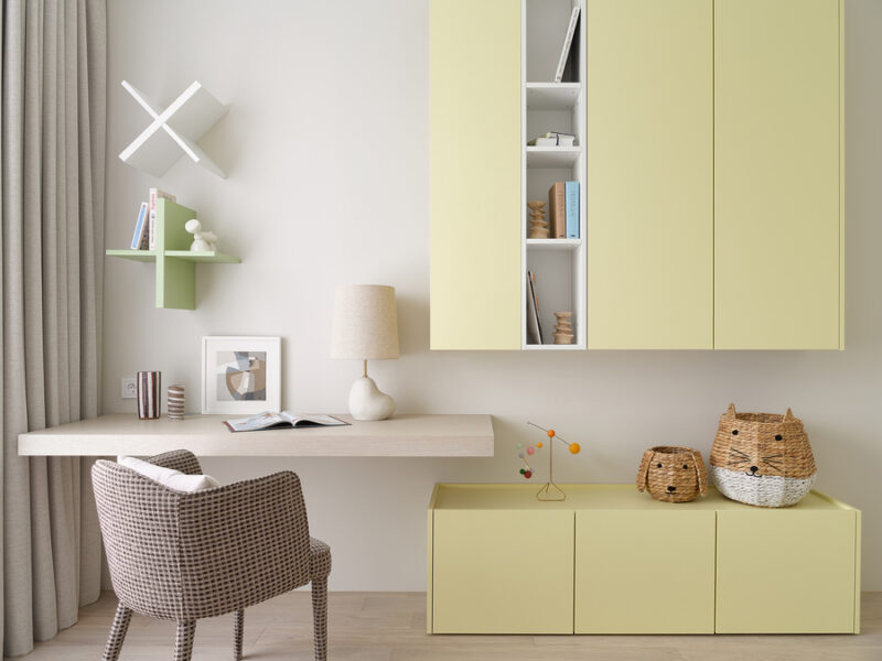
The study corner is already installed: a floating desk plane, a woven-textured armchair, and pale-yellow wall cabinets with an open white shelving insert. X- and cross-shaped shelves add a toy-block geometry above the desk. Because the work surface is a continuous floated slab, the corner will scale from toddler drawing to homework without replacement. The low yellow sideboard doubles as toy storage the child can actually reach.
The Parents’ Bedroom Plans for Month One
The bedroom is arranged around a temporary guest: a crib will stand beside the bed during the baby’s first months. As a result, there is no bedside table on the mother’s side — only a small shelf. The headboard wall is finished in soft upholstered panels that conceal the sockets and carry installed lighting, and a vanity table with a drawer and a large mirror faces the bed. It is a room designed for a specific year of life, with a clear path back to symmetry afterward.
 Pin
PinPhoto: Olga Karapetian
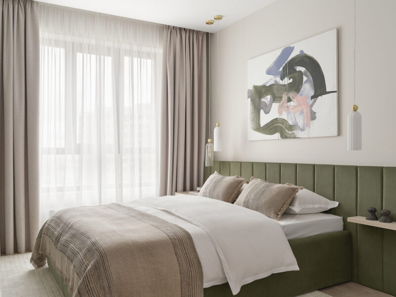
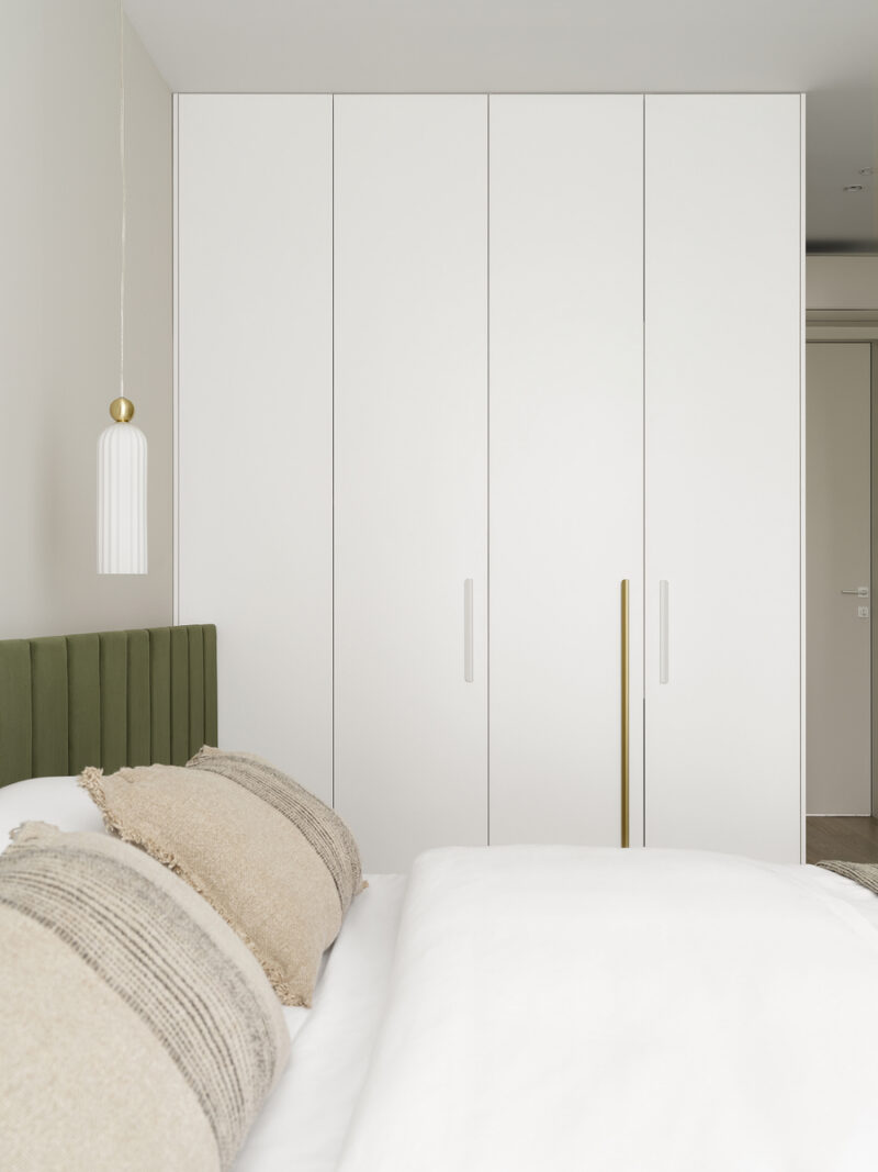
The olive velvet headboard runs wall-to-wall in vertical channels, extending past the mattress to host a floating shelf on the far side — the stand-in for the absent nightstand. Ribbed white pendants on brass stems drop from the ceiling, freeing the shelf surface entirely. The abstract canvas above gathers the apartment’s greens, blues, and corals into one frame. Layered taupe linens keep the material temperature warm against the cool wall paint.
 Pin
PinPhoto: Olga Karapetian
The wardrobe wall is deliberately mute: four full-height white doors with slim recessed pulls, one rendered in brass as a quiet center mark. Pushing the storage flush and handle-less lets the textured headboard and pendant carry the room’s visual interest. This is spatial hierarchy (the ranking of what the eye meets first) managed through restraint. The doors’ seams align with the ceiling shadow gap for a clean top edge.
 Pin
PinPhoto: Olga Karapetian
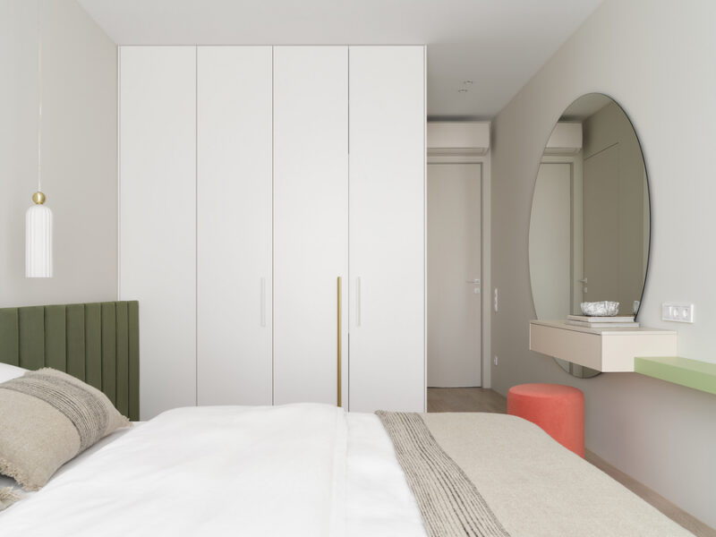
From the bed, the room’s full choreography is visible: wardrobe wall, door to the hallway, and the vanity corner with its round mirror and coral pouf. A sage-green floating shelf continues from the vanity, linking the corner back to the apartment’s palette. The composition leaves the center of the floor open — the space reserved for the crib. Every fixed element hugs the perimeter so the temporary one can hold the middle.
 Pin
PinPhoto: Olga Karapetian
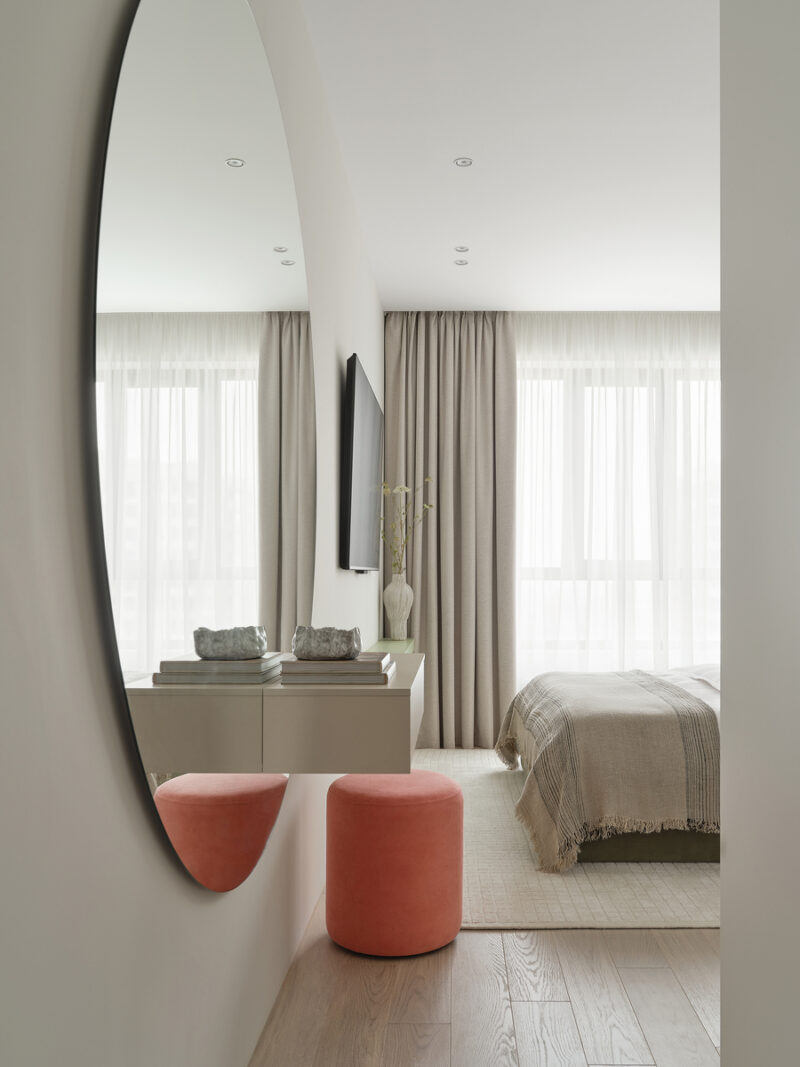
The vanity is a wall-hung drawer beneath an oversized round mirror, with the coral pouf supplying the only saturated note. Seen in reflection, the curtained window wall and wall-mounted TV show how the room layers function without freestanding furniture. Books and rough-cast ceramic bowls style the surface at a livable density. The mirror’s scale doubles the perceived depth of a room that gives its floor area away to the crib.
Two Bathrooms, Two Temperatures
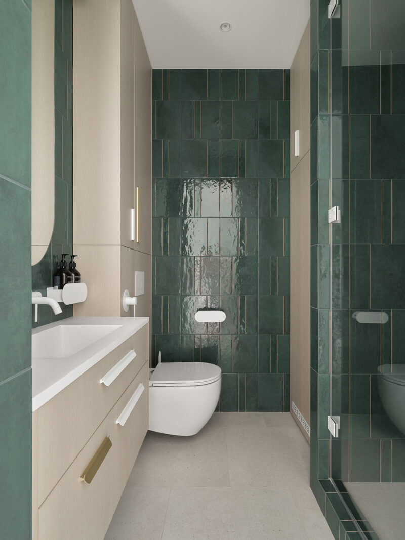
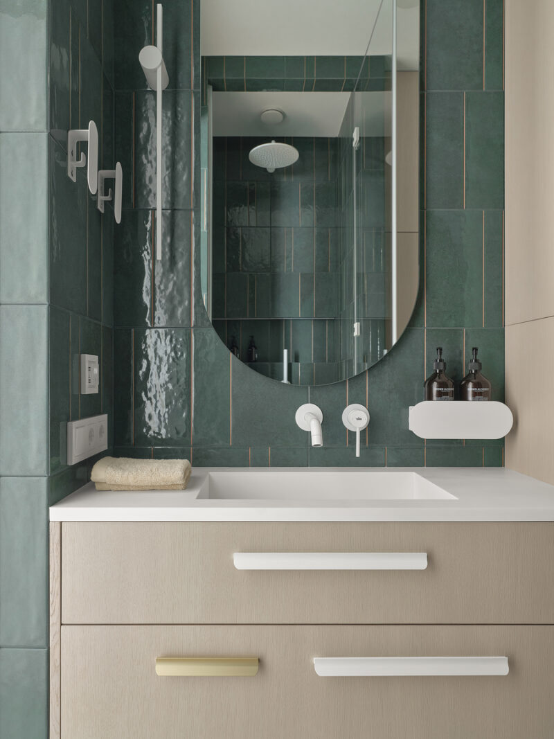
The apartment’s wet zones (rooms with plumbing and water-resistant finishes) split the mood. The guest bathroom mixes bright tiles with an oriental pattern and beige tiles with a sandstone texture, trimmed with brass accessories. The shower room added to the parents’ bedroom runs the opposite direction: glossy emerald tiles the clients loved, set against light furniture and fittings, with a tall cabinet on the left housing the washing machine and dryer. Together they give a small apartment the material range of a larger one.
 Pin
PinPhoto: Olga Karapetian
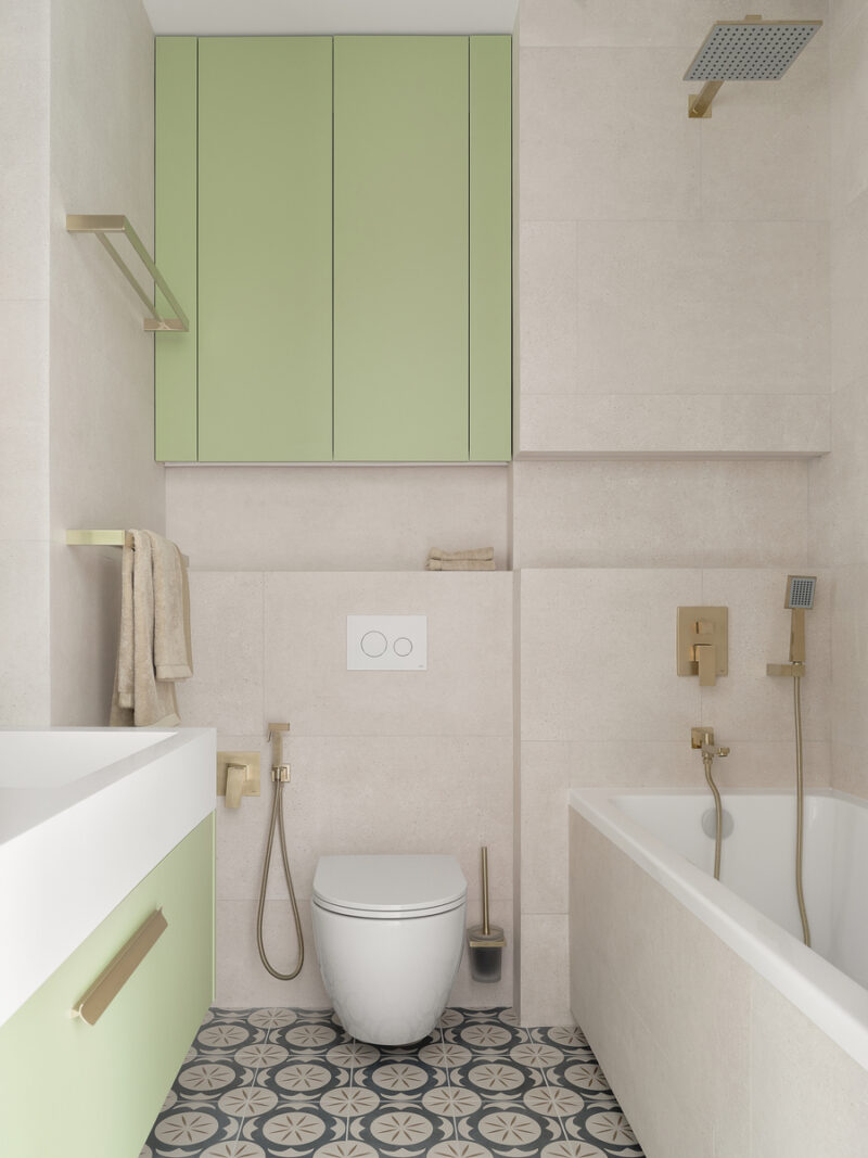
In the guest bathroom, the patterned floor — the same graphic tile as the hallway — meets sandstone-textured beige walls and a sage-green cabinet front. Brass hardware appears everywhere it can: rainfall shower, hand shower, towel rails, even the toilet brush holder. The bathtub panel is tiled to match the walls, dissolving the fixture into the room. Warm metal against soft stone keeps a windowless room from feeling clinical.
 Pin
PinPhoto: Olga Karapetian
The en-suite shower room stacks glossy emerald tiles in a vertical running bond, their handmade-style surfaces catching light in irregular ripples. Beige cabinetry and a white countertop basin lower the intensity at the working height. White fixtures — faucet, hooks, roll holder — sit against the green like line drawings. The narrow plan reads deeper than it is because the tile’s gloss doubles every light source.
 Pin
PinPhoto: Olga Karapetian
At the vanity, the arched mirror is set directly onto the emerald tile, reflecting the shower’s rainfall head behind. The wall-mounted white faucet keeps the countertop clear, and a small white shelf holds amber soap bottles that pick up the brass drawer pull below. Mixing white, brass, and wood-toned hardware on one cabinet is a risk that works because each finish appears more than once in the room. The result is jewel-toned but calm.
Before and After: The Replanning in Two Drawings
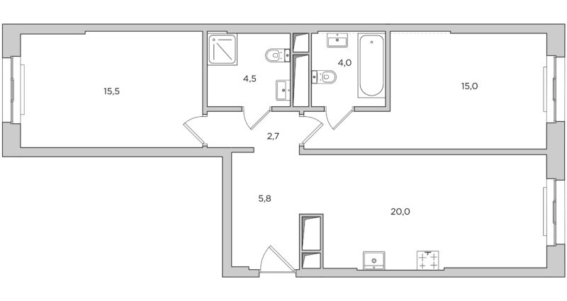
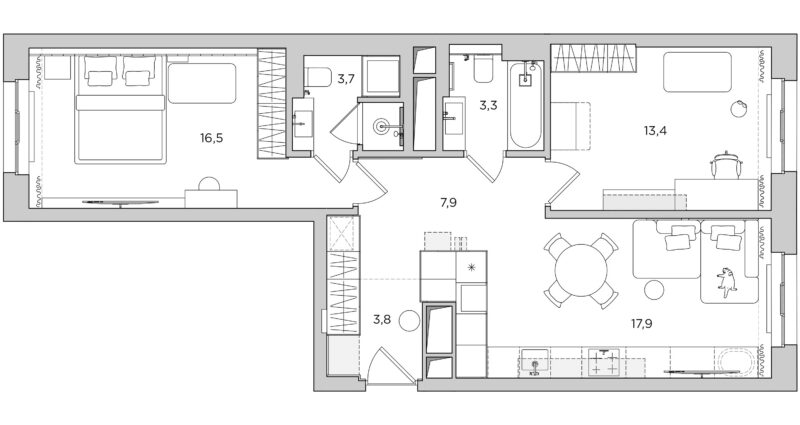
The drawings make the strategy legible. The developer’s version isolates the kitchen behind walls and stretches a corridor along the bedrooms; the built version trades that corridor for room area and threads the cat complex into the kitchen block.
 Pin
PinThe original layout shows the 20.0 m² kitchen-living room walled off from the 5.8 m² hall, with both bedrooms feeding a 2.7 m² connector. The master bedroom sits beside the kitchen-living room, which is what generated the long approach corridor. Storage is unplanned, and the plumbing box interrupts the hallway. It is a serviceable developer plan with no position on how a family would actually live in it.
 Pin
PinThe executed plan swaps the bedrooms — parents to the 16.5 m² room, the 13.4 m² nursery now adjacent to the 17.9 m² kitchen-living space — and shortens the dividing wall. The kitchen run extends toward the window, ending in the TV stand and cat house drawn with its resident. Built-in wardrobes line the 7.9 m² hall, absorbing the plumbing box, and two compact bathrooms (3.7 and 3.3 m²) serve guest and en-suite duties. Even the Maine Coon appears on the sofa: the plan is populated, which is the point.
Where the Plan Excels — and What It Will Ask of Its Owners
Replanning as the Real Design Move
The project’s strongest work is invisible in photographs: swapping the bedrooms and shortening one wall converts a dead corridor into usable width, which is why a narrow room fits a four-seat table and a deep sofa at once. Second, the pet program is architectural, not accessory — litter module in the hallway closet, climbing wall on its flank, den inside the TV stand — so the floor stays clear of cat furniture. Third, the color discipline holds: coral, sage, and emerald all sit at similar saturation over a pale ground, letting small rooms borrow calm from each other.
Storage and Sheen Will Keep Score
The honest costs are also real. Declining a full run of upper cabinets keeps the kitchen airy but concentrates storage in one appliance wall — a growing family will test that math within a few years. The finish set is demanding: glossy emerald tile shows water spots, velvet upholstery and pale oak floors must coexist with a long-haired Maine Coon and, soon, a toddler. And the mother’s shelf-for-a-nightstand is a bet on the crib phase; once the baby moves out of the bedroom, that side of the bed may want its table back.
A Quiet Template for the First-Child Apartment
This project’s contribution is procedural as much as visual: identify the one wall doing the most damage, move it, and let custom millwork absorb every program the plan cannot. The interior-design lesson runs parallel — a watercolor palette works because saturation, not hue, is what stays consistent. The apartment suits a specific client precisely: a young urban couple entering the child-and-pet years inside 60–70 m², who value calm over display. Would you accept a single wall of kitchen storage to keep a narrow room feeling open — or is a full bank of upper cabinets the one comfort a young family can’t spare?
FAQs
Who designed the Watercolor Apartment in Moscow?
The Watercolor Apartment was designed by the Alexander Tischler design company, a full-service interior firm, with Karen Karapetian as chief designer and Iuliia Ubozhenko as designer. The project was completed across 2023–2024, and the interiors were photographed by Olga Karapetian.
How big is the Watercolor Apartment?
The apartment measures 66 m² — roughly 710 square feet. It is a two-bedroom unit containing a combined kitchen-living room, a parents’ bedroom, a kids’ room, a guest bathroom, an en-suite shower room, and a hallway lined with built-in storage.
How does the apartment accommodate a cat?
Pet infrastructure is built into the cabinetry. Extended kitchen base modules double as a TV stand with round openings forming a cat house, the hallway closet flank carries a carpeted climbing wall with perches, and the far-right closet module conceals space for the Maine Coon’s litter box.
What changed from the developer’s original layout?
The designers swapped the master bedroom to another room, placed the kids’ room beside the kitchen-living space, and shortened the wall between them. This removed the long corridor the original plan created, widened the main living zone, and made room for the combined kitchen-and-cat-complex block.
What colors define the watercolor apartment’s interior?
The base is white, beige, and pale oak, layered with muted accents at matching saturation: coral velvet chairs and poufs, sage-green cabinet fronts, olive upholstery, and glossy emerald tile in the en-suite shower room. Soft yellows join the palette in the kids’ room.
Get gorgeous projects via email
