

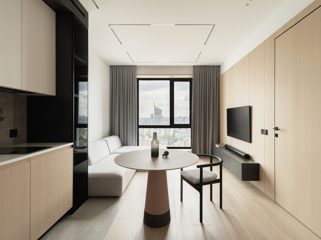
A father bought this 42 m² apartment in Moscow’s Wellton Towers Residential Complex as a gift for his son — and handed PLANKA Buro a brief every small-space designer knows well: make a compact one-bedroom function as a full home for a young couple. Completed in 2024, the project answers with a fully reorganized plan, a curved partition that widens the main circulation route, and an acoustic insulation package running through the floor, the bedroom ceiling, and every partition wall. The result makes a quiet but firm case that in small-apartment design, the plan — not the finishes — does the heavy lifting.
| Project Name | One-Bedroom Apartment, Wellton Towers Residential Complex |
| Architect / Designer | PLANKA Buro (interior design and execution) |
| Location | Moscow, Russia |
| Floor Area | 42 m² (approx. 452 sq ft) |
| Year Completed | 2024 |
| Client Type | Private — a father’s gift to his son; a home for a young couple |
How PLANKA büro Rewired a 42 m² Apartment Around One Curve
The developer’s stock layout squandered the unit’s best assets. What the site offered was rare freedom: two large windows, regular geometry, plumbing stacked in a corner, and no concrete partition walls — meaning the entire parti (the organizing idea of the plan) could be redrawn in plasterboard. PLANKA büro used that freedom to dissolve the cramped default kitchen into an open kitchen–living room and to turn the hallway into the apartment’s service spine, with built-in niches for closets, a slightly enlarged bathroom, and the laundry pulled out of the wet zone entirely.
The signature move is geometric. The passage from hallway to kitchen originally terminated in an acute-angled corner opposite the front door — dead space, and a finish that would chip and stain in daily use. The team cut the corner to a radial profile, then echoed the same curve on the kitchen side of the partition. One decision widened the circulation route, protected the wall finish, and gave two zones a shared visual motif. With no exterior scope, material expression carries the architectural identity indoors: a light-wood veneered MDF panel runs from the TV wall into the hallway, and the deep window jambs — faced in veneer in the living areas and porcelain stoneware in the bedroom — act as internal facades, framing the Moscow City skyline like a curated picture.
Design Decision: When the bathtub's factory-rounded corner refused to meet the tiled surround in a clean line, PLANKA büro simply cut the corner off the tub itself — a small fabrication intervention most contractors would skip, and the reason the bath enclosure reads as one continuous plane.
Inside the 42 Square Meters: A Room-by-Room Walkthrough
An Entry That Hides All the Machinery
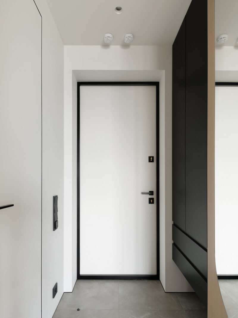
The hallway is where the plan earns its keep. A floating coat wardrobe with mirrored fronts visually doubles the narrow space, with a niche below sized for a robot vacuum station. Opposite, two contrast-colored closets do invisible work: the dark grey one conceals the distribution board and low-voltage panel, while the veneered one with a mirror insert hides the washer and dryer behind vented fronts that prevent moisture buildup. A lowered ceiling above absorbs the indoor air-conditioning unit — services stacked where aesthetics matter least.
 Pin
PinPhoto by Anton Ermakov
The entry sequence is reduced to graphic essentials: a white front door set in a slim black frame, black hardware, and a matte black closet volume meeting a mirrored panel edged in wood. Grey porcelain stoneware on the floor signals the utility zone before parquet takes over deeper in the plan. The restraint is deliberate — with no loose furniture, the threshold stays legible even at under a meter and a half of clear width.
 Pin
PinPhoto by Anton Ermakov
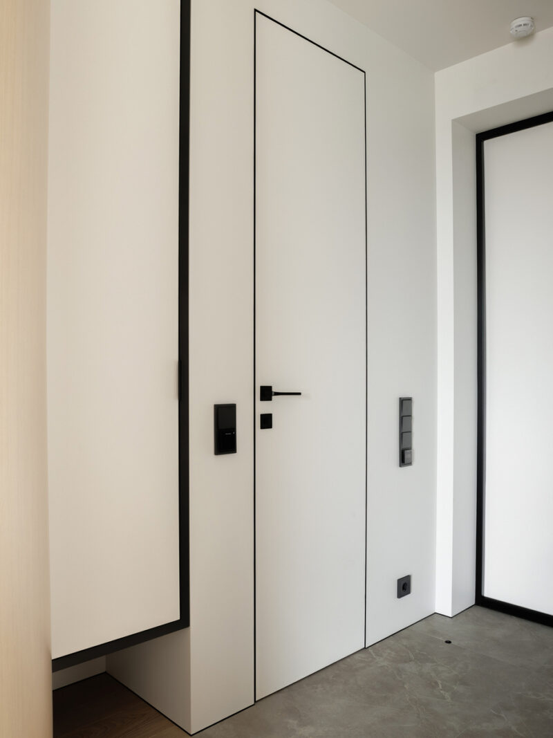
Full-height white closet fronts trimmed in thin black lines turn storage into wall architecture, and the interior door disappears into the same language with a frameless leaf and black perimeter reveal. Switches, the video intercom, and a lone outlet are aligned into a single vertical service strip. It is a lesson in how a small apartment stays calm: every panel opens, but nothing announces itself as a cabinet.
A Living Room Calibrated to the Skyline
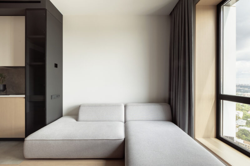
The joint kitchen–living room is the apartment’s public stage, finished dominantly in airless-sprayed paint (a spray application that leaves a perfectly smooth, seam-free surface) with the veneered MDF panel as the warm accent. A light grey corner sofa holds the window edge; opposite, a floating TV stand hangs off the paneled wall, its cabling routed through a hidden channel. The window jambs, faced in veneer, carry a small trick worth stealing: a power outlet set directly into the jamb for holiday lights or ambient lamps.
 Pin
PinPhoto by Anton Ermakov
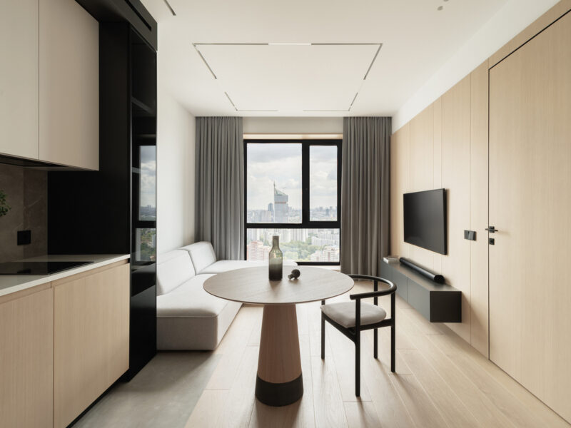
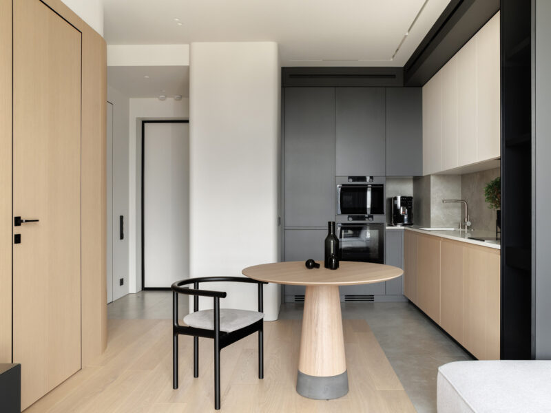
The wide view shows the spatial economy at work: kitchen, dining, and living compressed into one room without visual clutter. Flooring zones the plan — porcelain stoneware under the work zone, oak parquet under the social zone — with the seam sealed in silicone rather than bridged by a threshold strip. Recessed ceiling tracks replace pendant fixtures, keeping the low ceiling plane unbroken and letting the window supply the drama.
 Pin
PinPhoto by Anton Ermakov
The sofa is pushed hard against the glazing line, a placement that only works because the veneered jambs turn the window reveal into finished architecture rather than leftover depth. Floor-to-ceiling grey curtains soften the room’s strict geometry and manage glare on the fully glazed wall. The modular, low-backed sofa keeps sightlines open across the whole 42 m² — nothing in the room rises above eye level when seated.
 Pin
PinPhoto by Anton Ermakov
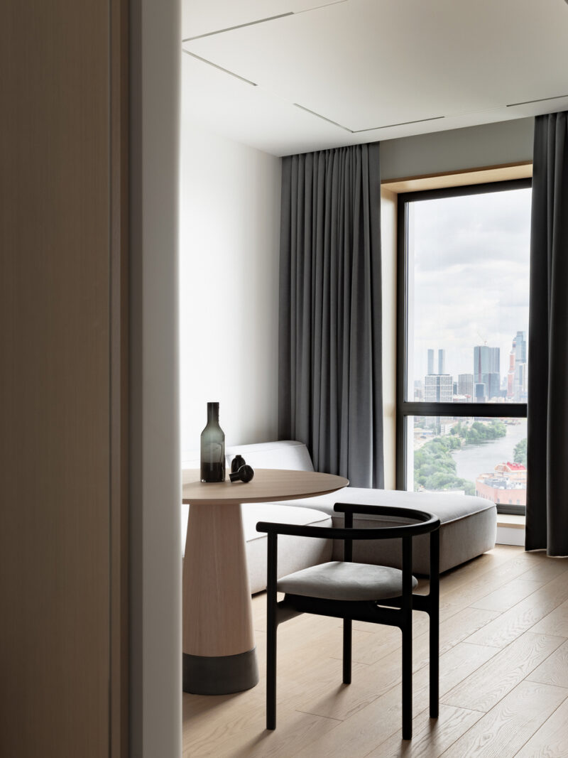
Framed from the bedroom doorway, the panorama explains the furniture plan: the dining table and chaise both orient toward the Moscow City towers on the horizon. The tapered oak dining table with its concrete-grey base repeats the apartment’s core palette — light wood, grey stone, black accents — in a single object. This is fenestration strategy (the placement and sizing of windows) working in reverse: the interior arranged to serve a view the architects did not design but refused to waste.
 Pin
PinPhoto by Anton Ermakov
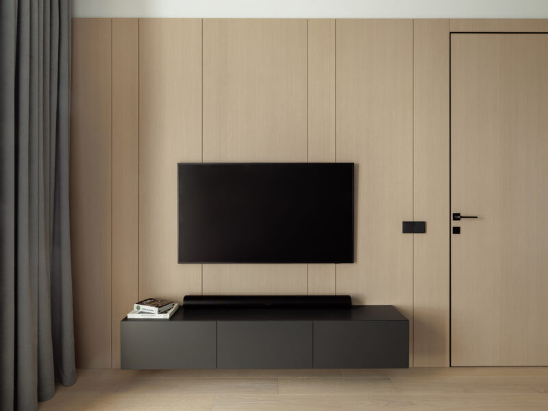
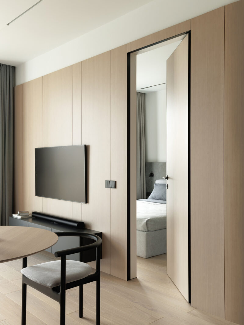
The TV wall demonstrates the project’s joinery discipline: vertical veneer panels with shadow-gap seams, a wall-hung anthracite media unit, and no visible cabling anywhere. The floating stand keeps the parquet running uninterrupted beneath it, which makes the room read larger at floor level. A soundbar and a stack of books are the only objects — the wall itself is the composition.
 Pin
PinPhoto by Anton Ermakov
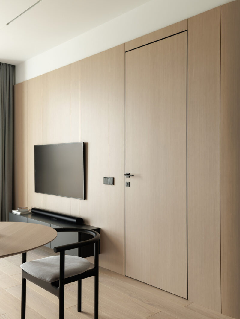
Look closely and the bedroom door is there — a full-height leaf cut into the veneer paneling, betrayed only by a hairline black reveal and a black lever handle. Concealed doors are a small-space staple, but the execution here extends the panel rhythm across the leaf so the joint pattern never stutters. The switch plate, mounted on the paneling in matching black, is treated as a deliberate graphic mark rather than an interruption.
 Pin
PinPhoto by Anton Ermakov
With the door open, the sightline runs from the living room straight to the bed, revealing how thin the boundary between public and private really is in 42 m². The same oak flooring and grey textile palette continue through the opening, so the two rooms read as one atmosphere divided by a wall of storage. It is spatial hierarchy managed by material continuity rather than by distance.
A Full-Scale Kitchen in a One-Bedroom Footprint
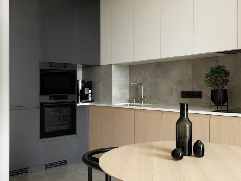
Enlarging the kitchen was the client brief’s center of gravity, and the built result concedes almost nothing to the floor area. A tall column integrates the refrigerator, oven, and microwave; a dishwasher, sink, and two-burner cooktop line the window run, with generous storage above and below. The cabinet fronts repeat the hallway’s two-tone logic — graphite against pale veneer — while air-conditioning vents above the wall units are cut to match the length of the ceiling lighting track, a symmetry most kitchens never bother with. A round dining table for two sits at the room’s pivot point.
 Pin
PinPhoto by Anton Ermakov
The corner detail shows the palette at full strength: matte graphite tall units with fully integrated black appliances, cream upper cabinets, pale veneer bases, and a grey stone-look backsplash rising to meet the wall units. Handle-free fronts and flush appliance faces keep the working wall reading as cabinetry rather than machinery. The single potted plant and black vessels are styling, but the restraint underneath is structural — every seam aligns.
 Pin
PinPhoto by Anton Ermakov
From the dining position, the kitchen, hallway, and living zone resolve into one continuous composition, with the radial-cornered partition easing the transition at the left of frame. The tapered table base — oak over a concrete-grey foot — anchors the center of the plan like a column. Stoneware underfoot in the kitchen zone meets parquet at a clean silicone-sealed line, marking the change of use without a level change or trim.
A Bedroom Engineered to Take the Wear
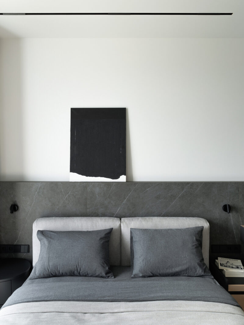
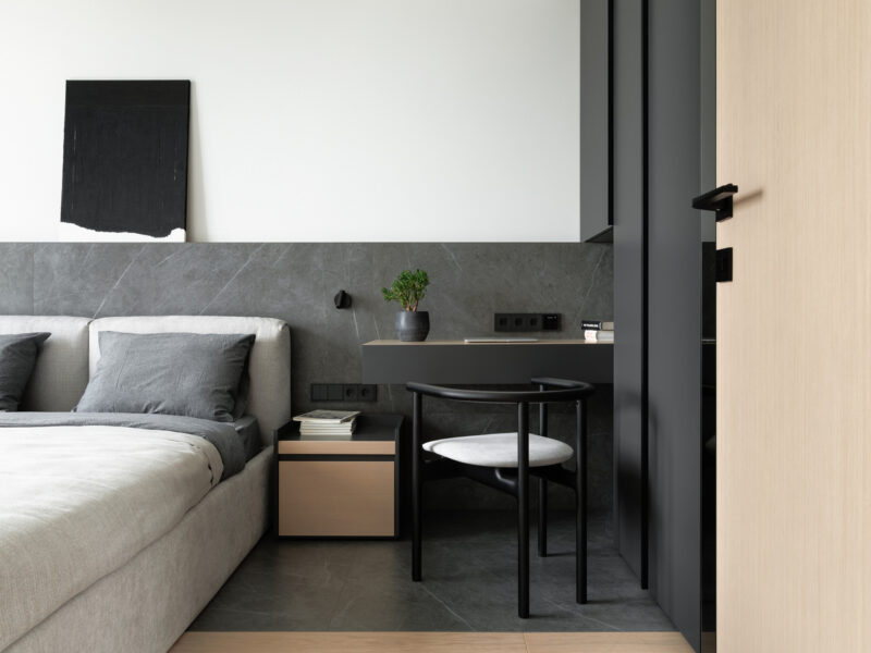
The bedroom’s accent piece is also its most pragmatic: a porcelain stoneware headboard band, chosen because painted walls soil quickly at the exact height hands and pillows touch daily, and underlined with LED lighting to make the utility read as intent. Stoneware covers the floor too — legal in a Moscow bedroom only because the team engineered acoustic insulation across the entire apartment: underlayment beneath the full floor, basalt slab cores with double Knauf plasterboard in every partition, a treated bedroom ceiling, and soundproofed boxes around built-ins. A floating desk slips into the wardrobe zone, and a bulkhead above the closet niche conceals the air supply and return vents.
 Pin
PinPhoto by Anton Ermakov
The bed elevation is a study in horizontal layering: white paint above, a grey stone band below, upholstered cushions against it, and bedding in graduated greys. Black wall-mounted reading lights and a leaning monochrome canvas keep the composition asymmetrical enough to feel lived-in. A recessed ceiling track supplies ambient light without a single pendant, preserving the room’s low, calm datum line.
 Pin
PinPhoto by Anton Ermakov
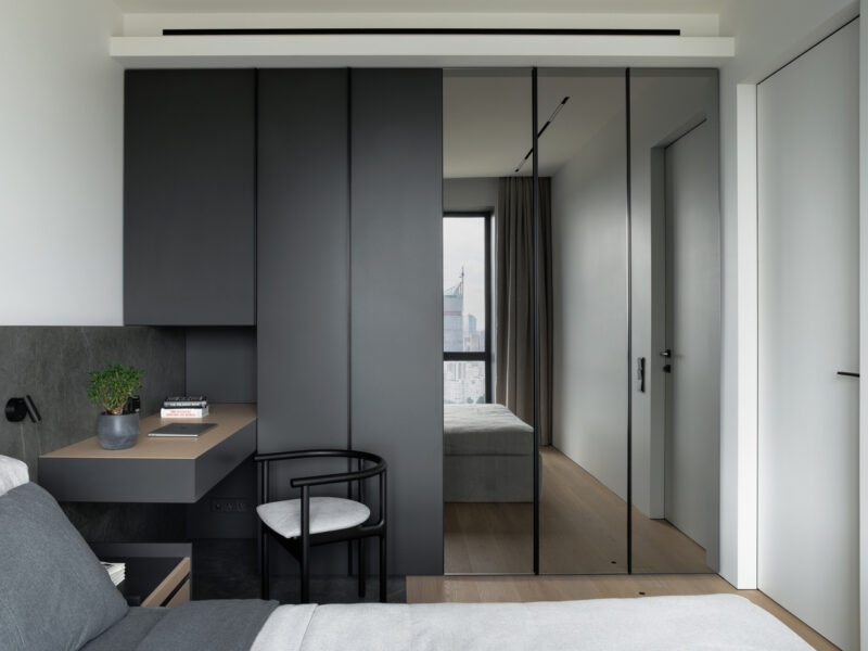
The desk is detailed as a cantilevered shelf with a veneer top, floating over a matching nightstand so the corner serves both sleep and work without two separate furniture footprints. Outlets sit flush in the stone wainscot exactly where a laptop charger needs them — evidence of an electrical plan drawn around behavior, not convention. The stoneware floor beneath the chair is the wear-resistance argument made literal: casters and chair legs will not scar it.
 Pin
PinPhoto by Anton Ermakov
Graphite wardrobe fronts meet smoked-mirror sliding panels that bounce the window and the skyline back into the room, visually doubling a space that measures only a few meters across. The overhead bulkhead reads as a clean architectural fascia while quietly housing the ventilation runs. It is the bedroom’s version of the apartment’s central theme: every surface is either storage, service, or reflection, and none of it looks like effort.
Three Tile Collections, One Strict Bathroom
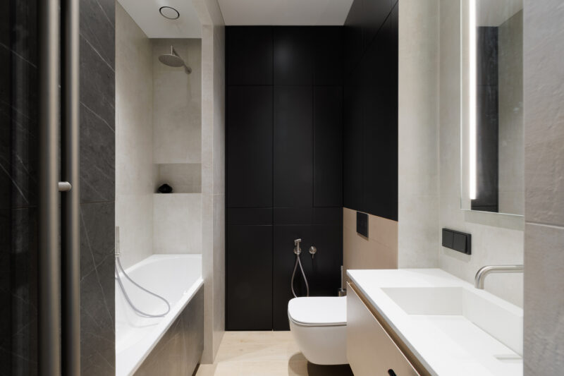
The bathroom holds to a disciplined three-part material script: wood-textured tile on the floor, anthracite accent walls, and sandy travertine-look tile elsewhere, with dark grey MDF panels concealing the plumbing manifold. The bathtub sits in a niche behind a purpose-built partition — an alternative to a glass screen that stays private, contains splash, and never shows limescale. An overhead rain shower pairs with a handheld spray inside the niche, and with the washer and dryer exiled to the hallway closet, the room stays visually light for its size.
 Pin
PinPhoto by Anton Ermakov
The full view shows the niche logic clearly: the tub tucks behind the anthracite marble-look partition at left, the shower head mounted inside so water never crosses into the dry zone. Matte black storage walls compress around the wall-hung toilet, then release into pale travertine tones at the vanity. Warm wood-look tile underfoot keeps a small, windowless room from tipping into severity.
 Pin
PinPhoto by Anton Ermakov
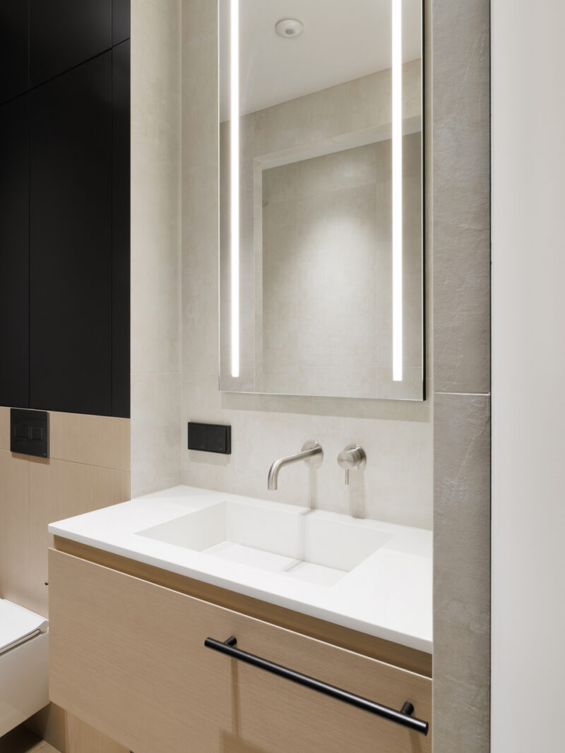
At the vanity, a solid-surface integrated basin sits on a veneer drawer unit with a long black bar pull — the apartment’s black-line motif at bathroom scale. The mirror’s vertical LED strips deliver even, shadow-free light at the face, the correct approach where overhead light alone would cast downward shadows. Brushed wall-mounted taps free the counter and make the thin worktop edge possible.
Where the Plan Pays Off — and What It Demands
Circulation and Acoustics as Real Investments
The radial corner is the project’s clearest win: a single geometric edit that widens the hallway-to-kitchen passage, eliminates a finish-destroying acute angle, and gives two zones a unifying motif — measurable habitability gains from one plasterboard curve. The acoustic package is equally substantive: basalt-core partitions with double insulated plasterboard, full-floor underlayment, and a treated bedroom ceiling not only satisfy Moscow’s sound regulations but legalize stoneware flooring where it genuinely earns its wear resistance. And relocating the laundry into a vented hallway closet frees the bathroom to be smaller, calmer, and better proportioned than most 42 m² units allow.
The Maintenance Bill for Minimalism
Matte graphite fronts and airless-painted walls are unforgiving surfaces; fingerprints, scuffs, and touch-ups will be a recurring line item in daily life. The bathtub’s privacy partition solves splash and limescale but takes borrowed light with it — the bathing niche will always feel enclosed, which some users will read as cocooning and others as tight. And the plan is tailored precisely to two people: one bedroom, dining for two, and no slack space means the apartment fits a young couple exactly — and a growing household not at all.
What a Gift Apartment Teaches About Small-Plan Design
This project’s contribution is not a single image but a sequence of correct decisions: demolish the developer plan, spend the budget inside the walls, and let durable materials do the decorating. PLANKA büro delivers a template for compact urban living — best suited to a young couple or a single professional who values silence, order, and a skyline more than spare square meters. It also blends registers deliberately: stone against oak, graphite against cream, the practical fused with the composed. If you had 42 square meters, would you spend where this project did — on acoustics and joinery you can barely see — or on finishes you can?
FAQs
Who designed the Wellton Towers apartment in Moscow?
The interior design and full execution were carried out by PLANKA büro, a Moscow-based design and construction team. The 42 m² one-bedroom apartment, completed in 2024, was commissioned by a father as a gift for his son and designed as a home for a young couple.
How big is the PLANKA büro apartment in Wellton Towers?
The apartment measures 42 m² (about 452 sq ft). Within that footprint it fits a joint kitchen–living room, a private bedroom, a bathroom with a niche bathtub, and a service-packed hallway containing the washer, dryer, coat storage, and the air-conditioning unit.
Why is there porcelain stoneware behind the bed?
The headboard wall takes constant contact, and light-colored paint soils quickly there. Porcelain stoneware gives the bedroom a wear-resistant surface at exactly the touch zone, and LED accent lighting turns the practical choice into the room’s main design feature. The bedroom floor uses stoneware for the same durability reason.
Where are the washing machine and dryer in this small apartment?
Both machines are hidden in a hallway closet with a veneered, mirror-inset front. Small vents cut into the closet doors prevent moisture from accumulating around the equipment. Moving laundry out of the bathroom freed floor space there and kept the wet room visually uncluttered.
How did the designers make a 42 m² layout feel larger?
They rebuilt the plan from scratch: an open kitchen–living room replaced the developer layout, a curved plasterboard corner widened the main passage, mirrored closet fronts stretched the hallway visually, and full-apartment acoustic insulation made the compact rooms quiet enough to feel genuinely private.
Get gorgeous projects via email
