

Most clients ask for a living room at the heart of the home; the owners of this 320 sq. m Moscow apartment on Kotelnicheskaya Embankment asked for a home that is nearly all heart. Special Style, the studio of Anastasia Rykova and Inna Ermakova, answered by dissolving the living room, dining room, and study into one continuous social volume — even the hallway was sacrificed to keep the plan uncluttered. What holds that openness together is a strictly classical skeleton of stucco, profiled doorways, and custom parquet, deliberately set against a modern, quietly colorful furniture layer. The brief was contradictory on purpose: classic yet modern, calm yet colorful.
| Project Name | Apartment on Kotelnicheskaya Embankment |
| Architect / Designer | Special Style — Anastasia Rykova and Inna Ermakova |
| Location | Kotelnicheskaya Embankment, Moscow, Russia |
| Floor Area | 320 sq. m (approx. 3,444 sq. ft) |
| Client Type | Private |
Two Load-Bearing Columns, One Vanishing Act: How the Open Plan Was Won
The parti (the organizing idea of the design) is radical subtraction: remove every partition the structure allows, then let ornament — not walls — do the zoning. Merging the living room, dining room, and study left the plan with two massive load-bearing columns that could not be removed. The obvious move was to dress them in stucco to match the walls; the studio instead clad them in gradient colored glass, turning dead structure into a light-reactive object that ties into the scheme’s cool gray-blue accents.
The classical “skeleton” carries the apartment’s identity the way a facade would: wall stucco, baseboard profiles, doorway architraves, and a parquet pattern drawn from the firm’s own sketches establish proportion and rhythm across the open volume. That skeleton also solved a real defect — the windows sat too far below the ceiling, so wide but deliberately minimalist stucco cornices compress the wall above the fenestration (the placement and sizing of windows) and visually correct the proportion. A warm, natural palette runs throughout, cut by that recurring gray-blue chill, so the space reads cohesive rather than mosaic — with room left for art to arrive over time.
 Pin
PinPhoto: Sergey Krasyuk
The gradient glass column stands at the left edge of the frame, shifting from deep blue at the crown to sand at floor level, half-dissolving into the beige wall of concealed sliding doors behind the Greene sofa and armchairs by Living Divani. Pebble coffee tables, also Living Divani, sit low on a fringed Kulturakovrov rug whose black striations give the pale field graphic weight. The composition shows the project’s central trade: no partitions, so structure, textiles, and cabinetry must define the zones. Track-mounted spots trace the ceiling perimeter, keeping the classical cornice line clean.
Design Decision: Rather than wrapping the two immovable structural columns in stucco to match the walls, Special Style clad them in gradient colored glass stretching from blue to sand. Depending on the light, the columns echo the apartment's blue accents or reflect their surroundings and practically disappear.
Room by Room: Walking the 320 Square Meters
A Threshold Compressed to Essentials
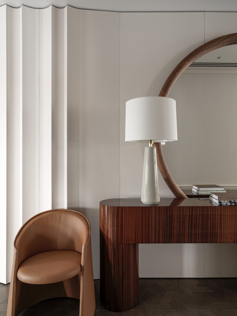
With the hallway eliminated as a room in its own right, arrival is staged as a single composed vignette rather than a corridor sequence. A custom high-gloss console meets a leather tub chair — the Husk armchair by Moroso — under the round wood-framed Giove mirror by Porada, with an Athens lamp by Visual Comfort & Co. providing a low pool of light. The fluted, wave-profile wall panels behind translate the apartment’s stucco language into cabinetry, so even the threshold obeys the classical skeleton.
 Pin
PinPhoto: Sergey Krasyuk
The entry vignette works on material contrast: mirror-gloss sapele grain against matte painted fluting, caramel leather against chalky walls. The Giove mirror leans into the composition rather than hanging flat, softening the formality. Dark chevron parquet grounds the pale envelope and previews the floor pattern that runs through the social core. It is a small lesson in how to make an entrance without dedicating floor area to one.
The Social Core: Living Room, Three Ways
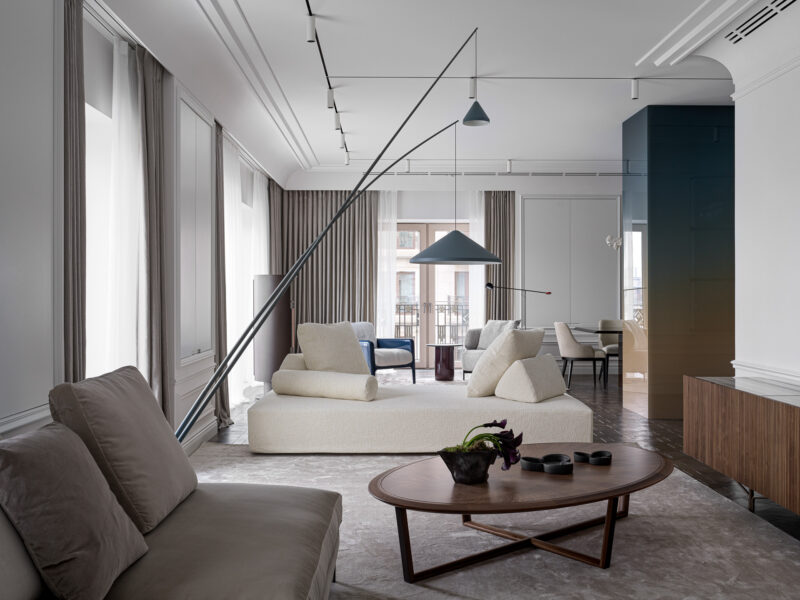
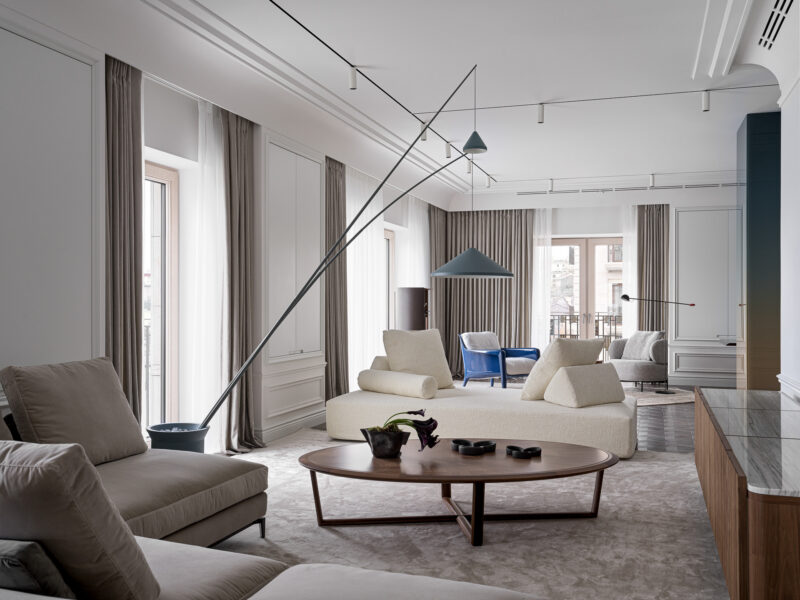
The main volume is furnished as overlapping islands rather than one seating wall: a floating Andersen sofa by Minotti (designed by Rodolfo Dordoni) holds the center, a second lounge group gathers by the balcony doors, and the study occupies the far corner. Circulation flows around the furniture, not along walls — the open plan’s spatial hierarchy is written entirely in rugs, light fittings, and sightlines. Layered lighting does the after-dark zoning: magnetic track spots, the sculptural North floor lamp by Vibia, and pendants dropped from near-invisible cables.
 Pin
PinPhoto: Sergey Krasyuk
The Andersen sofa’s bolster and wedge cushions give the central island a soft, almost bed-like informality, played against the crisp oval of the Piramide coffee table by Annibale Colombo. The North floor lamp by Vibia throws two impossibly long arms across the room, a gesture scaled to the volume it inhabits. Beyond, the gradient glass column catches amber light at the corridor’s edge, while linen-sheer curtain layers filter the embankment glare. The silk Limited Edition rug defines the zone’s footprint where walls no longer can.
 Pin
PinPhoto: Sergey Krasyuk
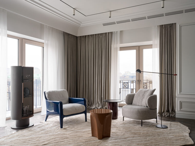
From the second sofa group, the room reads as a single luminous field: paneled walls, wide cornices masking the curtain tracks, and the blue-lacquered armchair holding the far corner like a punctuation mark. The wide stucco cornice band above the glazing is clearly visible here, correcting the awkward window-to-ceiling distance the designers inherited. Velvet, bouclé, and silk build tactile depth inside a palette that barely strays from greige. The discipline is the point — color is rationed so the blue reads as an event.
 Pin
PinPhoto: Sergey Krasyuk
The corner lounge pairs a glossy cobalt-framed armchair with a rounded gray easy chair, a cylindrical drinks cabinet, and a caramel-lacquered side table — small-scale pieces chosen for a zone meant for two people and a conversation. Sheer and blockout curtain layers wrap the corner glazing, and the textured wool rug ripples like raked sand underfoot. It demonstrates the plan’s flexibility: the same open volume hosts formal seating, work, and this softer, more private register without a single partition.
Dining at the Hinge Between Light and Dark
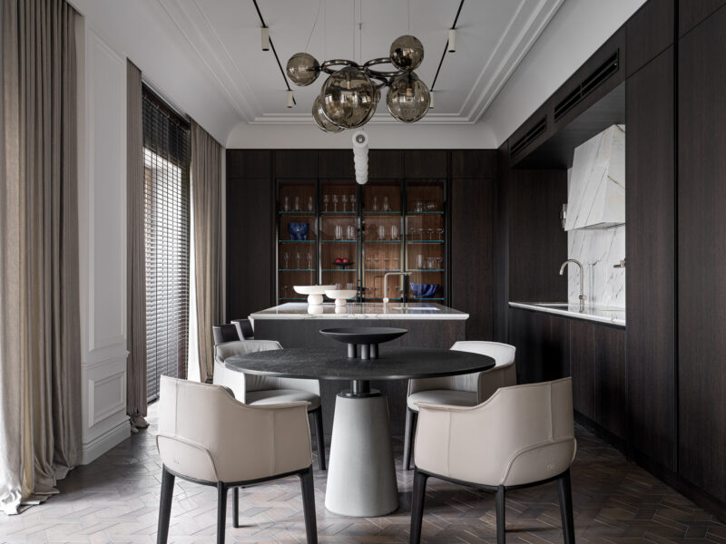
The dining zone sits where the pale living volume meets the smoked-oak mass of the kitchen, and the furniture stages that transition: a round black-topped table on a conical stone base, ringed by cream leather armchairs whose warmth pulls the light palette into the dark room. A smoked-glass globe chandelier hangs low, its charcoal spheres mediating between white ceiling and espresso cabinetry. Glazed vitrines behind lend the wall depth and glassware sparkle instead of solid bulk.
 Pin
PinPhoto: Sergey Krasyuk
The composition is almost photographic in its tonal control: cream leather, black stone, bronze-toned glass, and the herringbone-variant parquet running dark below. Backlit vitrines turn storage into an illuminated backdrop, so the dark wall reads as depth rather than weight. The chandelier’s clustered smoked globes echo the table’s roundness and keep the ceiling plane animated between the classical cornices. Blinds layered behind sheer drapery meter the daylight along the balcony wall.
An Archetipo Kitchen in Smoked Oak and Stone
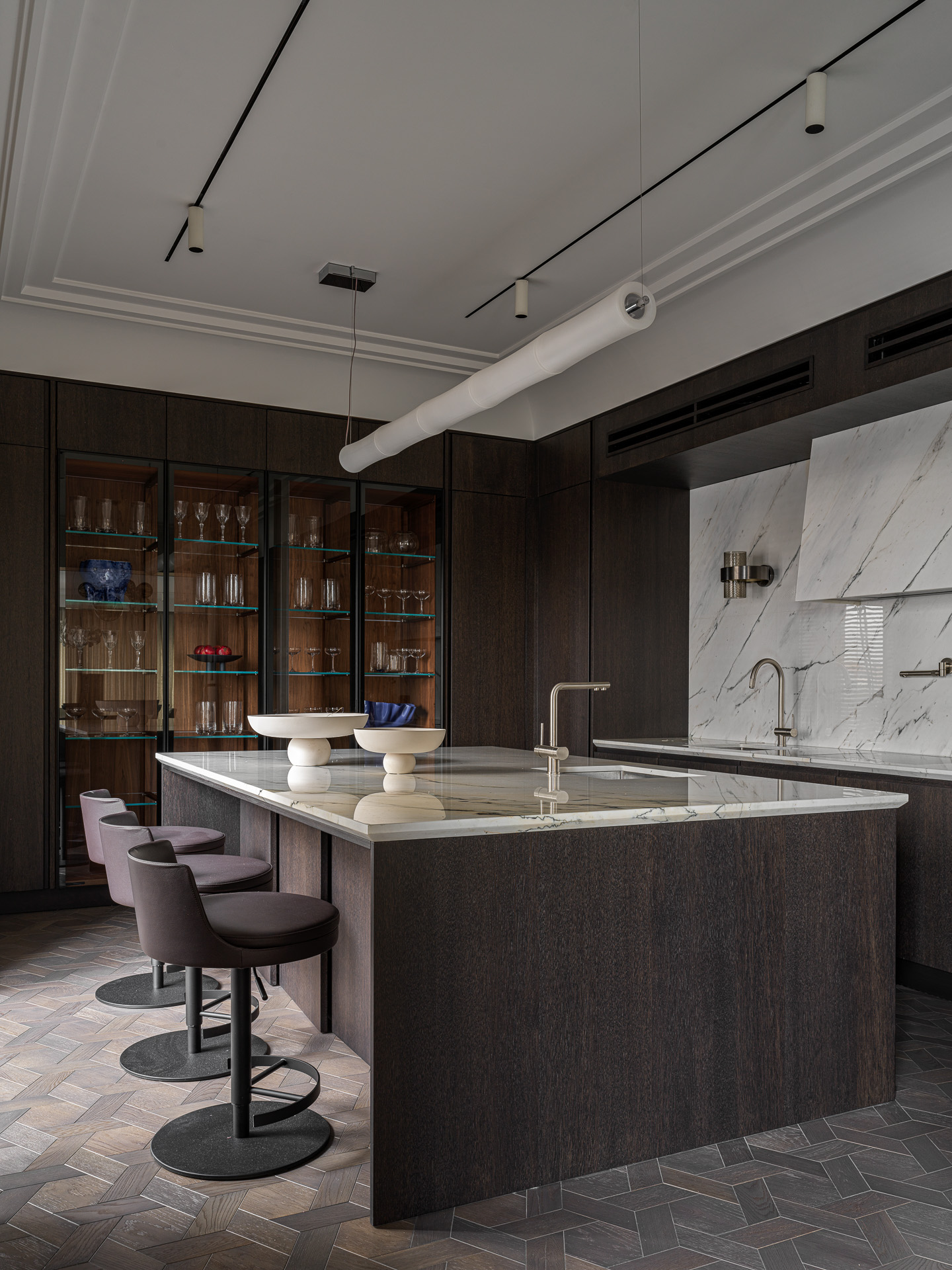
The Archetipo kitchen by L’Ottocento is treated as joinery architecture: full-height smoked-oak cabinetry absorbs appliances and ventilation, while fine marble — a faceted hood, bookmatched backsplash, and mitered island top — supplies the room’s light. Ponza GP bar stools by Frag pull up to the island under the tubular Take pendant by Lumen Center, with Armonia sconces by Vistosi (designed by Francesco Lucchese) glowing against the stone. A separate walnut-and-marble bar block extends the service program beyond the kitchen proper.
 Pin
PinPhoto: Sergey Krasyuk
The island is a monolith of dark oak crowned by a thick, softly veined marble slab with an eased classical edge profile — the modern-classic thesis restated in millwork. Frag’s leather-backed stools keep their profiles low so the stone horizon stays unbroken. On the far wall, the marble hood folds like paper above the cooktop, an origami move against the rigid cabinet grid. Glass-fronted display cases return glassware to view, resisting the fully sealed look that makes many dark kitchens feel corporate.
 Pin
PinPhoto: Sergey Krasyuk
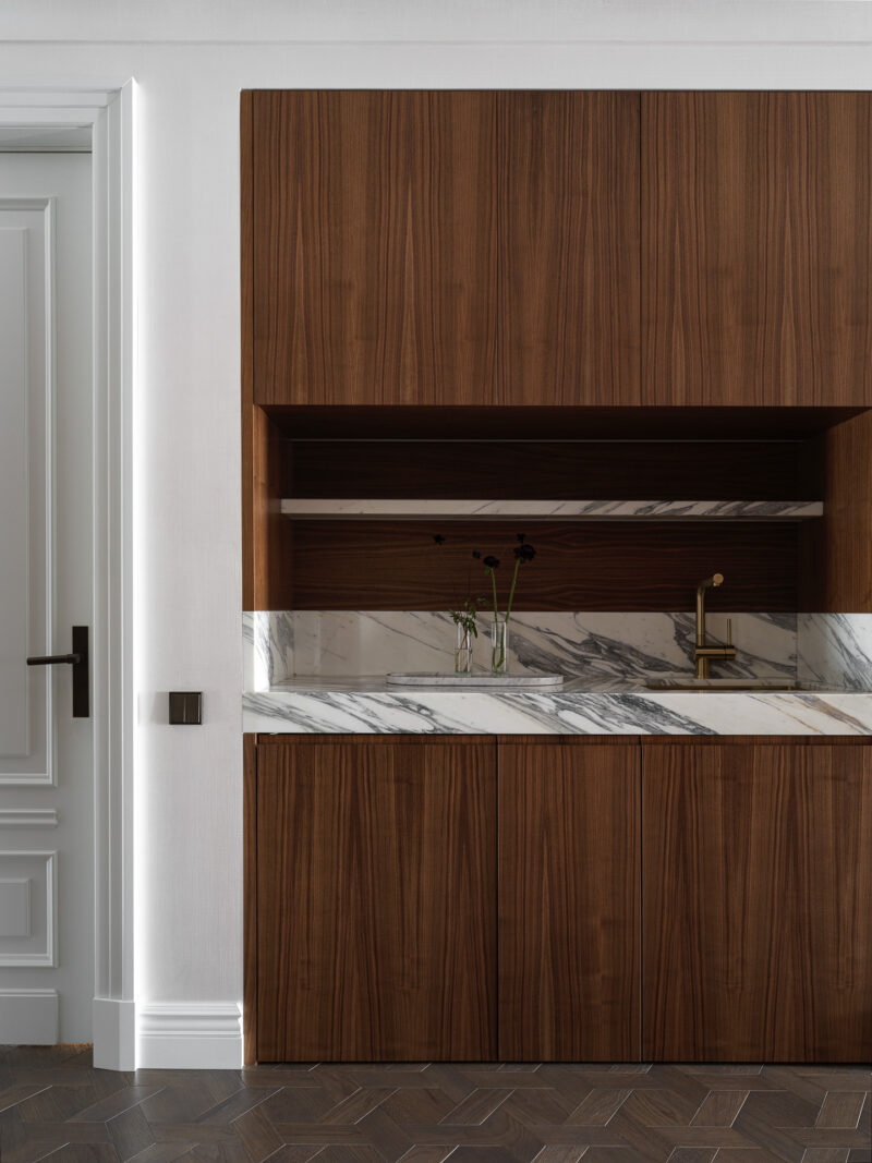
The auxiliary bar block compresses the same material logic into one bay: walnut doors above and below, an Arabescato-veined counter and backsplash band, and a niche lined in the same veneer so the marble shelf appears to float. A brushed-brass mixer is the only metal note, warm against the stone’s gray figuring. The unit sits flush within a white paneled wall, reading as furniture rather than kitchen. It is service space with the finish level of a display cabinet.
The Study That Never Got a Door
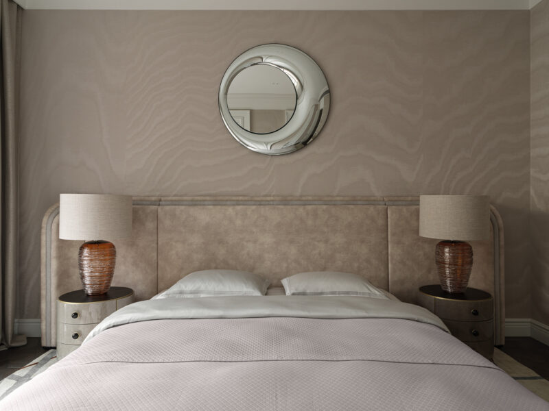
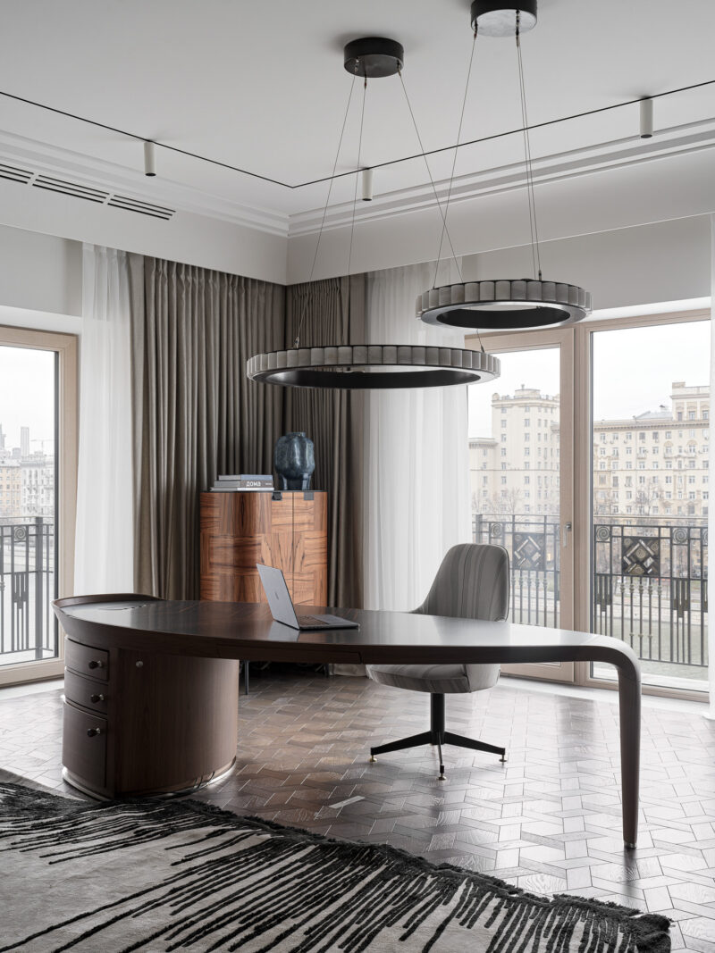
The client’s work life did not require a separate room, so the study claims the glazed corner of the social volume — arguably the best light in the apartment. The Erasmo desk by Giorgetti (designed by Massimo Scolari) faces the room, paired with the Colette desk chair by Baxter, while the expressive Tesaurus sideboard by Maxalto anchors the zone’s storage. Twin alabaster-ring chandeliers hang low to define the zone vertically, an artificial ceiling where no wall exists.
 Pin
PinPhoto: Sergey Krasyuk
The Erasmo desk’s leather-edged top and drum pedestal give the corner gravitas without bulk, and its curved silhouette suits a desk seen in the round. Corner glazing opens the workspace to the river and the Stalin-era facades opposite — borrowed monumentality as a daily backdrop. The paired ring chandeliers compress the ceiling height over the desk, carving a room out of air. Underfoot, the fringed rug and custom parquet stitch the study back into the living zone’s floorscape.
The Master Bedroom: Beige as a Discipline
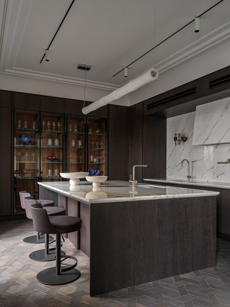
The master bedroom holds a single tonal register — beige on beige — and lets texture do the talking. The Calabria bed by Frato wraps its occupants in a broad, rounded headboard, flanked by Parma nightstands and amber spun-glass Thread lamps by Porta Romana. Walls in textured wallpaper from the Moire collection by Elitis shimmer with a watermarked grain, the Astral bamboo-fiber rug by Kelly Wearstler drifts below, and the convex Rosy mirror by Fiam Italia floats above the bed like a lens.
 Pin
PinPhoto: Sergey Krasyuk
Symmetry is total: paired lamps, paired drum nightstands, a centered mirror — a classical composition executed without a single classical molding. The moire wallpaper’s rippling figure gives the flat wall the depth of watered silk, so the monochrome never goes inert. The Rosy mirror’s dished, mercury-toned face gathers the whole room into a soft reflection, functioning as art in a space that refuses pattern. Velvet, linen, and quilted cotton keep the palette’s temperature even and the light diffuse.
The Second Bedroom: Giorgetti Craft and a Shot of Red
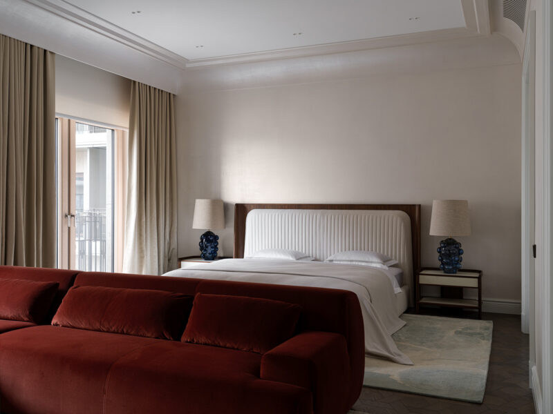
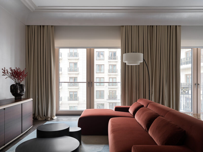
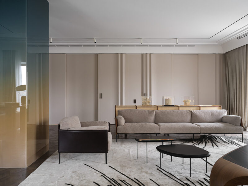
The second bedroom carries the apartment’s boldest color risk. The Hypnos bed by Giorgetti — its channel-quilted headboard framed in walnut — and the Archibald nightstand set a refined, cabinetmade tone, with the bubbled-glass Zelda table lamps by Porta Romana adding deep blue accents. Then a rust-red velvet sofa lands at the foot of the bed, and a matching sectional fills the room’s window-side lounge zone over a pale rug by The Rug Company, with a custom-made footstool completing the set.
 Pin
PinPhoto: Sergey Krasyuk
The bed’s vertical quilting and timber surround read as couture tailoring, a precision the loose-cushioned red sofa deliberately undercuts. The Zelda lamps’ blistered blue glass restates the apartment-wide blue accent at nightstand scale. Walls are kept to soft plaster and a stepped cove ceiling, so the saturated velvet carries the room alone. It is the clearest statement of the calm-yet-colorful brief: one disciplined envelope, one vivid inhabitant.
 Pin
PinPhoto: Sergey Krasyuk
In the lounge zone, the rust sectional stretches toward full-height balcony doors, its chaise angled to the view and to the arc of a double-shade floor lamp. Nesting black drum tables and a curved dark-veneer sideboard keep the supporting cast graphic and low. Champagne-toned curtains run wall to wall on concealed tracks beneath the cornice, a soft architecture standing in for walls. The pale blue-gray rug cools the red — complementary color logic applied with restraint.
A Bedroom Wrapped in High-Gloss Veneer
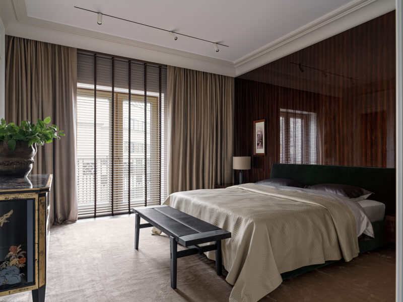
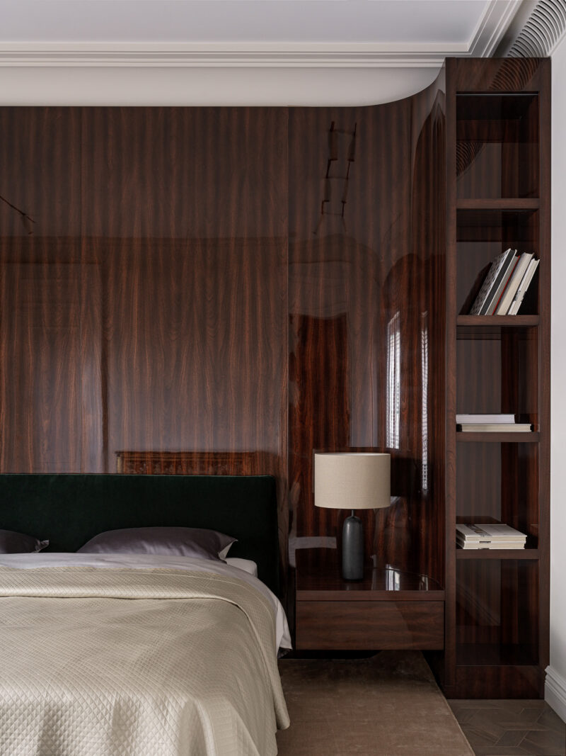
Another bedroom takes the apartment’s wood story to its most intense register: a wall of mirror-polished, flame-figured veneer curves around the bed, integrating a floating nightstand and a full-height bookshelf column in one continuous piece of cabinetry. A deep forest-green velvet headboard sinks into the dark grain, while a gilt chinoiserie chest and a black slatted bench add collected, worldly notes. Wood-slat blinds layered behind curtains filter the light into bands.
 Pin
PinPhoto: Sergey Krasyuk
Seen in full, the room balances its dark wall against a pale field of carpet, champagne drapery, and a white stepped ceiling with discreet track spots. The lacquered chest’s gold figures introduce ornament exactly where the modern envelope is plainest. Slatted blinds turn the balcony doors into a screen of horizontal shadow, an almost Japanese moment inside a classical Moscow shell. The quilted champagne bedspread bridges the beige language used elsewhere in the apartment.
 Pin
PinPhoto: Sergey Krasyuk
Up close, the veneer’s book-matched flame figure and piano-gloss finish behave like the gradient glass columns: a reflective surface that dissolves mass into light. The cabinetry curve into the shelf column is seamless joinery, with the nightstand cantilevered from the same panel run. Green velvet against red-brown gloss is a deep, saturated pairing handled at low contrast, so the room stays restful. Books and ceramics in the open shelves supply the lived-in note the brief anticipated art would bring.
A Walk-In Closet Built Like Cabinetry
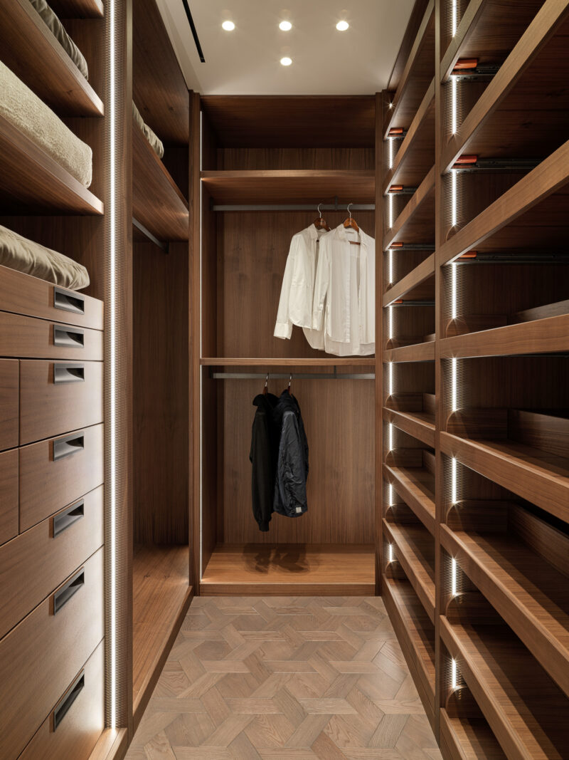
The custom-made walk-in closet treats storage as a small architectural interior rather than fitted shelving. Open walnut-toned bays with edge-lit LED strips line both walls, grading from drawers to double-height hanging, over a basket-weave parquet floor that elevates a service space to room status. Lighting comes from the Take collection pendant by Lumen Center and the Kean wall sconce by Visual Comfort & Co., layered with recessed downlights.
 Pin
PinPhoto: Sergey Krasyuk
Vertical LED seams turn each upright into a light source, washing the shelves evenly and eliminating the dead shadows that make closets feel like storage units. The open-bay strategy trades dust protection for legibility — everything visible, everything reachable. Pull-out rails and shallow drawers show a millimeter-level fit-out standard consistent with the apartment’s joinery elsewhere. The parquet’s woven pattern underfoot insists this is part of the home, not behind-the-scenes space.
Marble Geometry in the Master Bathroom
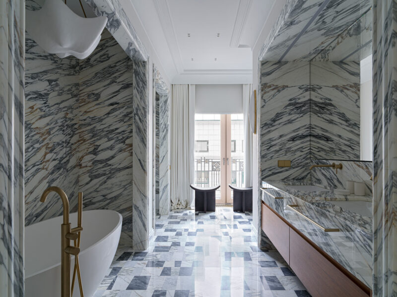
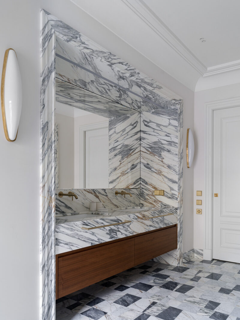
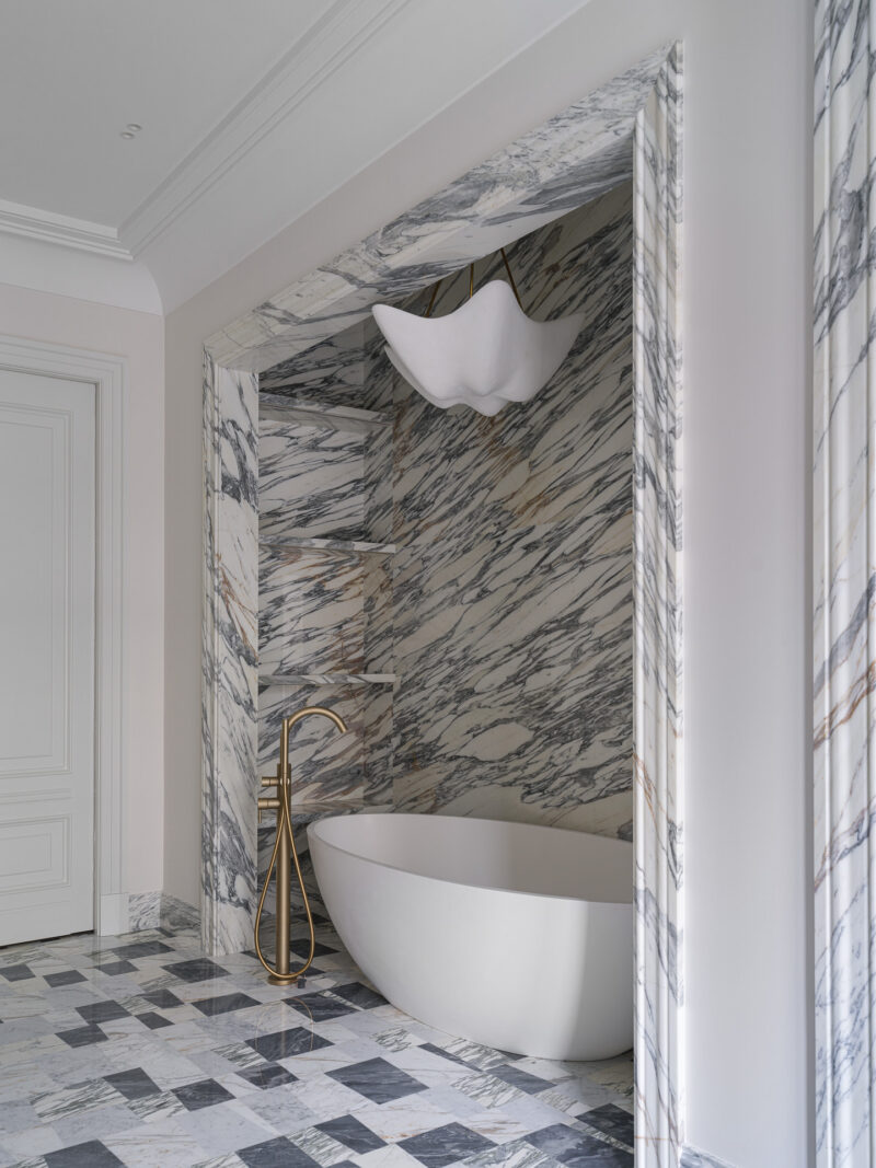
The master bathroom is the project’s thesis in stone. Floors by Lithos Design lay out a powerful geometric pattern in gray and white marble, deliberately framed by classical stucco-style profiles carved in the same Arabescato — vibrant geometry inside historicist molding, the whole apartment’s argument in one room. A sculptural freestanding bathtub by Gruppo Treesse sits in a marble-lined niche with corner display shelves, served by floor-mounted brass faucets by Cea Design, with the Cosima pendant and Ezra sconce by Visual Comfort & Co. above; a Brutus Stool by 101 Copenhagen adds a raw, primitive object to all that polish.
 Pin
PinPhoto: Sergey Krasyuk
The room reads as a marble street: tub niche to the left, twin-basin vanity to the right, and a curtained balcony door closing the axis with daylight. The floor’s interlocking gray-and-white blocks generate an almost digital pattern, while every opening is cased in carved marble architraves — modern graphics wearing classical dress. Brass fittings and rails warm the gray stone the way the gold gradient warms the living room’s glass column. Two sculptural dark stools by the window keep the long room from reading as pure corridor.
 Pin
PinPhoto: Sergey Krasyuk
The vanity bay shows the detail hierarchy clearly: a bold-figured Arabescato portal frames the niche, a mirrored back wall doubles the stone, and a walnut drawer unit floats beneath the mitered marble counter. Wall-mounted brass taps by Cea Design keep the counter clear and the plumbing invisible. Brass switch plates are composed into the wall like hardware jewelry. The carved profile edging the portal is the room’s classical signature, executed in stone rather than plaster.
 Pin
PinPhoto: Sergey Krasyuk
The Gruppo Treesse tub sits low and elliptical beneath the Cosima pendant, whose draped, fabric-like plaster form hovers over the water as a soft counterform to the hard stone. Corner shelves cut into the marble supply display and storage without a single added bracket. The Cea Design floor column with hand shower stands like a brass instrument beside the tub. Every surface in the niche is veined stone, yet the varied slab orientation keeps the pattern alive rather than wallpaper-flat.
A Small Bathroom Turned to Shadow
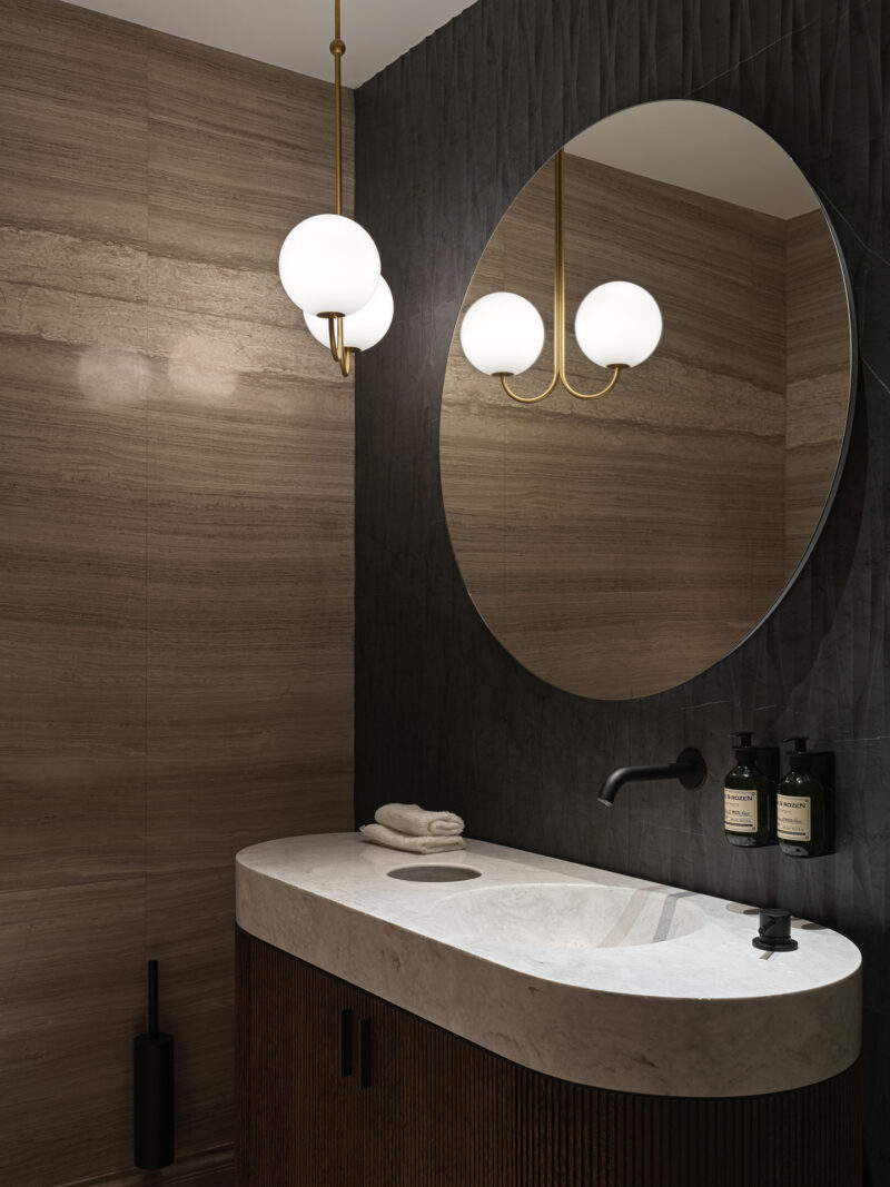
A second, more intimate bathroom inverts the master’s brightness: walls in striated, wood-toned stone meet a charcoal sculpted-relief panel behind the mirror, and the light level drops to evening. An oval stone basin with softly veined figuring rests on a fluted dark-wood vanity, with a wall-mounted black spout and a brass twin-globe pendant supplying the glamour. It is the apartment’s nocturne — the same stone-and-brass vocabulary played in a minor key.
 Pin
PinPhoto: Sergey Krasyuk
The round mirror doubles the pendant’s opal globes so the small room reads as candlelit. Horizontal striation in the stone runs like wood grain, blurring the line between the two materials the apartment loves most. Matte black fittings disappear against the dark wall, letting the pale sculpted basin carry the composition. Texture — rippled relief, fluted fronts, banded stone — replaces color entirely here, proving the palette’s range.
Where the Open Plan Pays Off — and What It Asks in Return
The Payoff of a Classical Skeleton
The project’s cohesion is its strongest achievement: with stucco profiles, cased doorways, and a custom parquet pattern establishing one continuous order, the 320 sq. m volume never fragments into a furniture showroom, even with pieces from a dozen makers. The column solution is genuinely resourceful — gradient glass converts the plan’s biggest obstruction into its most memorable object, one that changes with the light instead of fighting the openness. And the wide, minimalist cornices quietly repair the inherited window proportions, an unglamorous correction that improves every room facing the embankment.
The Price of Total Openness
Merging the study into the social core assumes work and family life will rarely collide; a call taken at the Erasmo desk is a call taken in the living room, with no door to close. The finish palette is also demanding to live with: high-gloss veneer walls, silk and bamboo-fiber rugs, and honed marble floors all show wear, water, and fingerprints faster than humbler materials, committing the owners to careful upkeep. Finally, the interior’s calm depends on curation — until the planned art arrives, some walls read as deliberately, perhaps austerely, blank.
What This Moscow Apartment Argues About Living Rooms
Special Style’s contribution here is a workable recipe for the classic-modern hybrid: let period detail form the fixed skeleton, keep the furniture contemporary and low, ration color to a single cool accent, and solve structural problems with reflection rather than disguise. It is a home built for people whose social life happens at their own table — hosts first, and only then readers, workers, and sleepers. As a model, it suits owners with the discipline to keep an open plan uncluttered. Would you give up a private, closable study to win a living room this generous — or is the door the one classical element worth keeping?
FAQs
Who designed the apartment on Kotelnicheskaya Embankment in Moscow?
The interior was designed by Special Style, the Moscow studio of Anastasia Rykova and Inna Ermakova. The project combines a classical architectural skeleton — stucco, profiled doorways, custom parquet — with contemporary furniture from makers including Minotti, Giorgetti, Living Divani, and Frato. Photography is by Sergey Krasyuk.
How big is the Kotelnicheskaya Embankment apartment?
The apartment measures 320 square meters, roughly 3,444 square feet. Most of that area is given to a single open social volume combining the living room, dining room, and study; the plan also includes a kitchen, multiple bedrooms and bathrooms, and a custom walk-in closet.
How did the designers handle the load-bearing columns in the open plan?
Two massive structural columns could not be removed, so instead of cladding them in stucco to match the walls, the designers wrapped them in gradient colored glass running from blue to sand. In changing light the columns echo the interior’s blue accents or reflect the room and visually disappear.
What style is the interior of this Moscow apartment?
It is a deliberate hybrid: a classical framework of wall stucco, baseboard profiles, doorway casings, and patterned parquet, filled with modern furniture and lighting. The palette is warm and natural, broken by a cool gray-blue accent, producing an interior the designers describe as classic yet modern, calm yet colorful.
Get gorgeous projects via email
