

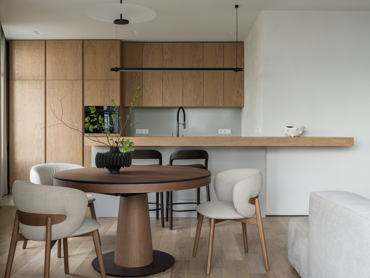
Restraint is easy to admire and hard to live in — which is what makes this minimalist Moscow apartment such a persuasive case study. Completed in 2024 for a young couple, the 110 m² home was designed by Jeanne Denisheva, with styling by Svetlana Nosova, and it stakes its argument on discipline: warm grey plaster, a tightly held oak palette, and a single tile series repeated in every wet room. What lifts the project beyond tasteful reduction is its planning intelligence. A full-height sliding partition reorganizes the apartment into public and private halves — evidence that minimalism, practiced rigorously, is a spatial strategy rather than a surface style.
| Project Name | Apartment in Moscow |
| Architect / Designer | Jeanne Denisheva (design); Svetlana Nosova (styling) |
| Location | Moscow, Russia |
| Floor Area / Land Area | 110 m² (floor area) |
| Year Completed | 2024 |
| Client Type | Private (a young couple) |
How One Sliding Wall Organizes This Minimalist Moscow Apartment
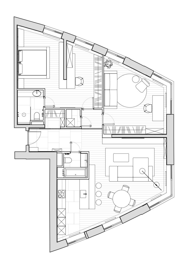
The apartment arrived from the developer as an open shell inside an awkward, non-orthogonal envelope: the floor plan tapers like a wedge, its perimeter splaying toward a glazed corner. Rather than fight the geometry, the parti (the organizing idea behind a plan) accepts it. The designer anchored the layout to two fixed conditions — the position of the wet zones and the direction of natural light — and split the wedge into a studio-like public half and a private half.
The public zone strings together the entry with its built-in wardrobe, a guest bathroom, the kitchen, dining, and living areas along the widest, brightest stretch of the plan. The private zone tucks the master bedroom, its en-suite, and a study — deliberately planned to convert into a future nursery — behind a large Rimadesio sliding partition. The partition is the project’s structural argument in miniature: one moving plane that modulates openness, privacy, and daylight without consuming floor area the way swing doors and corridors would. Materially, the same logic governs every surface. Custom millwork was produced by a single manufacturer, its oak veneer color-matched to the engineered wood flooring, so cabinetry reads as continuous wall rather than furniture. The interior elevations do what a facade would do in a freestanding building: they communicate the project’s identity through proportion and joint lines rather than ornament.
 Pin
PinThe plan drawing exposes the wedge-shaped envelope that shaped every decision in this minimalist Moscow apartment, with ribbon glazing tracing the splayed outer walls. The public sequence — entry, guest bath, kitchen, dining, living — occupies the wide southern half, while the bedroom, en-suite, and convertible study cluster in the quieter apex. Note how the sliding partition sits on the seam between the two zones, letting the studio plan borrow depth from the private side when open. It is a textbook demonstration of wet-zone-driven planning producing spatial generosity on a modest footprint.
Design Decision: The Rimadesio sliding partition does double duty: closed, it separates the private quarters from the living space; in its parked position, it becomes the concealed door of the entry wardrobe. One moving panel replaces two doors, keeping the wall plane unbroken and the entry sequence clutter-free.
Walking the Plan: From Threshold to Bath in a Single Material Language
A Threshold That Sets the Rules
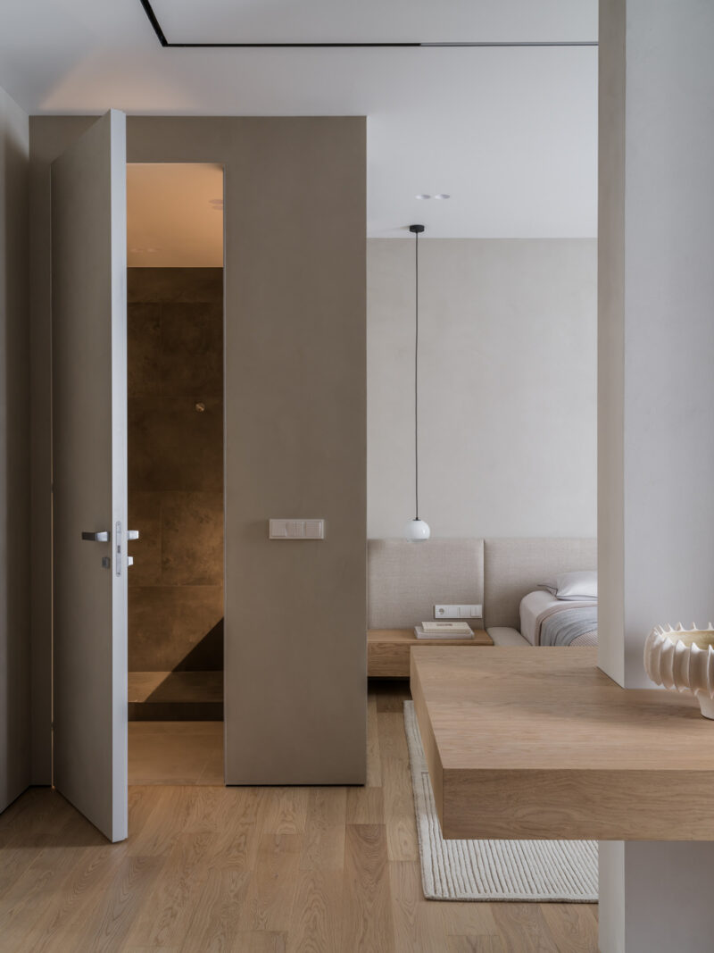
The entry establishes the project’s grammar before a single room is revealed: flush floor-to-ceiling doors, recessed baseboards, and a shift from porcelain underfoot to oak beyond. Circulation is compressed and deliberate — a short passage that meters the transition from public to private. The fenestration strategy (the placement and sizing of windows) leaves this core windowless, so the designer compensates with warm artificial light spilling from the bathroom and concealed ceiling tracks. The effect is a threshold that feels calm rather than dark, and it primes the eye for the restraint ahead.
 Pin
PinPhoto: Michael Chekalov
The view from the hallway catches a flush, full-height door swung open toward the bronze-toned bathroom, with the bedroom’s pendant and upholstered headboard beyond. Three material temperatures — greige plaster, oak flooring, and the darker tiled interior — are held in one composition without a single piece of trim negotiating between them. The absence of casings and baseboards forces millimeter-level alignment, and the payoff is legible here: planes meet as pure lines. It is the clearest single image of the project’s thesis that precision, not decoration, produces atmosphere.
Living on a Podium: The Low Room
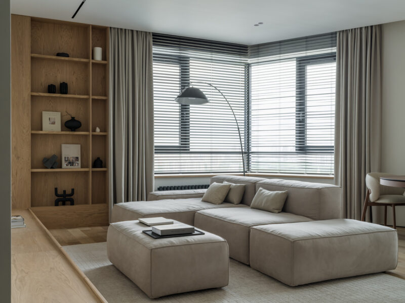
The living area sits at the glazed corner, where two window walls meet and black venetian blinds temper the exposure. A low modular sofa, an ottoman standing in for a coffee table, and a raised oak platform edging the media wall keep every horizontal line below sill height. The result is a room that defers to the view and the light. The palette is monochrome — greige upholstery, oatmeal rug, oak shelving — with contrast delivered by small black ceramics rather than color. It is a lesson in furnishing for stillness.
 Pin
PinPhoto: Michael Chekalov
The corner glazing floods the seating group with diffused daylight, filtered twice — once by the blinds, once by sheer-weight curtains — so the light lands soft and directionless. The oak platform at left doubles as a plinth and a datum line (a fixed reference height that other elements align to), tying the shelving unit to the floor plane. The blocky, low-slung sofa answers the platform’s geometry, keeping the room’s center of gravity near the floor in an almost Japanese register. The arc floor lamp is the sole diagonal in the composition, and it earns its place by pointing the eye back to the seating.
The Round Table as Counterpoint
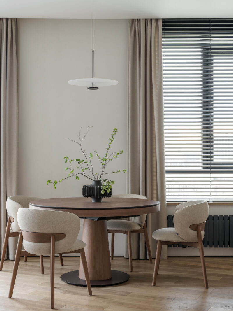
Set against the window between living room and kitchen, the dining area is the apartment’s one concession to the curve. A pedestal table in warm walnut-toned wood, ringed by rounded chairs on oak legs, breaks the orthogonal discipline that rules everywhere else. A flat disc pendant floats above at precisely the height where it reads as a horizon line. The furniture placement logic is social: a round table on a single base seats a shifting number of guests without hierarchy, which suits the brief of a home built equally for daily life and entertaining.
 Pin
PinPhoto: Michael Chekalov
The dining vignette shows how carefully the project modulates softness within a hard-lined shell: curved chair backs, a tapering pedestal, and the thin disc of the pendant against taut plaster walls. The black radiator beneath the window is left exposed and painted out as a graphic element rather than boxed away, an honest move that keeps the wall plane clean. Beige curtains and dark blinds form a layered light-control system that also softens acoustics. A single sculptural black vase supplies the composition’s necessary weight.
 Pin
PinPhoto: Michael Chekalov
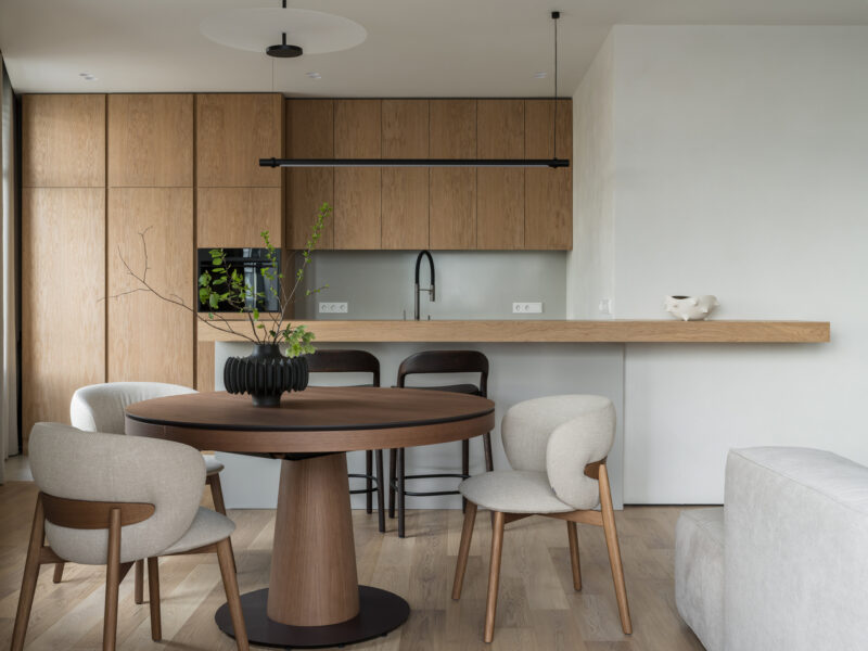
Seen in context, the dining table mediates between the sofa zone and the oak kitchen wall, occupying the pivot point of the open plan. The wide shot reveals the continuous oak counter slab running past the kitchen and dissolving into a floating shelf along the plaster wall — one member, two functions. Sightlines from the table reach the glazing in two directions, confirming that the social zones were plotted against the light. The composition demonstrates how an open plan can feel ordered when a single material datum carries the eye across programs.
Cabinetry That Reads as Wall
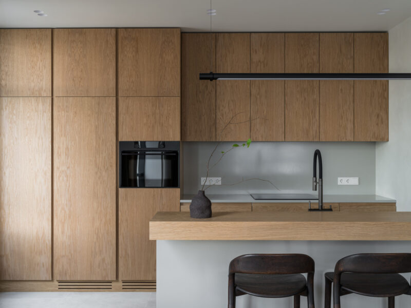
The kitchen is architecture first, appliance garage second. Full-height oak cabinetry runs to the ceiling with push-to-open fronts and no visible hardware, its veneer matched to the floor so the volume reads as a timber wall rather than fitted furniture. A grey composite backsplash and counter recede; the black built-in oven and articulated faucet function as graphic punctuation. The half-height island with its thick oak bar top orients cooking toward the room, while a horizontal black tube luminaire supplies task light without a canopy of pendants.
 Pin
PinPhoto: Michael Chekalov
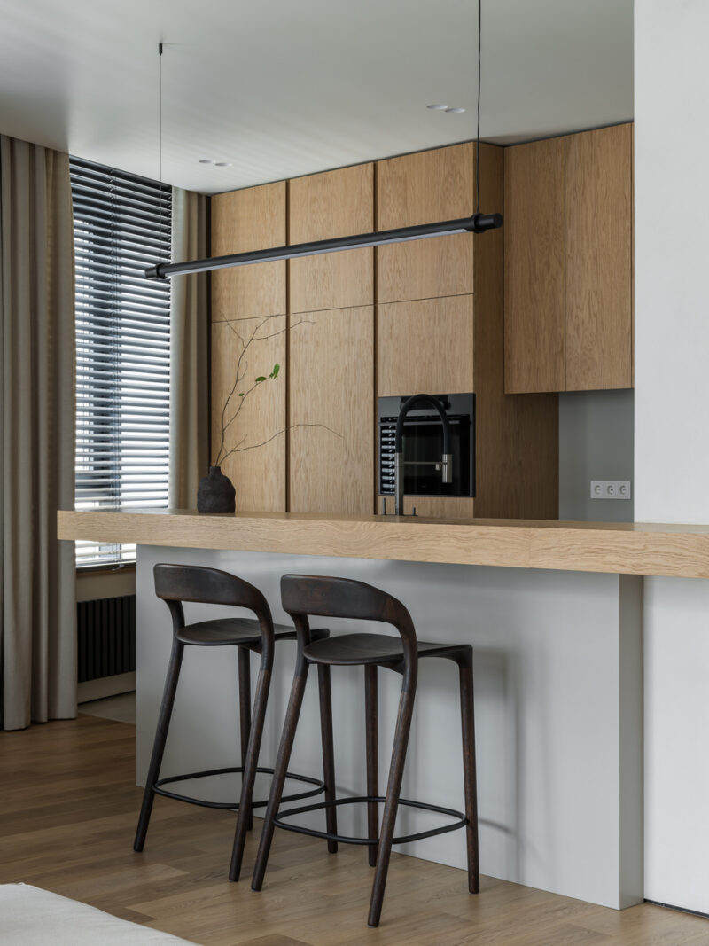
The bar side of the island shows the project’s material economy at close range: a thick oak slab cantilevering past a quiet grey base, met by two dark sculpted stools whose legs echo the black light bar overhead. Outlets are grouped and color-matched into the backsplash zone rather than scattered, a small discipline that keeps the elevation calm. The upper cabinets stop short of the side wall, allowing the plaster to breathe and preventing the timber from becoming oppressive. Every line here is either horizontal or vertical — the stools’ curves are the only exception, and they register as relief.
 Pin
PinPhoto: Michael Chekalov
The full kitchen elevation reads like a section through the project’s philosophy: one wood species, one panel module, one shadow line repeated until the wall becomes a single instrument. The integrated ventilation grilles at the plinth — barely visible slots in the oak — solve a technical requirement without breaking the composition. The grey backsplash band separates upper and lower cabinetry like a masonry joint, giving the elevation scale. This is the image that best rewards a second look: the longer you study it, the more coordination it reveals.
A Study Planned for Its Next Life
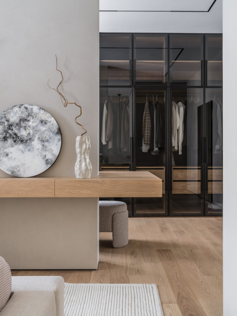
Behind the sliding partition, the study doubles as a dressing room — and is explicitly designed to become a nursery as the family grows. Smoked-glass wardrobe fronts in slim black frames display clothing like a boutique while keeping visual noise sealed behind glass. A cantilevered oak console serves as desk and vanity, paired with a boucle stool. The interior design analysis here is really a lesson in reversibility: nothing in the room’s fixed layer commits it to a single use, which is the quietest kind of long-term thinking.
 Pin
PinPhoto: Michael Chekalov
The smoked-glass wardrobe wall turns storage into a softly reflective backdrop, its black framing gridding the elevation like a curtain wall in miniature. The floating oak console bridges from the plaster partition toward the glazed units, its drawer front detailed flush so the slab reads as one extrusion. A round abstract canvas and a gnarled branch in a ceramic vessel supply the only irregular geometry, placed exactly where the eye rests. The oak flooring runs uninterrupted beneath everything, reinforcing the room’s convertibility — remove the freestanding pieces and the shell is ready for its nursery future.
The Bedroom: A Headboard That Becomes Infrastructure
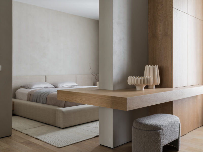
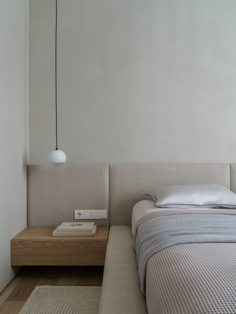
The master bedroom distills the project to plaster, linen, and oak. A wall-length upholstered headboard panel extends past the bed to absorb floating oak nightstands, switches, and outlets, turning what is usually visual clutter into a composed band of function. Lighting is deliberately minimal: a single glass globe pendant per side, dropped on a black cord, replaces table lamps. Dusty rose curtains introduce the apartment’s only whisper of color. The atmosphere supports one use — rest — and refuses to negotiate.
 Pin
PinPhoto: Michael Chekalov
The wide view shows the bedroom’s most inventive move: a thick oak work surface shooting out from the wardrobe wall and wrapping a structural column, so an unavoidable obstruction becomes the anchor of a vanity. The plaster-clad column and the timber slab form a spatial hinge between sleeping and dressing zones without a door. Ribbed ceramic vessels on the desktop repeat the vertical rhythm of the wardrobe joinery behind them. It is problem-solving disguised as composition — the kind of detail that separates planning from decorating.
 Pin
PinPhoto: Michael Chekalov
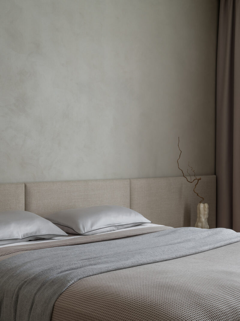
At close range, the material palette does its quiet work: hand-troweled plaster with visible cloud-like variation, woven linen headboard panels, and layered bedding that moves from crisp white to waffle-textured taupe. The black piping on the pillowcases is a single dark line in an otherwise misty field, and it sharpens everything around it. Texture, not color, carries the room. This is soft minimalism executed with enough tactility to avoid sterility.
 Pin
PinPhoto: Michael Chekalov
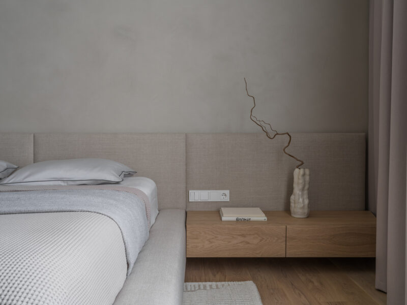
The bedside detail explains the headboard-as-infrastructure strategy: switches and outlets mount directly into the upholstered panel at hand height, while the oak nightstand floats free of the floor for easy cleaning. The globe pendant drops to exactly the height a table lamp would occupy, freeing the nightstand surface for books. Every functional requirement of a bedside — light, power, storage, surface — is present, yet nothing stands on legs. The result photographs as emptiness but performs as complete equipment.
 Pin
PinPhoto: Michael Chekalov
From the foot of the bed, the composition resolves into three horizontal bands — oak floor, linen headboard, misted plaster — interrupted only by a sculptural vase and a twisting branch. The continuous headboard panel visually widens the room by running past the mattress toward the curtain wall. Soft grey and blush textiles layer tone-on-tone, demonstrating how a monochrome scheme stays alive through weave and sheen rather than pattern. The restraint is total, and in a sleeping room, that is precisely the point.
Two Bathrooms, One Tile Series
Both bathrooms draw from a single stone-look tile series in shifting depths of grey-brown, with matching brushed fixtures throughout — a deliberate rule from the brief. The bathroom adjoining the bedroom is built around a walk-in shower washed by a concealed skylight-like light slot; the second bathroom, serving the public zone, carries a built-in tub and an integrated solid-surface washbasin. Mirror-front cabinets with under-lighting handle storage invisibly. The lighting design leans on indirect LED lines, so the stone surfaces glow rather than glare.
 Pin
PinPhoto: Michael Chekalov
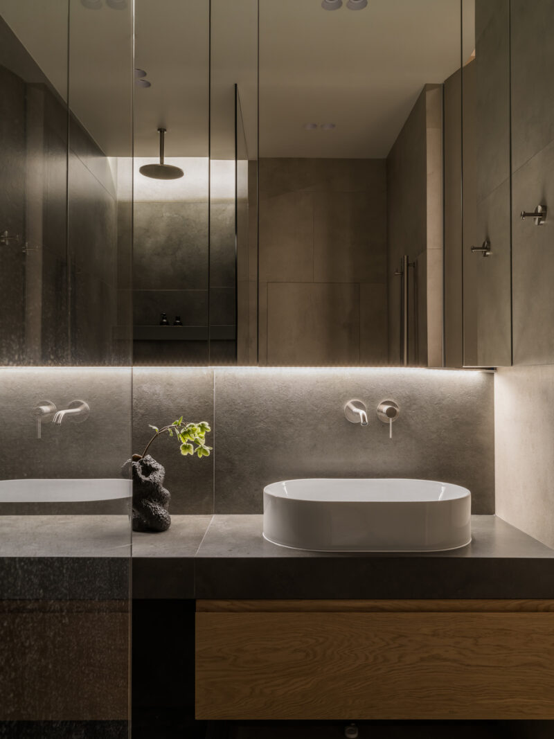
In the shower bathroom, the vanity composition stacks mirror cabinetry above a stone-look counter carrying a white oval vessel basin, with wall-mounted brushed taps keeping the deck clear. A continuous LED line beneath the cabinets grazes the tile, pulling out its mineral texture while doubling as functional face light. The oak drawer front below is the room’s single warm note, tying the wet zone back to the apartment’s flooring. Reflected in the mirrors, the ceiling-mounted rain head confirms how tightly the room’s few elements are cross-composed.
 Pin
PinPhoto: Michael Chekalov
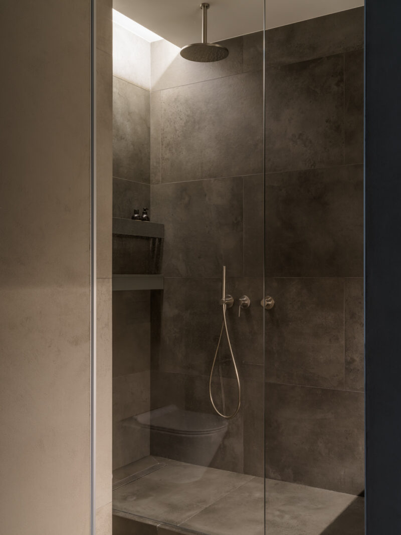
The shower enclosure is reduced to a frameless glass plane, ceiling-mounted rain head, and a recessed niche whose shelf aligns with the tile coursing. A concealed light slot above washes the wall in a vertical gradient, standing in for the daylight the room lacks. The large-format tiles minimize grout lines, letting the surface read as monolithic stone. Nothing here is decorative, yet the room has the gravity of a spa — a direct product of proportion and light placement.
 Pin
PinPhoto: Michael Chekalov
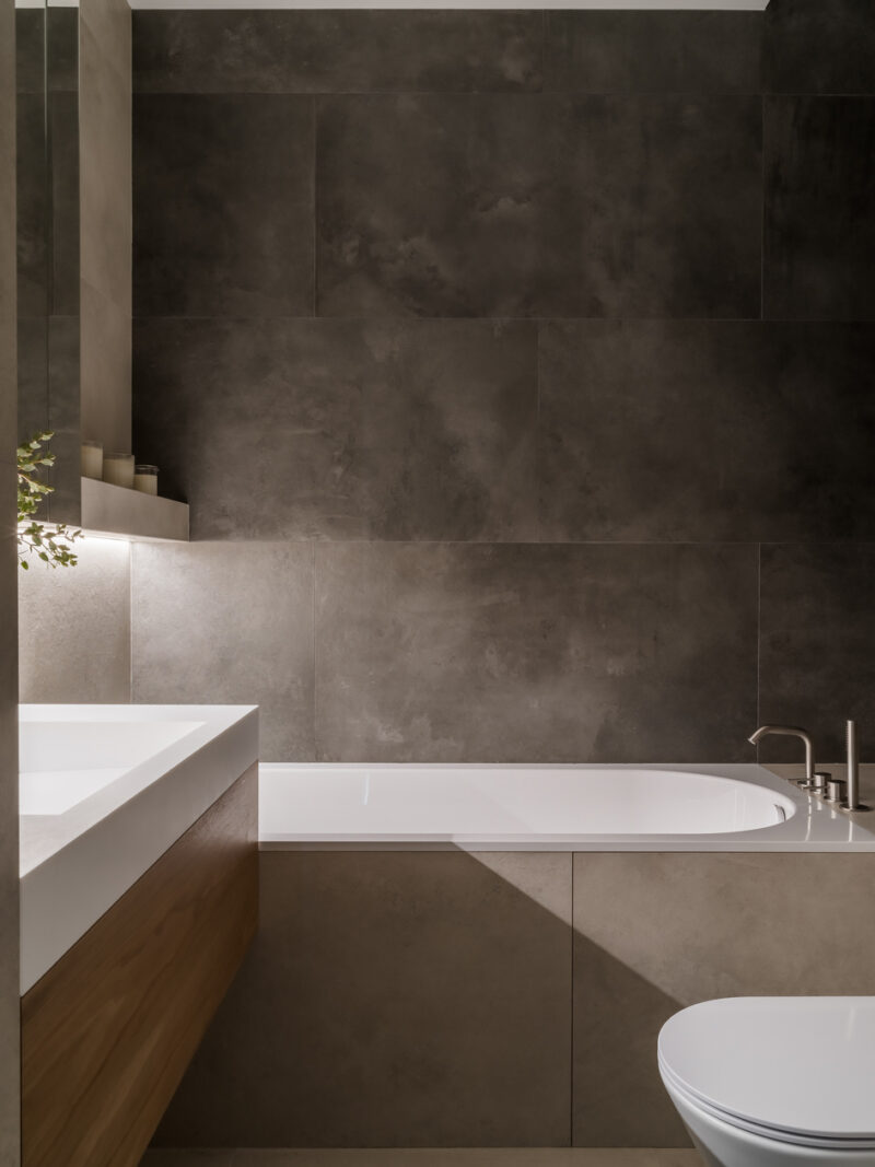
The tub bathroom shows the same tile series deployed at two tonal depths: darker cladding above, lighter panels wrapping the bath apron and floor. The built-in tub sits flush with its stone surround, deck-mounted brushed fittings clustered at one corner to keep the ledge usable. A niche shelf with candles above the vanity extends the indirect lighting strategy into ritual territory. Continuity of material between wall, apron, and floor makes a compact room read as carved rather than assembled.
 Pin
PinPhoto: Michael Chekalov
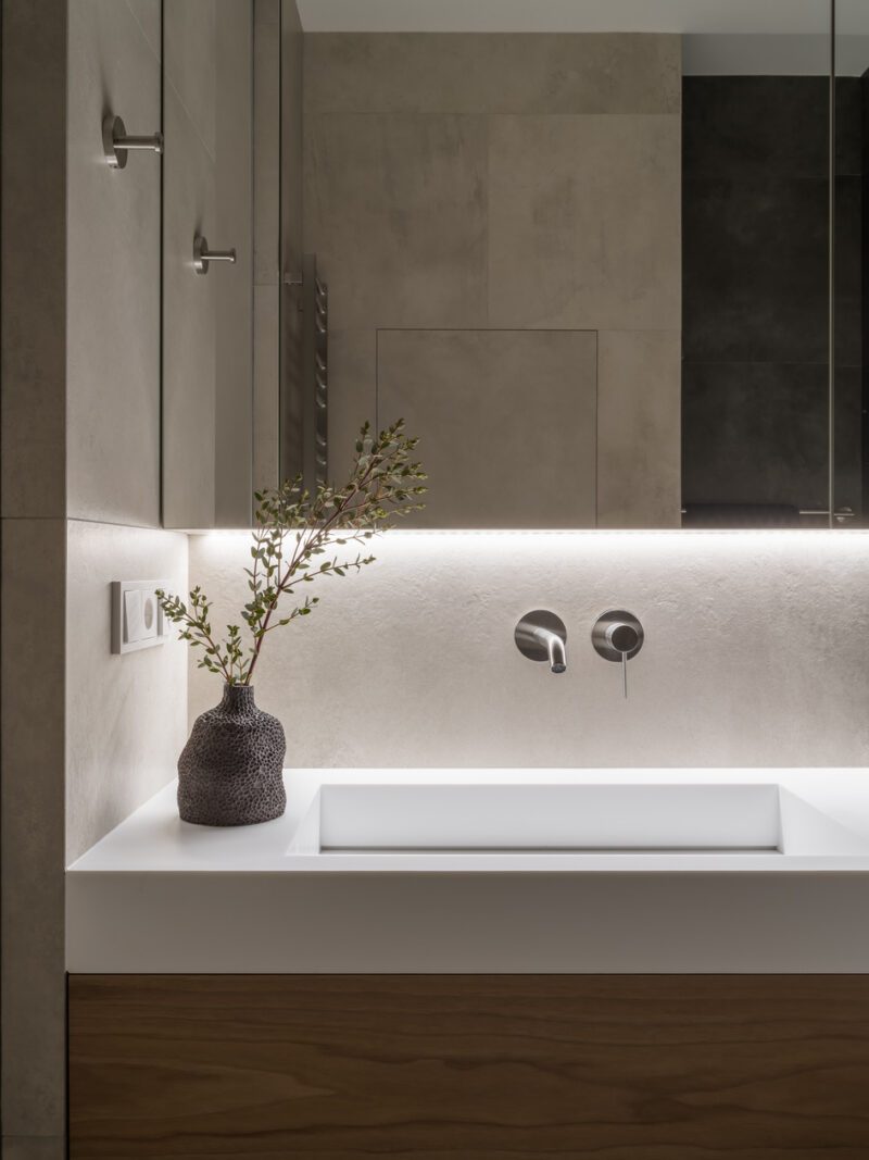
The integrated washbasin — a single solid-surface slab with the bowl formed into it — demonstrates the project’s preference for monolithic elements over assembled ones. Wall-mounted taps and a grouped switch plate keep the splash zone free of penetrations, easing both cleaning and the eye. Under-cabinet lighting again does the heavy lifting, throwing the textured plaster-look tile into gentle relief. A textured ceramic vase with eucalyptus supplies the organic counterpoint this disciplined room needs.
Where the Discipline Pays Off — and What It Asks in Return
✦ Material Continuity as Spatial Glue
The project’s strongest achievement is coherence under constraint. Matching the millwork veneer to the engineered flooring — and sourcing all built-ins from one manufacturer — makes a 110 m² plan read larger, because the eye never stops at a material seam. The sliding partition delivers genuine flexibility: an open studio for entertaining, a sealed private wing for daily life, with the wardrobe door absorbed into the same moving panel. And the lighting design is quietly excellent — indirect LED lines in the bathrooms and single low pendants in the bedroom put light on surfaces and tasks, never in the eyes.
✦ The Maintenance of Perfection
The same rigor carries costs. Flush doors, recessed baseboards, and shadow-gap detailing are unforgiving: they demand elite installation, and any future repair must meet the same tolerance or announce itself. A near-monochrome scheme leans heavily on texture and daylight; on Moscow’s darkest winter days, the grey palette will ask more of the artificial lighting than a warmer scheme would. Finally, minimal storage display means disciplined inhabitants — this interior offers few places for ordinary domestic overflow to hide, and the smoked-glass wardrobes politely expose whatever is behind them.
Why This Apartment Argues for Slower Minimalism
This project’s contribution is its insistence that minimalism is planning, not styling. The moves that matter — wet-zone-led zoning, the dual-purpose partition, a study pre-engineered for a nursery — are invisible in a mood board and decisive in daily life. As interior design, it shows how far texture, joinery precision, and light placement can carry a near-colorless palette. It is best suited to residents who prize order and stillness, and who are willing to maintain both.
Would you accept a home where one sliding wall decides the boundary between your public and private life — or is a fixed door a comfort worth keeping?
FAQs
Who designed the minimalist apartment in Moscow?
The apartment was designed by Jeanne Denisheva, with interior styling by Svetlana Nosova. Denisheva also created the artwork featured in the project, and the completed interiors were photographed by Michael Chekalov. Her portfolio is available at https://jeann.ru.
How big is the apartment and when was it completed?
The apartment measures 110 square meters of floor area and was realized in 2024. It is located in Moscow, Russia, and was designed as a private residence for a young couple who wanted a home suited to both daily living and entertaining.
What separates the living area from the private rooms?
A large Rimadesio sliding partition divides the open-plan public zone — entry, kitchen, dining, and living areas — from the private wing containing the master bedroom, en-suite bathroom, and study. The same moving panel also serves as the concealed door of the built-in entry wardrobe.
Can the layout adapt to a growing family?
Yes. The study in the private zone was deliberately designed to convert into a future nursery. Because the room’s fixed elements — flooring, wardrobes, and finishes — are use-neutral, the change requires swapping furniture rather than rebuilding, which was part of the original planning brief.
What materials define the interior?
The palette is intentionally limited: warm grey textured plaster, one dominant oak tone matched between custom millwork and engineered wood flooring, monochrome textiles, and a single stone-look tile series repeated across both bathrooms. Fixtures come from uniform collections to keep every wet room visually consistent.
Get gorgeous projects via email
