

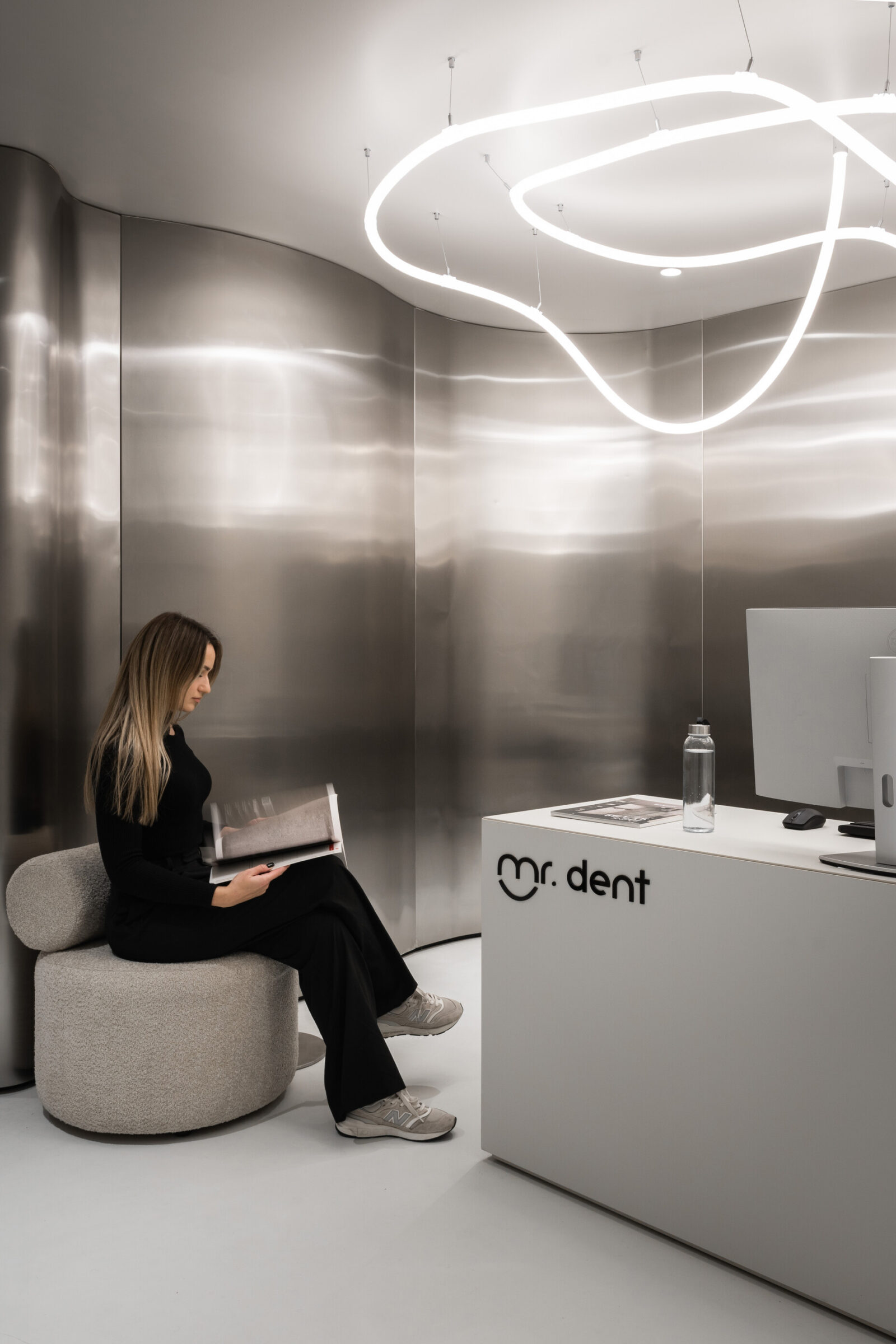
Nobody relaxes in a dental chair, and most waiting rooms make sure of it. Mr. Dent, a 110 m² clinic in Chisinau, Republic of Moldova, is built on the opposite premise. Completed in 2024 by MOOD Design Studio for a young couple of doctors who own the practice, this dental clinic design borrows its cues from spa hospitality rather than hospital protocol. A single curved wall of brushed stainless steel organizes the whole plan, boucle seating softens the metal, and daylight is treated as a clinical resource. The result argues that healthcare interiors can calm patients before a word is spoken.
| Project Name | Dental Clinic Mr. Dent |
| Architect / Designer | MOOD Design Studio |
| Location | Chisinau, Republic of Moldova |
| Floor Area | 110 m² (approx. 1,184 sq ft) gross built area |
| Year Completed | 2024 |
| Client Type | Private — clinic owners (a young couple of doctors) |
How One Curved Steel Wall Rethinks Dental Clinic Design
The brief carried a contradiction. The owners wanted the serenity of a spa, but a working clinic must hold technical rooms, sterilization, a restroom, and a lounge inside a long, narrow 110 m² footprint. MOOD Design Studio’s answer is a parti (the organizing idea of a plan) built around one sculptural gesture: a curved stainless steel partition that sweeps through the space, wrapping the service core while leaving circulation open and continuous.
The wall works twice. Functionally, it divides technical rooms, restroom, and lounge without resorting to a corridor of closed doors; spatially, its reflective, softly bowed surface keeps light and movement flowing around it, so a small plan reads as fluid rather than partitioned. The material expression carries the brand identity that a street facade would normally announce: brushed steel, a neutral beige-and-gray field, and black accents reserved for navigation signs, door handles, and recessed light fittings. Stainless steel and MDF furniture were chosen for longevity and easy cleaning, and self-leveling floors run as one seamless surface — a specification that satisfies medical rigor while quietly serving the minimalist aesthetic.
 Pin
Photo: Oleg Bajura
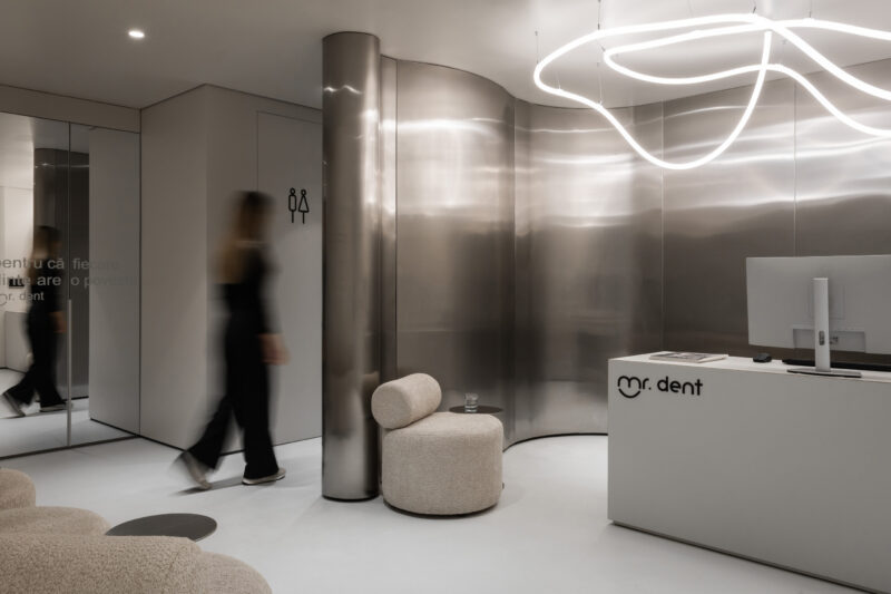
The signature view compresses the whole argument into one frame. The steel partition curves from a freestanding column past the reception desk, its brushed surface smearing the glow of the looping tubular chandelier into soft horizontal bands. Black elements — the restroom pictogram, the lowercase mr. dent logotype, the slim side table — do the wayfinding against an otherwise wordless palette. A single boucle chair tucked into the curve shows the interior-design counterweight: one tactile, warm object against an expanse of cool metal. The composition demonstrates how zoning, branding, and atmosphere are handled by a single architectural element.
Design Decision: The treatment rooms, not the waiting area, claim the entire window line. Patients wait in the deep, artificially lit zone while daylight is reserved for clinical work — then borrowed back through full-height glass partitions, so the corridor is brightened by the very rooms patients fear.
 Pin
Photo: Oleg Bajura
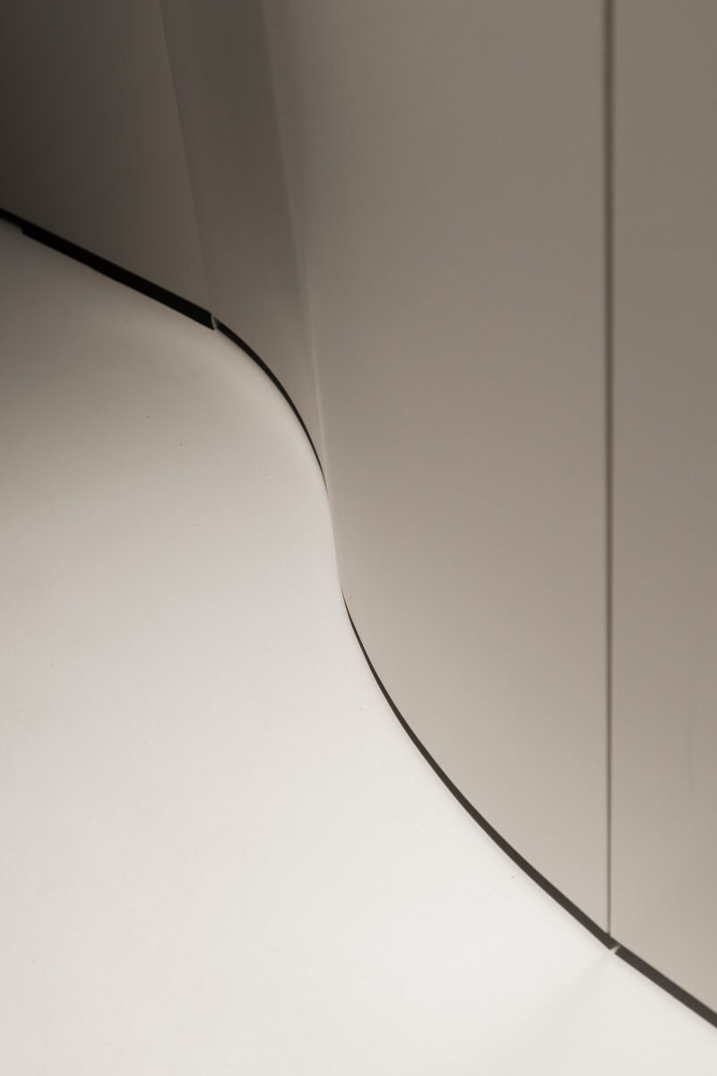
A close crop reveals the craft that makes the concept credible. Where the curved wall meets the self-leveling floor, a recessed black shadow gap (a deliberate reveal joint separating two planes) runs continuously, so the wall appears to hover rather than sit. The detail eliminates the baseboard — a small hygiene and cleaning advantage in a clinic — while sharpening the geometry of the curve. It is the kind of junction that costs coordination on site and pays back every day in visual precision.
Inside the 110 m² Plan: A Room-by-Room Walkthrough
Arrival: A Reception Wrapped in Brushed Steel
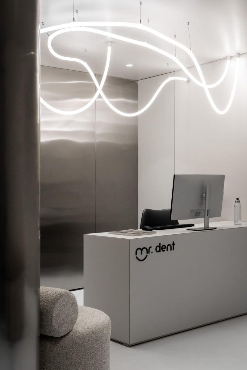
Entry lands the patient directly in the clinic’s most theatrical moment. The reception desk is a plain white monolith set against the steel curve, lit by a freeform tubular LED chandelier that loops overhead like a drawn line. The metal wall reflects both the light and the movement of staff, giving a compact lobby a sense of depth and quiet animation.
 Pin
Photo: Oleg Bajura
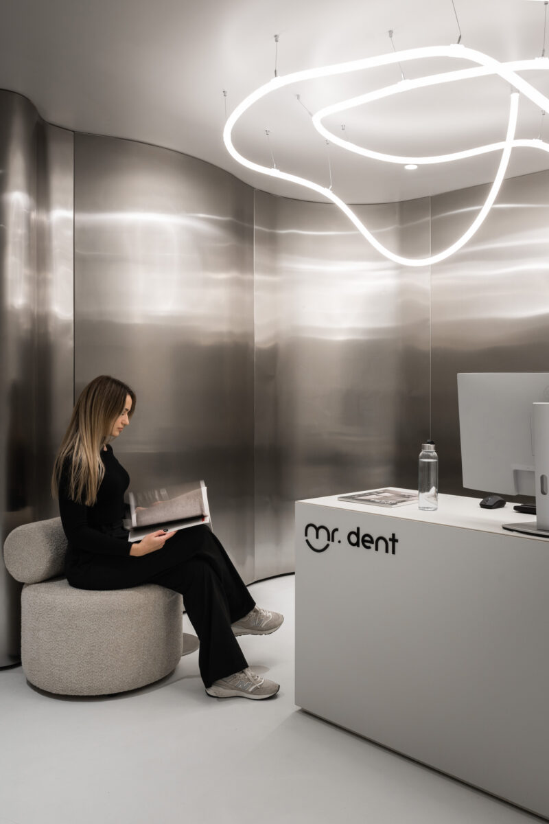
With a patient seated, the scale of the design snaps into focus. The boucle chair holds its own against the steel backdrop, its cylindrical bolster echoing the curvature of the wall behind it. The chandelier’s looping tube hovers low enough to define an intimate ceiling plane over the waiting zone without physically enclosing it. Note the restraint of the desk: a monitor, a magazine, a water bottle — the design depends on this discipline, and the clinic evidently practices it.
 Pin
Photo: Oleg Bajura
Seen from the entry axis, the reception volume reads as furniture-scale architecture: crisp edges, a thin countertop shadow line, and the logotype applied directly to the face. The chandelier’s cursive geometry deliberately breaks the orthogonal calm — it is the one element allowed to be playful, and it recalls the looping ‘m’ of the brand mark. Behind it, the steel wall turns the corner and disappears toward the corridor, pulling the eye deeper into the plan. Lighting, branding, and circulation are choreographed as one continuous experience.
The Waiting Lounge: Boucle Against Metal
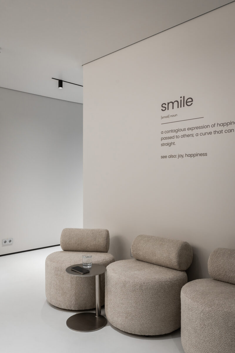
The lounge occupies the deep zone of the plan, where the palette does its psychological work. Warm beige boucle, satin steel side tables, and dictionary-style wall typography replace the laminated posters and rolling TV news of a conventional clinic. Artificial light is layered — the chandelier, discreet track spots, and a halo-lit mirror — so the windowless position never reads as dim.
 Pin
Photo: Oleg Bajura
Three rounded boucle chairs line the wall beneath a wall-applied dictionary entry for ‘smile’ — a gentle piece of copywriting that does the emotional labor of decoration. The chairs’ plump geometry is the tactile opposite of dental instruments, a deliberate sensory counter-narrative. A pedestal side table in brushed steel keeps the material story consistent at accessory scale. The vignette shows how tightly graphic design, furniture selection, and spatial planning are integrated.
 Pin
Photo: Oleg Bajura
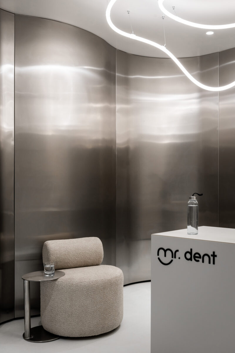
At close range the steel wall behaves almost like water: vertical panel seams nearly vanish, and the brushed grain stretches reflections into horizontal light bands. The chair and its steel side table form a self-contained still life within the curve, positioned where the wall’s geometry naturally shelters a seated person. This is spatial hierarchy built without partitions — the curvature alone signals ‘pause here.’ The floor’s seamless pour lets the entire composition read as one continuous surface.
 Pin
Photo: Oleg Bajura
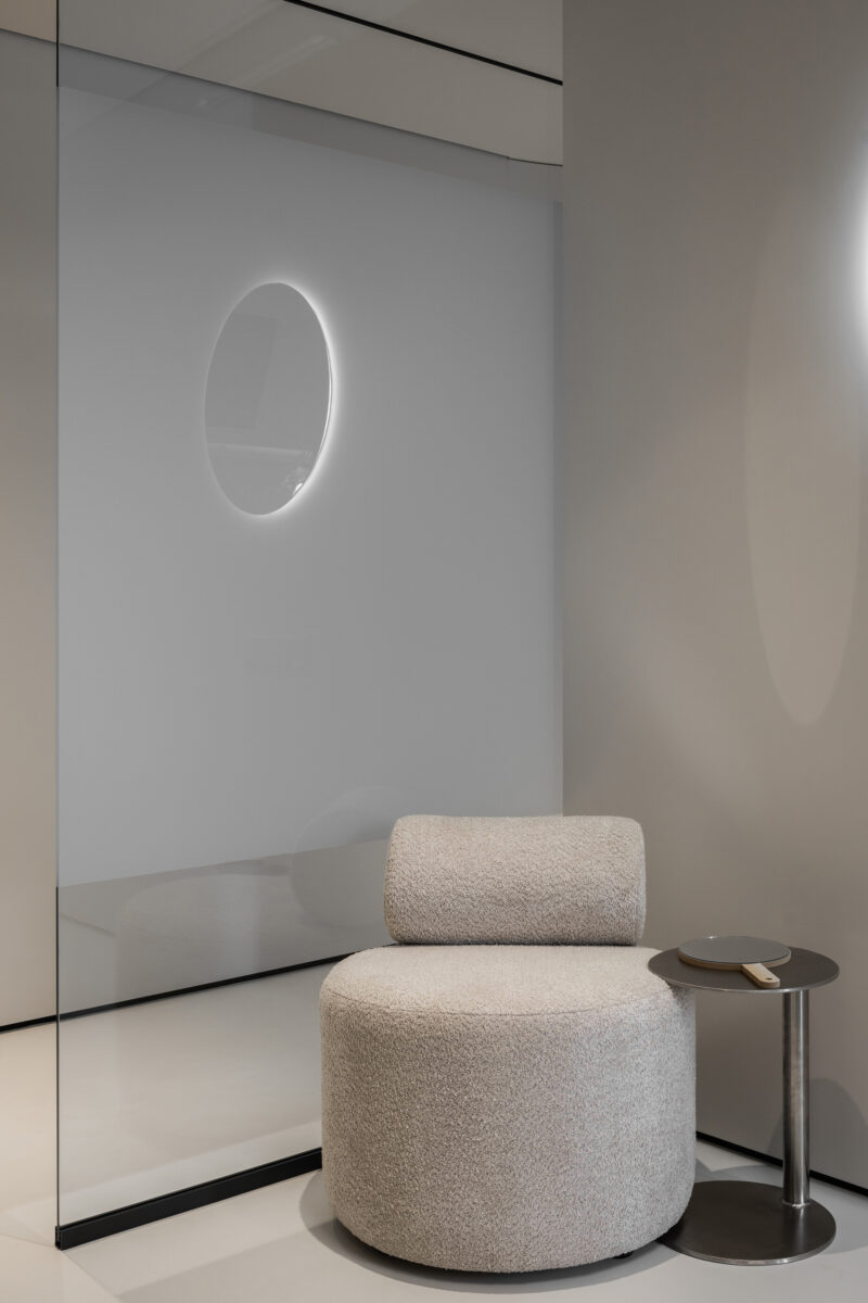
A round mirror with a halo of concealed backlighting floats on a frosted glass panel, accompanied by a hand mirror resting on the side table — a quiet acknowledgment that patients check their smile before and after treatment. The frosted band diffuses the treatment room beyond into a soft glow, delivering borrowed light without exposure. Every object in the frame is circular or cylindrical, reinforcing the project’s language of soft geometry. It is interior design working at the scale of a patient’s small rituals.
 Pin
Photo: Oleg Bajura
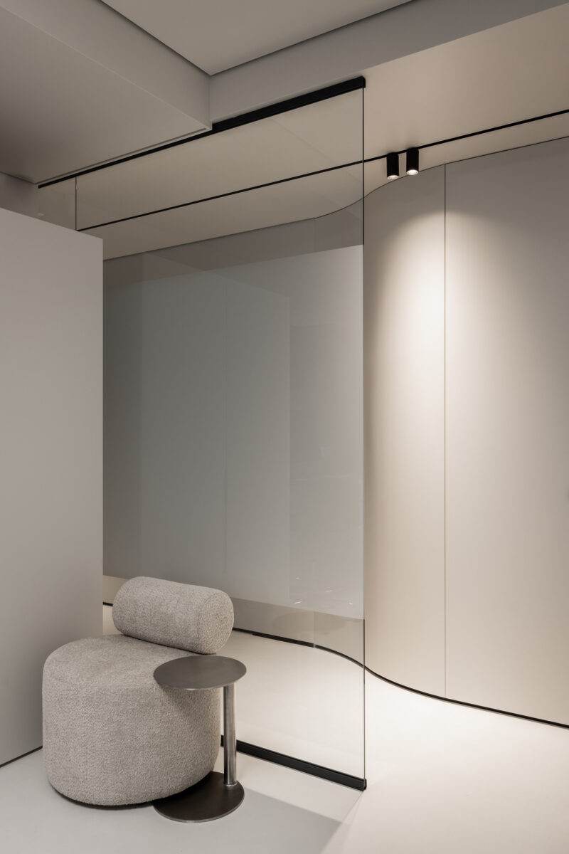
Here the junction between glass, curved joinery, and ceiling is laid bare. Twin black cylinder spots on a surface-mounted track graze the cabinetry wall, exaggerating its curvature with a raking wash of light. The glass partition is trimmed in slim black steel that picks up the clinic’s accent language, while the shadow-gap reveal continues uninterrupted beneath the curve. The photograph reads almost as a construction detail — evidence of how much coordination sits behind the apparent simplicity.
The Corridor: A Ribbon of Curved Wall and Glass
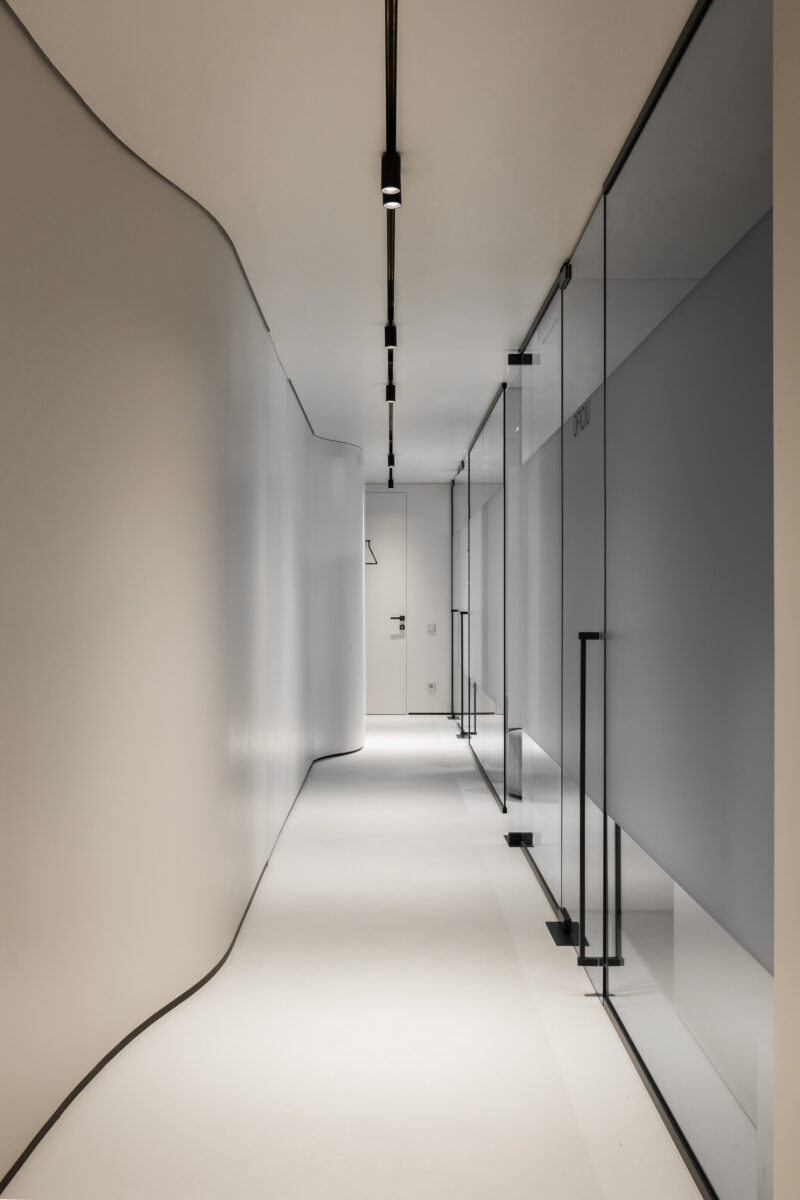
Circulation is where the daylight strategy becomes visible. The corridor runs between the undulating storage wall and a line of full-height glazed partitions fronting the treatment rooms, so sunlight from the window-adjacent clinical spaces washes into the route. A single black track of adjustable spots stitches the ceiling, keeping the fifth surface as calm as the walls.
 Pin
Photo: Oleg Bajura
The corridor demonstrates the plan’s fenestration logic (the placement and sizing of glazed openings) at interior scale: glass partitions act as internal windows, carrying daylight from the medical rooms into the circulation spine. Frosted midbands screen patients in the chairs while leaving clear glass above and below, so the eye still reads depth and brightness. The curved wall opposite conceals storage and services behind flush, handle-free panels. Room lettering applied directly to the glass keeps wayfinding weightless.
 Pin
Photo: Oleg Bajura
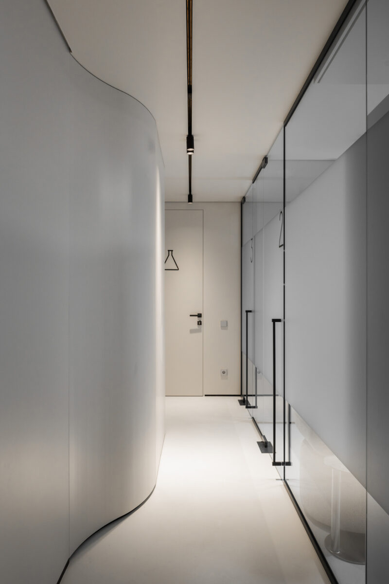
Looking down the corridor, numbered treatment rooms pass on the right before the axis terminates at a door marked with a wireframe flask — the sterilization and technical zone. The black line-drawn pictograms function as the clinic’s entire signage system, consistent with the door handles and track lighting. Vertical black pull bars on the sliding glass panels give the hand a clear target without interrupting transparency. The sequence shows how a strip plan can feel processional rather than institutional.
Treatment Rooms: Daylit, Steel-Lined, and Softly Witty
The three treatment rooms occupy the window line, so clinical work happens in the best light the building offers. White dental units stand against pale walls annotated with tongue-in-cheek dictionary definitions — ‘dentist,’ ‘surgeon’ — that give nervous patients something to smile at from the chair. The working wall in each room is a run of stainless steel and white cabinetry detailed more like a designer kitchen than a surgery.
 Pin
Photo: Oleg Bajura
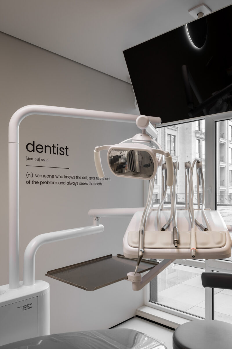
The dental unit sits directly beside a full-height window, confirming the plan’s central trade: clinical rooms get the daylight. The ‘dentist’ definition on the wall — ‘someone who knows the drill, gets to the root of the problem’ — injects humor precisely where anxiety peaks. Equipment, wall, and ceiling-mounted screen are all specified in white or black, so nothing visually competes with the view or the work. The room proves the spa concept survives contact with real dental hardware.
 Pin
Photo: Oleg Bajura
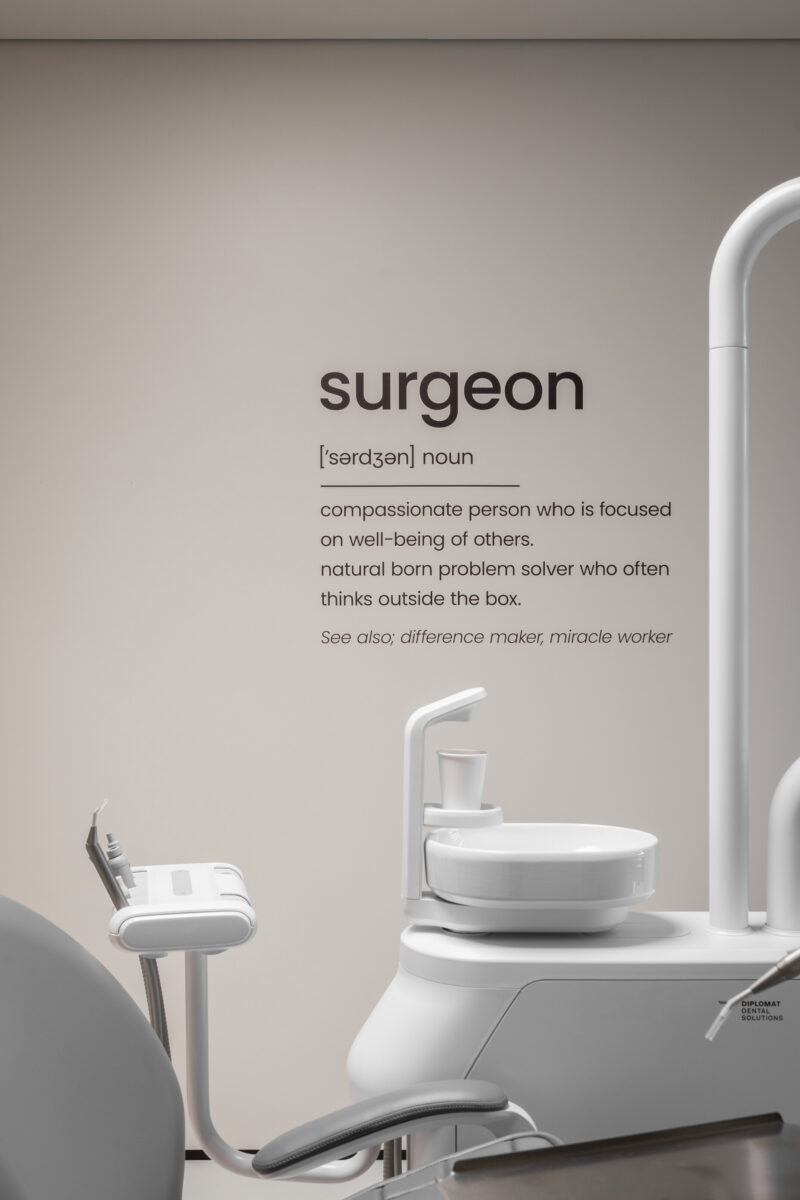
In the surgical room, the equipment itself becomes the sculpture: an all-white dental unit with its cantilevered arms and porcelain spittoon reads against the wall like a product photograph. The ‘surgeon’ definition above — ‘compassionate person focused on the well-being of others’ — reframes the most intimidating room in the clinic in humane terms. Warm gray walls keep contrast low and pupils relaxed. The styling shows an editorial confidence unusual in healthcare fit-outs.
 Pin
Photo: Oleg Bajura
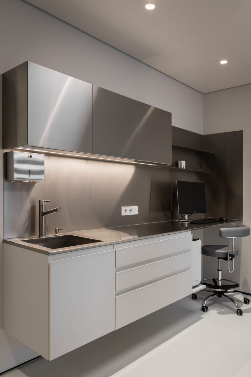
The working wall pairs brushed stainless uppers and backsplash with matte white drawer banks below, washed by a continuous linear LED under the cabinets. Stainless steel here is both regulation and rhetoric: it meets medical cleaning demands while restating the material of the reception’s signature wall. A wall-mounted monitor and adjustable stool keep the floor clear for the mobile equipment a clinic actually needs. It is the project’s clearest proof that durability and aesthetics were specified as one decision.
 Pin
Photo: Oleg Bajura
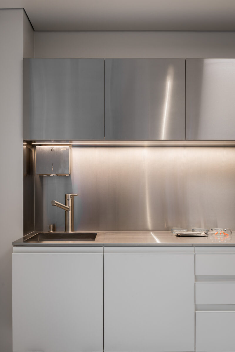
Up close, the cabinetry detailing rewards inspection: doors align on hairline gaps, the backsplash returns into a shadowed niche, and the LED strip sits fully concealed behind the cabinet edge. Petri dishes and safety glasses on the counter are the only clues this is a surgery rather than a chef’s kitchen. The steel’s directional grain runs consistently across every panel, a fabrication discipline that reads subliminally as competence. In a medical setting, that perception of precision is itself a form of patient reassurance.
The Restroom: A Monolith in Warm Gray
 Pin
Photo: Oleg Bajura
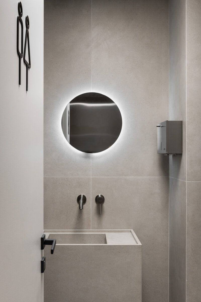
The restroom compresses the clinic’s language into two square meters. Large-format porcelain tile in a warm concrete tone wraps the walls and forms the freestanding washbasin as a single monolithic block, with grout lines aligned across planes. A circular mirror hovers on a corona of concealed backlight — the same halo motif used in the lounge — while gunmetal wall-mounted taps keep the fitting count minimal. Even the paper dispenser is stainless, holding the material line in the least glamorous room of the plan.
Reading the Plan: One Line of Rooms, One Curve of Wall
 Pin
Photo: Oleg Bajura
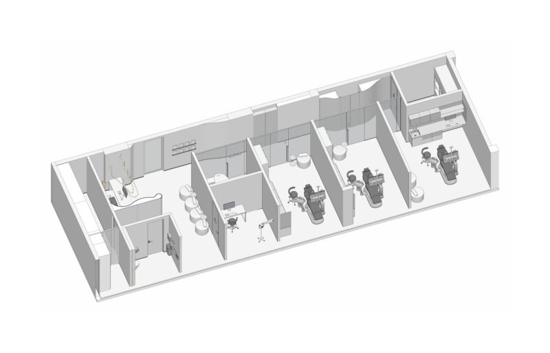
The axonometric drawing exposes the strip-plan logic the photographs only imply. Reception and the lounge anchor one end, followed by the office and three identical treatment rooms ranged along the window facade, with sterilization and services at the far end. The curved wall and glazed partitions read clearly as the two devices that keep this linear diagram from feeling like a row of cells. Seen in drawing form, the project’s efficiency is striking: nothing in 110 m² is circulation for circulation’s sake.
Where the Calm Holds — and Where the Steel Might Test It
Zoning Without Doors: The Payoff of the Curve
The plan extracts remarkable clarity from 110 m². The curved partition zones lounge, services, and circulation without a single unnecessary door, so a small clinic feels open rather than compartmentalized. The daylight strategy is equally disciplined: treatment rooms hold the window line, and glazed partitions with frosted midbands relay that light to the corridor and waiting area — privacy and brightness handled in one detail. Materially, the specification does double duty; stainless steel, MDF joinery, and seamless self-leveling floors satisfy medical durability while the boucle seating and halo-lit mirrors supply the tactile warmth that makes the spa comparison believable.
The Maintenance Bill for a Mirror-Soft Finish
The same choices carry real costs. Brushed stainless at hand height is a fingerprint archive; in a high-touch clinic, keeping that signature wall pristine is a daily commitment, not a one-time purchase. The material palette is also acoustically live — steel, glass, and poured floors reflect sound, and glazed partitions isolate less noise than solid walls, so the whine of a handpiece may travel further than the calm imagery suggests. Finally, the minimalism is only as strong as the housekeeping: a design with no visual tolerance for clutter asks the staff to curate every countertop, forever.
A Quiet Argument for Hospitality in Healthcare
Mr. Dent’s contribution is not a new typology but a persuasive recalibration: it treats patient anxiety as a design constraint equal to sterilization or equipment clearances. Architecturally, one curved wall organizes an entire clinic; in interior terms, boucle, halo light, and dictionary humor convert a feared visit into something closer to a boutique appointment. The model suits owner-operated practices willing to maintain exacting finishes in exchange for a brand patients remember — and recommend.
Would you feel calmer surrounded by warm boucle and brushed steel, or does a dental clinic earn your trust precisely by looking unapologetically clinical?
FAQs
Who designed the Mr. Dent dental clinic in Chisinau?
Mr. Dent was designed by MOOD Design Studio, based in Chisinau, Republic of Moldova, and completed in 2024. The clinic was commissioned by its owners, a young couple of doctors who wanted a calm, spa-like alternative to the typical sterile medical environment. Photography of the finished space is by Oleg Bajura.
How big is the Mr. Dent dental clinic?
The clinic occupies a gross built area of 110 square meters (roughly 1,184 square feet) in Chisinau. Within that footprint, the plan fits a reception and waiting lounge, an office, three glazed treatment rooms along the window line, a sterilization and technical zone, and a restroom.
What materials were used in the Mr. Dent clinic and why?
The palette centers on stainless steel and MDF furniture, chosen for longevity and easy maintenance in a medical setting, with seamless self-leveling floors for a clean, continuous surface. Neutral beige and gray tones are accented in black at handles, signage, and lighting, while boucle seating adds tactile warmth.
How does the clinic’s design maximize natural light?
The medical rooms are deliberately positioned along the windows so daylight pours into the workspaces. Full-height glazed partitions then carry that light onward into the corridor and waiting areas, keeping the deeper zones of the plan bright and connected to the outside despite the building’s narrow footprint.
What makes Mr. Dent feel spa-like instead of clinical?
A curved, reflective stainless steel wall replaces closed corridors, muted beige-gray tones avoid visual overload, and soft boucle chairs, halo-lit mirrors, and playful dictionary-style wall graphics reframe the experience. Every element was chosen so patients feel relaxed and at ease rather than processed through a sterile facility.
Get gorgeous projects via email
