

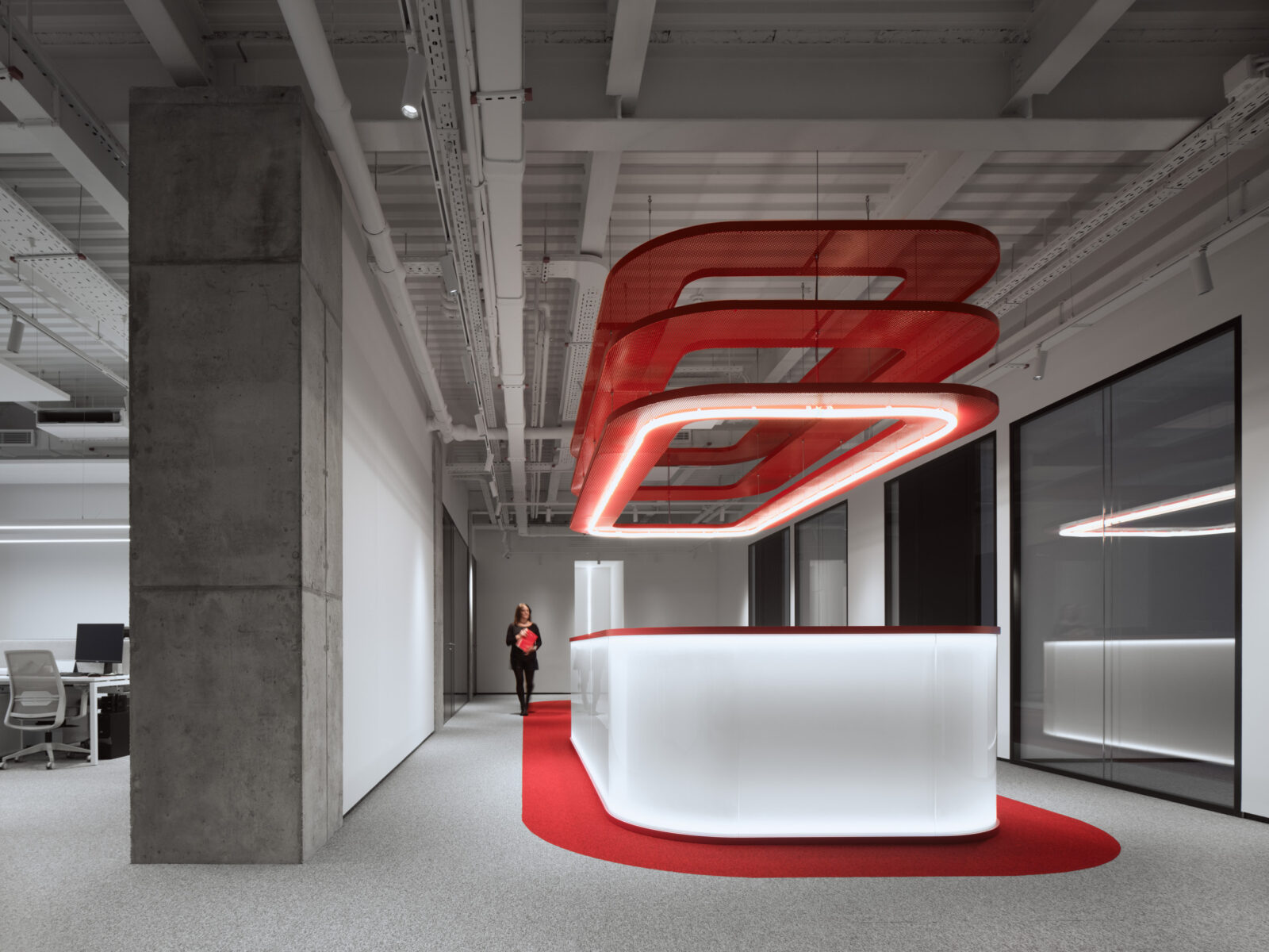
When a leading electrical equipment manufacturer moves into a former Bolshevik factory, the architecture must do more than occupy space — it must embody the company’s identity. Nefa Architects transformed a mid-20th-century industrial building on Moscow’s Leningradsky Prospekt into the 2,300m² DKC headquarters, with lighting design by QPRO. The project preserves the raw spatial generosity of its factory bones while introducing a lighting vocabulary drawn from the client’s own product catalog — a move that turns corporate infrastructure into spatial poetry.
| Project Name | DKC Office |
| Architect / Designer | Nefa Architects (Project Authors: Dmitry Ovcharov, Elena Mertsalova, Irina Zaitseva; Lead Architect: Svetlana Dudina; Head Architect: Vasilina Pavlova; Project Architect: Tatyana Kargina) |
| Location | Moscow, Russia (Leningradsky Prospekt, 15, building 20) |
| Floor Area / Land Area | 2,300 m² (total floor area) |
| Year Completed | 2024 |
| Client Type | Corporate — DKC, leader in engineering electrical equipment in Russia |
| Lighting Design | QPRO |
| Photographer | Maxim Loskutov |
| Structural Context | Mid-20th-century building on the historic Bolshevik factory territory (est. 1884) |
Preserving Factory Scale While Humanizing the Workspace: The DKC Lighting Strategy
The architects faced a familiar post-industrial challenge: a mid-20th-century factory shell with generous ceiling heights and exposed infrastructure, now tasked with housing a modern engineering headquarters. Rather than conceal the building’s structural logic, Nefa Architects treated the existing concrete and steel as a spatial asset. The design strategy centered on maintaining visual cleanliness, air, and dynamism while inserting functional lighting elements that double as brand expression.
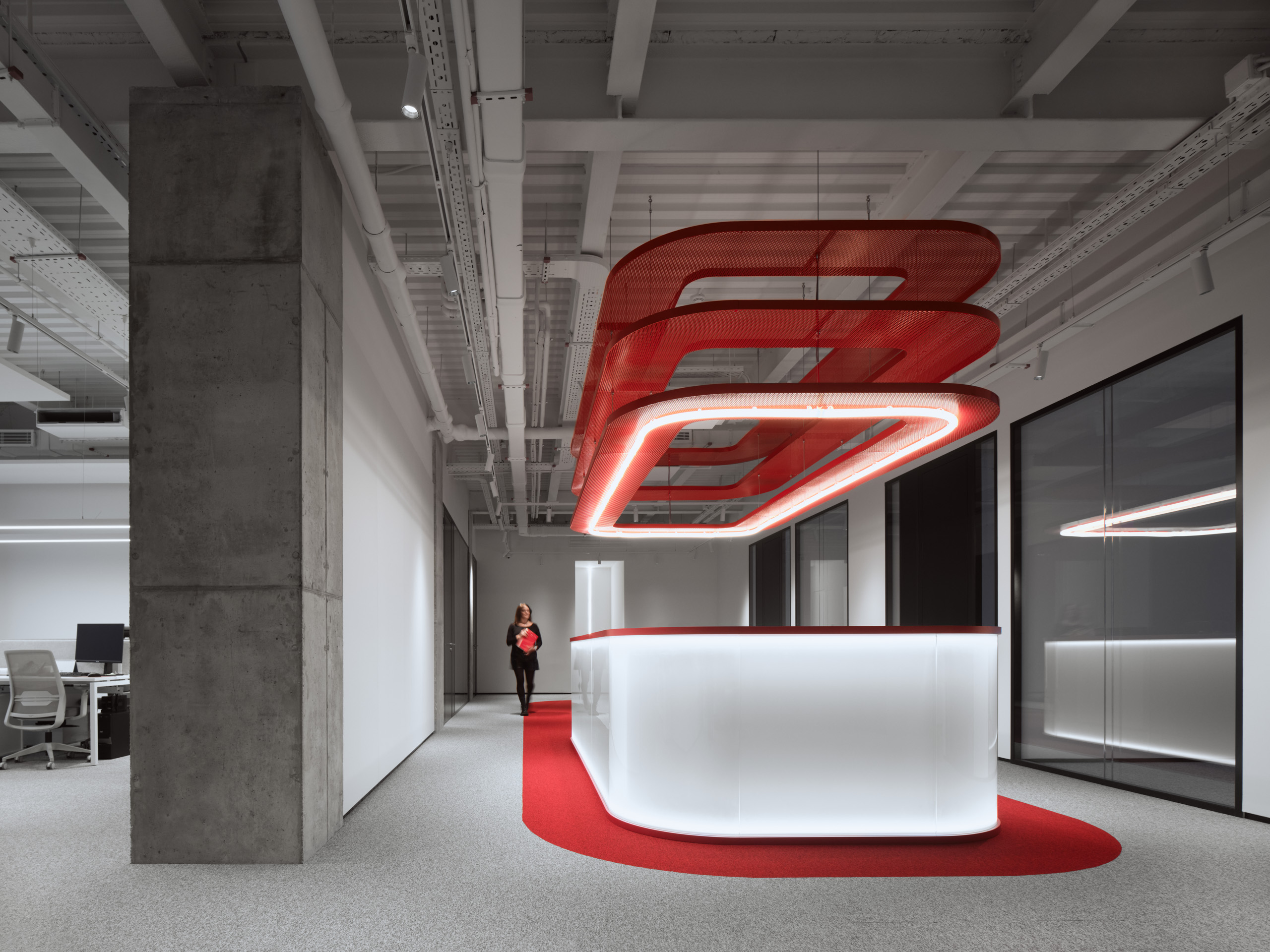
QPRO’s lighting design responds to this industrial substrate with a deliberately restrained material palette — white, gray, and red — that echoes DKC’s corporate identity. Track-mounted rotating spotlights follow the geometry of existing ducts and beams, avoiding visual ceiling clutter while allowing flexible illumination. In the double-height atrium, custom horizontal tubular luminaries thread through open structural elements, turning necessary infrastructure into spatial drama. The reception desk receives cold-light illumination that renders it as a “sparkling ice floe,” a calculated material contrast against the rough concrete surroundings.
 Pin
The double-height atrium functions as the building’s spatial anchor, where a monumental red sculptural installation establishes human scale against the factory’s vertical volume. The exposed truss ceiling preserves the industrial heritage while custom horizontal tubular fixtures weave through structural bays. Photo credit: Maxim Loskutov.
 Pin
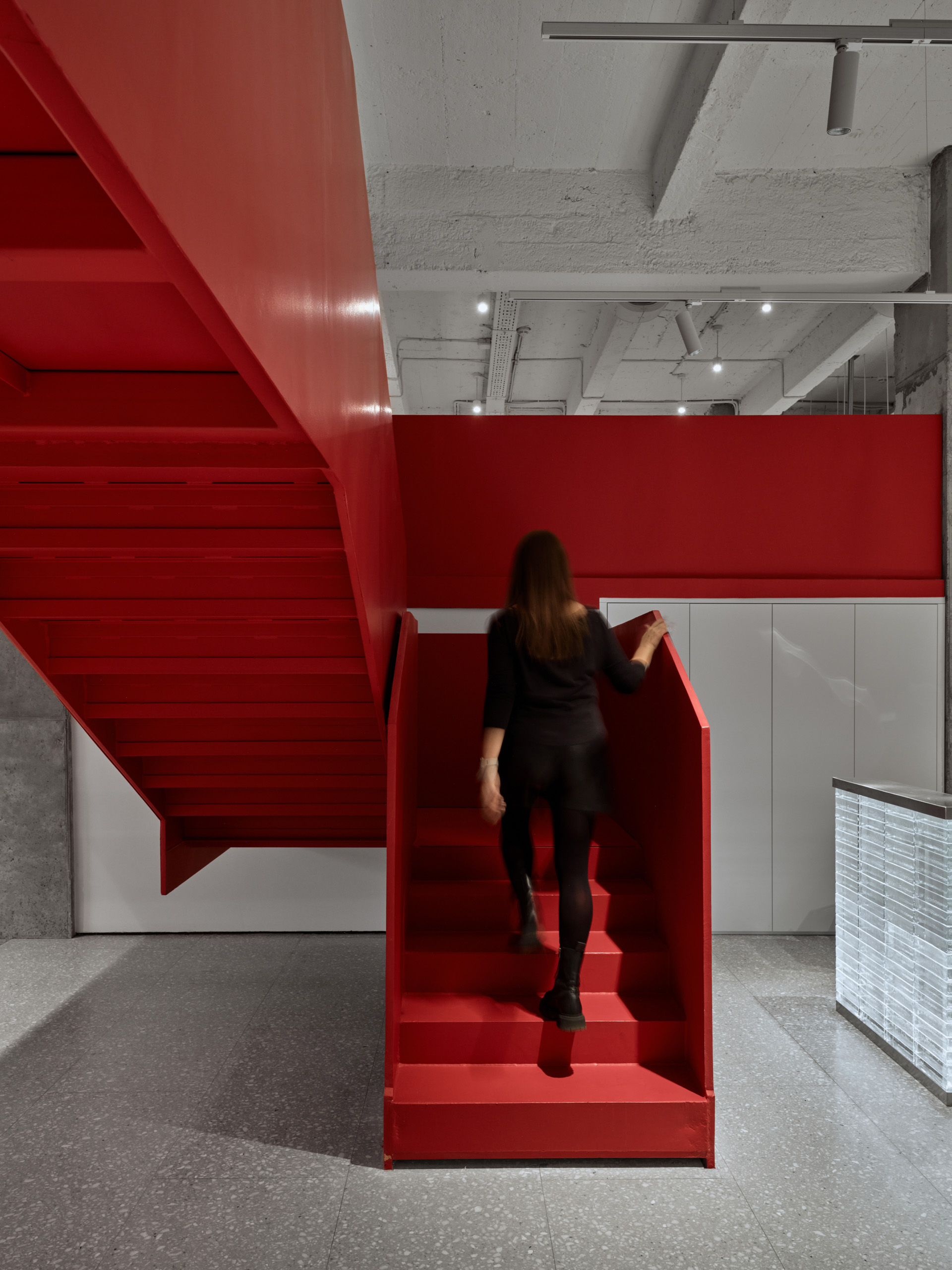
A second sculptural intervention introduces angular red geometry into the white-walled circulation zone, creating a dialogue between the building’s orthogonal structure and the lighting design’s chromatic accent strategy. The rough concrete floor texture remains visible, grounding the intervention in its factory context. Photo credit: Maxim Loskutov.
Design Decision: The architects mounted linear tubular luminaries on suspended metal trays in the entrance zone — a move that transforms the client’s own cable-management products into a ceiling-scape, merging brand identity with functional lighting infrastructure.
Spatial Walkthrough: From Atrium to Workstation
The Atrium as Corporate Stage: Sculpture and Scale
The rectangular double-height atrium serves as the project’s spatial and social heart. Here, the architects deploy custom horizontal tubular luminaries that pass through existing open structural elements — a gesture that respects the building’s structural honesty while introducing a rhythmic lighting layer. The fenestration strategy (placement and sizing of windows) in adjacent zones prioritizes borrowed light into deeper plan areas, reducing reliance on artificial illumination during Moscow’s daylight hours. Red sculptural interventions function at the scale of the human body, preventing the industrial volume from feeling cavernous.
Workstations and the Logic of Linear Light
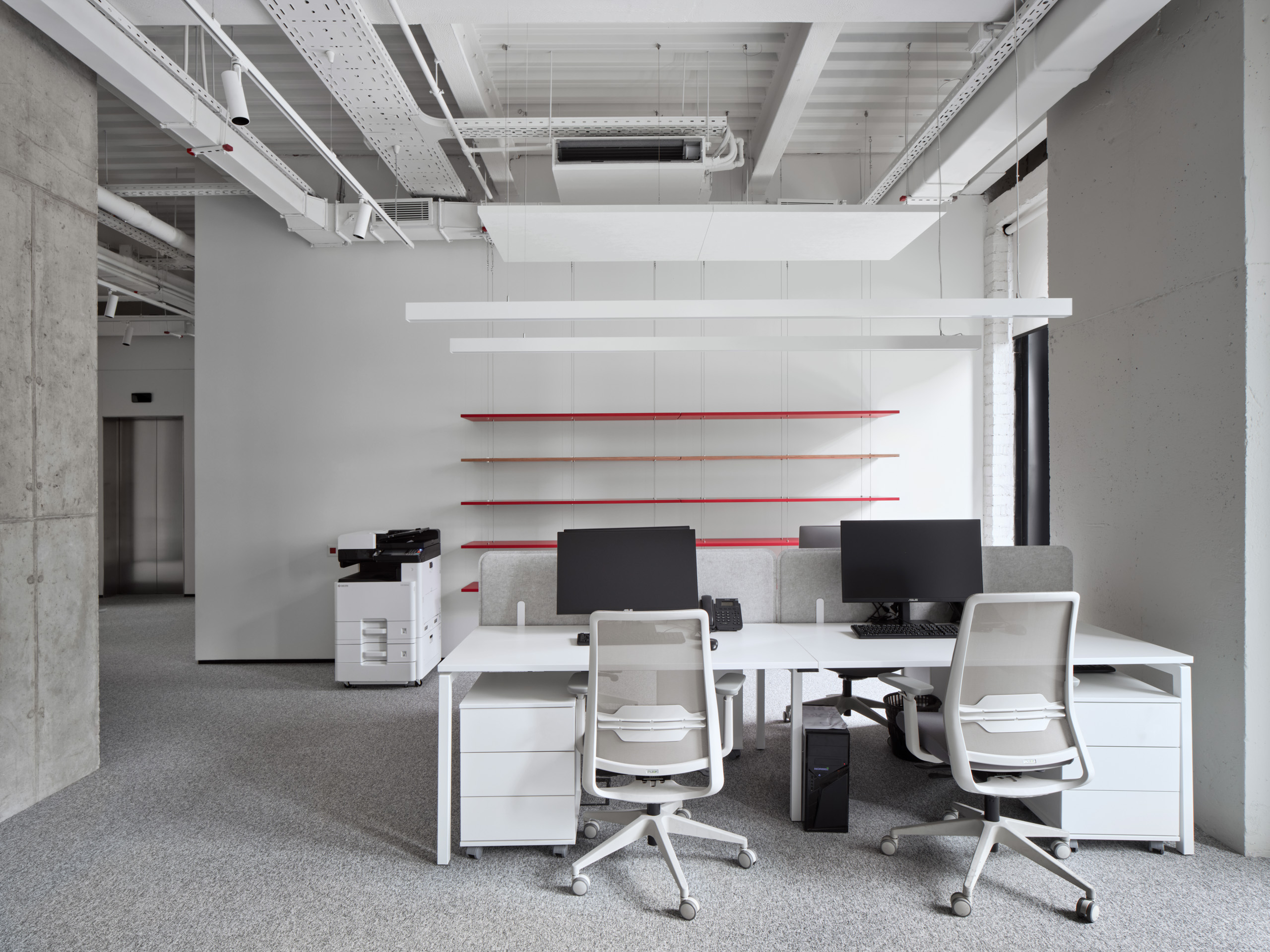
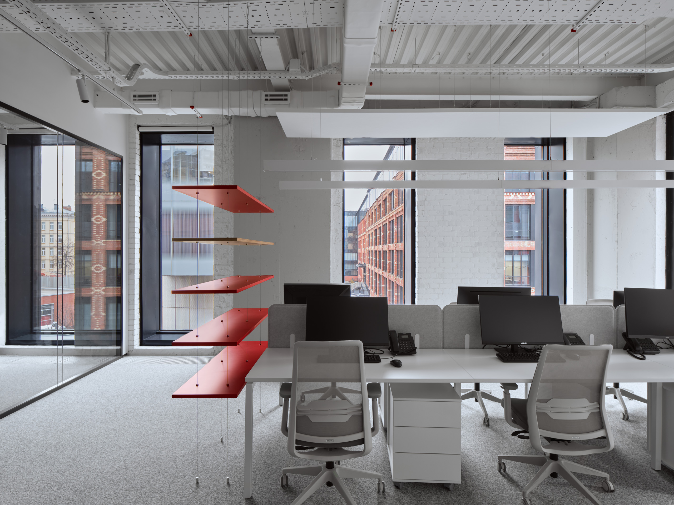
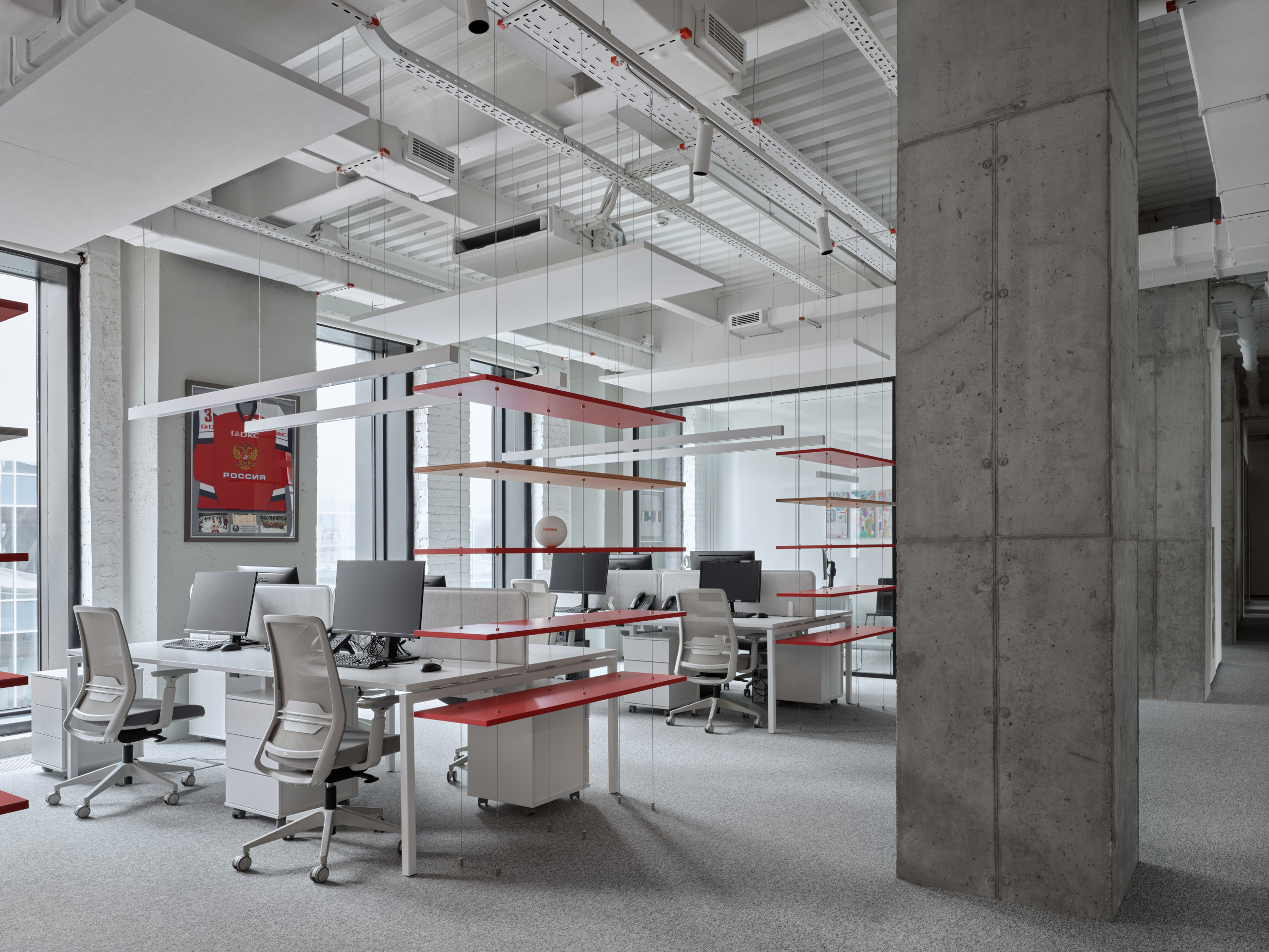
The open-plan workstation zone deploys linear pendant luminaires with wide optics aligned precisely to desk clusters, eliminating glare while maintaining the visual rhythm established by suspended shelving. Track spotlights along the window wall supplement ambient light for mobile workstations. Personal desk lamps provide task-level control, acknowledging that individual preference varies more than standardized ceiling grids allow. The parti (organizing principle) of the workspace is legible: light follows work, rather than work conforming to a rigid lighting grid.
 Pin
The open-plan workstation zone deploys linear pendant luminaires with wide optics aligned to desk clusters, eliminating glare while maintaining the visual rhythm established by suspended shelving. Track spotlights along the window wall supplement ambient light for mobile workstations. Photo credit: Maxim Loskutov.
 Pin
Red pendant fixtures punctuate the white workstation landscape, functioning as wayfinding devices that reinforce the corporate color strategy across the 2,300m² floor plate. The mirrored partition system amplifies both natural light and the ceiling’s industrial truss geometry. Photo credit: Maxim Loskutov.
 Pin
This expansive workspace demonstrates the project’s mirror strategy: reflective surfaces multiply the perceived volume of the factory hall while red accent tables provide chromatic anchors within the otherwise monochromatic field. The track lighting system allows reconfiguration as team structures evolve. Photo credit: Maxim Loskutov.
Social Spaces: From Cafe to Corporate Lounge
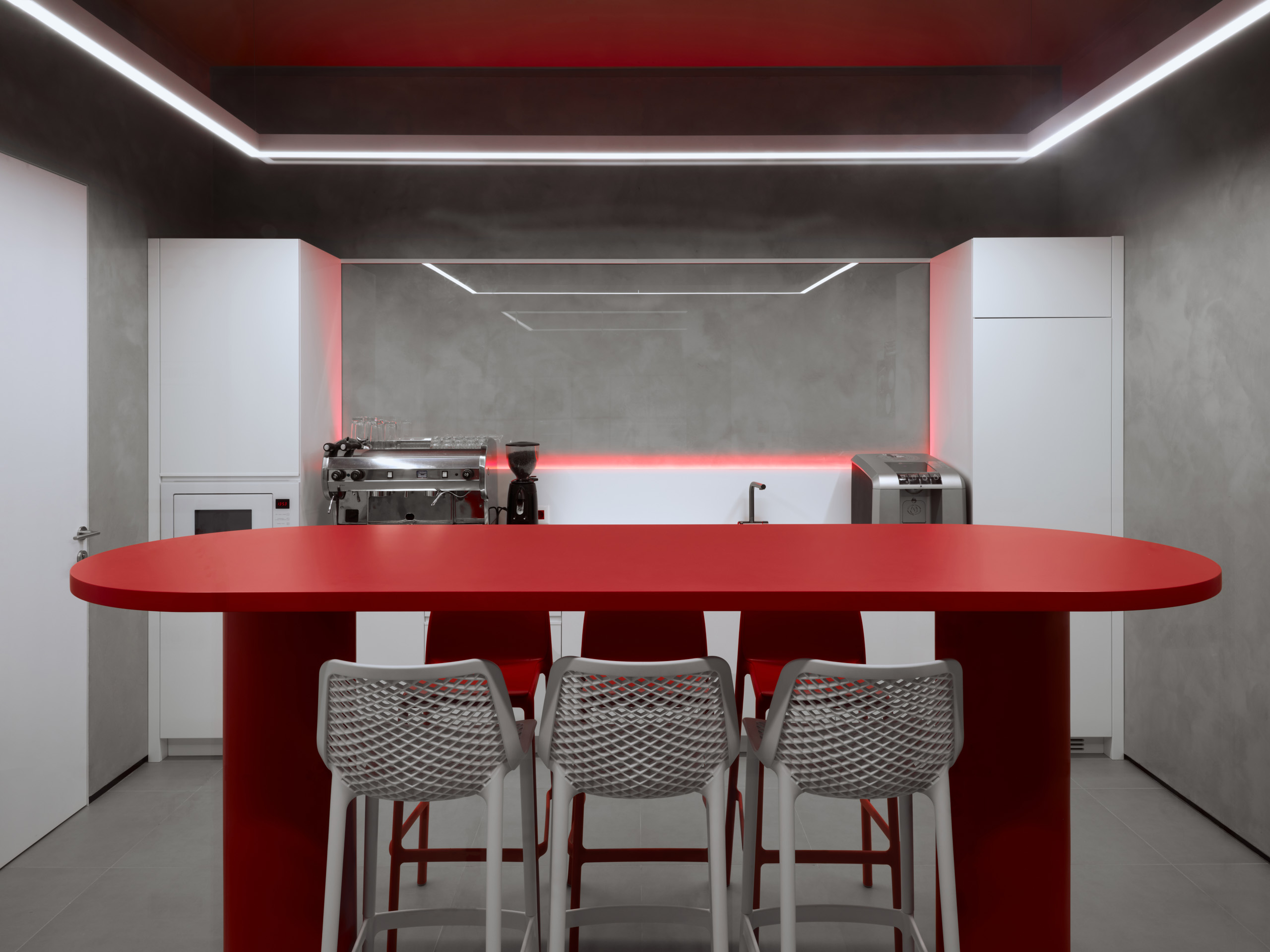
The cafe and presentation zone centers on a bold red oval table that reads as furniture-sculpture beneath a continuous red LED wash. Metal mesh chairs maintain visual permeability, ensuring the space does not visually congest the factory’s open floor plan. Meeting rooms, the gym, and the cafe share a common lighting DNA: rectangular pendant systems with wide optics that deliver uniform illumination without the institutional flatness of recessed troffers. Built-in luminaries in meeting rooms address corner darkness, a detail often neglected in pendant-only schemes.
 Pin
The cafe and presentation zone centers on a bold red oval table that reads as furniture-sculpture beneath a continuous red LED wash. Metal mesh chairs maintain visual permeability, ensuring the space does not visually congest the factory’s open floor plan. Photo credit: Maxim Loskutov.
 Pin
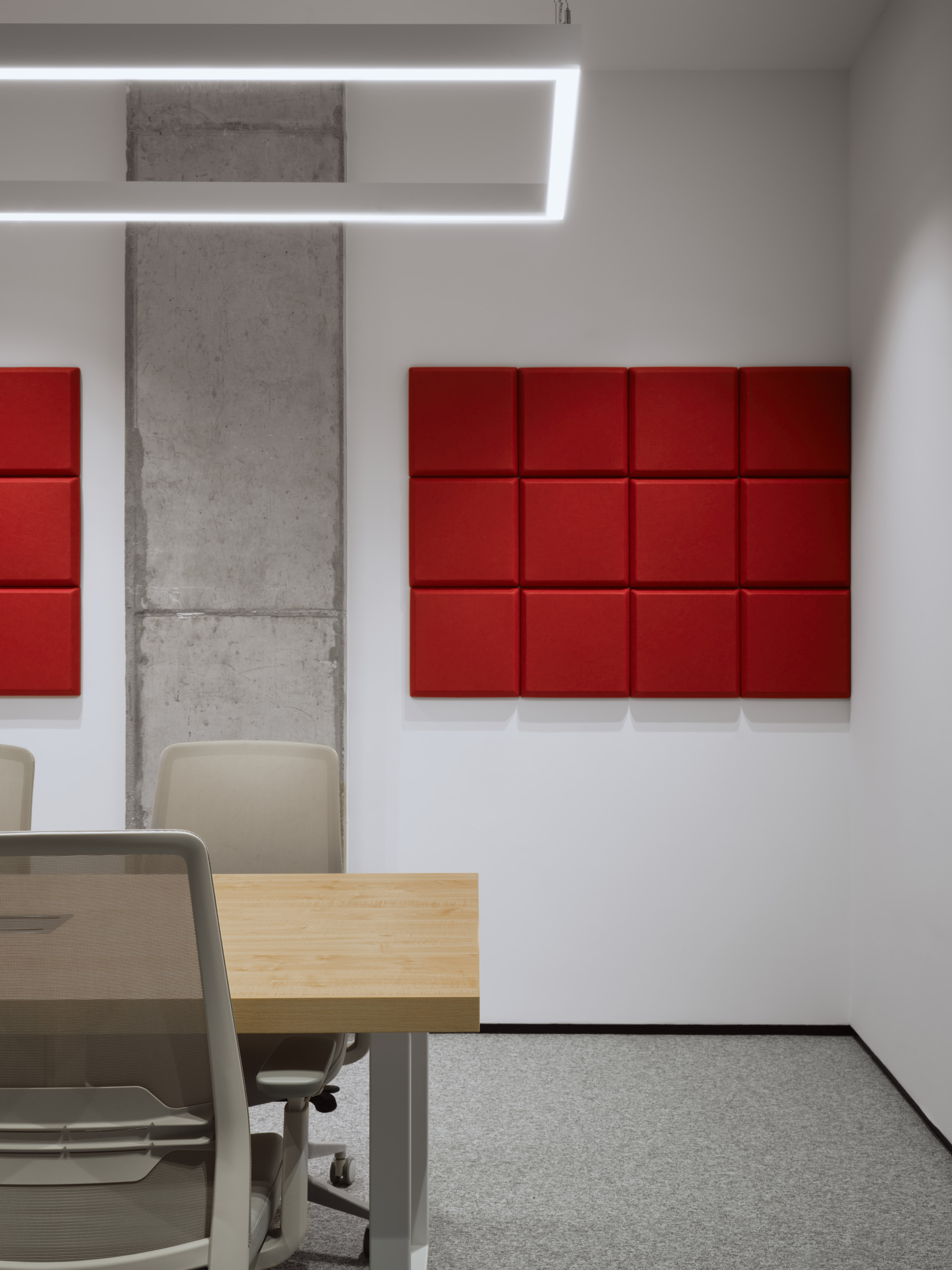
Modular red seating blocks create informal gathering territories within the common area, their cubic geometry echoing the industrial rationality of the host building. The white textured wall finish absorbs sound while reflecting task light from overhead tubular fixtures. Photo credit: Maxim Loskutov.
 Pin
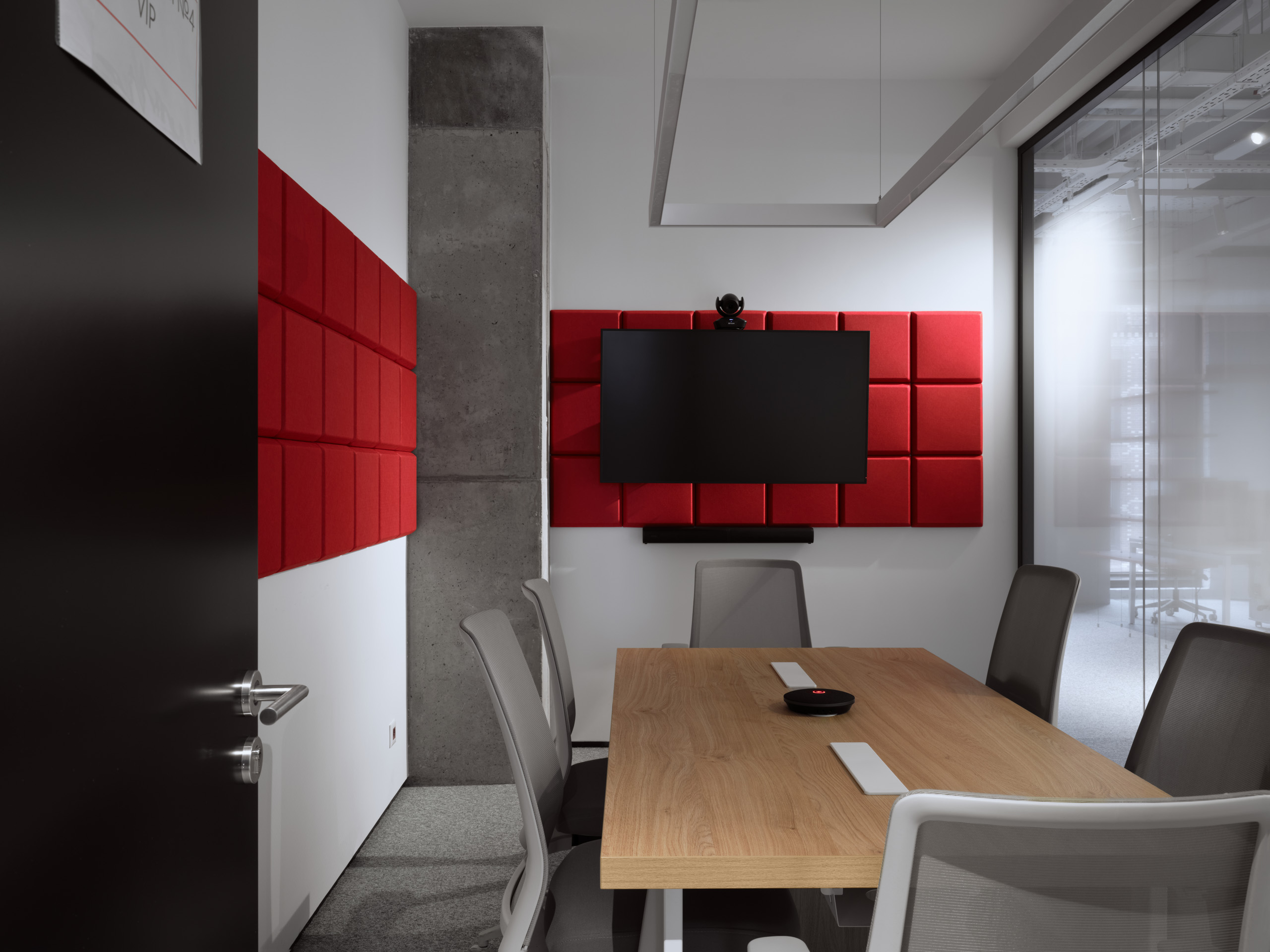
A more intimate lounge configuration pairs the project’s signature red cubes with a warm timber table, introducing material warmth without departing from the established chromatic discipline. The pendant cluster above provides localized illumination for informal reviews. Photo credit: Maxim Loskutov.
Circulation as Experience: Corridors and Thresholds
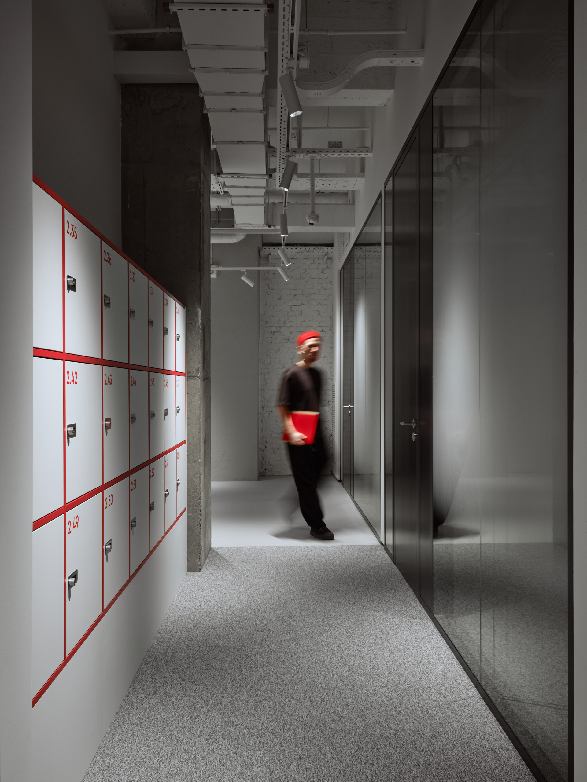
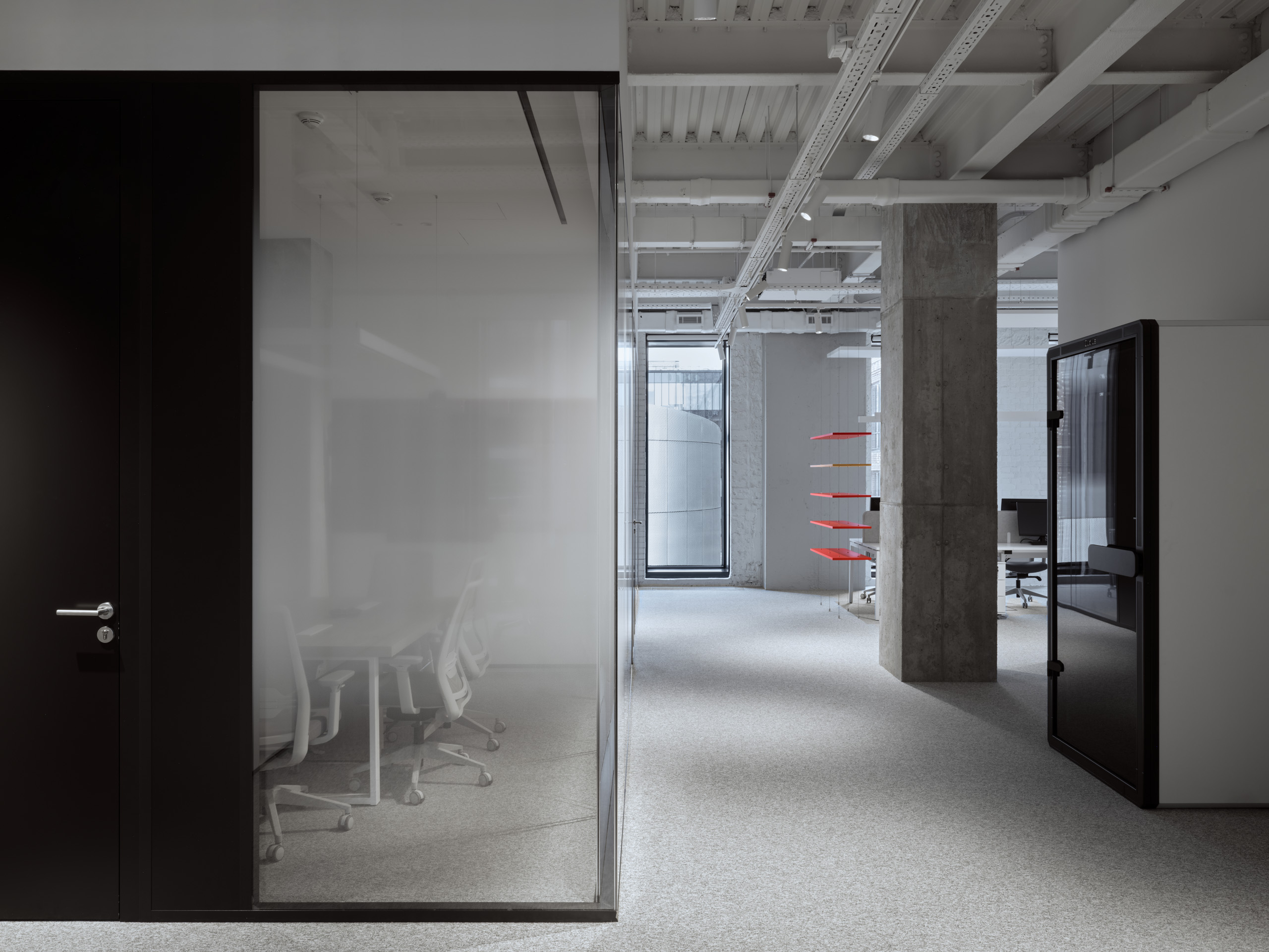
The corridor treatment rejects the conventional white-box approach, instead using red linear wall graphics as wayfinding devices that trace circulation paths through the deep floor plate. In the sanitary area, thin suspended red cylinders provide functional sink lighting while acting as color punctuation against rough concrete walls. A darker corridor sequence introduces tonal contrast to the predominantly white plan, using glass partitions to borrow light from adjacent zones while red accent fixtures maintain chromatic continuity. The suspended cable trays remain exposed, celebrating the building’s infrastructure rather than concealing it.
 Pin
The corridor treatment rejects the conventional white-box approach, instead using red linear wall graphics as wayfinding devices that trace circulation paths through the deep floor plate. Exposed concrete and steel remain visible, maintaining the project’s industrial honesty. Photo credit: Maxim Loskutov.
 Pin
A darker corridor sequence introduces tonal contrast to the predominantly white plan, using glass partitions to borrow light from adjacent zones while red accent fixtures maintain chromatic continuity. The suspended cable trays remain exposed, celebrating the building’s infrastructure rather than concealing it. Photo credit: Maxim Loskutov.
Where Industrial Preservation Meets Daily Function: An Honest Assessment
✦ What Works Exceptionally Well
The lighting design’s integration with existing structure is genuinely intelligent. By mounting track systems on suspended cables rather than concealing ceiling infrastructure, QPRO and Nefa Architects achieve two goals simultaneously: visual openness and future flexibility. The red-white-gray palette successfully dissolves lighting hardware into the interior rather than treating it as applied decoration. The atrium’s sculptural interventions provide necessary human scale in a volume that could otherwise feel cavernous, while the transparent reception desk — illuminated with cold light to suggest a “sparkling ice floe” — demonstrates how a single material gesture can define an entire arrival experience.
✦ Practical Considerations & Limitations
The extensive use of mirrored surfaces, while effective at amplifying light and space, introduces maintenance demands in an active factory-district environment where dust and particulate matter are realities. The exposed industrial ceiling, though aesthetically coherent, offers limited acoustic absorption — a potential concern in open-plan zones with hard surfaces where conference calls and collaborative work generate significant noise. The reliance on track spotlights for general illumination in workstation areas may require more frequent adjustment than fixed systems as desk layouts evolve, placing a subtle administrative burden on facilities management.
A Factory Reborn: What the DKC Office Gets Right About Corporate Identity in Architecture
The DKC office demonstrates that corporate headquarters need not default to generic glass-and-steel refinement. By treating the Bolshevik factory’s structural DNA as a design partner rather than a problem to solve, Nefa Architects and QPRO have created a workspace where the client’s own products become spatial protagonists. The result is architecture as brand manifesto — honest, developmental, and human-scaled, reflecting the corporate values DKC sought to embody.
This project is best suited for organizations with strong manufacturing or engineering identities seeking to root their workplace in physical substance rather than digital abstraction.
Would you accept the acoustic trade-offs of an exposed industrial ceiling in exchange for the spatial authenticity it provides — or does true workplace comfort require concealing the building’s structural history behind acoustic baffles and drop ceilings?
Questions About the DKC Office Moscow
Q: Who designed the DKC office in Moscow?
A: The architecture was designed by Nefa Architects, with Dmitry Ovcharov, Elena Mertsalova, and Irina Zaitseva as project authors. Lighting design was handled by QPRO.
Q: What building was the DKC office constructed in?
A: The office occupies a mid-20th-century building on the territory of the historic Bolshevik factory complex, originally established in 1884.
Q: How large is the DKC office?
A: The total floor area is 2,300 square meters.
Q: What is the design concept behind the DKC office lighting?
A: The lighting design emphasizes visual cleanliness, air, and dynamism using a white, gray, and red palette. Custom tubular luminaries and track spotlights integrate with exposed industrial structure.
Q: When was the DKC office completed?
A: The project was completed in 2024.
Get gorgeous projects via email
