

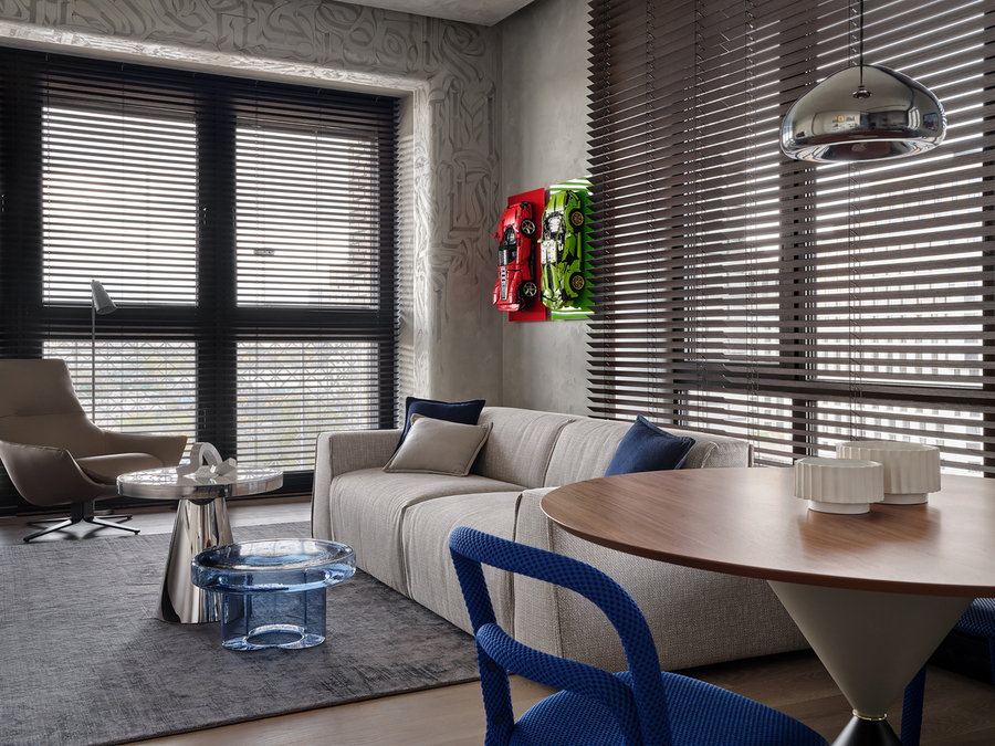
Seventy-one square meters is rarely enough room for a personality this loud. Yet this 71 m² Moscow apartment holds an isolated home office, an island kitchen, a bathtub set against a window, and a display program for LEGO supercars, Bearbrick figures, and a Marvel lightbox — without ever feeling crowded. Completed in 2023–2024 by the Alexander Tischler design company under lead designer Karen Karapetian, the corner unit was built for a financier’s family who wanted their collections treated as architecture, not clutter. The result argues that character in a compact plan is a planning problem first and a styling problem second.
| Project Name | Tough Character Apartment |
| Architect / Designer | Alexander Tischler design company (lead designer: Karen Karapetian) |
| Location | Moscow, Russia |
| Floor Area | 71 m² (approx. 764 sq ft) |
| Year Completed | 2023–2024 |
| Client Type | Private — a financier’s family |
How 71 m² in Moscow Absorbed an Office, an Island, and Two Collections
The starting conditions read like a checklist of compact-plan liabilities: a corner apartment with a single full bathroom, a generous but low-yield hallway, and a small bedroom. The clients’ brief pushed against all of it — they asked for an isolated office, a kitchen organized around an island, and dedicated space to display contemporary art, pop-culture objects, and a growing collection of travel magnets.
The design answers with circulation discipline. Corridors were minimized so nearly every square meter carries a program: the pocket of space between hallway and kitchen-living room became a utility core with concealed laundry and vacuum storage, while the glazed loggia — upgraded with a second layer of glazing for thermal comfort — was converted into a 4.1 m² study. The 36.6 m² kitchen-living room absorbs cooking, dining, lounging, and display along one continuous plane lit by three large windows.
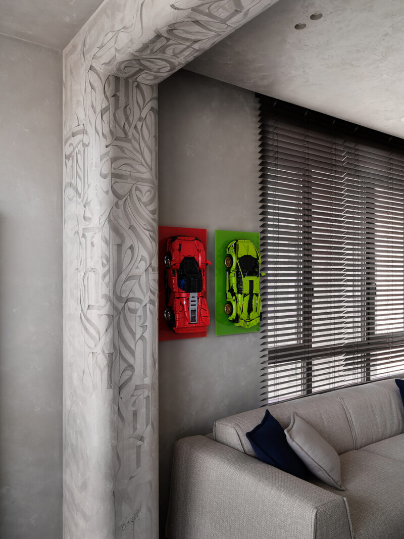
Because there is no exterior to speak for the project, the interior shell does the facade’s job. Decorative plaster runs across walls, ceilings, and even door leaves, forming a single mineral skin, and artist Vasiliy Matafonov’s hand-painted calligraphy climbs the arch between zones — embedding words meaningful to the owners directly into the surface. Structure, finish, and identity collapse into one gesture.
 Pin
PinPhoto: Olga Karapetian
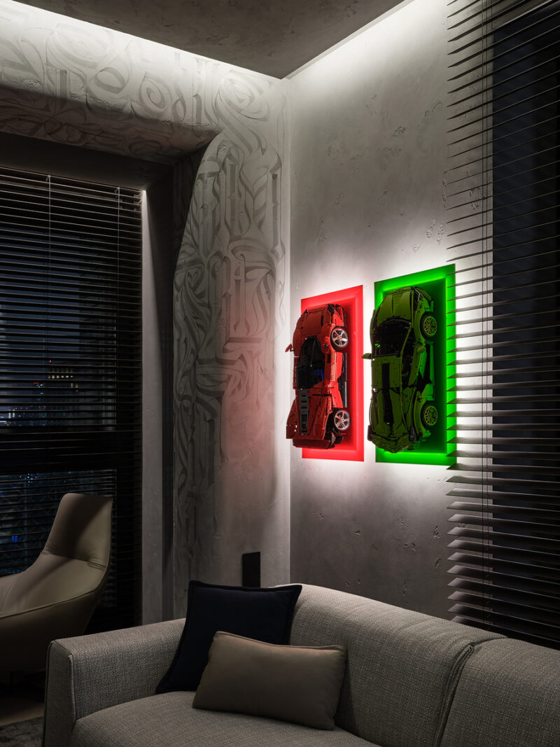
The photograph captures the project’s parti (the governing design idea) in a single corner: Matafonov’s gothic-script mural wraps the structural arch like carved stone, while LEGO Technic supercars mounted on red and green acrylic panels hang as saturated counterpoints. The plaster’s soft gray gives the calligraphy a bas-relief quality under raking daylight. Placing the most personal objects at the junction between living and dining zones turns a circulation moment into the apartment’s emotional center. It is display logic borrowed from galleries — neutral envelope, concentrated color.
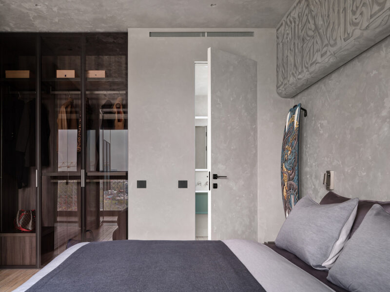
Design Decision: The developer placed the only full bathroom’s entrance in the hallway. The designers moved that door into the bedroom instead, enlarging the bathroom to 7.3 m² and freeing wall length for storage — trading conventional guest access for a private, window-lit bathing suite.
Room by Room: A Walkthrough of the Tough Character Apartment
An Entry Hall Written On, Not Just Walked Through
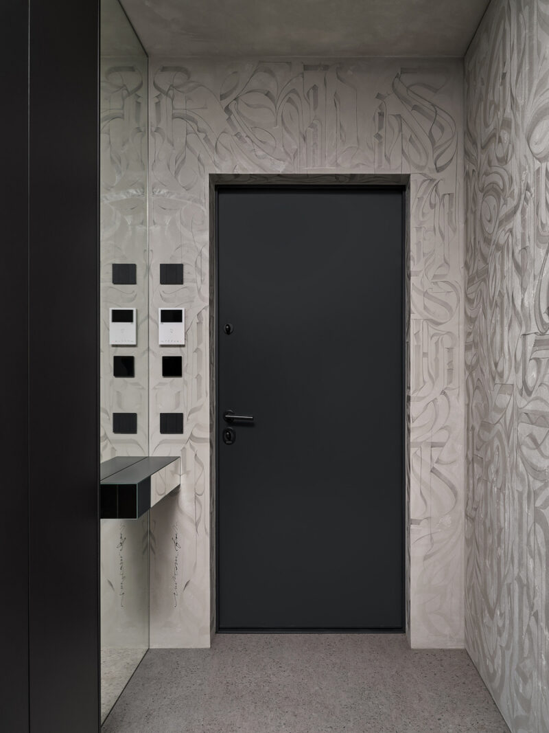
The hallway sets the material rules for everything beyond it. Instead of hiding the largest low-value zone of the original plan, the designers made it the overture: a floor-to-ceiling mirror doubles the perceived depth, and a hanging mirrored console dissolves into its own reflection, storing keys and small items without visual mass. Opposite, a full-height closet wears the same painted plaster as the walls — it conceals the water-supply and heating manifold and reserves suitcase storage, proof that the service program never breaks the surface.
 Pin
PinPhoto: Olga Karapetian
Matafonov’s calligraphy saturates every plaster surface around the matte-black entrance door, so the threshold reads as a scriptorium rather than a service zone. The mirrored wall at left carries the intercom panels and switches on glass, keeping the painted surfaces uninterrupted. A cantilevered mirror-clad console floats near the door — functional storage rendered nearly invisible. Terrazzo-flecked flooring grounds the composition in gray, letting the wall art hold all the tonal contrast.
A Living Zone Built Around Sound, Screens, and Scale Models
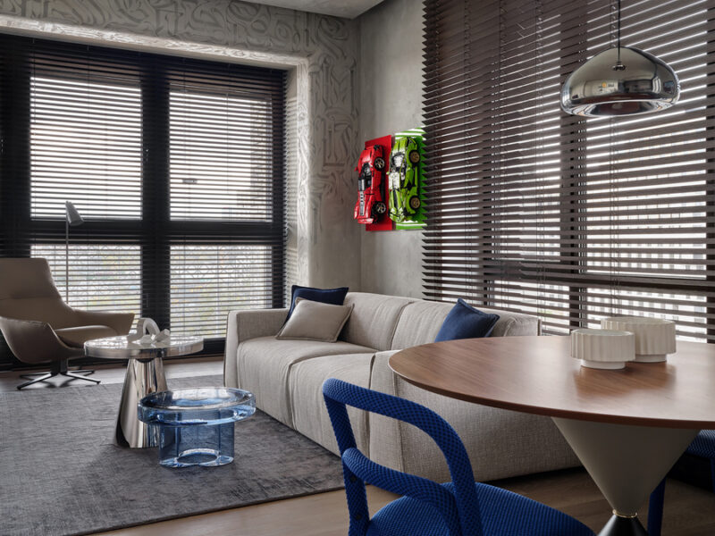
The living area occupies the window wall of the 36.6 m² great room, and its furniture plan is deliberately low and loose. A fold-out Milano Bedding sofa converts the room for overnight guests, a metal-finished hanging cabinet faces it, and a surround-sound system places speakers by the TV and above the seating. By the window, a compact lounge pairs a MisuraEmme armchair with a vinyl-player stand and a wall-mounted Alexander Tischler bar fronted in ribbed glass — a listening corner scaled to one or two people.
 Pin
PinPhoto: Olga Karapetian
Wood venetian blinds filter light across two exposures of the corner plan, striping the gray textile sofa and the chrome side tables. The seating group floats on a rug rather than pressing against walls, preserving the diagonal sightline from dining table to lounge chair. Blue accent cushions pick up the dining chairs across the room, an inexpensive move that stitches the zones together. The LEGO panels glow at the far wall like framed canvases, holding the corner between two window bays.
 Pin
PinPhoto: Olga Karapetian
At night the display strategy declares itself: halo lighting behind the red and green acrylic panels turns two LEGO Technic builds into wall-mounted sculpture, while a cove wash grazes the calligraphy above the window. Mounting the models vertically — wheels toward the viewer — compresses their depth so they occupy the wall like reliefs rather than shelves. It is a lesson in how collectors’ objects can be architecturalized: dedicated backing, dedicated light, no competing clutter.
 Pin
PinPhoto: Olga Karapetian
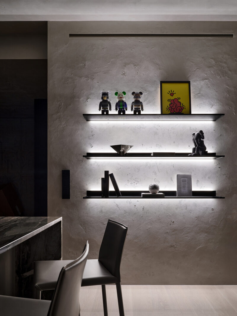
Three knife-edge steel shelves with continuous LED underlighting carry Bearbrick figures, a KAWS-style companion, books, and a framed print against rough plaster. The raking light exaggerates the wall’s texture, so the display gains a cave-wall drama that flat drywall could never provide. Keeping the shelves black and shadow-thin lets the objects, not the joinery, carry the color. This is the apartment’s thesis in miniature: rough envelope, precise hardware, curated contents.
Dining: Blue Midj Chairs Against a Deliberately Quiet Table
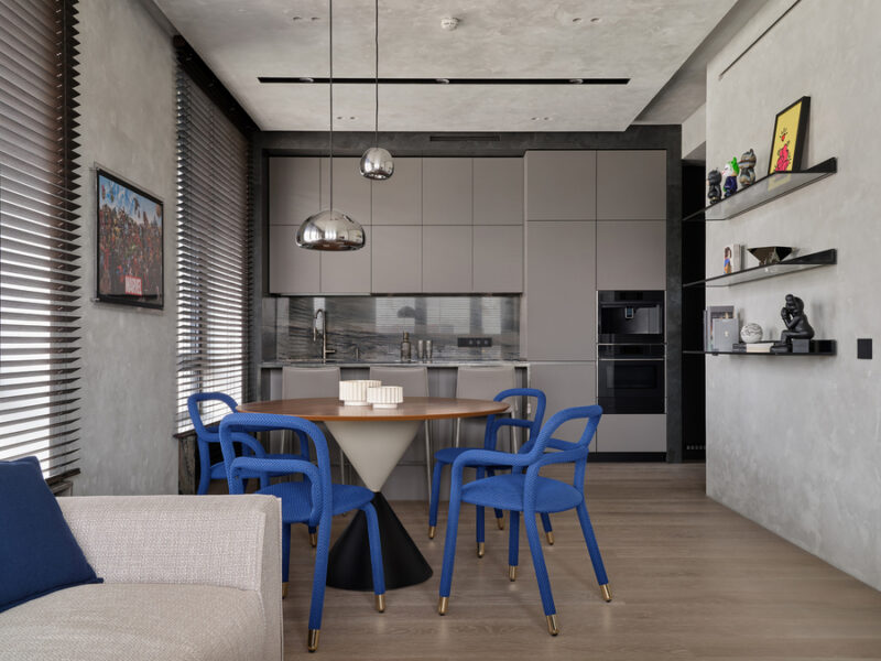
The dining zone sits between the island and the sofa, anchored by a round table chosen specifically not to compete. Its neutral top and two-cone base recede so the Midj chairs — upholstered in vivid blue mesh with brass-capped feet — can do the talking; the slim ring joining the table’s cones was color-matched to the chair legs. Overhead, polished pendants by British designer Tom Dixon bounce the room back at itself, and the owners’ Marvel poster hangs nearby in a lightbox from their collection.
 Pin
PinPhoto: Olga Karapetian
The composition works on contrast discipline: one saturated hue (the chairs), one warm plane (the walnut tabletop), and everything else held to grays. The mirrored Tom Dixon domes hover at different heights, multiplying the three window exposures without adding visual weight. Behind, the kitchen’s gray cabinetry becomes a backdrop rather than a competing figure. The Marvel lightbox at left reads as gallery signage — pop culture given museum treatment.
A Kitchen Framed in Stone, With the Island as Monolith
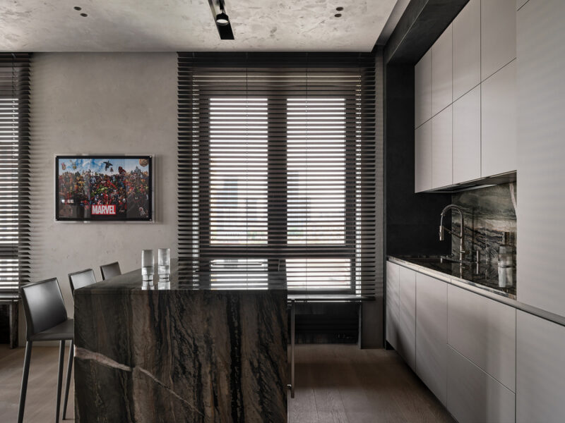
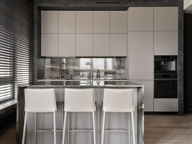
The kitchen line is enclosed in a porcelain stoneware frame that conceals the hood grille in its upper section, so the elevation reads as one carved niche rather than a run of cabinets. Countertops, backsplash, and window sills share a single quartzite with an active vein — the stone becomes the room’s signature texture. The custom Cesar island packs a cooktop with integrated downdraft hood, a wine cabinet, and deep drawers whose interior lighting activates as the fronts open; sockets hide on the island’s flank to preserve its monolithic reading, and three semi-bar stools turn the living-room side into a breakfast counter.
 Pin
PinPhoto: Olga Karapetian
The wide view shows how the island mediates between service and social space: its dramatic quartzite waterfall faces the dining zone, while the working face stays behind the stone horizon. The dark stoneware frame recesses the cooking wall into shadow, visually shortening the kitchen so the room reads as living space first. Track lighting overhead follows the ceiling’s plaster texture rather than fighting it. The Marvel poster placed within the kitchen’s sightline confirms that no zone is exempt from the collection.
 Pin
PinPhoto: Olga Karapetian
Straight on, the elevation demonstrates the frame concept: matte greige cabinet fronts sit inside a charcoal stone surround, with the mirrored-quartzite backsplash bouncing window light into the work zone. The island’s stone waterfall edges meet the floor with no plinth reveal, reinforcing the block-of-stone illusion the hidden side sockets protect. Three cream leather stools keep their backs low so they never break the counter’s horizon line. Built-in black appliances stack in a single tall column, concentrating the kitchen’s technical mass in one bay.
The 4.1 m² Loggia Office: Isolation by Conversion
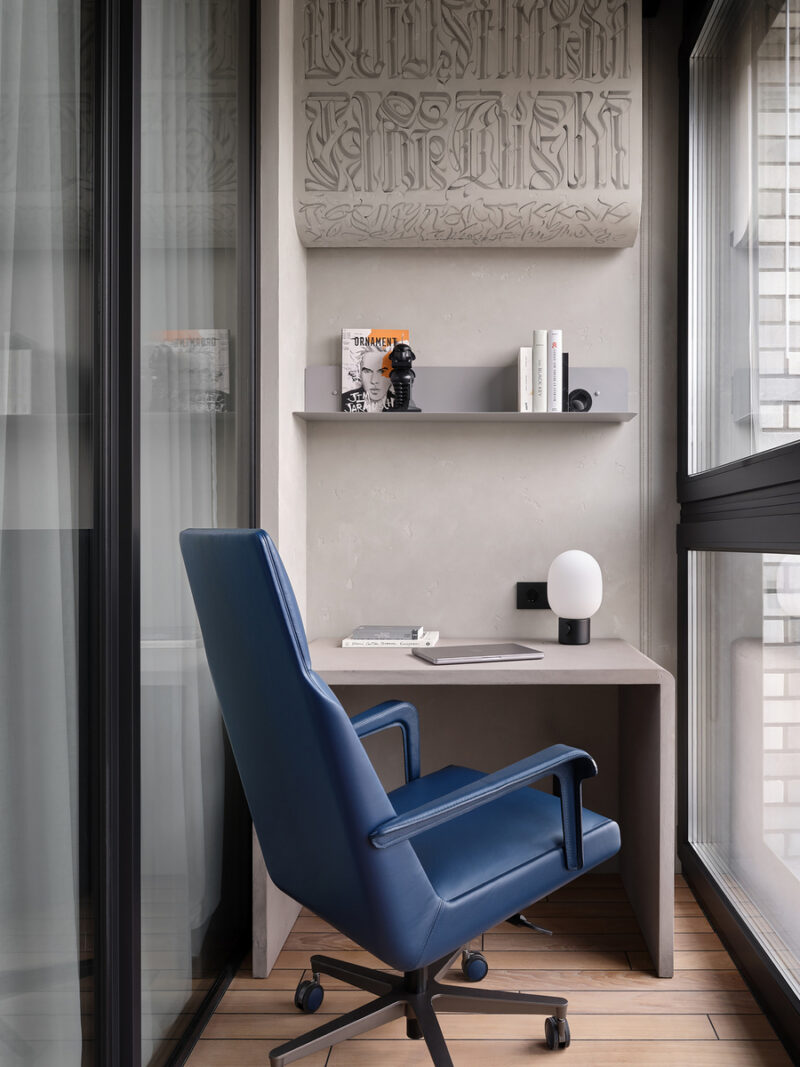
The isolated office the clients asked for was found, not carved — the loggia received a second layer of glazing (a supplementary interior window plane that improves thermal insulation), making the 4.1 m² balcony habitable year-round. A desk with a concrete finish occupies one end and a document cabinet the other, so the workspace and its storage face each other across a two-step commute. Matafonov’s calligraphy returns here as a sculpted frieze, tying the smallest room to the apartment’s largest gesture.
 Pin
PinPhoto: Olga Karapetian
The blue leather task chair — the same family of blue as the dining chairs and bed frame — injects the apartment’s accent color into an otherwise mineral palette of concrete, plaster, and glass. A single metal shelf carries books and a Bowie-cover magazine, keeping the desktop clear for the laptop and one JWDA-style table lamp. The calligraphy panel above curls off the wall like peeling parchment, a rare three-dimensional moment in the mural program. Full-height glazing on both sides makes the tiny room feel like a cockpit over the city rather than a closet.
A 14 m² Bedroom Where Storage Performs as Wall
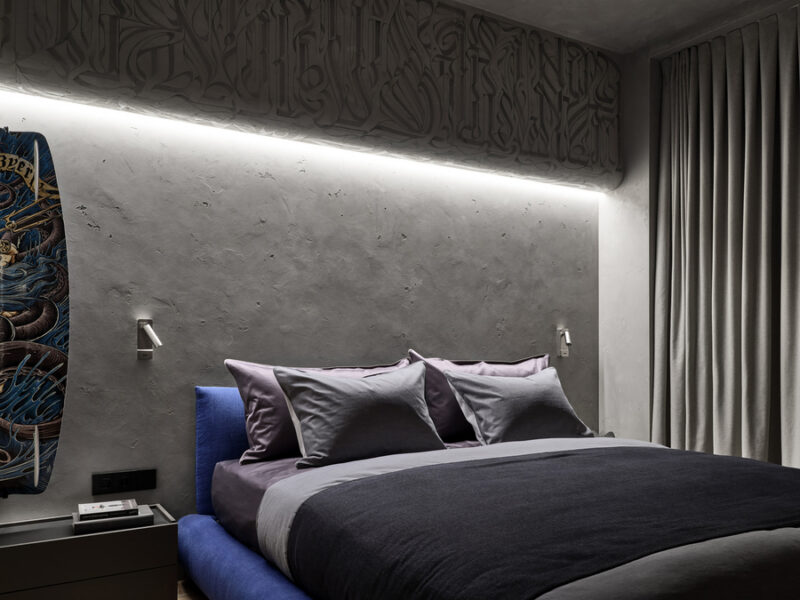
The bedroom compensates for its modest footprint with vertical ambition. MisuraEmme wardrobes — commissioned from the Italian factory to the designers’ drawings — run tinted-glass fronts with continuous vertical lighting, so clothing reads as boutique display rather than concealed bulk; accessory drawers are lined in grained eco-leather. Above the headboard, a curved plaster panel painted by the artist arcs toward the loggia, washed by concealed lighting that raises the wall’s texture into relief. The mirror is mounted directly on the door leaf, and the parquet is laid to resemble deck boards, its staggered plank division continuing into the bathroom.
 Pin
PinPhoto: Olga Karapetian
The cove light under the curved frieze does double duty: it dramatizes Matafonov’s carving overhead and grazes the rough plaster below, turning the headboard wall into a topographic surface. The royal-blue upholstered bed frame is the room’s single saturated element, bracketed by layered gray and mauve bedding. Slim wall-mounted reading spots replace nightstand lamps, keeping the small side tables free. A wakeboard hung at left — kraken artwork facing outward — shows the collection program extending even into the sleeping zone.
 Pin
PinPhoto: Olga Karapetian
This elevation explains the bathroom relocation: the white door beside the wardrobes opens directly from the sleeping zone into the enlarged bath, its green vanity just visible beyond. Smoked-glass wardrobe fronts reveal shelving and hanging rails in warm wood, their internal vertical LEDs off in daylight but legible as thin seams. The gray bedspread and plaster walls hold a narrow tonal band so the wardrobe’s amber interior becomes the warm pole of the room. Black switch plates dot the plaster like punctuation — hardware treated as graphic marks.
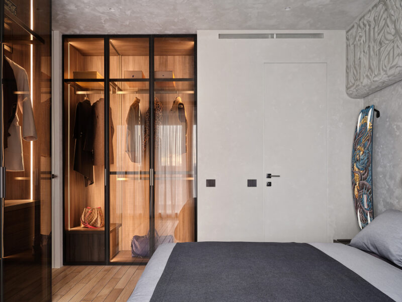 Pin
PinPhoto: Olga Karapetian
With the internal lighting on, the wardrobes convert into vitrines: coats, a leopard-print scarf, and monogrammed bags sit under shelf-edge glow like retail stock. The black-framed glass doors keep dust out while preserving the display, a decision that trades a degree of privacy for daily visual pleasure. Warm wood carcasses against the cool plaster ceiling create the room’s most effective temperature contrast. It is storage as scenography — the “voluminous and aesthetically pleasing” system the clients requested, delivered literally.
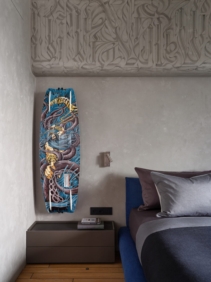 Pin
PinPhoto: Olga Karapetian
The detail shot rewards a closer read: the wakeboard’s Neptune graphic — trident, kraken, blackletter logo — rhymes deliberately with the gothic calligraphy carved above, connecting the owner’s sport to the apartment’s art program. A minimal reading light and flush black outlets keep the wall plane quiet around the board. The taupe nightstand floats clear of the floor, extending the deck-board parquet’s visual run. Nothing here is filler; every object either stores, illuminates, or means something.
The Main Bathroom: 7.3 m², a Window, and Palm Leaves Behind Glass
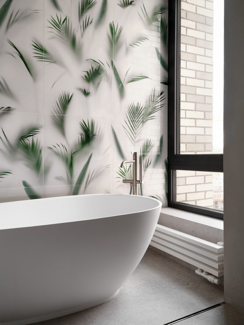
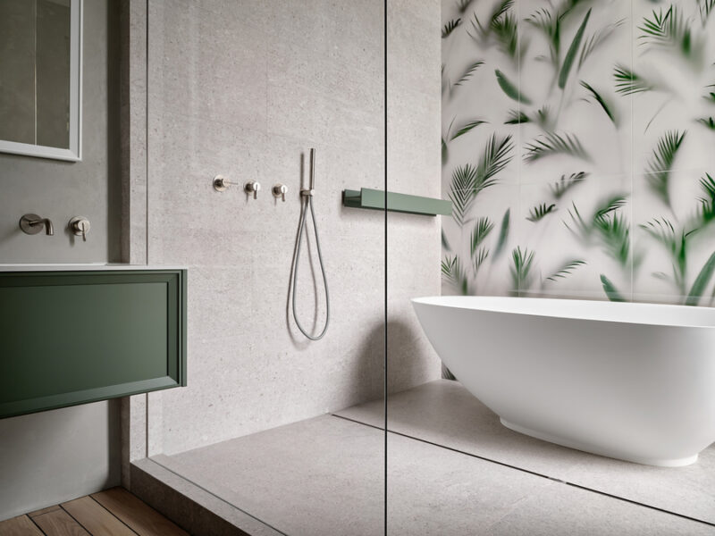
Annexing the hallway entrance let the main bathroom grow to 7.3 m² and adopt a layout most Moscow apartments cannot offer: a freestanding tub set directly against a window. Tiles from the Italian brand 41zero42 line the bathing wall with palm leaves that appear pressed against misted glass — a botanical image rendered in fog rather than color. Tub and shower share one open wet zone; the Antonio Lupi shower head is mounted flush into the ceiling and skimmed over with decorative plaster, and the deck-board parquet from the bedroom continues underfoot in the dry zone.
 Pin
PinPhoto: Olga Karapetian
The tub-at-window arrangement inverts the typical internal-bathroom compromise: daylight falls across the oval basin while the brick facade beyond preserves privacy at bathing height. The 41zero42 tiles read as frosted glass with vegetation trapped behind it, giving the wall depth without literal pattern. A low white radiator ledge doubles as a step and towel zone at the sill. Brushed-nickel floor-mounted fittings keep the plumbing sculptural and symmetrical against the tub’s rim.
 Pin
PinPhoto: Olga Karapetian
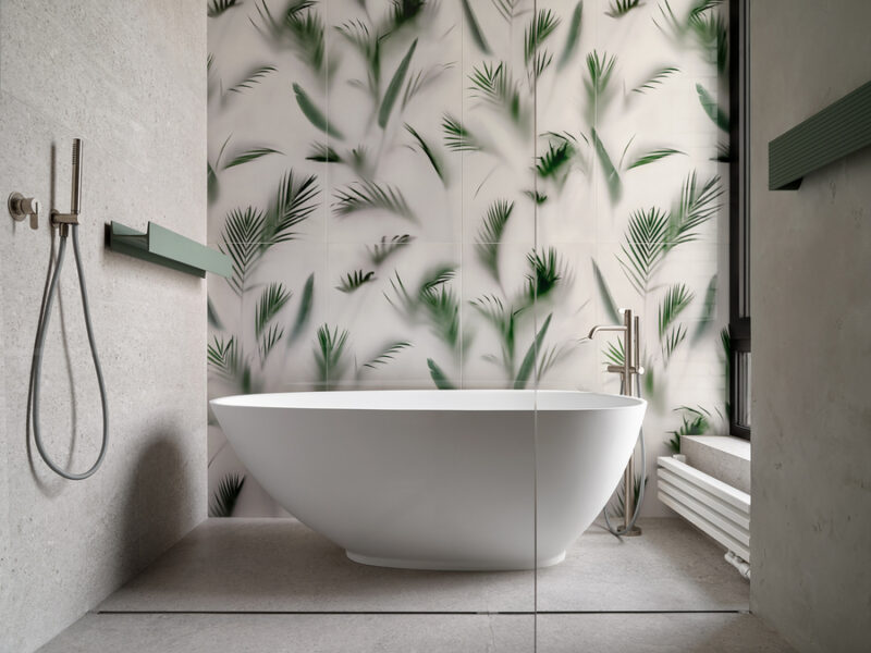
The frameless glass screen is the only separation between shower and tub, keeping the 7.3 m² room visually whole. Sage-green metal ledges — one in the shower, one by the window — introduce the bathroom’s accent color at grab-height, matched to the vanity beyond. Gray stone-look porcelain wraps floor and shower wall in large formats, minimizing grout lines in the splash zone. A linear floor drain at the glass line handles the open shower’s runoff without a curb.
 Pin
PinPhoto: Olga Karapetian
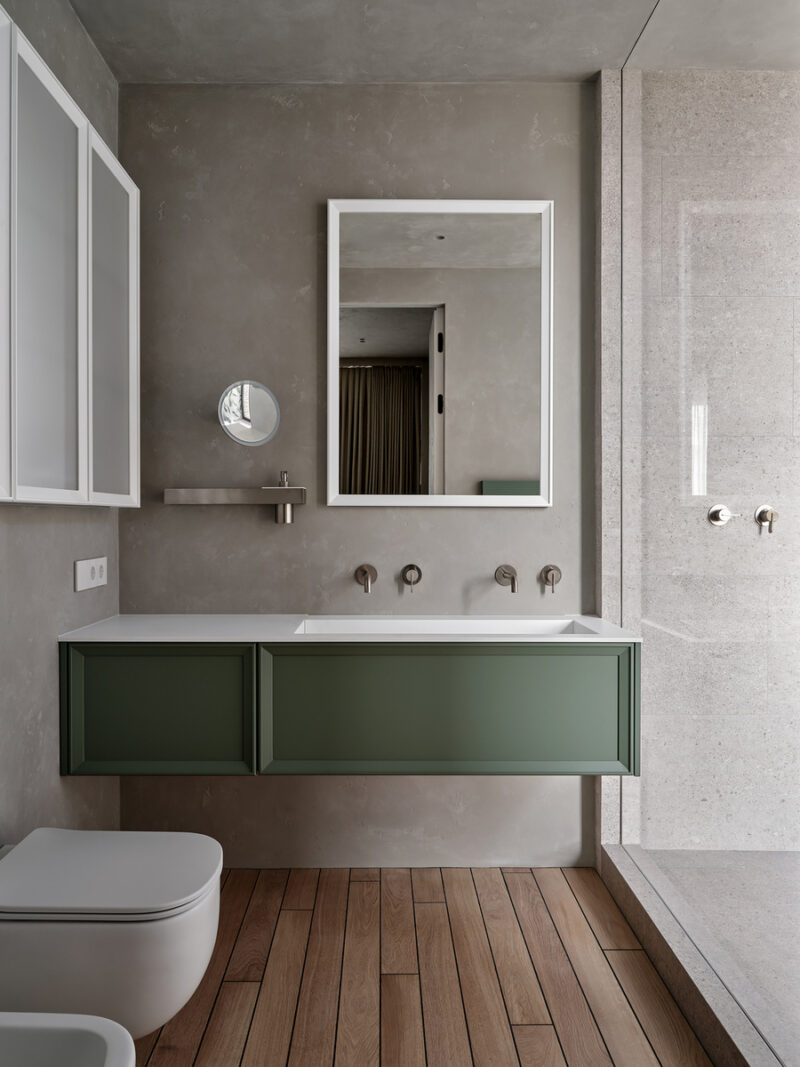
From the vanity corner the room’s zoning reads clearly: wood-look parquet under the dry functions, porcelain under the wet, with the transition ruled straight at the shower screen. The green lacquered vanity with classical panel fronts is a deliberate anachronism inside a contemporary shell — a piece of furniture rather than fitted casework. Wall-mounted brushed taps free the white counter for use. The composition proves the relocation gamble: this is a room to inhabit, not just pass through.
 Pin
PinPhoto: Olga Karapetian
The vanity elevation is almost domestic in tone: a white-framed mirror, a round magnifying glass on an articulated arm, and a brushed-steel shelf with soap dispenser sit against untiled decorative plaster — permitted here because the zone stays dry. Twin wall-mounted spouts serve one long integrated basin, a two-user arrangement inside a one-bathroom plan. The floating cabinet clears the parquet for the robot vacuum the utility core was designed around. Warm wood, sage lacquer, and gray plaster hold the palette to three quiet notes.
The Guest Bathroom: Stainless Steel as Magnet Board
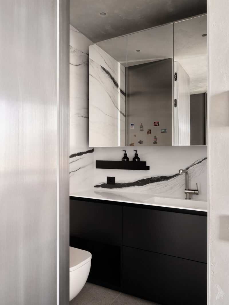
Across from the utility closet, the guest bathroom solves two briefs at once. Its oversized countertop with integrated sink and a kitchen-style faucet makes the room a working extension of the laundry — open both doors and a full laundry station appears. The wall and door panel are clad in stainless steel, chosen not for industrial styling but because it is magnetic: the clients’ travel-magnet collection finally has a home that grows with every trip, and RGB lighting around the mirror cabinet lets them shift the room’s mood for guests.
 Pin
PinPhoto: Olga Karapetian
Bookmatched panda-style porcelain slabs streak the wall with black veins that echo the calligraphy’s strokes, while the matte-black vanity block anchors the composition below a crisp white counter. The mirrored cabinet doors already carry the first travel magnets — the collection colonizing the steel as intended. A kitchen-grade swivel tap signals the room’s second life as a laundry annex. Even at roughly two square meters, the room maintains the apartment’s rule: every surface either performs or displays.
The Plan: Reading the Circulation Discipline
 Pin
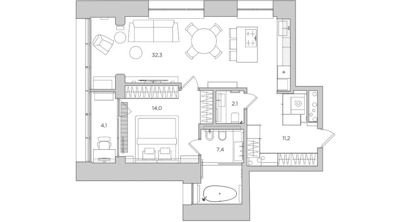
PinThe post-renovation plan makes the strategy legible: the 32.3 m² great room (36.6 m² including the kitchen bay) commands the corner glazing, the 14.0 m² bedroom and 4.1 m² loggia office stack along the second facade, and the 7.4 m² bathroom now opens from the bedroom side with the tub pushed to the window. The 2.1 m² guest bathroom and utility wall flank the 11.2 m² entry sequence, so all wet and service functions cluster on shared risers. Almost no floor area survives as pure corridor — the discipline that funds everything else.
Where the Discipline Pays Off — and What 71 m² Still Asks in Return
Storage as Architecture, Not Afterthought
The project’s strongest achievement is that its storage is load-bearing to the design, not appended to it. The utility core between hallway and great room hides laundry machines, two vacuum cleaners, a robot-vacuum dock, and a handheld-vacuum charging point behind flush black fronts — an entire building-services program in two meters of wall. Second, the display infrastructure is genuinely architectural: backlit steel shelving, acrylic-mounted LEGO panels, and a magnetic stainless bathroom wall give each collection a permanent, lit, dust-managed home. Third, the continuous plaster skin across walls, ceilings, and doors — activated by Matafonov’s calligraphy — gives a small plan a single, confident material identity where most compact apartments accumulate finishes.
The Price of Routing the Bath Through the Bedroom
The plan’s boldest move carries real costs. With the full bathroom accessible only through the bedroom, overnight guests on the fold-out sofa must either cross the owners’ private zone to shower or make do with the 2.1 m² guest WC — workable for a couple, awkward for longer stays. The open tub-and-shower wet zone demands disciplined water management and regular squeegee work to protect the adjacent parquet, and decorative plaster near splash zones will need periodic touch-ups. Finally, the tinted-glass wardrobes that make the bedroom glow also demand curation: display storage punishes mess in a way solid fronts forgive.
A Small Apartment That Argues for Personality Over Square Meters
The Tough Character Apartment’s contribution is not any single detail but its order of operations: solve circulation first, embed services invisibly, then spend the recovered space on identity — murals, monolithic stone, lit vitrines. It shows that a compact urban plan can host serious collections without becoming a storage unit, provided display is designed as infrastructure. This is a home best suited to a couple who curate rather than accumulate, who host occasionally rather than perpetually, and who accept maintenance as the tax on visual precision.
Would you route your only full bathroom through the bedroom to gain a window-lit tub — or is a hallway door the price of easy hospitality?
FAQs
Who designed the Tough Character Apartment in Moscow?
The Alexander Tischler design company, a full-service interior firm working across Moscow, Yekaterinburg, and Boca Raton, designed and implemented the project. Karen Karapetian led the design, with murals by artist Vasiliy Matafonov and photography by Olga Karapetian. The apartment was completed in 2023–2024 for a financier’s family.
How large is the apartment and how is it laid out?
The corner apartment measures 71 m² (about 764 sq ft). A 36.6 m² kitchen-living room with three windows anchors the plan, alongside a 14 m² bedroom, a 4.1 m² loggia office, a 7.3 m² main bathroom entered from the bedroom, a compact guest bathroom, and a utility core with concealed laundry.
Why does the main bathroom connect to the bedroom instead of the hallway?
The developer originally placed the bathroom entrance in the hallway. The designers relocated the door into the bedroom, which enlarged the bathroom to 7.3 m² and allowed a freestanding tub beside the window. Guests use the separate guest bathroom, which doubles as a laundry extension.
What artwork and collections appear in the interior?
Hand-painted calligraphy murals by Vasiliy Matafonov cover plaster surfaces in the hallway, living zones, office, and bedroom. The clients display LEGO Technic supercars on backlit acrylic panels, Bearbrick figures on illuminated shelves, a Marvel poster in a lightbox, a wakeboard, and travel magnets on magnetic stainless-steel bathroom walls.
What materials define the Tough Character Apartment?
Decorative plaster covers walls, ceilings, and doors as a continuous shell. The kitchen pairs a porcelain stoneware frame with quartzite counters, backsplash, and window sills on a custom Cesar island. Other signatures include 41zero42 palm-leaf tiles, tinted-glass MisuraEmme wardrobes, and parquet laid to resemble deck boards.
Get gorgeous projects via email
