

Most Italian restaurants outside Italy run on the same shorthand: checked cloth, terracotta, a wall of Chianti bottles. La Piazza restaurant in Yerevan declines all of it. S+S Design Studio, the international hospitality practice founded by Irina and Olga Sundukovy, treated the brief as a conversation between two cultures rather than an import from one. Across 654 square meters the studio built something closer to an actual piazza: a sequence of thresholds, a public center, and soft edges where people settle. The choreography is the point. The room tells you where to go before a host does.
| Project Name | La Piazza Restaurant |
| Architect / Designer | S+S Design Studio (Sundukovy Sisters) — Irina and Olga Sundukovy |
| Location | Yerevan, Armenia |
| Floor Area | 654 m² (approx. 7,040 sq ft) |
How Do You Build an Italian Square Without Building a Stage Set?
A themed restaurant fails at the same point every time: it quotes. The answer here was to borrow the organization of an Italian square rather than its ornament, then let Armenian material culture supply everything a guest can actually touch.
The plan reads as a genuine parti (the single organizing idea a plan is built on). A circulation spine runs from the entry to an open kitchen at the far end. The bar sits mid-room as the square’s fountain, the object you orbit rather than queue at. Fixed seating holds the perimeter the way café tables hold an arcade, and planting punctuates the spine like street trees.
There is no facade to read in the conventional sense; this is an insertion into an existing upper floor, and its exterior expression is the window wall itself. Fluted timber pilasters march along the glazing at regular bays, doing the work an arcade would do outside. They set a rhythm, frame the view, and register structure without pretending to carry it. Inside, that same fluting repeats at three scales — pilaster, bar base, ceiling band — which gives the interior a consistent grain without a single applied pattern.
 Pin
Photo: Evgeny Kulibaba
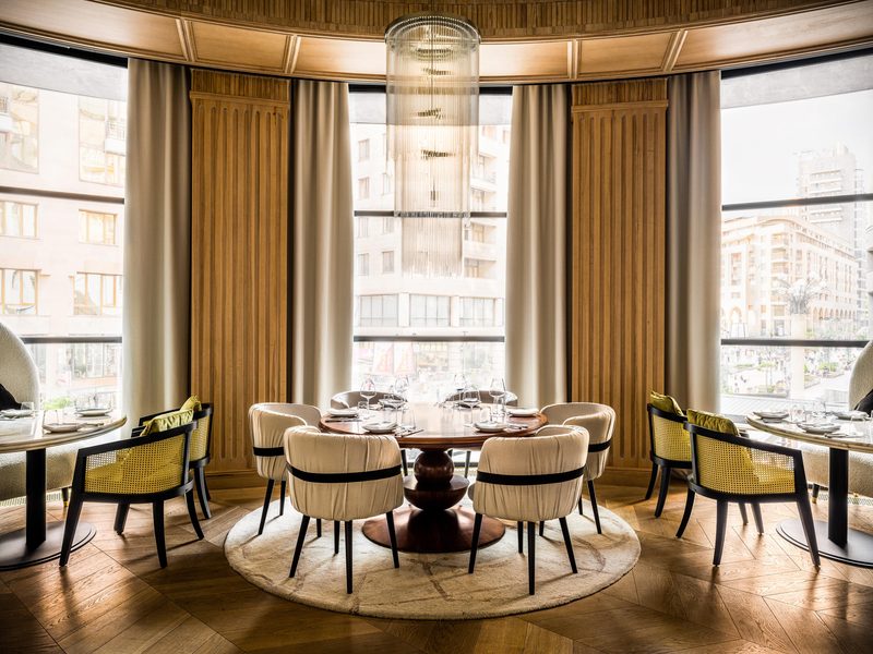
The curved bay is the one place where the interior admits how far above the street it sits. Fluted timber pilasters flank the glazing and a cylindrical glass chandelier drops the full height of the opening, tying floor to head. Herringbone oak runs to the window line without a threshold strip, so the eye reads the city as an extension of the floor plane. The heavy drape stacks on either side are functional as much as theatrical: they let staff tune glare through the day without dimming the whole room.
Design Decision: Glass chandeliers hang over the open kitchen, not the dining tables. Decorative lighting normally reserved for guests is spent on the working line instead, framing the cooks as the room's performance and pulling attention to the far end of the plan.
Walking Through La Piazza Restaurant in Yerevan, Space by Space
The Entry: A Chandelier Instead of a Door Line
The threshold does the heavy lifting. There is no vestibule and no host stand treated as an object; instead a low, wide curtain of glass rods compresses the ceiling at the door, and the room releases upward once you are past it. That compression and release (tightening one space so the next reads as larger) is the oldest move in spatial sequencing, and it works here because the ceiling beyond is a coffered timber grid that reads as height. Two upholstered dome booths flank the entry like gateposts. From this point the whole plan is legible in a single look.
 Pin
Photo: Evgeny Kulibaba
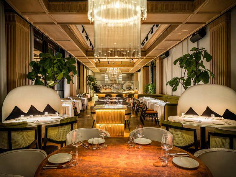
The entry chandelier is less a fixture than a ceiling event: a rectangular curtain of glass rods hung low and wide enough to compress the space beneath it. Step through and the coffers begin, the ceiling lifts, and the axis to the open kitchen opens up. The bouclé dome booths on either side act as soft gateposts, their curved backs turning the entry into a defined room rather than a leftover strip. The sightline is the real design work: kitchen dome, bar, and far windows all readable from the door.
 Pin
Photo: Evgeny Kulibaba
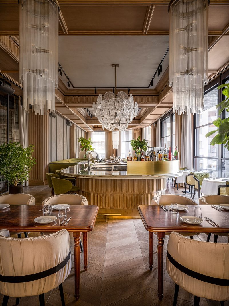
In daylight the same threshold reads differently. Two glass-rod cylinders bracket the view like a proscenium, and the onyx bar top catches light at the center of the frame. The camphor burl tables in the foreground sit on turned legs closer to a domestic dining table than a restaurant two-top, which is the point: the room borrows the furniture language of an Italian home rather than a trattoria. The herringbone shifts direction at the transition, marking a zone without a level change or a rug.
The Dining Room: White Linen Under a Coffered Timber Ceiling
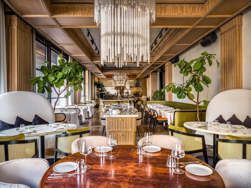
The dining room is organized like a terrace rather than a grid. Banquettes hold the perimeter, loose tables occupy the center, and fiddle-leaf figs break the spine at intervals. Materially it stays inside a narrow band: oak herringbone underfoot, camphor burl on the round tables, white linen on the square ones, olive velvet across the seating. The tablecloths carry more weight than they appear to, since they supply the room’s only pure white and pull the eye across the plan, keeping a timber envelope from reading heavy. Spacing is generous, which is what lets four seating formats share one room without visual conflict.
 Pin
Photo: Evgeny Kulibaba
This is the full axis in daylight. Planting sits at intervals along the spine, doing the work of street trees in a real square and breaking the sightline just enough to keep a large room from feeling like a hall. The marble-topped service station at the center is detailed as furniture rather than equipment: fluted timber base, brass pull, stone top matched to the tables. The palette discipline is visible in one frame — olive, cream, camphor, oak, white linen, and nothing else.
 Pin
Photo: Evgeny Kulibaba
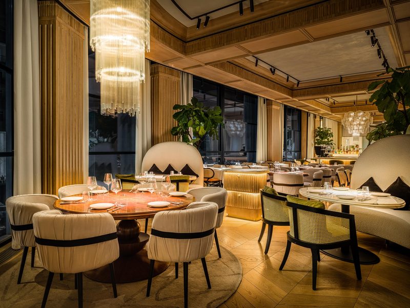
At night the burl veneer becomes the brightest surface in the frame. Warm downlight on camphor grain reads almost like a pool of light resting on the table, which is a lighting decision as much as a material one. The dome booth behind is upholstered in bouclé with dark triangular cushions whose profile suggests a mountain silhouette (assumed from context — please verify). Cane-backed armchairs in front carry olive velvet cushions, tying the loose seating back to the fixed banquettes across the room.
 Pin
Photo: Evgeny Kulibaba
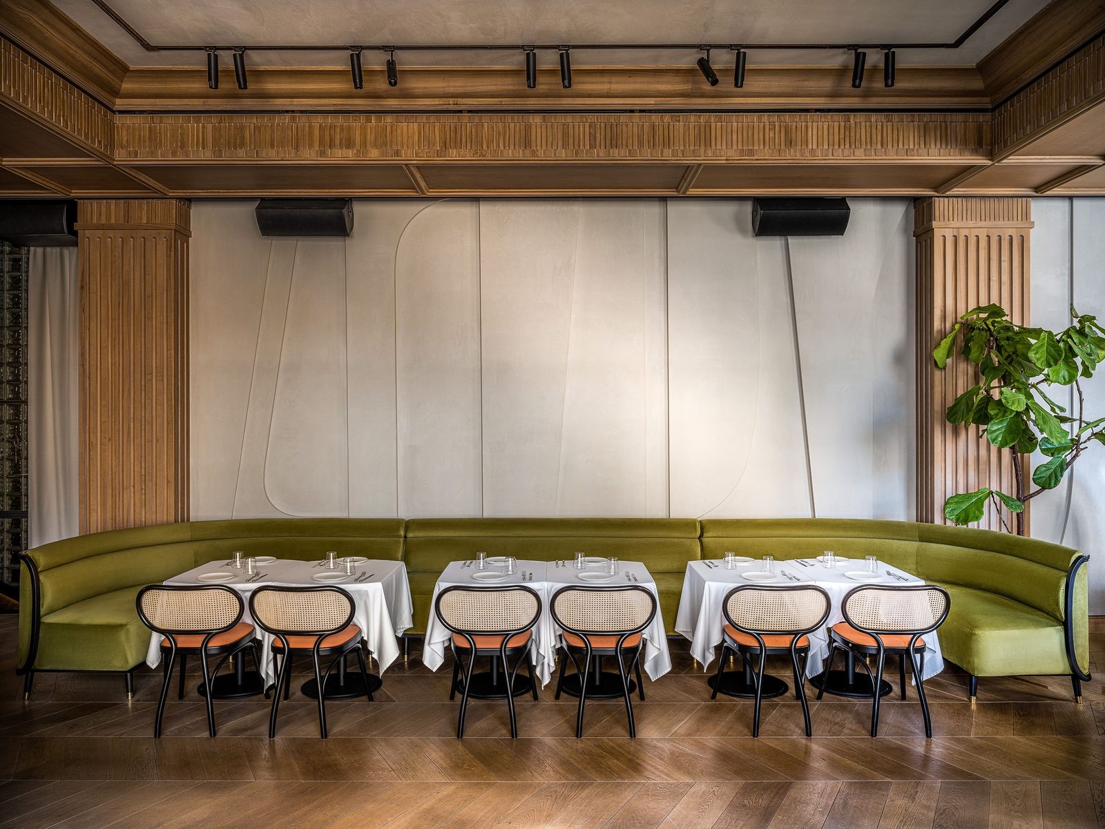
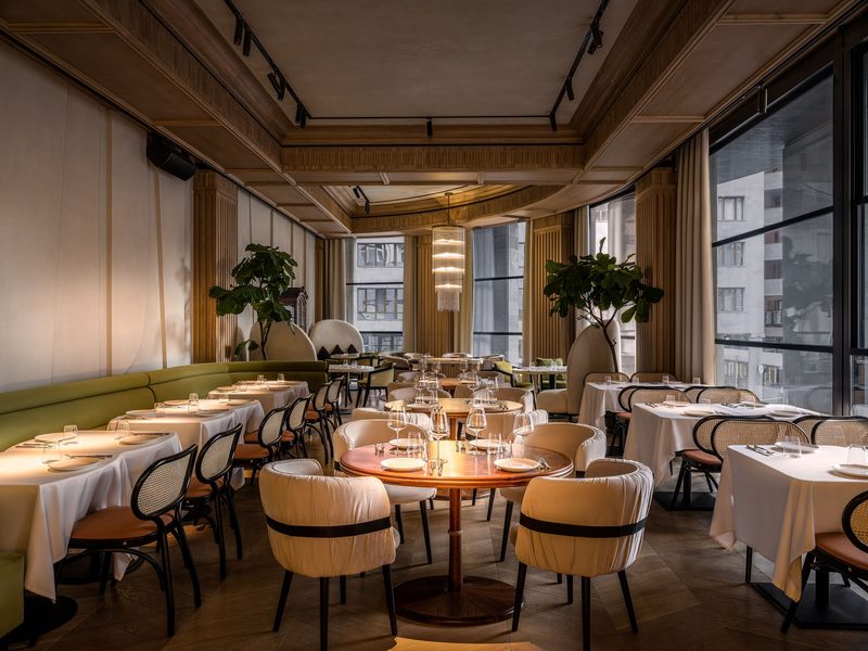
Daylight exposes how much of the seating plan depends on the perimeter. Green velvet banquettes run the wall, bentwood cane chairs with orange seats face them, and freestanding round tables float in the middle where circulation needs to flex. The bentwood is the most literal Italian café quotation in the room, and it is used sparingly. A chandelier in the bay marks the corner as a destination table without a partition, a step, or a screen.
The Bar as the Room’s Fountain
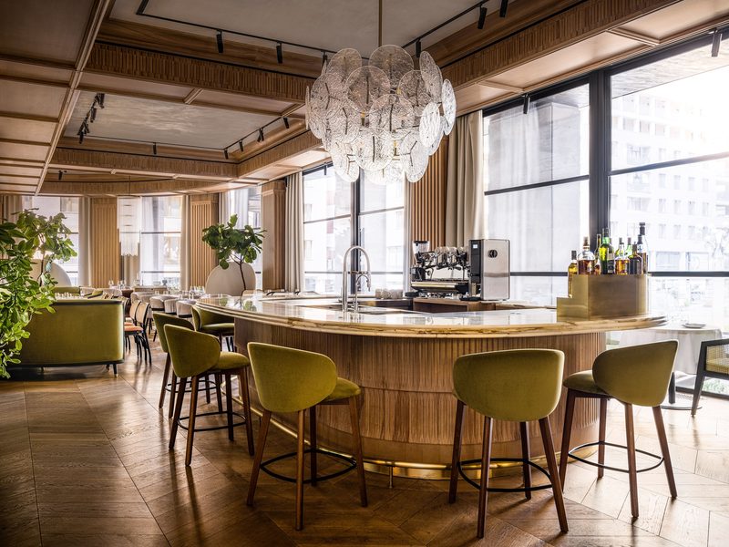
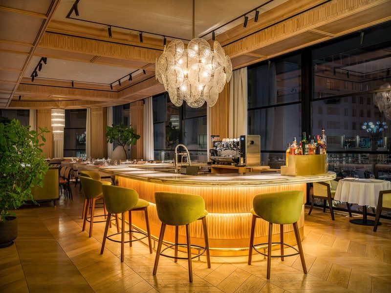
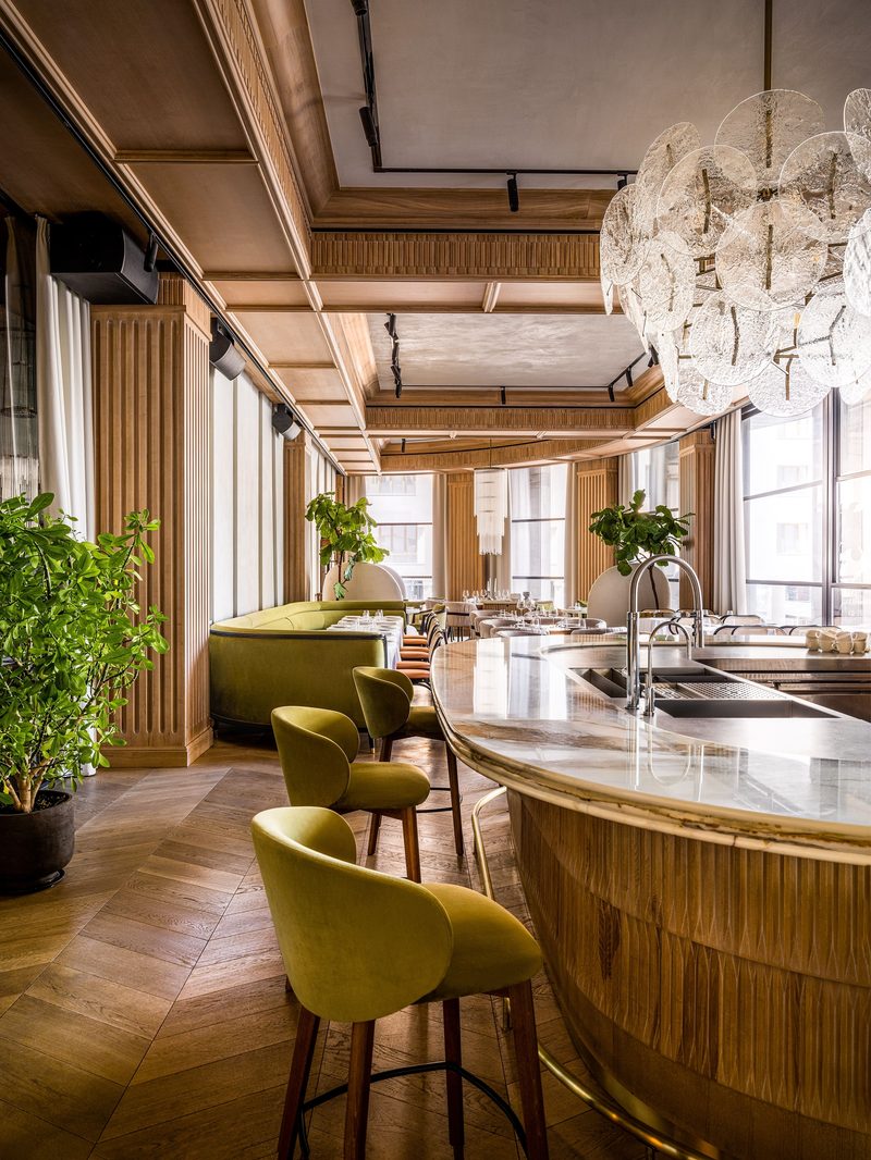
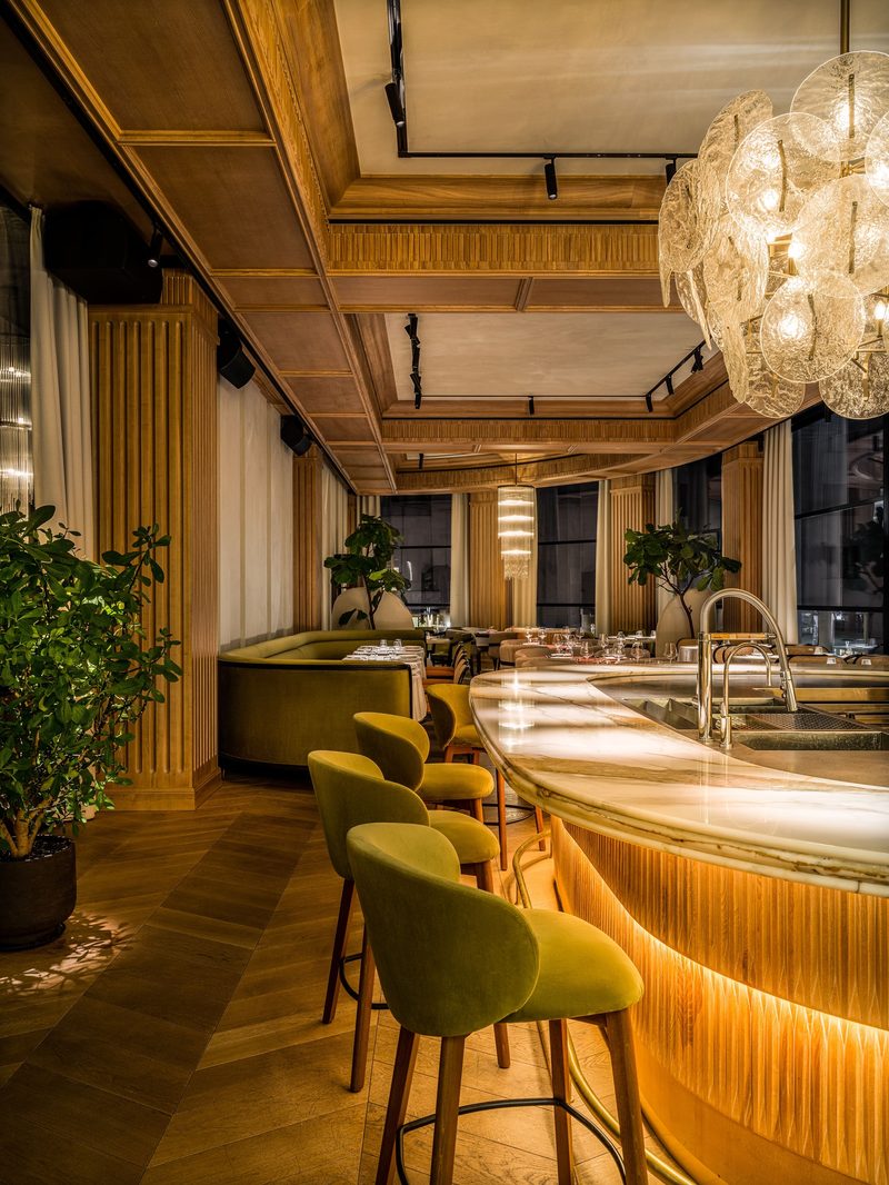
If the plan is a square, the bar is what stands at the middle of it. Round, freestanding, and positioned so circulation passes on both sides, it behaves as an object rather than a barrier. The fluted timber base is backlit at the plinth, which lifts the whole mass off the floor after dark, and the counter is a slab of figured onyx edged in brass. Above it hangs the dandelion-inspired chandelier the studio describes, a mass of textured glass discs reading as a soft cloud. Sightlines from the stools reach the kitchen, the windows, and most of the dining room, so a guest eating alone at the counter is still inside the room.
 Pin
Photo: Evgeny Kulibaba
The bar is approachable from most of the plan, which is what makes the fountain analogy hold. Its base is fluted timber, its top figured onyx with a brass edge that catches light from any angle. Olive velvet stools on walnut legs put the seated eye just above the counter line, keeping the bartender’s working surface visible rather than hidden behind a raised rail. In daylight the disc chandelier above almost disappears; it is designed for the evening.
 Pin
Photo: Evgeny Kulibaba
After dark the same fixture becomes the room’s center of gravity. Dozens of textured glass discs radiate from a brass armature, and a concealed strip beneath the fluted timber does the rest, lighting the counter from below so the onyx glows instead of reflecting. This frame reads warmest of any in the project because nearly every surface in it is either backlit or brass. The bottle display is kept low and loose, which stops the bar from turning into a back-lit wall of merchandising.
 Pin
Photo: Evgeny Kulibaba
From the dining side, the bar’s silhouette explains the circulation: a soft-edged object you walk around, not a counter you queue at. The green banquette in the middle distance and the olive stools in the foreground are the same color family at two different scales, which stitches the bar visually into the dining room instead of isolating it. Full-height glazing behind keeps the counter from ever feeling like an interior island cut off from the city.
 Pin
Photo: Evgeny Kulibaba
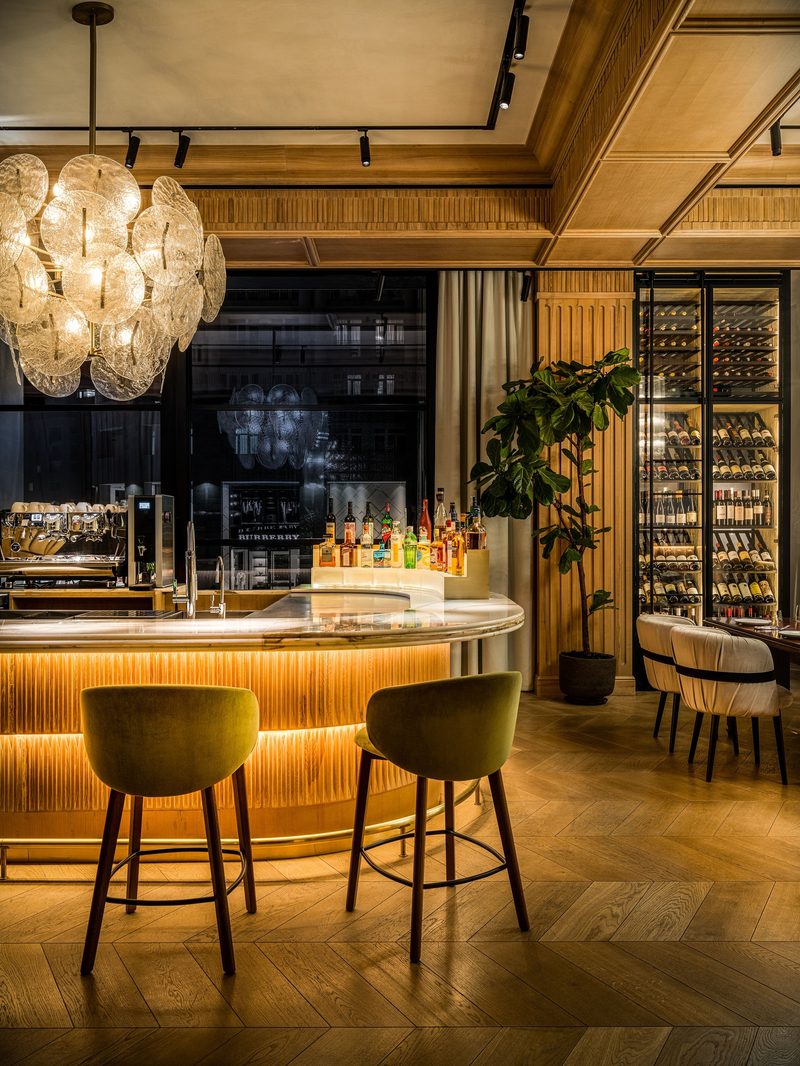
The side view shows the detail language carrying the whole interior. Fluting appears on the bar base, on the pilasters, and again as a reeded band at the ceiling. Repetition at three scales gives the room a consistent grain without a single applied pattern or motif. The curved green banquette beyond and the onyx counter are the two hard gestures in an otherwise timber envelope, and they are placed to be seen together.
 Pin
Photo: Evgeny Kulibaba
The wine storage is treated as joinery rather than merchandising: black-framed glass cabinets set flush into the timber wall and lit evenly, so the bottles read as texture instead of a feature wall. Note what is visible through the glazing — the storefronts of central Yerevan, which is exactly the relationship the piazza concept needs. This is not a sealed themed box; it sits above a working street and says so.
The Open Kitchen at the End of the Axis
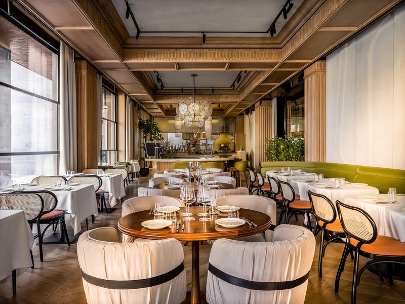
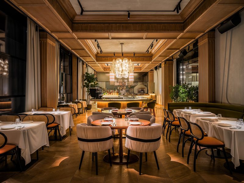
The kitchen is fully open and placed at the terminus of the spine. A domed oven, clad to catch light, occupies the position a focal sculpture would take in a lobby, and mirrored panels above the pass extend the space visually while pushing light back down the room. The decorative glass chandeliers hang over the working line rather than the tables. That single decision reframes the kitchen from back-of-house to stage, and it is consistent with the piazza logic: in a real square, the activity belongs at the edge, in public view, where anyone crossing can watch it happen.
 Pin
Photo: Evgeny Kulibaba
The brass-clad dome oven is the most sculptural object in the restaurant, and it is placed on axis so it terminates the view from the entry. The mirrored panel above the pass doubles the kitchen’s apparent depth and bounces daylight back into the dining room. Everything in front of it is deliberately quieter — white linen, cane, pale velvet — so the kitchen keeps the visual advantage without competing with the tables.
 Pin
Photo: Evgeny Kulibaba
At night the hierarchy inverts. Dining tables drop into pools of low light while the kitchen stays at working brightness, so the eye travels straight to the pass. Four service formats share this single frame: square linen-topped tables, round camphor tables, a continuous banquette run, and bar stools. That they coexist without visual conflict is a function of the tight palette, not of screening or level changes.
Booths and Banquettes: Two Ways to Sit at the Edge
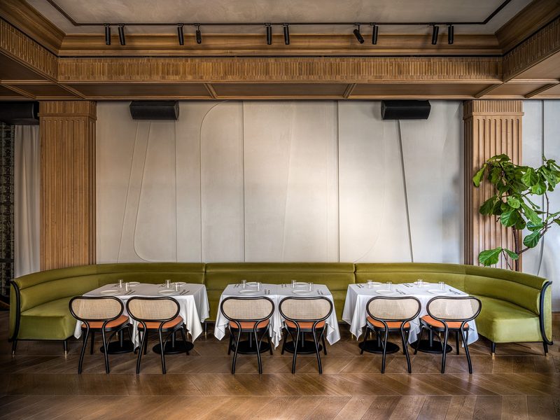
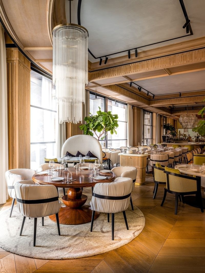
Two seating typologies do most of the emotional work. The curved green velvet banquettes are continuous and public: several parties share one seat, which is how a café terrace actually functions. The bouclé dome booths are the opposite, an enclosure with a high curved back that cuts sound and sightlines from three sides while leaving the fourth open. Placing those booths at windows rather than in dark corners is the smarter call, since it delivers privacy without exile. Between the two sits a flexible layer of cane armchairs and bentwood chairs that lets the floor absorb a party of two or a party of ten.
 Pin
Photo: Evgeny Kulibaba
Photographed straight on, the banquette wall becomes a study in proportion. The sculpted plaster panel behind carries a shallow relief curve that reads as an abstracted arch, and the banquette’s own curved ends answer it. Three tables share one continuous seat, which is precisely how a terrace works: the seat is public, the table is yours. The orange cane chairs are the only saturated warm color in the interior, and they appear only here.
 Pin
Photo: Evgeny Kulibaba
The bouclé dome booth is the most private seat in the restaurant, and it is placed at a window rather than in a back corner. Its high curved back cuts sound and sightlines from three directions while leaving the fourth open to the glazing. A round camphor table in front seats six on a rug that defines the zone without walls. The two seating types are doing different jobs in one frame: the booth is architecture, the loose chairs are furniture.
Where the Discipline Holds — and Where Service Will Feel It
What the Perimeter Strategy Buys
Holding the seating at the edges and giving the center to the bar and circulation buys something restaurants of this size usually lose: legibility. A guest at the door can read the entire plan and choose a mood without being walked through it. The lighting supports that clarity, with backlit joinery at the bar, tight pools on the tables, and working brightness at the pass, so light level maps directly onto function. The material restraint is real rather than claimed — oak, camphor burl, plaster, onyx, olive velvet, white linen, repeated at different scales, is the entire palette.
The Price of a Pale, Soft Room
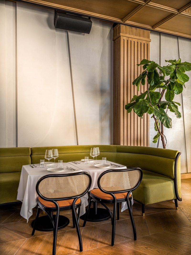
The finishes are honest about their maintenance cost. Cream bouclé at chair-back height, pale velvet seats, sculpted plaster within arm’s reach, and white linen on nearly every table make for a demanding regime in a room serving Italian food. The envelope also raises an acoustic question: coffered oak, glazing on two elevations, and hard herringbone floors are all reflective, leaving upholstery and drapery to carry the absorption load alone. And a fully open kitchen placed on axis means heat and noise peak exactly where the best sightline in the room is.
 Pin
Photo: Evgeny Kulibaba
This corner shows both the discipline and the exposure. The plaster panel’s soft curve, the banquette’s curved return, and the arc of the bentwood frame are three different radii in conversation, and they hold together because the color range is so tight. The same frame shows what the room asks of housekeeping: pale velvet at knee height, light plaster within reach of a chair back, and white linen on every surface that receives a plate.
A Room That Argues for Dialogue Over Quotation
La Piazza’s contribution is not a material or a structural idea. It is a method: take the organizational logic of a familiar public space, then let local material culture supply everything a guest can touch. That is a more portable lesson than another themed interior, and it is why the project should interest anyone working on a cross-cultural hospitality brief. It suits an operator who wants a room with a center of gravity rather than a room full of tables. Which raises the harder question: when a restaurant’s kitchen becomes its stage, does the dining room gain a focal point, or lose the privacy people go out to find?
FAQs
Who designed La Piazza restaurant in Yerevan?
La Piazza was designed by S+S Design Studio, also known as the Sundukovy Sisters, the international hospitality practice founded by Irina and Olga Sundukovy. The studio specializes in hospitality architecture and interior design and delivers projects across Europe, the Middle East, Asia, and the United States.
How big is La Piazza restaurant?
The restaurant covers 654 square meters, roughly 7,040 square feet. That area holds the entry sequence, a main dining room, a freestanding central bar, an open kitchen with a domed oven, and continuous banquette and booth seating running along two glazed elevations.
What is the design concept behind La Piazza?
The studio reinterpreted the traditional Italian piazza through the lens of contemporary Yerevan rather than recreating Italian clichés. Italian references appear as quotations rather than reproductions: pilasters, white tablecloths, and camphor veneer tables sit within a restrained palette of natural materials and understated contemporary Armenian elegance.
What materials are used in the La Piazza interior?
The palette stays deliberately narrow. Warm timber flooring, marble surfaces, olive-toned textiles, camphor veneer tables, sculpted plaster wall panels, and white linen carry the room. Glass appears throughout in the lighting, including the dandelion-inspired chandelier above the bar and the fixtures suspended over the open kitchen.
Who photographed La Piazza restaurant?
The project was photographed by Evgeny Kulibaba. The published set covers the entry sequence beneath its suspended chandelier, the main dining room in both daylight and evening light, the central bar, the open kitchen on axis, and the perimeter banquette and booth seating.
Get gorgeous projects via email
