

Sometimes the most radical move an architect can make inside a gallery is subtraction. That is the wager behind Gary Tatintsian Gallery Dubai, the gallery’s new 338 m² home in Dubai Design District (D3), designed by Architecture Studio MAST
The studio stripped an L-shaped commercial unit back to a clear rectangular volume: no internal partitions, no decorative gestures, only a precisely proportioned framework in which art holds the spotlight. The project matters because it redefines what flexibility means for a commercial gallery — not movable walls or gadgetry, but a disciplined neutral shell that can absorb anything from geometric painting to full-scale sculpture. It is a quiet building with a very deliberate argument.
| Project Name | Gary Tatintsian Gallery Dubai |
| Architect / Designer | Architecture Studio MAST (Vladislav Gaiduk, Founder & Principal Architect) |
| Location | Dubai Design District (D3), Dubai, UAE |
| Floor Area | 338 m² (converted L-shaped commercial unit) |
| Client Type | Private commercial art gallery |
Gary Tatintsian Gallery Dubai: Walls That Refuse to Touch the Ceiling
The brief called for an exhibition space of international standard that could meet the gallery’s curatorial requirements while staying flexible enough for everything from painting to large-scale installation. MAST’s response was to regularize the irregular plan. The L-shaped unit became a clear rectangular volume holding two exhibition halls, a central office, a separate museum room, and storage, with furniture reduced to the essentials — the office carries only two custom shelving units designed by the studio for catalogs and documentation.
The defining gesture is what was left out. With internal partitions eliminated, the interior reads as a single continuous volume: no gallery wall reaches the ceiling, so a clerestory-like gap (a high band of openings just below the roofline) runs above every partition and lets light and sightlines travel. From the street, visitors catch glimpses of what founder Vladislav Gaiduk calls a soft, almost cave-like light filtering through those openings. “Art should never feel confined,” he says. “Large-scale works need generous space to fully reveal themselves.”
The fully glazed retail façade posed the second constraint. Rather than blocking the shopfront, MAST set the exhibition walls slightly inboard, creating a circulation path between glazing and gallery and turning the storefront into a subtle announcement of the shows inside. The material language stays disciplined throughout — white partition faces, a polished concrete floor, and mechanical services left exposed overhead — so the architecture communicates one identity: a frame that defers to the work.
Design Decision: Instead of blocking the fully glazed shopfront, MAST pulled the exhibition walls inward, giving up perimeter hanging space to create a street-side circulation path. The storefront became a preview device: visitors sense the exhibition before they ever enter it.
From White Cube to Brick Chamber: A Walkthrough
Two Exhibition Halls, One Unbroken Volume
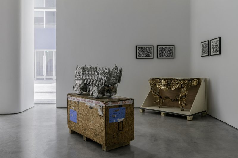
The two exhibition halls share a single, uninterrupted volume — none of the freestanding walls reaches the ceiling, so the eye reads the full shell even when the plan is subdivided. Above the white partition faces, the mechanical ceiling stays exposed, its ducts and red sprinkler lines registering as a technical frieze rather than a finish to hide. Daylight is borrowed from the glazed storefront and pulled deep into the plan, while the polished concrete floor gives heavy sculpture a surface that can take real weight. It is a white cube, but one that admits its own workings.
Across these views, the halls operate as a calibrated neutral field. Peter Halley’s geometric canvases — hard-edged rectangles of red, gold, black, and blue — hang flush against the white planes and quietly echo the room’s rectilinear discipline. Against that flatness, the inaugural works introduce deliberate friction: a stainless-steel tipper truck rendered in laser-cut Gothic tracery sits atop its own shipping crate, and polished gold figurative sculptures twist directly on the concrete floor. The wide shots reveal the project’s key section move — partitions stopping short of the slab, so a continuous band of light and exposed services runs above the art. One frame captures a tall Halley beneath a high window strip, daylight washing the wall without ever striking the canvas directly. The crate-as-plinth detail is the sharpest curatorial decision here: logistics infrastructure turned into display, collapsing the boundary between back of house and exhibition.
 Pin
Pin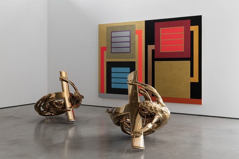 Pin
Pin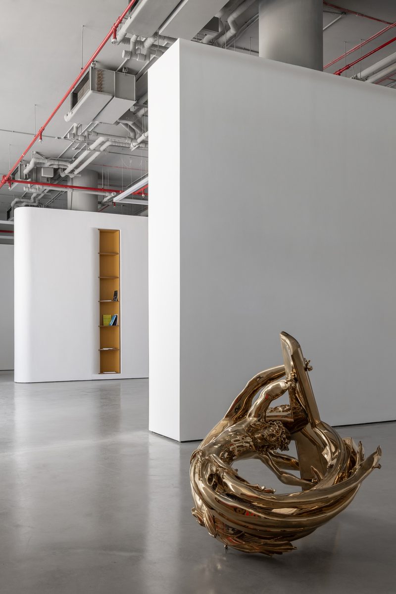 Pin
Pin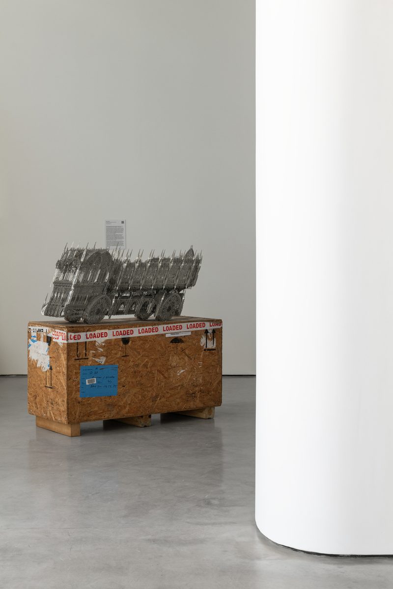 Pin
Pin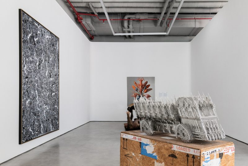 Pin
Pin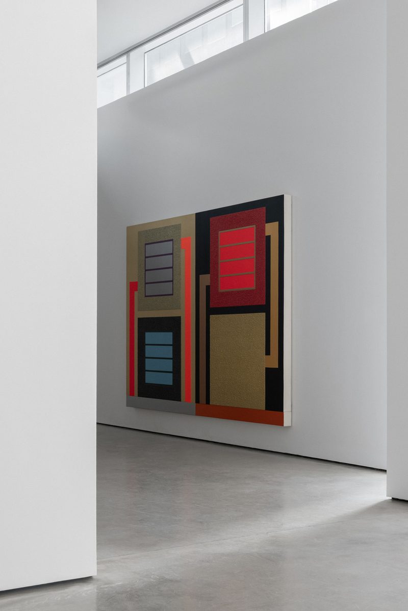 Pin
PinPhoto: Nikita Subbotin
The Curved Partition: Wayfinding Without Signage
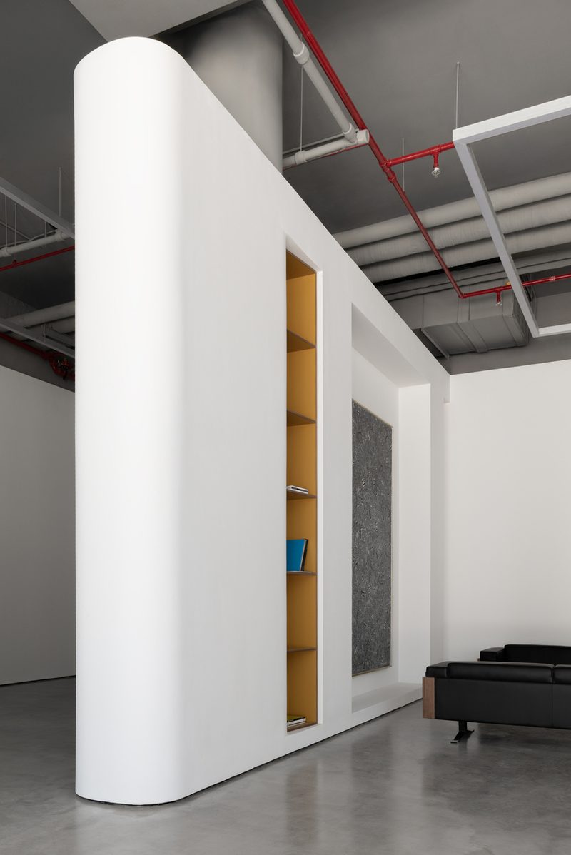
A single freestanding volume, its corner softened into a full-radius curve, does the work of corridor, threshold, and display wall at once. Visitors read the curve before any sign and are steered around the plan — parti-level thinking (the organizing geometry of the scheme) executed at the scale of furniture. Niches cut into the white shell reveal warm ochre shelving, the first hint of the palette reserved for the gallery’s working zones. Even this solid element stops below the ceiling, keeping the one-room reading intact.
The curved volume is the project’s quietest and most effective device. Shot from two directions, it shows how a rounded corner removes the pinch point a square partition would have created in the circulation loop. Recessed niches lined in ochre hold catalogs and small monographs, lit so they read as display rather than storage. A dark, densely worked painting sits in a deep white reveal beside the curve, and the black recessed plinth at the floor line lets the whole volume float slightly. The contrast of radius and grid — curve against the rectilinear hall — gives the plan its only deliberate moment of softness.
 Pin
Pin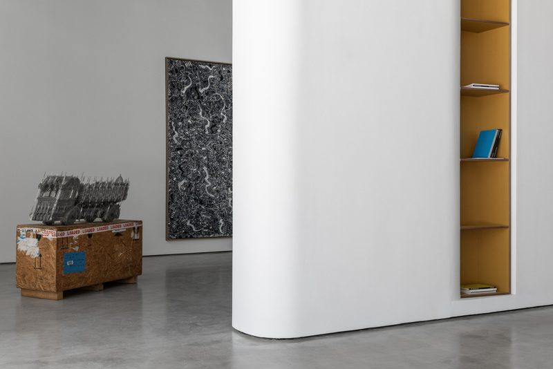 Pin
PinPhoto: Nikita Subbotin
A Reading Lounge at Domestic Scale
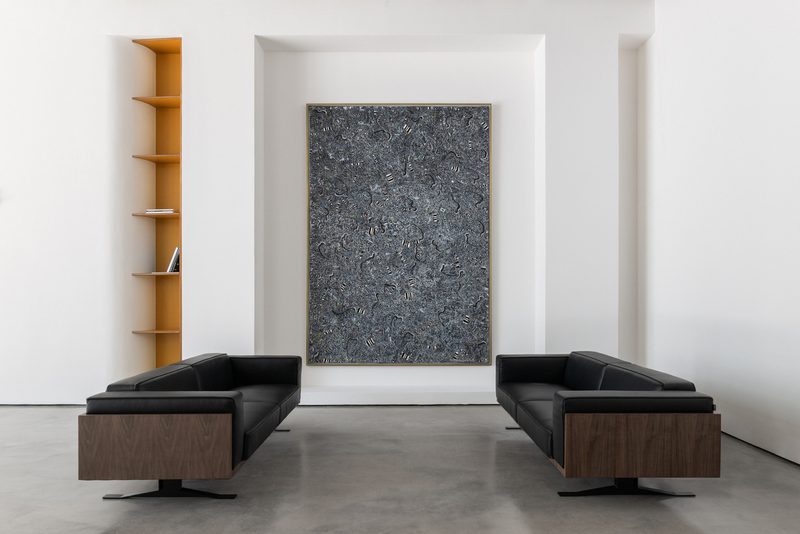
Between the halls, a lounge slows the visit down. Low black-leather sofas with wood-paneled sides face each other across the concrete floor, symmetrically arranged before a large dark painting set into a recessed white bay. The composition borrows domestic cues — conversation distance, book-filled niches, warm timber — and sets them inside the gallery’s cooler register. Lighting here feels softer and more directional than in the halls, marking the shift from looking to sitting. The space works as a decompression zone where a collector can discuss a piece while still standing inside its field.
The lounge views show how little furniture the architecture needs. The sofas are low and rectilinear, echoing the partition geometry, and their wood side panels pick up the ochre of the shelving niches cut into the adjacent wall. Behind them, large monochromatic paintings — black surfaces worked with dense calligraphic marks in thin brass-toned frames — are given recessed bays that read almost as rooms within rooms. The shelving rhythm is consistent with the office units, tying front and back of house to the same modular joinery language. Nothing here competes with the art; everything is scaled to keep sightlines open across the concrete floor.
 Pin
Pin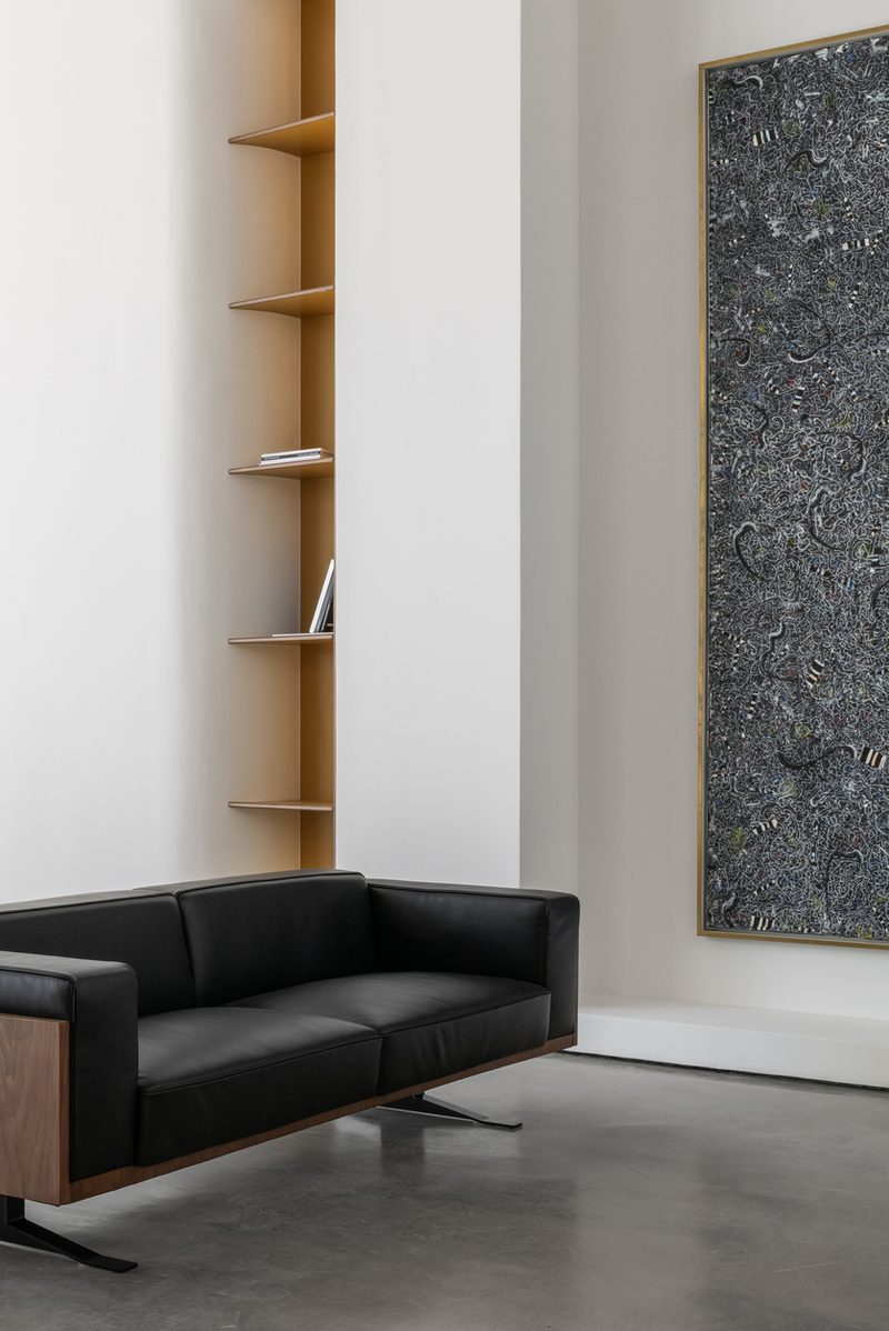 Pin
Pin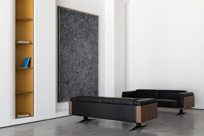 Pin
PinPhoto: Nikita Subbotin
Office and Catalog Library: Two Shelving Walls, Nothing More
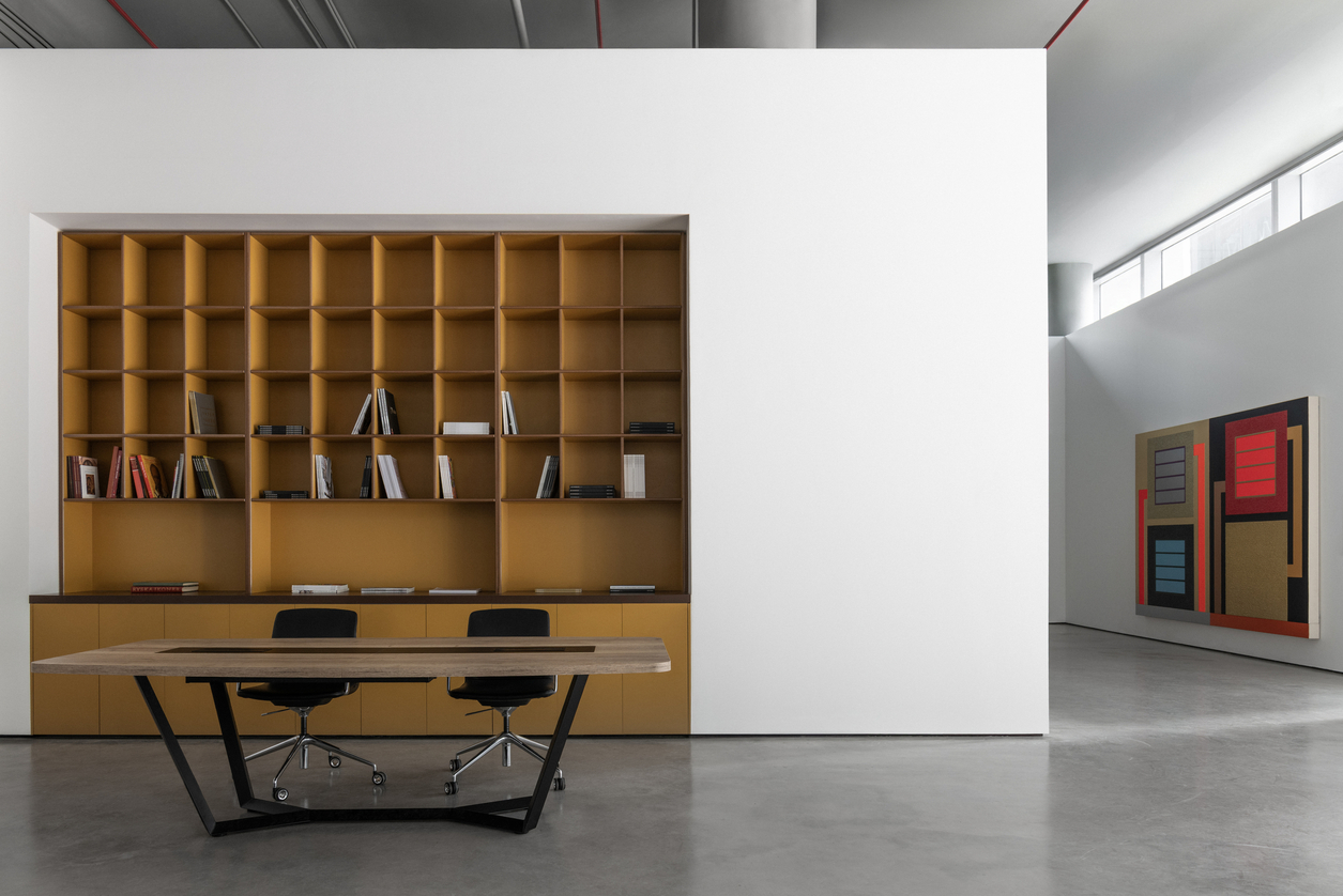
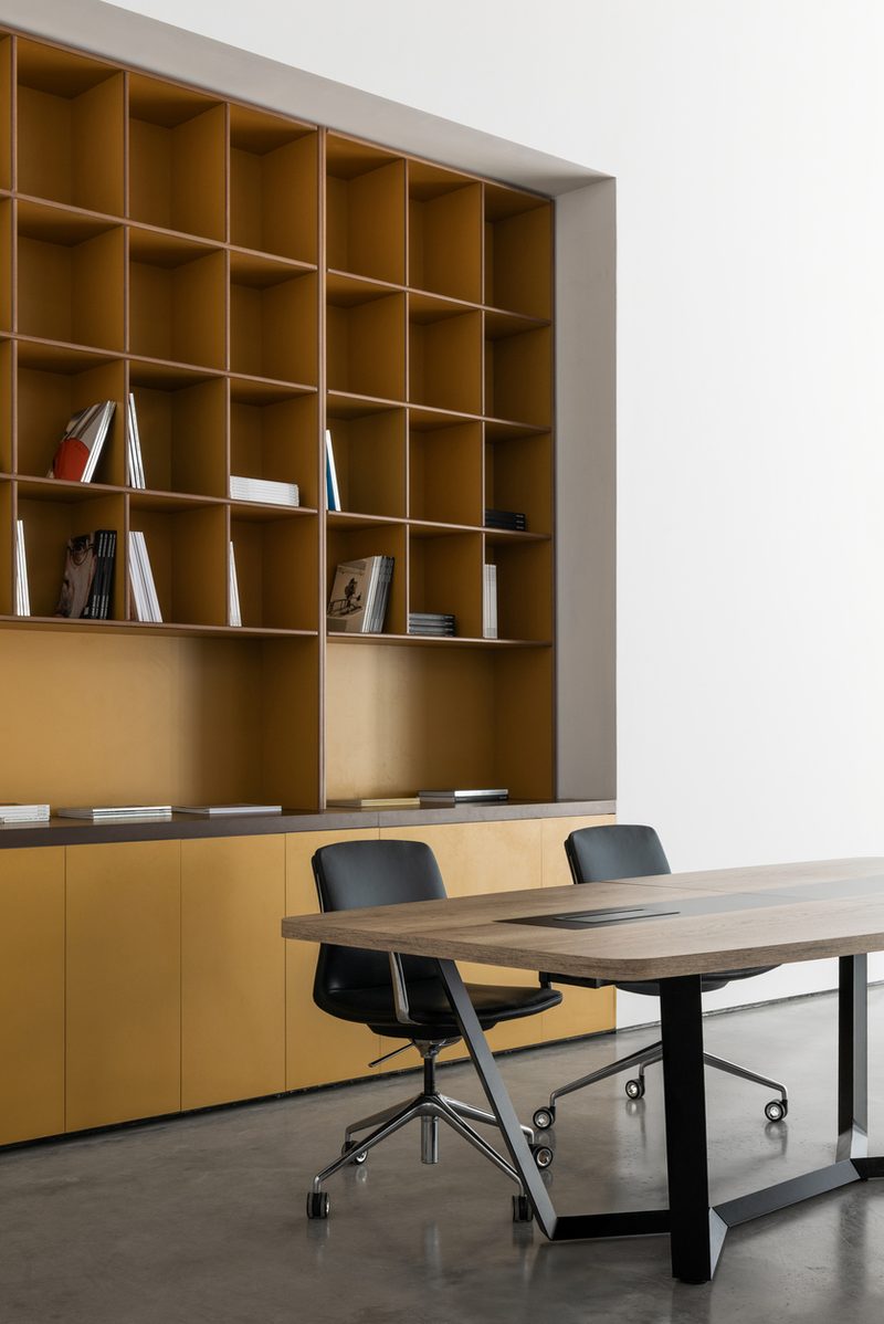
The central office holds the project’s only built-in furniture: two shelving walls designed by MAST for catalogs and documentation. A strict grid of square compartments in the same ochre tone as the gallery niches turns storage into a composed façade, while a long timber table on angled black steel legs doubles as desk, viewing table, and informal meeting point. Black task chairs keep the palette disciplined. Through the doorway, a Peter Halley canvas stays in sight — a reminder that even the back office sits inside the exhibition’s visual field.
The office photographs reveal the working register of the gallery. Floor-to-near-ceiling cubbies are left deliberately half-filled, storage treated as an honest grid that can grow with the archive rather than a finished composition. The long oak-toned table, with its trapezoidal black frame, sits parallel to the shelving so the room reads as a study hall rather than a cubicle office. In the wider view, the white exhibition hall and its geometric painting appear beyond the office wall, and the high window band repeats above — the same daylight strategy serving both zones. The restraint is the point: one material move, one furniture move, and nothing else.
 Pin
Pin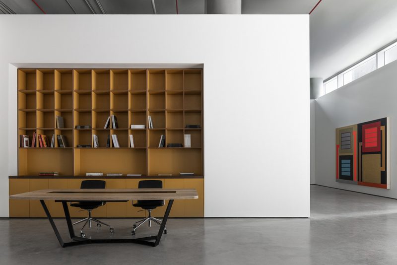 Pin
PinPhoto: Nikita Subbotin
The Museum Room: A Brick-Toned Chamber for Slow Looking
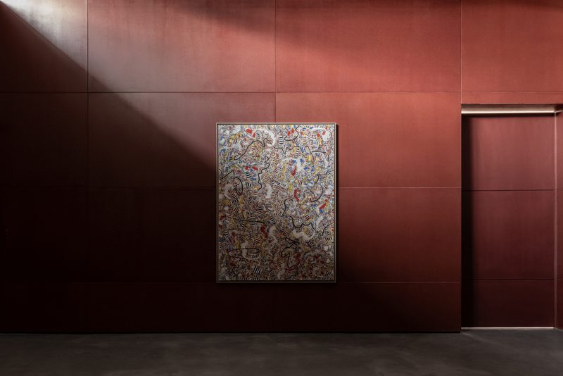
Behind a monumental partition with an oversized door — a threshold that announces importance before anything inside is seen — the museum room breaks the gallery’s own rules. Walls are clad in raw MDF panels finished in a deep brick tone, lighting drops to subdued accents, and the floor darkens underfoot. The architects cite the National Museum of Qatar and Louvre Abu Dhabi among the project’s references, and the lineage shows. Against the even white of the halls, this chamber gives the program a second tempo — a place for works that demand shadow.
The single view of the museum room shows how completely the atmosphere flips. Floor-to-ceiling MDF panels in a deep brick tone are laid out in a regular grid, their recessed joints giving the wall a measured rhythm. One densely worked canvas — a tangle of calligraphic marks flashing red, yellow, and blue — holds the long wall and carries further against the matte, light-absorbing surface. A blade of daylight cuts diagonally across the panels from a high opening, the room’s only concession to the outside. The oversized door sits flush within the grid, its edge traced by a thin line of light. This is the project’s counter-argument: after so much neutrality, a room with genuine mood.
 Pin
PinPhoto: Nikita Subbotin
Where the Neutral Framework Delivers — and What It Asks in Return
Light, Flexibility, and the Discipline of the Palette
Daylight is handled as a conservation strategy as much as an aesthetic one. Pulling the walls off the glazing and stopping them below the ceiling creates a continuous high band of openings, so daylight washes the halls indirectly — even ambient light, with direct sun kept off the artworks. Flexibility is equally concrete: a regularized rectangular volume, freestanding partitions, and a load-bearing concrete floor let the gallery move from Halley’s precise geometry to a full-scale steel truck without the architecture pushing back. And the palette — white planes, concrete gray, ochre joinery, one brick-red chamber — is tight enough to read clearly from the street.
The Frictions of a Hard, Open Shell
The same surfaces that make the gallery robust make it acoustically unforgiving. Concrete, plaster, and glazing will reflect sound during crowded openings, and any softness will have to come from people and temporary fit-outs rather than the building. The fully glazed façade is also asset and liability at once: the showcase strip gives up perimeter hanging space and puts UV and heat-gain management permanently on the facilities checklist. Finally, radical furniture restraint keeps the plan pure but puts real pressure on a 338 m² footprint as the program grows.
An Architecture That Knows When to Step Aside
Gary Tatintsian Gallery Dubai treats neutrality not as an absence of design but as its most active form — a framework precise enough to hold Peter Halley’s geometry and a laser-cut steel truck in the same visual field. Its real contribution is the pairing: white-cube openness for the halls, museum-grade atmosphere in the brick-toned chamber, and a storefront that teases rather than tells. The model suits any gallery or institution that needs flexibility without theatrical architecture. Would you trade the spectacle of a statement building for rooms that disappear behind the art — or does a district like D3 demand architecture that performs, too?
FAQs
Who designed the new Gary Tatintsian Gallery space in Dubai?
Architecture Studio MAST, led by founder and principal architect Vladislav Gaiduk. The studio transformed a 338 m² L-shaped commercial unit in Dubai Design District (D3) into a rectangular gallery containing two exhibition halls, a central office, a museum room, and storage facilities.
Where is Gary Tatintsian Gallery’s new Dubai space located?
The gallery is located in Dubai Design District (D3), Dubai, UAE. It occupies a converted commercial unit with a fully glazed retail façade, which the architects turned into a street-side preview of the exhibitions inside by setting the gallery walls slightly back from the glass.
What is the design concept behind the new Dubai gallery?
The concept is the elimination of internal partitions. The interior works as a neutral architectural framework in which no gallery wall reaches the ceiling, keeping one continuous volume. Walls are also set back from the glazed façade, creating a circulation path and soft, cave-like light from the openings above.
Which artists are featured in the gallery’s inaugural exhibition?
The inaugural exhibition features works by internationally recognized artists, including Peter Halley, whose geometric paintings reinforce the gallery’s spatial composition, and Tony Matelli, whose hyperrealistic sculpture introduces an almost theatrical presence within the restrained architectural setting MAST created for the space.
What is the museum room inside the gallery?
The museum room is a concealed chamber behind a monumental partition with an oversized door. Unlike the evenly lit white halls, it uses subdued accent lighting and walls clad in raw MDF panels finished in a deep brick tone — a design referencing the National Museum of Qatar and Louvre Abu Dhabi.
Get gorgeous projects via email
