

Most calm interiors reach for white paint and call it a day. Kvadrat architects went the other way. In this 123 m² Almaty apartment in Kazakhstan — set in the Esentai City residential complex at the foot of the mountains — designers Sergey Bekmukhanbetov and Rustam Minnekhanov rejected pure white outright, building serenity from texture, tone, and weight instead. Their clients are spouses who travel constantly for work and needed a home that restores energy and mental balance within a few hours, not days. The result is a working argument for recovery-first design, where every surface is calibrated for the nervous system as much as for the eye.
| Project Name | Esentai City Apartment |
| Architect / Designer | Kvadrat architects — Sergey Bekmukhanbetov, Rustam Minnekhanov |
| Location | Almaty, Kazakhstan |
| Floor Area / Land Area | 123 m² (built area) |
| Year Completed | 2024 (design year) |
| Client Type | Private (a married couple who travel frequently for work) |
How a 123 m² Almaty Apartment Became a Recharging Station
The design problem was psychological before it was spatial: give two exhausted travelers a home that resets them in “an hour in three,” as the brief put it. The obvious answer — an all-white envelope — failed on inspection. The apartment’s many panoramic windows flood the plan with daylight, and under that intensity a pure white interior reads flat, sterile, and strangely soulless. So the designers built the calm out of controlled contrast instead.
The palette holds to natural warm shades of white, with wall paint keyed precisely to the large-format porcelain stoneware underfoot. Depth comes from a deliberate game of opposites: rough against smooth, matte against mirror. That friction between finishes gives the tonal envelope its volume — the harmony of incongruous things, as the studio frames it.
With no facade to author, the apartment’s identity lives entirely in its material logic. Oversized, proportionally generous furniture pieces anchor the open plan and, counterintuitively, amplify its sense of lightness rather than crowding it. The parti (the governing organizing idea of a design) is continuity: one floor material, one tonal family, and a handful of dark sculptural masses that give the eye somewhere to rest.
Design Decision: The floor is large-format porcelain stoneware with a pronounced tactile relief — selected not for its look but for how it feels barefoot. The designers argue parquet and marble cannot produce that sensation, so the recovery concept literally begins at the soles of the feet.
Inside the Esentai City Apartment: Room by Room
The Living Room: Bouclé Islands Around a Black Drum
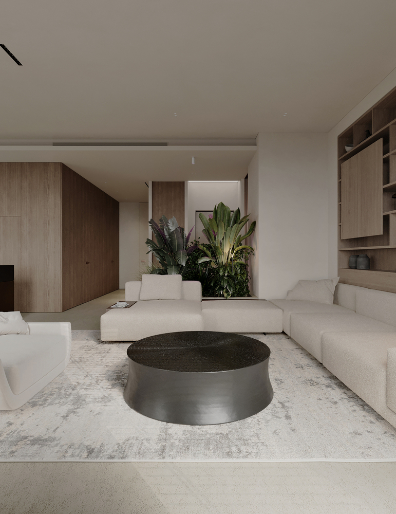
The main living space is arranged as low, deep seating islands orbiting a single dark coffee table. Planting is used architecturally — a dense interior garden screens the corridor and softens the junction between public and private zones. Natural light arrives generously through the glazing and is tempered by timber venetian blinds, which stripe the pale floor with warm shadow.
 Pin
Photo: Kvadrat architects
The wide view shows how the room’s calm is engineered rather than merely painted. Bouclé sofas, a mottled gray rug, and warm-white walls sit within a narrow tonal band, so the hammered black drum of the coffee table lands with real gravity. The interior planting behind the sofa works as a living partition, filtering sightlines toward the corridor. Nothing here shouts; the composition relies on mass, texture, and negative space.
 Pin
Photo: Kvadrat architects
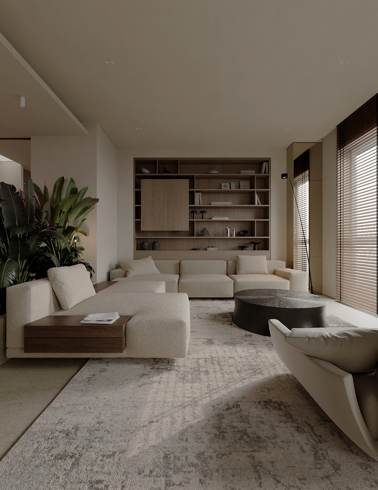
The built-in shelving wall turns storage into elevation. Its timber grid is composed like a facade study, with a sliding panel that can conceal a screen and staggered niches holding dark ceramic objects. A slim black floor lamp leans into the seating group, its thin line contrasting with the sofas’ rounded bulk. The blinds again convert harsh mountain daylight into a soft, directional glow.
 Pin
Photo: Kvadrat architects
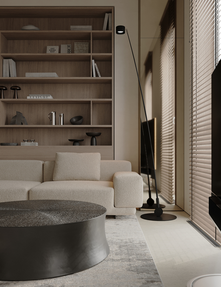
Up close, the material argument sharpens. The coffee table’s hammered, mineral-like surface catches light irregularly — exactly the kind of roughness the designers deploy against the smooth painted planes. On the shelves, books and small vessels are curated in the same muted register, proof that the styling discipline extends down to object scale. This is where matte-versus-reflective contrast does its quiet work.
 Pin
Photo: Kvadrat architects
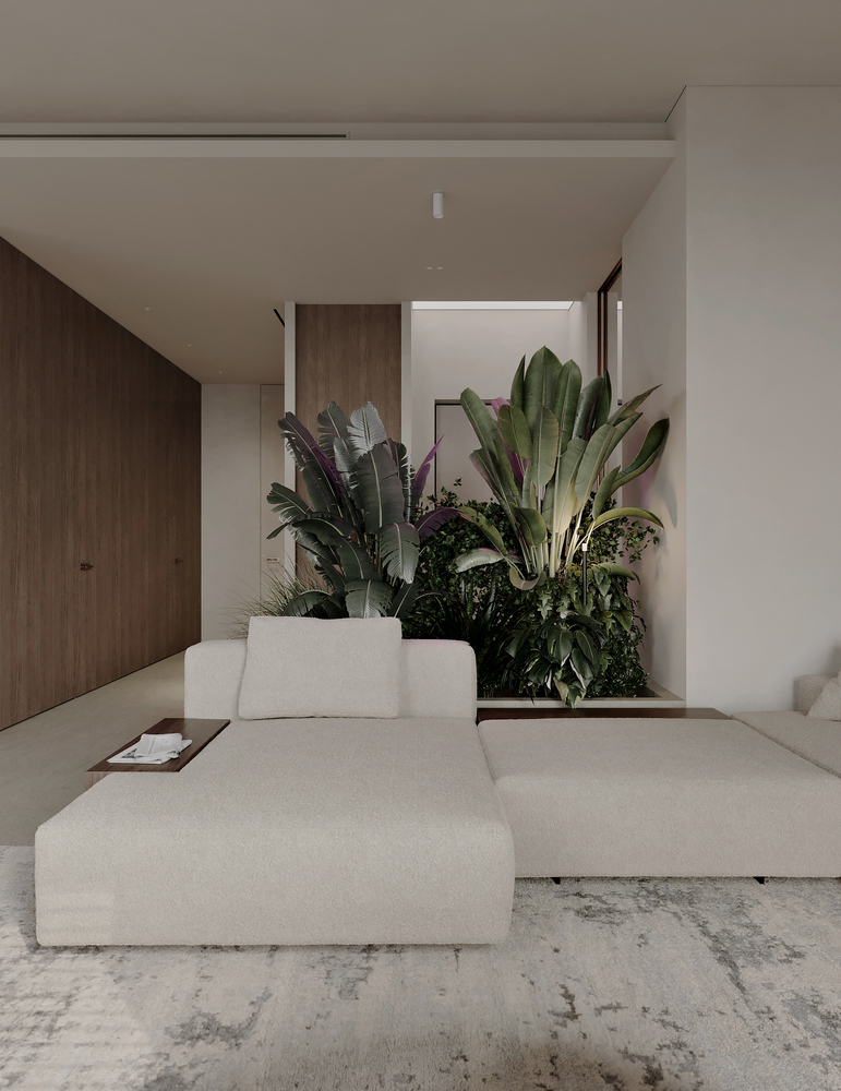
From the seating level, the interior garden reads almost as a courtyard. Broad-leaved planting rises past head height, dissolving the boundary between the living area and the circulation route behind it. The armless daybed module, with its slab-like cushion, keeps the horizon of the room low and unbroken. The effect recalls resort architecture more than a city apartment — deliberate, given the recovery brief.
A Dining Room That Borrows Its Drama from the Kitchen
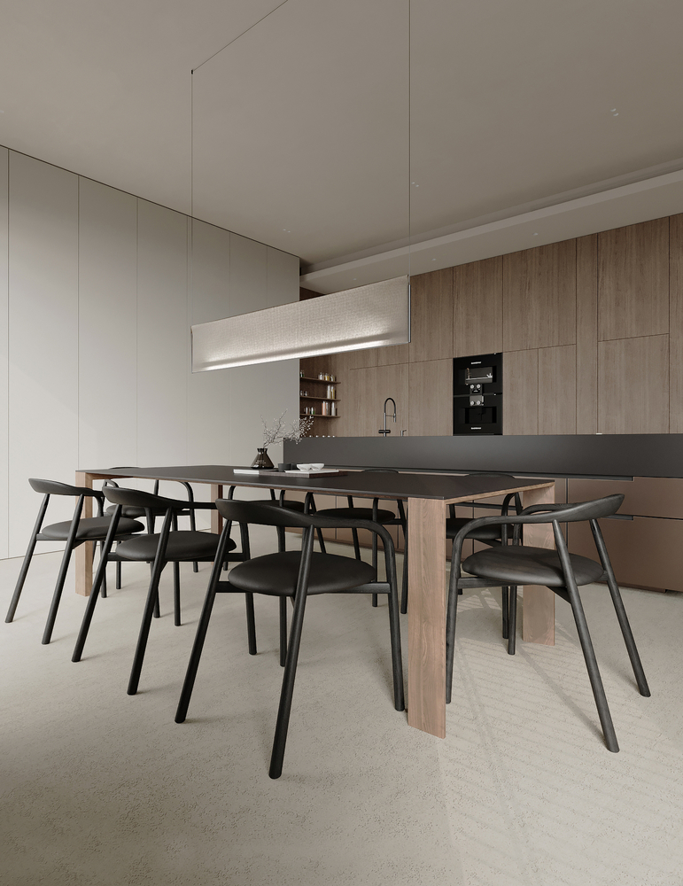
The dining zone occupies the seam between living space and kitchen, unified by the same pale floor and warm-white cabinetry walls. Rather than decorating the area, the designers let two dark horizontal elements define it: the stone-topped table and the illuminated pendant above.
 Pin
Photo: Kvadrat architects
The table pairs a thin dark top with blond timber slab legs, echoing the kitchen island’s two-material logic a step behind it. Sculptural black chairs, all curve and sinew, introduce the only overtly expressive silhouettes in the apartment. Overhead, a linear textile pendant washes the surface in even light while doubling as a spatial divider. The composition demonstrates how a dining room can hold presence without a single ornamental gesture.
The Kitchen: Bronze Mass Against Bleached Timber
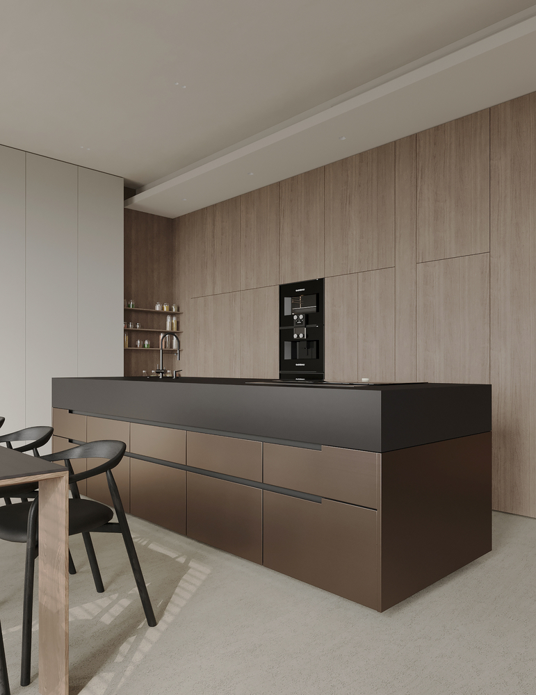
The kitchen is conceived as one monolithic island standing before a full-height wall of flush timber cabinetry. Appliances and shelving are recessed into the wall plane, keeping the room’s geometry intact and the visual noise near zero.
 Pin
Photo: Kvadrat architects
The island’s brushed bronze-toned fronts and thick charcoal counter give the kitchen its center of gravity, while the surrounding bleached-timber wall recedes like a backdrop. Handle-less fronts and shadow-gap reveals preserve the block’s monolithic reading. A compact open shelf niche by the sink admits just enough everyday life — jars, glassware — to keep the space from tipping into showroom stillness. Materially, the island’s warm metal bridges the palette’s pale and dark poles.
The Study: A Daybed Room Built for Slow Hours
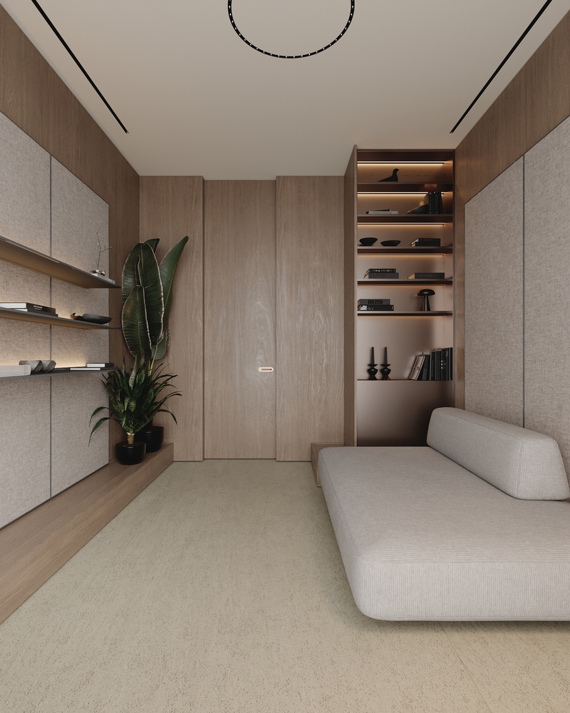
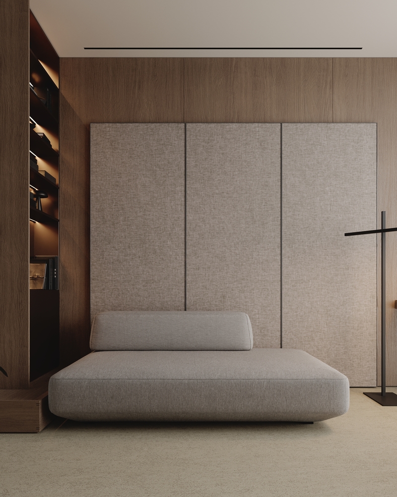
The second room works as study, library, and overflow lounge. Fabric-wrapped wall panels, backlit shelving, and a floor-standing daybed give it the acoustic softness and low posture of a decompression chamber. The millwork (built-in custom cabinetry) carries most of the room’s function so the floor stays clear.
 Pin
Photo: Kvadrat architects
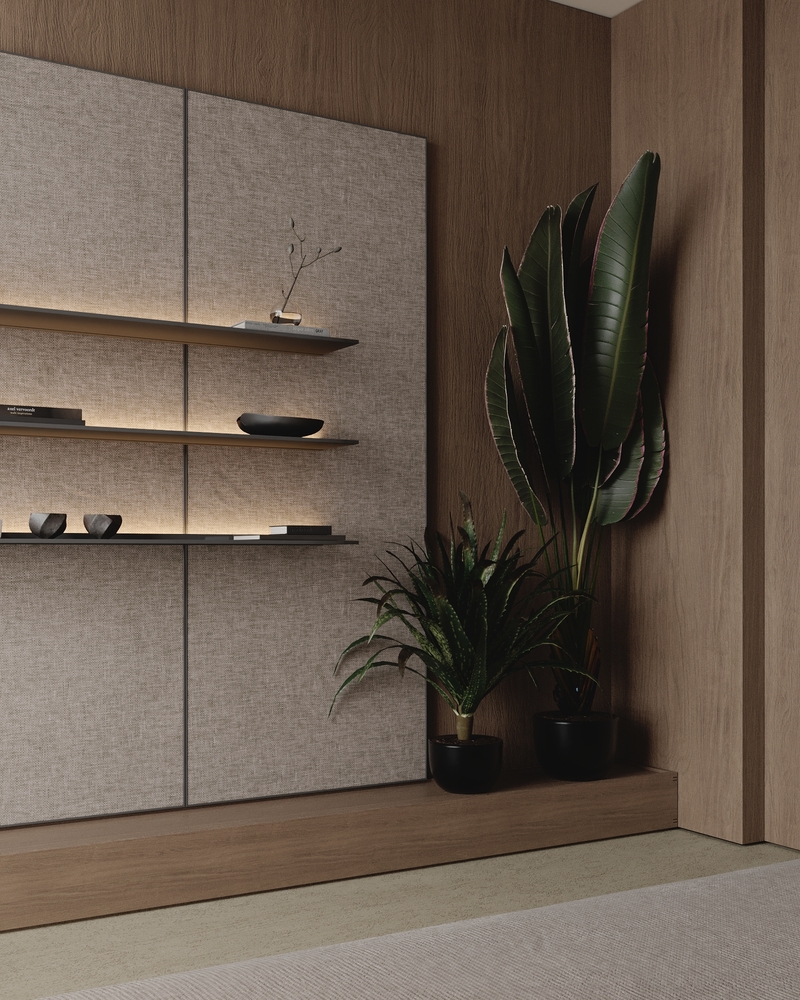
Linen-textured panels line the walls in tall vertical bays, alternating with timber and a recessed shelf column glowing from concealed LED strips. The daybed — armless, generously padded — sits directly on the carpeted floor plane, inviting horizontal use rather than upright work. Potted planting softens the corner by the concealed doors. The room’s spatial hierarchy is deliberately flat: no focal wall, no dominant object, just evenly distributed calm.
 Pin
Photo: Kvadrat architects
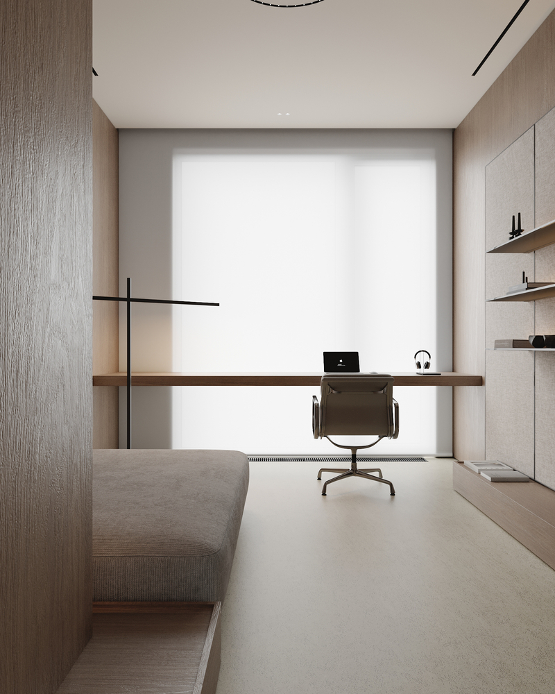
The work function is reduced to a single floating timber ledge spanning the window wall, paired with one classic swivel chair. Sheer roller shades convert the glazing into a luminous panel, delivering glare-free light across the desk surface. A thin black floor lamp crosses the composition like a drawn line. It is a lesson in restraint: the office exists, but it refuses to dominate a room dedicated to rest.
 Pin
Photo: Kvadrat architects
Seen frontally, the daybed and the three fabric wall bays behind it form an almost graphic composition — soft rectangle on soft rectangles. The corduroy-like ribbing of the upholstery plays against the flatter weave of the panels, another instance of the rough-smooth pairing that structures the whole apartment. The backlit book column at left provides the only sparkle. Nothing in the frame has a hard edge at seating height.
 Pin
Photo: Kvadrat architects
The detail view shows how lighting is used as material. Concealed strips graze the fabric panels and float the black steel shelves, turning storage into a low-intensity light source suitable for evening hours. Objects are sparse and dark, chosen for silhouette. The timber plinth running beneath ties the shelving to the floor and gives the plants a stage rather than a corner.
The Bedroom: A Cloud Bed in a Dusk-Dark Shell
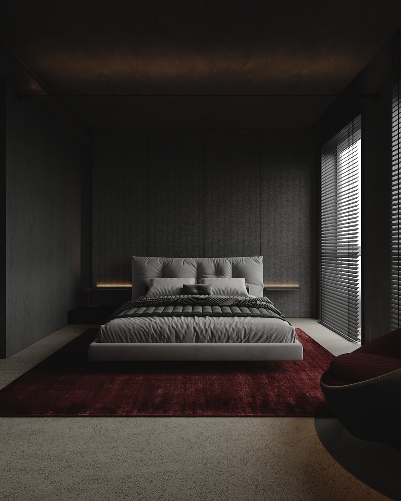
The owners asked not for a bedroom but for a new experience of rest, and the studio answered with soft, enveloping forms, neutral reliefs, and calm textures tuned for quality sleep. The room’s envelope goes dark — a reversal of the daytime spaces — so the pale bed reads as the single luminous object.
 Pin
Photo: Kvadrat architects
Charcoal fabric-panelled walls absorb light and sound, while concealed strips behind the floating side ledges trace a thin horizon line at mattress height. The bed itself is the thesis: a thick, pillowed platform whose shape the designers liken to an airy cloud. Beneath it, a deep oxblood rug supplies the apartment’s one saturated color note, warming the darkness rather than breaking it. Timber blinds seal the room into a controllable dusk at any hour.
 Pin
Photo: Kvadrat architects
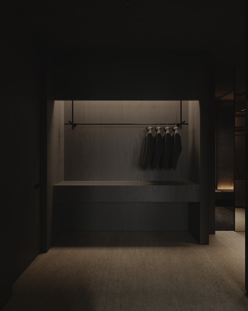
Adjacent to the sleeping area, the dressing niche is treated as a shadow box. A slender suspended rail carries a short run of garments under a soft downlight, above a monolithic bench-chest in near-black timber. The choreography is hotel-like: everything needed for departure or arrival in one gesture, consistent with owners who live between flights. Even here, the lighting is indirect and the edges recede.
Two Bathrooms, Two Temperatures
The apartment’s bathrooms split the palette in two. The guest facilities stay in the warm mineral whites of the day spaces; the primary bathroom plunges into dark stone. Both share the project’s monolithic discipline, where harmony can be traced from the concrete sink, consonant with the porcelain tiles, down to the lighting — every element carrying weight.
 Pin
Photo: Kvadrat architects
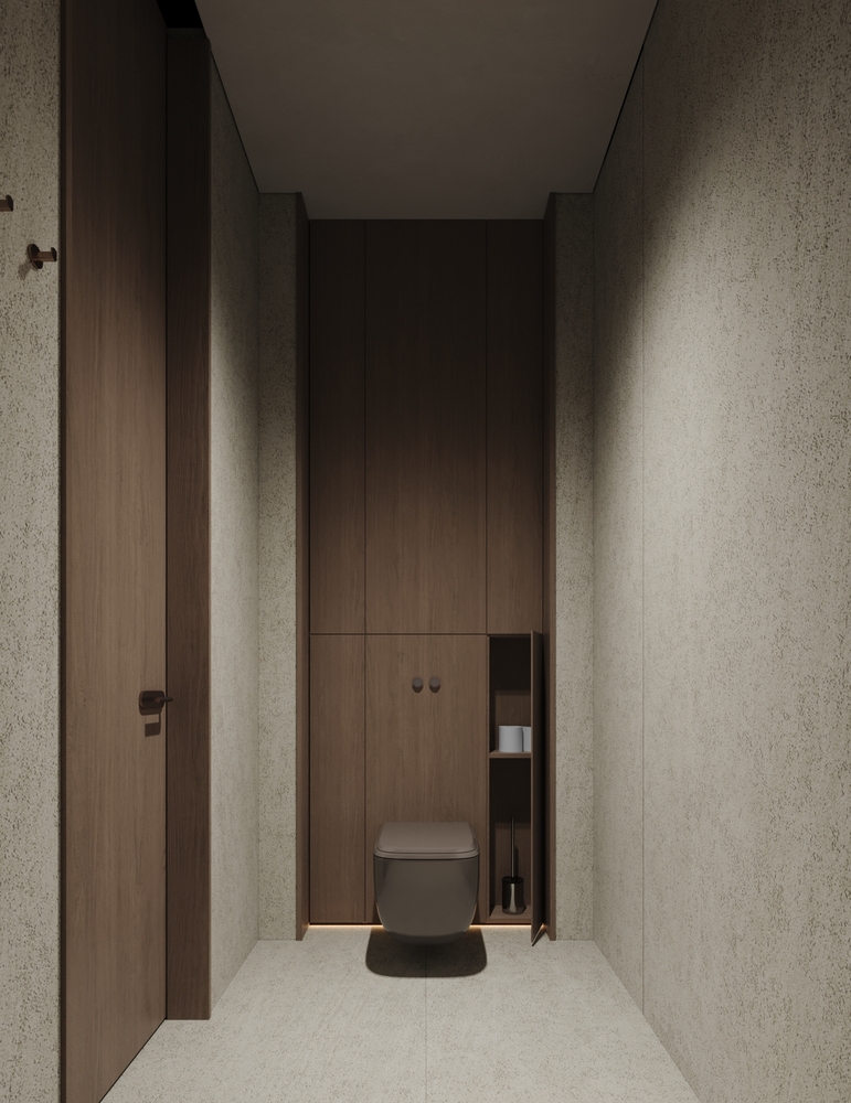
The guest WC compresses the apartment’s material story into a narrow bay: speckled mineral-finish walls, a flush wall of walnut-toned cabinetry, and a floating basalt-gray toilet underlit by a concealed strip. The concealed storage keeps brushes and paper literally inside the architecture. Light grazing along the floor line makes the small volume feel carved rather than boxed in.
 Pin
Photo: Kvadrat architects
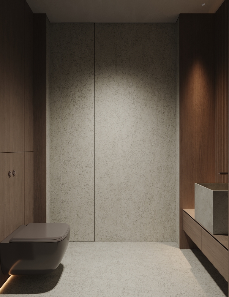
Here the textured wall plane takes center stage, its full-height panels meeting the terrazzo-flecked floor with barely a seam. The wall-hung fixture in warm gray sits low against the timber cabinetry, freeing the floor plane entirely. Downlighting pools on the stone, exaggerating its relief. The room shows how far the studio pushes tactility even in the most utilitarian spaces.
 Pin
Photo: Kvadrat architects
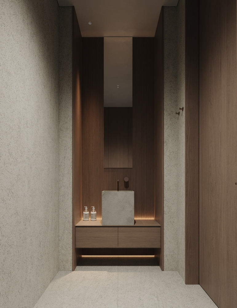
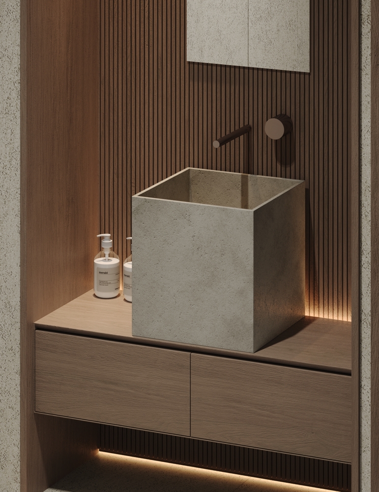
The vanity is staged like an altar: a cast concrete cube basin centered on a floating oak drawer unit, backed by a fluted timber wall that rises to a tall mirror. Concealed lighting outlines the niche at counter and toe-kick level. The composition is symmetrical, frontal, and unhurried — the fenestration-free interior (a space with no windows of its own) made generous purely through layered artificial light.
 Pin
Photo: Kvadrat architects
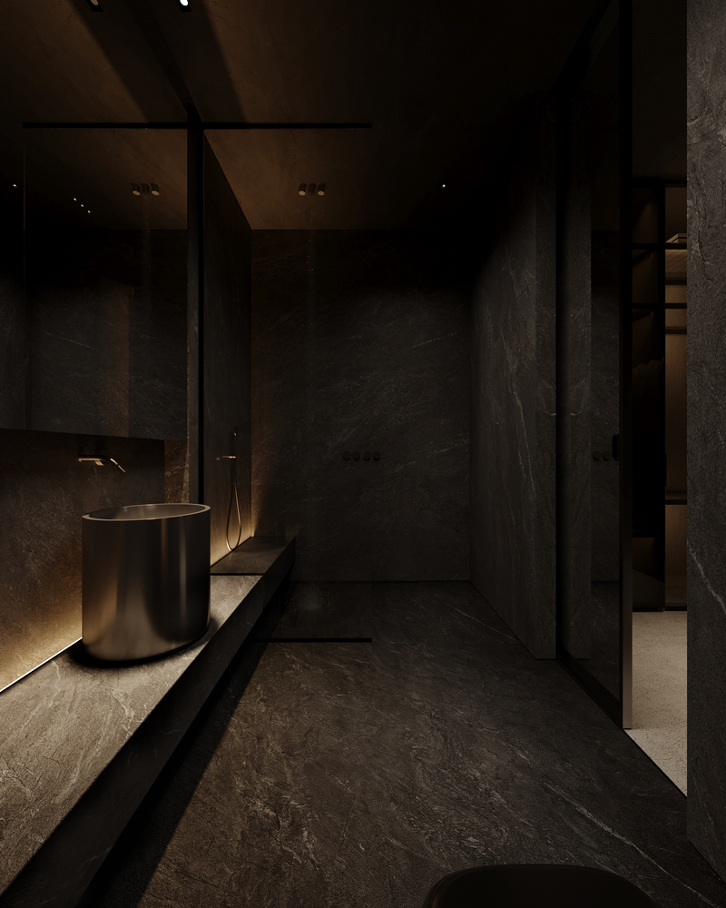
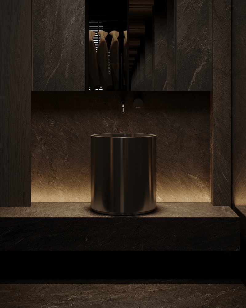
The primary bathroom trades daylight for atmosphere. Large-format dark stone wraps floor, walls, and the low shower bench in a continuous veined surface, while a brushed-metal cylinder basin catches the little light there is. Black-framed glass partitions separate wet and dry zones without interrupting the cave-like envelope. It is a decompression chamber in the most literal sense — sensory input reduced to stone, water, and glow.
 Pin
Photo: Kvadrat architects
Frontally, the basin becomes sculpture. The cylinder’s polished body sits on a stone plinth beneath a wall-mounted spout, with a raking backlight turning the stone’s texture into topography. In the mirrored cabinet above, the adjacent dressing room’s shirts appear like a still life — a quiet reveal of how tightly the private suite’s functions interlock. Few images in the set state the “each element has weight” principle this plainly.
The Loggia: An Outdoor Room Behind Timber Blinds
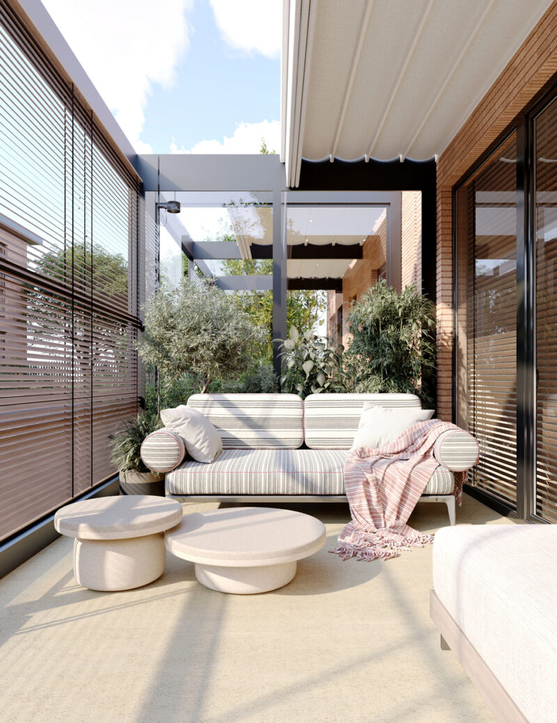
The outdoor space is treated as a fully furnished room rather than a leftover balcony. A loggia (a covered outdoor space recessed behind the building line) wrapped in adjustable timber blinds, it extends the apartment’s recovery program into open air.
 Pin
Photo: Kvadrat architects
Under a retractable canvas canopy and steel pergola frame, a deep striped sofa faces a pair of monolithic stone-look coffee tables whose rounded profiles echo the interior’s soft geometry. Full-height timber venetian blinds filter the mountain light and screen neighboring buildings without sealing off the sky. Potted olives and layered greenery blur the edge between furniture and garden. It is the one space where the palette relaxes into pattern — and it earns it.
Where the Calm Holds — and Where It Demands Discipline
Texture Doing the Work of Color
The project’s core strength is that its tonal restraint never collapses into blankness. Under intense daylight from the panoramic glazing, the relief of the porcelain stoneware, the fabric wall panels, and the hammered metal surfaces generate depth that flat white paint could not. Second, material continuity is genuinely rigorous: the cast concrete basin answers the porcelain tile, the bronze island answers the dark dining table, and the same tonal family runs from loggia to WC. Third, the oversized, low-slung furniture calibrates scale precisely — big pieces, sparsely placed, make 123 m² read larger and quieter than its plan.
 Pin
Photo: Kvadrat architects
The concrete cube reads almost geological against the milled precision of the oak drawers and fluted slats behind it. Its rough cast surface, wall-mounted bronze spout, and the glow washing up from the toe-kick condense the entire project into one detail. This is the integrity the designers describe — a single leitmotif carried down to the smallest fixture.
The Price of a Monolithic Interior
The same integrity imposes obligations. Nearly every function lives in bespoke millwork, so future changes — a nursery, a different work setup — mean rebuilding joinery, not rearranging furniture. The windowless primary bathroom and the dusk-dark bedroom depend entirely on their lighting scenes; a failed driver or a clumsy retrofit would flatten them instantly. And a palette this controlled leaves little tolerance for ordinary accumulation: bright objects, mismatched textiles, or everyday clutter will register loudly against the muted register. This is an interior that asks its owners to live with curatorial discipline.
A Case for Recovery-First Interiors
What Kvadrat architects built in Almaty is less a style statement than a protocol: identify what depletes the clients, then remove it surface by surface. The project’s contribution is showing that warmth and calm are engineering problems — solved with tactile flooring, tuned whites, layered indirect light, and a few weighty dark masses — rather than a paint decision. It suits people whose lives are loud elsewhere: frequent travelers, high-output professionals, anyone treating home as infrastructure for rest. Would you give up color and ornament almost entirely if the payoff were a home that resets you in a couple of hours — or does your idea of recovery need a little visual noise?
FAQs
Who designed the Esentai City apartment in Almaty?
The apartment was designed by Kvadrat architects, a design studio led by Sergey Bekmukhanbetov and Rustam Minnekhanov. The studio developed the 2024 project for a married couple who travel frequently for work, conceiving the home as a place for rapid recovery of energy and mental balance.
How big is the Esentai City apartment and where is it located?
The apartment has a built area of 123 square meters (about 1,324 square feet). It sits in the Esentai City residential complex in Almaty, Kazakhstan, at the foot of the mountains, with panoramic windows that bring intense natural light deep into the plan.
Why didn’t the designers use pure white in this apartment?
Pure white risked making the heavily daylit space feel flat, sterile, and empty — like a white box. Instead, the designers used natural warm shades of white matched to the textured porcelain stoneware floor, then layered rough and smooth, matte and mirrored finishes to give the tonal palette depth.
What materials define the interior of this Almaty apartment?
Key materials include large-format relief porcelain stoneware flooring, warm-white paint matched to it, fabric wall panels, bleached and dark timber millwork, dark veined stone in the primary bathroom, a cast concrete basin, and bronze-toned metal on the kitchen island — all unified by a single tonal leitmotif.
Get gorgeous projects via email
