

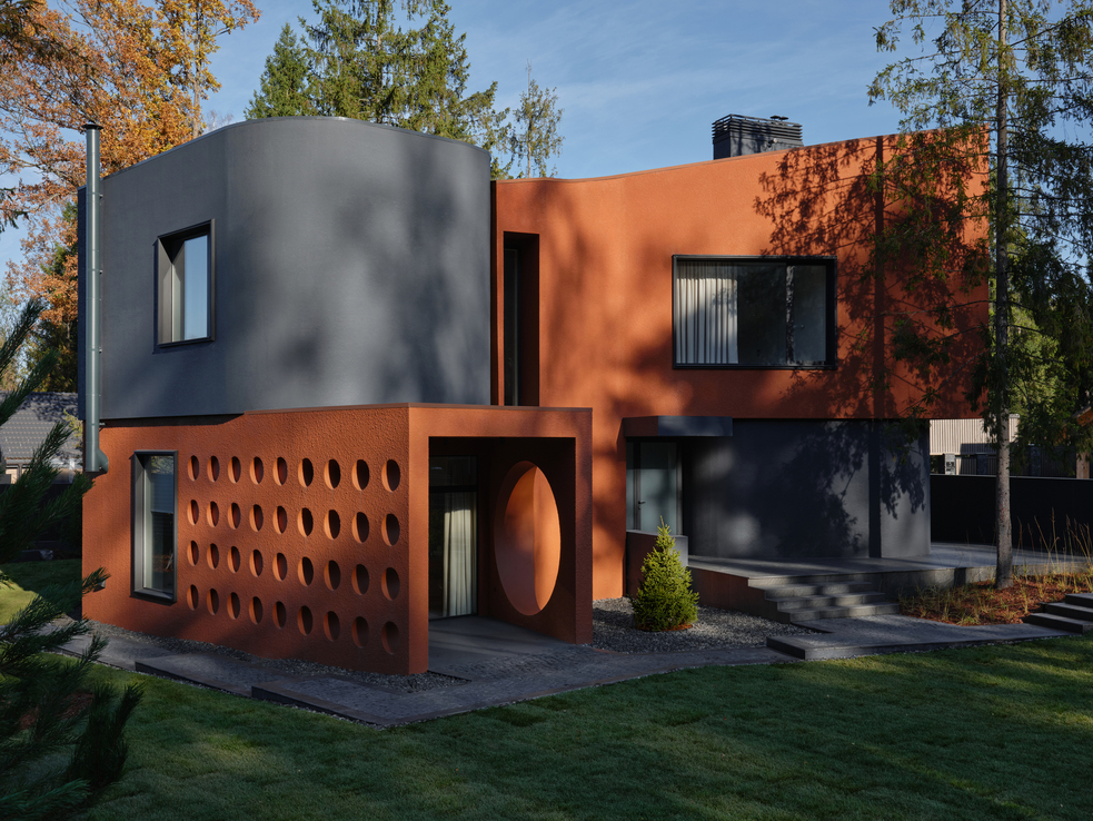
Not every architectural brief demands heroism. Some simply ask for rooms, a slope, and a promise to keep the trees standing. But Le Atelier Architectural Bureau — a Moscow-based practice known for materially bold residential work — turned that modest program into a 222 m² family house that reads as a deliberate argument for form-driven design. The Lisichkin Les House, completed in 2025 on a cottage estate outside Moscow, is a study in how two interlocking volumes, clad in terracotta and dark gray, can carve out distinct identities while serving the quieter needs of daily family life. It is also a rare contemporary Russian residential project that makes the sculptural exterior and the serene interior feel like parts of the same idea.
| Project Name | Lisichkin Les House |
| Architect / Designer | Le Atelier Architectural Bureau |
| Location | Lisichkin Les cottage estate, Solnechnogorsk district, Moscow Oblast, Russia |
| Floor Area | 222 m² |
| Year Completed | 2025 |
| Client Type | Private (family with two children) |
| Photographer | Maxim Loskutov |
When the Terrain Designs the House: Two Volumes, One Sloping Forest Site
The site presented two non-negotiable conditions: a sloping plot and mature trees the clients refused to lose. Le Atelier responded with a parti (fundamental organizing concept) that splits the program into two asymmetric volumes — one in warm terracotta, the other in dark charcoal — which interlock at an angle determined by the land’s natural contours. This is not a formal gesture for its own sake. The curved and rectilinear elements negotiate the slope together, with the darker volume partially recessed into the hillside and the terracotta mass projecting forward to capture afternoon light.
Each aperture was placed with view in mind. The fenestration strategy (placement and sizing of openings) treats every window as a frame — for a cluster of pines, a clearing, or a fragment of sky — rather than a default grid. The result is a facade composition that changes character as one moves around the building: from some angles it appears compact and grounded, from others it explodes into layered sculptural depth. The bold exterior gives way internally to a calm, neutral world — warm off-white tones, stone, timber, and textiles — with carefully placed color accents that keep the atmosphere from ever feeling flat.
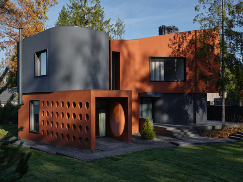
Photo: Maxim Loskutov
The main facade presents the two-volume logic at its clearest: the curved dark-gray mass sits atop the terracotta base, while the perforated entrance wall introduces a tactile rhythm that breaks the larger planes into human-scaled elements. The circular recesses catch shifting shadows throughout the day, animating the surface without competing with the surrounding forest.
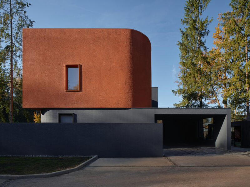
Photo: Maxim Loskutov
From the side elevation, the house reveals its vertical proportioning strategy. The terracotta volume rises as a monolithic slab with a single tall window, while the dark base provides visual anchoring against the changing foliage. The limited openings on this face suggest a deliberate choice to prioritize the forest views over panoramic exposure.
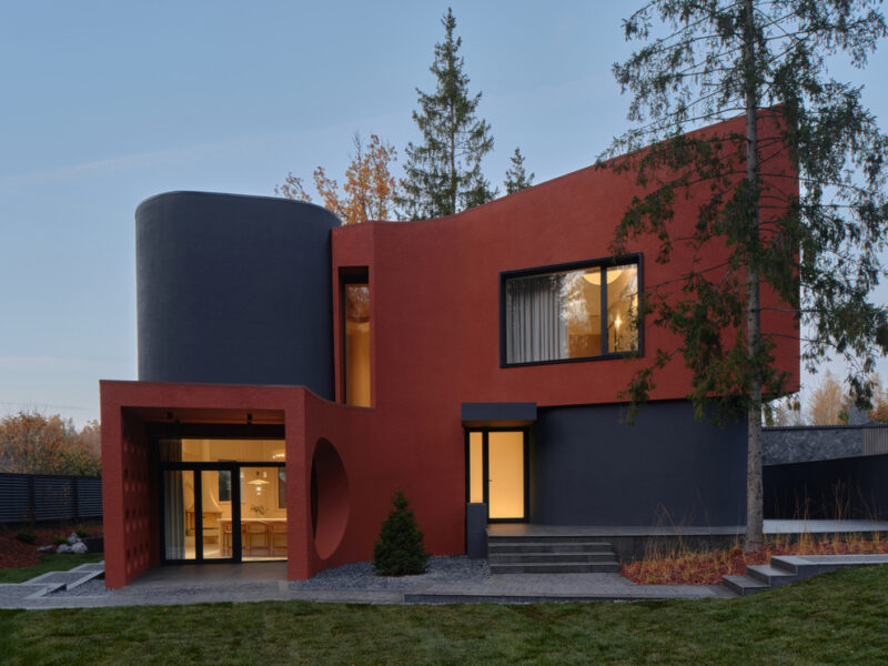
Photo: Maxim Loskutov
At dusk, the illuminated interior transforms the facade into a lantern-like presence. The glazing at the ground level reveals the open-plan living sequence — fireplace, dining, kitchen — while the upper floor maintains a more private, enclosed character. The interplay of warm interior glow against the cool exterior palette creates a compelling threshold moment.
Design Decision:The architects perforated the lower terracotta wall at the entrance with a grid of circular recesses. This reads as decorative from the approach, but functions as a privacy screen for the living room behind it — filtering light without the need for curtains or blinds.
Inside the Interlocking Volumes: A Room-by-Room Walkthrough
A Curved Sanctuary Framed by the Forest
The living room occupies the heart of the ground floor, organized around a built-in curved sofa that echoes the cylindrical geometry of the exterior’s dark volume. A large sliding window opens directly onto the tree line, dissolving the boundary between interior and landscape. The ceiling treatment — fine vertical ribbing in a warm plaster finish — adds textural interest without visual clutter, while a single terracotta cushion on the neutral upholstery quietly recalls the exterior palette.
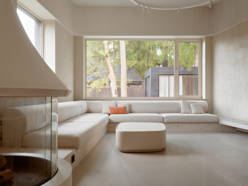
Photo: Maxim Loskutov
The built-in sofa follows the curve of the cylindrical volume, creating a seating arrangement that feels protective and oriented simultaneously. A low, rounded ottoman in pale stone anchors the center of the composition, while the large window frames a direct view of mature pines — evidence that the tree-preservation mandate shaped not just the building’s placement but the daily experience of its inhabitants. The vertical ribbed ceiling treatment draws the eye upward and reinforces the room’s calm, controlled material vocabulary.
The Fireplace as Centerpiece
The dining area shares the open ground floor but claims its own identity through a suspended cylindrical fireplace in white, visible from the entrance approach. The sculptural hood acts as a spatial divider between dining and living functions without introducing walls. A round timber table with mid-century influenced chairs sits on large-format stone tiles that continue throughout the ground floor, maintaining visual continuity. The palette here — pale plaster, natural oak, matte stone — demonstrates the interior’s disciplined restraint.
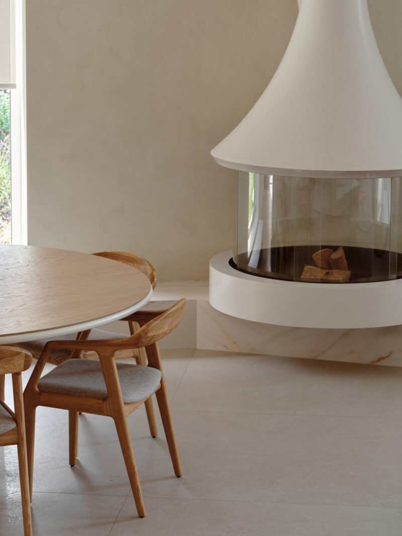
Photo: Maxim Loskutov
The suspended fireplace functions as both a spatial anchor and a sculptural focal point, its white conical form drawing the eye upward while its glass-enclosed firebox provides transparency at eye level. The round oak dining table reinforces the project’s consistent use of curved geometry as a counterpoint to the angularity of the floor plan, while the pale stone flooring unifies the open ground-floor program. This is interior design operating at architectural scale — the fireplace does the work of a wall without becoming one.
Morning Light and Shadow Play
The master bedroom on the upper floor is a study in controlled natural light. A large circular ceiling fixture — almost lunar in its presence — hovers above the bed, while a recessed strip of LED lighting provides ambient evening illumination. The closet doors are flush panels in warm wood tone that blend into the plaster wall, maintaining the room’s visual calm. A small terrazzo vessel sink sits as a sculptural object near the entry, its materiality bridging the bedroom and the adjoining bath.
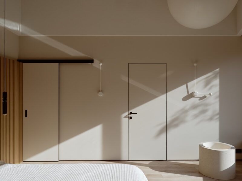
Photo: Maxim Loskutov
Morning light enters through a window off-camera, casting precise diagonal shadows across the plaster wall and the flush closet doors. The terrazzo sink — with its subtle aggregate texture — introduces a material counterpoint to the room’s otherwise smooth surfaces, while the minimalist pendant fixtures suggest a lighting strategy that privileges indirect glow over direct task illumination. The overall effect is meditative: a bedroom that feels designed for rest rather than display.
Stone, Glass, and a Single Accent of Color
The bathrooms carry the project’s material confidence into wet spaces. In the powder room, a dramatic stone slab with veining in warm gray and cream forms a curved backdrop behind a floating concrete basin, lit by a single spherical pendant. The main bathroom introduces the project’s boldest interior move: terracotta hexagonal tiles framing the tub, paired with a corrugated glass partition that diffuses light while maintaining privacy. Cove lighting traces the perimeter of the ceiling, eliminating the need for visible fixtures.
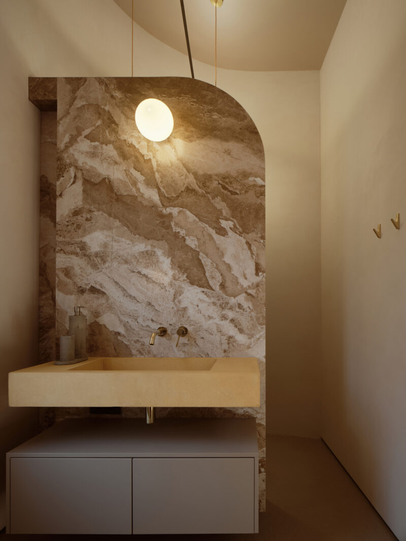
Photo: Maxim Loskutov
The powder room demonstrates how a small space can carry significant design weight. The arched stone slab with its dramatic natural veining reads almost as a found geological specimen — a deliberate contrast to the room’s otherwise machined precision. The floating basin and spherical pendant create a composition that is both functional and gallery-like, proving that bathrooms deserve the same architectural attention as any primary living space.
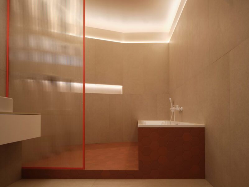
Photo: Maxim Loskutov
The main bathroom’s terracotta hex tiles around the tub directly reference the exterior cladding, creating a material dialogue between inside and out that few houses attempt. The corrugated glass partition with its thin red frame introduces a note of industrial craft into an otherwise refined space, while the cove lighting produces a soft, shadow-free illumination that flatters both the materials and the user. This is bathroom design conceived as spatial experience rather than utility.
A Workspace in Warm Neutrals
Adjoining the master bedroom, the study occupies a compact but well-lit corner of the upper floor. A wall-mounted timber desk with geometric drawer detailing floats above the oak floor, paired with a single window that admits northern light ideal for computer work. The built-in shelving in muted blue-gray provides storage without visual weight. This is not a statement room — it is a functional space designed for concentration, and its restraint is its strength.
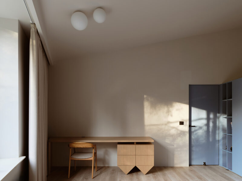
Photo: Maxim Loskutov
The study’s wall-mounted desk with its faceted drawer fronts introduces a subtle geometric play that echoes the house’s larger formal vocabulary at furniture scale. The muted blue-gray built-in shelving reads as an extension of the wall rather than an added element, maintaining the room’s spatial efficiency. Northern light floods in through the large window, creating the kind of consistent, diffused illumination that makes long work sessions comfortable — a detail that reveals the architects’ attention to how rooms are actually used.
A Bright Yellow Interruption
The most surprising room in the house belongs to the children. Against the prevailing palette of warm neutrals, a bank of vivid yellow cabinetry runs beneath the window and continues through a circular mirror into the adjacent space. The result is a burst of intentional color that signals this room has different rules — looser, more playful, designed for growing imaginations. The oak flooring and white walls provide a quiet frame that lets the yellow do its work without chaos.
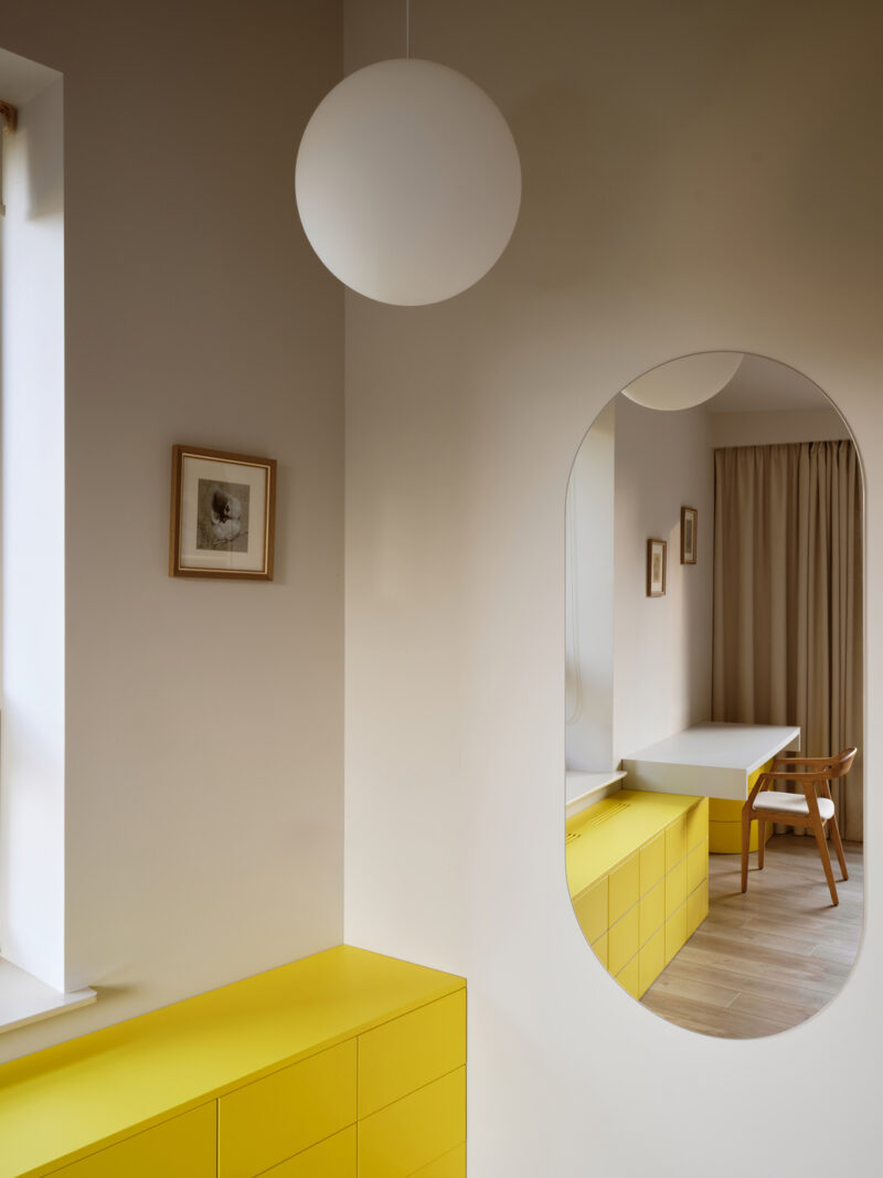
Photo: Maxim Loskutov
The yellow cabinetry is the interior’s most direct acknowledgment that this is a family house, not a minimalist gallery. The circular mirror — an unusual shape in a child’s room — creates a playful visual portal into the adjacent study space, suggesting the architects thought about how children move between rooms rather than treating each as an isolated box. The oak flooring and pale walls keep the bold color from overwhelming the space, demonstrating mature color discipline even in a room designed for kids.
Reading the Spatial Logic
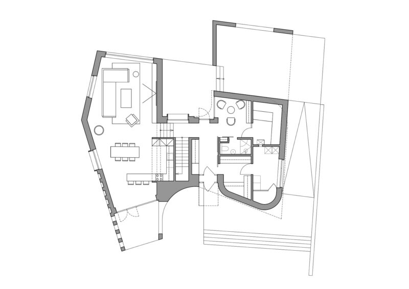
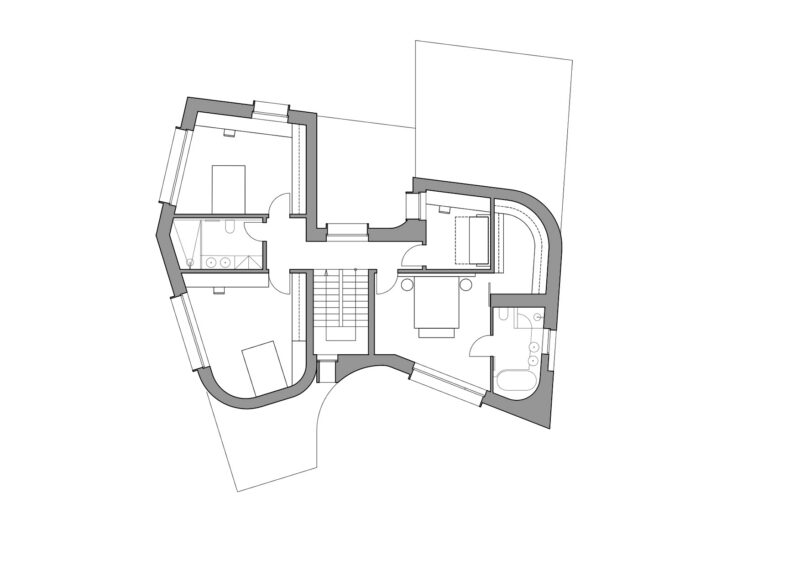
The ground floor plan reveals the open social core — living room, dining area, kitchen, and entrance hall — organized around a central staircase and a sauna suite tucked into the darker volume. The upper floor splits into two wings: children’s rooms to one side, master bedroom and study to the other. The curved walls that read as sculptural gestures from the exterior are shown here to be spatial organizers — they shape circulation, define room edges, and filter views between spaces.
 Pin
PinThe ground floor plan confirms the open-plan logic: living, dining, and kitchen flow together within the terracotta volume, while the entrance hall and sauna suite occupy the interstitial zone between the two primary masses. The curved wall at the living room’s edge is not merely formal — it creates a natural seating niche and directs foot traffic toward the stair without the need for a corridor.
 Pin
PinThe upper floor plan shows the bedroom wing arrangement with admirable clarity. The master suite occupies the quieter, forest-facing side, while the children’s rooms cluster near the stair core for easy parental access. The curved wall continues upward, dividing the two zones while allowing light to filter through strategically placed openings — a spatial device that maintains privacy without sacrificing the sense of openness that defines the house.
Where the Sculptural Ambition Succeeds — and the Maintenance Question Looms
The View Strategy and Material Coherence
The house’s greatest strength is the consistency between its external argument and its internal life. The view-oriented fenestration genuinely works — each window frames something worth looking at, and the resulting interior daylight is warm and directional rather than flat. The material palette, too, holds together across both architecture and interior design: stone, timber, and plaster create a tactile world that rewards attention without demanding it. The curved geometry, carried from the exterior volumes through to the living room sofa and bathroom details, gives the house a coherent design language that few residential projects achieve at this scale.
The Cost of a Sculptural Exterior
The ambition is not without trade-offs. The complex exterior geometry — curved walls, interlocking volumes, and the custom perforated screen — will require specialized ongoing maintenance, particularly in Moscow’s freeze-thaw climate where water infiltration at material joints is a perennial risk. The limited window area on certain facades, while effective for thermal performance and privacy, may leave some interior spaces feeling reliant on artificial light during the short winter days. And for a family with young children, the pale interior finishes, however beautiful, will face the test of daily life sooner than darker, more forgiving surfaces might.
A House That Trusts Form to Do the Work
The Lisichkin Les House makes a quiet but persuasive case that architecture does not always need a narrative concept to justify its beauty. Le Atelier has built a house where the formal intelligence of the exterior — the interlocking volumes, the view-calibrated windows, the terracotta-and-charcoal material dialogue — is matched by an interior that knows when to step back and let the light, the materials, and the forest views speak. It is a design best suited for a family who values spatial quality over square footage, and who sees maintenance as part of the contract with a thoughtfully made building.
Would you accept the higher upkeep of a sculptural exterior in exchange for a house that frames your landscape this precisely — or does the practical voice win when the paint starts to peel?
FAQs
Q: Who designed the Lisichkin Les House?
The house was designed by Le Atelier Architectural Bureau, a Moscow-based architecture firm. The project team included Sergey Kolchin, Gleb Kulikovsky, and Anastasia Volkova.
Q: Where is the Lisichkin Les House located?
The house is located in the Lisichkin Les cottage estate in the Solnechnogorsk district of Moscow Oblast, Russia, approximately 60 kilometers northwest of central Moscow.
Q: What is the floor area of the Lisichkin Les House?
The house has a floor area of 222 m² (approximately 2,390 square feet), distributed across a ground floor with social spaces and an upper floor with bedrooms.
Q: What materials were used on the exterior?
The exterior features two interlocking volumes finished in terracotta and dark gray plaster, with carefully placed windows designed to frame specific views of the surrounding forest.
Q: How does the interior design relate to the exterior?
The bold sculptural exterior gives way to a calm interior in warm off-white tones, using stone, timber, and textiles. Color accents — including terracotta in the bathrooms and bright yellow in the children’s room — reference the exterior palette.
Get gorgeous projects via email
