

Some renovation briefs ask for restraint. This one banned an entire color. A creative family came to the Alexander Tischler design company with an unusually specific demand: a warm, inspiring home without a single trace of gray. The result is an 83 m² two-bedroom apartment conceived as a Soviet-era interior filtered through memory rather than pastiche — vibrant in color, fluid in form, and quietly rigorous in its engineering. Led creatively by Karen Karapetian, the studio handled both design and full renovation, reworking a cramped, poorly connected plan while locking the construction budget before work began. It is a project where nostalgia does the emotional heavy lifting, and ventilation and acoustics do the invisible kind.
| Project Name | Back in the U.S.S.R |
| Architect / Designer | Alexander Tischler design company (Creative Director: Karen Karapetian) |
| Type | Two-bedroom apartment |
| Floor Area | 83 m² |
| Year Completed | 2025–2026 |
| Client Type | Private — a creative family |
| Photographer | Olga Shangina |
Designing a Soviet-Era Interior Without Nostalgia’s Gloom
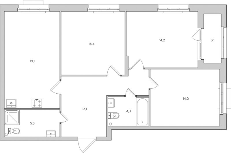
The original plan fought the family at every turn: no proper children’s room, no laundry space, a cramped living zone, and a dark, awkwardly shaped hallway stitching it all together. The studio’s answer was a full replan. Part of an adjoining bedroom was absorbed to create an 18 m² room for the daughters, the elongated bathroom gave up floor area for a compact laundry, and the primary suite gained an en-suite. Removing doors and partitions opened a sightline from the living room into the hallway, pulling daylight deep into the entrance.
The invisible work matters as much as the visible. Wall-mounted ventilation units filter and pre-heat incoming air without lowering the ceilings, and maximum soundproofing across floors, ceilings, and walls — backed by acoustic glazing — keeps the home quiet. Against that technical backbone, the design language is deliberately warm: glass blocks high on the kitchen wall, herringbone oak underfoot, and a palette that runs from pistachio and olive to terracotta and amber.
Design Decision: The two built-in refrigerators hide behind pistachio-green fronts recessed into the footprint of the children's room, so the tall cabinetry reads as deceptively shallow from the living area — full-height storage without a single bulky mass.
A Room-by-Room Walkthrough of the Apartment
Living Room: A Curved Sofa and a Childhood Cabinet, Reimagined
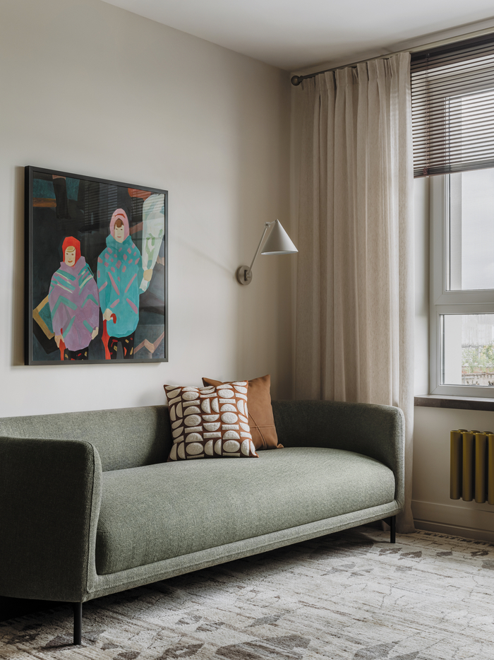
The lounge area centers on an olive-green upholstered sofa with a curved backrest, set opposite a piece the clients remembered from childhood: a glass-front display cabinet, reinterpreted with a mix of clear sliding doors and fluted hinged panels. Oak-veneer flooring laid in a classic herringbone pattern catches light along the changing grain, adding quiet texture. Framed tapestries and a patterned cushion keep the room layered rather than themed. The fenestration strategy (placement and sizing of windows) pairs dark venetian blinds with full-length linen sheers, so daylight can be tuned from glare-free diffusion to full exposure.
Across the shots, the room reads as a study in controlled saturation: the sage sofa sits on a weathered rug, a conical wall lamp cantilevers over the reading end, and a large figurative artwork anchors the wall without overwhelming it. The built-in media wall mixes fluted-glass vitrines, bronze-tinted display boxes, and open shelving around the television, proving that storage can carry the decorative load of a room. An olive-toned radiator below the window turns a utilitarian element into part of the palette.
 Pin
Pin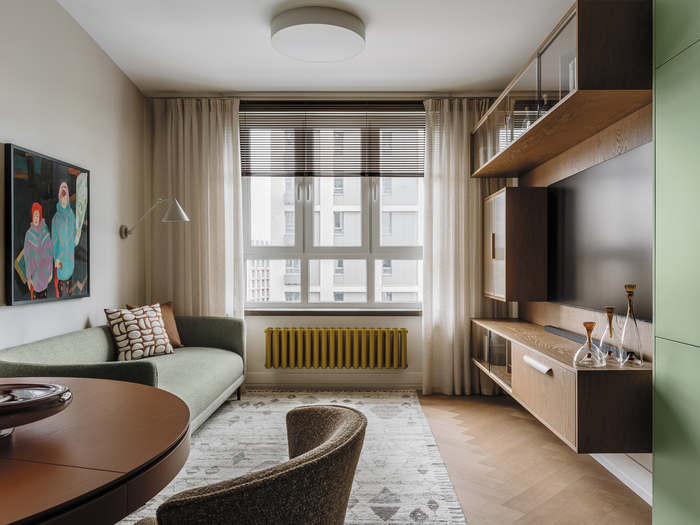 Pin
Pin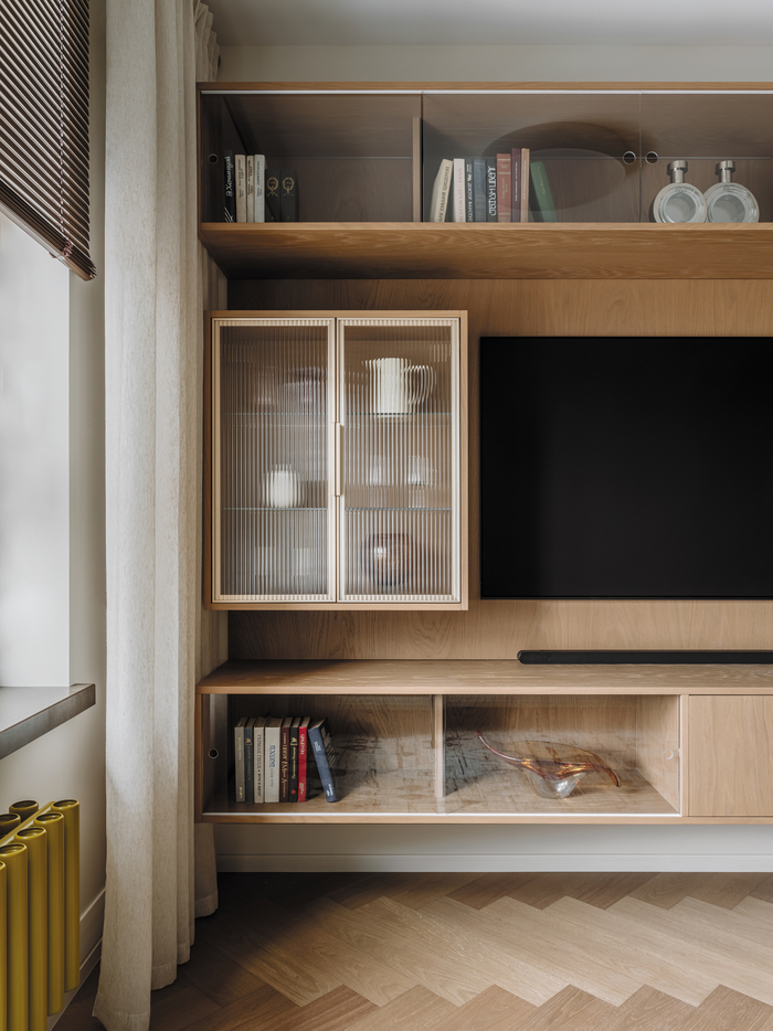 Pin
PinPhoto: Olga Shangina
Kitchen and Dining: A Freestanding Island and a Sculpted Plaster Wall
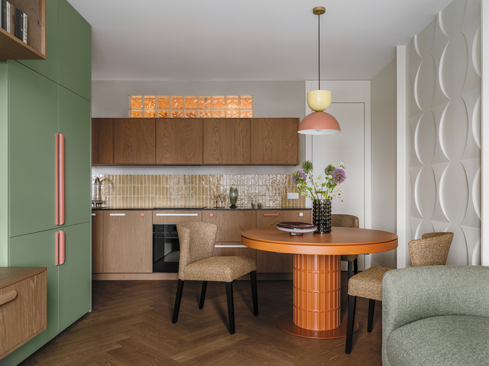
Rather than hugging a wall, the kitchen works as a freestanding unit. Low-profile oak-veneer cabinets sit beneath a glass-block transom — a mid-century gesture the clients specifically requested — paired with an amber-toned mosaic backsplash and colorful hardware. The dining area centers on an extendable round table whose curved silhouette is echoed in a two-tone pendant and a sculpted plaster wall panel. The panel deliberately has no dedicated lighting; daylight alone animates its relief.
The images show how the open plan stages color in layers: the pistachio-green tall unit with coral handles stands against oak cabinetry, while the terracotta table base and pendant shade carry warmth into the dining zone. Herringbone oak runs continuously underfoot, binding cooking and eating into one social field. A mint-green column marks the threshold, a small but decisive piece of color blocking that keeps the white shell from feeling neutral to a fault.
 Pin
Pin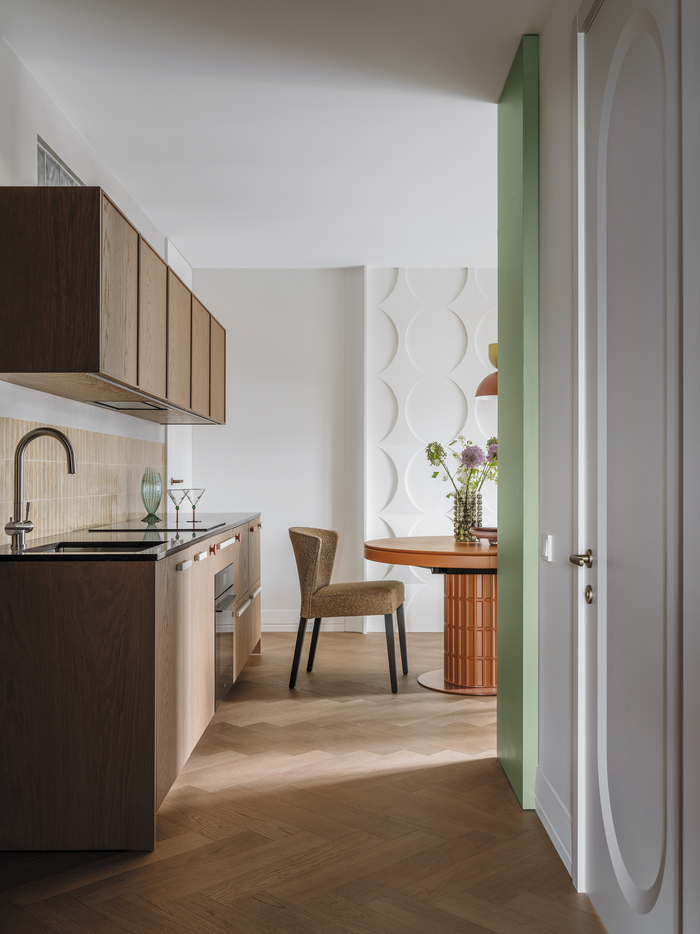 Pin
PinPhoto: Olga Shangina
Home Office: Green Geometry for a Collector’s Desk
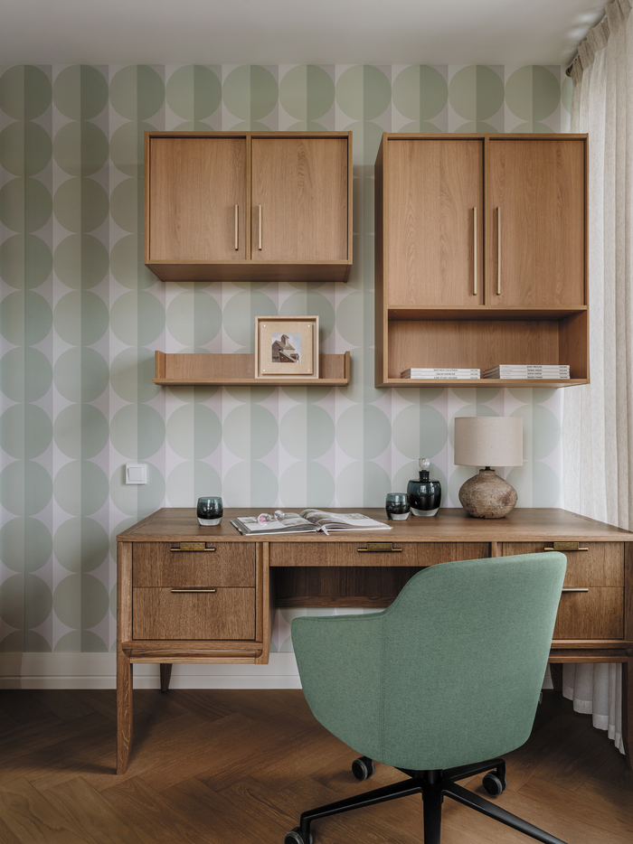
A separate office was designed for the homeowner, its walls wrapped in wallpaper of green circular motifs that quietly reference the plaster panel in the kitchen. Extensive shelving and wall-mounted oak cabinets display his collection of antiques. The desk, elevated on slender legs with brass-toned pulls, faces the window so the working day runs on natural light, while a sage task chair and a deep-green étagère keep the palette inside the apartment’s no-gray rule.
The photographs show a workspace that balances display and concentration: closed wall cabinets flank an open shelf of architecture books, and the ceramic lamp, dark glassware, and framed print are arranged with unusual restraint for a collector’s room. The veined-wood desk front gives the composition a crafted focal point, and the dark window frame with venetian blinds sharpens the view outside into a graphic backdrop.
 Pin
Pin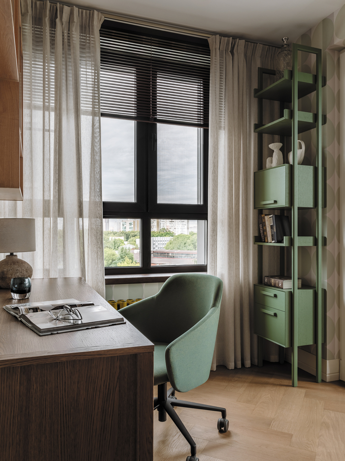 Pin
PinPhoto: Olga Shangina
Primary Bedroom: Asymmetry as Vintage Charm
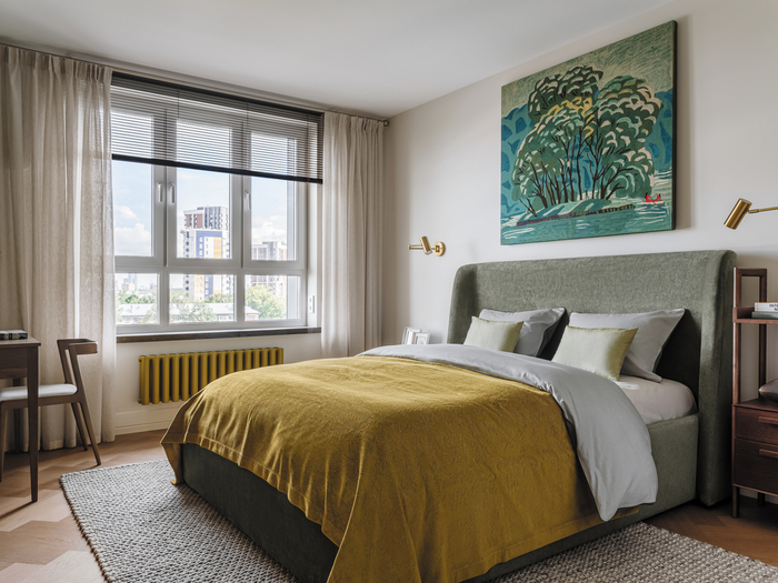
In the primary bedroom, a curved headboard mirrors the living room sofa’s silhouette. A small nightstand sits to the left of the bed, a low shelving unit to the right — a deliberate asymmetry that breaks convention and reads as quietly vintage. Against a deep green accent wall, a dedicated workspace pairs a slim desk with a custom rounded bookshelf manufactured in-house. Two custom closets handle wardrobe storage: one in warm oak veneer, the other in white with natural rattan panels.
The tapestry Tsaritsyno Island — one of three the family acquired as the project progressed — hangs above the bed and sets the room’s tonal key of green and gold. Brass swing-arm sconces free the nightstand surfaces, the ochre herringbone bedspread and olive upholstered frame continue the saturated palette, and an olive radiator beneath the window repeats the living room’s move of folding services into the color scheme. The green-walled desk niche shows how a workspace can sit inside a bedroom without visual noise.
 Pin
Pin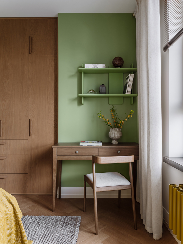 Pin
Pin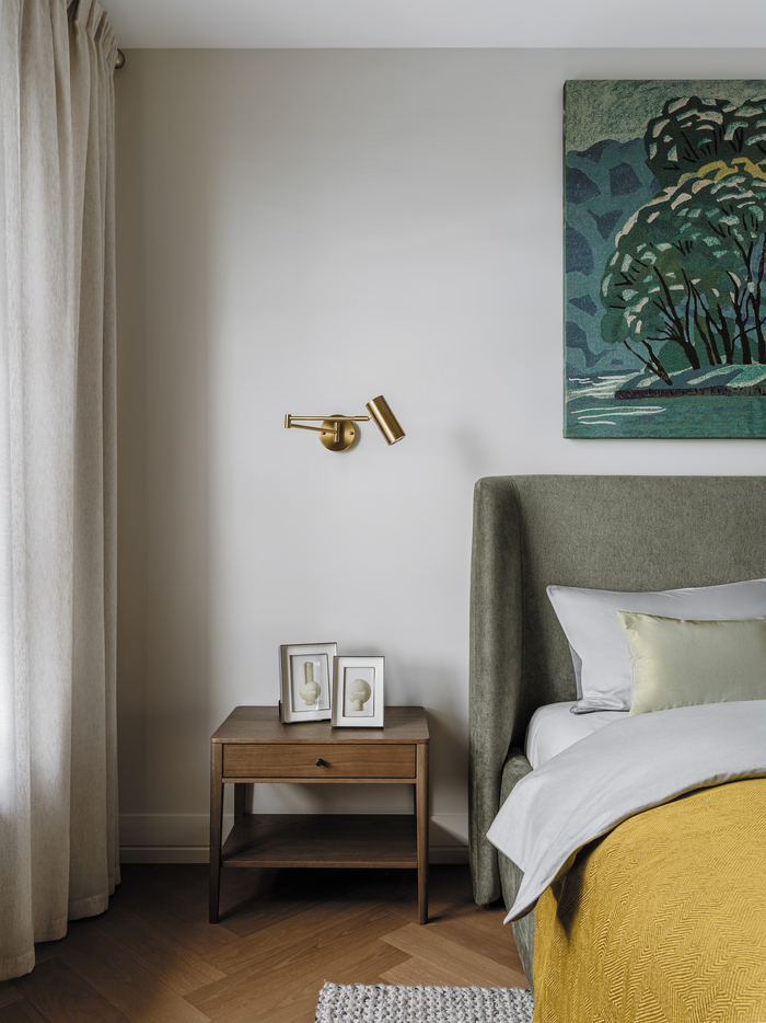 Pin
Pin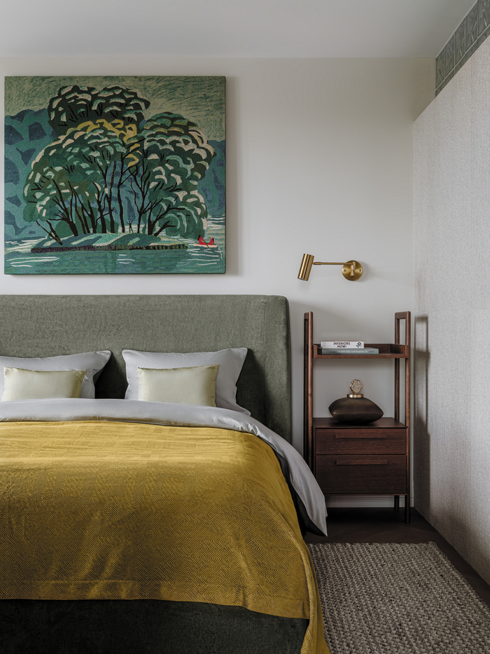 Pin
PinPhoto: Olga Shangina
Children’s Bedroom: Eighteen Square Meters Carved From a Neighbor Room
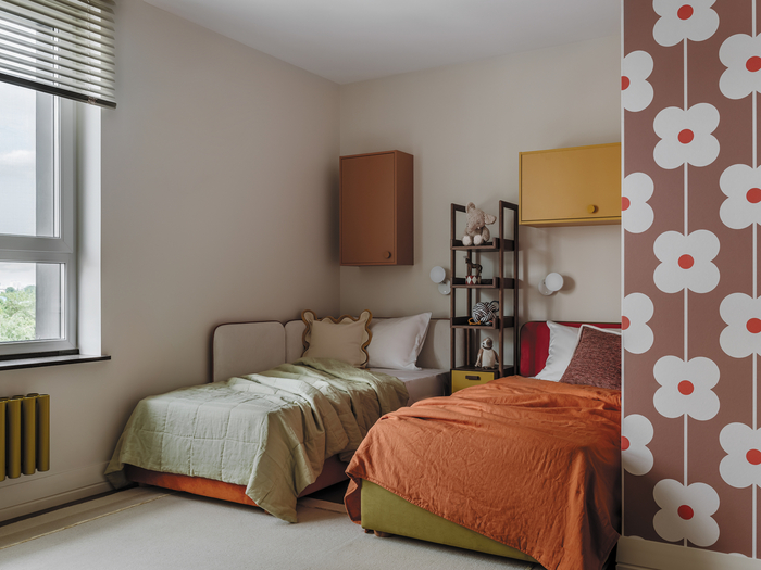
To give the daughters a generous room, the studio took over part of the adjoining bedroom, producing an 18 m² space. Two beds and two desks are arranged symmetrically, with wardrobes, open shelving, a bookcase, and drawers absorbing the storage load. Rhythmic floral wallpaper covers one wall, its circular motifs repeated playfully in the cabinet hardware. The brightly colored beds convert easily into daybeds when friends visit, leaving the center of the room open for play.
The images reveal how symmetry keeps a shared room calm: each girl gets an identical wall-mounted cabinet and sconce, while a shared bookshelf bridges the beds. The desk run combines oak worktops, a perforated pegboard, and yellow knobs that tie back to the wallpaper’s rhythm. Terracotta mirror frames and drawer fronts warm the white built-ins, and the olive task chair proves the palette can stretch to a child’s needs without breaking the apartment’s logic.
 Pin
Pin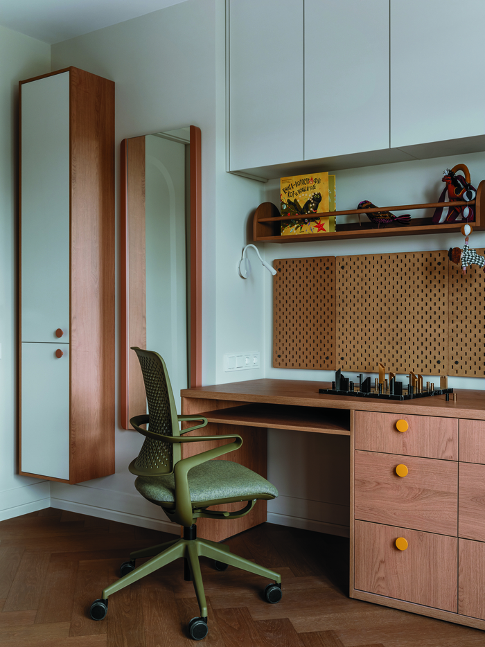 Pin
PinPhoto: Olga Shangina
Bathrooms: Glass Blocks, Brass, and a Terracotta Ceiling
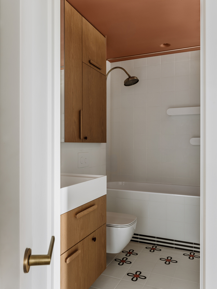
The new en-suite borrows light through a section of glass-block wall that runs along the ceiling and cascades to the floor, washing the room in reflections. A fluted-glass shower screen, brass-toned fixtures, and an ornate sconce finish the space, alongside a custom chest of drawers whose wood grain is deliberately misaligned across the fronts. The guest bathroom, expanded with a few inches taken from the hallway, wears small-format tiles with an irregular, handcrafted feel and a naive pattern; its ceiling — like the hallway’s — is painted a rich terracotta, one of the clients’ favorite hues.
Across the bathroom shots, the detailing carries the nostalgia: a scalloped brass-framed mirror and vintage wall-mounted mixer sit above an oak vanity with diagonal-grain drawer fronts, while porcelain floor tiles lay down a geometric floral motif. The en-suite trades the tub for a walk-in shower behind ribbed glass, and the guest room answers with a terracotta ceiling over cream tile — proof that the no-gray rule produces warmth precisely where most apartments default to white.
 Pin
Pin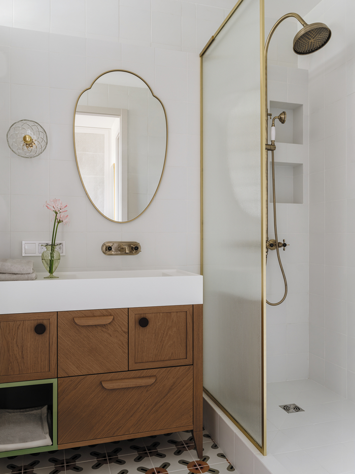 Pin
Pin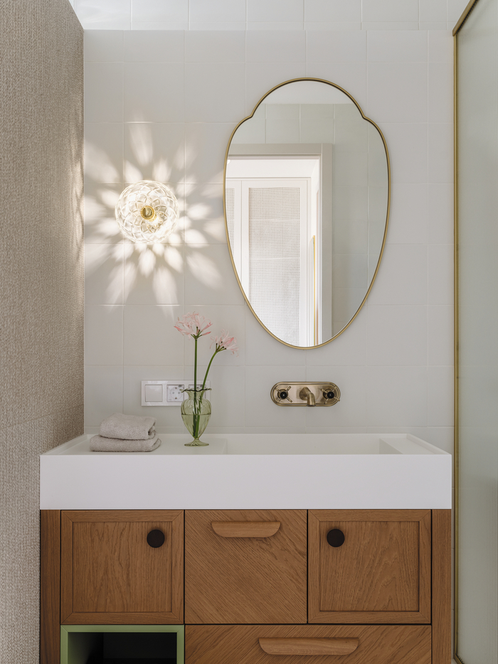 Pin
PinPhoto: Olga Shangina
Laundry Room: A Utility Space Won From the Old Bathroom
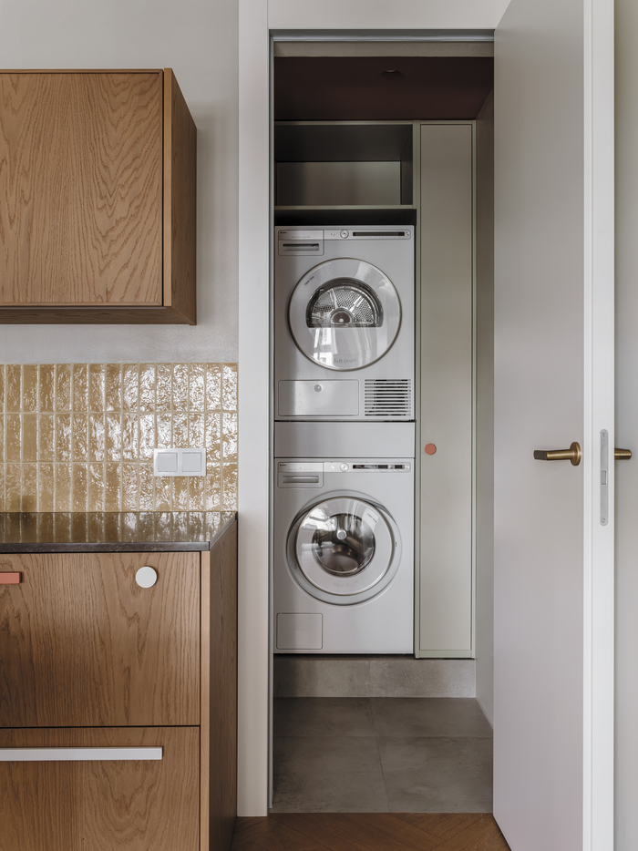
A door beside the kitchen opens onto a compact laundry carved from the previously elongated bathroom. It neatly houses a washing machine, a tumble dryer, a drying cabinet, and open shelving for household supplies.
The photograph shows how much function fits into a few square meters: stacked washer and dryer sit in a tall niche beside a slim storage cabinet, while an amber glass-mosaic backsplash and oak cabinetry tie the utility space back to the kitchen’s material story. Coral and white knobs keep even this back-of-house room inside the apartment’s color discipline.
 Pin
PinPhoto: Olga Shangina
Balcony: French Doors and a Reading Nook
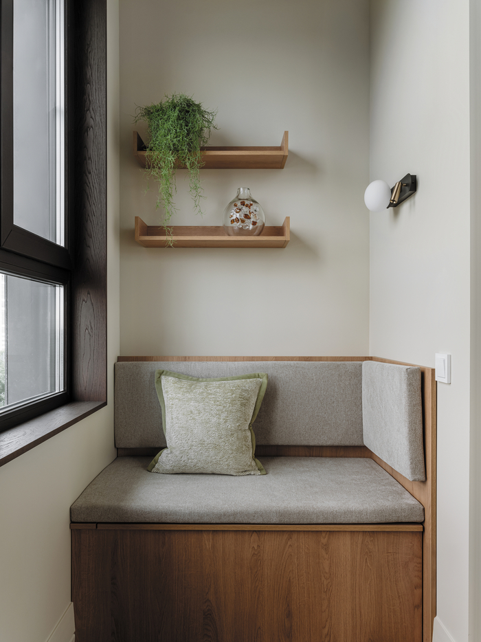
Originally, the balcony entrance was a standard window-sill unit. The studio removed it and installed full-height French doors, transforming the threshold. To the right of the entrance sits a bench with an upholstered seat and backrest; a floor-to-ceiling wardrobe occupies the left side.
The image shows the nook at its best: oak shelves hold a trailing plant and a small glass vase above the cushioned bench, with a compact globe sconce for evening reading. Dark stained timber cladding around the window frame gives the corner a cabin-like warmth that contrasts deliberately with the apartment’s brighter rooms.
 Pin
PinPhoto: Olga Shangina
Floor Plans: Before and After the Replan
The drawings make the strategy legible. The original plan shows a dark central hallway, no children’s room, and a single oversized bathroom. The replanned layout opens the kitchen-living field, inserts the laundry and second bathroom, enlarges the girls’ room to 18 m², and gives the primary suite its en-suite and workspace — all within the same 83 m² shell.
 Pin
Pin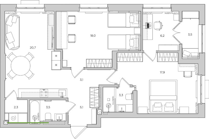 Pin
PinWhere the Renovation Excels — and Where It Asks for Commitment
A Color Discipline That Never Slips
The palette’s greatest strength is its consistency: from the pistachio refrigerator fronts to the terracotta bathroom ceiling, no surface breaks the no-gray rule, yet the effect is warm rather than loud. The replan is equally disciplined — the laundry, en-suite, and 18 m² children’s room were all won through small, precise territorial trades rather than structural heroics. And the engineering brief was taken seriously: wall-mounted ventilation preserved the ceiling height while full soundproofing and acoustic glazing deliver the quiet the clients demanded.
The Upkeep Behind the Warmth
The same choices create obligations. Amber mosaic backsplashes, handcrafted small-format tiles, and a sculpted plaster panel are surfaces that demand careful cleaning and will not age invisibly. Bespoke joinery — misaligned grain fronts, custom bookshelves, recessed refrigerator housings — ties the apartment’s value to one fabricator’s precision, making future repairs or alterations costlier than off-the-shelf equivalents. And a palette this committed leaves little room for drift: a single ill-chosen replacement piece in neutral gray would read as a mistake, so the owners curate for life.
What This Apartment Gets Right About Designing With Memory
Back in the U.S.S.R argues that nostalgia works best as structure, not decoration. The Soviet-era references — glass blocks, the display cabinet, the tapestries — are load-bearing ideas that shaped the plan, the joinery, and the palette, while the renovation’s quiet technical layer handles the unglamorous work of air and sound. This is a design for families who want their history present but their comfort current, and who accept that a committed palette is a long-term relationship. Where do you draw the line — should a home’s color story be disciplined enough to ban a hue outright, or does every rule eventually need its exception?
FAQs
Who designed the Back in the U.S.S.R apartment?
The apartment was designed and fully renovated by the Alexander Tischler design company, a full-service interior firm. Karen Karapetian served as Creative Director and lead designer, working with a team that included chief designer Diana Besedina and designer Tatyana Shchelkunova.
How big is the apartment and what type is it?
It is an 83 m² two-bedroom apartment, completed in 2025–2026 for a creative family. The renovation reconfigured the original layout to add a proper children’s room, a laundry room, and an en-suite bathroom within the same footprint.
What makes this interior ‘Soviet-era’ in style?
The design references the clients’ Soviet-era childhoods through glass blocks, a reimagined glass-front display cabinet, vintage-style fixtures, and tapestries — all rendered in vibrant color with fluid, organic forms. The clients banned gray entirely, so the palette runs through pistachio, olive, terracotta, and amber.
How did the designers fit a laundry room into the plan?
The laundry was carved out of the previously elongated bathroom. Despite its compact size, it neatly houses a washing machine, a tumble dryer, a drying cabinet, and open shelving for household supplies, accessed via a door beside the kitchen.
Get gorgeous projects via email
