

Some of the most instructive residential work happens when a brief asks for almost nothing visible: no statement colors, no theatrical gestures — just calm. This modern Moscow apartment in the Garden Quarters residential complex, completed in 2024 by Design Bureau No. 11 under architects Kirill Dunaev and Anna Dunaeva, takes that quiet brief seriously across 265 square meters. Commissioned by a family of entrepreneurs, the interior tests how far a neutral palette can go when it is disciplined by noble materials — Calacatta Green quartzite, continuous wood veneer — rather than propped up by decoration. The result is a case study in restraint that still holds a reader’s attention room after room.
| Project Name | Apartment in the Garden Quarters Residential Complex |
| Architect / Designer | Design Bureau No. 11 — Kirill Dunaev and Anna Dunaeva |
| Location | Moscow, Russia |
| Floor Area | 265 sq.m. (approx. 2,852 sq.ft.) |
| Year Completed | 2024 |
| Client Type | Private — a family of entrepreneurs |
How One Quartzite Slab Organizes a Modern Moscow Apartment
The plan divides 265 square meters into two clear territories. The private wing holds a master block, two children’s bedrooms, a playroom, and a children’s bathroom; the public wing gathers an office, a dining room, and a kitchen-living room. Within that open zone, the kitchen is visually pulled back from the living area — a massing decision (the arrangement of volumes within the plan) that keeps the social space clean and preserves a degree of privacy for the working side of the household.
The material logic is just as deliberate. The designers searched at length for a stone whose figure could carry the whole scheme, and the Calacatta Green quartzite they found became the interior’s organizing device. It appears on the main axes — anchoring the dining group, opening the entry sequence, and forming a pedestal — so that circulation repeatedly returns the eye to the same veined surface. A second thread, wood veneer, runs through the entire interior starting in the living room; custom veneered panels with a backlit three-dimensional element, built to the bureau’s own sketch, give the flat neutral field a sculptural focus. Because the apartment sits within a new residential complex, the interior rather than a facade carries the project’s identity — and these two materials do the communicating.
Design Decision: Because seamless, joint-free furniture was a stated priority, the bureau hired professional climbers to dismantle a window and hoist the oversized pieces through the opening — including a table for ten, a 4-meter console, and a 3.5 × 5.5-meter sofa.
Room by Room: A Walkthrough of the Garden Quarters Interior
A Living Room Built Around Soft Gray Geometry
 Pin
Photo: Sergey Krasyuk
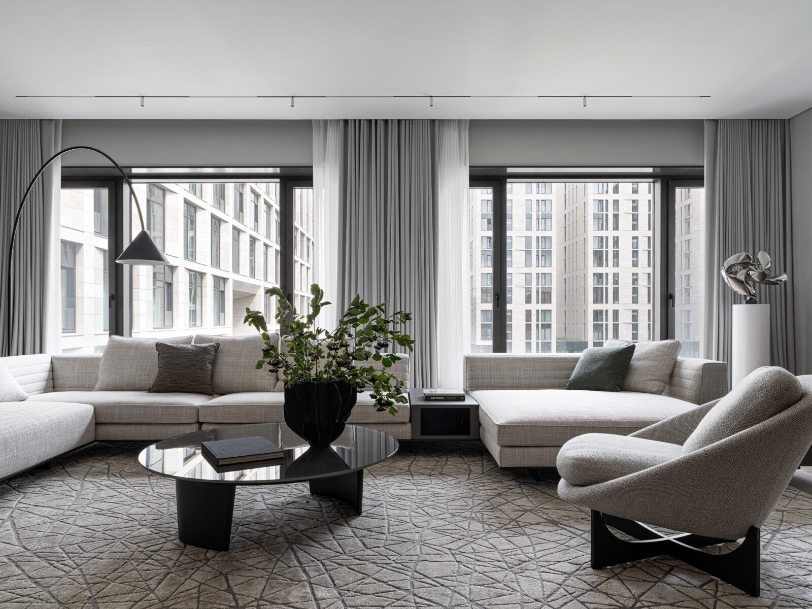
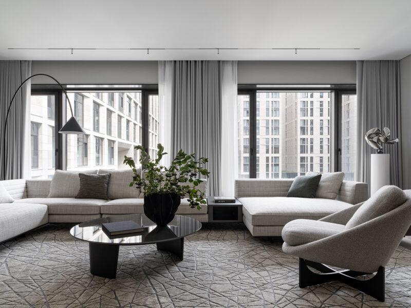
Two low-slung sectional sofas in pale woven upholstery face each other across a round smoked-glass coffee table, with a curved lounge chair closing the conversation circle. Layered curtains — sheer inner panels, heavier gray outer drapes — soften the black-framed window wall and diffuse daylight evenly across the abstract-patterned rug. A polished-steel sculpture on a white plinth and a black arc floor lamp supply the only strong accents. The composition demonstrates the project’s core argument: with enough textural variety, a near-monochrome room reads as layered rather than empty.
The living room is where the veneer thread begins and where the family’s wish for a soft, bright environment is most legible. Furniture is arranged for conversation rather than for a television, an interior-design decision that signals how the clients actually decompress. Track-mounted spotlights along the ceiling perimeter provide adjustable evening light, while the deep window reveals admit generous daylight without glare.
The Dining Axis: Where Calacatta Green Does Its Work
 Pin
Photo: Sergey Krasyuk
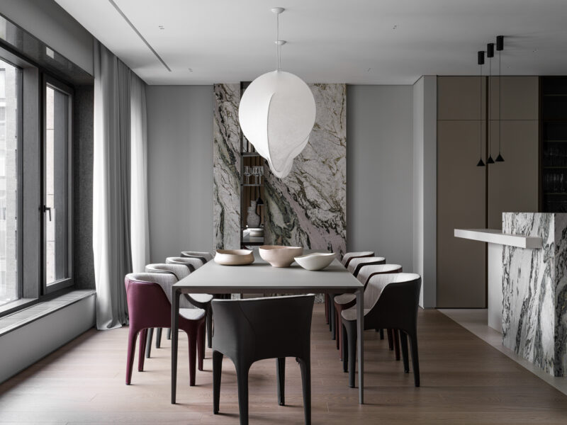
A ten-seat dining table sits directly beneath a sculptural white cocoon pendant, flanked by leather-backed chairs in graphite, oxblood, and pale gray. Behind it, two book-matched slabs of Calacatta Green quartzite frame a recessed smoked-glass display niche, turning the stone into a proscenium for the table. The quartzite’s gray-green veining supplies nearly all of the room’s color, which is precisely the point. This is the main axis the designers describe: sightlines from the living zone terminate here, on stone rather than on artwork.
 Pin
Photo: Sergey Krasyuk
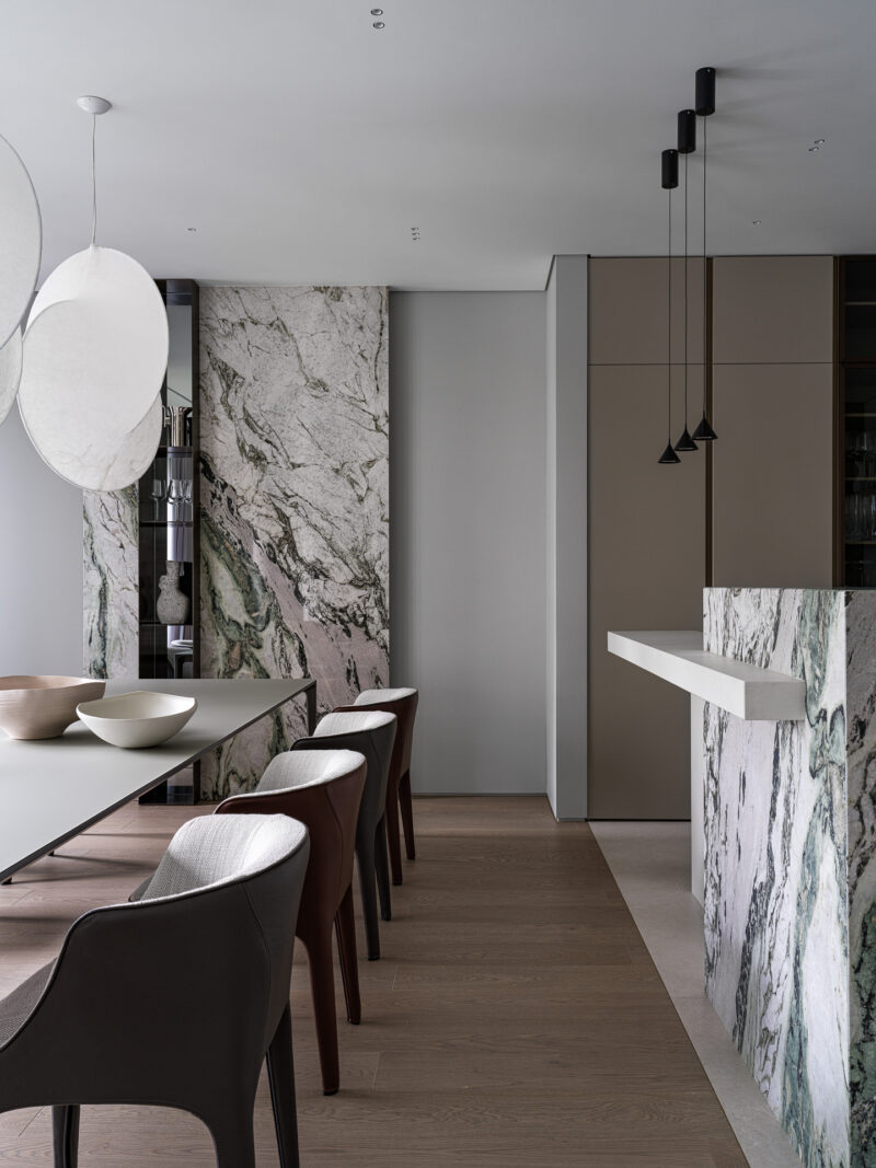
Seen from the table’s end, the dining zone and the kitchen bar read as parallel stone events: quartzite panels on the wall, and the same material wrapping the raised bar that screens the kitchen. Three slender black pendants drop above the bar, their vertical lines answering the veining below. The white table surface and pale ceramic bowls keep the middle ground quiet so the stone edges dominate. The photograph makes the spatial strategy plain — the kitchen is present but visually subordinate, exactly as the plan intends.
Seating for ten confirms that hosting was written into the brief, and the table itself is one of the seamless pieces that arrived through the dismantled window. The dining group’s placement on the quartzite axis gives everyday meals a formal backdrop without resorting to ornament.
A Kitchen Designed to Recede
 Pin
Photo: Sergey Krasyuk
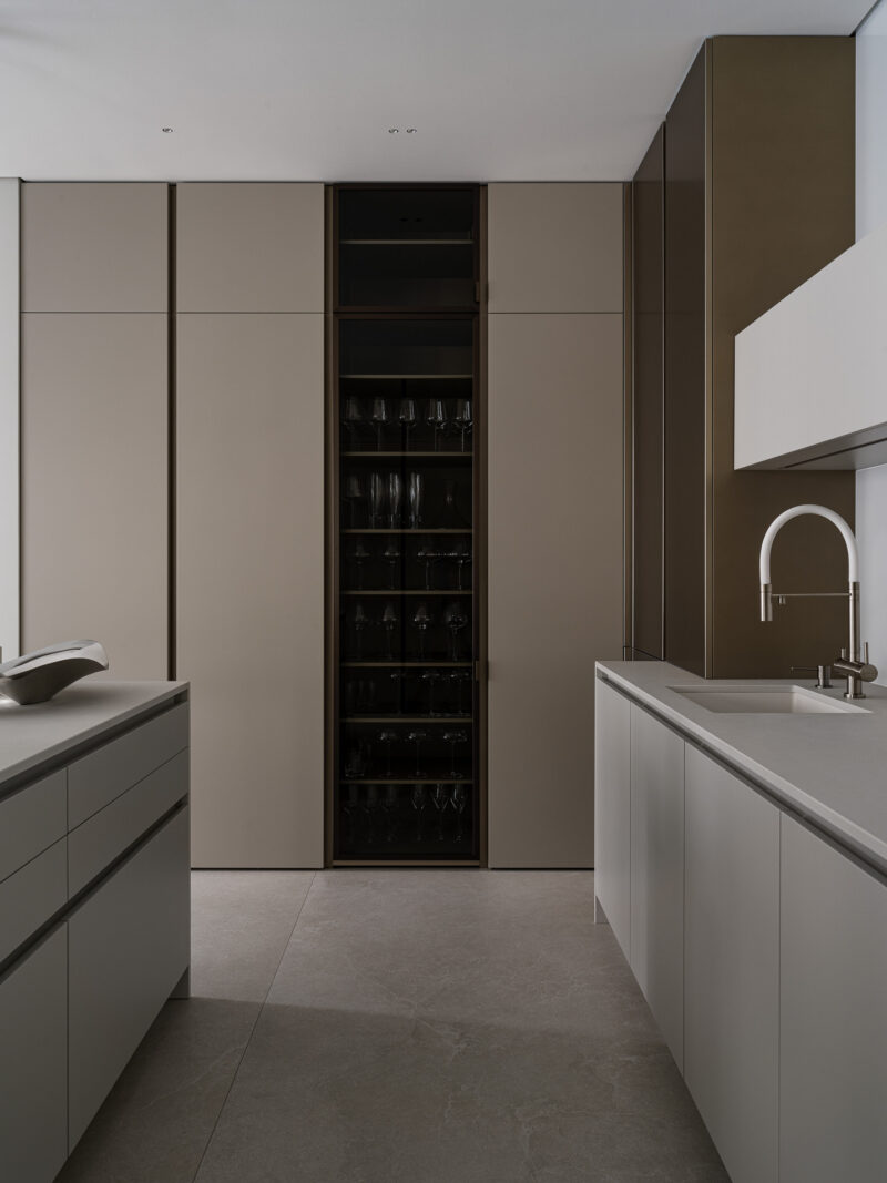
Floor-to-ceiling cabinetry in warm greige conceals appliances and storage behind flush, handle-free fronts, while a bronze-framed glass case displays stemware like a small archive. The palette shifts here from cool gray to a deeper taupe-bronze register, marking the kitchen as a distinct territory within the open plan. A white gooseneck faucet is nearly the only bright object in the frame. The room shows how the project achieves visual quiet: not by emptiness, but by suppressing hardware, joints, and contrast.
 Pin
Photo: Sergey Krasyuk
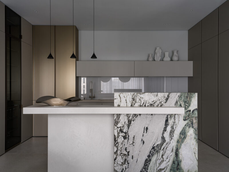
The island pairs a thick white worktop with a raised quartzite screen, so the working surface hides behind the same stone that headlines the dining room. Cone pendants hang low over the counter, and a mirrored backsplash strip bounces window light back into the room’s center. The sculptural metal bowl on the counter is styling, but it also underscores the reflective-versus-matte material play. Functionally, the raised stone edge conceals prep clutter from the living zone — a small section change doing real spatial work.
The kitchen’s fenestration strategy (the placement and sizing of windows) is indirect — borrowed light through the backsplash glazing and the open plan — so finishes were chosen to perform under artificial light as well as daylight. The taupe cabinetry warms what could otherwise read as a clinical service zone.
The Master Bedroom: Two Beds, One Calm Envelope
 Pin
Photo: Sergey Krasyuk
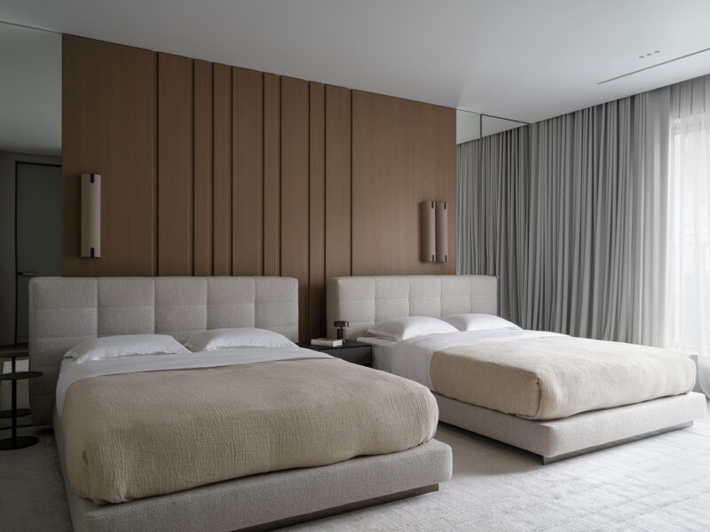
Two identical upholstered beds share a wall of vertical oak paneling, each marked by its own leather-wrapped sconce, with a slim black nightstand between them. Full-height mirrors flank the paneled wall, visually doubling the room’s width while keeping the material count low. Linen bedcovers in oatmeal tones sit against white sheets, holding the palette to three close values. The symmetry is hotel-like in its discipline, yet the wood grain and soft drapery keep it domestic rather than austere.
 Pin
Photo: Sergey Krasyuk
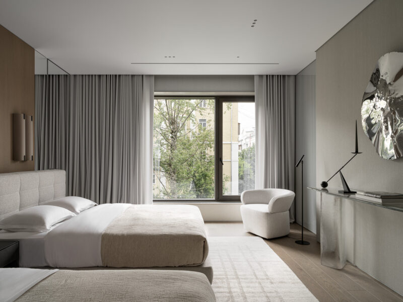
From the window side, the room reveals its quieter luxuries: a barrel-backed armchair for reading, a cast-glass console against the far wall, and a rippled polished-steel wall relief that catches daylight like water. Layers of gray drapery run wall to wall, letting the owners tune the light from full sun to blackout. The tree canopy outside the picture window supplies the room’s only saturated color. It is a persuasive demonstration that a neutral scheme need not be static when texture and reflection carry the variation.
The master block sits deep in the private wing, and the room’s spatial hierarchy is unambiguous: the paneled wall anchors sleep, the window wall hosts daytime rituals. Artificial light is deliberately layered — sconces for reading, a floor lamp for the chair, recessed spots for general fill — so the room functions at every hour without a single overhead glare source.
A Dressing Corner That Borrows the City View
 Pin
Photo: Sergey Krasyuk
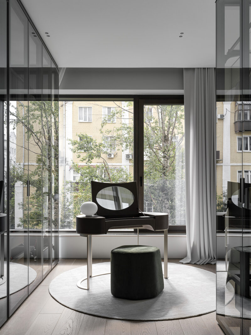
Smoked-glass wardrobe fronts line both sides of this corner of the master block, their reflective panels multiplying the window and the yellow-brick facades beyond. At the center, a dark vanity table with a flip-up oval mirror and a bottle-green velvet pouf sits on a round rug, composing a small, almost ceremonial island for daily routines. The glass doors display clothing as a curated volume rather than hiding it. Placing the vanity against the glazing is a quietly generous move — grooming happens in true daylight, which no artificial source fully replicates.
The First Children’s Room: Blue as a Controlled Event
 Pin
Photo: Sergey Krasyuk
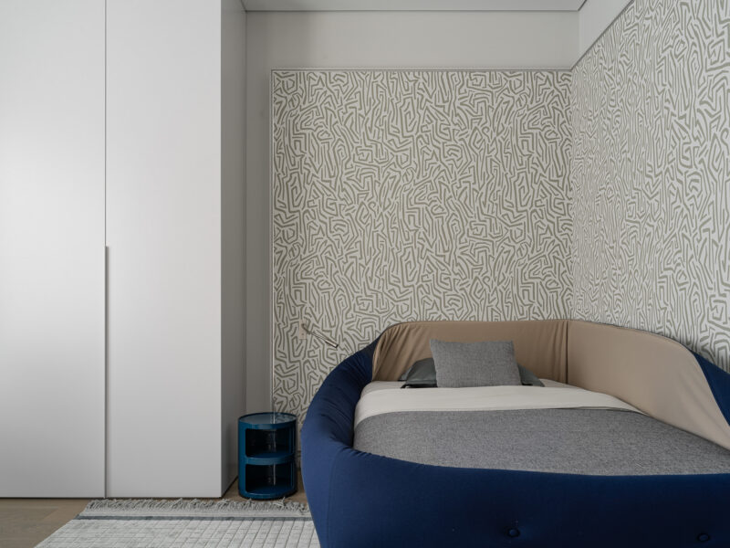
A rounded bed upholstered in deep navy with a camel-toned inner rim sits against a wall of maze-patterned wallpaper in soft olive on white, with a glossy blue cylindrical nightstand tucked beside it. The bed’s curved, padded perimeter is both playful and practical for a child — no hard corners at the sleeping zone. The wallpaper delivers pattern at a scale fine enough to read as texture from across the room. Against the apartment’s neutral base, this single saturated object defines the room’s entire character.
 Pin
Photo: Sergey Krasyuk
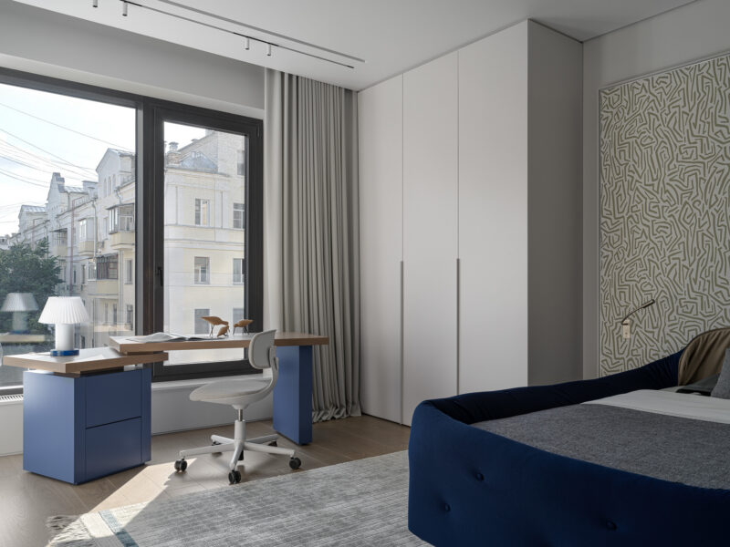
The work zone repeats the bed’s blue in a pair of lacquered pedestal drawers supporting a two-tier oak desktop, angled toward the window and the historic facades beyond. A white task chair and a small blue-based table lamp keep the corner light and adjustable as the child grows. White wardrobes with minimal pulls disappear into the wall, conceding all attention to the desk. The room shows the bureau’s method for children’s spaces: hold the envelope neutral, then concentrate color in the furniture that a child actually touches.
This bedroom belongs to the private wing’s children’s cluster, and its interior logic mirrors the adult zones — controlled palette, concealed storage — while allowing one emphatic color. The desk’s window placement prioritizes daylight for homework, with track spots covering evening hours.
The Second Children’s Room: Green Crosses and Built-In Order
 Pin
Photo: Sergey Krasyuk
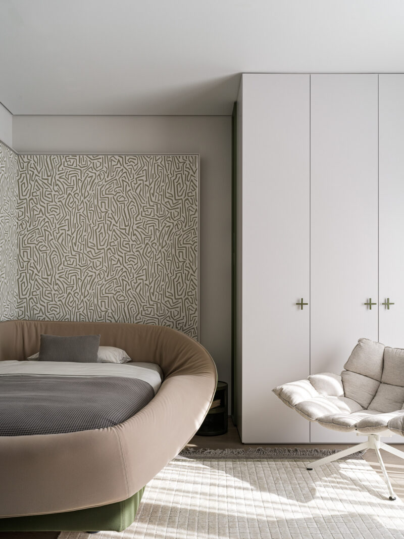
Here the accent shifts to olive green: cross-shaped door pulls, a green bed base beneath the camel upholstered rim, and the same maze wallpaper turned into a headboard panel. A quilted swivel lounge chair on a white star base gives the child a genuine reading perch, not a miniature of one. The wardrobe wall runs flush to the ceiling, absorbing storage without visual weight. The two children’s rooms are siblings in the truest sense — same bones, different temperament.
 Pin
Photo: Sergey Krasyuk
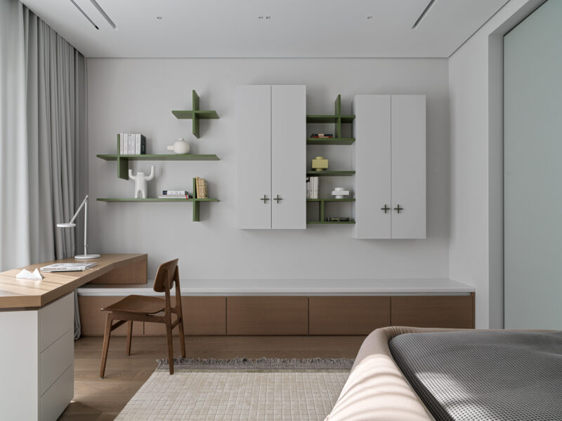
The study wall composes open green shelving in pinwheel arrangements around two white wall cabinets with cross-shaped pulls, above a continuous oak bench and drawer run. A cantilevered oak desk extends from the bench line, paired with a classic bentwood-style chair in walnut tones. The cross motif repeats at every scale — pulls, shelf junctions, perforated shelf backs — giving the room a coherent graphic identity. It is a disciplined piece of casework design that treats a child’s storage with the same rigor as the adult kitchen.
 Pin
Photo: Sergey Krasyuk
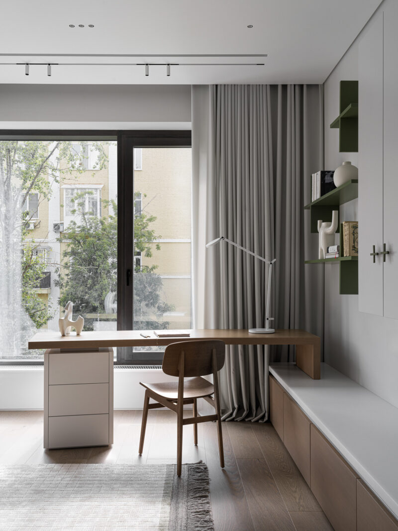
Seen toward the window, the desk turns to face the light, sharing the oak bench that runs the room’s full length and doubles as window seating. Green shelves step up the wall beside the wardrobe, holding books and ceramics within a child’s reach. The gray drapery and track lighting match the apartment’s public rooms, quietly teaching the eye that this room belongs to the same family of spaces. Continuous benches like this one are an underrated planning device — they merge desk, seat, and storage into a single calm line.
A Playroom Signed in Neon
 Pin
Photo: Sergey Krasyuk
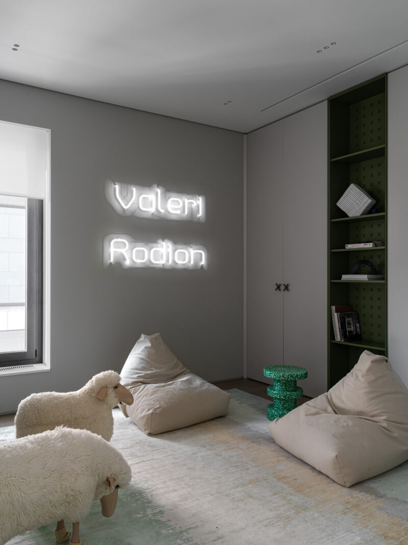
White neon signs spelling Valeri and Rodion — the children’s names — glow against the gray wall above a pair of canvas beanbag loungers and two woolly sheep footstools. A recessed olive-green shelf niche with the cross-perforated back panel ties the room to the second bedroom’s language. The abstract rug in faded mint and sand is soft underfoot and forgiving of play. Personalization here is literal but restrained: the names are rendered in cool white light, not primary-color vinyl.
 Pin
Photo: Sergey Krasyuk
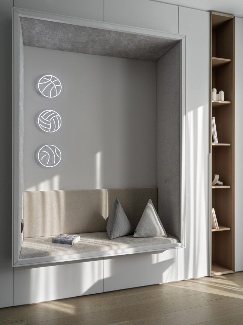
A deep upholstered niche carved into the wardrobe wall creates a padded reading nook, lined in gray felt and beige cushions, with three neon sports balls — basketball, volleyball, soccer — glowing on its back wall. A slim oak shelf tower beside the niche keeps books at arm’s reach. The nook borrows a trick from the adult rooms: a single framed opening that concentrates softness and light in one place. For a child, it is a den; for the plan, it is storage and seating fused into one cabinet depth.
The playroom completes the children’s cluster and absorbs the energy that the bedrooms deliberately exclude. Durable, washable surfaces — felt, canvas, painted casework — acknowledge how the room will actually be used, while the neon pieces give the children authorship of their own territory.
Bathrooms: From Stone Gravity to Confetti Tile
 Pin
Photo: Sergey Krasyuk
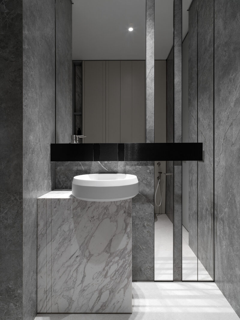
The guest bathroom is the apartment’s darkest, most compressed space: gray stone-clad walls, full-height mirror strips, and a black steel shelf floating above a monolithic white marble pedestal that carries a round vessel sink. This is the pedestal moment the designers describe — the noble-stone theme distilled into a single freestanding block. Vertical mirror bands slice the stone into panels and make the narrow room read taller. The restraint is total: one material event, precisely lit from a single recessed spot.
 Pin
Photo: Sergey Krasyuk
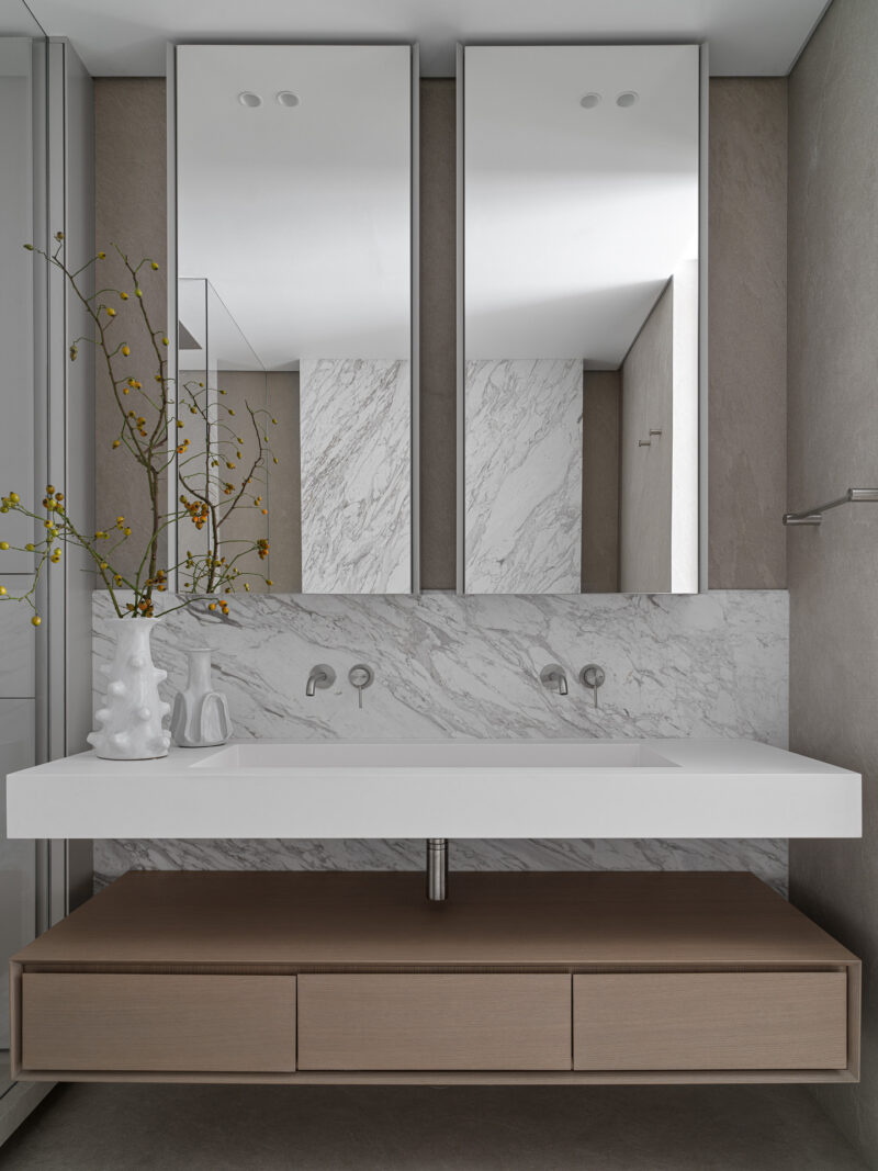
In the master bathroom, a white marble backsplash with pronounced gray veining runs behind a cantilevered white double-trough sink, with wall-mounted taps keeping the counter clear. Twin framed mirror cabinets float in front of clay-toned plaster walls, and an oak drawer unit below adds the veneer thread even here. Rosehip branches in a sculptural white vase supply the room’s only color. The detailing — shadow gaps, wall-mounted fittings, concealed drainage — reflects the same joint-averse discipline as the furniture brief.
 Pin
Photo: Sergey Krasyuk
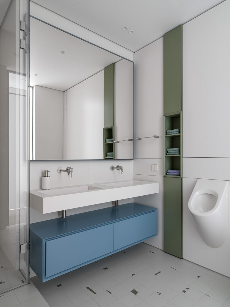
The children’s bathroom translates the bedroom palette into wet-zone materials: a sky-blue floating drawer unit under a white double sink, an olive-green towel tower with open niches, and terrazzo-flecked floor tile scattered with confetti-like chips. A large frameless mirror doubles the daylight from the adjacent shower’s glazing. Fixtures are mounted at heights that will still work as the children grow. It is proof that a family bathroom can be genuinely playful without a single cartoon motif.
 Pin
Photo: Sergey Krasyuk
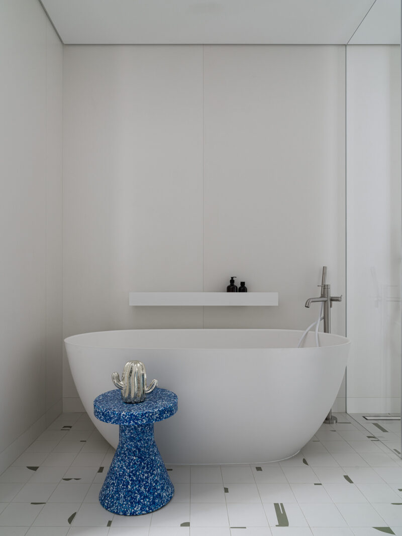
A freestanding oval tub in matte white stands against seamless large-format wall panels, attended by a cobalt-blue recycled-plastic side table holding a chromed cactus figure. The confetti floor tile continues from the vanity zone, unifying the room. A floor-mounted brushed-steel filler keeps the tub’s silhouette uninterrupted. The single saturated object against a white field is the apartment’s compositional signature, executed here at bath scale.
Where the Discipline Pays Off — and What It Will Demand
The Axis Strategy Earns Its Keep
The project’s clearest strength is its material economy. Two threads — Calacatta Green quartzite and oak veneer — organize 265 square meters, so every room feels related without repetition. The stone’s placement on circulation axes means the most expensive material is also the most seen, a rational allocation of budget. And the children’s zone succeeds on its own terms: each child gets a distinct color identity within the same casework system, which keeps the private wing coherent while giving its youngest residents real ownership.
The Price of the Seamless Ideal
The same discipline creates obligations. Furniture that entered through a dismantled window cannot easily leave or be reconfigured; the seamless ideal trades flexibility for purity. A palette this quiet also depends on scrupulous upkeep — pale upholstery, matte stone, and light oak forgive very little in a household with two active children. Finally, handle-free, joint-free casework tends to cost more to build and to repair, a consideration for anyone tempted to replicate the approach on a tighter budget.
A Case for Calm as the Real Luxury
What this modern Moscow apartment argues, convincingly, is that neutrality is not the absence of design but its hardest test. Bureau No. 11 delivers atmosphere through proportion, stone figure, and light rather than color — and still carves out individuality where it matters most, in the children’s rooms. The design suits owners who want a home that lowers the pulse after demanding workdays and who are willing to maintain the discipline that makes such calm possible. It also shows how interiors carry identity in new-build complexes where facades cannot. Would you commit to furniture so seamless it had to come through the window — or is the freedom to rearrange worth a few visible joints?
FAQs
Who designed the Garden Quarters apartment in Moscow?
The interior was designed by Design Bureau No. 11, founded in 2014 by architects Kirill Dunaev and Anna Dunaeva. The Moscow-based studio works across scales, from residential and commercial interiors to the architectural design of private houses. The project was completed in 2024 for a family of entrepreneurs.
How large is the apartment and how is it laid out?
The apartment measures 265 square meters, divided into two zones. The private wing contains a master block, two children’s bedrooms, a playroom, and a children’s bathroom; the public wing holds an office, a dining room, and a kitchen-living room in which the kitchen is visually set back from the living area.
What stone is used in this interior?
The main material is Calacatta Green quartzite, which the designers selected after a long search. It appears on the interior’s principal axes — behind the dining group, at the entrance, and as a pedestal in the guest bathroom — establishing the color range for the entire apartment.
How was the oversized furniture delivered?
Because the clients prioritized seamless furniture without joints, several pieces were too large for the building’s interior routes. The bureau hired professional climbers to dismantle a window and bring the pieces in through the opening, including a dining table for ten, a 4-meter console, and a 3.5 by 5.5-meter sofa.
What is the most unusual object in the apartment?
The designers point to “Silentium,” a three-dimensional artwork by artist Victoria Dego that combines plaster, ink, and a papyrus-like texture. It serves as the interior’s standout art object within an otherwise restrained, neutral scheme built on stone and wood veneer.
Get gorgeous projects via email
