

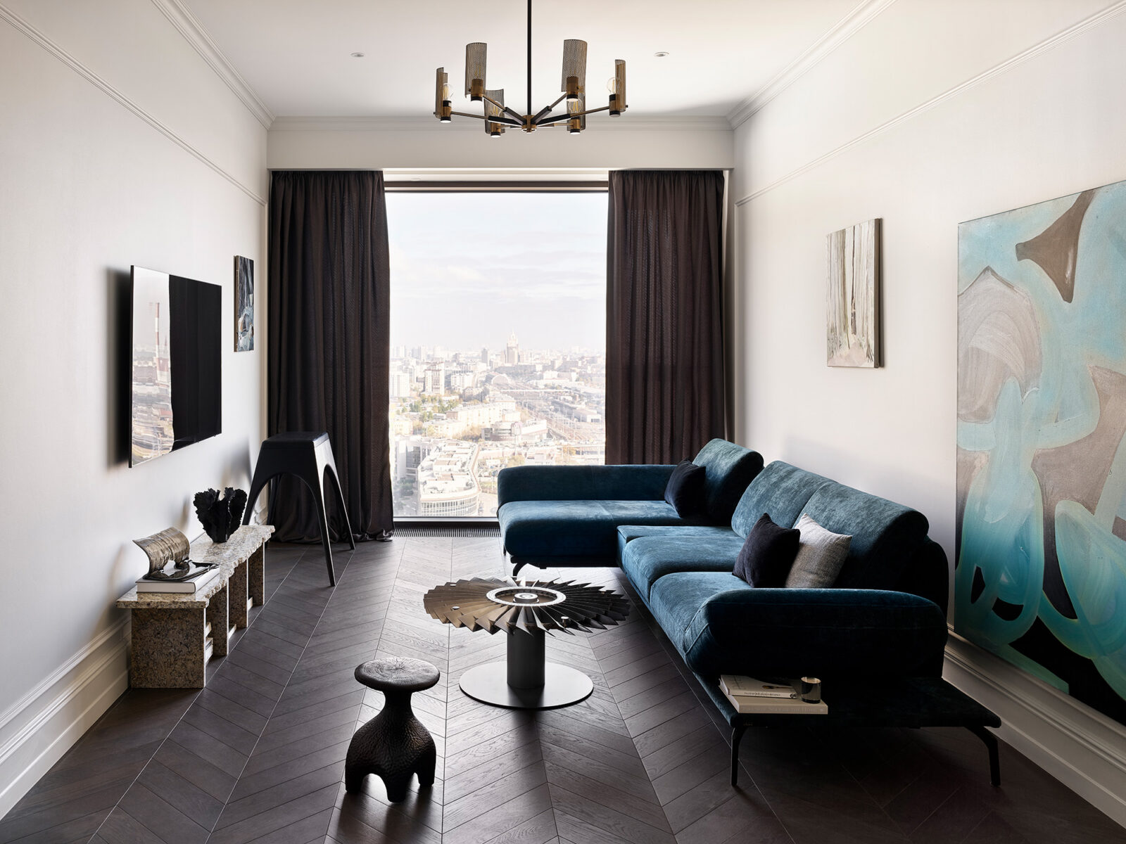
Most compact apartments chase neutrality; this one takes sides. For a bright 70 m² apartment in Moscow, interior designer Marina Mirasova was handed an unusual brief from a young businessman: make it unlike anything else in the building. The result, styled by Milena Morozova and photographed by Sergey Ananiev, treats the interior as a character study rather than a decorating exercise. Perched on the 22nd floor of a new residential complex, the apartment turns a conventional open-plan layout into an argument for saturated color, gallery-grade objects, and stone chosen the way collectors choose art.
| Project Name | Bright 70 m² Apartment |
| Architect / Designer | Marina Mirasova (styling: Milena Morozova) |
| Location | Moscow, Russia |
| Floor Area | 70 m² (approx. 753 sq ft) |
| Client Type | Private (single owner) |
Interior as Portrait: Building a 70 m² Apartment Around One Personality
The site handed Mirasova an unusual constraint: the shell was already finished in high-quality natural materials when the collaboration began, and the client wanted the original layout preserved. The design response was surgical rather than structural — minor ergonomic adjustments only, with the creative budget concentrated on the two rooms a bachelor actually lives in: the open-plan kitchen-living area and the master suite. A guest bedroom and guest powder room complete the plan.
That restraint in massing terms freed the project to work through materiality instead. The parti (the organizing idea behind the design) is the leathered quartzite slab that anchors the kitchen island and backsplash; the living room sofa was upholstered specifically to answer the stone’s hue, so the two halves of the open plan read as one composition rather than adjacent zones. Three-meter ceilings and floor-to-ceiling panoramic glazing do the architectural heavy lifting, flooding the plan with daylight and framing the Moscow skyline as a permanent artwork on the fourth wall. The interior identity is communicated less through built form than through curation: gallery pieces, custom commissions, and vintage finds assembled with the density of a private collection, held together by classical wall moldings and dark chevron parquet.
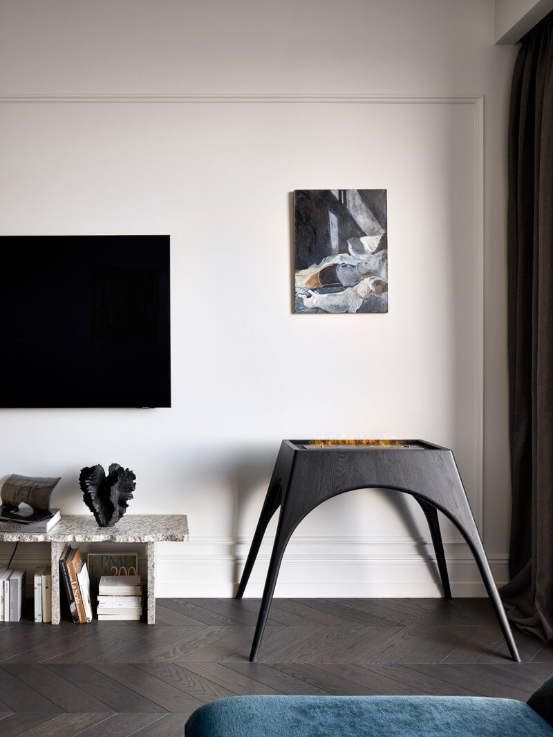
Design Decision: The living room console by Ilya Kuznetsov hides a bio-fireplace beneath a fold-down panel. Rather than making fire a permanent focal point, Mirasova made it optional — the object reads as sculpture by day and becomes a hearth only when the owner chooses.
Inside the Apartment: A Room-by-Room Walkthrough
The Entry: A Four-Marble Console Sets the Rules
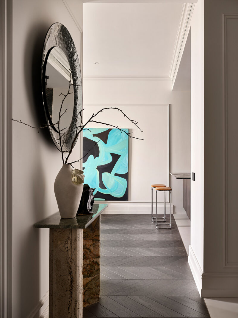
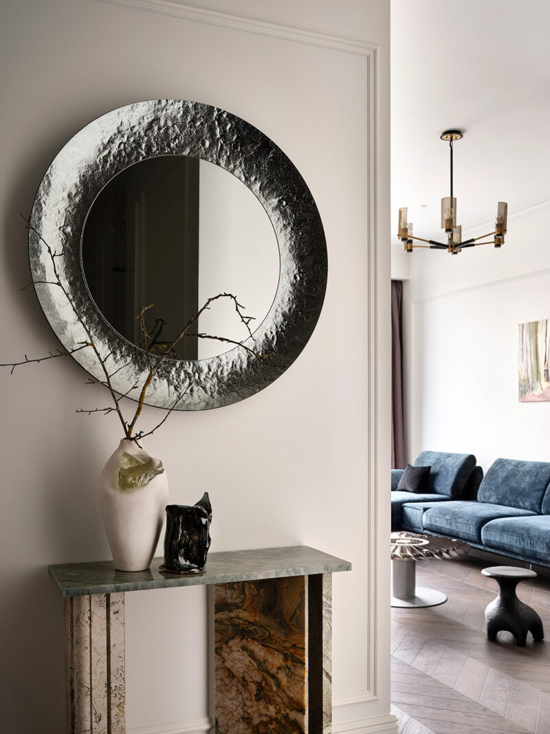
The threshold announces the apartment’s method in a single object. Mirasova designed the entry console from four types of marble, its coloring deliberately echoing the kitchen cabinetry deeper in the plan — a circulation cue that pulls the eye from the front door straight through to the living space. An exclusive vase by Elena Loginova and a Tonin Casa mirror complete a vignette that behaves like a gallery plinth rather than a drop zone.
 Pin
PinPhoto: Sergey Ananiev
The view down the entry corridor compresses the apartment’s whole logic into one frame: the stratified marble console in the foreground, the turquoise abstraction on axis, and the kitchen’s leather barstools beyond. The chevron parquet establishes a directional grain that literally points the visitor inward. Classical wall paneling keeps the envelope quiet so the objects carry the color argument.
 Pin
PinPhoto: Sergey Ananiev
Up close, the console’s four marbles read as geological strata — cool green top, warm ochre-veined supports — while the textured-glass mirror above scatters light like water. The pairing of a matte ceramic vessel with a glossy black sculptural vase shows the styling discipline at work: every surface contrast is deliberate. It is a compact lesson in how entry furniture can carry architectural weight in a 70 m² plan.
The Living Room: Velvet, Granite, and a Turbine at Its Center
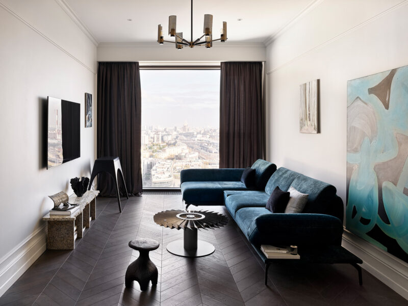
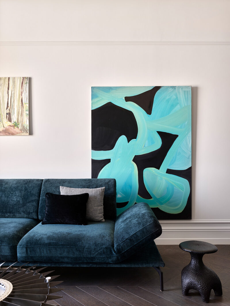
The living zone is where the curation is densest. A deep teal sofa — its upholstery selected to complement the kitchen quartzite — faces a coffee table whose base is an actual aircraft turbine, fabricated at a titanium factory by the client’s friends. A granite TV console-library built to Mirasova’s sketches, the Kuznetsov bio-fireplace console, and Maria Koroleva’s vivid blue painting Night Dance complete a room that functions as both lounge and private gallery.
 Pin
PinPhoto: Sergey Ananiev
The wide view shows how the room borrows its drama from the city: the panoramic window delivers the Moscow skyline as a full-height mural, with dark curtains framing it like proscenium drapery. The turbine table sits at the exact center of the composition, its radial blades echoing the chandelier’s spoke geometry above. Furniture is kept low and perimeter-hugging so the 3-meter ceiling height and the view stay dominant.
 Pin
PinPhoto: Sergey Ananiev
This angle demonstrates the color logic that holds the scheme together: the teal velvet sofa and Koroleva’s turquoise-on-black canvas amplify one another, while the blackened sculptural stool grounds the palette. The turbine blades entering the frame at lower left add machined precision against all that softness. It is a textbook case of art driving a room’s palette rather than decorating it after the fact.
 Pin
PinPhoto: Sergey Ananiev
The quieter wall shows the room’s counterweight: a raw-edged granite bench serving as TV console and library, its rough stone deliberately unpolished against the crisp millwork behind. The Kuznetsov console stands with its panel folded down, flame alive — furniture and fireplace in one silhouette. Small dark sculptures and stacked art books keep the vignette domestic rather than showroom-still.
The Kitchen: Built Around One Slab of Stone
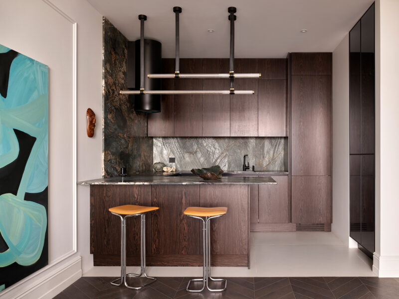
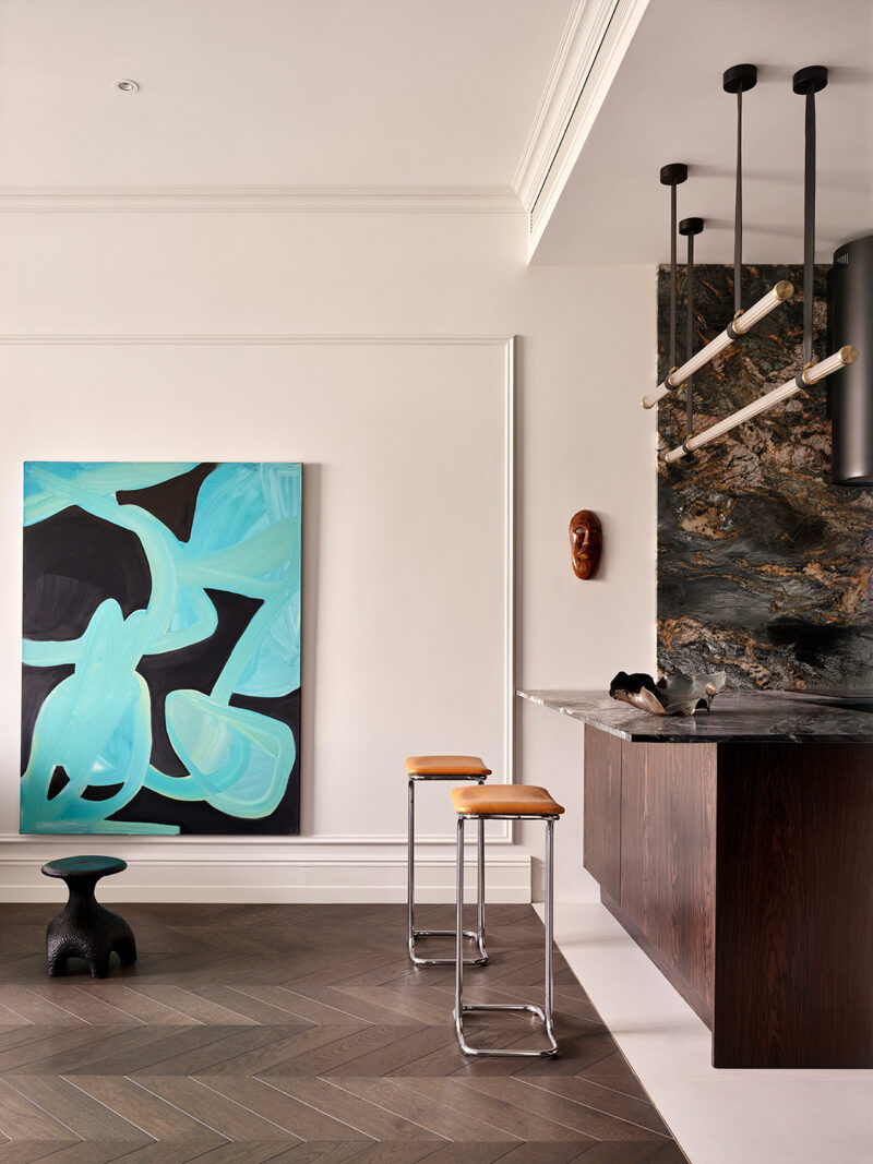
The kitchen was custom-built in Max Malevich’s workshop in natural wood veneer, but the stone is the protagonist. Leathered quartzite (a finish that is honed, then textured to a soft matte sheen) wraps the island and backsplash, its smoky veining captivating designer and client alike. Vintage Italian barstools from the 1970s, a 1980s chandelier, and sculptural vases by Anna Mark layer eras onto the composition.
 Pin
PinPhoto: Sergey Ananiev
The elevation reads as a study in dark-on-dark restraint: rosewood-toned veneer cabinetry running flush to the ceiling, the quartzite backsplash shimmering between, and a cylindrical black hood disappearing into the palette. The suspended linear fixture with its slender glass tubes adds mid-century precision without visual bulk. Cognac leather barstool seats supply the single warm accent, proving how little color a well-judged material scheme actually needs.
 Pin
PinPhoto: Sergey Ananiev
At the junction of kitchen and living area, the full-height quartzite panel shows its dramatic veining — closer to an abstract canvas than a work surface — while the chevron parquet hands off to pale stone flooring at the kitchen threshold. The floor transition quietly zones the open plan without a single wall. A carved wooden mask beside the stone adds the collector’s touch that runs through the whole apartment.
The Master Bedroom: Oxblood Velvet Under a Private Star
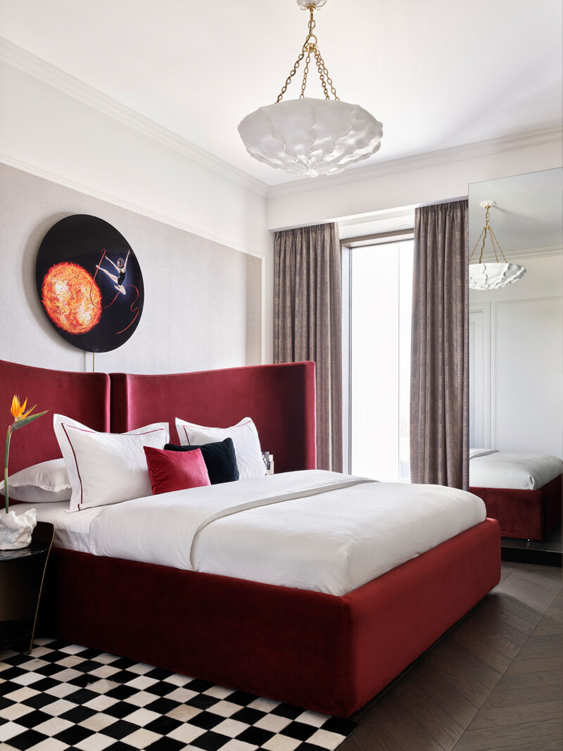
The bedroom concentrates the apartment’s boldest color move. A custom bed with an oversized winged headboard, upholstered in deep red velvet, dominates the room; above it hangs Fly Me to Antares by Anna Bo, a circular canvas inspired by the brightest star in the Scorpius constellation. An AERIN chandelier — a brand Mirasova associates with effortless luxury — and a hand-stitched Indian patchwork rug of black-and-white hide fragments complete the suite.
 Pin
PinPhoto: Sergey Ananiev
The image shows how a single saturated hue can organize an entire room: the oxblood velvet bed frames crisp white bedding, while the checkerboard hide rug injects graphic tension underfoot. Anna Bo’s fiery circular canvas hovers over the headboard like the star it depicts, its orange core the room’s only competing warm note. The sculptural plaster chandelier and gray textile-panel wall keep the upper half of the room calm, letting the bed carry the drama.
The En-Suite Bathroom: Marble Drama in a Compact Footprint
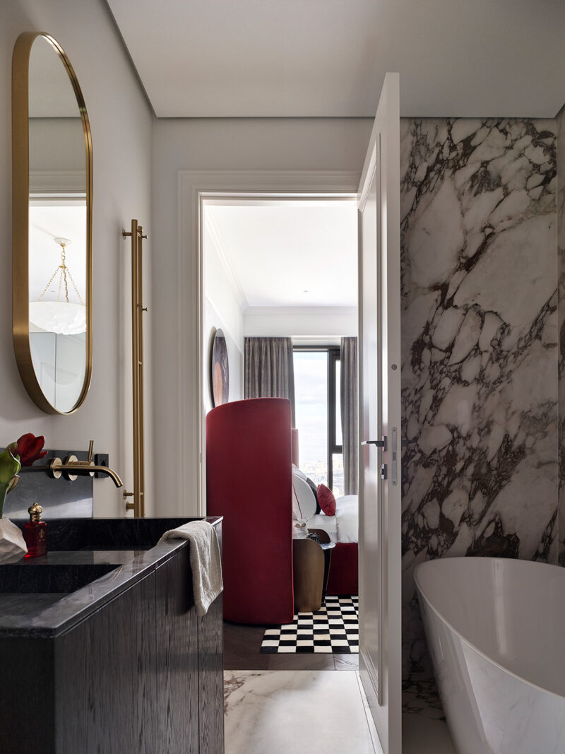
The master bathroom compresses the apartment’s material confidence into its smallest room. Boldly veined marble wraps the bathing zone around a freestanding sculptural tub, while a dark stone vanity with brushed brass fittings holds the opposite wall. The doorway frames the red bed beyond, so even the bathroom participates in the apartment’s color narrative.
 Pin
PinPhoto: Sergey Ananiev
The sightline is the design decision here: from the vanity, the eye travels past a brass-framed capsule mirror and heated towel rail straight to the oxblood headboard in the bedroom — an enfilade (a suite of rooms aligned along one axis) in miniature. The violently veined marble slab beside the white tub supplies the drama, while the near-black vanity stone absorbs it. Brass hardware ties the wet zone to the warm metallics running through the rest of the apartment.
Where the Bold Palette Pays Off — and What It Asks in Return
Color Discipline Inside the Chaos
For an interior this loaded, the restraint is remarkable. The quartzite-to-sofa color chain and the entry console’s echo of the kitchen cabinetry give the open plan a material through-line most compact apartments never achieve. Second, the curation has genuine range — 1970s Italian barstools, a titanium-factory turbine, contemporary Russian canvases — yet each piece answers another across the room, so density never tips into clutter. Third, the architectural shell is left calm: white moldings, dark parquet, and panoramic glazing form a stable frame that lets the objects perform.
The Price of a One-Owner Interior
The same choices carry costs. Natural stone this expressive — leathered quartzite, four marbles, raw granite — demands sealing and careful maintenance that a lacquer-and-laminate interior never would. The palette is also radically personal; an interior built as one bachelor’s portrait will resist the next owner, and even a future partner, in a way neutral schemes do not. And with the creative investment concentrated in the living area and master suite, the guest bedroom inevitably reads as a supporting act.
A Case for Interiors That Take Sides
This project’s contribution is its refusal to hedge. Mirasova demonstrates that a 70 m² plan does not require visual minimalism to feel composed — it requires a disciplined color spine and objects strong enough to justify their space. The apartment suits a specific inhabitant: a single owner who wants a home that argues, entertains, and reflects him back. It is a portrait, and portraits are not transferable.
Would you commit your own home to a palette this personal, knowing it may never suit anyone else — or is that permanence exactly what makes an interior worth having?
FAQs
Who designed the bright 70 m² apartment in Moscow?
The apartment was designed by interior designer Marina Mirasova, with styling by Milena Morozova. It was photographed by Sergey Ananiev. The client is a young businessman who asked for an interior unlike any other in his building, and the design was built around his personality.
What materials define the apartment’s interior?
Leathered quartzite anchors the kitchen island and backsplash, complemented by natural wood veneer cabinetry, a four-marble entry console, a raw granite TV console-library, and velvet upholstery. Dark chevron parquet and classical white wall moldings form the neutral architectural frame around these materials.
What is the layout of the 70 m² apartment?
The plan consists of an open kitchen-living area, a master suite with an en-suite bathroom, a guest bedroom, and a guest powder room. Located on the 22nd floor, it features three-meter ceilings and floor-to-ceiling panoramic windows. The original layout was preserved with only minor ergonomic adjustments.
What makes the living room coffee table unusual?
Its base is a genuine aircraft turbine, fabricated at a titanium factory by friends of the client. The one-of-a-kind piece serves as the focal point of the living room composition, its machined radial blades contrasting with the velvet sofa and soft gallery lighting around it.
Did the designer change the apartment’s original structure?
No. The apartment had already been finished with high-quality natural materials when the project began, and the original layout was maintained with only minor ergonomic adjustments. The design effort focused on the key living zones: the open-plan kitchen-living area and the master bedroom.
Get gorgeous projects via email
