

Olga Bondarenko of designed this 100 sqm Moscow apartment for a young couple seeking calm amid city life. The brief called for a contemporary interior that balanced architectural playfulness with genuine comfort — a space that felt curated yet entirely livable.
Bondarenko responded with a restrained palette of warm wood tones, muted grays, and strategic pops of color that unify the open-plan living areas while giving each room a distinct atmosphere. The designer drew from an international roster of manufacturers — BoConcept, Gubi, Vibia, Miniforms, Calligaris — mixing Scandinavian lighting, Italian furniture, and Russian artistic talent to create an interior that feels globally informed yet personally specific. Every material choice reflects an intent to create tranquility without sacrificing personality: the Ligne Roset art panel by Ronan and Erwan Bouroullec anchors the living room with its organic geometry, while birch bark-inspired 41ZERO42 tiles in the master bath root the contemporary aesthetic in Russian natural heritage. The result is a home designed not just for the couple’s present life, but for the family they plan to become.
| Architect / Designer | Olga Bondarenko, AUGUST Buro |
| Location | Moscow, Russia |
| Floor Area | 100 sqm (approx. 1,076 sq ft) |
| Client Type | Private — young couple |
| Photographer | Evgeny Gnesin |
| Stylist | Irina Bebeshina |
Designing for a Future Family: How a 100-Sqm Moscow Apartment Balances Playfulness and Restraint
Bondarenko approached this Moscow apartment interior with a clear parti: divide 100 square meters into zones that feel open yet defined, calm yet visually engaging. The client’s dual request — tranquility and style — shaped every decision. Rather than treating these as opposing forces, the designer used architectural volumes as both spatial organizers and aesthetic statements.
The open kitchen-living area demonstrates this philosophy most clearly. A floating glass base on the kitchen island adds an ethereal quality that lightens the room’s center, while wood-toned cabinetry introduces warmth against the cool gray plaster walls. The Ligne Roset panel by Ronan and Erwan Bouroullec functions as both art and spatial anchor — a design element that commands attention without disrupting the room’s calm.
The material language extends this tension between warmth and precision. Porcelanosa and 41ZERO42 tiles appear throughout, their textured surfaces catching light differently at each hour of the day. In the corridor, a graphic sliding glass door with thin vertical panels filters views between spaces, creating a visual bridge that maintains connectivity while suggesting separation. Art by Alexey Charugin, titled “Pike-UFO,” adorns this transitional zone — a piece inspired by the artist’s own daughter’s drawings, it introduces a personal narrative that prevents the minimalist interior from feeling impersonal.
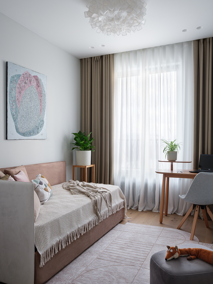
The apartment’s most distinctive quality is its forward-looking planning. Designed for a couple anticipating their first child, the neutral-toned children’s room and carefully appointed bathrooms suggest a designer who understood that good residential architecture must accommodate lives that haven’t fully unfolded yet. The Scandinavian-style nursery avoids gender-specific color choices, relying instead on form and texture — a cloud-shaped paper chandelier, abstract art by Daria Dmitrieva, flexible daybed seating — to create a space that can evolve as the child’s needs change. This kind of anticipatory design thinking separates competent interior decoration from genuinely thoughtful residential architecture.
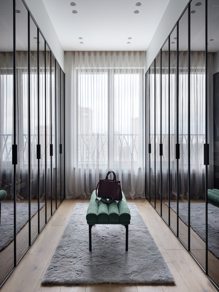
Design Decision:Bondarenko chose a transparent glass wardrobe for the master bedroom — a counter-intuitive move in a private space. The decision visually expanded the room's perceived depth while turning storage into a design feature rather than hiding it behind opaque panels.
Room-by-Room Spatial Walkthrough
A Living Room Where Color and Calm Coexist
 Pin
PinPhoto: Evgeny Gnesin
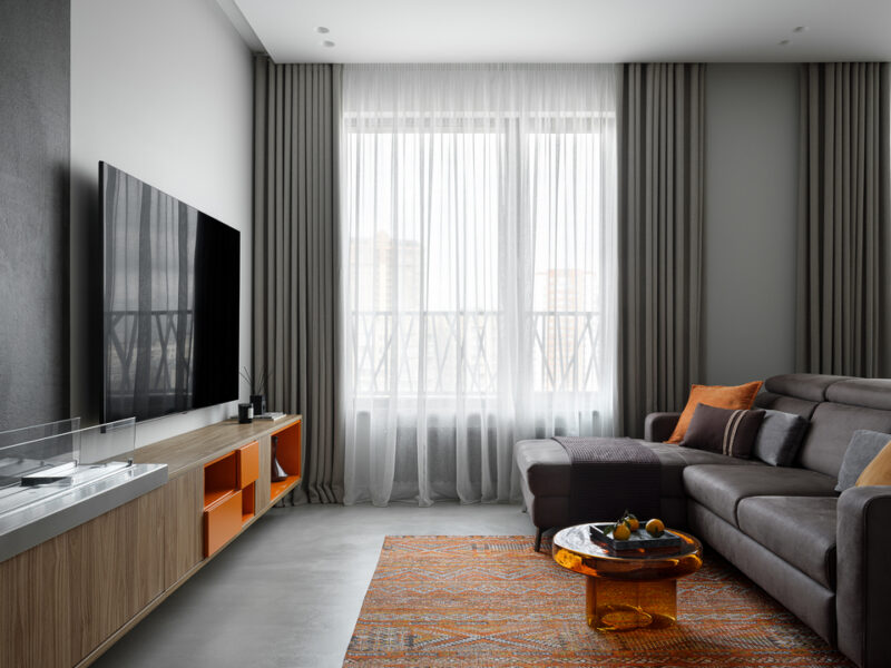
The living room centers on a substantial gray sectional sofa positioned to receive natural light from the floor-to-ceiling windows. Sheer curtains layered with heavier gray drapes allow the occupants to modulate light throughout the day — a practical consideration for east or south-facing urban apartments where glare can become an issue. The orange patterned rug introduces warmth and visual energy that prevents the neutral palette from feeling sterile.
 Pin
PinPhoto: Evgeny Gnesin
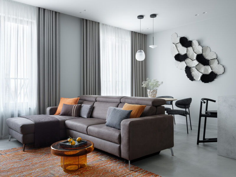
This wider view reveals how the living room connects to the dining area beyond. The Ligne Roset panel by the Bouroullec brothers hangs on the wall as a sculptural element — its organic black-and-white geometry reads as artwork while subtly echoing the room’s material contrasts. The gray sofa with amber and charcoal accent pillows creates a color thread that runs through both spaces.
 Pin
PinPhoto: Evgeny Gnesin
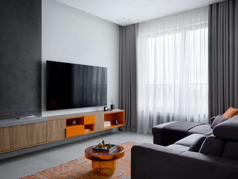
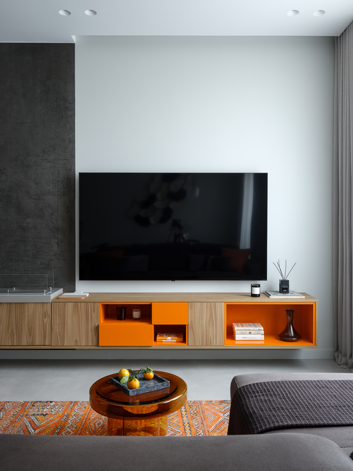
The TV wall demonstrates Bondarenko’s attention to material layering. A section of dark textured tile meets smooth white plaster, creating a vertical division that adds architectural interest to an otherwise functional wall. The floating media console in light wood with orange interior compartments continues the color strategy established by the area rug.
 Pin
PinPhoto: Evgeny Gnesin
A closer view of the media console reveals its careful proportions. The orange compartments are sized for books and objects, transforming storage into display. An amber glass coffee table sits on the patterned rug, its translucent quality allowing the textile’s design to remain visible while adding a tonal accent that ties the room together.
 Pin
PinPhoto: Evgeny Gnesin
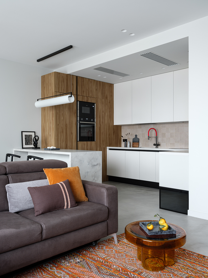
This perspective from the living room toward the kitchen illustrates the open-plan logic. The sofa’s back faces the kitchen island, creating a natural division between entertaining and cooking zones without requiring walls. The cylindrical pendant light over the island marks the kitchen’s territorial claim within the larger volume.
 Pin
PinPhoto: Evgeny Gnesin
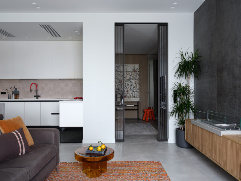
The view toward the corridor reveals the graphic sliding glass door with vertical metal fins — a threshold element that filters sightlines while allowing light to pass. A tall potted plant and the wood-and-glass fireplace console frame the passage, turning circulation space into a composed architectural moment.
An Intimate Dining Nook Defined by Craft and Light
 Pin
PinPhoto: Evgeny Gnesin
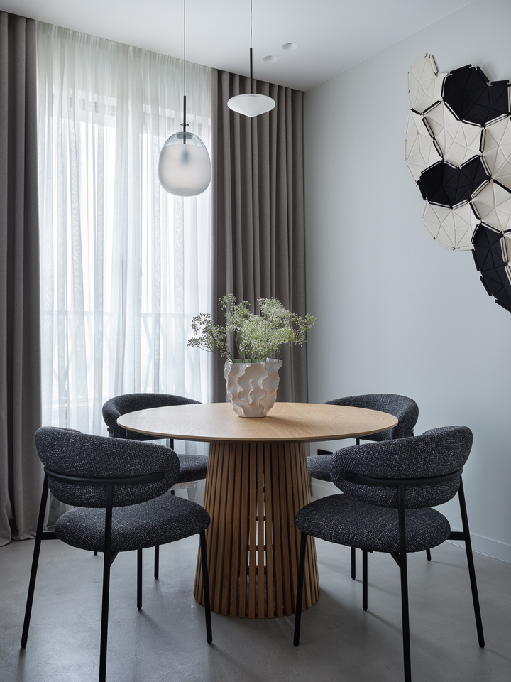
The dining area occupies a corner near the window, where a round table with a fluted wood base and four upholstered chairs in charcoal boucle create an intimate gathering spot. Two pendant lights — one spherical and translucent, one disc-shaped — hang at slightly different heights, providing layered illumination for both daily meals and evening entertaining. The black-and-white geometric wall sculpture echoes the Bouroullec panel’s visual language, creating material continuity across the open plan. A sculptural ceramic vase with dried flowers centers the table, adding organic texture to the otherwise crisp interior.
A Kitchen Built for Both Performance and Presence
 Pin
PinPhoto: Evgeny Gnesin
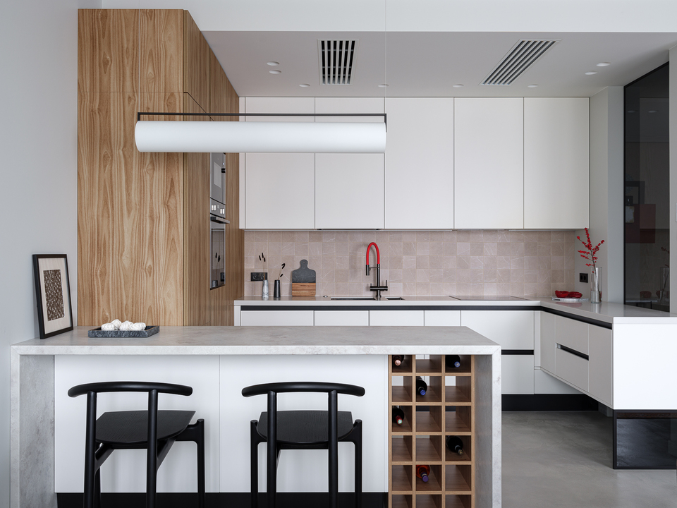
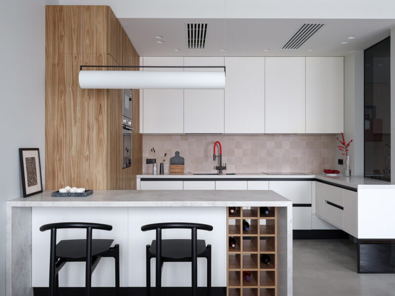
The kitchen presents a study in warm-and-cool material contrast. Floor-to-ceiling wood paneling houses the built-in oven and microwave, while matte white cabinets line the opposite wall. The island in light stone-look laminate provides both workspace and casual seating, with two black bar stools tucking neatly beneath the overhang.
 Pin
PinPhoto: Evgeny Gnesin
From the opposite angle, the kitchen’s functional logic becomes clearer. The island incorporates a wine rack on its inner face — a detail that speaks to how the space is actually used. The cylindrical pendant light references industrial fixtures but in a scaled, residential-appropriate form. A glass partition at the kitchen’s edge maintains visual connection to the corridor beyond while containing cooking odors and noise.
 Pin
PinPhoto: Evgeny Gnesin
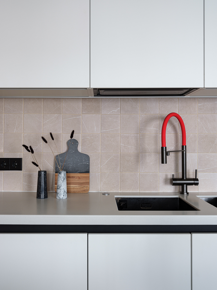
The backsplash detail reveals the kitchen’s most distinctive material choice: small-format textured tiles in a warm sand tone, their geometric surface catching light differently across the day. The red gooseneck faucet introduces a single bold accent against the neutral palette — a move that risks visual disruption but succeeds because it reads as a functional tool elevated to design object.
A Master Bedroom Where Texture Replaces Ornament
 Pin
PinPhoto: Evgeny Gnesin
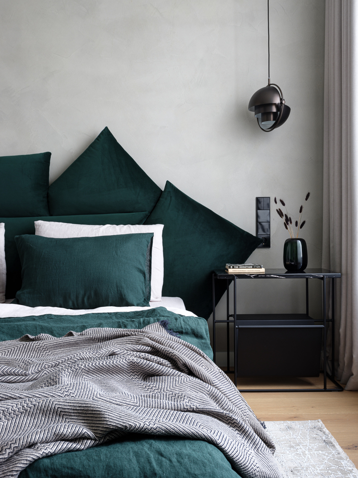
The master bedroom’s most arresting feature is its headboard: an arrangement of deep green velvet cushions in varying sizes that transforms the bed into a sculptural object against the gray plaster wall. A Gubi Multi-Lite pendant hangs beside the bed, its adjustable shade allowing the residents to direct light for reading or ambient effect. The BoConcept bedside table in black metal and glass provides a minimal surface that doesn’t compete with the headboard’s visual weight.
 Pin
PinPhoto: Evgeny Gnesin
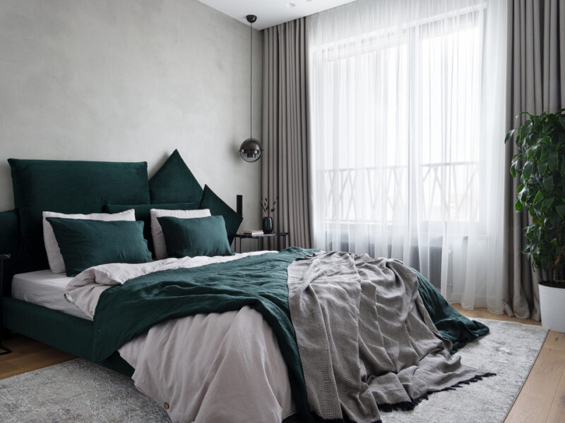
The full bedroom view reveals how natural light filters through sheer curtains, softening the green and gray palette into something more atmospheric. Light wood flooring continues from the living areas, maintaining spatial continuity. A patterned throw blanket adds another textile layer, its geometric design introducing visual complexity without additional color. The room’s proportions feel generous despite the apartment’s modest overall footprint, a result of the designer’s decision to keep furnishings minimal and walls unadorned.
The Transparent Wardrobe as Spatial Device
 Pin
PinPhoto: Evgeny Gnesin
The walk-in wardrobe features floor-to-ceiling mirrored wardrobes on both sides, their dark metal frames creating a rhythmic linear pattern that elongates the narrow space. A green upholstered bench sits at the center on a gray rug, providing both seating and a focal point. The mirrors reflect light from the window at the far end, effectively doubling the room’s perceived depth — a strategic response to the limited square footage of a 100 sqm apartment where every centimeter of perceived space matters.
A Neutral Nursery Designed for Whoever Arrives
 Pin
PinPhoto: Evgeny Gnesin
Designed in anticipation of a child whose gender the parents did not yet know, the children’s room adopts a deliberately neutral Scandinavian palette. A daybed in soft pink upholstery provides sleeping and seating flexibility, while a cloud-shaped paper chandelier introduces whimsy without descending into cartoonishness. Art by Daria Dmitrieva hangs on the wall, its abstract organic forms suggesting a child’s imaginative world. A small desk and chair near the window create a future study nook.
 Pin
PinPhoto: Evgeny Gnesin
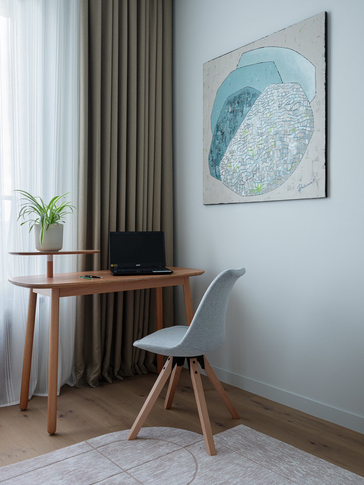
The desk area occupies a corner near the window, where natural light supports reading and drawing activities. The same artwork by Daria Dmitrieva visible in the wider shot hangs above the workspace, creating a visual connection between study and rest areas. A small potted plant adds living green to the room’s otherwise muted palette.
Russian Material Memory in a Contemporary Bath
 Pin
PinPhoto: Evgeny Gnesin
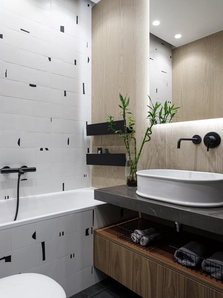
The master bathroom combines wood-toned wall panels with 41ZERO42 tiles whose texture evokes birch bark — a material reference that grounds the contemporary interior in Russian natural heritage. A white vessel sink sits atop a dark stone vanity, while open wire storage baskets keep towels accessible. The matte black fixtures — wall-mounted faucet, towel bar, and accessories — introduce a graphic quality that reads as deliberate contrast against the warm wood and white surfaces.
Playful Geometry in a Compact Bath
 Pin
PinPhoto: Evgeny Gnesin
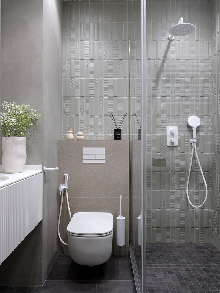
The children’s bathroom uses 41ZERO42 tiles with a varied geometric pattern in muted gray tones, creating visual interest without overwhelming the small space. A wall-mounted toilet and bidet spray maximize floor area, while the glass-enclosed shower keeps the layout efficient. White fixtures and accessories maintain the clean, bright atmosphere appropriate for a child’s daily routine.
 Pin
PinPhoto: Evgeny Gnesin
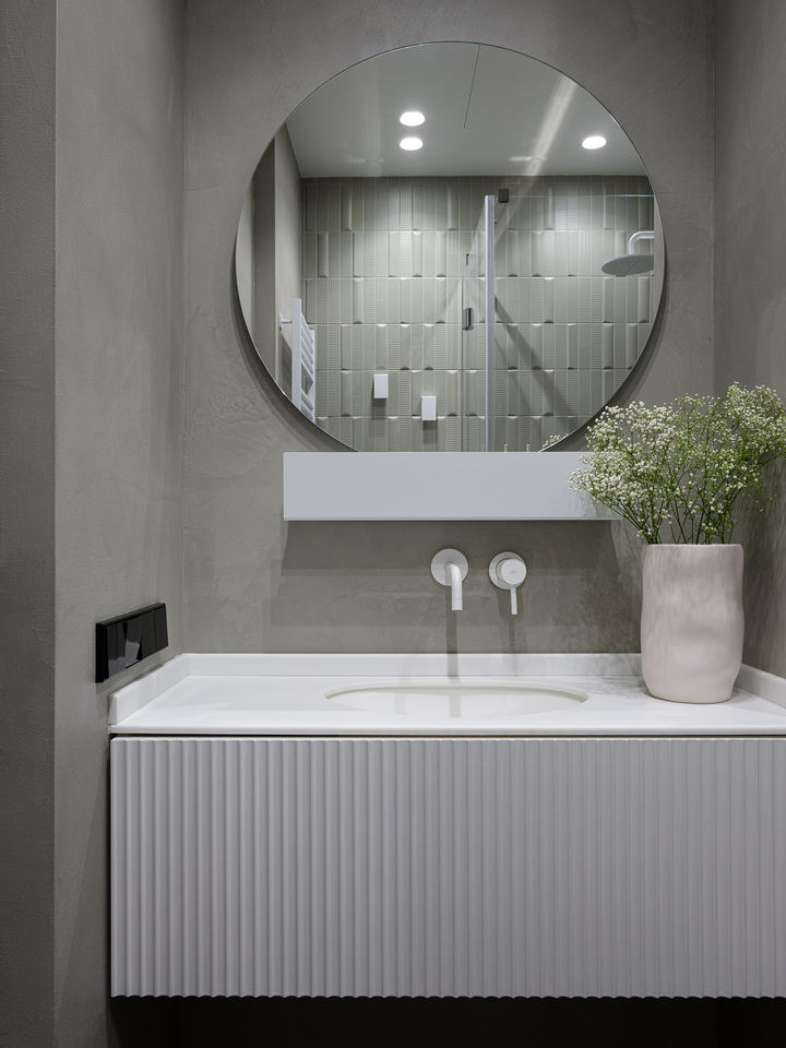
The vanity wall features a large round mirror that reflects the textured tile across from it, effectively borrowing visual depth from the opposite wall. A ribbed white vanity cabinet introduces subtle surface texture, while wall-mounted chrome fixtures keep the counter clear. The baby’s breath flowers in a white ceramic vase add a delicate organic touch that softens the bathroom’s otherwise graphic character.
Reading the Floor Plan
 Pin
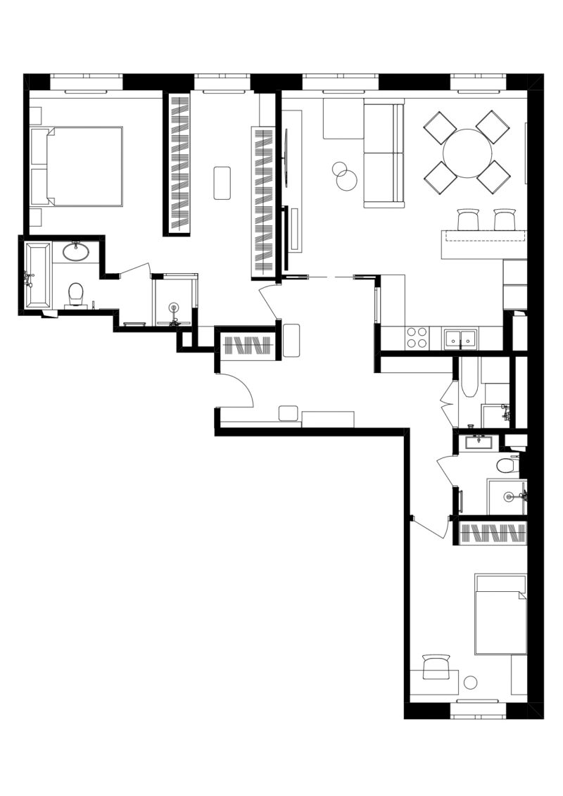
PinThe floor plan reveals a logical three-bedroom arrangement with the master suite occupying one wing and the children’s rooms along the opposite corridor. The open kitchen-living-dining area occupies the central and right portions of the apartment, receiving light from two exposures. This L-shaped configuration allows the public areas to function as a continuous entertaining space while the private zones remain physically and acoustically separated.
Where Restraint Succeeds — and Where It Might Be Tested
The Material Palette’s Quiet Precision
The project’s greatest strength lies in its material consistency and the designer’s confident use of architectural volume as a spatial tool. Bondarenko limited the palette to wood, gray plaster, white surfaces, and carefully measured accent colors — orange in the living room, green in the master bedroom, red in the kitchen faucet. This discipline prevents the compact apartment from feeling cluttered while allowing each room to develop its own atmosphere. The floating media console, the glass-based kitchen island, and the transparent wardrobe all demonstrate a consistent strategy: using transparency and suspension to maintain visual flow in a space where solid forms would create obstruction. The 41ZERO42 tiles, with their textured references to natural materials, add tactile interest without visual noise.
The Cost of Visual Discipline
The reliance on a restrained palette does introduce certain risks that prospective clients should consider. Light-colored upholstery in the children’s room and the light wood flooring throughout will face real maintenance demands as the family grows — finger prints, spilled liquids, and the general entropy of childhood do not favor pale surfaces. The transparent glass wardrobe, while visually effective, offers no concealment for inevitable clutter; the residents must commit to rigorous organization or the feature becomes a daily reminder of disorder. The open kitchen plan — excellent for the couple’s current entertaining lifestyle — may prove less practical when cooking smells and noise need to be contained around a sleeping infant. These are not design failures so much as trade-offs inherent to the aesthetic choices made — the cost of the visual serenity the clients requested.
A Moscow Apartment Designed for Lives Still Unfolding
Olga Bondarenko’s 100 sqm Moscow apartment interior succeeds because it was designed with future use in mind, not just present aesthetics. The neutral children’s room, the durable material selections, and the flexible open-plan living area all suggest a designer who understood that residential architecture must accommodate change rather than merely photograph well. The project contributes a useful case study for compact urban family living: proof that 100 square meters can feel generous when every decision serves both spatial and emotional goals. For designers working on similar briefs, the apartment demonstrates how restraint in color and material can actually expand perceived space, and how selecting pieces from multiple European manufacturers — rather than a single brand — creates interiors that feel collected rather than purchased. This is a home best suited for young urban professionals transitioning into parenthood — people who value contemporary design but refuse to sacrifice practicality for visual impact.
Would you trade the visual openness of a transparent wardrobe for the clutter-concealing comfort of traditional cabinetry — or does the architectural honesty of exposed storage make the space feel more generous than it actually is?
FAQs
Q: Who designed this Moscow apartment interior?
A: Olga Bondarenko of AUGUST Bureau designed the apartment. Her Moscow-based practice focuses on contemporary residential interiors that balance architectural precision with livable comfort.
Q: What is the size of this Moscow apartment?
A: The apartment measures 100 square meters, approximately 1,076 square feet. The floor plan includes two bedrooms, two bathrooms, and an open kitchen-living-dining area.
Q: What materials were used in the kitchen and bathrooms?
A: The kitchen features Porcelanosa and LAMINAM surfaces with 41ZERO42 textured tiles on the backsplash. Both bathrooms use 41ZERO42 tiles — the master bath features birch bark-inspired textures, while the children’s bath uses varied geometric patterns.
Q: What is distinctive about the master bedroom design?
A: The master bedroom features a transparent glass wardrobe that visually expands the space, a sculptural cushion headboard in deep green velvet, and Gubi Multi-Lite pendant lamps with adjustable shades for flexible lighting.
Q: Was this apartment designed for a family with children?
A: Yes, the clients were a young couple planning for their first child. The designer created a gender-neutral Scandinavian-style children’s room with flexible furniture that adapts as the child grows.
Get gorgeous projects via email
