

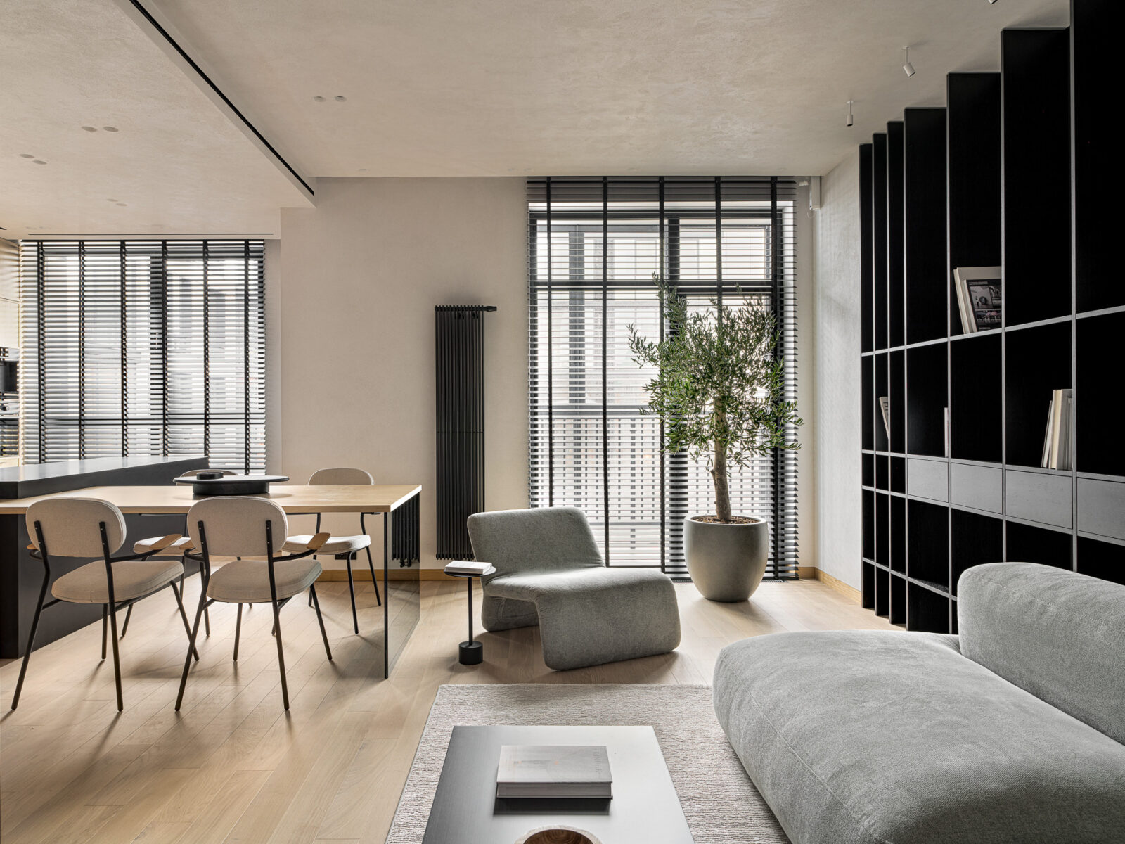
Most apartment mergers inherit awkward geometry and never quite shake it. This minimalist apartment in Kazan, Russia, does the opposite: AR Architects — interior designers Azat Khanov and Ruslan Aibushev — fused two units into a single 150 m² home that reads as if it were always one plan. The clients asked for minimalism without sacrificing function, and the result is a study in how far that brief can be pushed. Warm oak millwork, decorative plaster, and a disciplined black-and-sand palette organize the entire apartment around two scenarios: gathering and retreat.
| Architect / Designer | AR Architects — Azat Khanov, Ruslan Aibushev |
| Location | Kazan, Russia |
| Floor Area | 150 m² (approx. 1,615 sq ft) |
| Client Type | Private (family) |
| Photography | Sergey Krasiuk |
How Two Units Became One Minimalist Apartment in Kazan
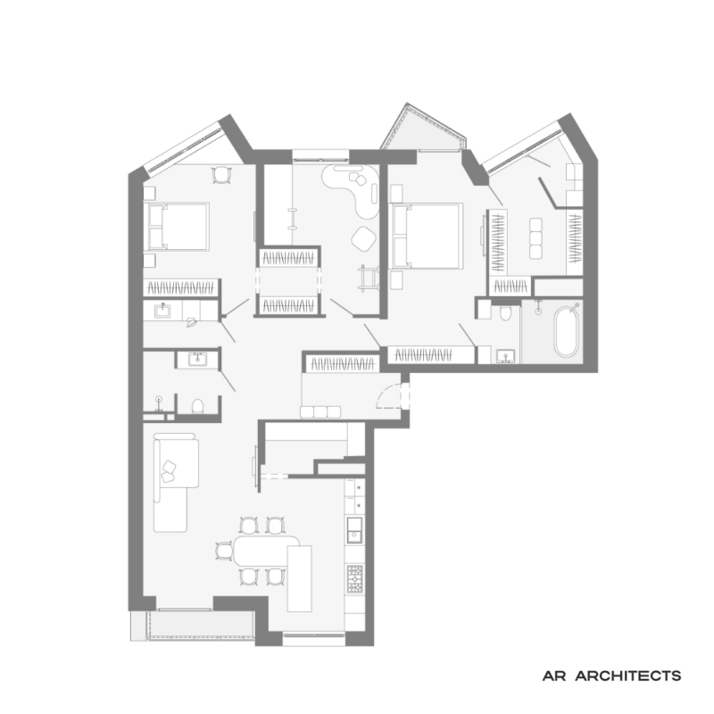
The core problem was structural inheritance: two separate apartments mean duplicated entries, redundant wet zones, and load-bearing walls that resist an open plan. AR Architects answered with clear zoning (dividing the plan into functional territories) built around two scenarios. The kitchen-living room operates as the social engine of the home; the private wing — bedrooms, dressing rooms, and bathrooms — is an area of seclusion. The hall works as the connective hinge between the two, so circulation never cuts through a room to reach another.
The spatial logic is legible in the finishes. All engineering systems are concealed, walls and ceilings stay light and monochromatic, and soft decorative plaster gives the surfaces a tactile grain that keeps the minimalism from turning sterile. Because there is no facade to carry the project’s identity, the ceiling does that work instead: its recessed lines run in a uniform geometry across the plan, structuring the interior the way fenestration (the placement and sizing of windows) would order an elevation.
 Pin
PinPhoto: Sergey Krasiuk
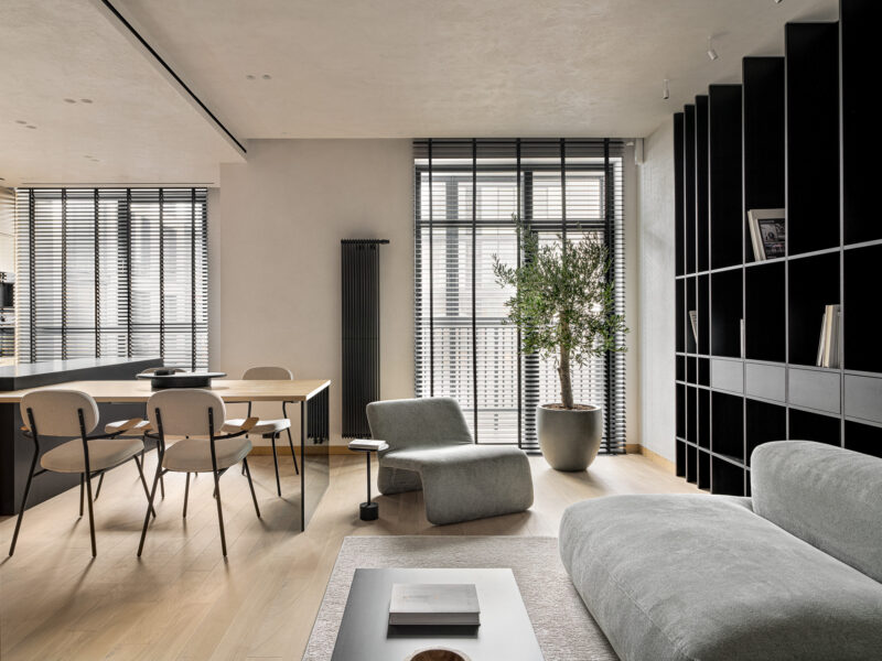
This wide view across the dining and living zones shows the parti in one frame: a light plaster envelope, pale oak flooring, and a single black storage wall holding the far edge of the room. The olive tree at the window softens the geometry and marks the boundary between the dining and lounge territories without a single partition. Black-slatted venetian blinds filter daylight into horizontal bands, extending the graphic language of the shelving. The restraint is deliberate — every element belongs to one of three tones: sand, gray, or black.
Design Decision: The ceiling's recessed shadow lines run uninterrupted even above doorways, where most builders would break them. AR Architects kept the geometry continuous to make the ceiling read as one structuring plane, reinforcing order across a plan stitched together from two separate apartments.
Inside the Plan: A Room-by-Room Walkthrough
The Living Room: A Black Shelving Wall as Counterweight
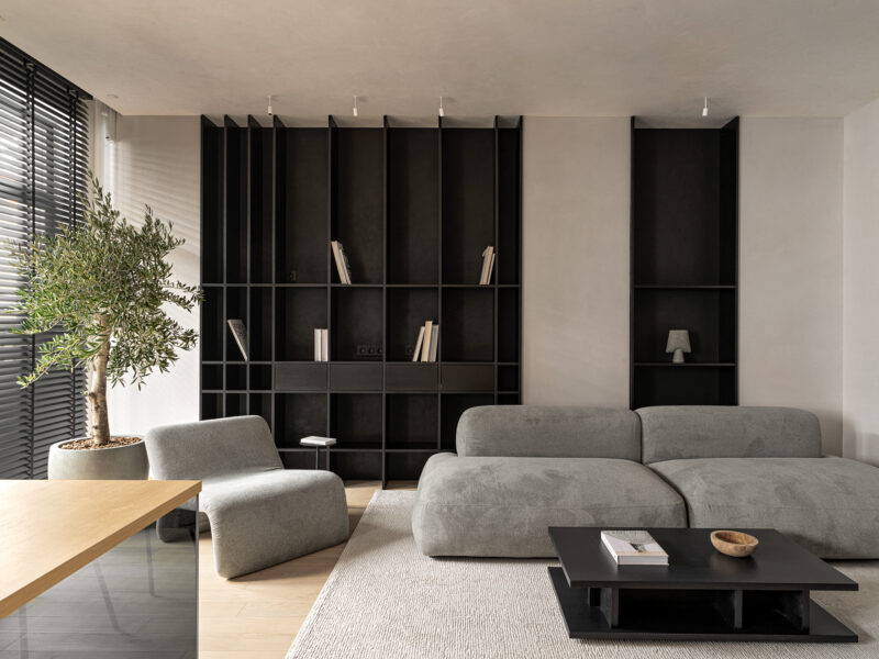
The lounge is composed like a balance sheet. On one side, a low, deep-seated modular sofa group by MASS Furniture in pale gray bouclé; on the other, a full-height black shelving wall whose vertical fins step forward in rhythm. The sofa’s rounded, cushion-like massing is the emotional temperature of the room — relaxed, almost gravity-bound — while the shelving supplies the discipline. A dark coffee table and a textured ivory rug mediate between the two. Track-mounted spotlights graze the shelving so the black volume gains depth after sunset instead of collapsing into a void.
 Pin
PinPhoto: Sergey Krasiuk
The seating group sits fully on the rug, a placement decision that defines the lounge as an island rather than furniture pushed to walls. The black shelving wall behind absorbs books and objects into shadow, letting the gray upholstery carry the visual weight. Note how the shelving’s uprights extend past the top shelf toward the ceiling — the unit behaves like architecture, not casework. The two-tier black coffee table repeats the shelving’s stacked-plane logic at hand height.
 Pin
PinPhoto: Sergey Krasiuk
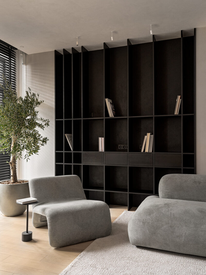
Seen closer, the shelving reveals its syntax: irregular vertical fins of varying depth create bays that shift from open display to closed drawers at the midline. Power outlets are recessed directly into the black back panel, keeping the wall functional without visual noise. The sculptural lounge chair — a continuous folded band of gray upholstery — echoes the sofa’s soft geometry. The pairing shows the project’s central trade: hard black grid, soft gray mass.
Kitchen and Dining: Oak Cabinetry Around a Black Core
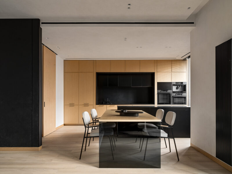
The kitchen is a single wall of flat-front oak cabinetry with a black niche cut into its center — hob, sink, and appliance stack all live inside the dark recess, so the working zone reads as one graphic void. The island extends into a smoked-glass-based dining table at matching height, a hybrid move that physically fuses cooking and eating. It is the clearest expression of the brief: the connection between zones is not implied, it is built. A generous walk-in pantry with open storage keeps small appliances and supplies out of the main volume entirely.
 Pin
PinPhoto: Sergey Krasiuk
The elevation reads almost as a painting: oak frames a matte-black inset holding the coffee machine, ovens, and backsplash. Upper cabinets run to the ceiling with no reveal, absorbing storage into the wall plane. The dining table’s smoked-glass base makes the oak top appear to float, keeping the floor visually open beneath six seats. White-and-black chairs with bentwood armrests repeat the apartment’s two-tone rule at furniture scale.
 Pin
PinPhoto: Sergey Krasiuk
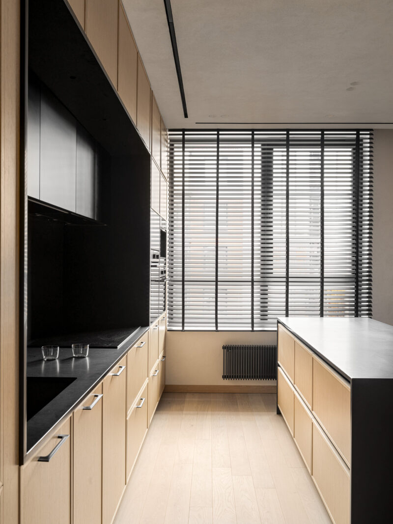
From inside the working aisle, the black stone countertop and island top form parallel dark planes under a bright window wall. The venetian blinds cut daylight into precise horizontal increments, giving the room a controlled, even light that flatters both the oak grain and the black surfaces. Cabinet hardware is minimal steel pulls, sized to disappear at a distance. A low black radiator sits beneath the window rather than interrupting the cabinetry run — engineering placed where it costs the composition least.
The Main Bedroom: Charcoal Against Plaster
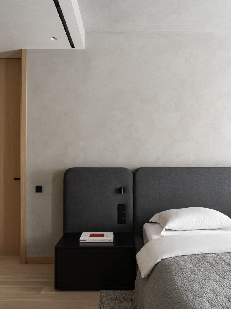
The main suite pares the palette to its quietest register. A wide upholstered headboard in charcoal gray carries integrated reading lights and outlets, so the wall above stays completely bare plaster. A black lacquered nightstand floats the only glossy surface in the room. The pigmented decorative plaster does the atmospheric work here — its mottled, suede-like texture catches raking light from the recessed ceiling track and keeps the large empty wall from feeling flat. The bedroom connects directly to its own dressing room and bathroom, completing the plan’s retreat scenario.
 Pin
PinPhoto: Sergey Krasiuk
The detail shot shows how much design is loaded into the headboard: rounded panel corners, a black rotary reading light, and flush black outlets set into the fabric itself. Bed linens stay white against a quilted gray coverlet, holding the monochrome line. The oak door casing at left is nearly frameless, its handle a thin black bar consistent with hardware across the apartment. Nothing hangs on the walls — the plaster’s texture is the artwork.
A Children’s Room Designed to Grow Up
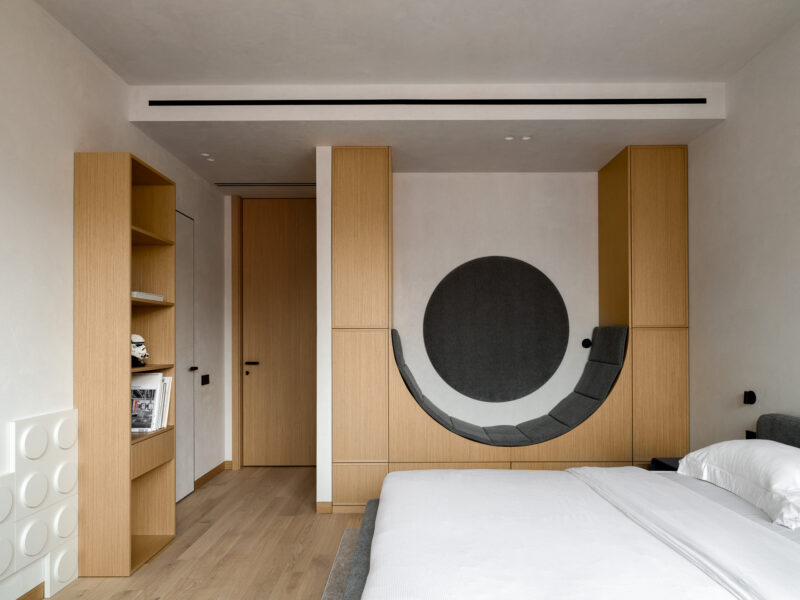
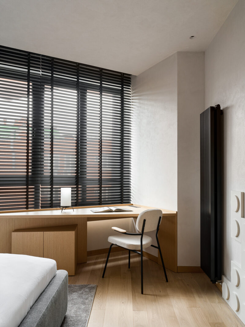
The children’s room is the project’s most forward-looking move. Its dressing room acts as the connective element between the sleeping zone and the play area, and the layout is explicitly designed to be reconfigured as the family grows. Oak wardrobes frame a wall niche holding a circular dark-felt panel with a curved upholstered seat — part reading nook, part acoustic pin-board. White wall panels molded with oversized round studs bring a toy-brick motif into the architecture itself without a single primary color. A built-in desk runs the full width of the window.
 Pin
PinPhoto: Sergey Krasiuk
The circular niche is the room’s gravitational center: a dark felt disk set into the wall with a crescent-shaped cushioned bench tracing its lower arc. It gives a child a defined, den-like perch while staying dead simple to repurpose later — remove the cushion and it is a pin-up wall for a teenager. The Lego Stormtrooper helmet on the shelf confirms who lives here. Oak cabinetry wraps the niche on three sides, turning storage into the room’s architecture.
 Pin
PinPhoto: Sergey Krasiuk
The desk zone shows the future-proofing plainly: a long oak worktop cantilevers from cabinet volumes beneath the window, deep enough for two workstations as homework demands grow. A black vertical radiator stands against the plaster like a graphic stripe, and the studded white panels at right catch the light in soft circles. Black wooden venetian blinds control glare on the work surface without curtains eating floor space.
 Pin
PinPhoto: Sergey Krasiuk
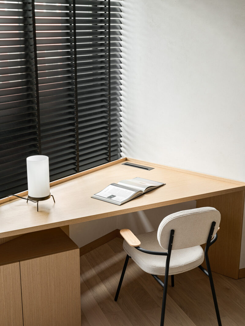
At detail scale, the desk edge carries a raised oak lip and a recessed black cable channel — small ergonomic decisions that keep the surface tidy in daily use. The desk chair pairs a black steel frame with bouclé upholstery and bentwood armrests, a junior echo of the dining chairs. A simple cylindrical glass lamp provides task light with no visual weight. The composition treats a child’s workspace with the same seriousness as an executive study.
Two Dressing Rooms, Two Temperatures
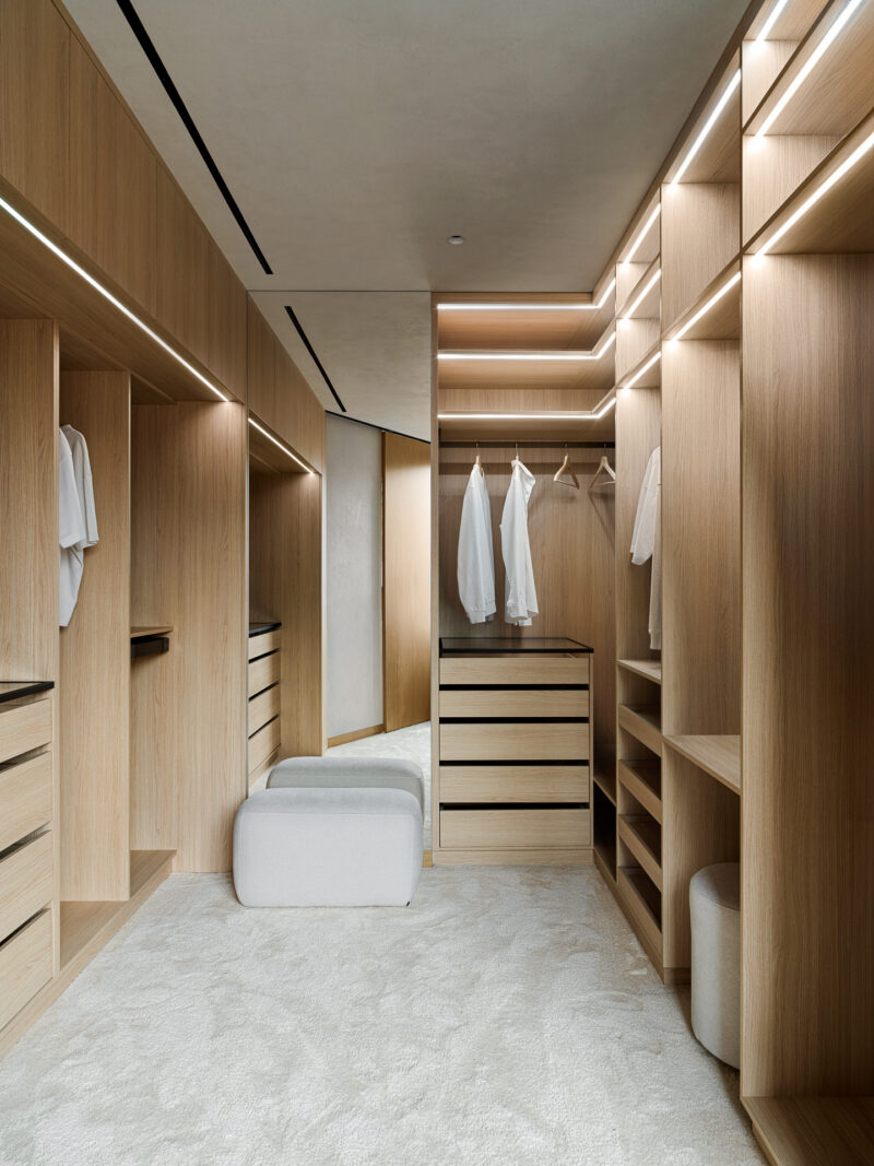
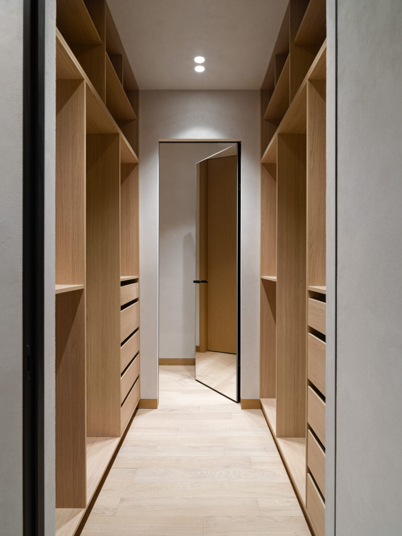
Storage in this apartment is a spatial event, not an afterthought. The main dressing room is a full walk-in fitted wardrobe zone in oak, lit by LED strips recessed into every shelf run, with a soft carpet floor that changes the acoustics the moment you step in. A second, corridor-like dressing passage serves the other bedroom with open shelving, drawer banks, and a full-height mirror door. Both are windowless by design — artificial lighting is tuned for reading fabric color accurately, and every linear meter of wall works as storage.
 Pin
PinPhoto: Sergey Krasiuk
The main walk-in reads as a boutique: continuous LED lines wash each hanging bay, a glass-topped island drawer unit anchors the center, and upholstered ottomans provide a seat for dressing. The carpet is the only soft floor in the apartment, a sensory cue that this is the innermost layer of the private wing. Open shelving keeps the wardrobe legible at a glance. The oak here matches the kitchen exactly, binding opposite ends of the plan into one material story.
 Pin
PinPhoto: Sergey Krasiuk
The second dressing passage compresses the same system into a corridor: symmetrical oak banks of open shelves, drawers, and hanging space on both flanks, with a mirror-faced door closing the axis. Two ceiling downlights are all the space needs, since the pale oak bounces light efficiently. The mirror doubles the perceived depth of a genuinely narrow room. It is an object lesson in extracting a full dressing program from leftover inter-apartment geometry.
The Main Bathroom: A Backlit Tub Behind Smoked Glass
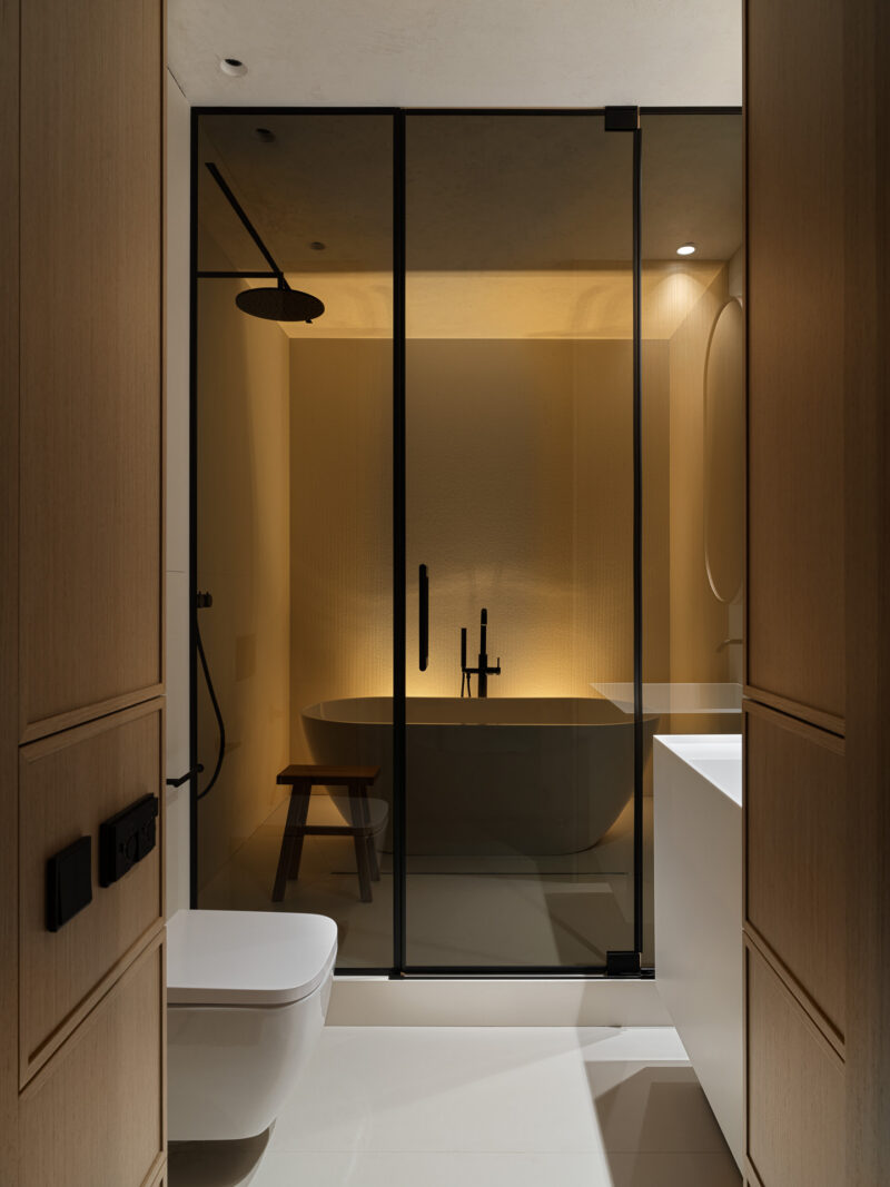
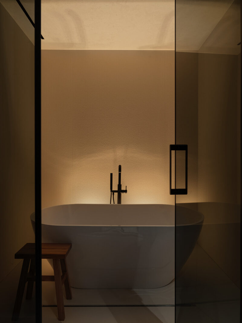
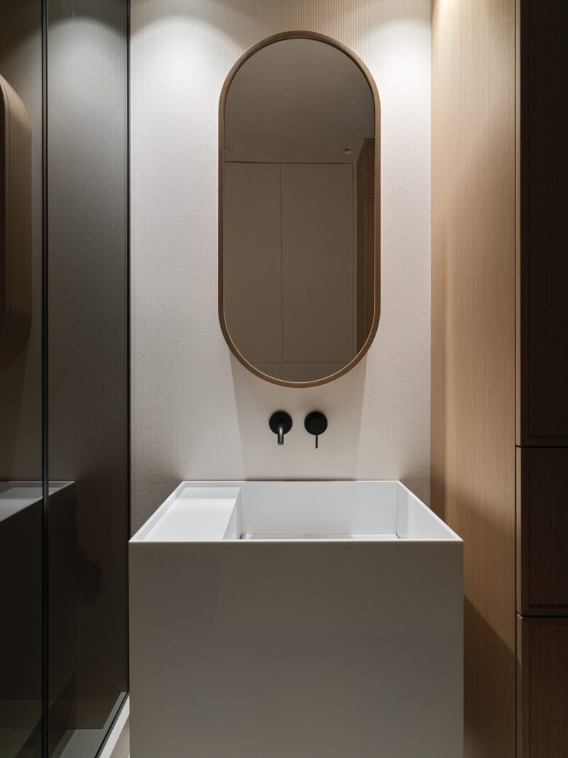
The main bathroom stages bathing as theater. A freestanding oval tub sits in a smoked-glass enclosure with black framing, backlit by a concealed cove that grazes ribbed plaster walls in warm amber. The wet zone — shower and tub together — is fully separated from the vanity and WC by the glass wall, so steam stays contained and the dry zone stays dry. A cube-like white solid-surface washbasin, wall-mounted black fittings, and an oval oak-framed mirror complete a kit of parts that is small in number and exact in placement.
 Pin
PinPhoto: Sergey Krasiuk
Approaching through oak-paneled doors, the sequence is legible in one glance: wall-hung WC, smoked-glass wet zone, white monolith basin at right. The glass tints the tub chamber like a lantern, glowing amber from its hidden cove lighting while the foreground stays cool and bright. Black switch plates mounted on the oak paneling keep controls visible but graphically consistent. The layering of transparencies gives a compact bathroom the depth of a much larger suite.
 Pin
PinPhoto: Sergey Krasiuk
Inside the enclosure, the freestanding tub and floor-mounted black filler are silhouetted against ribbed plaster washed in low, warm light — a deliberately dim scene tuned for evening soaking rather than morning efficiency. A small wooden stool adds the only organic, hand-scaled object, a quiet nod to Japanese bathing culture. The ribbed wall texture catches the cove light as fine vertical shadow lines. This is lighting design doing the work that tile patterns usually attempt.
 Pin
PinPhoto: Sergey Krasiuk
The vanity condenses the bathroom’s language: a square-cut white basin volume, two wall-mounted matte-black taps, and an oval mirror in a slim oak frame hung on ribbed plaster. Downlights above the mirror model the wall’s texture without glare on the glass. Oak paneling at right conceals full-height storage. Every fixture is wall-mounted, keeping the floor plane continuous and cleaning effortless.
The Second Bathroom: Ceppo Stone as a Single Envelope
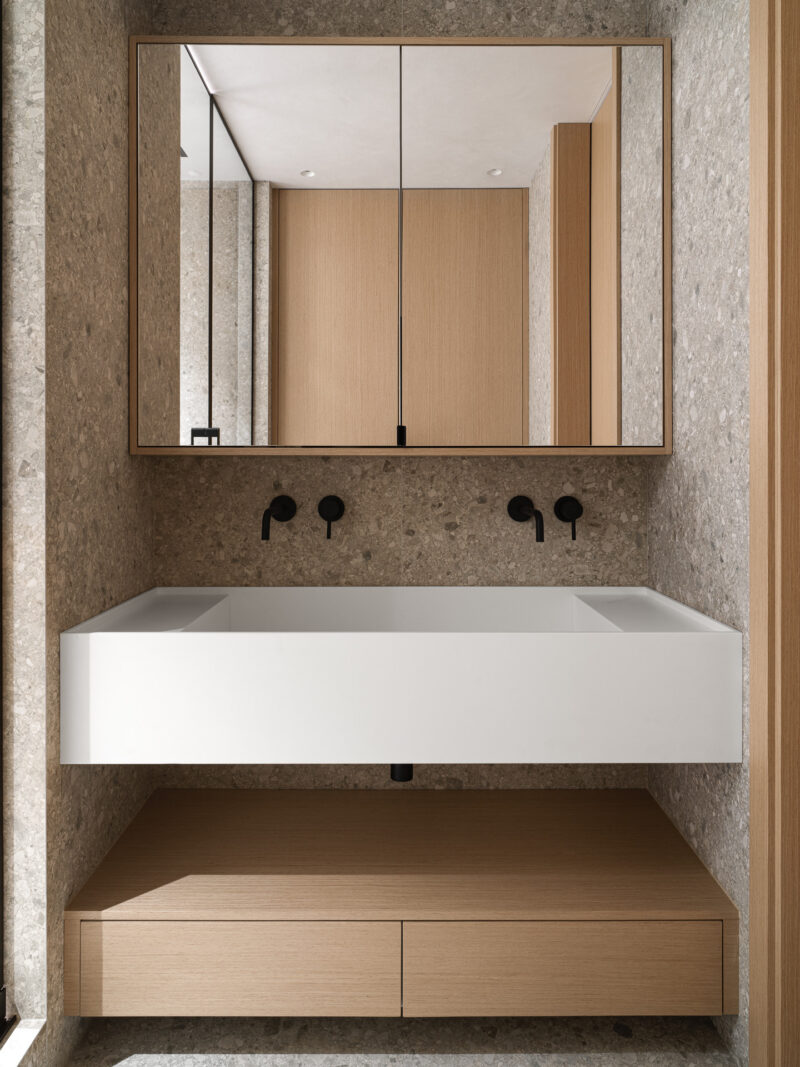
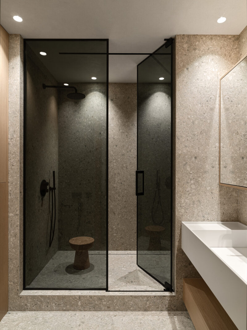
The second bathroom swaps warm plaster for a single enveloping stone. Ceppo di Gré-style aggregate surfaces (a gray stone flecked with embedded pebble fragments) run across floor, walls, and shower interior, turning the room into one continuous mineral volume. A long white double-basin trough floats above an oak drawer unit, and a wide oak-framed mirror cabinet doubles storage. Black-framed smoked glass encloses the shower with the same detailing as the main bathroom, keeping the two rooms recognizably siblings despite entirely different materials.
 Pin
PinPhoto: Sergey Krasiuk
The vanity wall shows the project’s most confident material moment: the speckled stone wraps every plane, while the white solid-surface trough and paired black wall taps sit against it in flat graphic contrast. The mirror cabinet reflects oak doors opposite, pulling warmth into a mineral room. A floating oak drawer bench below the basin adds towel storage without touching the stone floor. Symmetry across the two tap sets makes the room read as calm rather than busy.
 Pin
PinPhoto: Sergey Krasiuk
The shower enclosure treats the stone as continuous — floor, curb, and walls in the same aggregate, with black-framed tinted glass as the only inserted element. Recessed downlights inside the shower ceiling model the stone’s texture, a detail often skipped in residential wet zones. A small cork stool repeats the main bathroom’s wooden-stool gesture in a material that tolerates water. The result is a compact shower that feels carved rather than assembled.
A Utility Room That Works Like a Back-of-House
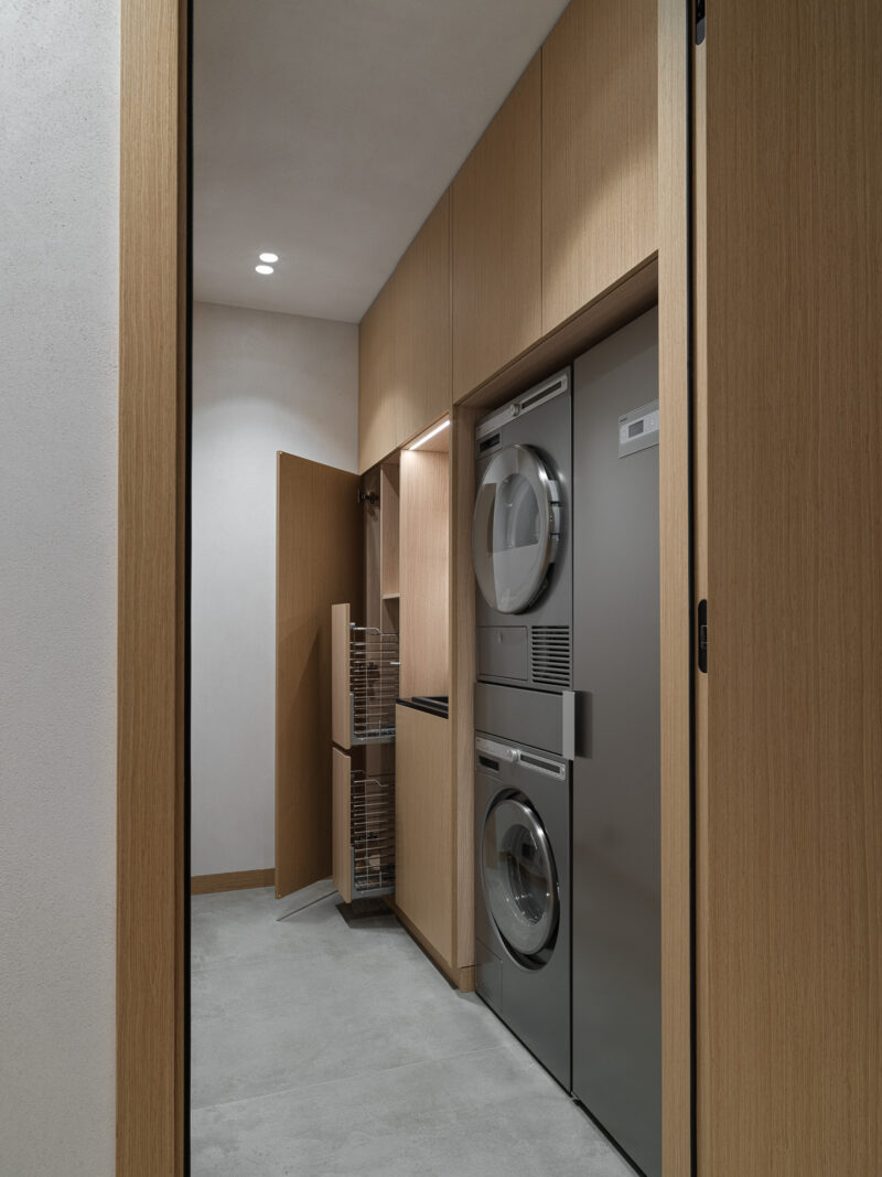
The service program gets the same design attention as the show spaces. Off the hall, a dedicated utility room stacks the washer and dryer beside a full-height gray appliance column, all recessed into oak cabinetry with pull-out wire storage racks concealed behind flush doors. Gray porcelain floor tile takes the wear that oak flooring should not. It is the room that makes the rest of the apartment’s emptiness possible — every mop, basket, and detergent bottle has an assigned, invisible address.
 Pin
PinPhoto: Sergey Krasiuk
Viewed from the hall, the utility room reads as one oak wall until the doors open to reveal stacked laundry machines and telescoping wire baskets. An LED strip under the upper cabinets lights the folding counter. The stainless machine fronts are the only industrial note in the apartment, and they are positioned where a closed door erases them. This is the concealed-engineering thesis of the project executed at household scale.
Reading the Plan: Two Scenarios, One Hinge
 Pin
PinThe floor plan makes the zoning strategy explicit. The kitchen-living volume occupies the lower wing with the island-table hybrid drawn as a single continuous element, while the bedrooms, dressing rooms, and bathrooms cluster in the upper wings — each sleeping zone paired directly with its own storage and wet room. The hall sits precisely at the junction, distributing circulation without corridors bleeding into living space. Wardrobe poché (the thickened storage walls drawn in hatch) lines nearly every internal boundary, showing how the merger’s leftover geometry was consumed by function.
Where the Discipline Pays Off — and What It Asks in Return
Where the Spatial Logic Earns Its Keep
First, the zoning genuinely works. Pairing each bedroom with its own dressing room and bathroom eliminates morning cross-traffic through shared space — a functional payoff you can trace directly on the plan. Second, the material discipline is enforced, not just declared: one oak, one plaster, one black across 150 m² makes the merged apartment read as a single authored space, and repeating the same glass-and-black-frame detail in both bathrooms binds different material palettes into one system. Third, the lighting design carries real weight — cove-lit ribbed plaster in the main bath and shelf-integrated LEDs in the dressing room replace decoration with atmosphere.
 Pin
PinPhoto: Sergey Krasiuk
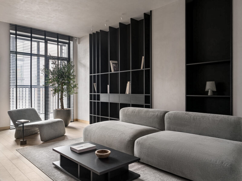
The shelving wall rewards a closer look: fins of varying depth create a subtle relief that changes with the ceiling spots’ grazing angle, so a monochrome black surface produces genuine visual movement. Outlets integrated into the back panels mean lamps and devices can live on the shelves without cords crossing the floor. The drawers at the midline hide the clutter that open shelving usually broadcasts. This is where the apartment’s minimalism proves it is engineered, not staged.
What Emptiness Costs in Daily Life
The honesty cuts the other way, too. Near-empty plaster walls and open black shelving demand curatorial discipline — a family’s ordinary sediment of papers, chargers, and toys has nowhere sanctioned to rest outside the utility room and pantry. The tub chamber’s atmospheric dimness is tuned for evening use and will frustrate anyone wanting bright task light in that zone. And decorative plaster, for all its texture, is less forgiving of scuffs and children’s traffic than paint — touch-ups require a craftsperson, not a roller.
A Working Argument for Warm Minimalism
This project’s contribution is proof that minimalism scales to real family life when storage is treated as architecture. AR Architects spent the merger’s extra square meters not on bigger rooms but on infrastructure — pantry, utility room, dressing rooms — that lets the visible spaces stay empty without daily effort. The apartment suits owners who want calm as a default condition and are willing to maintain the system that produces it. It also shows automation and concealed engineering serving atmosphere rather than novelty. Would you give up walls of art and open family clutter for this degree of visual quiet — or is a lived-in home supposed to show its seams?
FAQs
How big is the AR Architects apartment in Kazan?
The apartment measures 150 square meters, roughly 1,615 square feet. It was created by combining two separate apartments into a single home, which allowed the designers to dedicate generous space to a walk-in pantry, a utility room, and two dressing rooms alongside the main living areas.
Who designed the 150 m² minimalist apartment in Kazan?
The project was designed by AR Architects, with interior designers Azat Khanov and Ruslan Aibushev leading the work. The bureau merged two apartments into one plan organized around a social kitchen-living zone and a private sleeping wing. Interior photography is by Sergey Krasiuk.
What materials are used in this minimalist interior?
The palette is deliberately narrow: pale oak millwork and flooring, soft decorative plaster on walls and ceilings, black accents in shelving, fixtures, and window blinds, plus gray upholstery. The second bathroom is wrapped in Ceppo di Gré-style aggregate stone across floors, walls, and the shower interior.
Does the apartment include smart home technology?
Yes. An automation system controls lighting, climate, and curtains from a smartphone or by voice command. Different lighting scenarios are programmed for each zone, and all engineering systems are concealed within the millwork and ceiling geometry, so the technology stays invisible in daily use.
How is the children’s room designed for the future?
The children’s room uses its dressing room as a link between the sleeping and play areas, and the layout is intended to be reconfigured as the family grows. Built-in oak storage, a full-width window desk, and a circular felt niche seat can be adapted from play functions to study and teenage use.
Get gorgeous projects via email
