

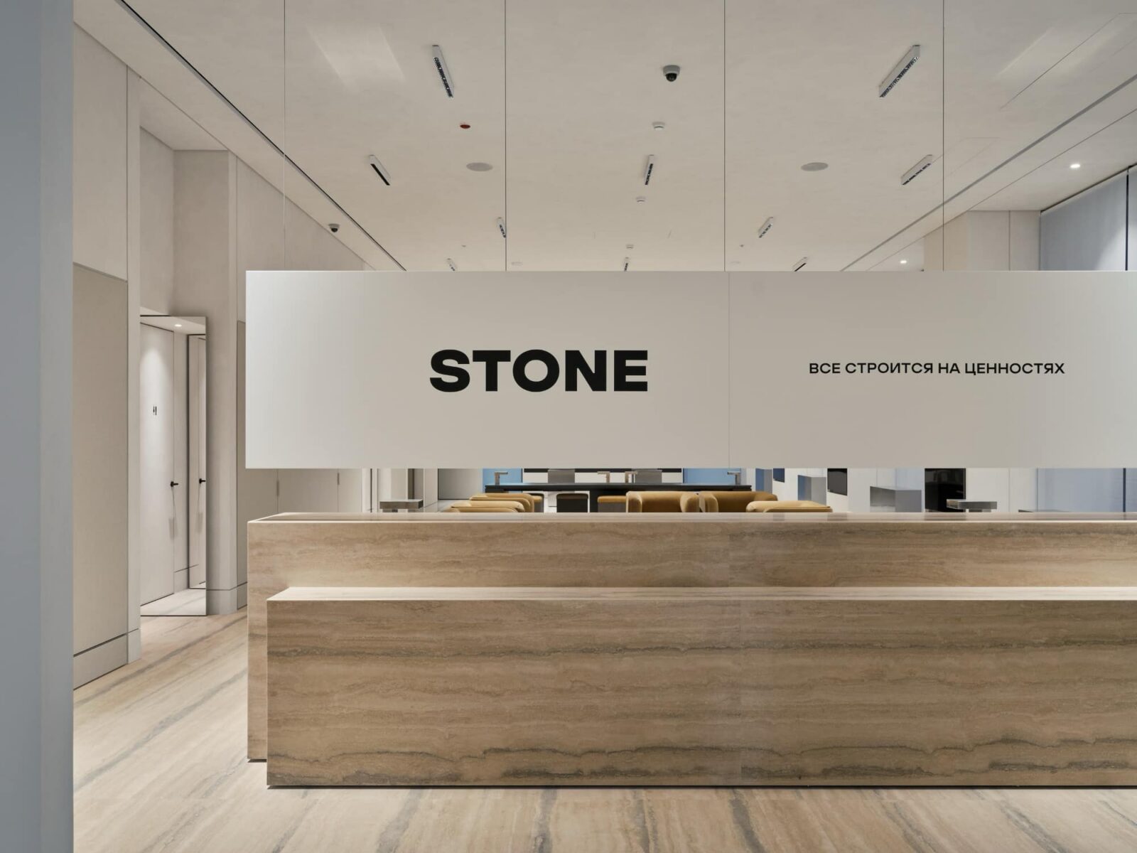
When a real estate developer commissions a sales office that must serve as the public face of their brand, the architecture cannot merely function—it must persuade. KEMELIN PARTNERS approached the 700 m² STONE sales office with precisely this understanding, crafting an interior that operates as both operational workspace and curated brand experience. The project represents a strategic shift for the client: merging previously separate residential and commercial real estate divisions into a single, unified environment that communicates scale, quality, and coherent identity.
The studio has shaped numerous landmark projects for STONE, from public areas in Grade A office buildings to retail spaces and premium residential interiors. This commission asked them to consolidate that accumulated expertise into one representative whole—a space for client meetings, broker tours, presentations, and contract signings, all functioning within a carefully controlled aesthetic environment grounded in soft minimalism and material integrity.
| Field | Value |
| Project Name | STONE Sales Office |
| Architect / Designer | KEMELIN PARTNERS |
| Floor Area | 700 m² |
| Client Type | Real estate developer (STONE) |
| Key Materials | Travertine Striato, decorative plaster, brushed stainless steel, textile wall panels, wenge and eucalyptus wood, Corian, high-gloss lacquered MDF |
How to Merge Two Real Estate Divisions Into One Coherent Spatial Identity
The central challenge of this project was not merely spatial—it was organisational. STONE’s residential and commercial divisions had operated as separate entities, each with its own atmosphere and aesthetic. KEMELIN PARTNERS was tasked with bringing both divisions under one roof while maintaining a unified brand experience. This transformation informed every aspect of the design, from spatial planning to material selection.
The architects responded with a restrained, monochromatic palette and an architectural mindset that privileges spatial composition over decorative solutions. Most surfaces receive a uniform finish of lightly textured decorative plaster, creating subtle depth without visual distraction. Travertine flooring and a monumental reception desk introduce warmth, complementing the neutral walls while cooler, reflective metal elements provide contrast. The result is a calm, cohesive environment where light and material do the primary communicative work.
Panoramic glazing ensures generous daylight penetration throughout, and lighting functions as an integral architectural element rather than mere technical provision. The interplay between natural and artificial light shapes how the space evolves throughout the day, supporting the comfort of occupants who may spend extended hours inside.
Design Decision: Rather than placing a reception desk opposite the entrance as convention dictates, the architects constructed a sequential welcome experience—visitors first encounter a suspended structure bearing the STONE logo paired with a stone plinth displaying architectural models, delaying the full spatial reveal until a staff member guides them into the adjoining lounge.
The Welcome Area: A Reception Reimagined as Sequence
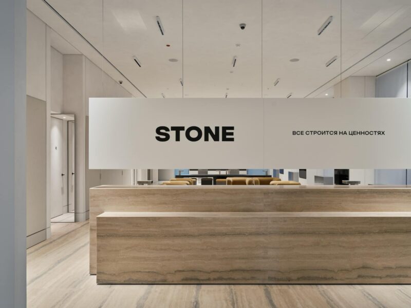
The architects deliberately abandoned conventional reception design. Visitors enter to find a suspended STONE logo structure and a travertine plinth showcasing finely crafted architectural models, illuminated by pinpoint accent lighting. A staff member greets guests here and escorts them into an adjoining lounge where the full spatial narrative unfolds. The travertine reception desk sits beyond this initial threshold, grounding the space in material warmth while maintaining visual clarity.
 Pin
PinThe reception area abandons conventional desk-upon-entry logic in favour of a curated sequence. A suspended STONE logo structure and travertine plinth with architectural models create a deliberate pause before the full spatial reveal. The monochromatic palette and clean lines establish the soft minimalist tone that governs the entire interior.
The Welcome Area: Open-Plan Hall and Business Lounge
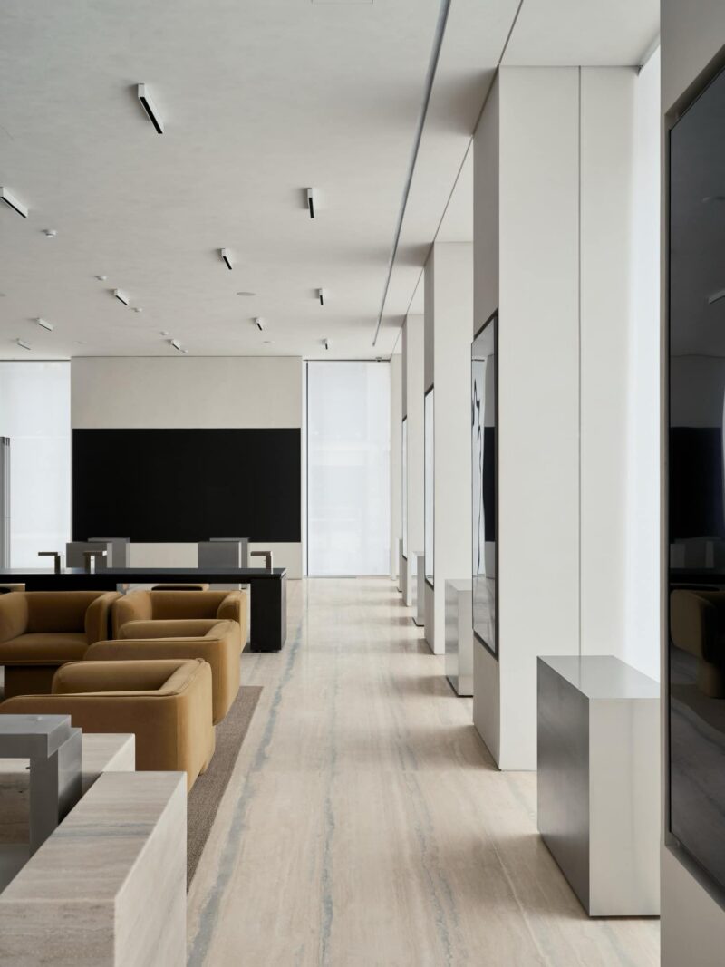
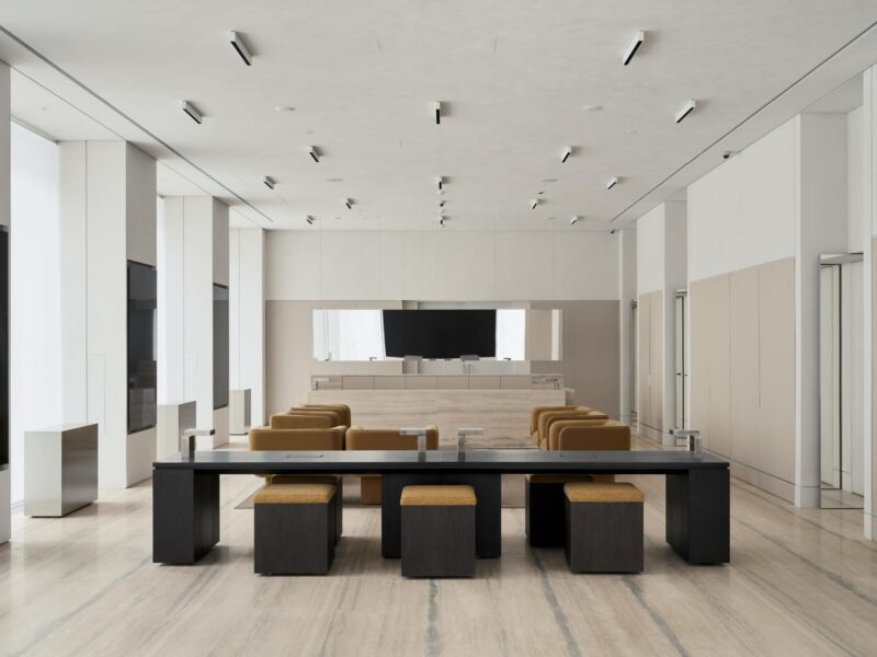
The welcome area extends into a generous open-plan hall where zoning is achieved solely through bespoke furniture arrangements. A long communal worktable with integrated seating anchors the business lounge function, while rows of mustard-yellow Block Armchairs by Missana define a more informal reception zone. LED screens positioned along window-facing columns and at the far end of the room display architectural visualisations, interactive floor plans, and promotional content. The adaptability of the space is central to its design—sliding partitions allow the showroom to connect with adjacent meeting rooms, transforming it into an event venue suitable for catering setups, lectures, and exhibitions.
 Pin
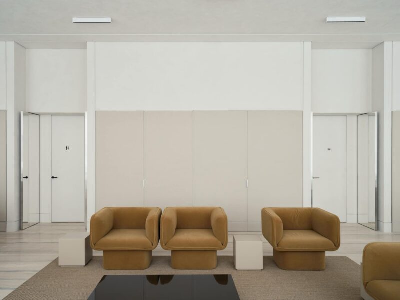
PinThe open-plan hall achieves spatial zoning through furniture alone. The communal worktable references business lounge typology, while mustard-yellow armchairs introduce controlled warmth against the travertine floor and white plaster walls. LED screens embedded in the architecture serve as dynamic presentation tools.
 Pin
PinThree Block Armchairs by Missana arranged on a sisal carpet create an informal reception pocket within the larger open plan. The restrained furniture selection reinforces the project’s commitment to spatial clarity, allowing the proportions of the room and the quality of materials to command attention.
The Corridor: Palladian Geometry and the Architectural Enfilade
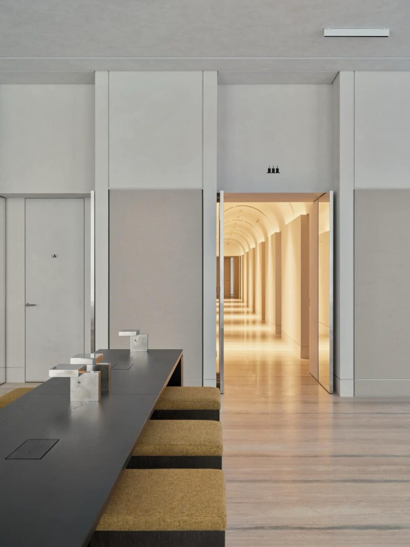
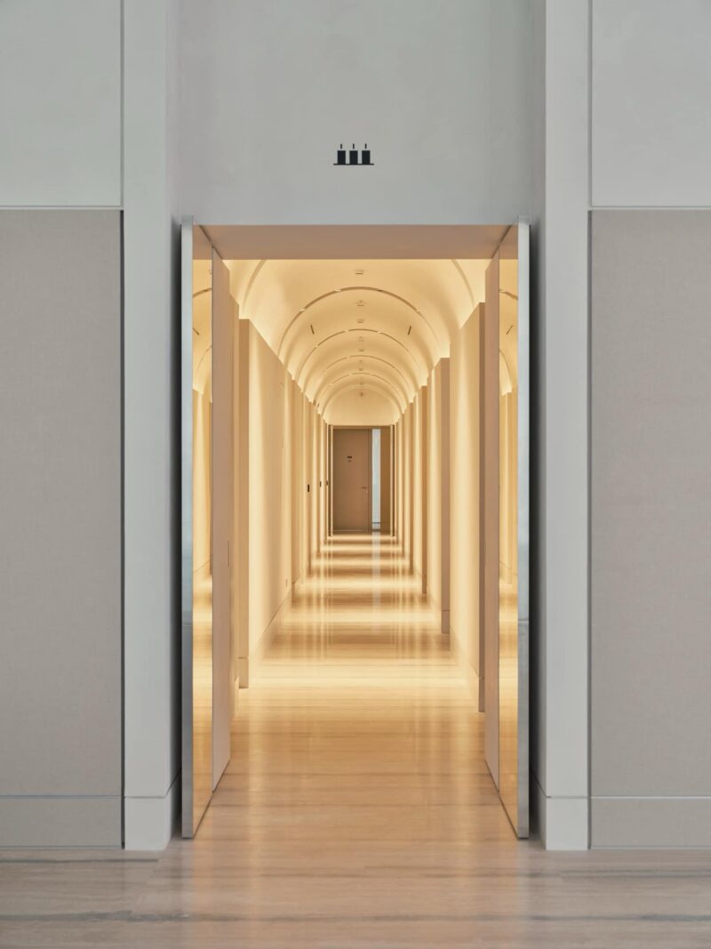
One of the project’s defining spatial moves is the corridor that hosts nine meeting rooms. Given floor plan constraints, eliminating the corridor was impossible, so the architects introduced visual rhythm to reduce its perceived length. The layout divides into two parts: a square lobby area leading to premium VIP meeting rooms, and a linear passage for standard rooms. The square hall is distinguished by a circular ceiling feature—a floating circle within a square that pays homage to Palladian geometry, a recurring reference in KEMELIN PARTNERS’ work. Concealed lighting gives this sculptural element a soft, ambient glow.
 Pin
PinThe perspective from the communal worktable captures the corridor’s enfilade effect—repeated arched bays create a rhythmic progression that transforms a necessary circulation spine into an architectural experience. The warm tonal shift between the white reception zone and the illuminated corridor signals a spatial threshold.
 Pin
PinThe vaulted corridor demonstrates how a necessary circulation element can become a design feature. Repeated arched bays with diffused lighting create an architectural enfilade that reduces the perceived length of the corridor while elevating the walking experience into something approaching ceremony.
 Pin
PinThe threshold between the square lobby and the linear corridor marks a deliberate tonal and spatial shift. The neutral plaster walls of the reception zone give way to warm, illuminated vaulting—preparing visitors for the more intimate, materially richer meeting rooms beyond.
Meeting Rooms: Flexible Partitions and Standard Formats
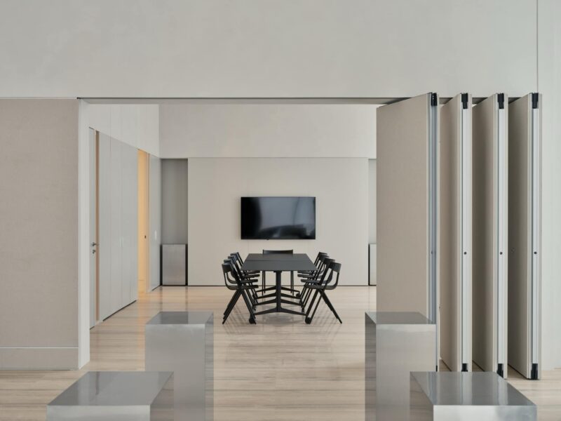
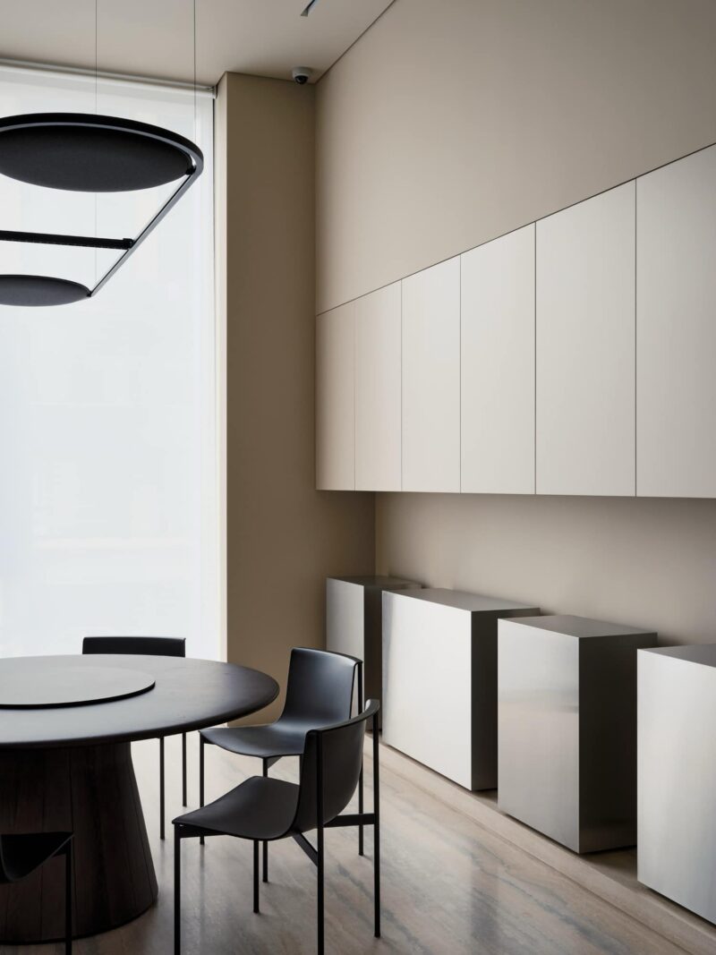
Along the corridor’s windowed side, meeting rooms accommodate various configurations. One space features folding textile partitions that allow the room to expand or contract as needed, with a black conference table and stackable chairs by Viccarbe. Another room centres on a round table by Pedrali with black seating, set against white built-in cabinetry. These standard rooms prioritise adaptability—the partitions, furniture, and lighting systems all support rapid reconfiguration for different meeting scales and formats.
 Pin
PinFolding partitions clad in textile transform this meeting room from enclosed private space to open-plan extension. The Pedrali table and Viccarbe chairs prioritise function without competing with the architecture—a restraint that defines the standard meeting rooms along the corridor.
 Pin
PinA round table format offers an alternative to the rectangular conference norm, encouraging more equitable discussion dynamics. The white built-in cabinetry maintains the monochromatic discipline while providing necessary storage, keeping the room visually calm and operationally efficient.
VIP Meeting Rooms: Three Distinct Characters for High-Value Negotiations
The three VIP suites each carry a distinct conceptual identity, designed to allow clients to select a room based on preference or previous visits—a personalised service model proposed by the architects. The contrast between the understated corridor and the richly detailed interiors amplifies the sense of arrival.
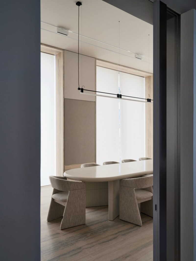
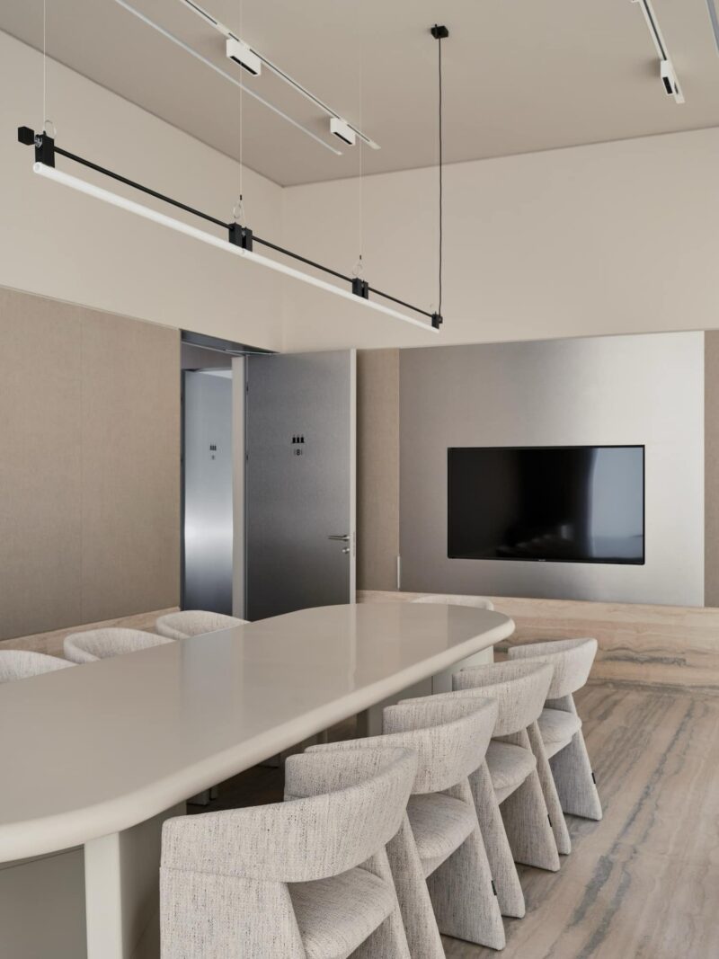
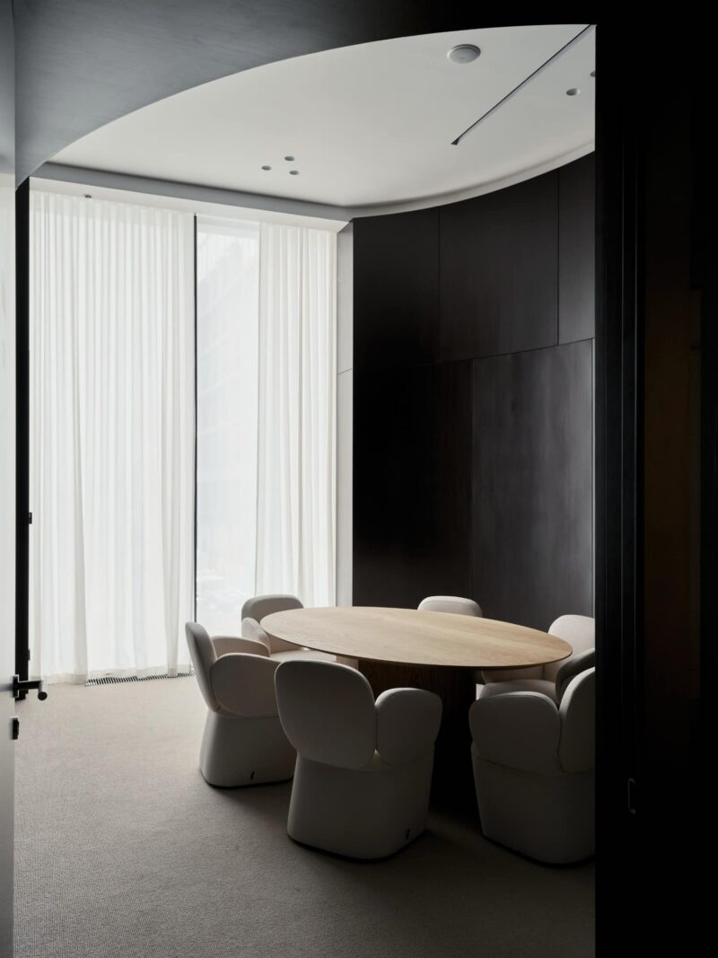
One VIP room draws on Mid-Century Modern references from the 1950s, using natural materials including textile wall panels and travertine details with a palette of quiet sophistication. Another fuses 1970s design with Japanese minimalism—metallic finishes, velvet carpeting, and saturated tones balanced by a sculptural concrete-textured wall that adds presence and supports a reflective atmosphere. The third reinterprets the classic executive office with rich wenge and eucalyptus wood finishes, a dark muted palette, and a semi-oval layout that fosters a softer, more conversational dynamic for high-value residential property negotiations.
 Pin
PinThe oval travertine conference table anchors this VIP room with material weight and formal precision. White upholstered chairs soften the composition while the wood-panelled walls introduce warmth absent from the corridor—creating the intended contrast between threshold and destination.
 Pin
PinA wall-mounted display and stainless steel door introduce controlled technical elements into the VIP environment. The semi-oval table configuration encourages face-to-face exchange rather than across-the-table confrontation—a spatial decision that supports the room’s purpose in high-value negotiations.
 Pin
PinDark wenge paneling transforms this VIP suite into the most formally weighted of the three rooms. The contrast with the white corridor outside is deliberate—guests move from light to dark, from open to enclosed, from public to privileged. The progression is architectural theatre.
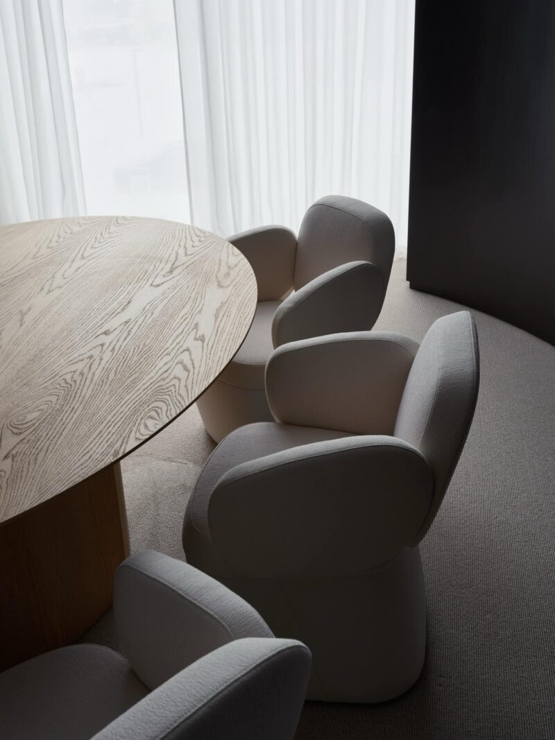 Pin
PinThe table’s wood grain reveals the attention to material selection that defines the project. This close view demonstrates how the architects balanced durable, high-traffic performance requirements with the tactile richness expected in a premium sales environment.
Staff Workspace: The Operational Backbone
While the public-facing areas command attention, the staff zone provides the functional infrastructure that keeps the office operational. An open-plan workspace for managers features fabric-covered dividers, ergonomic seating, and access to breakout areas, restrooms, kitchen, and utility rooms. The staff entrance is separated from the guest flow—a practical decision that keeps service movements invisible to clients. The workspace maintains the same monochromatic discipline as the public areas, ensuring visual continuity across the entire floor plate.
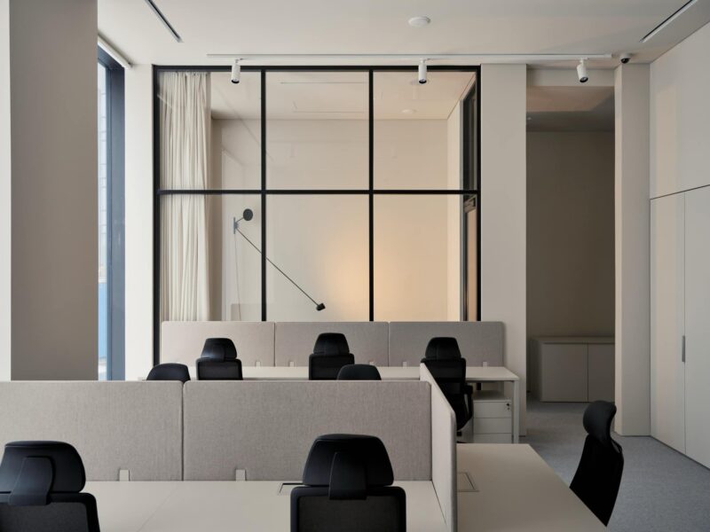 Pin
PinThe staff workspace applies the same minimalist discipline to operational areas. Fabric-covered dividers provide acoustic and visual separation without solid walls, preserving the open plan’s generosity while supporting focused work. The glass partition maintains daylight penetration deep into the floor plate.
Client Bathroom: Material Drama in a Compact Zone
Even the restroom receives architectural consideration. Dark mirrored walls create a dramatic contrast to the light-toned public areas, while bespoke travertine pedestal sinks and Corian surfaces extend the project’s material language into a space often neglected in commercial interiors. Custom lantern-inspired fixtures illuminate the mirror areas, continuing the layered lighting approach seen throughout the project.
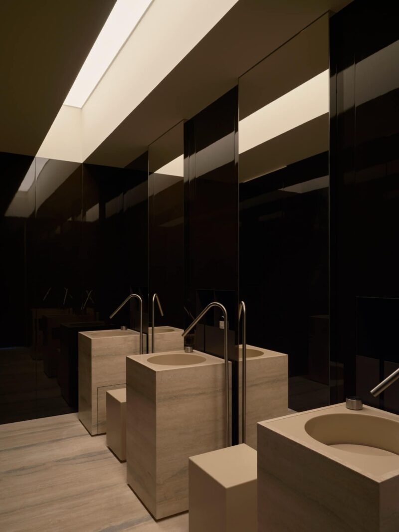 Pin
PinThe client bathroom reverses the project’s tonal logic—dark mirrored walls replace the white plaster of the public zones, creating an intimate, materially rich counterpoint. Bespoke travertine sinks demonstrate the architects’ commitment to carrying the material palette into every corner of the experience.
Where Soft Minimalism Meets the Demands of Daily Commerce
✦ What Works Exceptionally Well
The sequential reception strategy is a genuine innovation in commercial office design. By withholding the full spatial reveal and guiding visitors through a controlled progression—from entry threshold to logo plinth to lounge to main hall—KEMELIN PARTNERS constructs a brand narrative in architectural form. The experience unfolds with deliberation rather than immediate exposure.
The vaulted corridor solution transforms a common planning constraint into the project’s most memorable spatial moment. The enfilade lighting and repeated arched bays reduce perceived corridor length while creating an architectural procession that elevates movement into experience. Meeting rooms arranged along the windowed side with service functions opposite demonstrates efficient planning logic.
The material palette achieves a difficult balance—durable enough for high-traffic commercial use yet refined enough to signal premium positioning. Travertine, brushed stainless steel, and textile panels perform differently but speak the same visual language.
✦ Practical Considerations & Limitations
The white plaster walls and light-toned travertine flooring demand rigorous maintenance protocols in a high-footfall sales environment. The interior’s visual calm depends on cleanliness; any scuff, mark, or wear pattern will read immediately against the monochromatic field.
The reliance on bespoke furniture for spatial zoning, while elegant, may limit future reconfiguration. Unlike fixed partitions, these pieces require careful placement to maintain their intended functional and compositional roles—any ad hoc relocation risks disrupting both circulation and aesthetics.
The three distinct VIP room characters, while offering client choice, require consistent upkeep of multiple material palettes and furniture collections. The operational complexity of maintaining three different interior identities within one floor plate should not be underestimated.
An Office as Brand Argument: What STONE’s Space Communicates
This project demonstrates that a sales office can function as a three-dimensional brand manifesto. Every decision—the sequential entry, the Palladian ceiling geometry, the travertine palette, the three distinct VIP characters—reinforces STONE’s positioning as a developer concerned with proportion, material quality, and enduring design rather than transient display.
The interior is best suited to organisations that understand their physical environment as a primary communication tool. It works because KEMELIN PARTNERS treated the architecture not as a container for business activity but as an argument for the brand itself—an argument made through proportion, light, and material rather than logo repetition or colour-matched corporate identity.
When the material palette is this restrained, does every joint, every surface, every transition bear more scrutiny than in a busier interior? And if so, is that heightened precision a burden on the construction team—or exactly the point?
Questions About the STONE Sales Office
What design style defines the STONE sales office?
The interior follows a soft minimalist approach, characterised by clean lines, harmonious proportions, a monochromatic palette, and an emphasis on natural light and material integrity. Decorative solutions are minimised in favour of spatial composition and architectural clarity.
How large is the STONE sales office?
The sales office occupies 700 m² and includes a welcome area, nine meeting rooms ranging from standard to VIP formats, a business lounge, open-plan staff workspace, and supporting service areas.
What materials are used throughout the STONE sales office?
Key materials include Travertine Striato flooring from Italy, lightly textured decorative plaster walls, brushed stainless steel, textile wall panels, wenge and eucalyptus wood, high-gloss lacquered MDF, and Corian solid surfaces.
How does the STONE sales office handle different types of meetings?
The office features nine meeting rooms including flexible standard formats with sliding partitions and three VIP suites with distinct characters—one referencing Mid-Century Modern design, another blending 1970s forms with Japanese minimalism, and a third reinterpreting the classic executive office. Clients can select rooms based on preference.
What makes the corridor design distinctive?
The corridor is organised around Palladian geometric principles—a circular ceiling feature within a square lobby pays homage to classical proportion, while the linear passage features a vaulted ceiling with enfilade lighting that creates a rhythmic architectural procession and reduces the perceived length of the corridor.
Get gorgeous projects via email
