

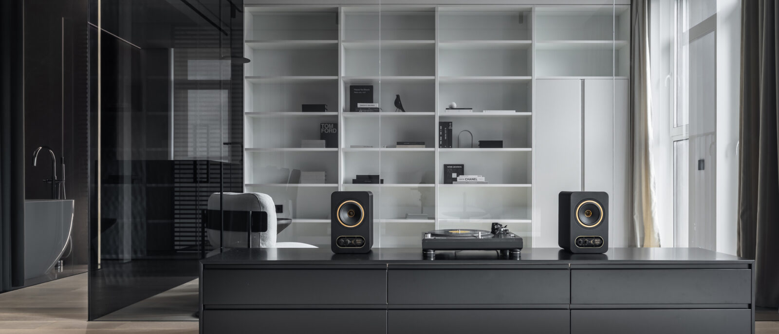
For a young lawyer whose days are structured around argument and precedent, home must offer something else entirely: withdrawal, quiet, and absolute visual order. ARCHJOINT designed this 80 m² apartment in 2024, inside Moscow’s Residences of Composers, for a client with an exacting professional life and an analytical mind. Led by Ivan Kochev and Lesya Agafonova, the team crafted a minimalist apartment interior that trades decoration for atmosphere, using tinted glass, shadow profiles, and a restrained material palette to forge a space that feels removed from the city’s perpetual motion.
| Project Name | LAW Interior |
| Architect / Designer | ARCHJOINT (Ivan Kochev, Lesya Agafonova) |
| Location | Moscow, Russia |
| Floor Area | 80 m² |
| Year Completed | 2024 |
| Client Type | Private (young lawyer) |
| Photographer | Anton Brzhozovsky |
Designing Stillness: How Tinted Glass and Shadow Lines Create a Lawyer’s Urban Sanctuary
The site imposed a familiar Moscow condition: a premium residential tower with generous floor-to-ceiling height but a limited footprint, requiring the architect to create psychological spaciousness within physical constraint. ARCHJOINT’s response centers on a parti (organizing principle) of layered transparency. Tinted gray glass partitions divide the apartment’s private and public zones without sacrificing visual continuity. These panels can be veiled with curtains when the occupant desires full seclusion, offering a rare flexibility in a compact plan.
Engineered wood flooring extends from the entry through the living spaces and up the bedroom wall, treating the floor plane as a continuous material ribbon that unifies the plan. Shadow profiles — recessed channels where walls meet ceilings — reinforce the interior’s graphic precision, turning structural junctions into deliberate aesthetic events. The result is an atmosphere of controlled calm: strict architectural geometry softened by rounded furniture silhouettes and curated textiles.
Design Decision: The architects specified tinted gray glass rather than clear glass for the interior partitions. The tint adds perceptual depth to the narrow plan while filtering sightlines — a choice that prioritizes atmospheric mood over maximum transparency.
 Pin
PinPhoto: Anton Brzhozovsky
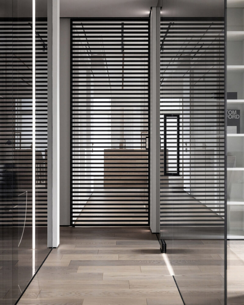
The horizontal slatted glass partition mediates between corridor and living zone, filtering light and glimpses without exposing the full plan. This device exemplifies how ARCHJOINT treats transparency not as a binary condition but as a calibrated spatial tool — one that can be adjusted through curtains, sliding panels, and the glass’s own tinted density to suit the occupant’s changing needs for openness and privacy.
Entry Sequence: Concealed Storage and a Corridor of Filtered Light
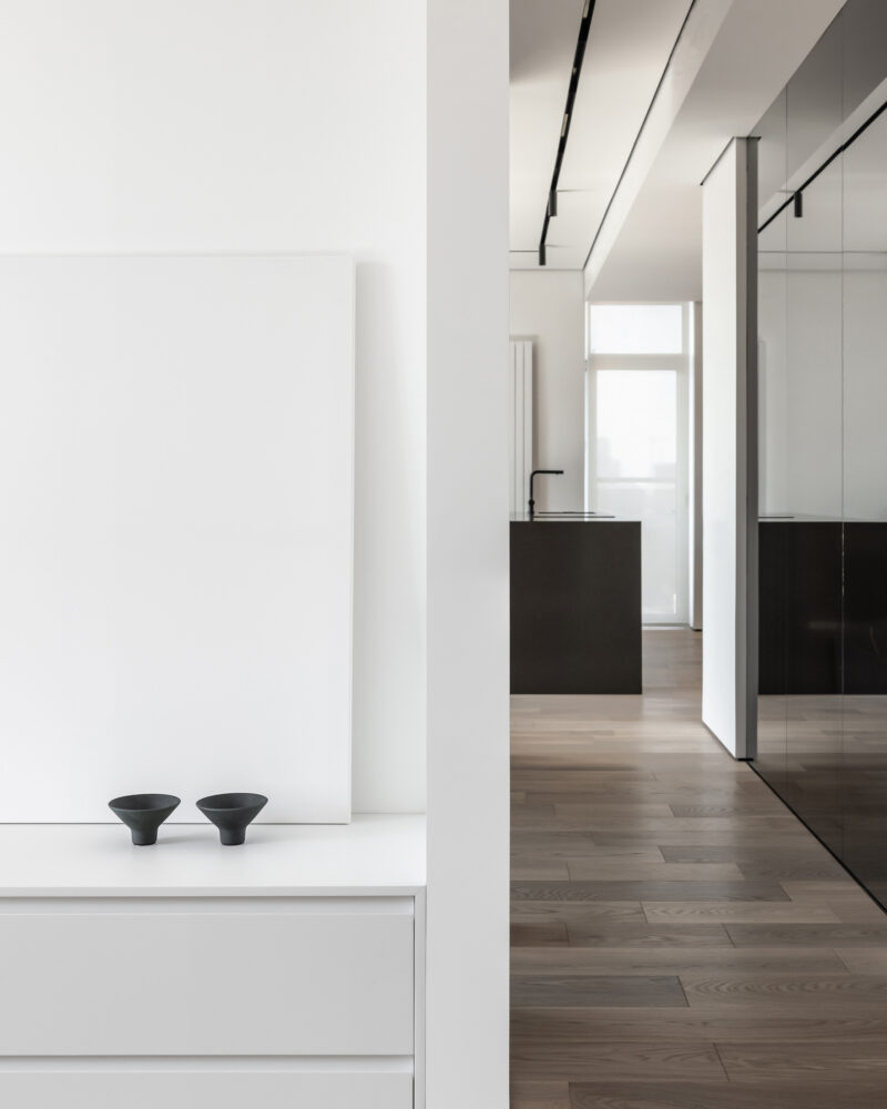
The entry threshold establishes the apartment’s governing logic immediately: everything hides. A wall of white built-in cabinetry lines the passage, swallowing shoes, coats, and domestic clutter before they can disturb the interior’s composure. The corridor terminates in a slatted glass partition that mediates between the entry and the living zone, filtering light and glimpses without exposing the full plan. This sequencing — from enclosed to partially revealed — builds anticipation and enforces a mental transition from public street to private refuge.
 Pin
PinPhoto: Anton Brzhozovsky
The entry corridor presents a study in restraint: white built-in cabinetry with discreet black hardware stores domestic necessities out of sight, while a precisely framed opening offers a controlled glimpse toward the kitchen island beyond. This threshold moment establishes the apartment’s organizational principle — conceal first, reveal selectively — creating anticipation before the main living spaces unfold.
 Pin
PinPhoto: Anton Brzhozovsky
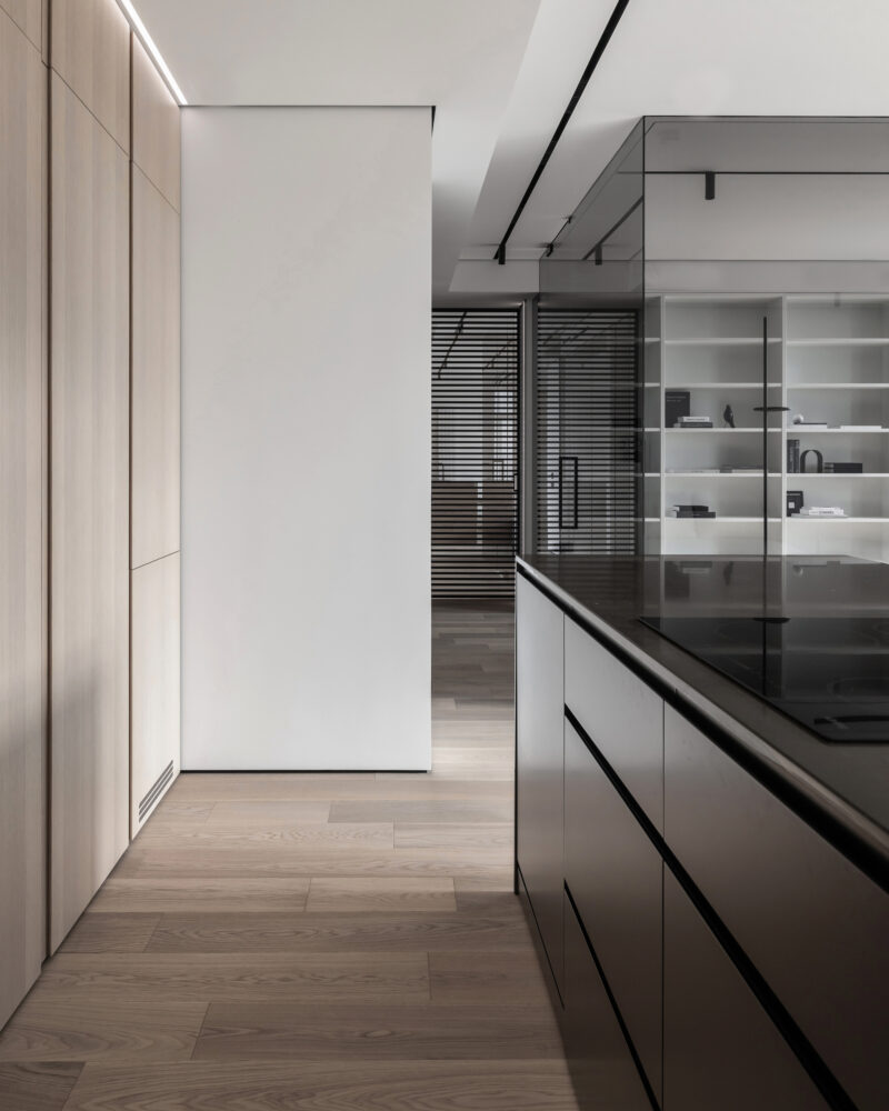
Engineered wood flooring runs the length of the corridor, bordered on one side by flush wooden cabinetry and on the other by a dark built-in unit that anchors the composition. At the corridor’s end, horizontal slatted glass filters light and views between zones, demonstrating how the architect uses transparency as a spatial layering device rather than a simple divider.
Living Room: Vinyl, Gray Glass, and the Art of Curated Comfort
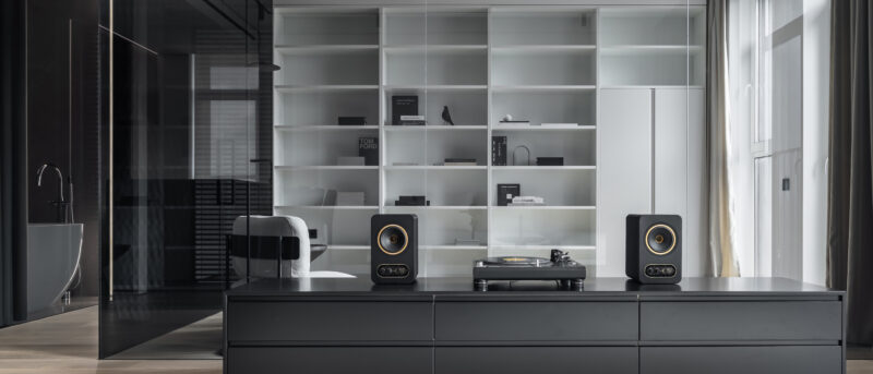
The living room occupies the social heart of the plan, positioned between the kitchen and the study. A low-profile black credenza anchors the space, topped with a vinyl record player and paired speakers that function as both audio equipment and sculptural objects. The Mononova sofa sits in quiet opposition — light-toned, generously cushioned, its rounded form softening the room’s rectilinear architecture. Through the tinted glass partition, the bathroom’s freestanding tub appears as a ghosted silhouette, a deliberate visual layering that adds depth without congestion.
 Pin
PinPhoto: Anton Brzhozovsky
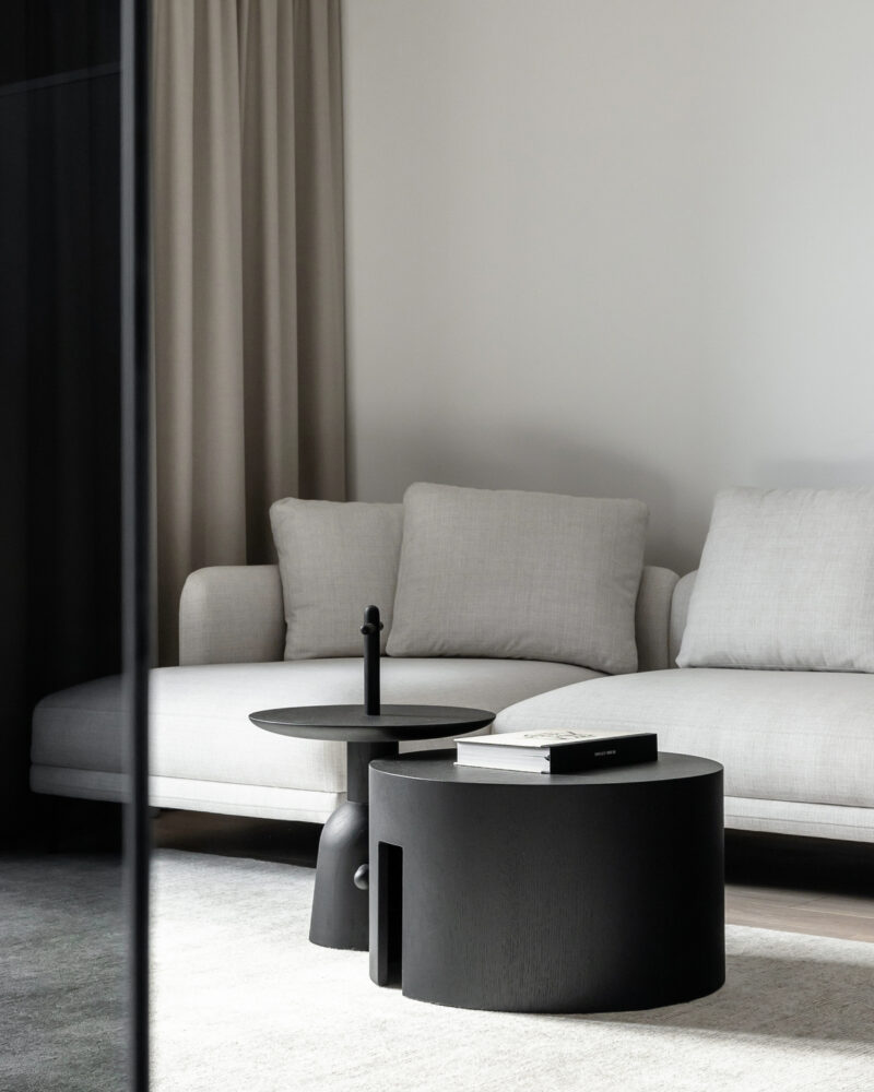
The living room’s seating arrangement centers on a light-toned Mononova sofa paired with sculptural black coffee tables by Meridiani and Cassina, their rounded forms introducing organic counterpoints to the room’s strict geometry. A Dovlet House rug defines the conversational zone while absorbing sound, contributing to the apartment’s deliberately muted acoustic character.
 Pin
PinPhoto: Anton Brzhozovsky
A wide view from the living area reveals the apartment’s spatial strategy in full: the black credenza with its vinyl record player and paired speakers faces a floor-to-ceiling bookshelf, while tinted glass partitions beyond offer filtered views into the bathroom and study. This composition demonstrates how ARCHJOINT uses furniture as spatial anchors within an open plan, creating distinct functional territories without physical walls.
Kitchen: Wood Facades and a Monolithic Black Island
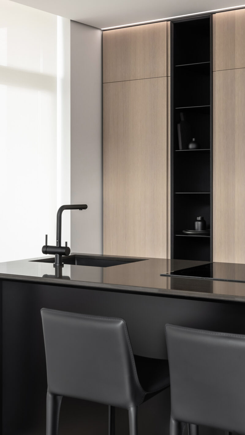
The kitchen demonstrates how material contrast can organize function. Mebburo cabinetry with light wood facades conceals appliances and storage, presenting a unified timber plane that warms the apartment’s neutral backdrop. Against this, a black island with an OMOIKIRI sink and matte faucet reads as a monolithic insertion — a dark anchor that defines the cooking zone and provides casual seating via leather-topped stools. The island doubles as a visual bridge between kitchen and living areas, its surface continuing the black tones of the credenza opposite.
 Pin
PinPhoto: Anton Brzhozovsky
The kitchen island presents a study in material contrast: a matte black surface with an undermount OMOIKIRI sink and minimalist faucet sits before mebburo cabinetry clad in vertical wood veneer. The composition demonstrates how the architect uses color rather than walls to delineate functional zones, with the island’s dark mass anchoring the cooking area against the lighter timber backdrop.
 Pin
PinPhoto: Anton Brzhozovsky
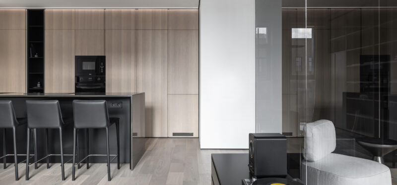
This wide perspective captures the kitchen-living relationship in full: the black island with leather-topped stools faces a wall of wood-fronted cabinetry with integrated appliances, while a tinted glass partition to the right separates the living area visually without interrupting the plan’s continuity. The engineered wood flooring unifies both zones, reinforcing the architect’s strategy of treating the apartment as a single continuous volume.
Study: A Record Player as the Room’s Architectural Anchor
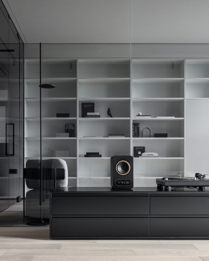
The study — functioning equally as a home library — occupies a zone defined by a full-height white bookshelf and the same black credenza that extends from the living room. A Flou armchair faces the shelving unit, positioned for reading beneath a LINEA LIGHT-STILNOVO floor lamp. The vinyl record player, visible from both living and study zones, operates as a spatial hinge: it gives the study its identity while maintaining acoustic and visual connection to the main social space. Glass partitions on two sides ensure the room never feels confined.
 Pin
PinPhoto: Anton Brzhozovsky
The study area centers on a black credenza topped with a vinyl record player and a single speaker, facing a full-height white bookshelf curated with monochromatic volumes and select objects. A Flou armchair sits partially visible behind a tinted glass partition, demonstrating how the architect uses furniture placement and transparent dividers to create distinct functional zones within an open plan without sacrificing visual continuity.
Bedroom: Where the Floor Becomes the Wall
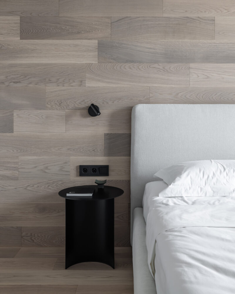
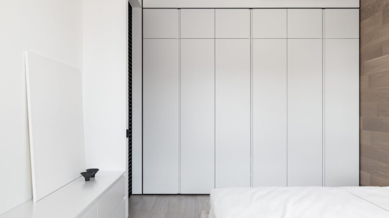
The bedroom’s most distinctive move is the engineered wood flooring that continues vertically onto the headboard wall, treating surface as an unbroken material plane. A Pigo bed with an upholstered frame sits against this timber backdrop, flanked by a black Flou side table that echoes the dark accents used throughout the apartment. A sliding panel in matching wood tones can close the bedroom off from the living area, offering the same transparency-control logic seen in the glass partitions. Floor-to-ceiling wardrobes in matte white provide storage without visual weight.
 Pin
PinPhoto: Anton Brzhozovsky
The bedroom’s headboard wall receives the same engineered wood planks used on the floor, creating a continuous material surface that visually expands the room’s perceived dimensions. A Pigo bed with a textured light-gray frame sits against this timber backdrop, paired with a black Flou side table whose sculptural form recalls the coffee tables in the living area. The black reading sconce and outlet plate demonstrate the architect’s obsessive attention to hardware continuity.
 Pin
PinPhoto: Anton Brzhozovsky
Floor-to-ceiling wardrobes in matte white line the bedroom’s opposite wall, their flush panels and minimal reveals maintaining the apartment’s visual discipline. A small black slatted vent visible at the edge confirms that mechanical systems have been integrated into the architectural language rather than treated as afterthoughts, reinforcing the project’s overarching commitment to detail coherence.
Bathroom: A Tub Behind Glass
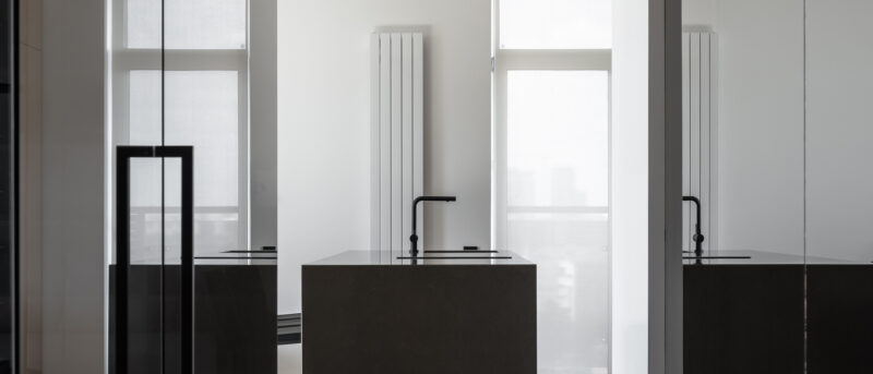
The bathroom concentrates the apartment’s most dramatic spatial gesture: a freestanding BelBagno bathtub positioned behind a tinted glass partition, visible as a silhouette from the living area. This placement transforms the tub from a utilitarian fixture into an architectural element. Within the bathroom itself, a long vanity with a black countertop and matte fixtures runs along one wall, while a vertical radiator doubles as a geometric accent. The glass enclosure around the tub zone allows natural light to penetrate deeply while maintaining privacy — a solution that resolves the classic conflict between openness and modesty in compact residential plans.
 Pin
PinPhoto: Anton Brzhozovsky
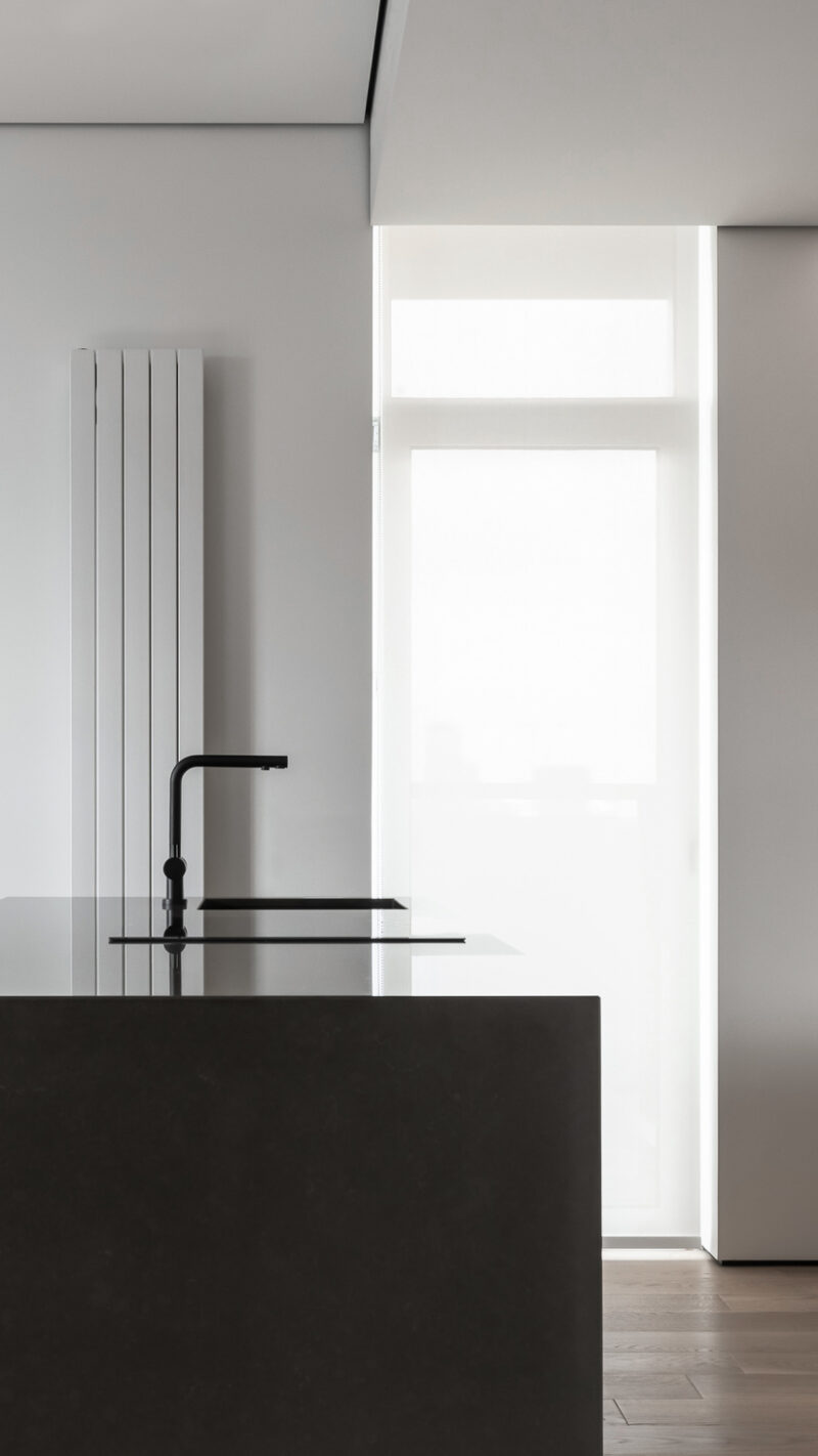
The bathroom vanity presents a black rectangular basin with a matte faucet, positioned before a tinted glass partition that separates the vanity zone from the tub area beyond. A vertical panel radiator provides a rhythmic geometric counterpoint to the room’s otherwise smooth surfaces, while the glass partition allows natural light from the window to penetrate both zones simultaneously.
 Pin
PinPhoto: Anton Brzhozovsky
A closer view of the vanity reveals the precision of the bathroom’s material transitions: the black countertop meets the matte white wall with a shadow-profile joint, while the tinted glass partition’s metal frame introduces a thin linear element that echoes the slatted partitions elsewhere in the apartment. This detail shot confirms how consistently ARCHJOINT applies its material palette across every room.
Floor Plan: Reading the Spatial Logic
 Pin
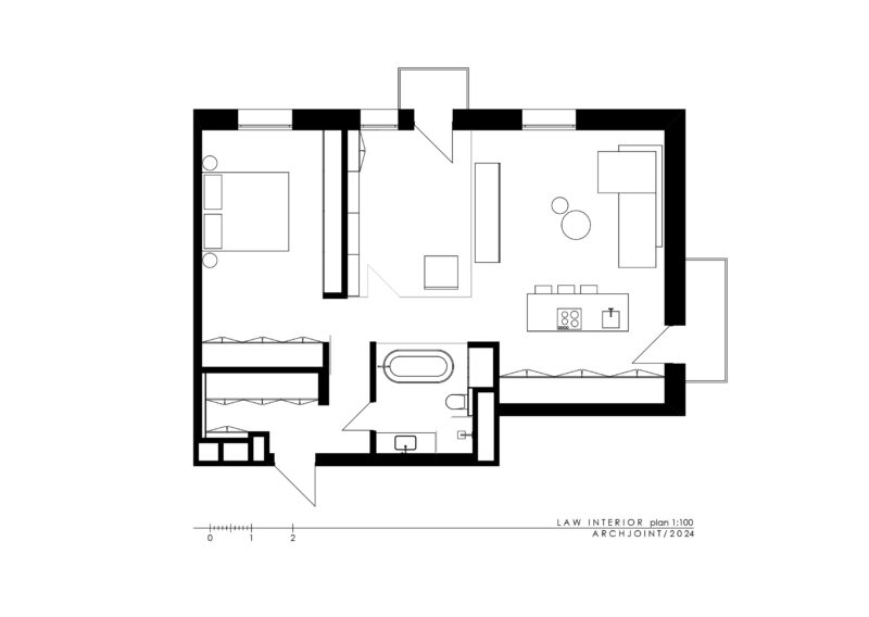
PinThe floor plan at 1:100 scale reveals the apartment’s efficient spatial logic: entry corridor with concealed storage leading to an open kitchen-living area, a bedroom with an en-suite bathroom, and a study positioned to receive natural light through the glass partitions. The plan confirms how the 80 m² footprint has been optimized to provide distinct functional zones without wasted circulation space.
Where Restraint Succeeds — and Where Personality Must Come From Within
The Material Palette’s Quiet Authority
The project’s greatest strength lies in its material coherence. Engineered wood, tinted glass, matte black metal, and white lacquer form a disciplined quartet that never wavers across the 80 m² plan. The shadow profiles at wall-ceiling junctions demonstrate an attention to detail that elevates the project beyond typical residential fit-outs. The glass partition system succeeds as both a spatial device and a psychological one — the apartment feels larger than its footprint because sightlines extend beyond individual rooms, creating a sense of generosity that belies the compact square footage.
When Minimalism Meets the Mess of Living
The honest challenge is one of maintenance and curation. An interior this restrained demands continuous tidiness; there are no visual distractions to mask clutter. The neutral palette, while calming, also places the burden of warmth and personality on the occupant — through books, textiles, and the objects she chooses to display. The rounded furniture forms help soften the atmosphere, but this apartment will always reflect the discipline of whoever lives inside it. For some, this is liberation; for others, it may feel like another kind of pressure.
A Blueprint for the Analytical Mind
LAW Interior makes a specific case: that minimalism, when executed with material intelligence rather than mere subtraction, can serve the psychological needs of urban professionals who spend their days processing complexity. ARCHJOINT has created a space that thinks the way its occupant thinks — in clear categories, with everything in its place. The project contributes to a growing body of work that treats the apartment not as a showcase but as a cognitive tool, an environment designed to restore rather than stimulate.
For whom is this design best suited? The single professional who values order over ornament, who finds comfort in empty surfaces, and who understands that the most luxurious thing a small apartment can offer is mental quiet.
Would you accept the visual discipline of a neutral palette in exchange for a space that calms your mind the moment you walk through the door — or does true comfort require more color, more texture, more visual noise?
FAQs
Q: Who designed the LAW Interior apartment?
A: The LAW Interior apartment was designed by ARCHJOINT, a Moscow-based architecture and interior design firm led by Ivan Kochev and Lesya Agafonova. The project was completed in 2024.
Q: What is the floor area of the LAW Interior apartment?
A: The apartment spans 80 m² and includes an entrance hall, a combined kitchen-living room, a study (library), a bedroom, and a bathroom.
Q: What materials were used in the LAW Interior project?
A: Key materials include engineered wood flooring that extends onto the bedroom wall, tinted gray glass partitions, shadow profiles at wall junctions, and built-in cabinetry with wood and lacquer finishes.
Q: Where is the LAW Interior apartment located?
A: The apartment is located in Moscow, Russia, within the Residences of Composers residential complex.
Q: What is the design style of the LAW Interior apartment?
A: The interior follows a minimalist approach with a neutral backdrop, strict architectural lines softened by rounded furniture shapes, and a restrained material palette of wood, glass, and matte black metal.
Get gorgeous projects via email
