

A retreat is easy to promise and hard to build. Alisa Shabelnikova began the House on the Istra River in 2019 with a bare plot, a decade-long relationship with the clients, and a brief that ran from the architectural concept all the way to the ornaments on the Christmas tree.
The result is a 900-square-meter, two-story house for a family of seven on the waterfront of the Istra Reservoir, planned as a decompression chamber between the pace of the city and the birch woods outside. What makes it worth studying is not its size but its restraint — the discipline needed to keep a house this large feeling like somewhere you can exhale.
| Project Name | House on the Istra River |
| Architect / Designer | Alisa Shabelnikova (ASdesign Studio) |
| Location | Istra Reservoir waterfront, Russia (assumed from context — please verify) |
| Floor Area | 900 m² across two stories |
| Year Completed | Two-year turnkey build begun in 2019 (exact completion year not stated in source) |
| Client Type | Private — a family of seven; secondary residence |
| Styling | Daria Ishkaraeva |
| Photography | Sergey Ananiev |
How the House on the Istra River Solves the Problem of Too Much Room
The brief carried an unusual risk. A ground floor holding an entrance hall, a combined living-kitchen of more than 120 square meters, a secondary utility kitchen, a billiard room with its own lounge, and a wellness area with a Russian bath, sauna and changing rooms can easily read as a sequence of halls rather than a home.
Shabelnikova’s parti — the organizing idea behind a plan — is an axial one. Rooms line up on clear sightlines, doorways are cut tall to match the ceiling height rather than standard door stock, and the second floor stacks bedrooms, children’s rooms, an office and a gym above the public plane. A separate guest wing keeps visitors out of family territory, and deep built-in storage absorbs the clutter that usually ruins open planning at this scale.
Scale control does the rest. Furniture, lighting and even appliances were specified against room height instead of catalog norms, which is why a 120-square-meter volume reads as generous rather than vacant.
The source material does not describe the exterior envelope, but the photographs read it indirectly. Full-height glazing runs the length of the living room, making birch trunks and lawn the dominant wall finish, while brick and pale masonry appear through the kitchen window — a country vernacular kept at arm’s length from the tailoring inside.
Design Decision: Instead of choosing a rug to suit the living room, Shabelnikova sketched a five-by-five-meter piece, had it hand-woven in India, and then built the entire living-kitchen palette around it. The floor covering became the color plan, not the finishing touch.
A Walk Through the Istra House, Room by Room
The Living Room: a Wine-Red Sofa as Center of Gravity
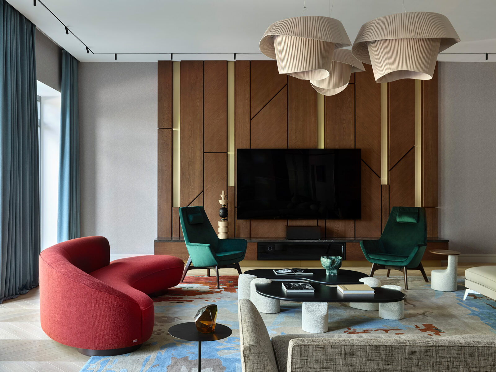
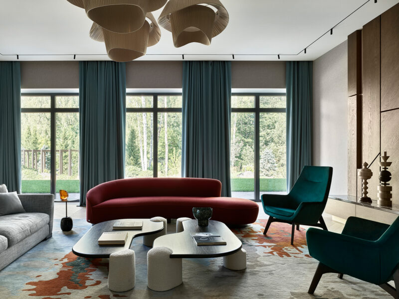
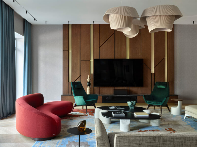
The living room takes the largest share of the open plan and is organized by color rather than by walls. A curved wine-red sofa sits off-axis against blue-gray drapery, two teal armchairs close the conversation circle, and a gray sectional holds the fourth side. Circulation runs behind the seating, never through it. Three lighting layers — perimeter track, sculptural pendants, and low table lights — give the room distinct evening moods without disturbing the daylight scheme.
 Pin
PinPhoto: Sergey Ananiev
Floor-to-ceiling glazing turns the birch stand into the room’s dominant surface, and the curtains are pitched to sit alongside that view rather than compete with it. The hand-knotted rug carries the rust-and-blue mineral pattern that everything else samples from: red in the sofa, deep blue-green in the armchairs, warm neutrals in the boucle stools tucked beneath the biomorphic coffee tables. Note the ceiling. A slim black track traces the perimeter and leaves the plane otherwise uninterrupted, so the pleated pendants register as objects rather than fixtures.
 Pin
PinPhoto: Sergey Ananiev
The television wall is a piece of joinery, not a backdrop. Walnut panels are grooved into a geometry of verticals and diagonals, with recessed brass strips lighting the seams, giving a large flat screen somewhere to belong instead of somewhere to hide. The stone shelf beneath runs unbroken across the full width and swallows the equipment. It is a clear demonstration of the studio’s habit of answering a technical problem — screen, cable, speaker — with carpentry.
Two Dining Tables, Two Kinds of Hosting
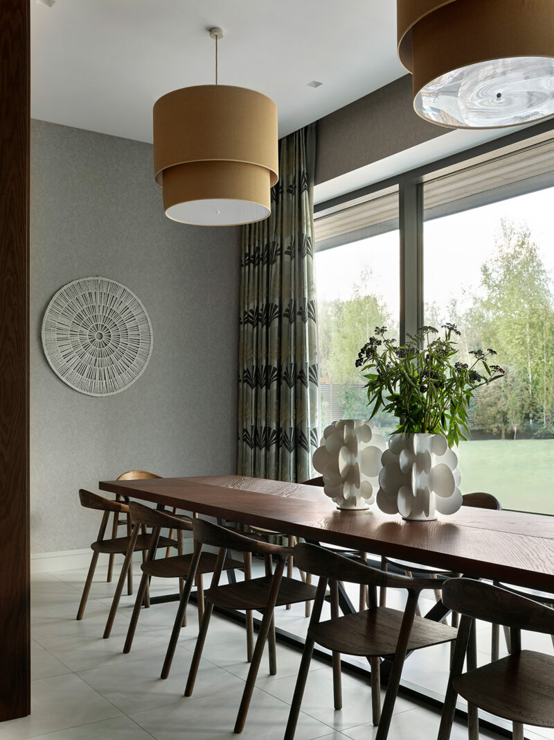
The house separates ceremony from routine. A custom table seating up to twenty handles the large gatherings the owners are known for, while a smaller oval table beside the kitchen covers ordinary meals. Both sit on pale porcelain floor, which cools the wood-heavy palette and marks the dining zone as separate from the parquet living room without a single partition doing the work.
 Pin
PinPhoto: Sergey Ananiev
The long table is a single dark slab on a slim metal frame, deliberately underdesigned so that twenty chairs do not become twenty competing objects. Patterned drapery introduces the only graphic motif in the room, echoed in a woven wall disc opposite. Glazing again takes the place of art on the exterior wall, framing lawn and treeline. Sculptural white vessels on the table supply the volume that a table this long needs at its center.
 Pin
PinPhoto: Sergey Ananiev
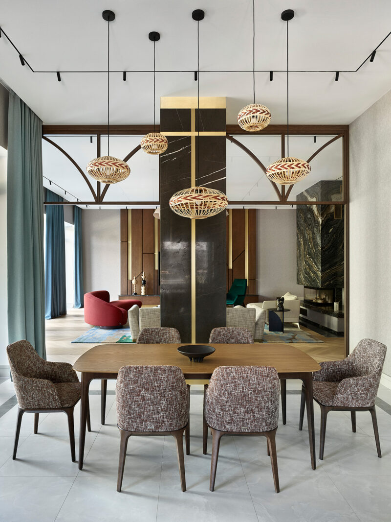
This view explains the plan better than a drawing would. A glazed timber screen with arched mullions separates dining from living while keeping the sightline open, and a column clad in gray marble with inlaid brass anchors the axis. Woven rattan pendants drop in a row that measures the table’s length. The mirrored return at the right multiplies the living room beyond, a familiar device used here to stretch a plan that already has room to spare.
The Kitchen: Green Lacquer With a Working Kitchen Behind It
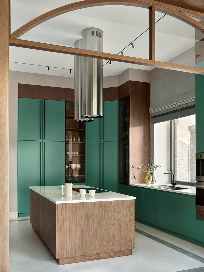
The visible kitchen is a social one; a secondary utility kitchen absorbs the noise, mess and appliance storage that would otherwise sit on display. Tall units in saturated green run floor to soffit, with walnut framing above and glazed bays holding glassware. The island is clad in wood and topped in pale stone, deliberately reading as furniture rather than cabinetry so that it belongs to the dining side of the room as much as the cooking side.
 Pin
PinPhoto: Sergey Ananiev
Green lacquer at this quantity is a risk, and it works because the value is dark enough to hold its own against walnut and because the finish is flat rather than glossy. Vertical routed handles keep the fronts free of hardware. The cylindrical stainless extractor is left frankly industrial, which reads as honesty in a room this decorated. The window over the sink is treated as a working aperture, dropped to counter level and dressed in a simple Roman blind.
 Pin
PinPhoto: Sergey Ananiev
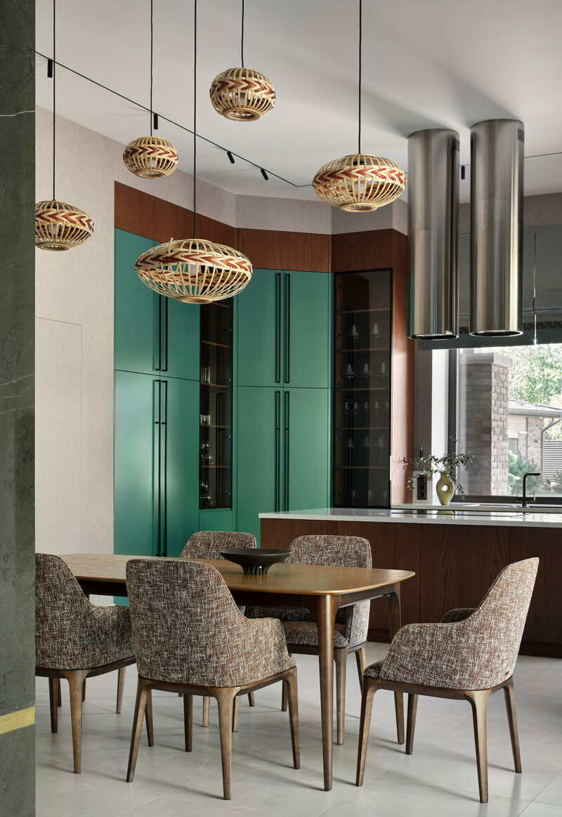
Seen from the dining side, the kitchen behaves like a stage set: color at the back, wood in the middle ground, and a marble column with a brass inlay framing the left edge of the composition. The tweed-upholstered chairs pick up the rust in the pendants, tying this corner back to the living room rug. Twin extractors mark the cooking axis without a hood bulkhead, keeping the ceiling flat and continuous through the entire public floor.
The Home Office: One Room That Breaks the Palette
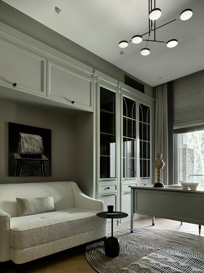
The office is the only space in the house that argues with the rest of it. Where the public rooms are warm and open, this one is cool, gray-green and enclosed, with classical glazed cabinetry and cased panels above the sofa. That shift is functional: the room asks for a different posture, and the palette signals it before the furniture does.
 Pin
PinPhoto: Sergey Ananiev
Sage-painted joinery wraps two walls, with astragal glazing on the bookcases and plain flush storage overhead — an unusually traditional detail set in an otherwise modern house. A boucle sofa and a ribbed circular rug soften the geometry. The black-and-white painting is the room’s only high-contrast element, and the desk is finished in the same green as the cabinetry so it disappears into the composition when seen from the door.
The Master Bedroom: Suede Panels, Brass Seams, a Bed Drawn In-House
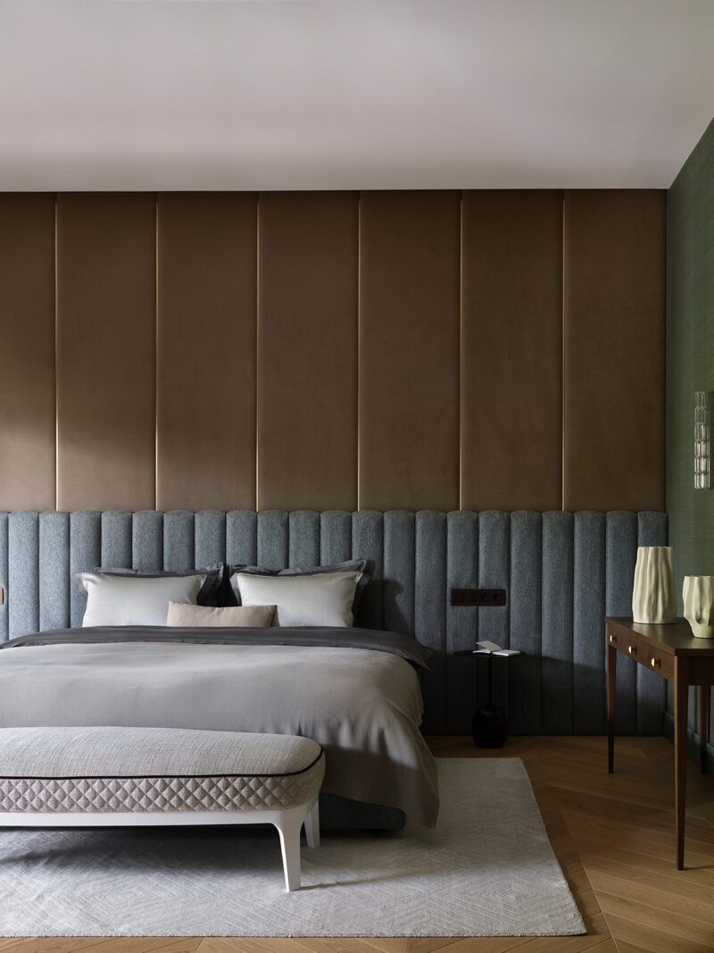
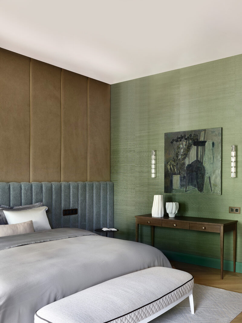
The principal bedroom is built as a single upholstered wall. Alcantara panels in olive run the full width above a fluted headboard in blue-gray, divided by thin brass reveals that catch the wall-light and give the surface a rhythm. The bed itself was designed by the studio, the console is bespoke joinery, and the textiles are custom. It is the most tailored room in the house and, tellingly, the quietest.
 Pin
PinPhoto: Sergey Ananiev
The proportional move here is worth noting: the headboard does not stop at the bed but continues to the corner, turning a piece of furniture into architecture and making the room read wider than it is. Brass strips between the suede panels are the only ornament on that plane. Herringbone parquet returns underfoot after the porcelain of the public floor, a deliberate signal that the private half of the house has begun.
 Pin
PinPhoto: Sergey Ananiev
On the adjacent wall, green wallcovering with a visible weave meets the olive suede at a clean corner, and the color relationship carries the whole scheme: two warm-cool neighbors rather than an accent wall. A dark walnut console with brass pulls holds a pair of ribbed ceramic vessels beneath a muted still life. Slim glass sconces flank the painting at eye level, lighting the art and the console surface with one gesture.
The Master Bathroom: Jade Marble Under a Mint Ceiling
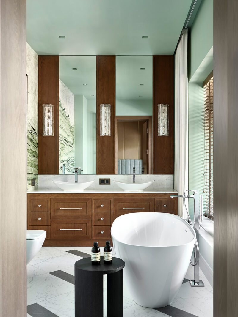
The main bathroom sets a green-veined stone against a painted ceiling in the same family, so the room reads as one hue at two intensities. A freestanding tub occupies the window, a double vanity in stained oak faces it, and mirrored panels between walnut piers carry the stone around the room by reflection. Wooden blinds handle a waterfront site’s privacy problem without giving up daylight.
 Pin
PinPhoto: Sergey Ananiev
The vanity is detailed like furniture — framed drawer fronts, turned metal knobs, a marble top with a set-back splash — which keeps a large fitted run from feeling like a hotel installation. Textured glass sconces sit on the walnut piers rather than on the mirror, so the reflection stays clean. The checkerboard marble floor is the one graphic decision in the room, and it earns its place by giving the eye something to do below waist height.
The Girl’s Room: a Mural Instead of a Feature Wall
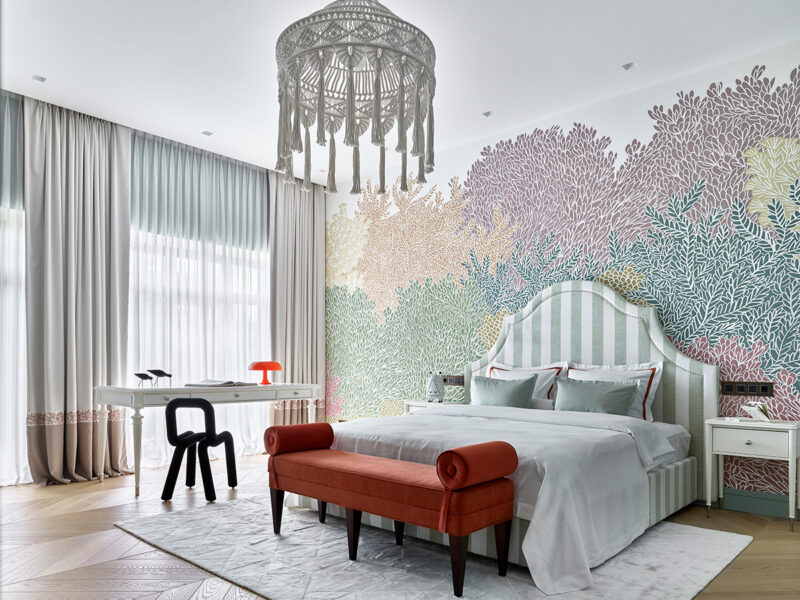
The children’s rooms were given their own logic rather than a scaled-down version of the adults’. Here a hand-drawn botanical mural covers two walls in chalky corals, greens and lilacs, and everything else is deliberately quiet: a striped upholstered headboard, white painted furniture, pale bedding. The room can grow up without being redecorated, because the only thing that reads as childlike is the drawing itself.
 Pin
PinPhoto: Sergey Ananiev
A macrame chandelier made to the designer’s own sketch hangs off-center over the bed, its fringe echoing the mural’s foliage. The coral bolster bench at the foot of the bed is the single saturated object in the room and pulls the wallpaper’s warmest tone down to floor level. Curtains carry a printed border at the hem, a restrained way to repeat the pattern without adding a second competing surface. The sculptural black chair at the desk keeps the room from tipping into sweetness.
Guest and Secondary Bedrooms: Blue as the Common Thread
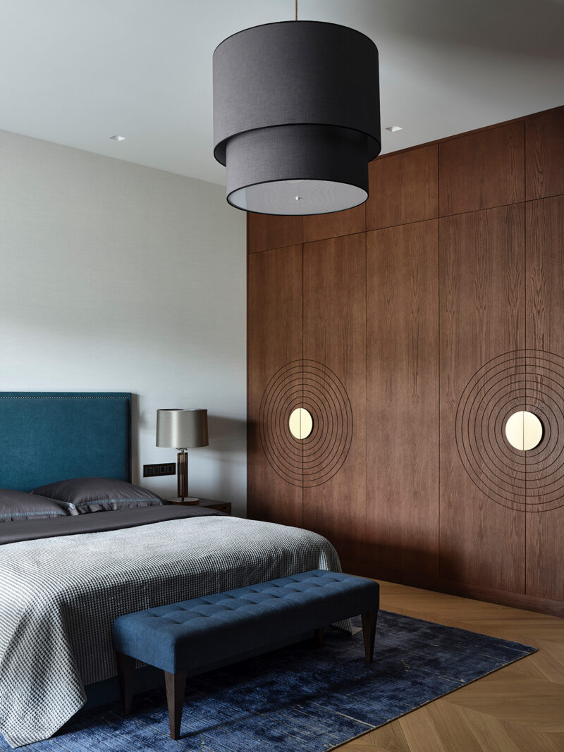
The remaining bedrooms hold to a blue-and-walnut register with different amounts of pattern. One pairs a teal headboard with a full wall of walnut wardrobe joinery; another leans on textile art above the bed. Each room includes a work surface, which matters in a house used as a retreat by a family that clearly still works while it is there.
 Pin
PinPhoto: Sergey Ananiev
The wardrobe wall is the argument of this room. Concentric circles are routed into the walnut and centered on brass disc pulls, turning eight meters of storage into a low-relief composition. A drum pendant in charcoal balances the mass of the joinery, and the blue rug and tufted bench keep the floor plane from being ceded entirely to timber. It is a good lesson in giving a functional wall a reason to be looked at.
 Pin
PinPhoto: Sergey Ananiev
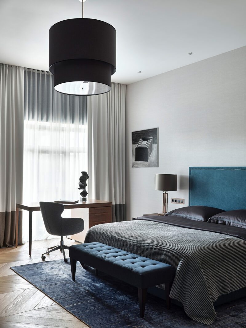
Pulled back, the same room shows its second function. A walnut desk sits in the window bay where the light is best, with a compact swivel chair that does not read as office equipment. Two-tone curtains — pale above, dark band below — visually lower a tall window and settle the proportions. The grayscale artwork and dark shades keep the scheme cool, in contrast to the warmer rooms downstairs.
 Pin
PinPhoto: Sergey Ananiev
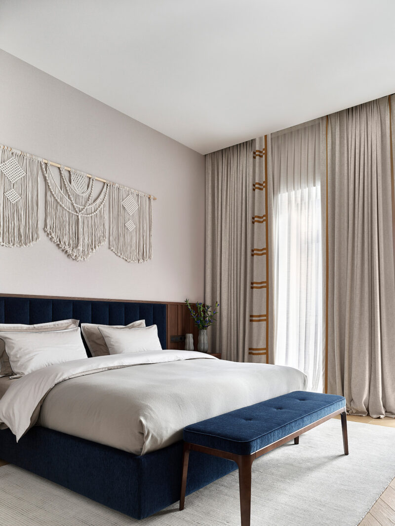
The guest room takes the softest position in the house: a deep navy upholstered bed and bench against a blush-tinted wall, with three macrame panels hung as a horizontal frieze in place of a headboard wall treatment. The linen curtains carry an applied ochre stripe that ties back to the brass used elsewhere. Nothing here is bespoke joinery, which reads as a deliberate hierarchy — guests get comfort, family gets carpentry.
The Secondary Bathrooms: One Grammar, Three Dialects
The remaining wet rooms share a single vocabulary — white marble, dark stained wood, chrome, and one strong color — recombined each time. That consistency is what keeps a house with this many bathrooms from feeling like a sequence of unrelated projects, and it makes the stone offcuts from the main rooms usable rather than wasted.
 Pin
PinPhoto: Sergey Ananiev
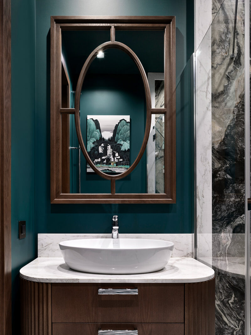
The children’s bathroom takes the boldest color position: a deep teal on walls and ceiling, with a walnut-framed mirror whose oval within a rectangle is the most decorative gesture in the house. Dark green marble in the shower is visible through the glass, so the color story runs across both zones. The vessel basin and marble top are conventional; the mirror is doing all the personality work, which is an economical way to give a small room a character.
 Pin
PinPhoto: Sergey Ananiev
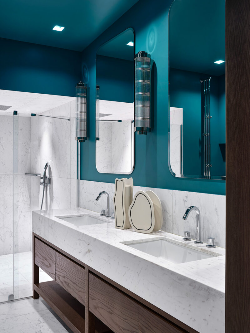
A larger shared bathroom repeats the teal but changes the register to something crisper: white marble wainscot, twin undermount basins in a slab top, and ribbed glass sconces mounted directly onto the color field. The rounded rectangular mirrors and open shelf below the vanity keep the run from feeling heavy. Where the children’s bathroom is decorative, this one is functional, and the shared palette is what makes them read as one house.
 Pin
PinPhoto: Sergey Ananiev
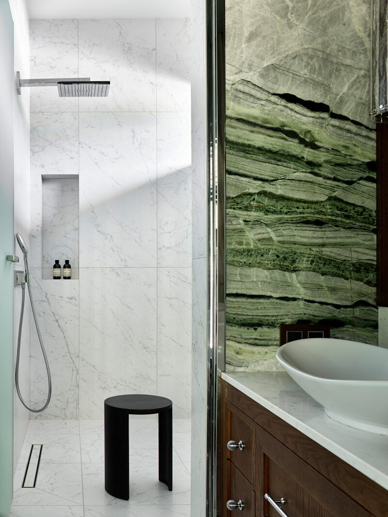
This shower room shows the material logic at its clearest. A wall of dramatically banded green stone faces a shower lined in quiet white marble, so the eye has one place to rest and one place to look. The linear floor drain and flush niche keep the wet zone free of ledges. A black stool is the only movable object — a small acknowledgment that a bathroom used after a sauna needs somewhere to sit.
Billiards and the Bath House: Where the Plan Loosens Up
At the far end of the ground floor the house changes character. The billiard room and the wellness suite with its Russian bath and sauna are the only spaces given over entirely to leisure, and they are also the only ones detailed in a frankly traditional way — paneled walls, timber linings, warm low light. Placing them at the end of the axis means the noisiest and the most private activities in the house share the same quiet corner.
 Pin
PinPhoto: Sergey Ananiev
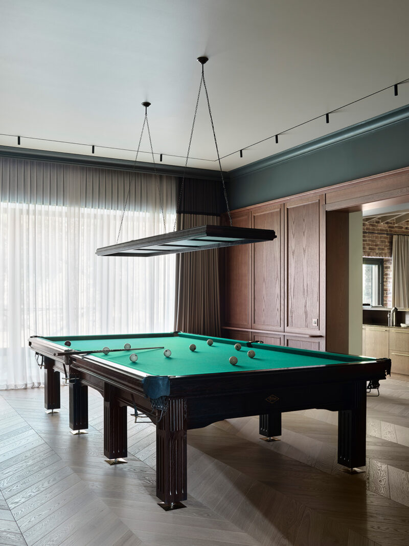
Full-height oak paneling and a deep green cornice give the billiard room a club-like weight the rest of the ground floor avoids. The chevron floor runs at an angle to the table, which sounds like a clash and instead keeps the eye moving around the room. The suspended timber light box is sized to the slate rather than to the room, delivering flat shadowless light across the cloth — the one place in this house where lighting is purely a performance requirement.
 Pin
PinPhoto: Sergey Ananiev
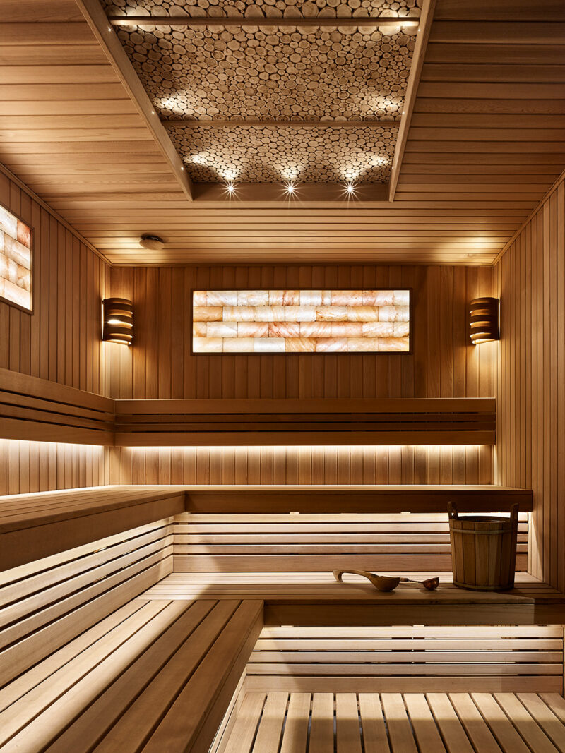
The sauna is lined in two woods: a darker tone for the walls and a paler, lower-conductivity species for the benches, which is a comfort decision as much as an aesthetic one. Backlit salt panels and a ceiling coffer packed with cut log ends supply texture where no artwork can survive the heat. Continuous strips beneath the benches light the floor without putting any source at eye level, which is exactly right for a room designed to be used with eyes closed.
Where the Discipline Holds — and Where 900 Square Meters Pushes Back
What the Landscape Palette Actually Buys
The color strategy is structure, not decoration. Blue, green and brown are pulled from the reservoir and the woods, so each room can shift intensity — teal in the children’s bathroom, olive in the master bedroom, forest green in the kitchen — without leaving the family. The India-woven rug then gives the 120-square-meter living-kitchen one reference that the sofa, armchairs and pendants all sample from.
Scale calibration is the second win. Furniture and lighting were sized against ceiling height rather than standard dimensions, so the largest room reads as generous instead of hollow, while tall doorways and axial sightlines keep a 900-square-meter plan legible from anywhere inside it.
The Maintenance Written Into the Detailing
The specification asks a lot of its owners. Walnut veneer on walls and ceilings, brass reveals and marble in every wet room all change with time and use, and a house people walk into from a boat dock will test all three.
Almost everything is bespoke — the rug, the chandeliers, the bed, the kitchen, most of the storage. That is why the rooms hold together, but it also means damage or a change of taste sends the owners back to the same makers, and interiors this integrated resist renewal one piece at a time.
Calm at this scale is not free either. A 900-square-meter second home with a bath house and a gym implies heating, servicing and cleaning for rooms nobody may enter for weeks.
A House Built for the Handover Between City and Forest
What this project contributes is a method more than a style. Take the palette from the site, set one object as the reference, then size everything else against the room’s real dimensions rather than the catalog’s. That sequence is why a house this large stays coherent.
It suits a specific client: a large family that hosts often, wants a second home rather than a showpiece, and will maintain natural materials in exchange for rooms that answer to the season outside.
Would you accept the upkeep that walnut, brass and marble demand in return for a house that answers to the landscape — or does a weekend retreat argue for materials you can simply lock up and leave?
FAQs
Who designed the House on the Istra River?
Interior designer Alisa Shabelnikova of ASdesign Studio designed it for clients she had already worked with for nearly a decade. She handled the project turnkey, beginning with selecting the plot and developing the architectural concept and finishing with the decoration of the house.
How big is the House on the Istra River?
The house covers roughly 900 square meters across two stories and accommodates a family of seven. The combined living and kitchen area alone exceeds 120 square meters, and a custom dining table in the house seats up to twenty people.
What color palette was used in the Istra River house?
The palette comes from the surrounding landscape and its changing seasons: blues, greens and browns, warmed by wood, natural stone, textile and brass. A wine-colored sofa provides the accent in the living room, and a five-by-five-meter rug hand-woven in India unifies the living and kitchen scheme.
How long did the Istra River house take to build?
The clients approached the designer in 2019, when they decided to build a country house, and the project was delivered fully turnkey in about two years. That period covers everything from the initial groundwork through construction and the interior fit-out to the final photo shoot by Sergey Ananiev.
What rooms are in the House on the Istra River?
The ground floor holds an entrance hall, a combined living room and kitchen, a secondary utility kitchen, a billiard room with a lounge, and a wellness area with a Russian bath, sauna and changing rooms. The upper floor contains bedrooms, children’s rooms, an office and a gym.
Get gorgeous projects via email
