

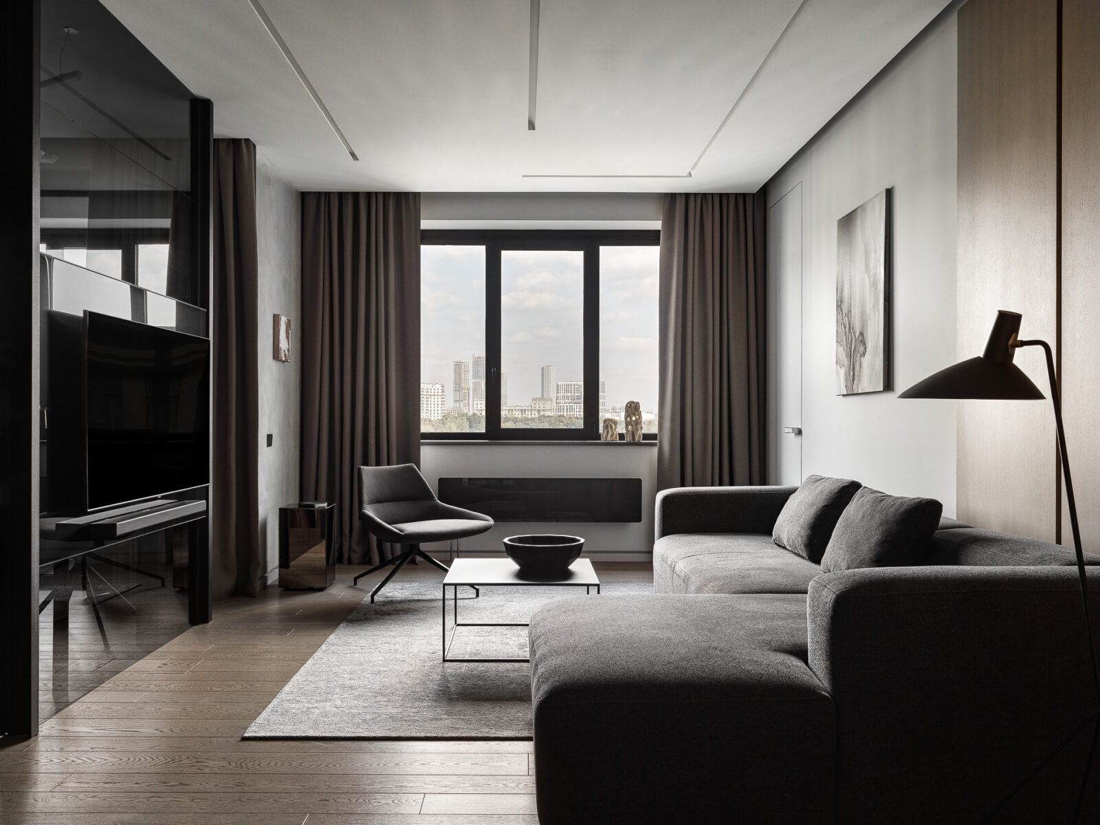
Most compact apartments choose between openness and privacy. This minimalist Moscow apartment by Crystal.archi refuses the trade-off. Working within 67.4 square meters in the Iskra-Park residential complex near Dinamo metro, architects Timur Akhmyatov and Dmitry Ushakov replace interior walls with tinted glass partitions, contrasting floor materials, and a disciplined palette of light beige wood, gray, and black. The layout borrows its logic from hotel apartments — a bedroom that opens into its own bathroom, a living zone divided by glass rather than drywall — while preserving the calm that draws people to functional minimalism in the first place.
| Project Name | Comfortable Apartment in Moscow |
| Architect / Designer | Crystal.archi — Timur Akhmyatov and Dmitry Ushakov |
| Location | Moscow, Russia — Iskra-Park residential complex, Dinamo metro |
| Floor Area | 67.4 m² (approx. 725 sq ft) |
How a Minimalist Moscow Apartment Zones 67.4 m² Without Interior Walls
The constraint here is familiar to any urban dweller: one compact floor plate that must hold living, dining, cooking, sleeping, working, and two bathrooms without feeling carved up. Crystal.archi’s parti (the project’s central organizing idea) is zoning by material rather than by wall. Black glossy slate marks the entry corridor and service spine; engineered wood, toned to match the white oak veneer on the walls, marks the living zones. The floor itself draws the boundaries.
Where physical separation is needed, it stays transparent. A partition of tinted knee glass, fixed by two black powder-coated metal profiles, divides the living area from the dining zone; a sliding tinted-glass panel does the same between bedroom and master bath. Light passes through everything, so the small footprint reads larger than it measures.
With no facade to speak for it, the apartment states its identity through its interior elevations. Vertical black inserts run between veneered wall panels and concrete-like decorative plaster in both the living zone and the bedroom — a graphic rhythm that stitches functionally different rooms into one composition and gives the eye a structural logic to follow.
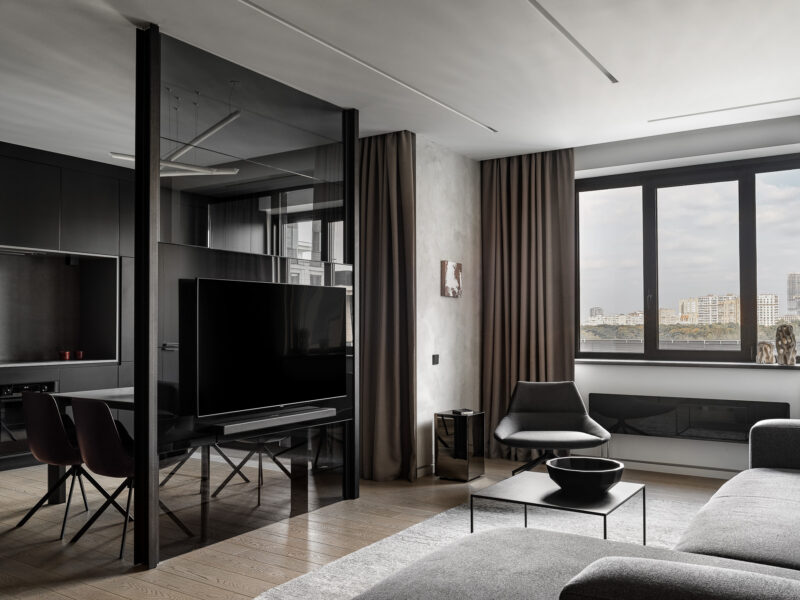
Design Decision: The living-room partition is more than a divider. Its central panel is black stemalite (enameled tempered glass) that carries the television and soundbar — one element working simultaneously as zoning device, media wall, and graphic anchor, eliminating the need for a TV cabinet entirely.
Inside the Apartment: A Room-by-Room Walkthrough
A Living Room Framed by Tinted Glass and Park Views
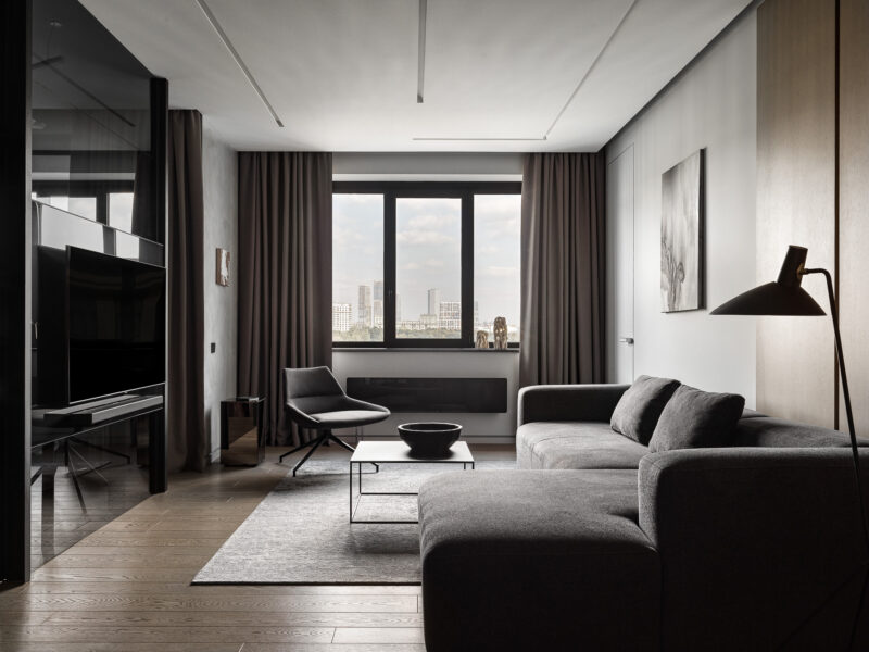
The living zone faces windows with a panoramic view of the park against the urban skyline, and the interior answers that brightness with warm light and dark neutral shades. The dark gray Blok sofa from La Forma anchors the room against white walls and veneered panels, while concealed plaster ceiling lights run in a line with the vertical divisions of the cabinetry — artificial light literally following the architecture. In the window corner, a reading zone pairs a Dunas XL armchair from Inclass with a gold-finished mirrored coffee table from BoConcept, each accompanied by paintings from artist Elina Maximova.
 Pin
Photo: Sergey Krasyuk
The wide view shows how the fenestration (the placement and sizing of windows) does the room’s decorating: gray upholstery, a slim black-framed coffee table, and small sculptures on the sill leave the city panorama as the dominant image. The sectional’s low, deep volumes invite lounging without blocking the glazing line. Curtains in a warm taupe soften the gray-on-gray restraint.
 Pin
Photo: Sergey Krasyuk
Seen from the sofa, the tinted-glass partition reads as a dark, reflective plane holding the television on its stemalite core. The dining zone remains visible through the glass, so the room borrows depth from its neighbor. This is the project’s spatial thesis in one frame: separation without opacity.
 Pin
Photo: Sergey Krasyuk
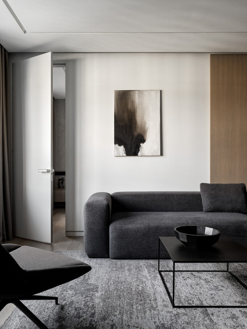
Against the white wall hangs Elina Maximova’s painting “A Hint of Clarity” from Backbone Gallery, its ink-dark bloom concentrating the apartment’s entire palette into one canvas. The Blok sofa’s charcoal upholstery and the black steel coffee table pick up the pigment; the oak panel at right supplies the warm counterweight.
 Pin
Photo: Sergey Krasyuk
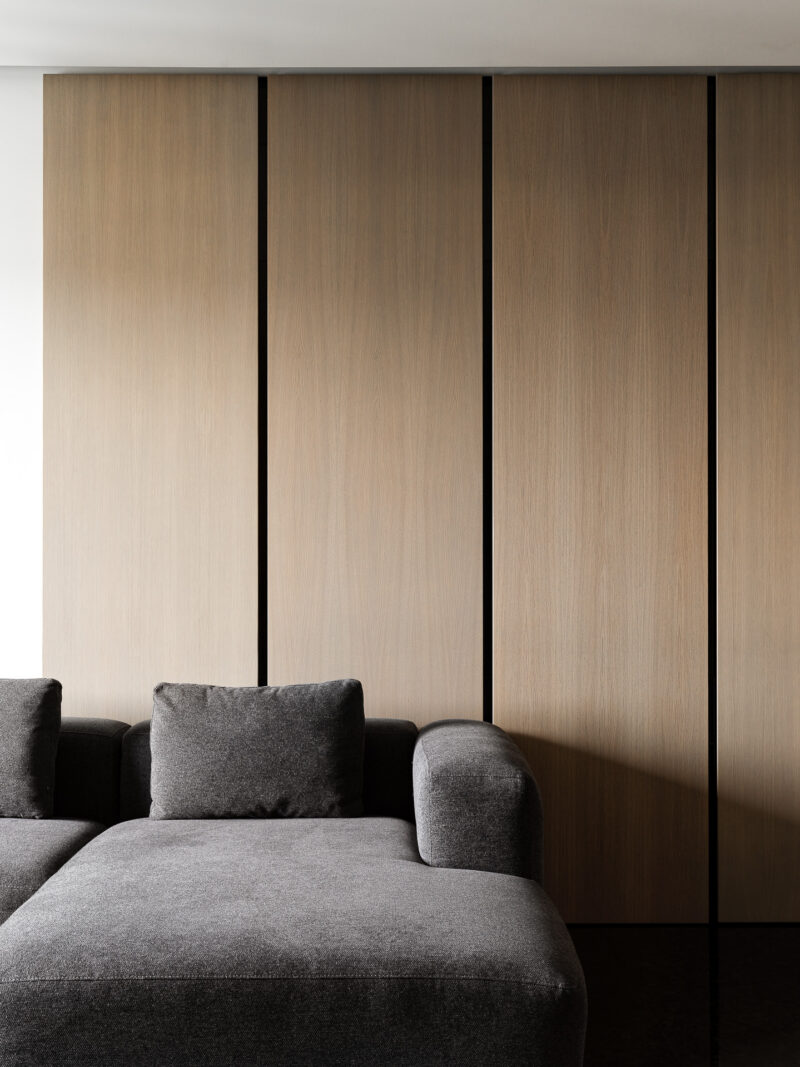
The detail view of the wardrobe wall shows the vertical black inserts slotted between white oak veneer panels. The recesses double as shadow gaps and pulls, keeping the storage wall entirely free of hardware. It is quiet joinery doing structural-looking work — the graphic device that recurs in the bedroom.
 Pin
Photo: Sergey Krasyuk
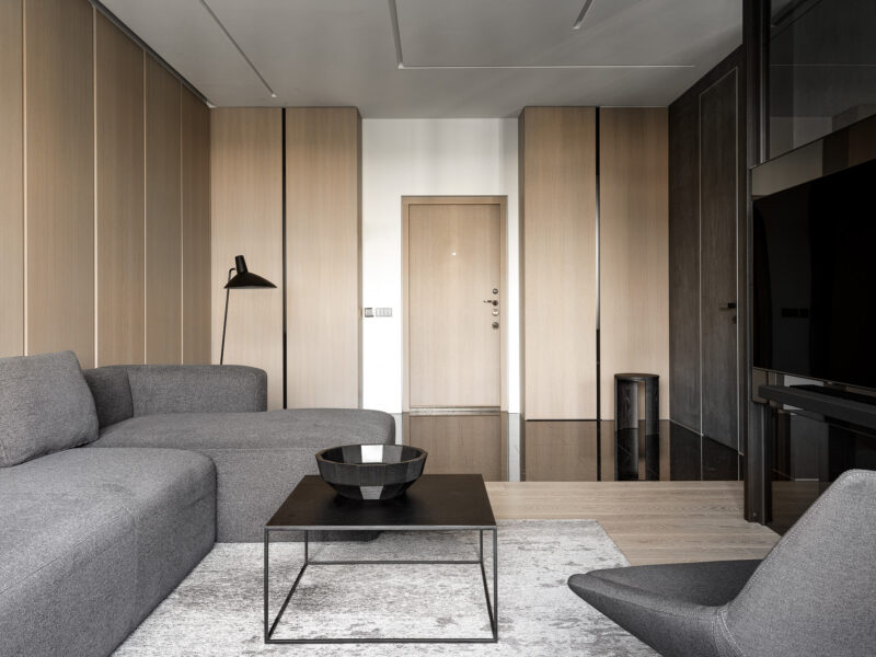
Toward the entry, the black glossy stone floor of the corridor meets the pale engineered wood of the living zone in a crisp datum line. The &Tradition Tripod HM8 floor lamp stands in silhouette against the light facades, and a black stool marks the threshold. Material change, not a door, announces that you have arrived.
Dining at the Glass Threshold
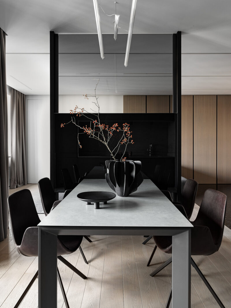
The dining zone sits directly against the tinted-glass partition, sharing light with the living area while belonging to the kitchen’s territory. The Atta table from La Forma — ceramic top, angled steel legs — seats six on Yasmin leather chairs whose splayed bases mirror the diagonal composition of the Centrsvet Aurora chandelier overhead. Styling stays sparse: a Home Art vase and a 101 Copenhagen dish from L’Appartement, nothing more.
 Pin
Photo: Sergey Krasyuk
The axial view down the table shows the partition’s black metal profiles framing the dining zone like a proscenium. Dark leather chairs and the sculptural black vase hold the center, while the oak wardrobe wall and curtained window supply symmetrical warmth on either flank. The gray ceramic tabletop reads as a continuation of the apartment’s stone surfaces.
 Pin
Photo: Sergey Krasyuk
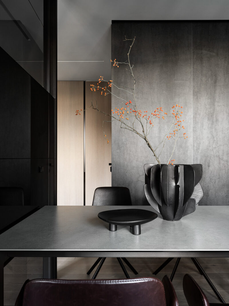
The still-life detail — a faceted black ceramic vase with orange-red berry branches and a footed black dish — is the styling work of Yes We May, and it earns its place. The berries are nearly the only saturated color in the entire apartment, calibrated against the gray plaster wall behind.
A Kitchen Recessed into Its Own Niche
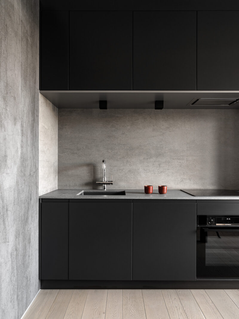
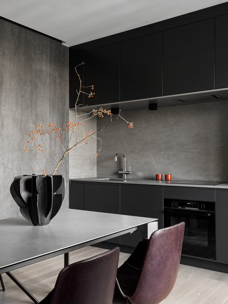
The kitchen occupies the slot between two volumes — the balcony and the guest restroom — and its dark painted facades treat cooking as a monolithic block rather than a display. The working wall is carved out as a light gray niche: quartz countertop from Caesarstone below, large-format ceramic granite backsplash behind, square Qbik fixtures washing the work surface. The facade plane then continues into the balcony wardrobe, one unbroken line that absorbs the kitchen into the architecture.
 Pin
Photo: Sergey Krasyuk
The elevation view shows the niche strategy clearly: matte black uppers and lowers bracket a recessed gray working zone, with the black Bosch oven disappearing into the base run. Two red cups on the counter are the only interruption. The composition treats appliances and storage as a single cast object.
 Pin
Photo: Sergey Krasyuk
From the dining table, the kitchen reads as a dark backdrop rather than a workspace — handleless facades, a slim chrome mixer, and the gray stone niche. The pale wood floor bounces daylight into the block’s shadow. This is the hotel-apartment logic the designers cite: the kitchen present, but never on stage.
A Bedroom That Works Like a Hotel Suite
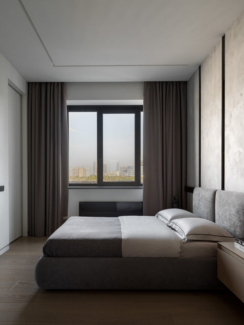
The bedroom compresses three functions — sleeping, working, dressing — into one carefully sectioned volume. The custom bed wears upholstery that mimics decorative plaster, dressed in Ateliertatic bedding with a dark border, and stands against a gray headboard wall striped with black glossy glass — the same vertical device as the living-room wardrobe, deliberately connecting the two spaces. Wall-hung veneer bedside tables, built from a custom sketch, carry a Ferm Living sculpture from GK Concept; the horizontal bedside lamps echo the glass radiator under the window.
 Pin
Photo: Sergey Krasyuk
The bed view shows the room’s tonal discipline: gray velvet-like upholstery, layered white and gray bedding, taupe curtains, and the textured plaster wall panels divided by dark seams. The window frames the Moscow skyline at sill height. Nothing competes with the horizontal calm of the composition — this is a room engineered for sleep.
 Pin
Photo: Sergey Krasyuk
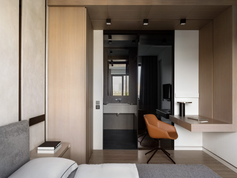
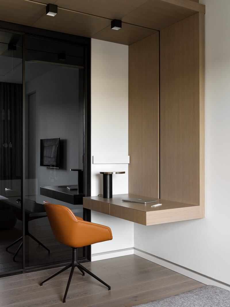
Looking toward the en suite, the sliding tinted-glass partition stands open between the sleeping area and the bathroom’s dark volume, exactly the hotel-apartment section the architects intended. The oak wardrobe wall, white lacquer reveal, and cognac desk chair compress into one layered elevation. Daylight from the bedroom window reaches deep into the bathroom through the glass.
 Pin
Photo: Sergey Krasyuk
The workspace detail shows a console table with drawers cantilevered from the oak wall system, its volume rising to merge with the ceiling finish. A BoConcept Vienna swivel chair in cognac leather supplies the apartment’s warmest accent, and the wall sconce by Yana Tikhonenko of Plush Design sits flush with the panels. Storage, desk, and ceiling read as one piece of joinery.
The Guest Restroom as a Dark Monolith
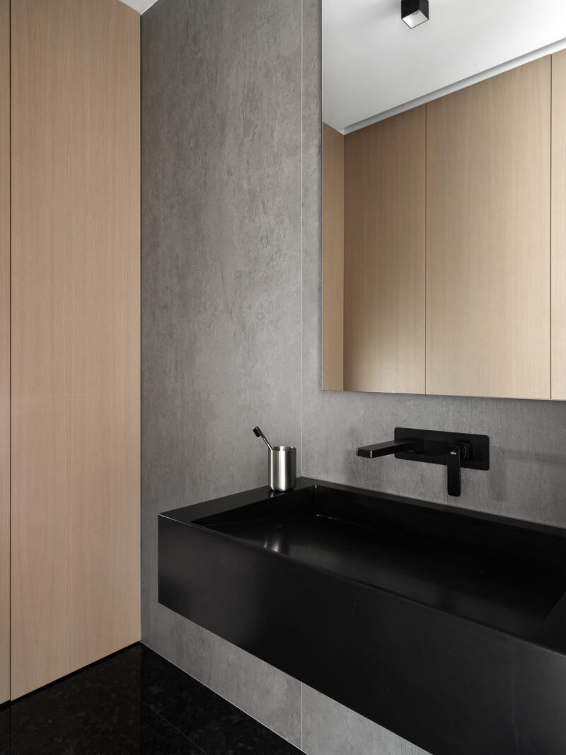
The guest restroom is clad in dark large-format ceramic granite from Laminam finished to resemble wet concrete, and its tall entry door disappears into the volume — the granite is mounted directly into the door leaf, with a Tupai handle carrying an inlaid granite insert. The black slate floor flows in from the living zone uninterrupted. Veneered panels on one side conceal a wardrobe niche and access to the laundry area.
 Pin
Photo: Sergey Krasyuk
The vanity wall pairs a wall-mounted black artificial-stone sink — concealed drain, color-matched faucet — with gray plaster-effect granite and warm oak cabinetry. Centrsvet Qbik fixtures in a dark finish light the mirror zone from above. The composition proves the apartment’s palette scales down: three materials, three tones, zero decoration.
A Master Bath Built Around One Continuous Volume
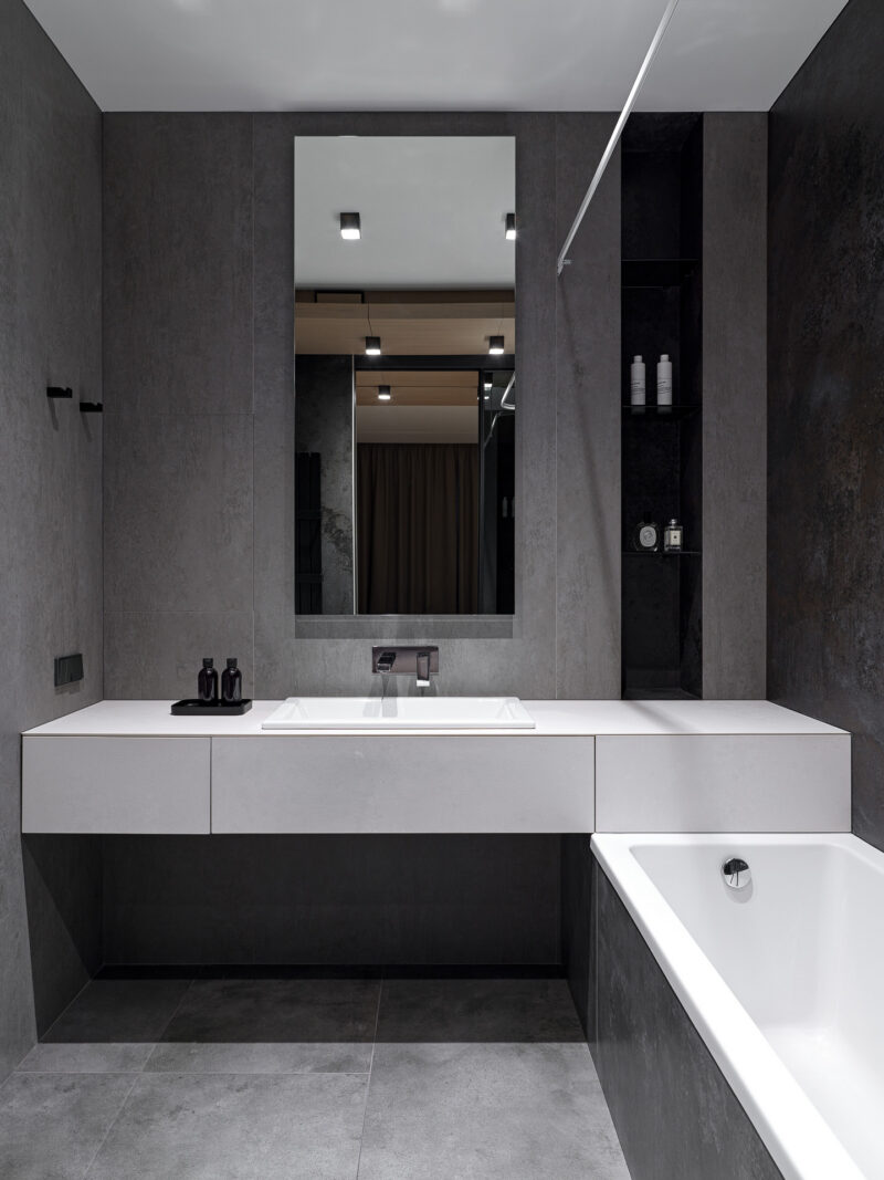
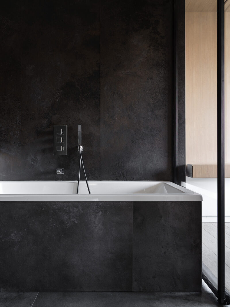
In the master bathroom the organizing move is a single cast gesture: the bathtub volume transitions directly into a console vanity with an integrated sink, custom-made from Caesarstone artificial stone with pull-out drawers below and a tall backlit mirror above. Walls wear large-format ceramic granite mimicking concrete; the shower zone switches to granite resembling textured metal, and a tropical rain shower is recessed flush into the ceiling.
 Pin
Photo: Sergey Krasyuk
The frontal view shows the white Caesarstone console running wall to wall before turning down into the tub apron — one continuous horizontal against dark gray granite. A black shelving niche recessed beside the mirror keeps bottles off the counter. The pale volume floats in the dark room like a lit object.
 Pin
Photo: Sergey Krasyuk
The tub detail captures the shower wall’s textured-metal granite, its mottled patina reading almost like blackened steel. Chrome controls and a handheld spray are the only reflective points. Through the glass partition at right, the bedroom’s oak cabinetry glows — the daylight loop between the two rooms working in reverse.
Reading the Plan: Where the Zoning Logic Lives
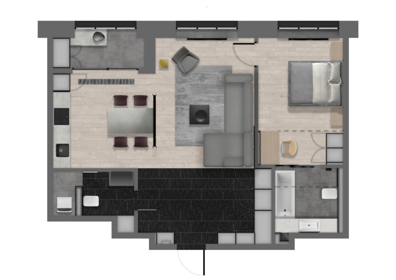
The floor plan makes the material zoning legible at a glance and shows how much program the 67.4 m² actually holds: open living-dining-kitchen band along the windows, bedroom suite with workspace, two bathrooms, and a laundry zone off the service corridor.
 Pin
The drawing exposes the parti in plan: the dark tiled service spine — entry, corridor, guest restroom — runs along the bottom edge, while the pale wood living band claims the glazing. The bedroom and its bathroom form a self-contained suite at right, connected by the sliding partition drawn as a dashed line. Every wet zone clusters against the corridor, keeping services short and the living perimeter free.
Where Discipline Pays Off — and Where It Demands Upkeep
Zoning That Earns Its Square Meters
The floor-material boundary between black slate and engineered wood gives the plan legibility that usually requires walls, at zero cost to daylight. The vertical black-insert motif, repeated on the living-room wardrobe and the bedroom headboard wall, unifies rooms that never see each other — a genuinely architectural use of interior finish. And the bedroom-bathroom pairing behind sliding tinted glass delivers the project’s clearest functional win: natural light reaches an internal bathroom that would otherwise live under artificial light alone.
The Price of Glass and Gloss
The same surfaces that produce the effect will demand attention. Black glossy slate and stemalite show dust, water spots, and fingerprints faster than any matte alternative, and the tinted partitions add regular glass-cleaning to the maintenance routine. The transparent bedroom-bath connection presumes occupants comfortable with visual openness — guests or couples on different schedules may want the partition’s privacy limits tested before committing. Finally, the recessed kitchen niche depends heavily on its integrated lighting; on dim days, dark facades absorb rather than reflect what little daylight arrives.
A Compact Argument for Hotel-Style Living at Home
Crystal.archi’s project demonstrates that functional minimalism is a zoning strategy, not a styling exercise. By letting floors, glass, and a repeated graphic motif do the work of walls, Akhmetov and Ushakov extract a full suite of rooms from 67.4 square meters without ever making the plan feel subdivided. It is best suited to a single professional or a couple who value order, tonal calm, and the ritual comfort of a well-run hotel — and who are willing to maintain the surfaces that produce it. Would you sleep with only tinted glass between you and your bathtub, or is that transparency exactly what makes a compact apartment feel generous?
FAQs
Who designed the Comfortable Apartment in Moscow?
The apartment was designed by Crystal.archi, the Moscow practice of architects Timur Akhmyatov and Dmitry Ushakov. It is located in the Iskra-Park residential complex near Dinamo metro station, with interior styling by Yes We May and photography by Sergey Krasyuk.
How big is the Crystal.archi apartment in Iskra-Park?
The apartment measures 67.4 square meters (about 725 square feet). Within that footprint it holds an open living-dining-kitchen zone, a bedroom with an integrated workspace, a master bathroom connected to the bedroom by sliding glass, a guest restroom, and a laundry area.
What materials define this minimalist Moscow apartment?
The palette combines light white oak veneer on walls and furniture, black glossy slate and matching engineered wood flooring, decorative plaster resembling concrete, large-format ceramic granite from Laminam, and Caesarstone quartz and artificial stone. The contrast between light and dark finishes delineates the functional zones.
What furniture brands were used in the apartment?
Key pieces come from La Forma (Blok sofa, Atta table, Yasmin chairs), &Tradition (Tripod HM8 floor lamp), Inclass (Dunas XL armchair), BoConcept (Vienna chair, mirrored coffee table), Ferm Living via GK Concept, plus lighting by Centrsvet and a sconce by Plush Design.
How is the living room separated from the kitchen?
A custom partition of tinted knee glass, fixed by two black powder-coated metal profiles, divides the living area from the dining and kitchen zone. Its central panel is black stemalite — enameled tempered glass — onto which the television and soundbar are mounted, so the divider doubles as the media wall.
Get gorgeous projects via email
