

Rental interiors are usually designed by subtraction — beige finishes, survivable furniture, nothing a future tenant could object to. Ivan Kochev of studio ARCHJOINT took the opposite bet. SOFT G, a minimalist Moscow apartment of 72 m² in the ÀLIA Residential Complex, completed in 2025, treats a rental unit as a full design commission: warm greys held to a strict monochrome, oak used sparingly for warmth, and light deployed as an architectural material. The result argues that a rental can compete on design rather than price — and that neutrality, handled with discipline, reads as quiet luxury rather than absence.
| Project Name | SOFT G |
| Architect / Designer | Ivan Kochev, ARCHJOINT |
| Location | ÀLIA Residential Complex, Moscow, Russia |
| Floor Area | 72 m² (approx. 775 sq ft) |
| Year Completed | 2025 |
| Client Type | Private (rental investment) |
| Photography | Daniel Annenkov |
The Well-Set Stage: Turning a Rental Brief Into a Design Discipline
The brief carried a constraint most residential projects never face: the occupant is unknown. ARCHJOINT’s answer was to treat the interior as a well-set stage — a ready-to-live backdrop specific enough to command a higher price segment, yet open enough for any tenant to write their own story onto it. That framing became the project’s parti (the governing organizing idea): maximum spatial clarity, minimum fixed personality.
The redevelopment reworked the plan into a spacious kitchen-living area, a private master bedroom, a second bedroom, a bathroom, a dedicated laundry room, and an entrance hall — an unusually complete program for 72 m². Because an apartment has no facade to compose, the material expression moves indoors: full-height panels in warm grey act as the project’s elevation, while a monochrome palette — the client’s favorite color — forms a backdrop the studio describes as elegant, easy on the eyes, and quietly secure. Oak surfaces interrupt the grey exactly where a hand or a gaze needs to rest, giving the space tactile warmth without breaking its restraint. Every volume is then traced by shadow gaps and continuous linear lighting, so the architecture itself — not applied decoration — carries the identity of the home. The payoff is practical: a legible plan, durable investment appeal, and rooms that photograph as calmly as they live.
Design Decision: Instead of skirting boards, trims, or visible hardware, ARCHJOINT articulated nearly every junction with shadow gaps — recessed negative joints between planes. The choice demands millimeter precision on site, but it lets walls, cabinetry, and doors read as continuous monolithic panels, so the rooms feel carved rather than furnished.
Inside the 72 m² Plan: A Room-by-Room Walkthrough
A Corridor Calibrated to Frame the Kitchen
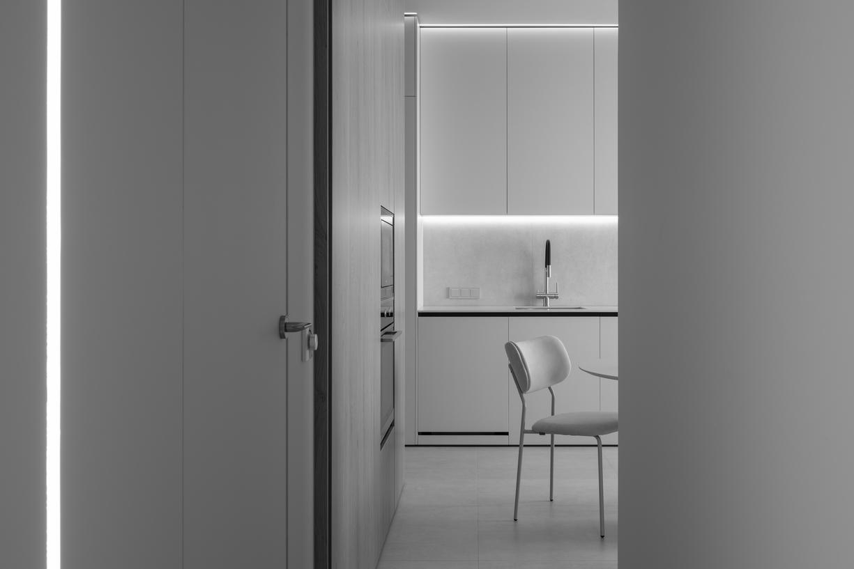
The entrance sequence is short but deliberate. Storage is absorbed into flush wall panels, and the circulation spine (the main path of movement through the plan) runs straight toward the brightest zone of the apartment, so arrival ends in light rather than in a dead wall. A vertical strip of linear LED marks the threshold like a drawn line, announcing the lighting language that repeats in every room.
 Pin
Photo: Daniel Annenkov
Seen from the hallway, the kitchen composes itself like a framed photograph: the door leaf, the oak-clad appliance column, and the backlit splashback stack into receding planes of grey. The vertical light line at far left balances the horizontal glow under the wall cabinets. It is a small lesson in enfilade thinking — aligning openings so each room borrows depth from the next — executed here at apartment scale.
The Living Room: Grey on Grey, Kept Awake by Texture
The kitchen-living area is the apartment’s public face, and it is where the monochrome gamble either works or collapses. It works because no two greys share a finish: chenille upholstery, matte panel fronts, powder-coated steel, and stone-look porcelain each catch light differently, so the room reads as layered rather than flat. Furniture is kept low and modular, holding the eye line clear across the space.
 Pin
Photo: Daniel Annenkov
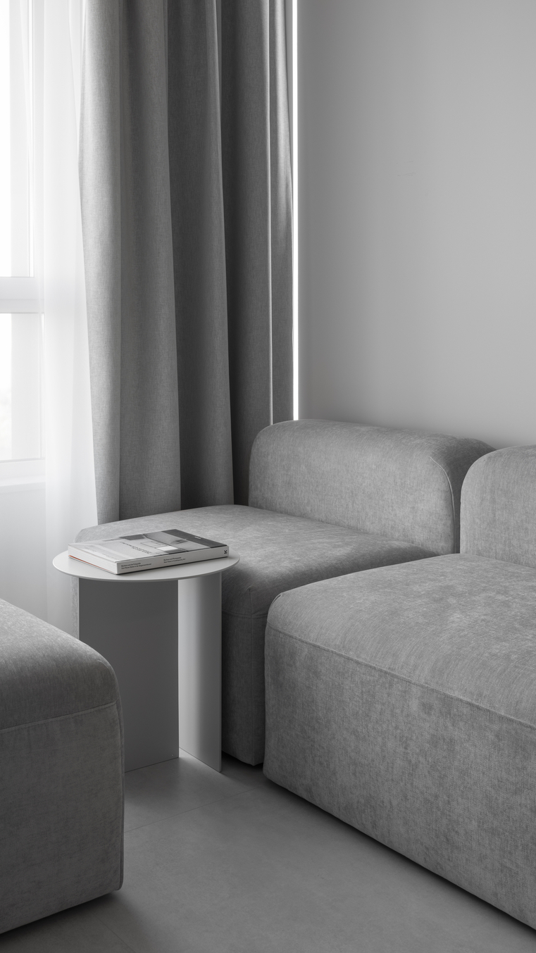
A modular sofa in soft grey chenille sits against sheer and blackout curtains in nearly the same tone, with a slim white steel side table by OMINIMALISM as the only hard edge. The vertical LED reveal beside the window doubles as an artificial daylight seam after dark. The rounded sofa arms matter more than they appear to: in a room of strict planes, they are the one concession to the body.
 Pin
Photo: Daniel Annenkov
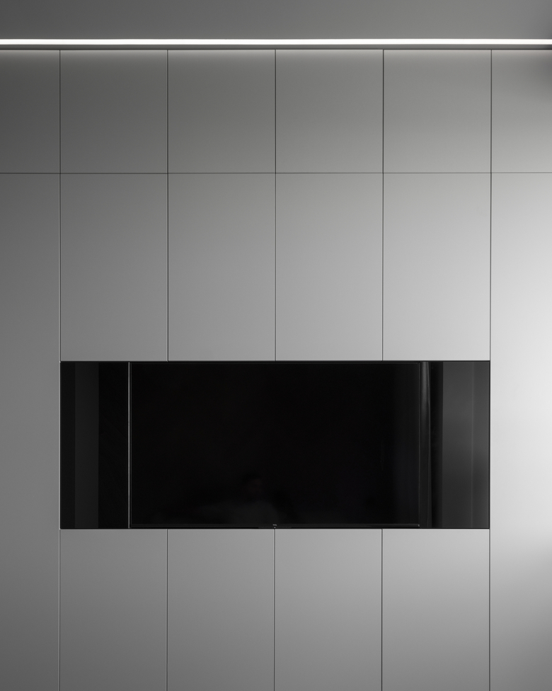
The media wall is a grid of matte grey panels with a black recessed niche holding the television — the screen disappears into a shadow box instead of hanging as an object. Panel joints align precisely with the niche edges, and a single linear luminaire washes the wall from above. It is the clearest statement of the project’s thesis: technology, storage, and structure absorbed into one quiet surface.
 Pin
Photo: Daniel Annenkov
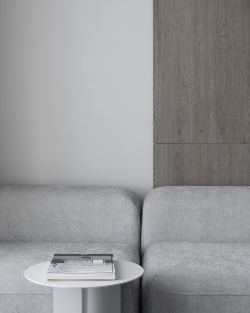
Where two sofa modules meet, an oak-toned wardrobe volume rises behind them, its horizontal shadow gap continuing the datum line set by the seat backs. The pale steel side table carries a stack of design monographs — staging, yes, but staging that shows how the interior expects to be lived in. The wood grain supplies the warmth the grey palette deliberately withholds.
One Oak Wall Carries the Kitchen and Dining Zone
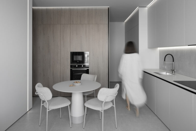
Rather than distributing wood accents evenly, ARCHJOINT concentrated them into a single full-height oak wall that conceals the ovens and tall storage. The working run opposite stays white-grey and handleless, lit by a continuous strip beneath the upper cabinets. Between the two, a round pedestal table keeps circulation fluid — no corners to negotiate in the plan’s busiest zone.
 Pin
Photo: Daniel Annenkov
The oak wall reads as cabinetry-as-architecture: black-framed appliances sit within it like punched openings in an elevation. SK Design chairs with rounded upholstered backs echo the table’s soft geometry, softening the room’s orthogonal logic. Note the black shadow gap under the countertop run at right — a dark negative line that makes the white worktop appear to float free of its base units.
Chevron Oak Gives the Master Bedroom Its Only Pattern
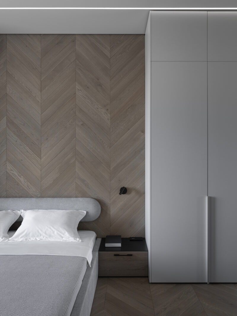
The master bedroom is the one room where the project permits pattern: a chevron-laid oak wall (planks cut and set in a V-shaped point pattern) that rises behind the bed and continues onto the floor, wrapping the sleeping zone in a single warm material. Everything else stands down — grey wardrobes with shadow-gap reveals, an upholstered bed frame, a black wall-mounted reading spot instead of table lamps.
 Pin
Photo: Daniel Annenkov
The chevron wall does double duty as headboard and artwork, its diagonal grain animating a room that owns no other ornament. A compact oak nightstand with a black stone-look top bridges the bed and wardrobe volumes. The wardrobe’s slim vertical pull — a full-height bar rather than a knob — keeps the tall grey elevation unbroken, consistent with the apartment’s no-visible-hardware rule.
The Second Bedroom Works a Double Shift
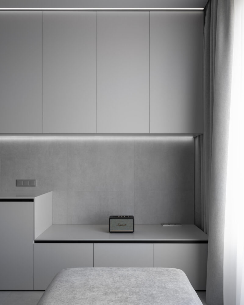
The second bedroom is planned as the flexible cell every rental needs: part guest room, part workspace. A continuous worktop counter runs beneath wall cabinets along the window, backed by the same grey stone-look tile as the kitchen, so the room can absorb a desk setup, a media corner, or storage overflow without renovation.
 Pin
Photo: Daniel Annenkov
Upper cabinets hover over a backlit tile niche, the LED strip washing the counter in even, shadow-free task light. A Marshall speaker — practically the only black object in the room — becomes a focal point by default, which says everything about the palette’s restraint. The counter steps up at the left to meet a taller storage volume, resolving the height change with a clean white plinth rather than a filler panel.
A Mirror Wall Doubles the Bathroom’s Apparent Depth
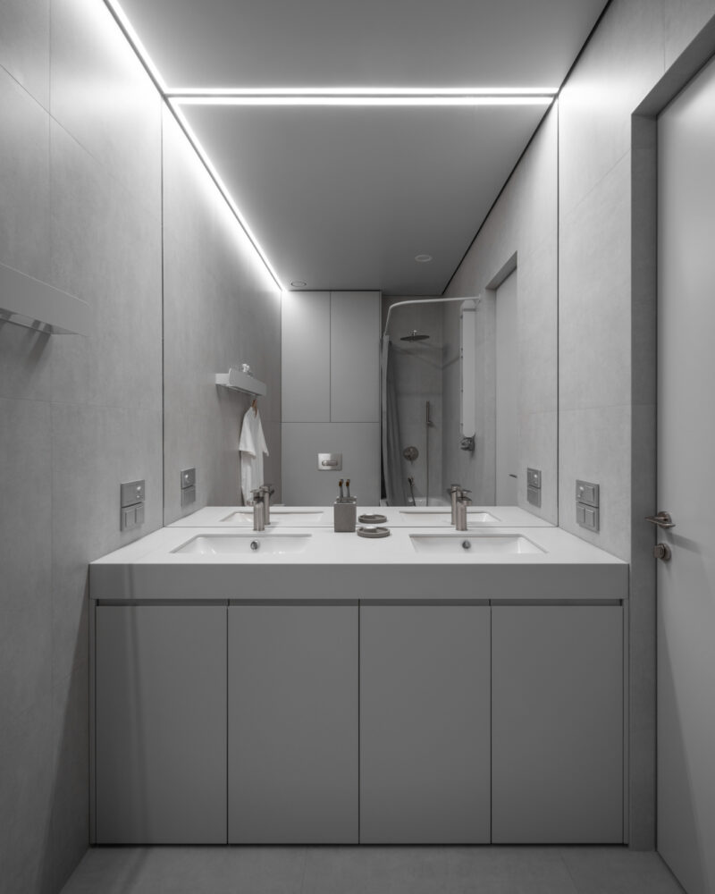
The bathroom compresses a double vanity, bathtub-shower, and concealed cistern into a narrow plan — then dissolves the compression with a full-width mirror wall that visually doubles the room. Grey porcelain in a large format keeps grout lines scarce, and the ceiling perimeter is traced by the same linear lighting that runs through the rest of the home.
 Pin
Photo: Daniel Annenkov
Twin undermount basins sit in a monolithic white counter over handleless grey fronts, with Grocenberg brushed-steel fittings kept deliberately low-sheen. The mirror wall reflects the shower zone and the recessed ceiling light lines, so the room appears twice its actual width. Concrete accessories on the countertop repeat the material story in miniature — grey, tactile, unpolished.
 Pin
Photo: Daniel Annenkov
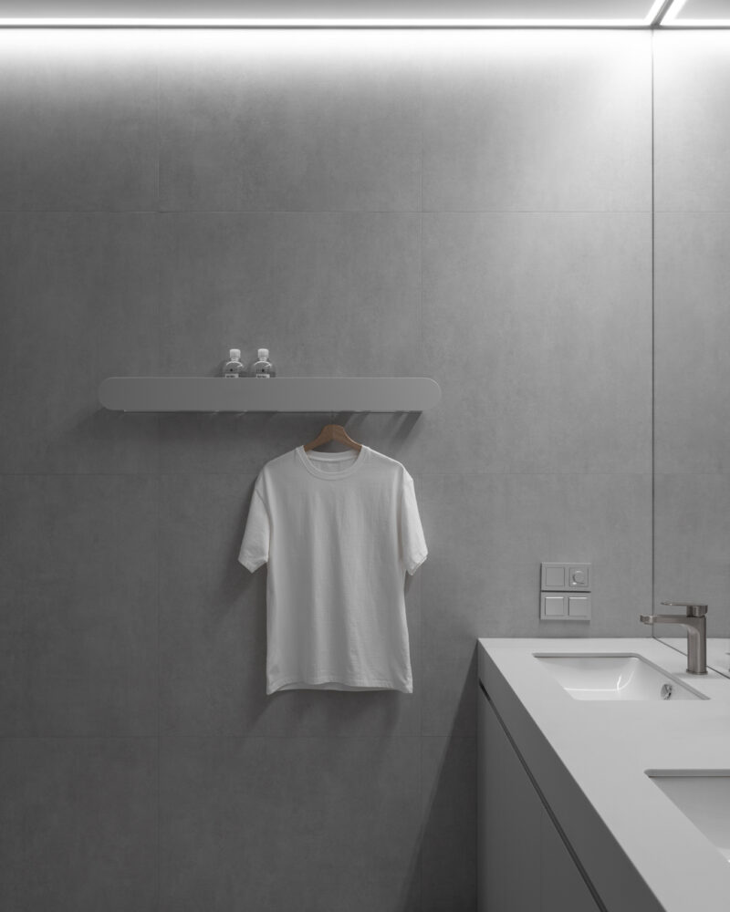
A wall-mounted SWOG rail shelf holds toiletries above a hanging tee — a styling gesture, but also a demonstration of the fitting’s dual function as shelf and hanger in a room with no space to spare. The cementitious grey tile takes the ceiling wash of light with a soft, even grain. Switches and controls cluster in one chrome block beside the vanity, keeping the remaining wall surface entirely quiet.
Where the Discipline Pays Off — and Where Tenants Will Test It
Light as the Only Ornament
Three strengths stand out. First, the lighting concept genuinely replaces decoration: continuous LED lines trace ceilings, niches, and counters, so every room has depth and hierarchy after dark without a single decorative fixture. Second, the redevelopment extracts a six-room program — including a laundry room — from 72 m² while keeping the kitchen-living zone generous, a spatial efficiency most rentals of this size never reach. Third, the interior-design layer is calibrated for turnover: rounded, modular furniture and a neutral envelope mean the apartment can be re-staged for a new tenant without touching a wall.
 Pin
Photo: Daniel Annenkov
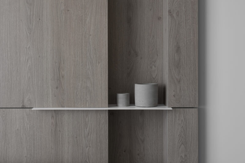
A 4 mm powder-coated steel shelf slips into the shadow gap between oak panels, appearing to pass through the cabinetry like a blade. Concrete vessels on top keep the still life in-palette. The detail rewards a second look: the joint that elsewhere separates panels here becomes the support for a functional element — the shadow gap earning its keep.
The Price of Monolithic Surfaces
The same rigor generates real-world friction. Handleless matte fronts and floor-to-ceiling panels show fingerprints and scuffs readily, and a rental population will not treat them as gently as a proud owner would — touch-up on a shadow-gap system is a joinery job, not a paint job. The meters of concealed LED are an ongoing maintenance line item; a failed strip inside a ceiling reveal is harder to swap than a lamp. And the committed grey monochrome, while broadly appealing, will polarize: tenants who need color or visual softness may read the calm as coldness, narrowing the pool even as the design lifts the price.
 Pin
Photo: Daniel Annenkov
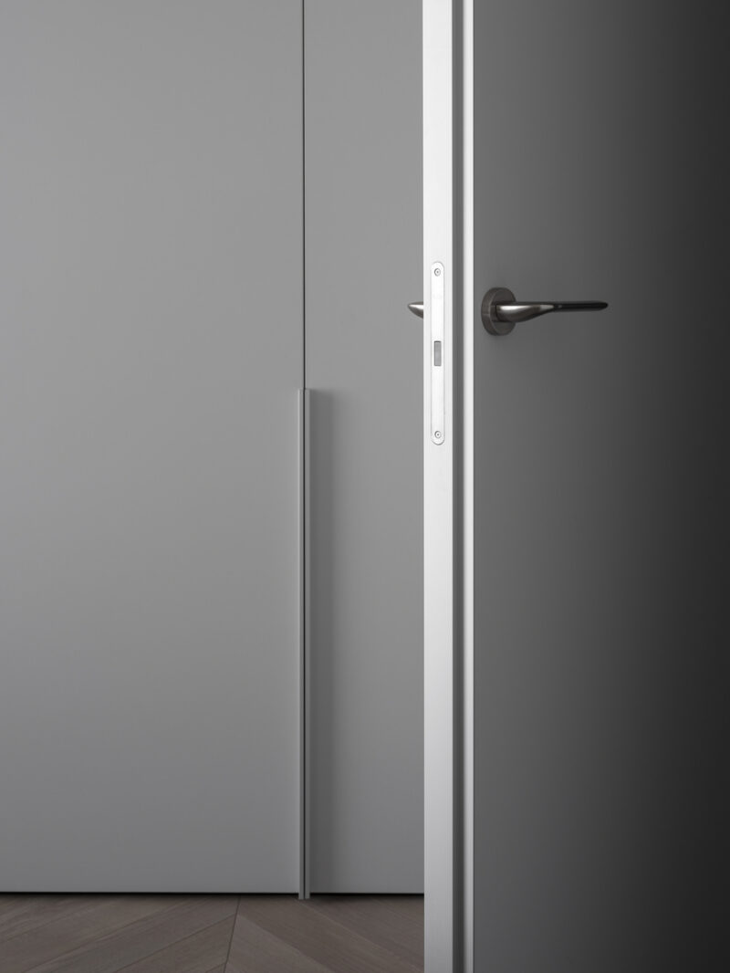
The junction between wardrobe, jamb, and door shows where the money went: a full-height aluminum pull, a magnetic mortise latch, and a frameless leaf finished in a deeper grey than the wall. Every element aligns to the millimeter — which is exactly why any future repair or replacement must meet the same tolerance to avoid announcing itself.
What This Minimalist Moscow Apartment Teaches About Rental Design
SOFT G’s contribution is a proof: investment property and serious design are not opposing categories. Architecturally, it shows that shadow gaps and linear light can give a small plan monumentality without consuming a centimeter of area. As interior design, it demonstrates that neutrality is a discipline of texture and tone, not an absence of choices. The design suits a tenant who wants a finished, hotel-calm home — and a landlord competing on quality rather than square meters. Would you rent a home this rigorously edited, or does a space need room for a little imperfection before it can feel like yours?
FAQs
Who designed the SOFT G apartment in Moscow?
SOFT G was designed by Ivan Kochev of ARCHJOINT, a Moscow-based architecture and interior design studio working in a minimalist idiom. The studio also carried out the construction and finishing work itself. The project was completed in 2025 inside the ÀLIA Residential Complex, with photography by Daniel Annenkov.
How big is the apartment and what rooms does it include?
The apartment measures 72 m², roughly 775 square feet. After a full redevelopment of the plan, it contains a combined kitchen-living area, a private master bedroom, a second bedroom, a bathroom, a separate laundry room, and an entrance hall — an unusually complete program for the footprint.
Why is the whole interior designed in grey?
Warm grey is the client’s favorite color, and the designers found it an ideal rental backdrop: elegant, easy on the eyes, and calming rather than tiring. To keep the monochrome from feeling cold, oak accents add tactile warmth, while shadow gaps and linear lighting give the palette depth and structure.
What furniture and fixture brands were used in the project?
The furnishing list is largely Russian: dining chairs by SK Design, a dining table by TOK Mebel, a coffee table by OMINIMALISM, sanitary ware by Grocenberg, bathroom rail shelves by SWOG, and case furniture by mebburo. All linear and technical lighting throughout the apartment is by Arlight.
Get gorgeous projects via email
