

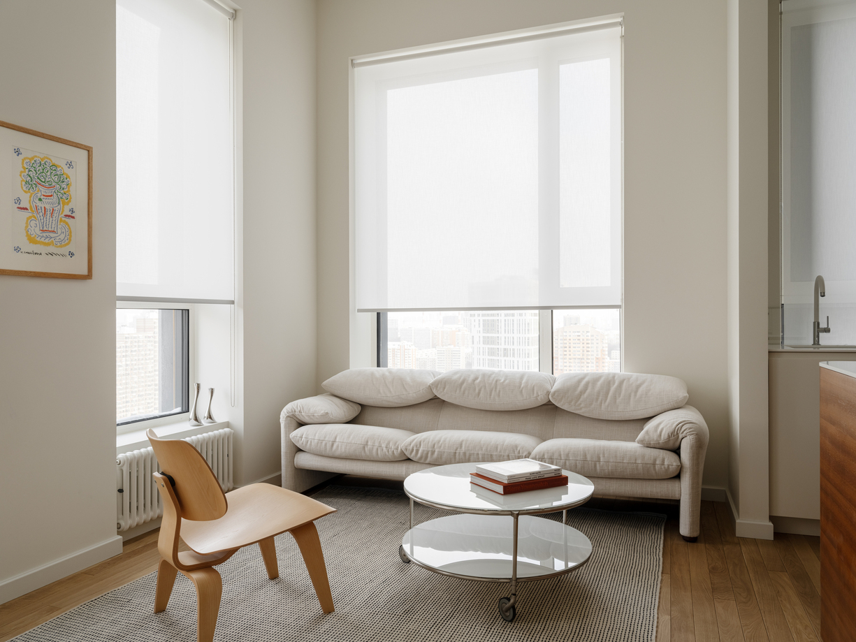
Compact apartments usually force a choice between storage and air. In the Trilogy Crystal residential complex, designer Irina Mishuris declined to make it. Her 55 m² Moscow apartment (about 592 square feet), completed in 2025 for a young professional woman, folds a full domestic program — an island kitchen, a bedroom suite, a walk-through closet, and two bathrooms — into a plan organized by floor-to-ceiling cabinetry and a glazed interior partition. The result reads as a single calm volume of warm white, oak, and mahogany, yet nearly every wall is working. It is small-space design argued with unusual discipline, and it rewards a close reading.
| Project Name | Urban Sanctuary for a Young Woman |
| Architect / Designer | Irina Mishuris |
| Location | Trilogy Crystal Residential Complex, Moscow, Russia |
| Floor Area | 55 sq.m (approx. 592 sq. ft.) |
| Year Completed | 2025 |
| Client Type | Private — young professional woman |
How One Glazed Partition Reorganizes a 55 m² Moscow Apartment
The constraint here is not an awkward plot but a standard developer shell: one occupant, a modest footprint, and daylight arriving from a single window wall high above Moscow. Mishuris’ parti (the central organizing idea of a plan) treats storage as structure. Full-height white cabinetry lines the kitchen and hallway, absorbing appliances, wardrobe overflow, and a concealed bar, so the rooms need very little freestanding furniture and the massing of daily life disappears into the walls.
The second move solves the light problem. A white-framed glazed partition with sliding panels separates the kitchen from the entry hall, working like an interior verrière: it closes off sound and cooking smells while letting daylight from the window wall pass deep into the plan’s windowless core. Pocket and sliding doors replace swing doors throughout, so circulation space is never sacrificed to door arcs.
With no facade to author, material expression migrates to the joinery. Oak door casings stand proud of the white walls like portal frames, marking every threshold; the kitchen island wears a curved mahogany-toned veneer that reads as furniture rather than millwork; continuous oak flooring binds the sequence together. The interior communicates its logic the way a good elevation would — frames announce openings, flush white mass reads as service, and glass reads as shared light.
 Pin
PinPhoto: Mikhail Loskutov
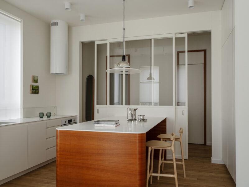
This wide view captures the apartment’s spatial argument in a single frame. The glazed partition behind the island slides open to link kitchen and hall, its slender white muntins echoing the window mullions so the interior glazing feels native rather than applied. The cylindrical extractor hood floats free of the wall, keeping the perimeter run of cabinetry unbroken, while the mahogany island anchors the composition like a piece of case-goods furniture. Note how the oak-framed doorway visible through the glass repeats the threshold language established across the plan.
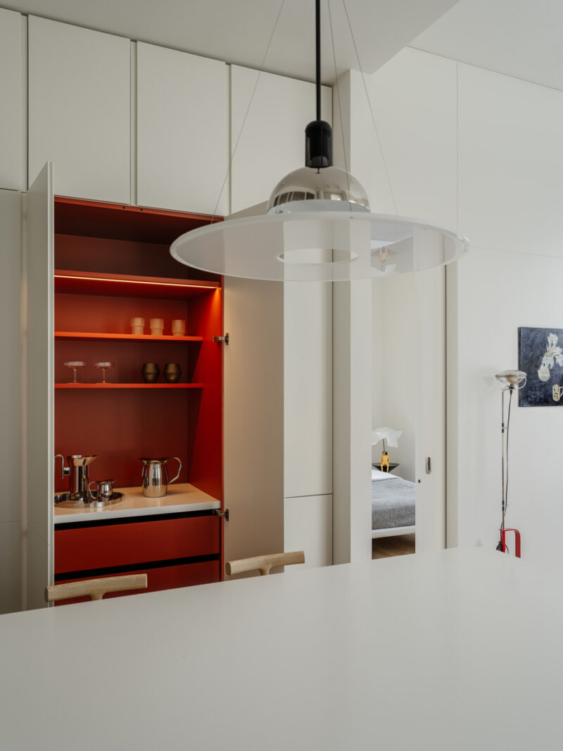
Design Decision: Color is stored rather than displayed. The scheme's strongest pigment — a saturated brick red — appears only inside the bar cabinet and behind the bathroom door, so the daytime envelope stays near-white while every act of opening a door becomes a small reveal. In 55 square meters, that restraint keeps the eye unburdened.
Room-by-Room: How the Plan Actually Lives
The Entry Hall: A Threshold That Works Like a Dressing Room
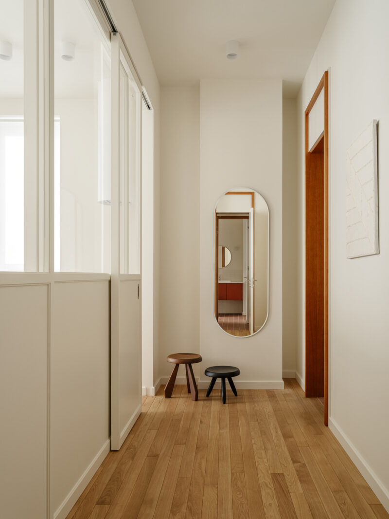
The entry sequence is short but deliberate. A pill-shaped mirror hangs on the pier facing the door, flanked by the oak-cased opening to the bathroom corridor, so the last-look ritual is built into the architecture rather than improvised. Two low sculptural stools — one walnut-toned, one black — offer a perch for changing shoes and double as objects. The sliding glazed partition on the left borrows kitchen daylight for a space that would otherwise depend entirely on the ceiling-mounted cylinder downlights.
 Pin
PinPhoto: Mikhail Loskutov
The hallway demonstrates the project’s thin-but-generous circulation logic. Oak flooring runs uninterrupted toward the bathroom, whose red-toned vanity flashes in the mirror’s reflection — a controlled preview of the color hidden deeper in the plan. The two tripod stools introduce the only dark wood tones in the sequence, calibrated against the white textured canvas on the right wall. Every element here is either reflective, glazed, or low, which keeps the compressed width from reading as a corridor at all.
Living Room: Collector’s Modernism on a Short Sightline
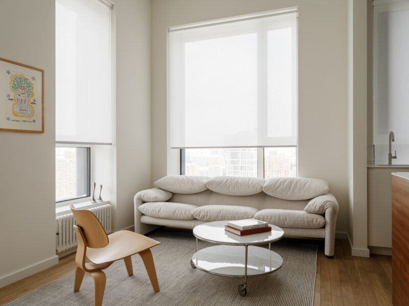
The living zone occupies the window wall, and its furnishing strategy is curatorial: a low, pillow-backed three-seat sofa in oatmeal linen, a molded plywood lounge chair, and a chrome-framed glass trolley table on casters. Nothing rises above sill height, so the paired windows deliver an uninterrupted band of sky. Sheer roller shades filter the high-rise glare into an even, diffuse wash, while slim column radiators are left exposed below the sills as honest period-flavored hardware. A flatweave rug with a stitched border quietly defines the seating territory on the open oak floor.
 Pin
PinPhoto: Mikhail Loskutov
The composition balances softness against precision: the sofa’s loose, draped cushions play off the hard chrome and glass of the rolling table, while the bentwood chair mediates between them in warm ash. Framed naive-style artwork adds a single note of primary color without competing with the view. The photograph also reveals how shallow the living zone actually is — barely one rug deep — yet the low furniture datum and the tall window proportion make the compression feel intentional rather than forced.
 Pin
PinPhoto: Mikhail Loskutov
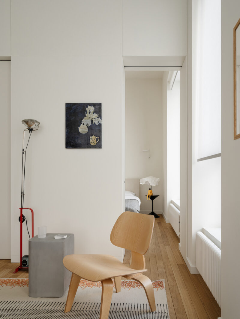
This corner shows the plan’s longest interior sightline, running from the living area through the pocket-door opening into the bedroom. A chrome floor lamp with an exposed red cable rest stands as industrial punctuation beside a cast-concrete side table — two eras of design shorthand sharing one square meter. The dark still-life painting is the apartment’s tonal exception, giving the white wall a focal depth. Keeping the bedroom door pocketed open extends perceived space in both directions, a free gain in a 55 m² plan.
Kitchen: A Mahogany Island Against a Disappearing Wall
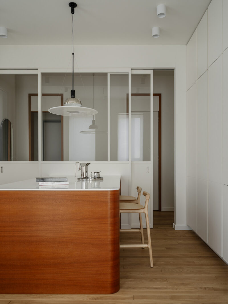
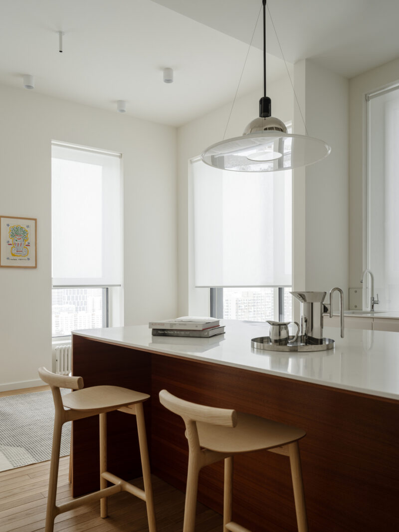
The kitchen is the apartment’s engine room and its most architectural space. One wall is a flush bank of warm-white, handle-free storage that conceals the refrigerator, pantry, and a bar; the working run below the window holds an undermount sink, induction hob, and oven under a thin white quartz counter. The island — curved mahogany-toned veneer under the same white top — carries the social program: two ash counter stools, a chrome coffee service, and a stack of design monographs. A disc pendant with a chrome dome hangs from a discreet black cable, giving the room a jewelry-scale centerpiece.
 Pin
PinPhoto: Mikhail Loskutov
The island’s radiused corner is the project’s most tactile gesture — veneer bent around a curve that invites the hand and softens the room’s orthogonal grid. Its wood grain runs horizontally, emphasizing the island’s furniture-like reading against the vertical rhythm of the glazed partition behind. The ash stools, with their sculpted T-shaped backrests, repeat the pale wood of the floor a tone lighter. This is interior design doing structural work: one warm mass holding an all-white room in balance.
 Pin
PinPhoto: Mikhail Loskutov
Seen from the living side, the island reads as a room divider with a servery top. The chrome coffee pot and creamer on their tray are styled, but they also make a functional point: the counter’s overhang turns two stools into a breakfast table, sparing the plan a separate dining zone. Beyond, the sheer shades pull soft daylight across the quartz — an even, shadowless work light that flatters both food prep and the photograph.
 Pin
PinPhoto: Mikhail Loskutov
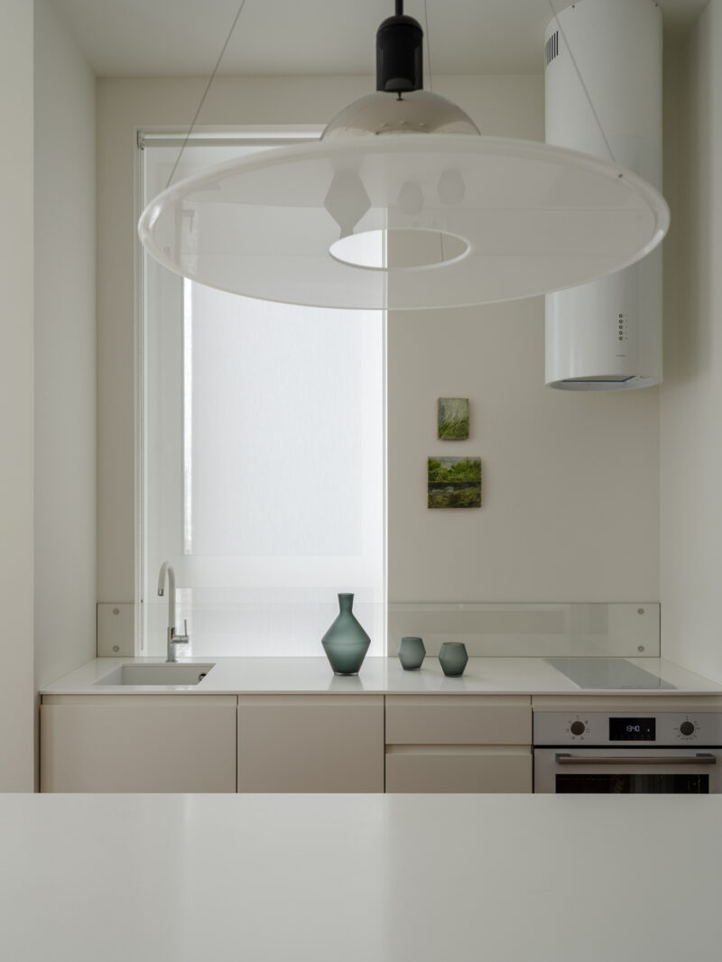
The working elevation is deliberately mute: taupe-white fronts, a glass splash panel fixed with visible dot fittings, and a white cylindrical extractor mounted clear of the wall. Two small landscape canvases in mossy greens are the only ornament, scaled like specimens rather than statements. The fenestration strategy (the placement and sizing of windows) puts the sink directly beside the glass, so daily chores get the best light in the room while the hob sits deeper, away from glare.
 Pin
PinPhoto: Mikhail Loskutov
Open one flush white door and the apartment’s secret appears: a bar lined entirely in brick red, with an LED strip washing shelves of coupes and smoked glass. The interior color is not decorative excess — it signals a change of register, marking the cabinet as hospitality rather than storage. A pull-out white counter holds the polished coffee set, extending the kitchen’s worktop logic into the millwork. It is the Design Decision made physical: color as an event, rationed behind doors.
 Pin
PinPhoto: Mikhail Loskutov
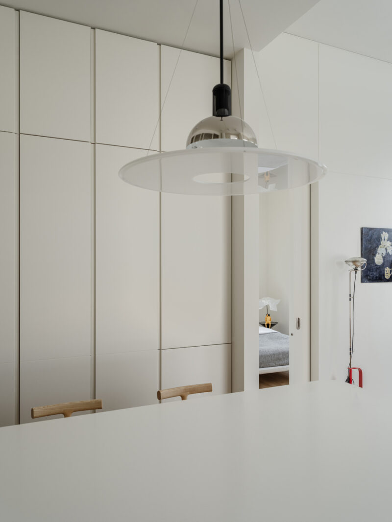
With the cabinetry closed, the same elevation goes silent, and the pendant becomes the protagonist: a chromed dome hovering over a translucent disc, suspended on fine wires. The open pocket door frames the bedroom beyond like a lit vitrine, its gray blanket and paper lamp visible from the kitchen stools. This borrowed-view discipline is what lets a small apartment feel layered — each room lends the next its depth.
Bedroom: A Sleep Box Buffered by a Walk-Through Closet
The bedroom is reduced to essentials — an upholstered low bed, a black pedestal side table, paired wall-mounted reading lights — and gains its luxury from what surrounds it. A walk-through closet lined with open white shelving, drawers, and hanging rails forms an acoustic and visual buffer between the sleeping area and the bathroom, so the morning routine happens along one straight path. The palette narrows to white, ecru, and a gray wool bed blanket; a single line-drawn canvas and a crumpled-paper lamp supply personality without clutter.
 Pin
PinPhoto: Mikhail Loskutov
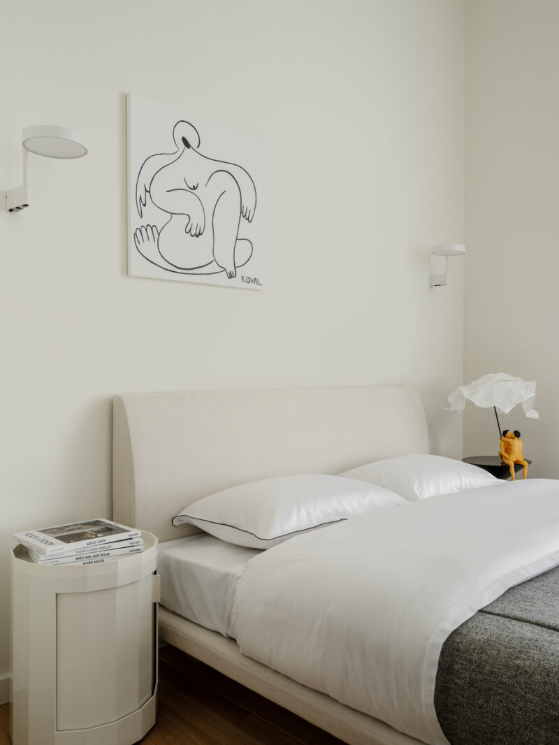
The bed detail shows how tightly the tonal range is controlled: ecru headboard, white sateen bedding with a thin black piped edge, and swing-arm sconces in matte white that vanish against the wall. The line-drawn figure canvas leans figurative warmth into an otherwise abstract room, while the amber resin figurine on the side table provides the space’s one saturated note. Books stacked on the drum nightstand — Aalto, Mies, Loos — read as both styling and a designer’s bibliography.
 Pin
PinPhoto: Mikhail Loskutov
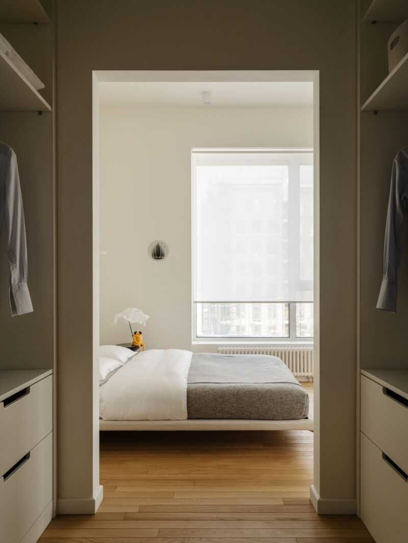
Shot from inside the closet, this frame explains the suite’s spatial gradient: dim, dense storage compresses the view before it releases into the bright sleeping volume. Open rails and cubbies keep the wardrobe shallow enough to walk through comfortably, accepting visible clothing in exchange for zero door swings. The window beyond, softened by a sheer roller shade, shows the high-rise context the apartment otherwise edits out — a reminder of exactly what this calm interior is defending against.
Bathrooms: Terracotta Underfoot, Red at the Vanity
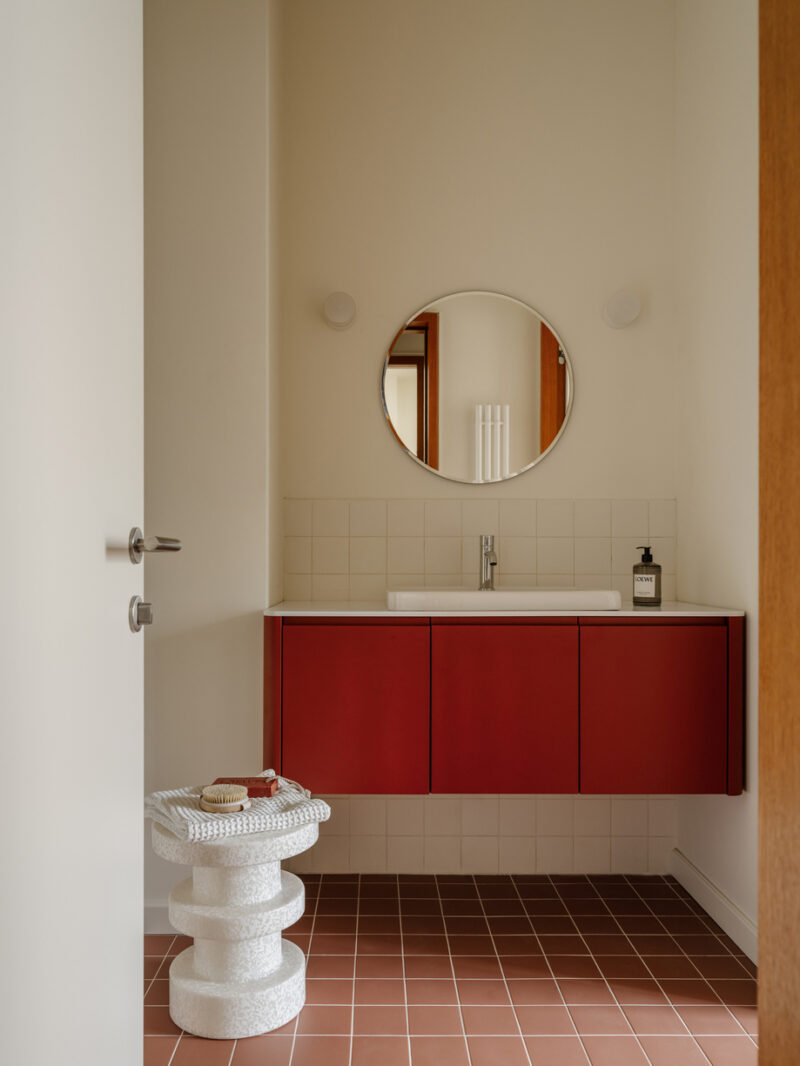
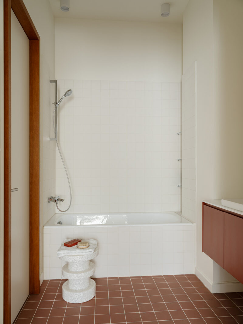
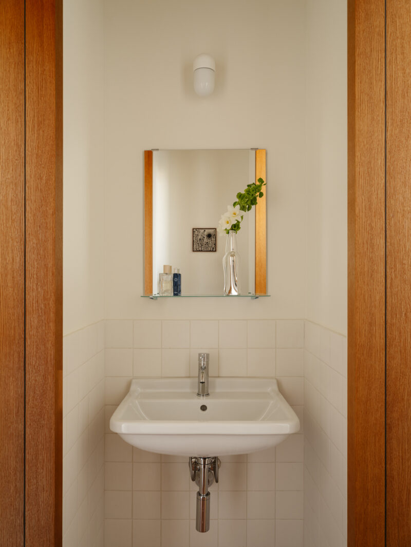
The main bathroom is where the concealed palette finally goes public. A wall-hung vanity in matte brick red floats over a terracotta-toned floor grid, under a frameless round mirror lit by twin globe sconces; square white wall tile keeps the upper register cool. The bathing wall pairs a tiled-in tub with a chrome slide-bar hand shower and slim glass shelves recessed beside it. A separate guest washroom repeats the grammar at smaller scale — wall-hung basin, oak-edged mirror shelf, capsule sconce — so visitors never cross the private suite.
 Pin
PinPhoto: Mikhail Loskutov
The vanity elevation is the apartment’s boldest composition, and it works because every dimension is disciplined: three equal door fronts, a thin white counter, a mirror sized to the cabinet below. The terracotta floor grid grounds the red rather than competing with it, its white grout lines echoing the wall tile above. Cast-stone stool aside, there is no freestanding furniture — the room’s character is carried entirely by surface and fixture, the wet-room equivalent of the kitchen’s storage wall.
 Pin
PinPhoto: Mikhail Loskutov
The bathing zone stays deliberately quiet so the vanity can speak. White square tile wraps the tub apron and rises past head height, with recessed glass shelving replacing a bulky niche or caddy. The chrome slide-bar set and wall-mounted mixer keep maintenance simple and sight lines clean. Warmth arrives only at the floor, where the terracotta grid continues — a material handshake between the bathroom’s cool upper half and the apartment’s wood-toned base plane.
 Pin
PinPhoto: Mikhail Loskutov
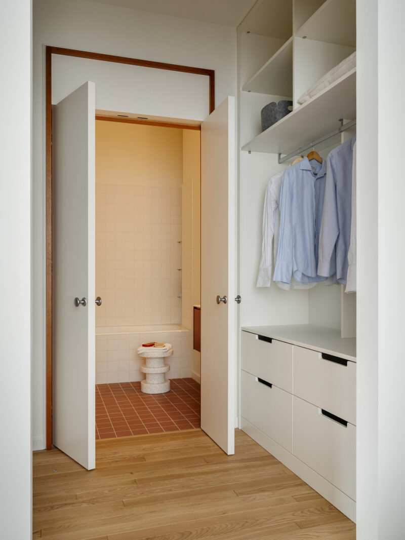
This transition shot shows the suite’s enfilade (a sequence of rooms aligned on one axis): closet drawers on the right, twin white doors opening onto the glowing bathroom straight ahead. The oak transom frame over the doorway carries the threshold language into the most utilitarian corner of the plan. Warm light bouncing off the cream tile turns the bathroom into a lantern at the end of the storage corridor — an effect that costs nothing but alignment.
 Pin
PinPhoto: Mikhail Loskutov
The guest washroom compresses the project’s vocabulary into two square meters: white square tile to wainscot height, a wall-hung ceramic basin with exposed chrome trap, and a mirror framed by two vertical oak battens that echo the apartment’s door casings. A single glass shelf holds fragrance bottles; a capsule sconce supplies even face light. Nothing here is novel, and that is the point — consistency of detail is what makes a small apartment read as designed rather than decorated.
Where the Discipline Pays Off — and Where It Asks for Patience
Light That Travels the Whole Plan
The glazed kitchen partition is the project’s quiet triumph: daylight from the single window wall reaches the entry hall and the plan’s core, so no primary space depends on artificial light by day. Storage-as-architecture pays off just as concretely — with appliances, bar, and wardrobe absorbed into flush walls, each room needs only three or four freestanding pieces, and those pieces can afford to be sculptural. The material grammar holds across every threshold: oak casings, oak floor, mahogany island, terracotta bath, each warm accent calibrated against the same near-white field.
The Cost of Keeping Everything Behind Doors
Handle-free white fronts and white quartz counters are unforgiving surfaces; edge scuffs and fingerprints will demand routine care that a busier household might resent. The concealed-storage strategy also assumes an editing owner — it works for one disciplined occupant, but a second resident or an accumulating decade would strain it. Finally, the main bathroom bathes by tub and hand shower only, and the sheer-only window treatment trades blackout capacity for daylight — reasonable choices for this client, real friction for others.
A Case for Designing Small Around One Life
What this project contributes is not a new form but a demonstration of sequence: storage first, light paths second, objects last. By solving the architecture — partitions, thresholds, concealed volume — before choosing a single chair, Mishuris lets 55 square meters carry design-classic furnishing without congestion. It is a blueprint for the solo urban professional who values calm over display and is willing to maintain it. Would you accept a home where every possession lives behind a flush white door — or does a room only feel like yours when its objects are on view?
FAQs
How big is the Urban Sanctuary apartment by Irina Mishuris?
The apartment measures 55 square meters, roughly 592 square feet. It is located in the Trilogy Crystal Residential Complex in Moscow, Russia, was completed in 2025, and was designed for a private client — a young professional woman living alone.
What makes this 55 m² Moscow apartment feel larger than it is?
Three strategies do the work: a glazed sliding partition that lets window light reach the interior core, full-height concealed storage that eliminates freestanding cabinets, and pocket doors that free up floor area normally lost to door swings. Long diagonal sightlines between rooms extend perceived depth.
What is the color palette of the apartment?
The base palette is warm white and cream, grounded by oak flooring and door casings and a mahogany-toned kitchen island. Saturated color is deliberately concealed: brick red lines the hidden bar cabinet and the bathroom vanity, paired with terracotta floor tile in the wet zones.
Who photographed the Urban Sanctuary project?
The apartment was photographed by Mikhail Loskutov, with styling by the studio Yes We May. The interior design is by Irina Mishuris, who completed the project in 2025 for a residential client in Moscow’s Trilogy Crystal complex.
Get gorgeous projects via email
