

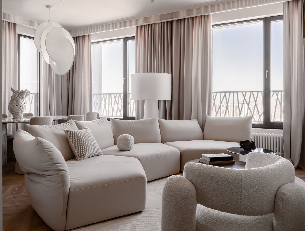
Calm is easy to promise and hard to build. In this 123-square-meter (1,324 sq ft) Moscow apartment in the SHOME residential complex, Gavalli design set out to make an interior that recedes — a soft, light, tactile background for the daily life of television host and blogger Maria Kravtsova, rather than a stage that competes with it. What makes the project worth studying is how literally the studio took that brief: roughly 80 percent of everything in the apartment, from built-in cabinetry to lighting scenarios and textiles, was produced from the designers’ own sketches. The result reads less like a furnished flat and more like a single authored object.
| Project Name | Apartment in the SHOME residential complex |
| Architect / Designer | Gavalli design |
| Location | Moscow, Russia |
| Floor Area | 123 m² (approx. 1,324 sq ft) |
| Client Type | Private — television host and blogger Maria Kravtsova |
Designing Calm as a System: Why 80% of This Moscow Apartment Was Drawn From Scratch
The working brief called for a fully authorial interior in which architecture and product design operate as one system. That framing matters. Instead of selecting furniture to fit finished rooms, Gavalli design treated the millwork, the lighting scenarios, the textiles, and the freestanding objects as extensions of the plan itself — a parti (the organizing idea behind a design) built on proportion, light, and material rather than on statement pieces.
The project’s central constraint was economic: hold the budget without surrendering the premium level of execution or visual quality. The studio’s answer was precision — exact work with the built structure, the material palette, and custom elements, so that money went into what the hand touches and the eye lingers on. Because most of the interior is bespoke, nothing had to be over-specified to compensate for an awkward off-the-shelf neighbor; each element could be sized, finished, and lit for its exact position.
With no exterior to speak through, the apartment’s structural expression happens at the wall. Painted paneling with slim applied moldings, a continuous fluted frieze at the ceiling line, chevron oak floors, and stone thresholds give the envelope a quiet classical order, while the inserted volumes — a wood-clad media wall, brass-faced kitchen cabinets — read as modern furniture placed inside that shell. Interior form and spatial logic stay legible from any point in the plan.
Design Decision: The fluted frieze running below the crown molding is not just ornament — in the main living space and bedroom it doubles as a continuous ventilation grille, absorbing HVAC diffusers into the classical detailing so no ceiling vent interrupts the room's calm upper edge.
Room by Room: How the Apartment Holds Its Composure
A Living Room Assembled Around Softness
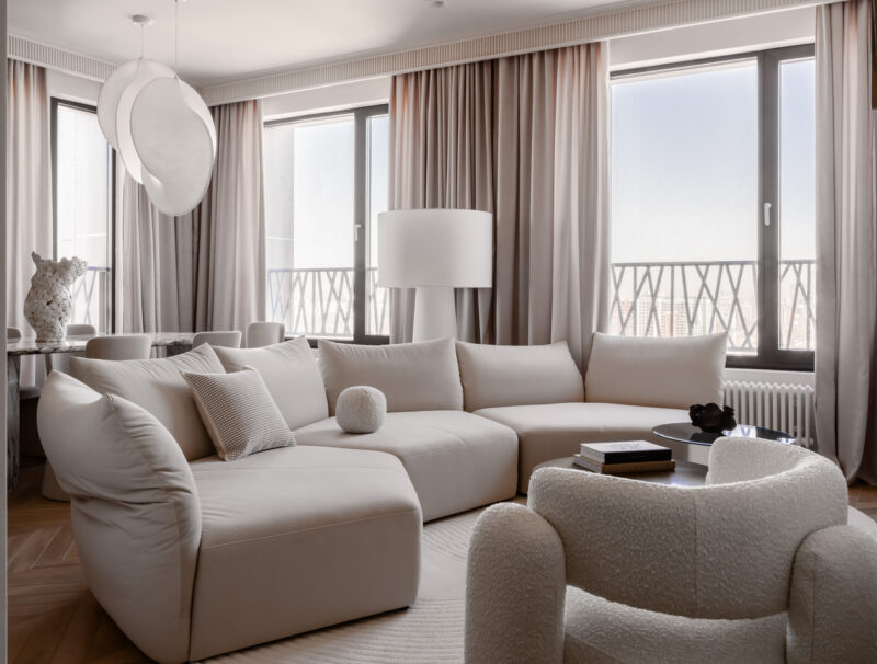
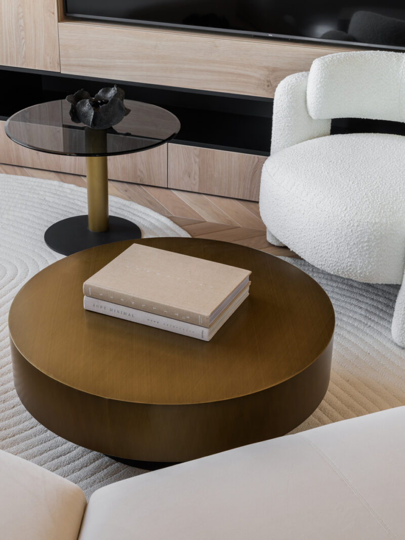
The main living space is organized as a low, rounded landscape: a curved modular sofa in warm off-white, boucle armchairs, and a pair of circular tables — one brass drum, one smoked glass on a slender stem — floating on a ribbed circular rug. Nothing here has a hard corner at seating height. Track-mounted brass cylinder spots handle ambient light from the ceiling, while an oversized drum floor lamp and paper pendants supply the softer evening register. The palette runs from cream to greige, letting texture, not color, do the differentiating work.
 Pin
PinThe wide view shows how the seating group is set diagonally against two window walls, keeping the glazing free and pulling daylight deep into the room. Layered curtains — sheer plus blackout in a warm gray — soften the black window frames and give the perimeter a fabric thickness that matches the upholstery. The composition demonstrates the project’s core method: many custom soft elements in near-identical tones, separated only by texture and silhouette.
 Pin
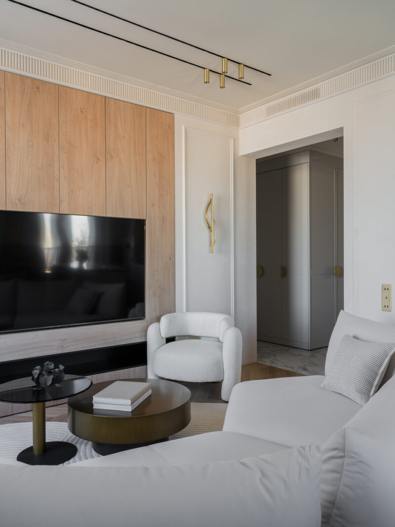
PinThe media wall treats storage as architecture. Light oak-toned panels run floor to frieze, with the television and a shadow-gap niche recessed flush so the wall reads as one cabinetmade surface. A sculptural brass sconce sits on the painted pier beside it, marking the transition from wood volume to paneled wall. This is the clearest example of the built-in program doing the compositional work usually left to freestanding furniture.
Marble at the Center: The Dining Room as Quiet Theater
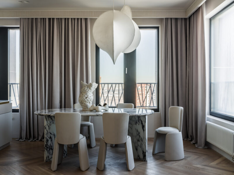
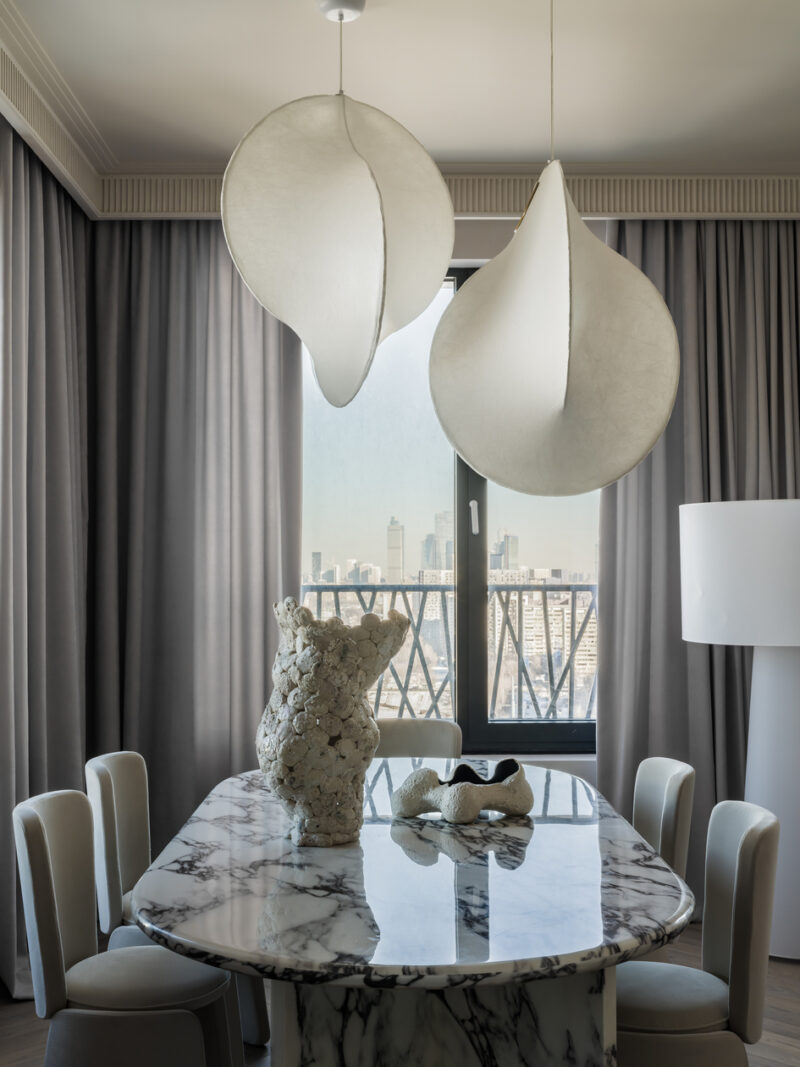
The dining zone occupies the glazed corner between kitchen and living room, anchored by an oval marble table with dramatic violet-gray veining and a set of low, rounded upholstered chairs. Overhead, two large sculptural cocoon pendants hang like paper lanterns, scaling the seating group up to the room height without adding visual weight. Full-height curtains wrap the corner, so the table sits inside a fabric-lined bay with the Moscow skyline behind it — theatrical in composition, muted in palette.
 Pin
PinSeen frontally, the dining group shows the project’s controlled contrast at work: the boldest material in the apartment — heavily veined marble on both top and legs — is surrounded by the softest forms, suede-like chairs with rounded backs and stubby legs. The chevron floor turns under the table without a rug, letting the stone meet the oak directly. Restraint everywhere else earns the table its intensity.
 Pin
PinFrom below, the paired pendants reveal their asymmetric petal geometry, catching light on their translucent shells against the window. Ceramic vessels with rough, coral-like surfaces sit on the polished stone, a deliberate collision of raw and honed textures. The fluted frieze runs uninterrupted above the curtain line, tying this corner back to the living room’s ceiling language.
 Pin
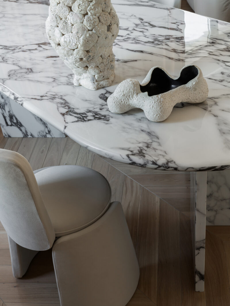
PinThe detail shot rewards a closer look at the tabletop: a softened, almost pebble-shaped edge profile eases the marble’s mass, and the sculptural ceramics — one built from bubbled discs, one a biomorphic vessel glazed black inside — function as tactile counterpoints. The pairing sums up the studio’s object strategy: few pieces, each chosen or made to be touched as much as seen.
A Kitchen in Brass, Stone, and Quiet Gray
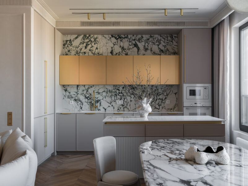
The kitchen compresses the apartment’s whole palette into one wall. A backsplash of green-veined stone runs the full width, brushed-brass upper cabinets hang across it like a metal band, and greige lower cabinets with fluted island fronts keep the base calm. Appliances are integrated or finished in matching steel, and the brass tap and slim pulls repeat the metal accent at hand scale. The island doubles as a serving counter toward the dining table, keeping the work zone shallow and the circulation open.
 Pin
PinThe elevation reads as three stacked horizontal strata — stone, brass, painted cabinetry — held inside the same paneled-and-fluted frame as the living spaces, so the kitchen never breaks the apartment’s architectural continuity. Track spots with brass cylinders align with the cabinet band, reinforcing the datum line. It is a compact, urban kitchen that borrows its glamour from material rather than size.
The Main Bedroom: A Soft Perimeter for Sleep and Ritual
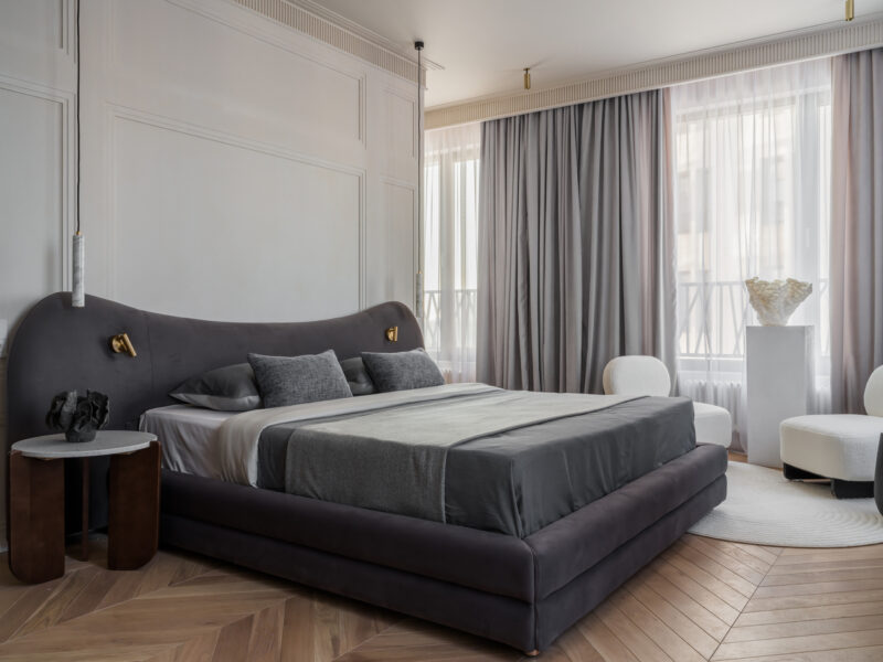
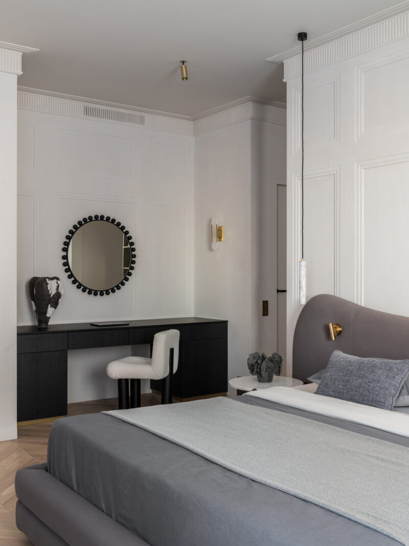
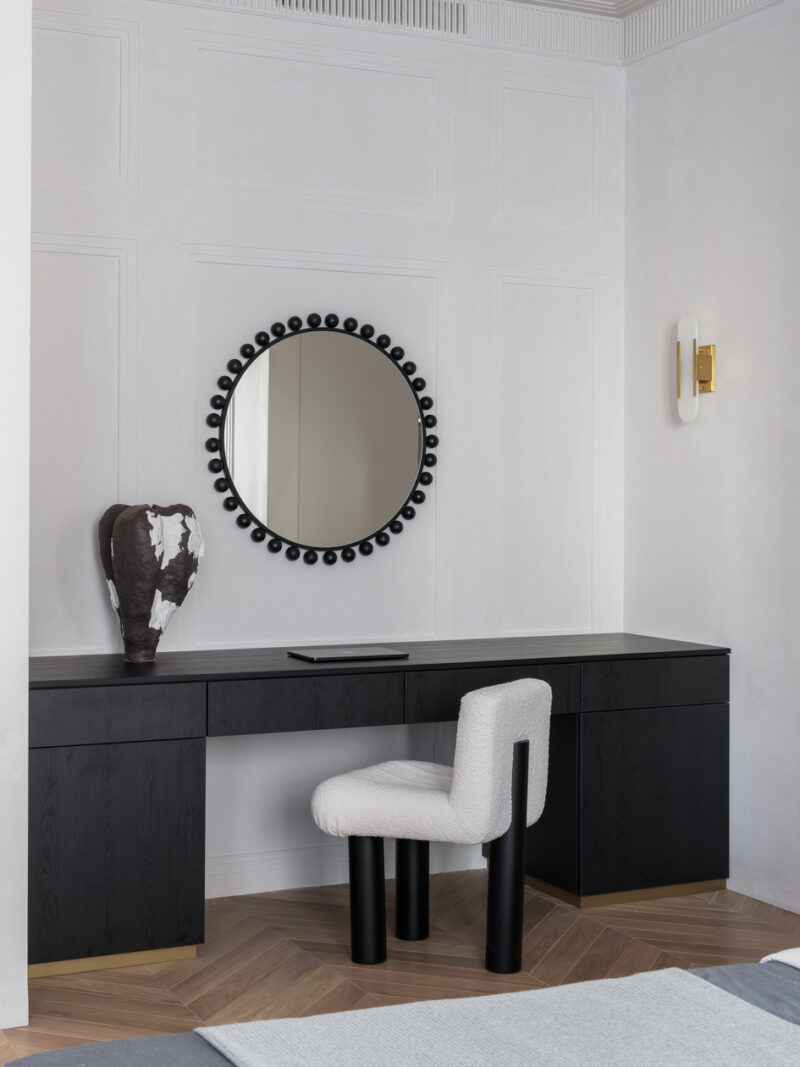
The main bedroom pairs classical wall paneling with resolutely contemporary custom pieces. A wide upholstered bed in deep graphite anchors the room, its sculpted, wing-like headboard carrying integrated brass reading spots and flanked by slender marble pendant lights on black cords. Across from it, a black-stained dressing console runs wall to wall beneath a bead-framed round mirror. Sheer and blackout curtains in a gradient from gray to blush wrap the window wall, and boucle slipper chairs by the glazing create a small daylight sitting corner.
 Pin
PinThe wide view establishes the room’s tonal architecture: white paneled walls, chevron oak floor, and a dark soft island of a bed at the center. The custom headboard curves like a low wall, thick enough to hold lighting and shallow shelving functions that would otherwise demand nightstands. Note how the pedestal by the window carries a single ceramic sculpture — the room’s only vertical accent besides the pendants.
 Pin
PinFrom the foot of the bed, the relationship between sleeping and grooming zones becomes clear: the black console and its boucle stool sit in a paneled niche, visually separated by a pier that conceals the walk-in closet door. Brass sconces on both walls keep the metal accent consistent. The composition shows how the plan gives a single room two distinct scenes without a partition.
 Pin
PinThe vanity vignette concentrates the apartment’s black-and-white argument: a matte black console with a brass plinth shadow line, a mirror ringed in black spheres, and a boucle chair on cylindrical black legs. Against the molded white wall the group reads almost graphically. It is custom furniture behaving like art, but the drawer bank and knee space confirm it was drawn for daily use first.
The Gray Room: A Second Bedroom Built Like a Study
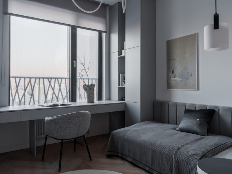
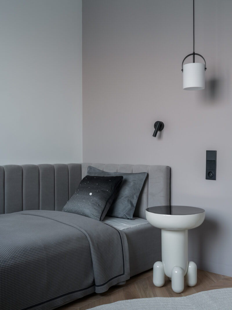
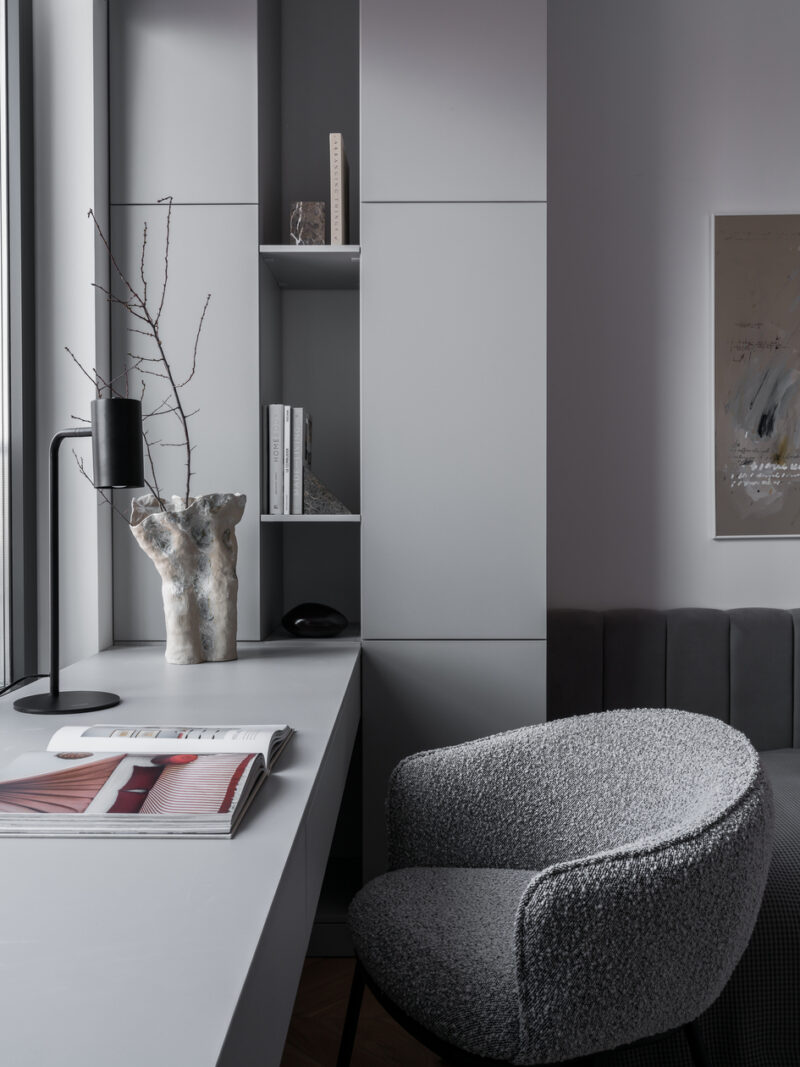
The second bedroom runs on a single gray gradient. A long built-in desk spans the window wall, its top continuing into a storage column with open niches, while a channel-tufted daybed in dove-gray velvet occupies the opposite corner. Matte gray cabinetry, a pale gray wall finish, and a boucle desk chair keep the room within one temperature; a playful glossy white side table on rounded legs and a slim black reading spot are the only interruptions. The setup reads as bedroom, study, and guest room in one compact plan.
 Pin
PinThe full view shows the room’s best move: pushing the worktop against the glazing so the desk gets the view and the daylight, while the bed retreats to the quiet corner. The storage column between them acts as a spatial hinge, holding books at the desk side and closing flush toward the bed. Sheer roller shades filter the skyline without blacking out the workspace.
 Pin
PinThe corner detail explains how the room stays serene: pendant, wall spot, and switch plate are all mounted on one clean wall plane in black and white, and the channel-tufted backrest gives the daybed the tailored geometry of a sofa. The glossy side table with its cartoonish legs is a precise dose of humor — one object, not a theme.
 Pin
PinAt the desk, the open niches break the cabinet run into a small domestic library, styled with books, stone bookends, and a raw ceramic vessel. The black task lamp is the only dark vertical in a field of grays, calibrating contrast at reading distance. Custom casework at this level of restraint is what lets a small room carry three functions without visual noise.
Two Bathrooms, Two Temperatures of Stone
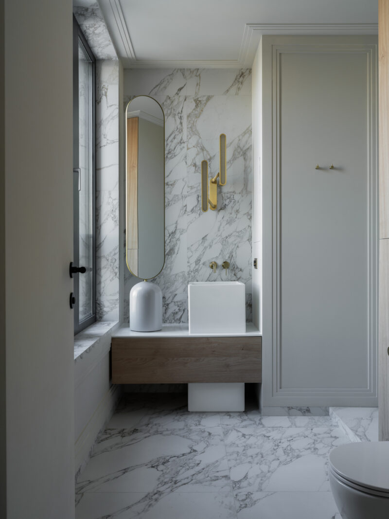
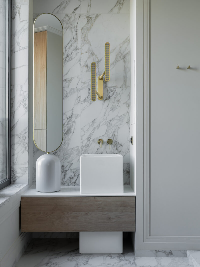
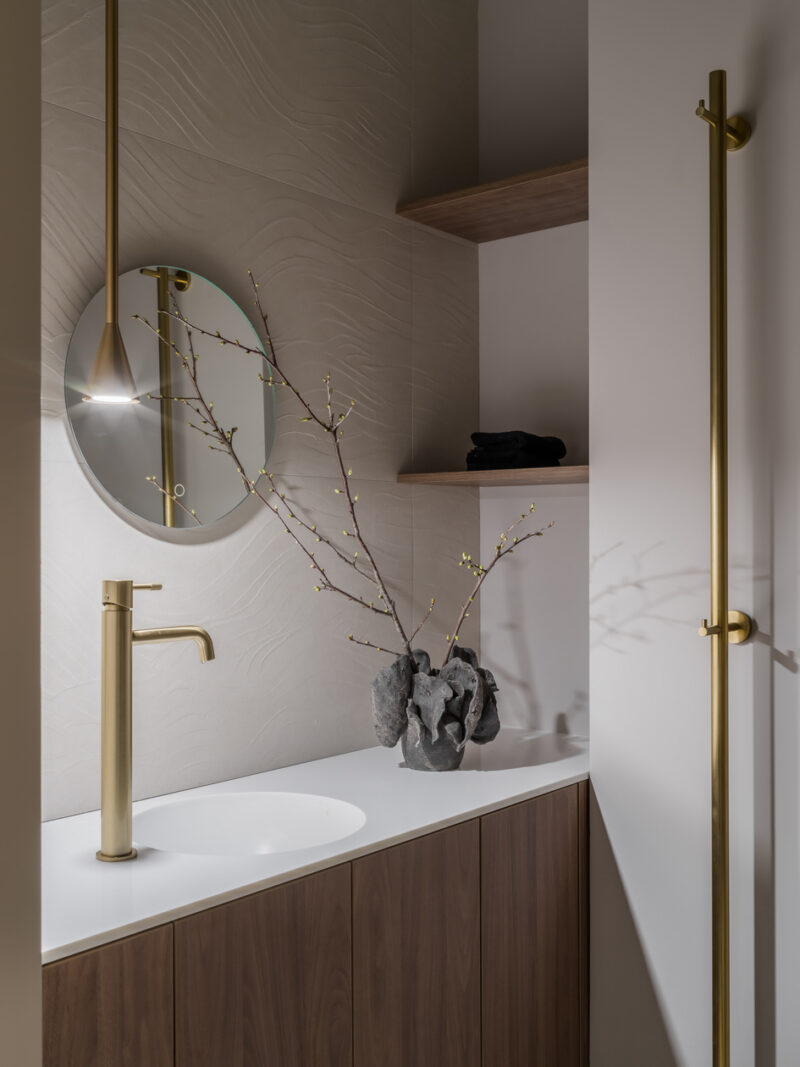
The apartment’s bathrooms split the material story in two. The main bathroom is cool and luminous: floor-to-ceiling slabs of dramatic gray-veined marble-look stone, a cube washbasin on a floating oak-front vanity, a gold-framed capsule mirror, and a sculptural brass sconce. The second bathroom turns warm and mineral — sand-toned tiles with a carved, wave-like relief, walnut cabinetry, and slender brass hardware from tap to heated towel rail. Both rooms run their metals, stone, and wood in the same proportions as the living spaces, so even the wet zones speak the project’s language.
 Pin
PinThe main bathroom elevation shows the veining bookmatched across the wall plane, with paneled storage doors painted a soft gray-green to calm the composition’s edges. The white cube basin and dome-shaped table lamp introduce pure geometric solids against the stone’s turbulence. A wall-mounted brass mixer keeps the counter empty — a small decision with a large effect on perceived order.
 Pin
PinCloser in, the fixture group works as a still life: capsule mirror, ribbed brass sconce, cube basin, dome lamp — four elemental shapes on a veined field. The oak drawer front warms the stone at exactly the point where hands interact with the vanity. It is a compact masterclass in limiting a room to one gesture per material.
 Pin
PinThe second bathroom trades drama for touch. The relief-carved tile catches raking light from the pendant spot, turning the wall into a low-contrast texture study, while the tall brass towel bar and slender mixer read as jewelry against it. Walnut vanity fronts and a corner of open shelving keep the room domestic rather than clinical — consistent with the brief’s emphasis on tactility.
The Dressing Room: Storage Promoted to Architecture
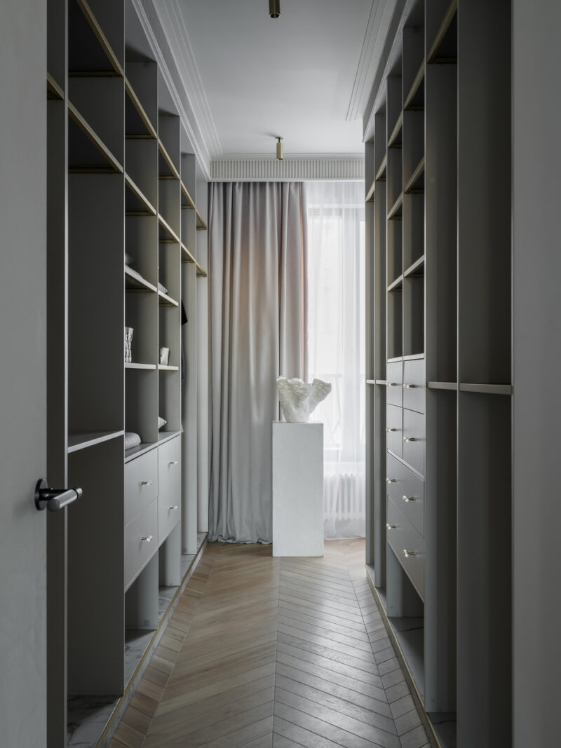
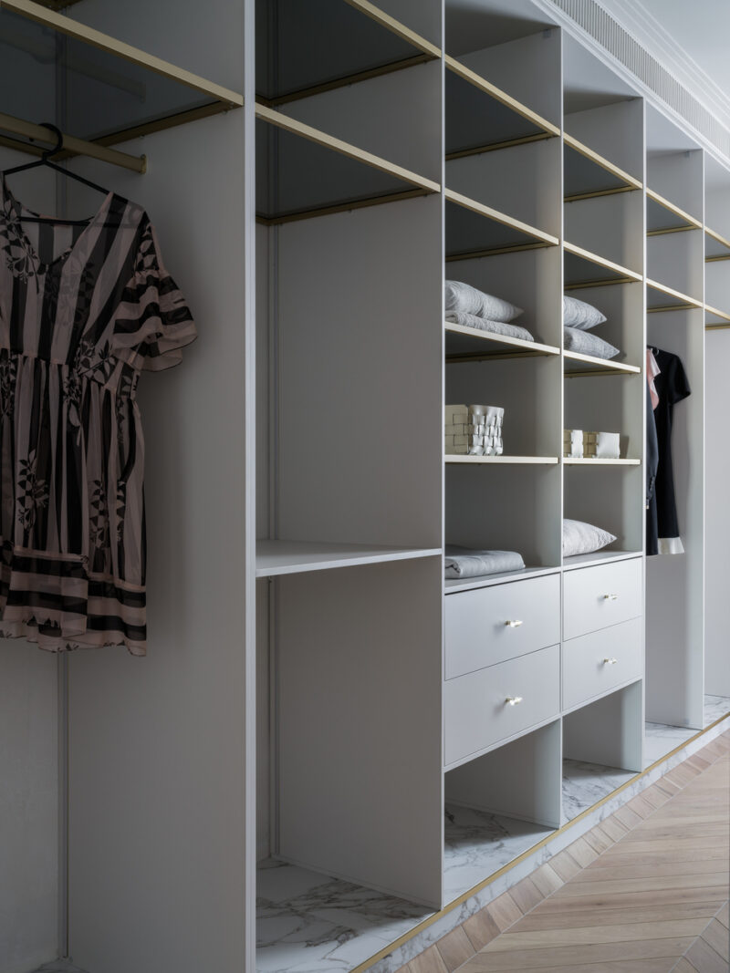
Between bedroom and bathroom, a walk-in dressing room turns pure storage into one of the apartment’s most composed spaces. Full-height open shelving in warm gray lines both walls, its edges trimmed in thin brass; drawer banks with faceted glass pulls sit at counter height. The chevron oak floor meets a marble-look border at the cabinetry line, and the axial view terminates in a curtained window with a single sculpture on a white pedestal — a museum-like full stop at the end of a service corridor.
 Pin
PinThe axial photograph shows why the room works: symmetry, a controlled vanishing point, and a curated object as the terminus instead of a blank wall. Gradient curtains from gray to blush soften the light source, and the fluted cornice carries through even here. Treating a closet corridor with the same ceremony as a gallery is the project’s clearest statement that no space is secondary.
 Pin
PinThe elevation detail reveals the millwork logic: open cells sized to folded garments, brass-edged shelf fronts, and hanging rails in the same metal, so the storage reads as fine cabinetry rather than closet fit-out. The stone plinth border protects the base and visually grounds the towers. This is where the 80-percent-custom figure becomes tangible — every dimension here is specific to its contents.
Where the Discipline Pays Off — and What It Asks in Return
Precision as a Budget Strategy
The project’s stated challenge — premium execution on a held budget — is answered convincingly by the custom program. Because casework, lighting, and textiles were drawn as one system, the apartment avoids the redundancy tax of retail furnishing: no oversized sofa compensating for a weak wall, no extra decor patching gaps. Second, the material hierarchy is disciplined — marble, brass, and oak appear in nearly every room, but always in the same proportional roles, which makes 123 square meters read as one continuous thought. Third, the lighting design is genuinely scenario-based: track spots, sconces, pendants, and reading lights are layered so each room can shift from working brightness to evening softness without a single decorative fixture feeling ornamental.
 Pin
PinThe coffee-table detail condenses the strengths into one frame: a brushed-brass drum table on a recessed base, a smoked-glass satellite table, and a ribbed rug whose concentric texture echoes both circles. Every object earns its place through material and geometry rather than pattern. When custom pieces are this resolved, restraint stops looking like economy and starts looking like intent.
The Price of a Fully Authored Home
The same discipline creates real-life obligations. A palette this pale — cream velvet, white boucle, light rugs — demands vigilant maintenance in a home that is actually lived in, and polished marble on the dining table and kitchen backsplash will etch and stain without care. The near-total custom program also reduces flexibility: pieces drawn for exact positions cannot be rearranged or replaced casually, so the interior’s coherence depends on it staying largely as delivered. Finally, the second bedroom’s strict gray monochrome is elegant but austere; a child or long-term guest may want more color than the system currently permits.
A Case for the Interior as a Single Instrument
This apartment argues that calm is not a style but a production method. By authoring roughly 80 percent of the interior — architecture, casework, light, and textile as one score — Gavalli design shows how a held budget can still deliver premium texture, provided every decision is made once and made exactly. It is a home best suited to an owner who values composure over spontaneity: a public person, like its client, who wants the private sphere to ask nothing of her. The open question is the trade-off at its core: would you accept an interior this fixed — beautiful, complete, resistant to rearrangement — in exchange for its calm, or is the freedom to move a sofa worth more than a perfect composition?
FAQs
Who designed the SHOME apartment in Moscow?
The interior was designed by Gavalli design, a Moscow-based studio, for television host and blogger Maria Kravtsova. The project is a completed, fully realized interior in the SHOME residential complex, built around the idea of a calm, tactile space that serves as a background to daily life.
How large is the apartment, and how much of it is custom?
The apartment measures 123 square meters (about 1,324 square feet). Approximately 80 percent of its contents — built-in and freestanding furniture, lighting scenarios, textiles, and decorative objects — were produced from the studio’s own sketches rather than purchased as ready-made pieces.
What was the main challenge of the project?
The key difficulty was holding the budget while preserving a premium level of execution and visual quality. The studio resolved it through precise work with the built structure, the material palette, and custom elements, avoiding compromises in the overall sense of coherence.
Which brands and suppliers partnered on the project?
Named project partners include MKA Paint (One Decor), Donel, Plug, Solira, Vintage flooring, Italon, Ametis, Dikart, Orac, Decaro, 41zero42, Sunerzha, Boheme, and Invisible Doors — covering paint, flooring, tile, moldings, hardware, and sanitary fittings.
Get gorgeous projects via email
