

Most beauty salons open with a reception desk and a row of waiting chairs. Rascveti (Blossom) Beauty Studio in Tyumen, Russia, opens with a semi-bar-height island where guests check in, drink coffee, browse skincare, and occasionally gather for small events. Interior designer Anastasia Sukhova of Sukhova Design Studio conceived this colorful beauty salon for a client she knew well — an aesthetic cosmetologist whose home she had already designed — and that trust reads in every decision. Within 53 m², the project argues that a compact commercial interior can carry a complete artistic program: disciplined color blocking, bespoke steel furniture, and an original painting at its center.
| Project Name | Rascveti (Blossom) Beauty Studio |
| Architect / Designer | Sukhova Design Studio |
| Location | Tyumen, Russia |
| Floor Area | 53 m² (approximately 570 sq ft) |
| Client Type | Private — an aesthetic cosmetologist |
| Photography | Mikhail Stoliar |
Rethinking the Beauty Salon Plan: An Island Instead of a Reception Desk
The brief compressed a full commercial program — reception, retail, laundry, treatment, restroom — into 53 m². A conventional salon parti (the organizing idea of a plan) would spend a large share of that area on a reception desk and a lounge that do one job each. Sukhova refused the split. Her plan centers on a multifunctional semi-bar-height island that works simultaneously as the receptionist’s workstation, a gathering table for guests, and a surface for small events, releasing the rest of the 16 m² guest hall for circulation and retail.
The section does as much work as the plan. With 3.4-meter ceilings, storage is absorbed into full-height built-in cabinetry that reads as wall rather than furniture, so the eye travels along vertical lines and shifting perspectives instead of freestanding objects. Because the project has no exterior of its own, the material envelope becomes its facade: color-blocked Flügger paint declares each functional zone, Atlas Concorde stone-look porcelain meets industrial gray squares by Kerama Marazzi underfoot, and white mosaic, fluted glass, and mirror bands multiply daylight until the compact volume reads far larger than its footprint. The interior itself is the brand argument that separates this studio from its competitors.
Design Decision: A deep hand-washing niche sits in the service corridor, outside the restroom, so visitors never need to enter the WC before a treatment. Sukhova stages even this hygiene stop as an emotional set piece: a deep blue wall animated by sculptural plaster volutes and a bird silhouette picked out in vivid yellow.
Room by Room: How 53 m² Unfolds in Five Acts
A 7 m² Entrance That Sets the Chromatic Rules
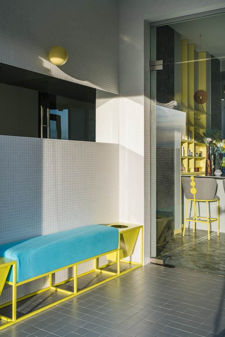
The journey begins in a 7 m² entrance hall that functions as a decompression chamber between the street and the studio. A suspended storage cabinet holds one wall; opposite it, a vibrant upholstered bench offers a place to change shoes — a domestic ritual imported into a commercial space. Full-height glass doors then reveal the guest hall beyond, so the room’s small footprint borrows depth from the view through it. Every finish that will recur later is introduced here in miniature: white mosaic, gray floor tile, and the yellow-turquoise-blue accent triad.
 Pin
Photo: Mikhail Stoliar
Low evening sun rakes across the entrance hall, catching the turquoise bench cushion and its fluorescent yellow steel frame. A dark mirror band runs above the white mosaic dado, stretching the perceived width of the room while a sphere sconce repeats the accent color at eye level. Through the glass door, the yellow retail shelving and a disc-backed bar stool preview the guest hall’s palette before a visitor has taken three steps. The color blocking (using solid planes of a single color to define zones) begins at the threshold and never lets up.
 Pin
Photo: Mikhail Stoliar
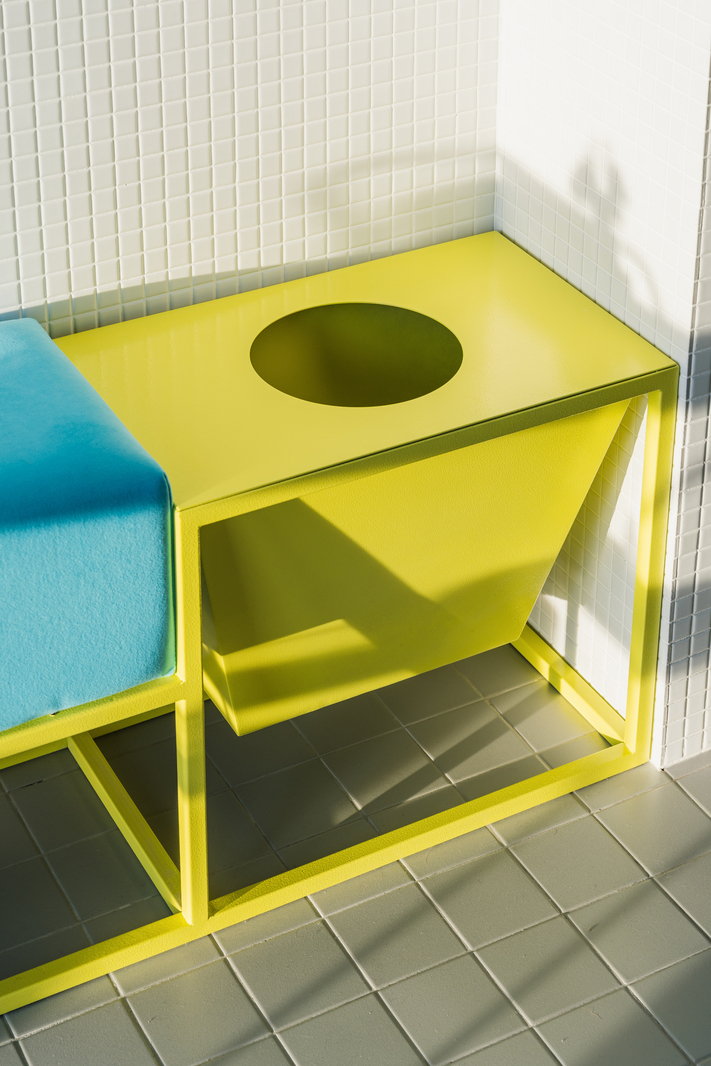
A detail of the bench end shows how far the bespoke program extends. The powder-coated frame integrates a faceted steel hopper beneath a circular cutout, turning the seat’s terminus into a planter-like receptacle rather than a dead corner. Sukhova designed this piece, the bar stools, and all cabinetry from her own sketches, following the modernist tradition of the Gesamtkunstwerk (a total work of art in which architecture, furniture, and decoration form one composition). The crisp shadows on the white mosaic confirm how much visual work the small-format tile does as a neutral backdrop.
The 16 m² Guest Hall: An Island, Not a Desk
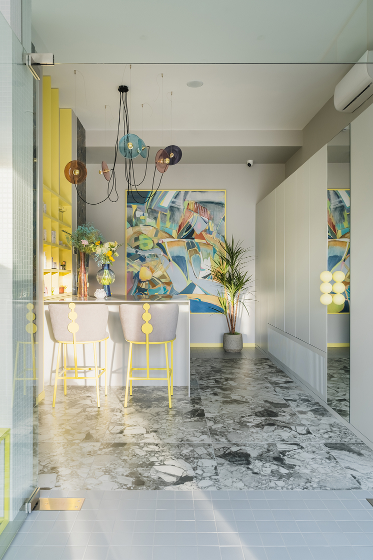
Past the glass doors, the guest hall operates as lobby, café, shop, and event room at once. A continuous wall of built-in cabinetry defines the room’s geometry and conceals its storage, while the white island counter forms the centerpiece where guests relax before appointments, browse skincare products, or share a coffee. The designer’s own painting anchors the central axis, so the first long view in the studio terminates in art rather than signage — a hierarchy of focal points that tells visitors what this place values.
 Pin
Photo: Mikhail Stoliar
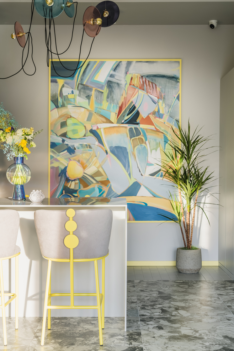
The island reads as hospitality furniture, not office equipment: a waterfall counter attended by bar stools whose gray upholstery is pinned by a spine of yellow discs. Behind it, open yellow shelving displays retail product under a constellation of colored-glass pendant lights, their cables drawn loosely across the ceiling like a sketch. The floor shifts from small gray tile at the threshold to large-format stone-look porcelain that resembles scattered stones, marking the zone change without a single wall. Fresh flowers and the painting beyond complete the axial composition.
 Pin
Photo: Mikhail Stoliar
The room’s conceptual center is Warm August, an original painting by Sukhova herself — a new 160 × 210 cm version of a canvas she first painted in 2010. The work celebrates the abundance and maturity of late-summer nature, and attentive viewers will find the silhouette of a young woman holding a pear hidden in the composition. Its thin yellow frame matches the baseboards and stool frames, binding artwork and architecture into one system. A potted dracaena softens the junction between painting and cabinetry wall.
The Service Corridor, Staged Like a Gallery
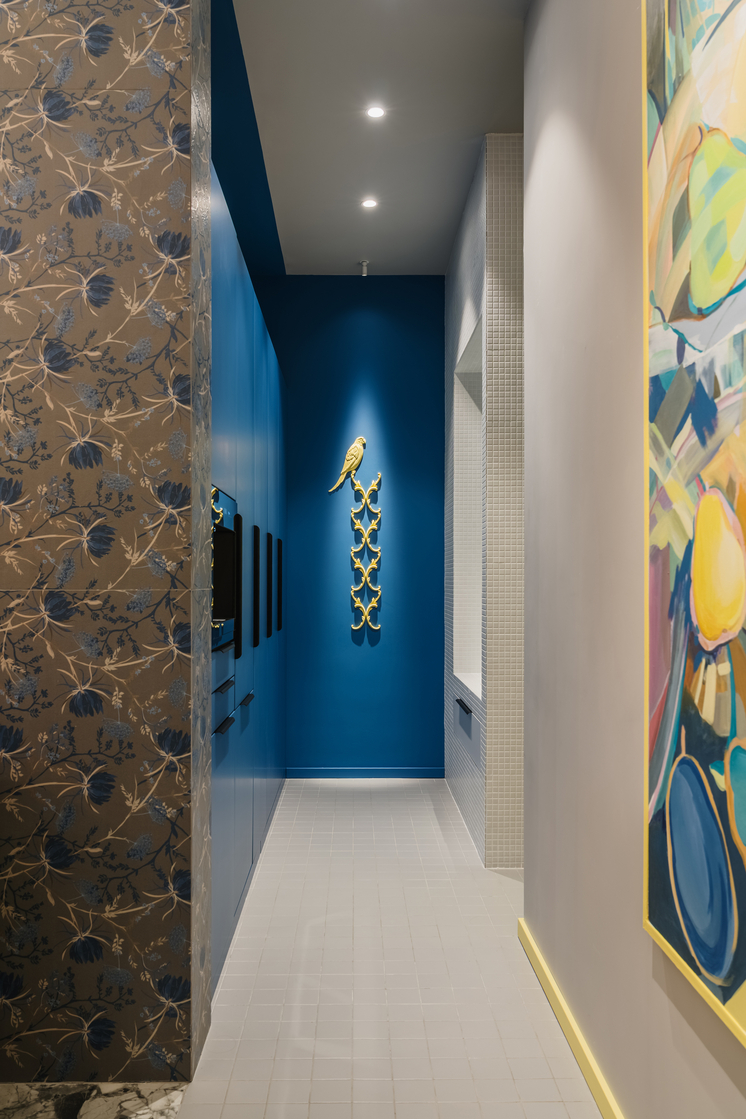
To the left of the guest hall lies the 7 m² service area, where the studio’s entire back-of-house is compressed into one minimalist block of built-in cabinetry: washing machine, tumble dryer, refrigerator, coffee machine, and ironing board all disappear behind flush fronts. Opposite stands the hand-washing niche noted earlier. What could have been the plan’s most utilitarian corner instead receives the most theatrical lighting in the studio, proving the project’s thesis that no zone is too functional for an emotional experience.
 Pin
Photo: Mikhail Stoliar
A downlight isolates the yellow plaster ornament — stacked volutes crowned by a perched bird — against the deep blue wall like an artifact in a vitrine. The appliance wall on the left dissolves into the same blue, its black pulls the only clue to the machinery behind, while a pier of botanical-relief tile mediates between the corridor and the guest hall. White mosaic lines the washing niche at right, bouncing borrowed light back into the passage. The composition turns a two-meter service run into one of the studio’s strongest axial views.
4 m² of Manufactured Sunshine
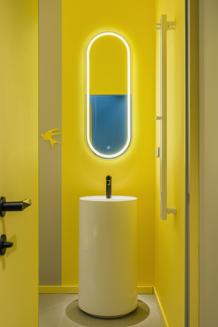
A concealed yellow door in the service area opens onto the 4 m² restroom, the most saturated space in the project. The room has no window, so Sukhova floods it with warm sunshine-yellow across walls, door, and trim to synthesize the feeling of natural daylight. It is a small, legible lesson in compensatory color design: where the architecture cannot deliver sun, the palette does.
 Pin
Photo: Mikhail Stoliar
A cylindrical white pedestal basin with a matte black tap stands like a plinth beneath a backlit capsule mirror, whose halo intensifies the room’s glow. The mirror reflects the blue of the adjacent zone, momentarily placing the palette’s two poles — sun and sea — in one frame. A yellow swallow figure on the wall continues the bird motif from the corridor ornament, and an olive-toned paint band adds just enough contrast to keep the monochrome from flattening. Black hardware punctuates the scheme with graphic precision.
A 19 m² Treatment Room Split Between Morning and Evening
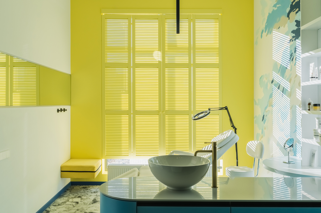
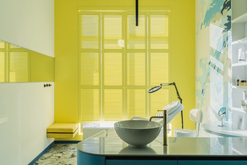
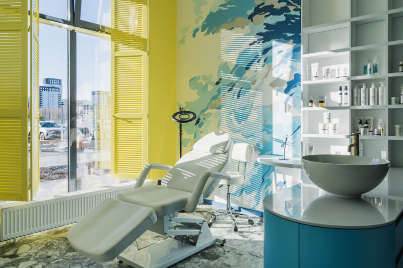
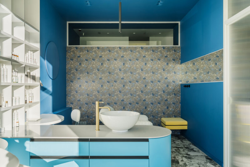
Through a fluted glass door, the guest hall opens onto the 19 m² treatment room, the studio’s working heart. Daylight floods the space through a glazed street wall; in the evening, light filters through plantation shutters (hinged louvered panels mounted inside the window), casting graphic shadows across walls and furniture. The room divides into two moods matched to two services: a bright “morning” zone by the window for facial treatments, and an intimate blue “evening” zone for relaxing facial massage. Between them, a rounded storage unit with a vessel sink serves both zones through drawers accessible from either side.
 Pin
Photo: Mikhail Stoliar
Backlit by the low sun, the yellow shutters glow like a lightbox and throw striped shadows across a painted cloud mural in aquas and sands. A floating yellow bench cushion, edged in black piping, cantilevers from the white cabinetry wall beside the window. The white treatment chair and magnifier lamp sit within the brightest band of the room, exactly where skin work demands honest light. Every fixed element — shutters, wall, bench — belongs to the same yellow family, so the zone reads as a single luminous volume.
 Pin
Photo: Mikhail Stoliar
With the shutters folded open, the morning zone connects to the street and the city skyline beyond, reminding visitors that this saturated interior sits inside an ordinary Siberian block. The adjustable treatment chair faces the light, while white display shelving stocked with professional product forms a working wall at right. The mural’s blue clouds drift toward the evening zone, functioning as a painted transition between the room’s two halves. Shadow stripes from the louvers animate every surface they cross.
 Pin
Photo: Mikhail Stoliar
The evening zone inverts the palette: deep sea-blue walls and ceiling wrap a white massage couch, with botanical-relief tile — Ariana’s Floralia Ombrelle — spreading a silvery thicket of thistles behind it. A small yellow ottoman floats against the blue as a single warm counterpoint, and an internal clerestory strip above the tile borrows light from the neighboring volume. The tactile relief of the tile invites touch as much as viewing, an intentionally sensory finish for a room devoted to touch. Recessed spots keep evening light low and directional.
 Pin
Photo: Mikhail Stoliar
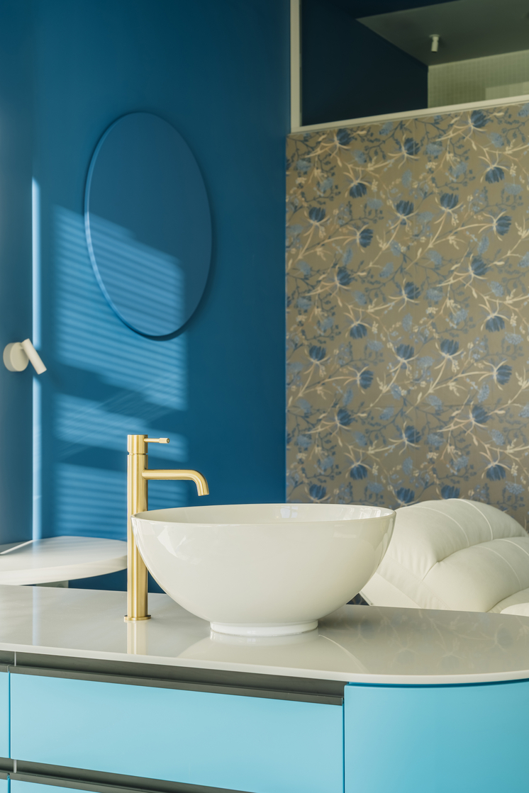
At the pivot between zones, a bowl-shaped vessel sink and a tall brushed-brass mixer stand on the white quartz top of the rounded turquoise unit. A blue-tinted round mirror hangs tone-on-tone against the blue wall, visible only by its shadow line — a quietly radical piece of styling. The curve of the cabinet lets practitioners circulate around it from either treatment station without a hard corner. Brass, blue, and white here distill the studio’s Mediterranean references to three materials.
 Pin
Photo: Mikhail Stoliar
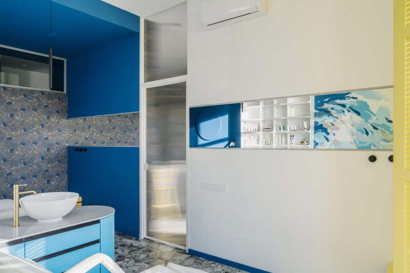
Looking back toward the guest hall, the fluted glass door reads as a glowing amber panel, diffusing the yellow beyond into the blue zone without surrendering privacy. The mirrored niche above the tile wainscot doubles the white product shelving opposite, layering real and reflected storage. Blue cabinetry, gray floral tile, and the white wall with its recessed display niche demonstrate the color-blocked wall strategy at its most controlled. Even the air-conditioning unit is absorbed into the white field rather than fought.
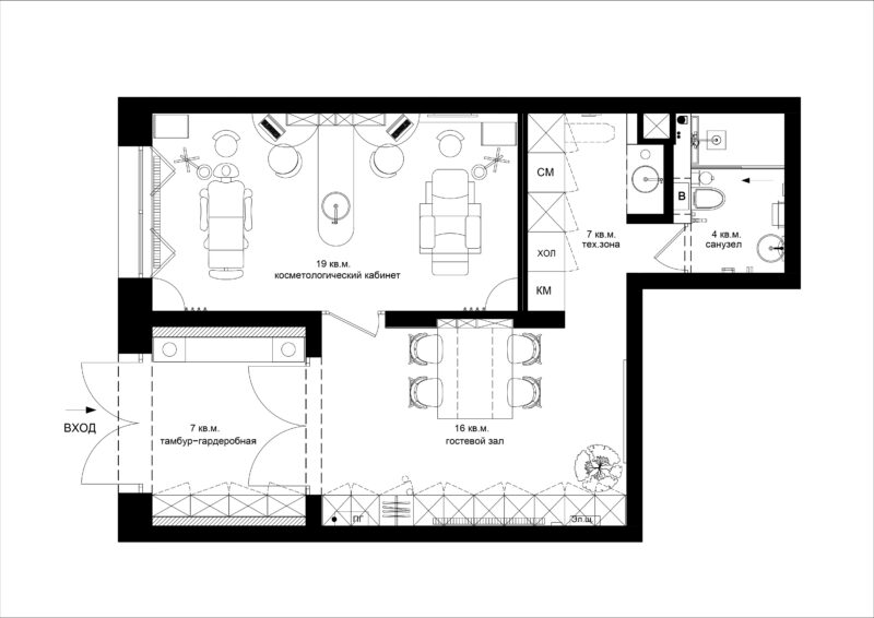 Pin
The plan confirms the economy of the parti: the 19 m² treatment room and 16 m² guest hall claim the two prime daylit volumes, while the 7 m² vestibule-cloakroom, 7 m² tech zone, and 4 m² WC line the service edge. Storage runs continuously along perimeter walls instead of intruding into floor area, and the island sits at the crossing of every circulation path. No corridor exists purely for movement — each passage doubles as storage, washing, or display space.
Where the Color Discipline Pays Off — and What It Will Demand
Color as Circulation Logic
The island genuinely consolidates the program: reception, retail counter, café table, and event surface occupy one footprint, which is why a 16 m² hall can feel generous. Zoning by light is equally precise — facial treatments claim the daylit window band where color rendering is most honest, while massage retreats into the dim blue zone where glare would be a liability. And the reflectivity strategy earns its keep: mirror bands, fluted glass, and small-format mosaic bounce light through the plan until 53 m² photographs like twice the area.
 Pin
Photo: Mikhail Stoliar
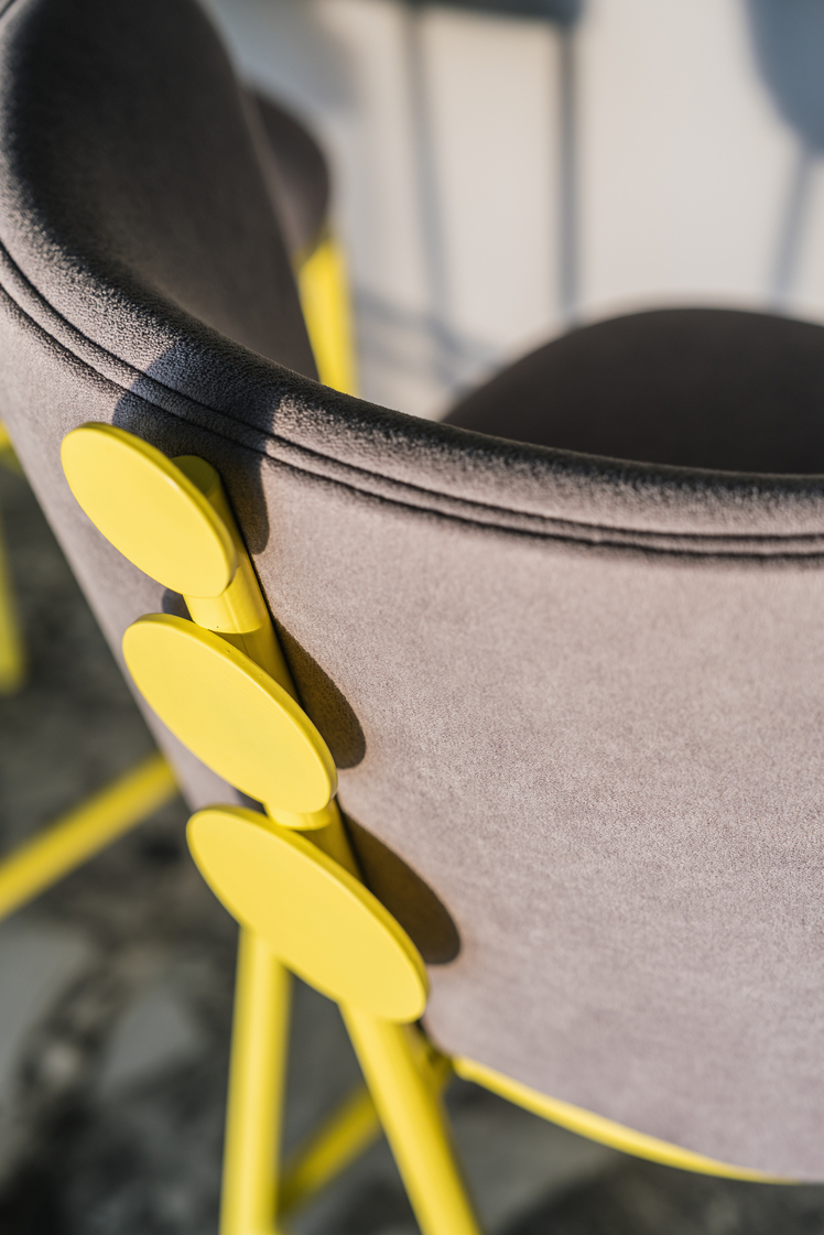
The stool detail shows the consistency that makes the scheme credible: three lacquered yellow discs clamp the gray upholstered back to the frame, resolving a structural connection as an ornament. It is the Gesamtkunstwerk logic operating at hardware scale. When even a fastener participates in the color argument, the larger gestures — blue rooms, yellow shutters — stop feeling arbitrary.
What a Saturated Palette Asks in Return
Color-blocked painted walls in a high-traffic salon will show scuffs faster than tile, and touch-ups across this many distinct hues mean a real maintenance protocol, not an occasional roller pass. The near-fluorescent yellow also casts strong reflected color — acceptable in the restroom, but a reason the plan wisely confines skin-assessment work to the neutral daylit zone; any future re-programming of the rooms would fight that constraint. Finally, the bespoke steel furniture that gives the studio its identity cannot be replaced from a catalog: damage to a bench or stool means a return to the fabricator.
A Salon That Trades the Waiting Room for a Table
Rascveti’s contribution is typological: it imports hospitality planning into a service business that usually defaults to clinical furniture, and it treats interior design as the brand itself rather than decoration applied to one. The client now visits her own studio to drink coffee and meet friends — the clearest possible proof that the spatial bet paid off. This model suits independent practitioners whose personal identity is the business, and clients who want ritual rather than throughput.
Would you check in at a communal island with a coffee in hand — or does a beauty appointment still call for the formality of a front desk?
FAQs
Who designed the Rascveti Beauty Studio in Tyumen?
Interior designer Anastasia Sukhova, founder of Sukhova Design Studio, designed the studio for an aesthetic cosmetologist whose private home she had previously completed. Sukhova also designed all bespoke furniture from her own sketches and painted the artwork at the studio’s center. The project was photographed by Mikhail Stoliar.
How big is the Rascveti Beauty Studio?
The studio occupies 53 m² (about 570 sq ft) with 3.4-meter ceilings. The plan comprises a 7 m² entrance hall, a 16 m² guest hall, a 19 m² treatment room, a 7 m² service area, and a 4 m² restroom, with storage built into the perimeter walls.
What is the color palette of this beauty salon?
The palette rests on a calm base of gray and white enlivened by vivid accents: an almost fluorescent yellow evoking the sun, deep blue recalling the sea and the restorative power of water, and turquoise referencing Mediterranean vegetation. Black accents add contrast and graphic definition throughout the interior.
What finishing materials were used in the studio?
Walls and ceilings are color-blocked in Flügger paint. Floors combine Atlas Concorde stone-look porcelain with industrial gray square tiles by Kerama Marazzi. Ariana Floralia Ombrelle relief tiles form the botanical wall feature, complemented by white mosaic, clear and fluted glass, mirrored surfaces, and Rodecor decorative moldings.
What is the painting in the guest hall?
The central artwork is Warm August, an original painting by Anastasia Sukhova, produced as a new 160 × 210 cm version of a canvas she first painted in 2010. It celebrates the abundance of late-summer nature and hides the silhouette of a young woman holding a pear within the composition.
Get gorgeous projects via email
